
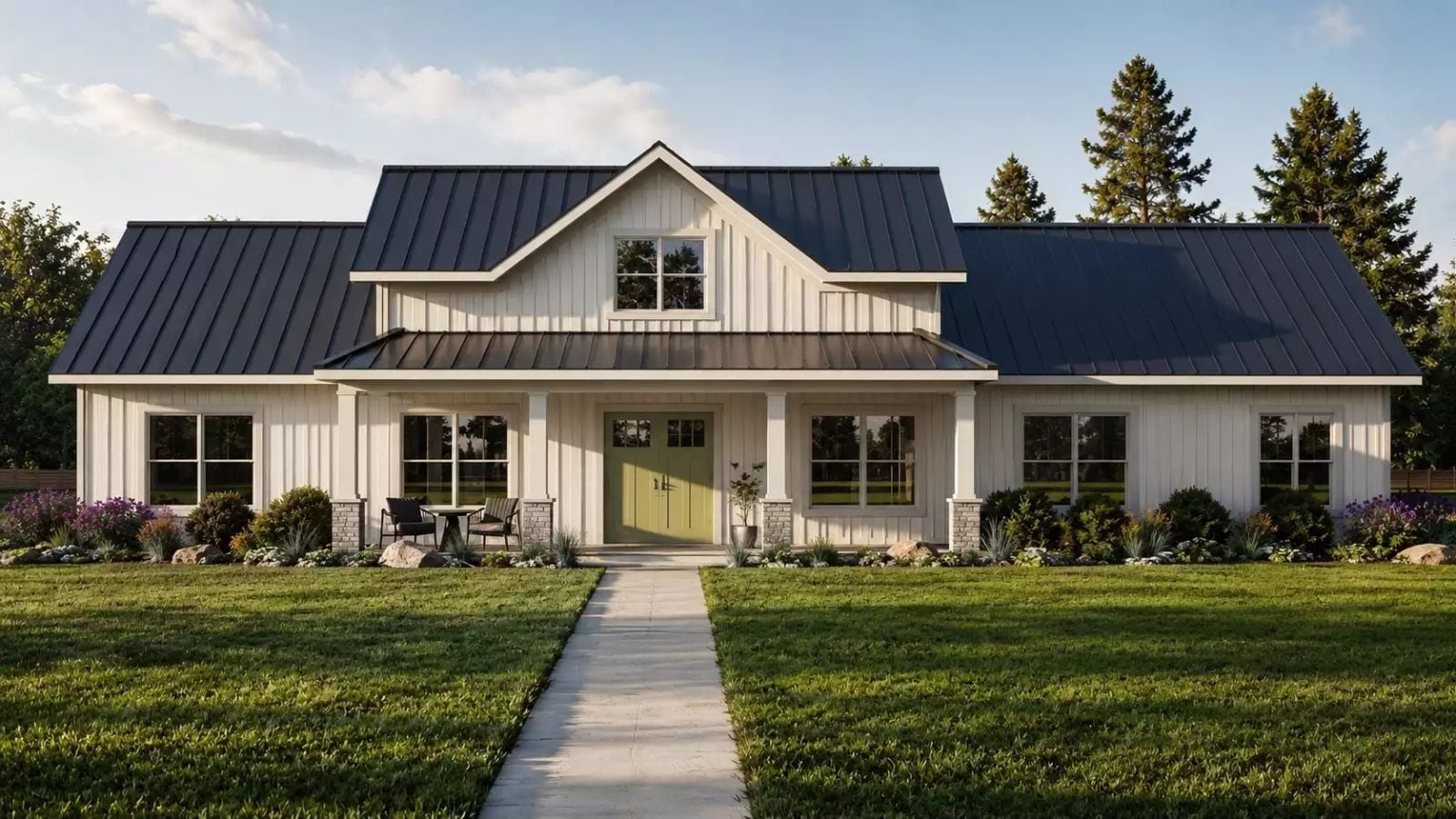
Starter homes are fine until they aren’t, and most families hit that wall around year three when the homework has taken over the dining table because there’s simply nowhere else for it to go. The Bradshaw is built for that exact turning point: a butler’s pantry that absorbs the grocery chaos, a covered patio where dinner spills outside naturally, an open main living area that holds the whole household without feeling like a pile-up, and a layout that actually gives everyone a place to land.
Specifications
- Sq. Ft.: 2,115
- Bedrooms: 3
- Bathrooms: 2.5
Floor Plan – Main Floor
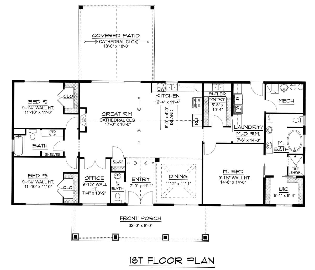
Single-story ranch, three bedrooms, a dedicated office, and a butler’s pantry tucked between the kitchen and laundry room. The great room’s cathedral ceiling anchors the center of the plan. Master suite sits privately on the right wing with a walk-in closet and tile shower.
Board-and-Batten White Exterior with Covered Porch Built for Real Outdoor Living
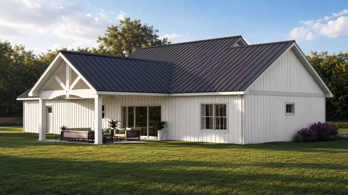
Vertical board-and-batten siding paired with a dark metal roof is a contrast that reads clearly from the street and doesn’t date quickly. The gabled porch is deep enough to shelter actual seating — not just a doormat and a potted plant.
Exposed Beam Ceiling and Circular LED Chandelier Make This Dining Room Worth the Upgrade
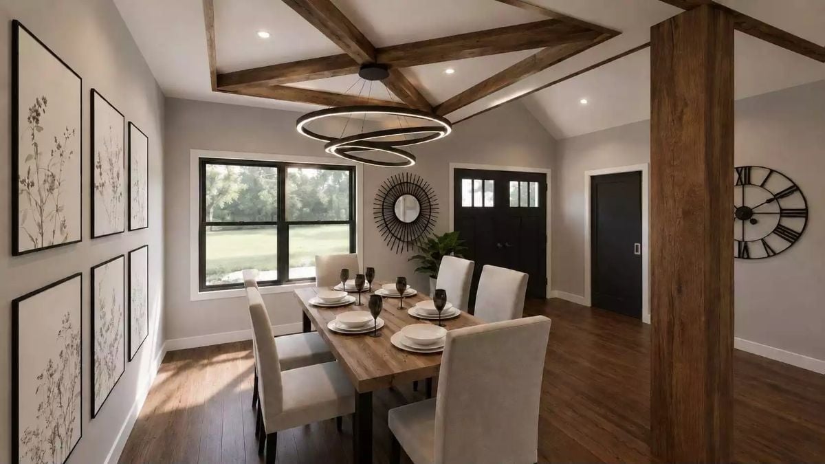
Rough-hewn ceiling beams play against a three-ring LED chandelier that feels almost sculptural at this scale — an unlikely pairing that works because neither element is trying to disappear. The dining table’s wood grain echoes the structural post framing the room, six upholstered chairs keep it livable, and botanical prints line the wall without tipping the room into clutter.
Dark Marble Island and Stainless Hood Make This Kitchen Hard to Walk Past
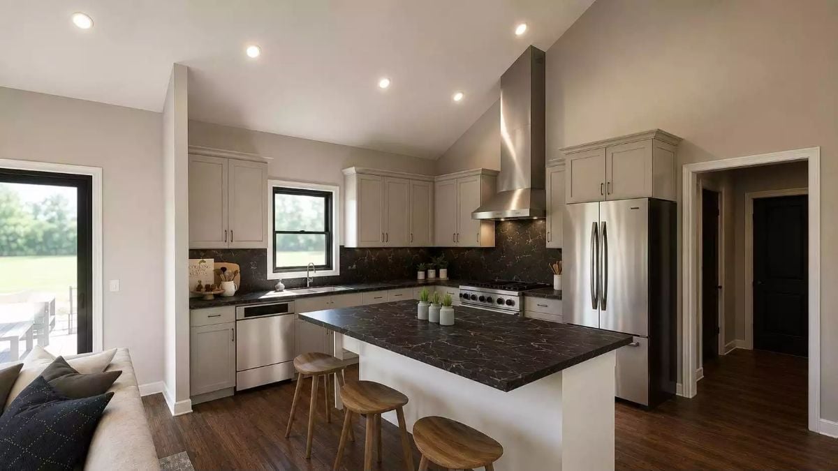
Black-veined marble runs across both the perimeter counters and the island, anchored overhead by a wall-mounted stainless chimney hood. Three saddle-seat stools pull up casually on the near side. The backsplash carries the same stone pattern straight to the cabinet line, so the whole run reads as one continuous surface rather than a collection of separate decisions.
Worth Knowing: Dark countertops on a white island base can read as top-heavy if the island is too narrow, but the proportions here keep it grounded. Running the same stone on both the perimeter and island is a deliberate move that sidesteps the mismatched look common in staged homes. If you’re drawn to this combination, honed finishes hold up better than polished ones in a kitchen that actually gets used.
Stacked Stone Fireplace That Goes All the Way to the Vaulted Ceiling
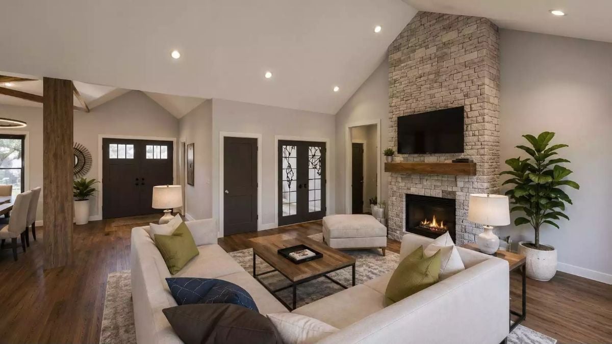
Cream sofas with olive and navy pillows anchor the seating, but the stone chimney is what stops you cold. It runs floor to peak, framing a wood mantel and wall-mounted TV in a single unbroken vertical mass. Dark hardwood floors and recessed lighting handle the rest of the room without competing for attention.
Why It Works: Vaulted ceilings can make a room feel cavernous and cold if there’s nothing to balance all that vertical space. Running the stone chimney to the roofline solves that problem by giving the eye somewhere deliberate to land, and it means the TV reads as part of a composed moment rather than something bolted to a leftover wall.
Geometric World Map Wall Art That Actually Earns Its Place in a Home Office
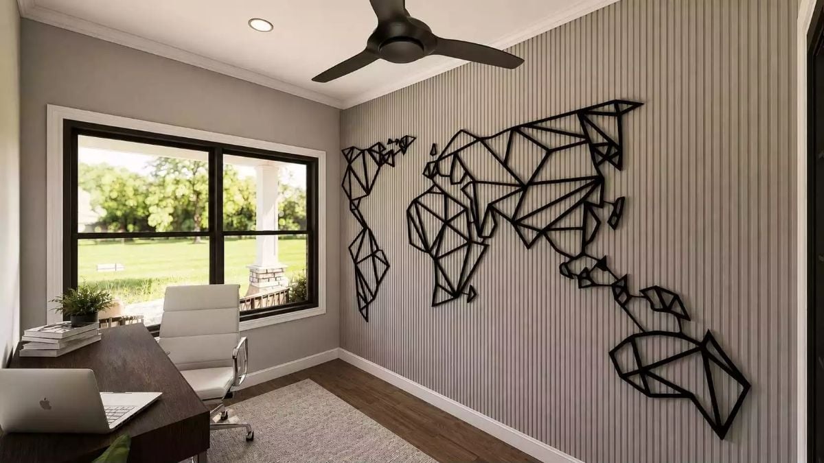
Slatted wall paneling gives the accent wall enough texture to hold a large-scale geometric world map without the two fighting each other. The dark wood desk and white leather chair keep the palette grounded. Natural light from the black-framed window does most of the heavy lifting. It’s a working room, and it actually feels like one.
Quick Fix: Slatted wall panels are one of the few accent wall treatments that work without paint or wallpaper. If you’re mounting large metal wall art, the vertical grooves double as built-in alignment guides — the piece hangs level on the first try instead of the fourth.
Striped Wallpaper and Low-Profile Bed That Make a Bedroom Feel Taller Without Adding Height
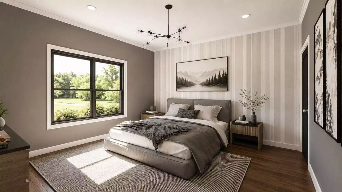
Subtle striped wallpaper pulls the eye upward while the low platform bed keeps the room feeling open rather than crowded. Two moves, opposite directions, same goal.
Subtle striped wallpaper draws the eye upward while the low platform bed keeps the room feeling open rather than crowded.
Freestanding Tub With Brass Filler in a Layout That Actually Gives It Room to Breathe
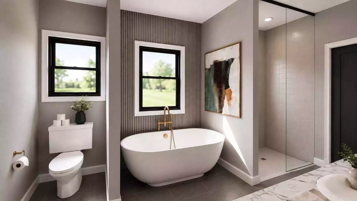
Freestanding tubs get cramped into corners all the time, but this one has real clearance on three sides.
The floor-mounted brass filler is the fixture worth watching — warm metal against white stone reads expensive without announcing itself. Fluted wall panels behind the tub define the alcove without demanding attention, and the glass shower enclosure at the far end keeps the room open rather than boxed off.
Laundry Room With Dark Marble Counters That Makes the Chore Feel Less Like One
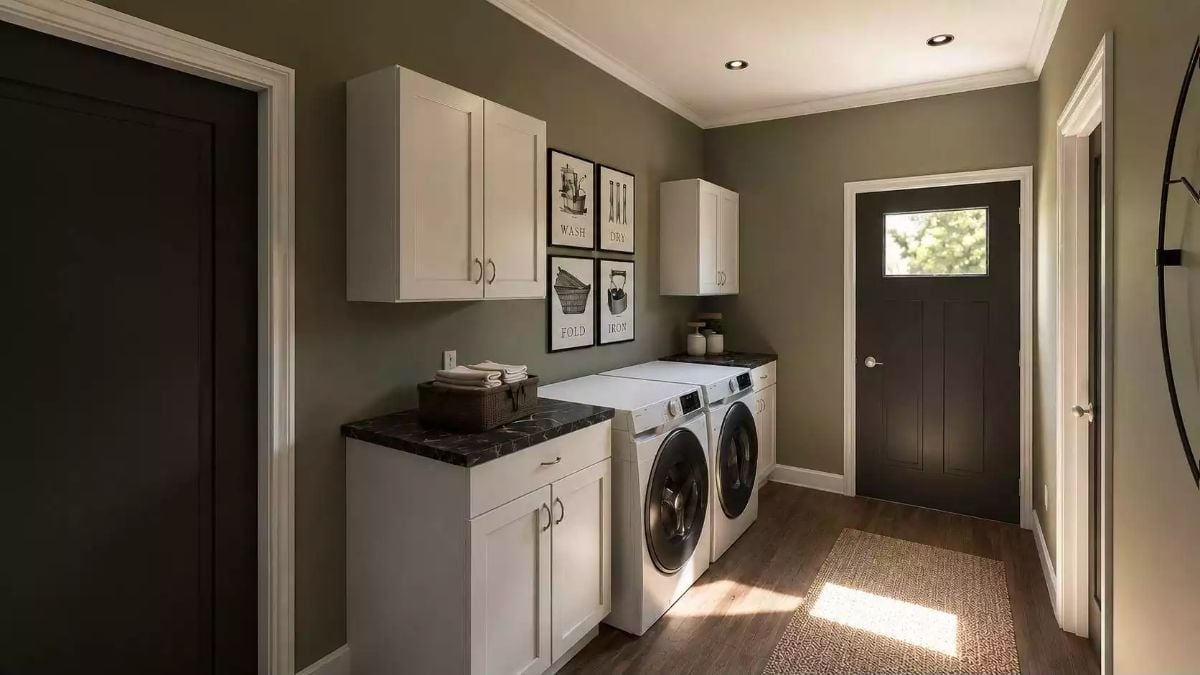
Olive-toned walls do what white cabinetry alone rarely manages: keep a laundry room from feeling like a utility closet with pretensions. Dark marble counters run across both the folding station and above the machines, tying the two zones together into something that reads as a room rather than an afterthought. Four framed wash-dry-fold-iron prints handle decor without overselling it. The woven rug by the door is a small, practical detail that earns its place every single day.
In The Details: Front-load washers and dryers sit flush with standard base cabinet height, which makes counter depth worth planning carefully before you order machines. Get that alignment right and your folding surface runs level across the entire wall. Even a half-inch mismatch reads as sloppy once everything’s installed and you can’t unsee it.
Pin It
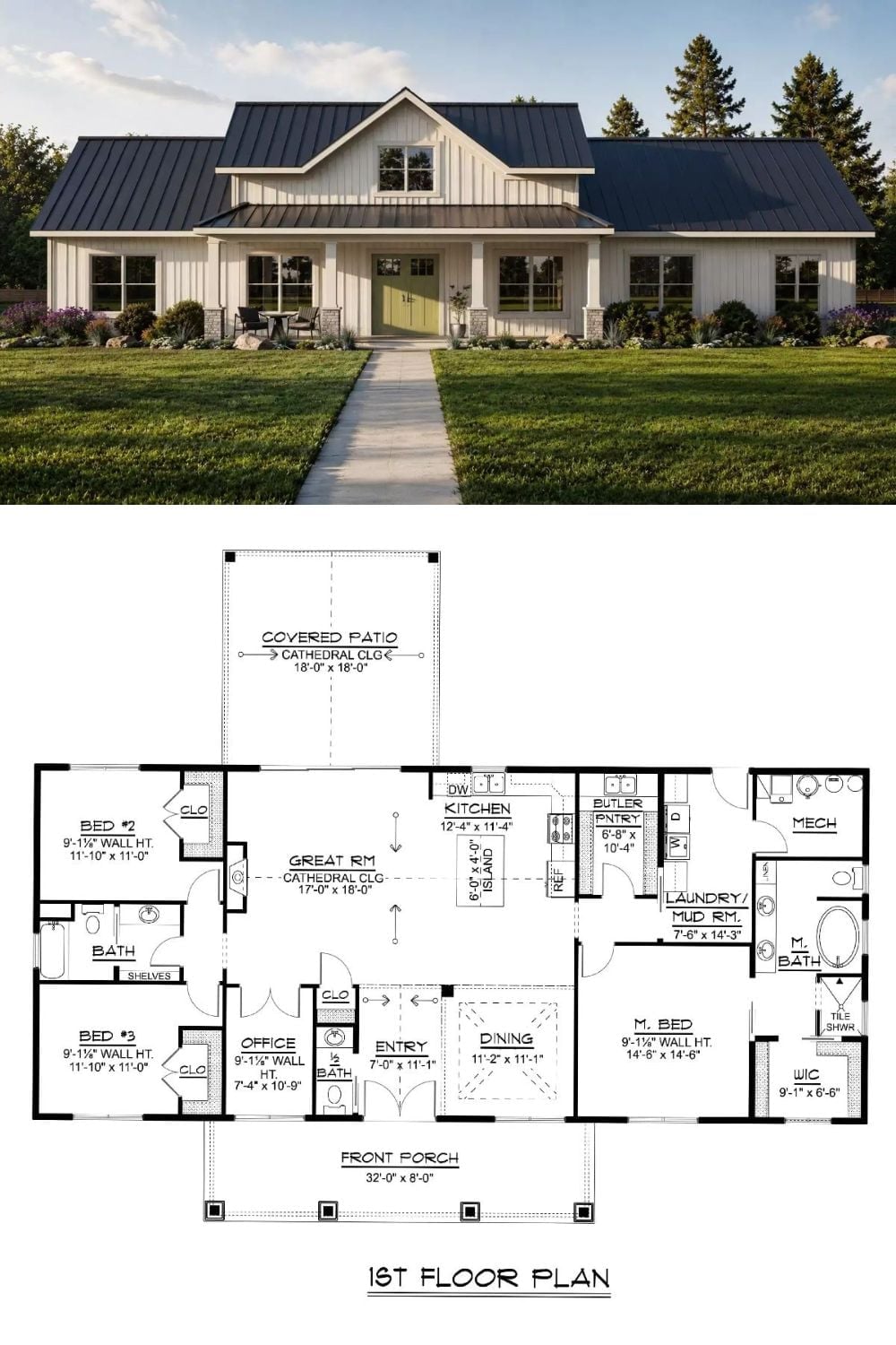
The exterior rendering shows a board-and-batten farmhouse with a metal roof and a covered porch with real depth. Below it, the floor plan lays out three bedrooms, a butler’s pantry, a great room with cathedral ceiling, a dedicated office, laundry and mud room, and a master suite with walk-in closet. Single-story living, serious square footage.
History Corner: Butler’s pantries took hold in American homes during the late 19th century as a staging area between the kitchen and formal dining room, typically managed by household staff. By mid-century they’d largely vanished from residential design as domestic service became rare. Their return in modern floor plans reflects something straightforward: families want to entertain without their guests staring at every dish in the sink.
