
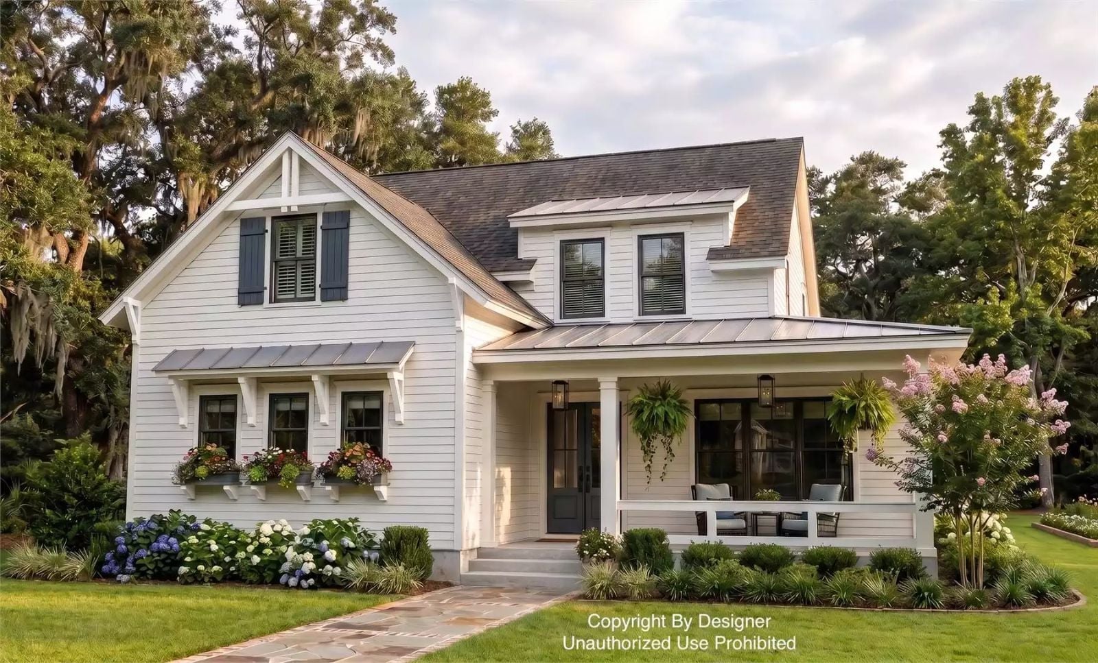
The Belmont Gardens is built around a simple premise: parents shouldn’t have to be upstairs to know what’s happening downstairs, and kids shouldn’t have to be in the same room as everyone else just because there’s nowhere else to go. A main-floor primary keeps things convenient without putting adults at the center of every school-night collision, while an open great room, a kitchen that talks to the dining table, and an upstairs loft give a family of four actual room to spread out — or collapse together, depending on the day.
Specifications
- Sq. Ft.: 2,759
- Bedrooms: 4
- Bathrooms: 3.5
Floor Plan – Main Floor
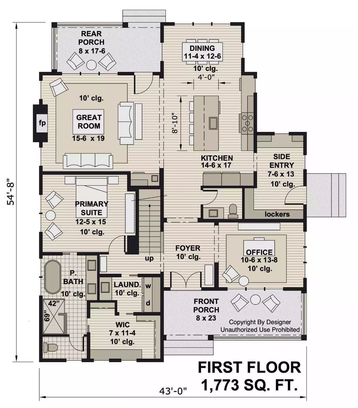
The first floor puts the primary suite on the main level alongside a great room with fireplace, open kitchen, dining, and office. A side entry with lockers keeps daily chaos contained. Stairs indicate additional bedrooms up.
Floor Plan – Second Floor
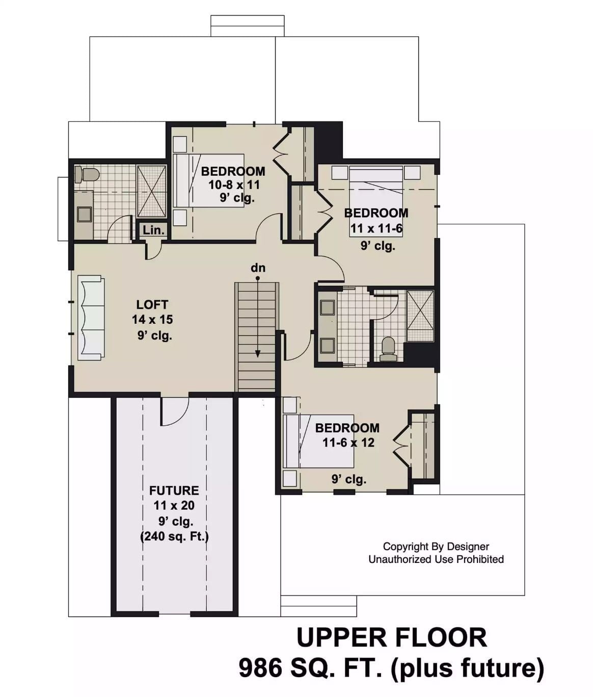
Upstairs you get three bedrooms, a shared bath, and a loft that opens onto the staircase — the kind of space that actually gets used. Each bedroom sits under 9-foot ceilings, and there’s a future space adding 240 square feet whenever the family decides it needs more room.
Shiplap Fireplace Wall Anchors a Living Room Built for Real Life
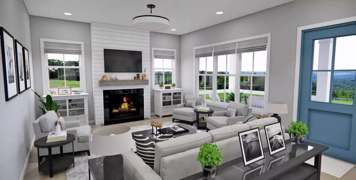
White shiplap runs floor to ceiling around the fireplace and TV mount, giving the room a clear focal point without anything trying too hard. The gray sectional, black coffee table, and roman shades all stay in their lane — grounded, unfussy, and easy to live with on a Tuesday night.
Gray Island, White Quartz, and Pendants That Mean Business
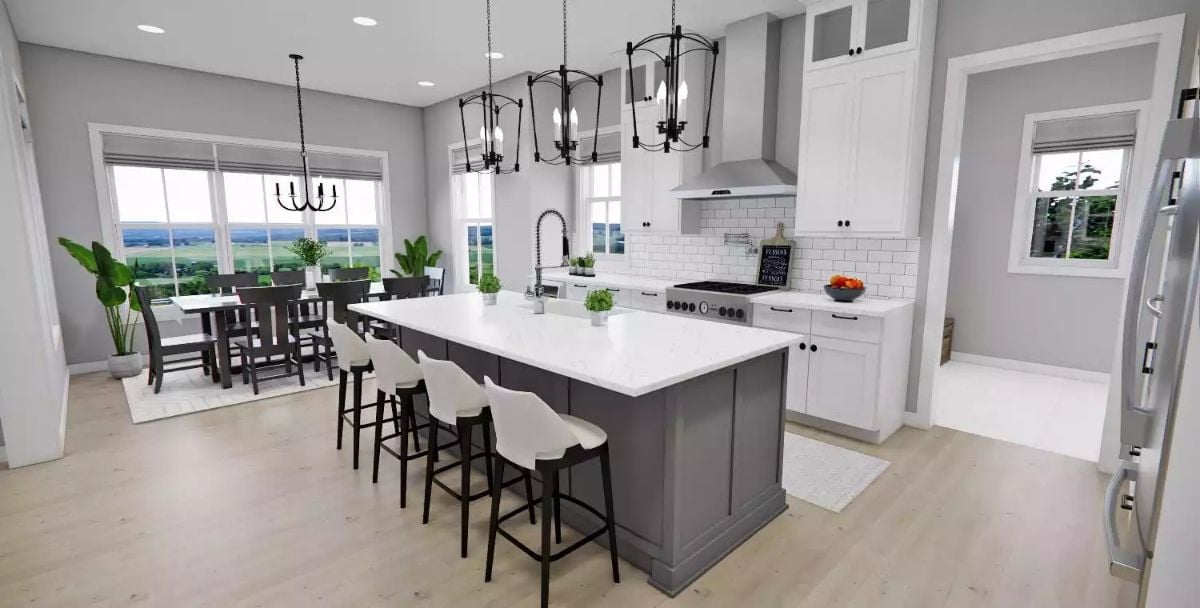
Three black lantern pendants hang low over a gray island topped in white quartz. Bar stools angle toward the dining area so the kitchen and table stay in easy conversation — which is the whole point of blowing out a wall in the first place.
History Corner: Open-plan kitchens became common in American homes during the mid-20th century, driven partly by a cultural shift away from isolating domestic work from family life. Before that, kitchens were typically tucked away — often staffed by hired help in wealthier households. The layout here shows how completely that idea has reversed.
Gray-on-Gray Done Right, With a Dragonfly Print Trio to Prove It
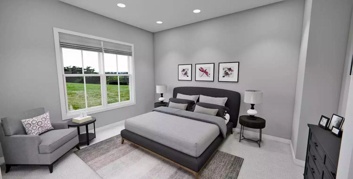
Soft gray walls and carpet do the calming work, but the three botanical prints above the headboard are what make the room interesting: flowers, a dragonfly, and splashes of red-pink against white matting. The upholstered bed has a gently curved headboard that reads more modern than farmhouse. A single armchair near the window catches natural light without crowding anything out.
Quick Fix: Recessed lighting placed too close to walls creates harsh scallop shadows that flatten a room. Positioning cans roughly 24 inches from the wall casts light more evenly across the space. If you’re retrofitting, dimmable LED retrofits in existing housings give you flexibility without a full rewire.
Freestanding Tub, Marble Shower Wall, and a Vanity That Pulls Its Weight
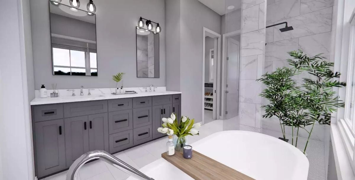
Gray shaker cabinets with black hardware run the full length of the vanity wall, anchoring double sinks under a quartz countertop. Bamboo near the shower adds something living without competing with the marble. That wood tray across the tub is doing a lot of quiet work — it’s the kind of detail that photographs well and, more importantly, actually holds a candle and a glass of wine.
Common Mistake: Freestanding tubs look best when plumbing is planned before the slab is poured. Retrofitting a floor-mount filler later often means relocating supply lines, which drives up costs fast and can limit where the tub actually lands in the room.
Shark Decor and Floating Shelves Make This Home Office Worth Closing the Door
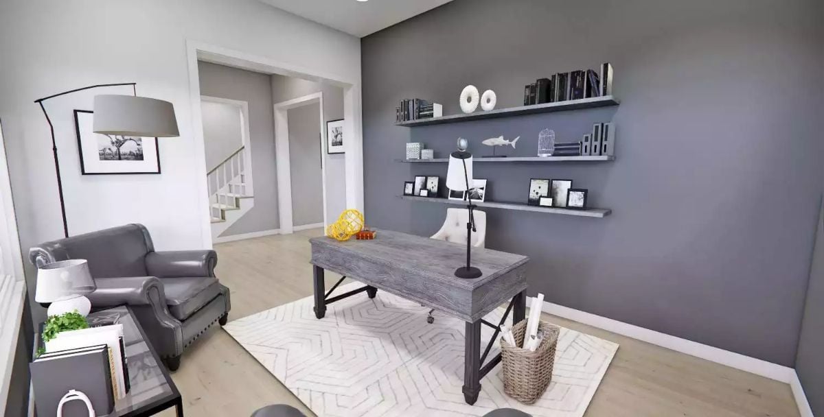
Matte charcoal on the accent wall keeps the floating shelves from reading as generic storage, and that ceramic shark on the middle shelf earns a genuine second glance. The reclaimed-finish desk, leather club chair, and woven basket for rolled documents all pull from the same gray-brown palette without looking like they were ordered from the same mood board.
Try This: Floating shelves look clean until they’re overloaded. A rough guide many decorators use: one-third books, one-third objects, one-third empty space per shelf. Vary the height of objects slightly so your eye has somewhere to move instead of hitting a flat wall of stuff.
Head upstairs and you’ll find the loft doing something rare for a bonus space: it actually functions.
Loft Landing With Two Sofas and Nowhere to Hide From Each Other
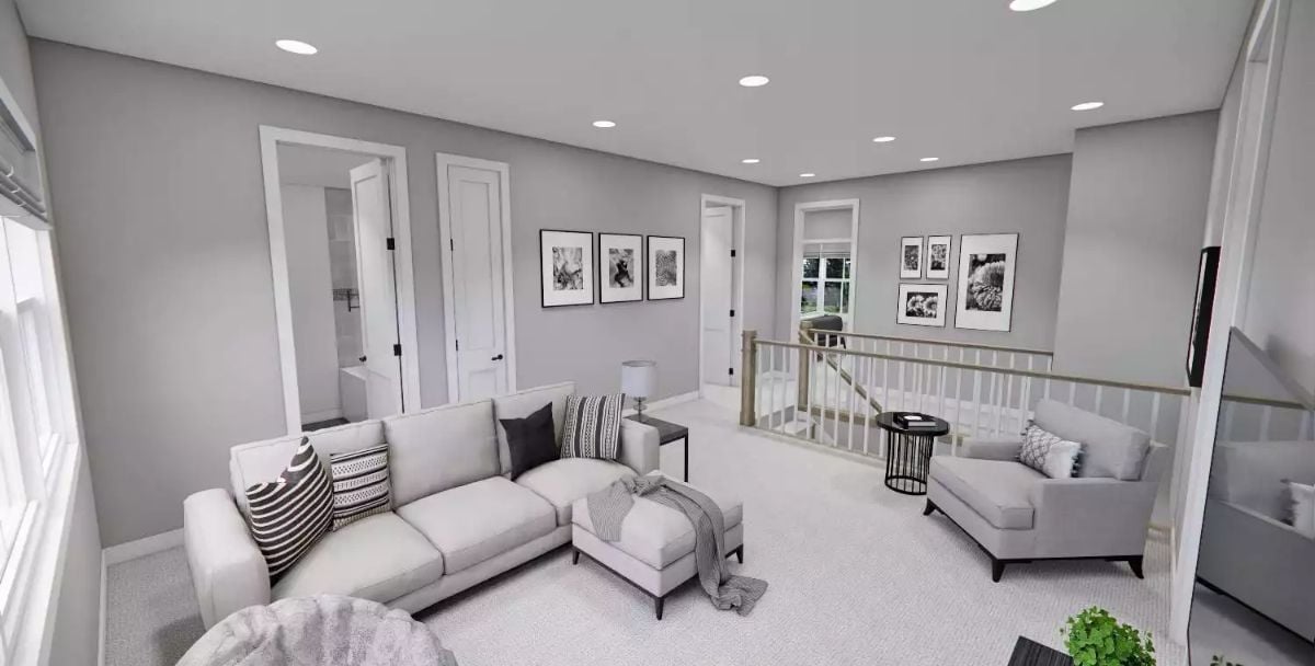
A sectional and a loveseat face each other across carpet, framed by staircase railing and recessed cans overhead. Patterned throw pillows and black-and-white gallery art save it from reading like a hotel corridor seating area.
Bonus Room With a Desk in the Corner and No Excuses to Leave
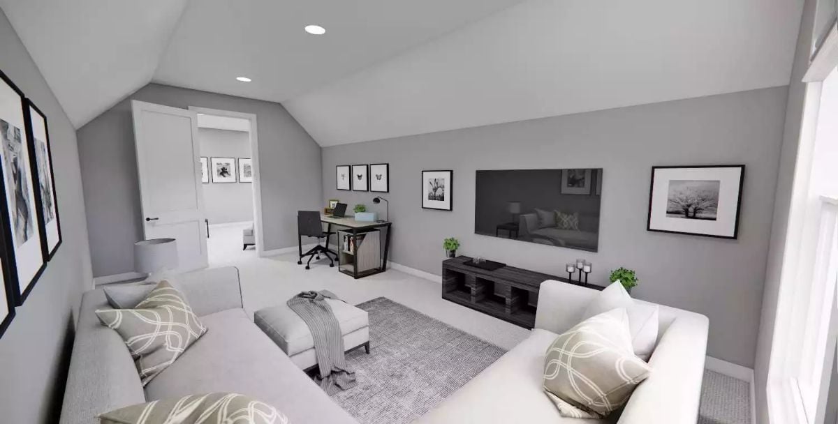
Vaulted ceiling, wall-mounted TV, sectional chaise, desk tucked in the corner. It covers homework, movie nights, and whatever else a family needs to throw at it on a given afternoon.
Style Tip: Lofted bonus rooms with sloped ceilings can feel awkward to furnish because standard furniture heights fight the roofline. Keep taller pieces — desks, bookshelves — near the perimeter walls where the ceiling is lowest, and you’ll preserve visual headroom at the center. Simple placement habit, noticeable difference.
Pin It
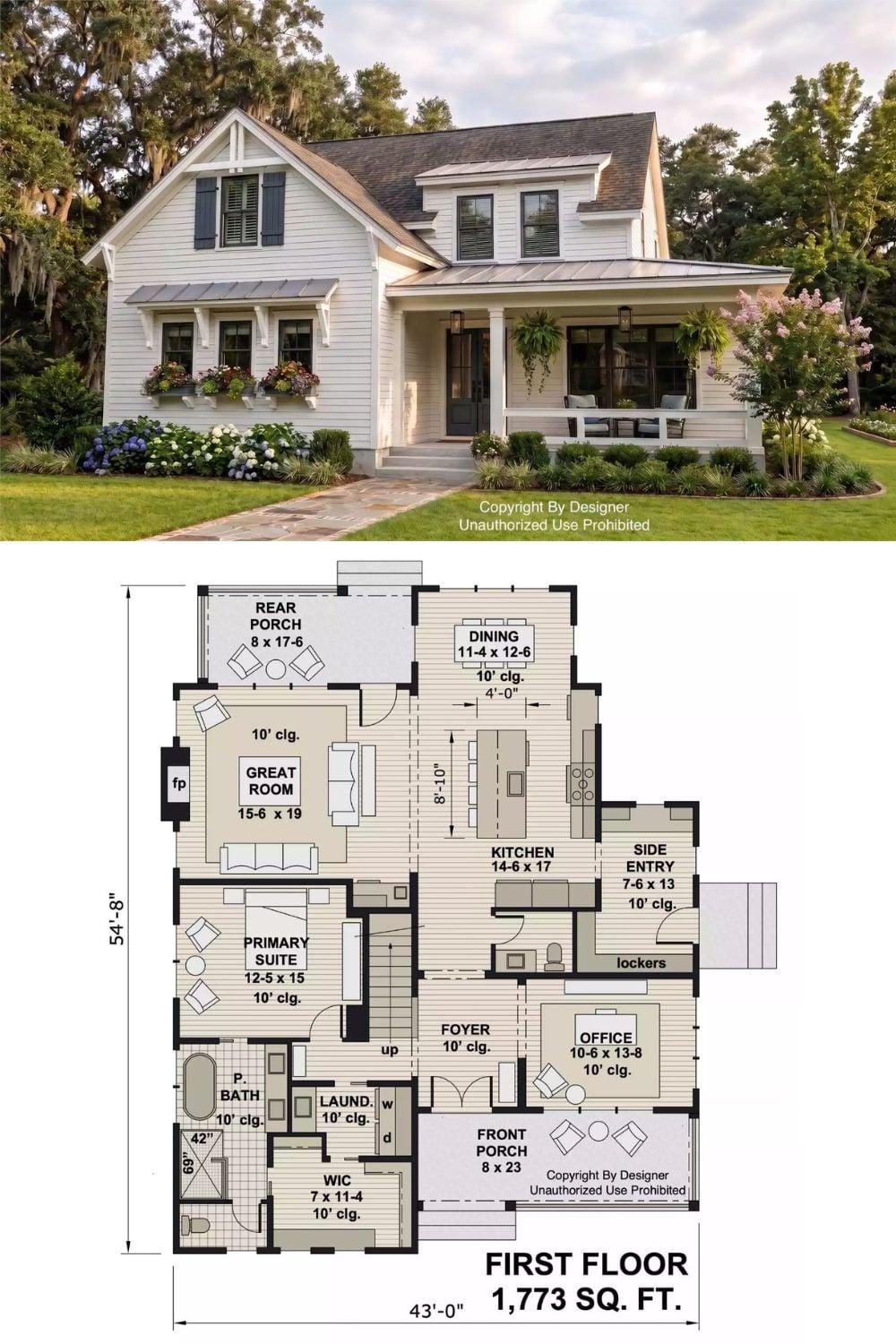
Exterior photo shows a modern farmhouse with a wraparound porch and dormers. The floor plan below reveals 1,773 square feet with a great room, kitchen, primary suite, and office on the main level.
