
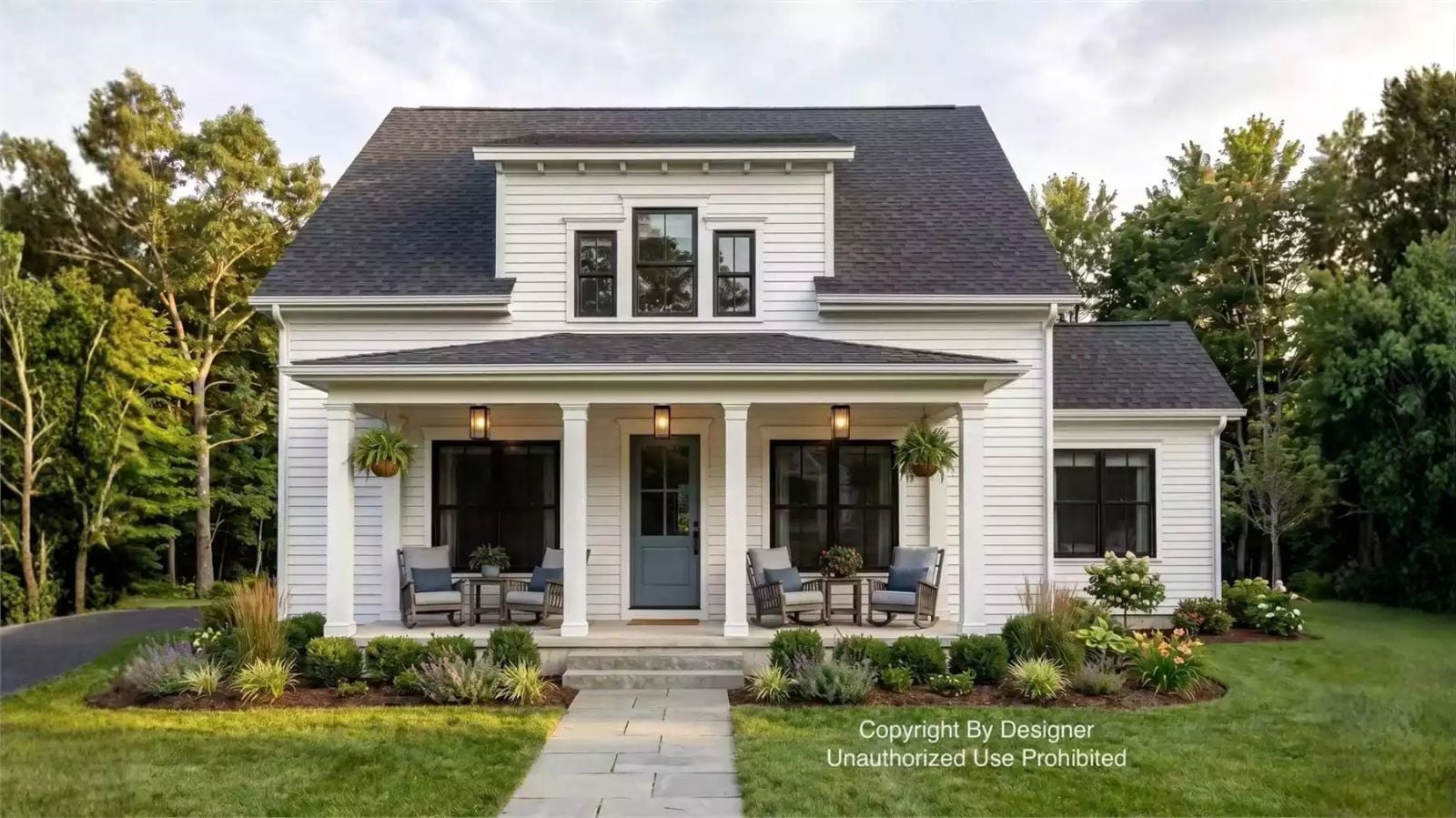
Four bedrooms under one roof does not guarantee togetherness — it just guarantees four separate retreats. The Belford Close is built around the messier version of family life: homework spreading across the kitchen island, someone calling down from the loft, dinner running long because nobody wants to leave the table, with a main-floor primary suite that keeps parents close and a loft that gives kids their own floor without giving them their own zip code.
Specifications
- Sq. Ft.: 2,788
- Bedrooms: 4
- Bathrooms: 3.5
Floor Plan – Main Floor Plan
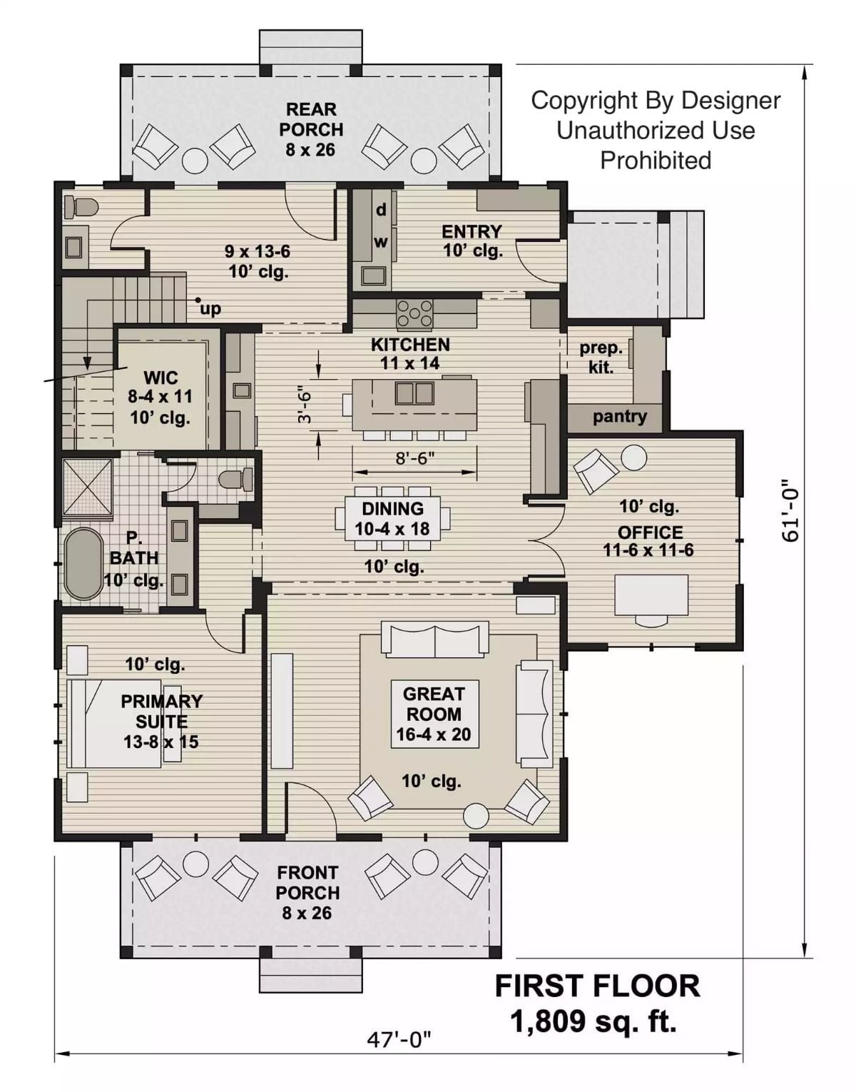
The primary suite and its walk-in closet sit on the main level, separated from the open kitchen, dining, and great room core by enough distance to matter. An office occupies a spot off the entry. Front and rear porches both run 8 by 26 feet, which gives the layout a satisfying indoor-outdoor symmetry that most plans at this square footage don’t bother with.
Floor Plan – Second Floor Plan
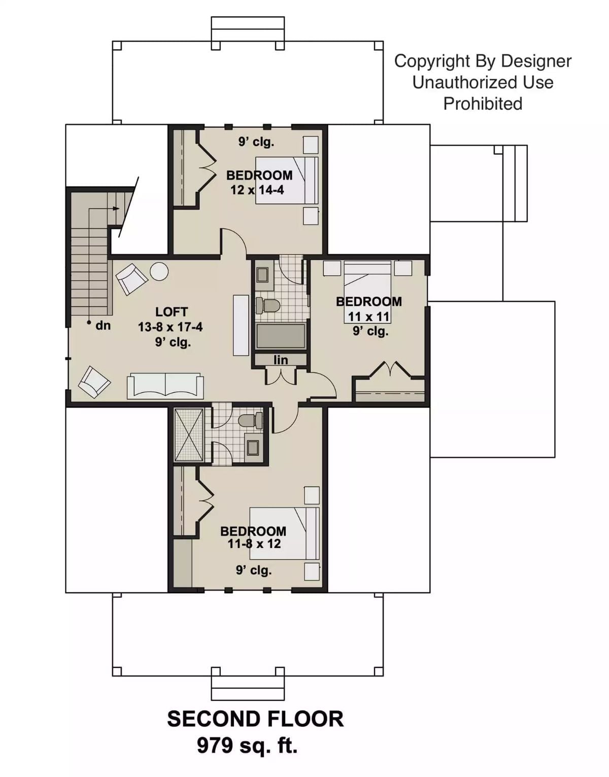
Three bedrooms and a loft split 979 square feet on the second floor, all under 9-foot ceilings. Two full bathrooms serve the level, with a linen closet tucked between them. Bedroom sizes run from 11×11 up to 12×14-4, and the loft opens directly to the staircase — which makes it the natural gathering point up there rather than just dead space at the top of the stairs.
Gray Done Right: How This Living Room Avoids Looking Like a Cloud
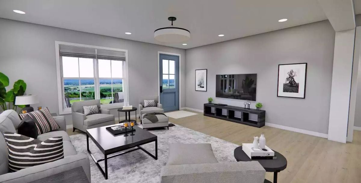
Warm oak flooring is doing most of the heavy lifting here, keeping the gray walls and upholstery from sliding into cold territory. Black accents on the coffee table and media console add contrast without introducing a third color. An open countryside view pulls the eye straight through the room and out, which doesn’t hurt either.
Try This: Mirror the black coffee table and console pairing by picking one accent tone and repeating it in at least three spots across the room. It creates visual cohesion without looking like a showroom. Two competing accent tones is usually one too many — the room starts to feel argued-over rather than considered.
Gray-Blue Island, White Counters, Black Hardware — Kitchen Color Logic That Actually Holds Together
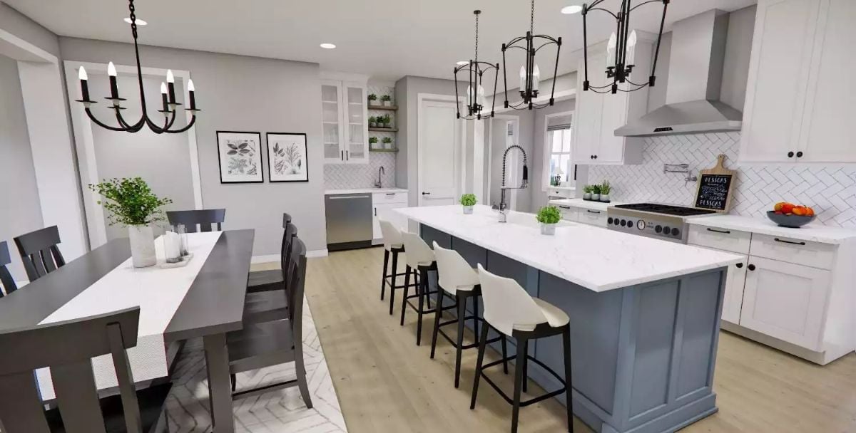
The blue-gray island base earns its keep by pulling color away from the all-white perimeter without fighting it. Black hardware and pendant frames hit the same note four times across the room, which is enough repetition to read as intentional. Controlled, but not stiff about it.
- Match island base paint to a secondary furniture piece, like a dining chair frame
- Use the same metal finish on pendants, cabinet pulls, and faucet
- Keep the countertop one consistent material so the eye gets a rest
Charcoal Bed Frame, Gray Walls, White Carpet — Monochrome That Doesn’t Flatten
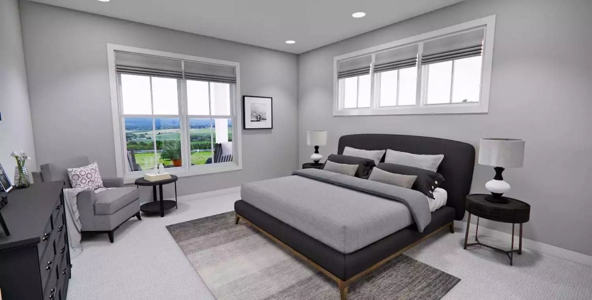
Dark charcoal upholstery on the bed frame and dresser anchors the room so the gray walls don’t dissolve into each other. Two mismatched lamps — one black-based, one white — add just enough asymmetry to keep things from feeling staged. Roman shades sit half-raised, letting light in without demanding attention. It’s a quiet palette, but it reads as deliberate rather than unfinished.
Budget Tip: Roman shades are among the more affordable window treatments that still look tailored. Furnishing a room in a single neutral? Good shades will do more visual work per dollar than a pile of decorative pillows — and they’re a lot easier to live with long-term.
Matte Black Fixtures, Marble Tile, Glass Shower — Primary Bath With Actual Priorities
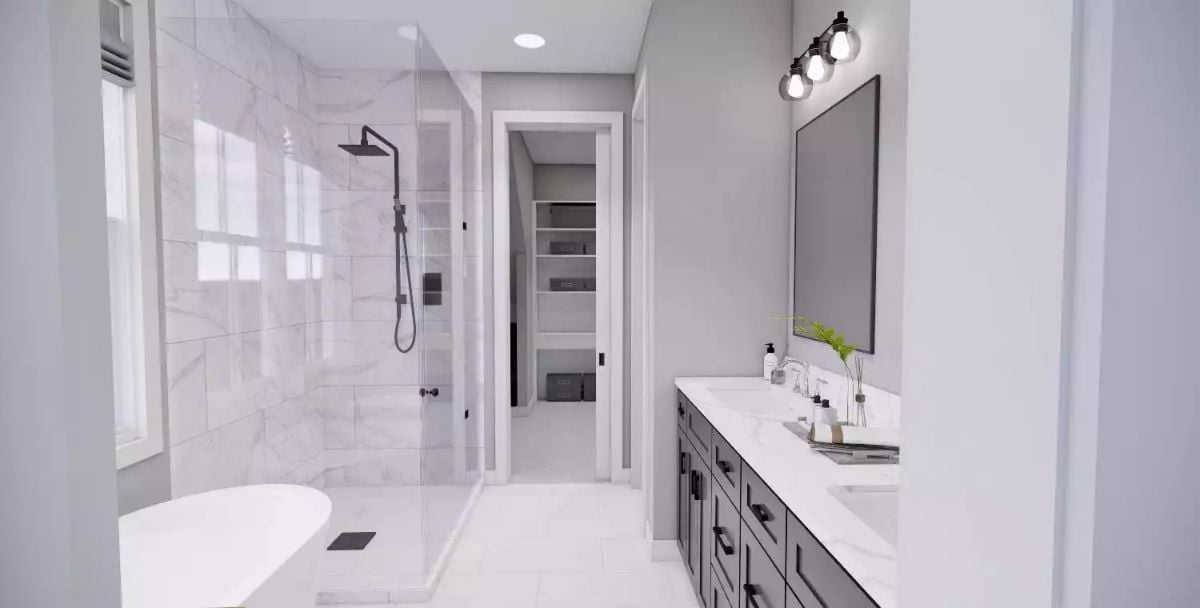
Frameless glass keeps the shower from visually compressing the room, so the large-format marble tile can read across the full wet area without interruption. Matte black hardware connects the rain head to the vanity pulls. A freestanding tub sits low in the corner — present, but not trying to dominate.
Editor’s Note: Walk-in closets accessed directly from the primary bath are among the most requested layout features in new construction. Keeping that passthrough short and straight — as this one appears to be — avoids the awkward hallway stretch that can make even a large suite feel oddly segmented.
Mudrooms and laundry rooms often get treated as afterthoughts, but this one makes a case for taking them seriously.
Subway Tile, White Cabinets, and a Sink That Makes Laundry Day Tolerable
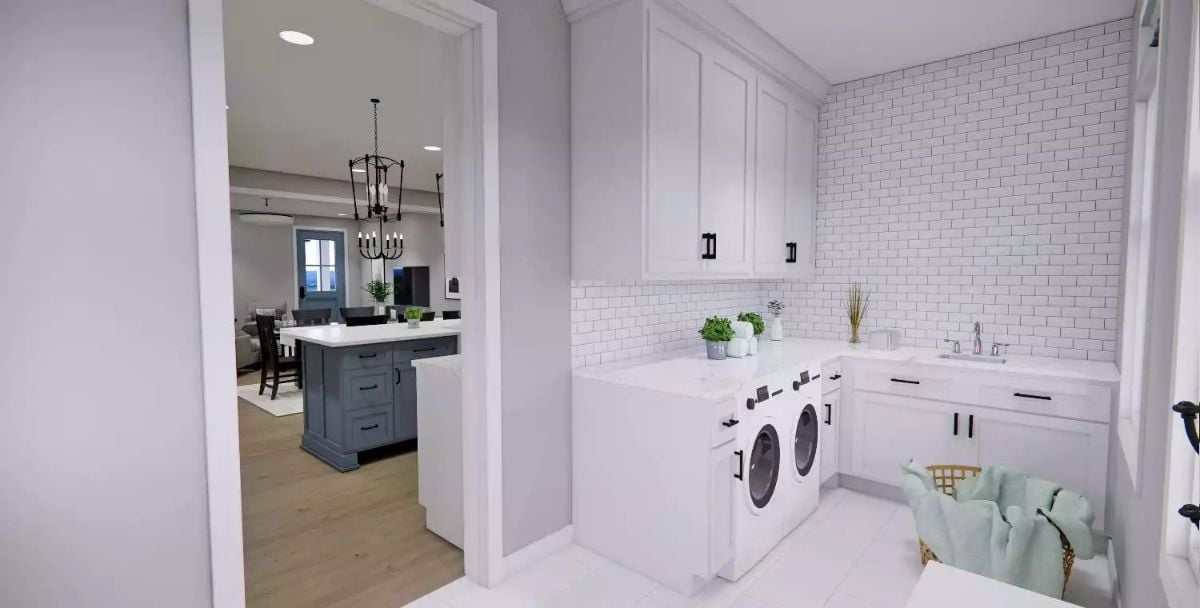
Upper cabinets run nearly to the ceiling, giving this laundry room more storage than plenty of kitchens can claim. White subway tile covers the full wall behind the machines, and black hardware echoes what’s happening in the kitchen next door — a small detail that makes the two rooms feel like they were planned together rather than finished separately. Counter space over the washer and dryer means folding doesn’t require a field trip to the dining table.
Bean Bag, Built-In Console, Big TV — Basement Hangout With No Pretensions
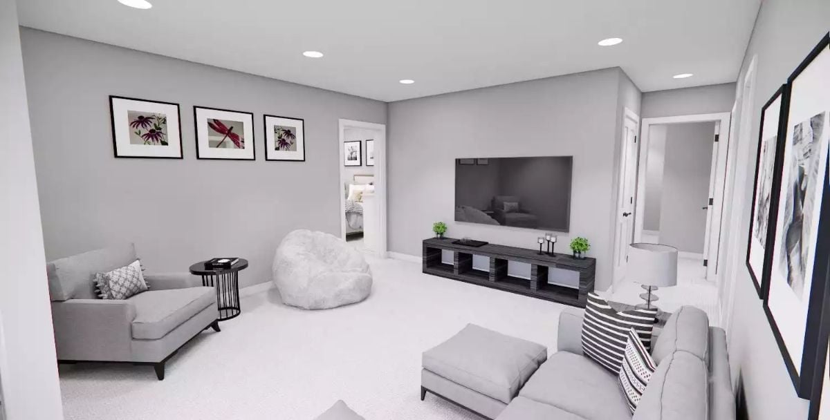
A white bean bag chair anchors the center of the room and sets the tone immediately: this space is for sitting, not impressing anyone. Gray walls, carpet, and upholstery stay in the same family without collapsing into sameness.
Color Story: Gray-on-gray rooms fail when every surface lands at the same value. Here, the dark console pulls the eye and gives the palette something to push against — without it, the room would just read as one big pale smear. Pick one piece that’s noticeably deeper than everything else and the room stops looking accidental.
Pin It
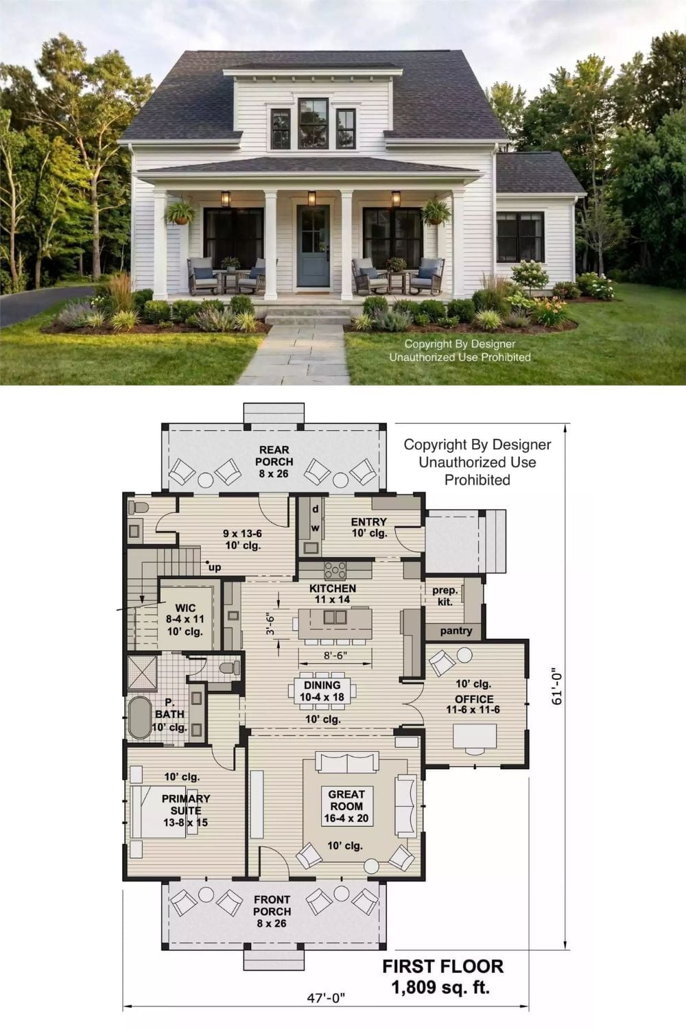
The exterior shows a white farmhouse with a covered front porch, columned entry, and a dormer window above. The first-floor plan below lays out 1,809 square feet: main-floor primary suite, great room, kitchen, dining area, office, prep kitchen, pantry, and both front and rear porches.
