🔥 Would you like to save this?
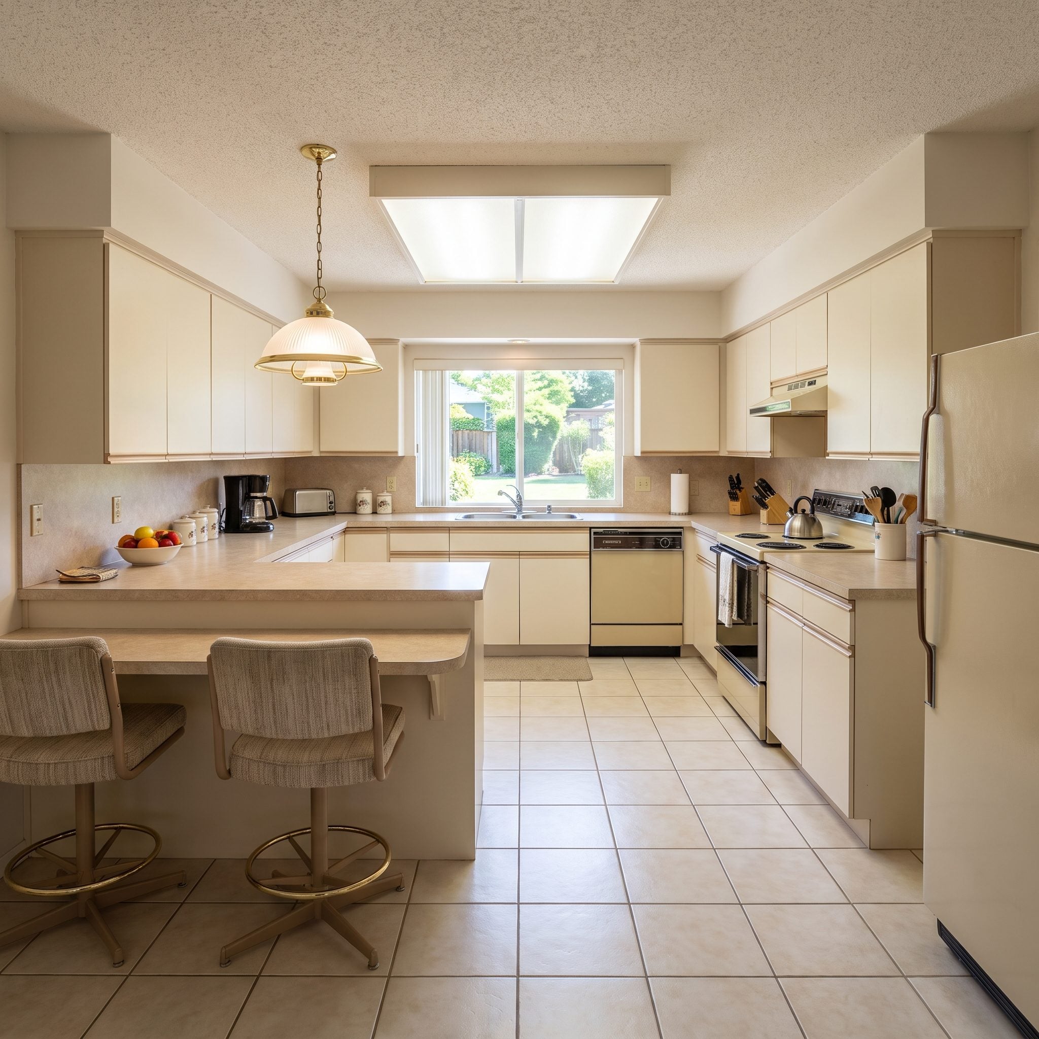
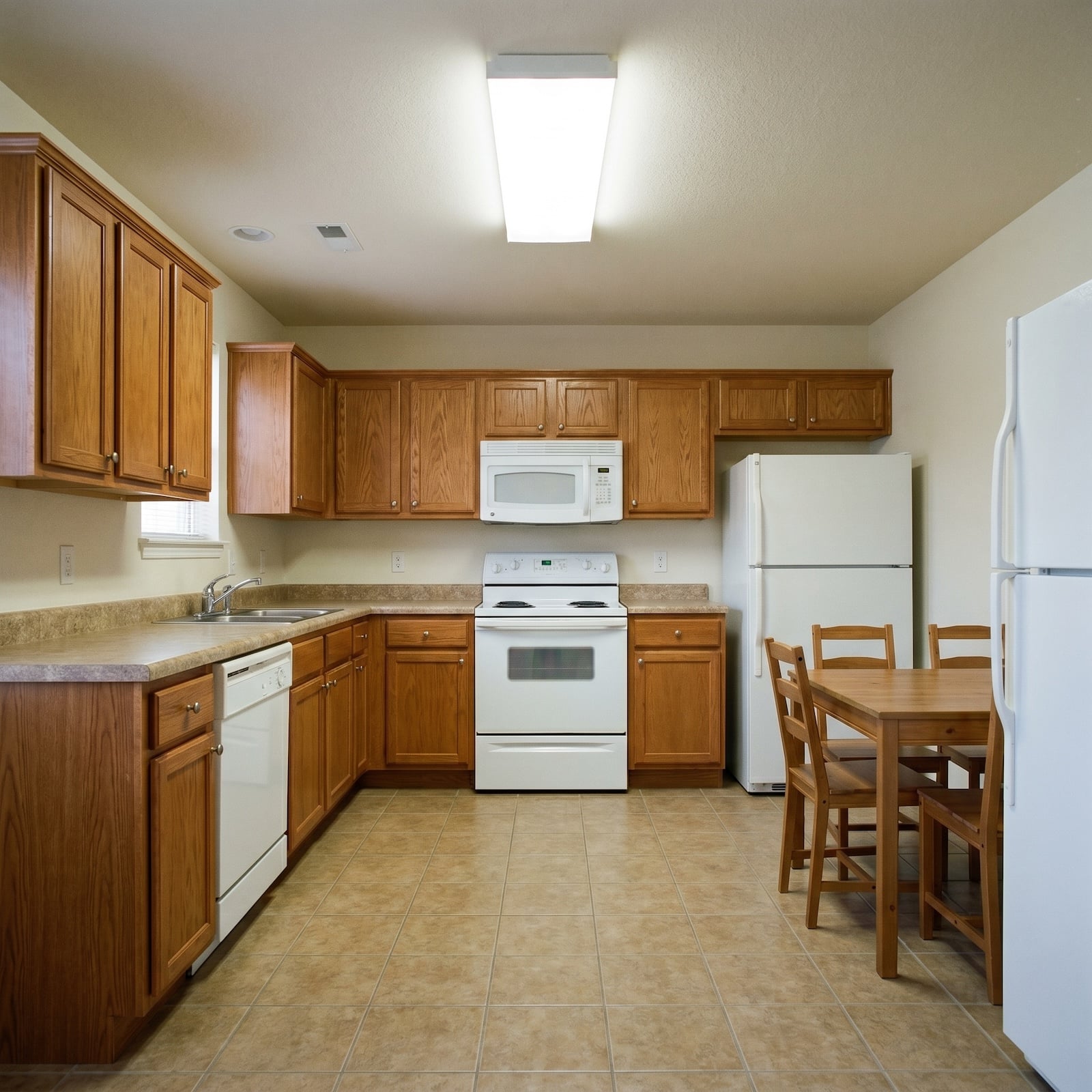
It wasn’t broken—it had just stopped inspiring her. Every morning started in the same dated L-shaped kitchen, where worn finishes, awkward layouts, and decades-old design choices made the heart of the home feel more like a time capsule than a place to gather. Instead of settling for another cookie-cutter remodel, she gave AI a challenge: reimagine the space with a $100,000 budget and no shortage of bold ideas. The result is 30 striking before-and-after transformations that show just how dramatically an ordinary 1990s kitchen can be reinvented.
In order to come up with the very specific design ideas, we create most designs with the assistance of state-of-the-art AI interior design software. Also, assume links that take you off the site are affiliate links such as links to Amazon. this means we may earn a commission if you buy something.
30. Matte Black Cabinets and a Slatted Ceiling That Actually Earn the Drama
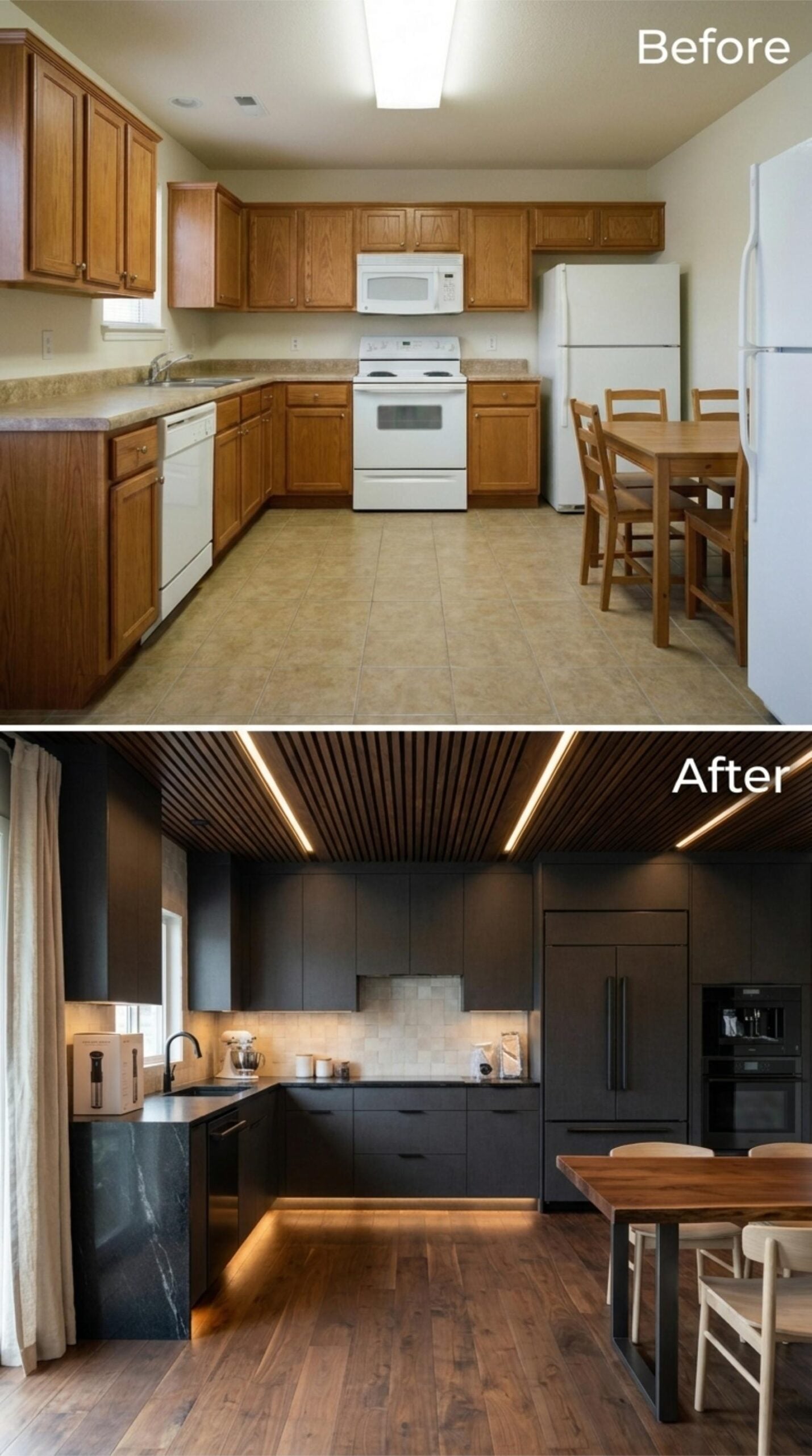
Warm-toned LED strips run along a dark wood slatted ceiling, giving the whole room a low, moody glow that pendant fixtures simply can’t replicate. The flat-front cabinets are matte black with recessed pulls, and the backsplash keeps things grounded with neutral stone tile. Underfoot, wide-plank hardwood anchors it all.
29. Navy Blue Cabinets and a Coffered Ceiling That Refuse to Play It Safe
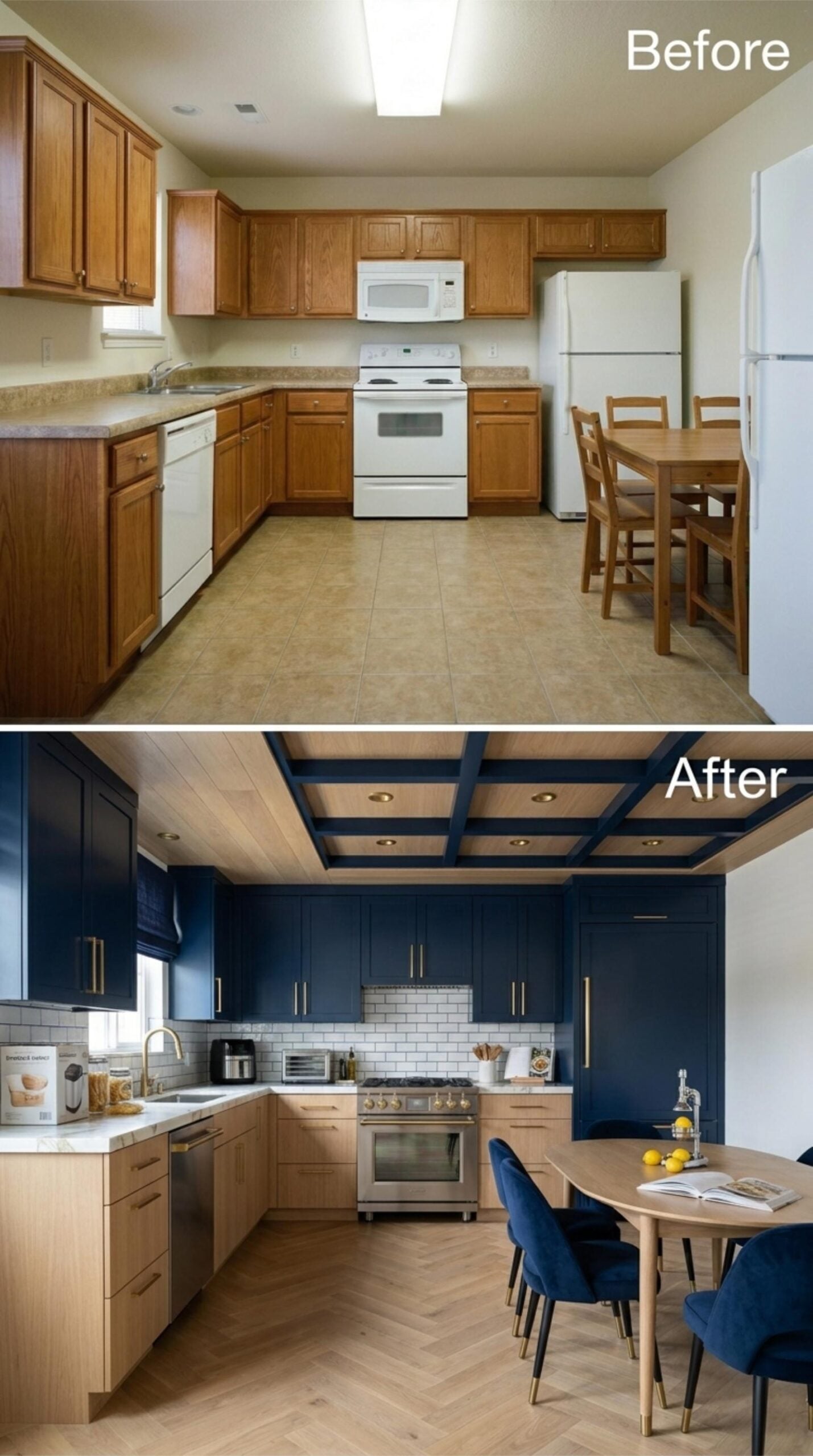
Light maple lower cabinets pair with navy uppers finished in brass pulls, and the coffered ceiling picks up the same navy trim against natural wood panels. Herringbone floors do the heavy lifting underfoot.
28. Dark Stain, Stone Backsplash, and a Red Range That Knows Exactly What It’s Doing
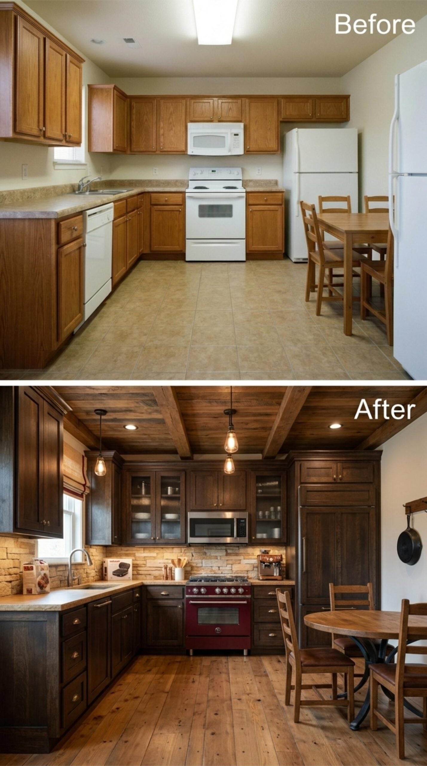
Espresso-stained cabinetry runs floor to ceiling beneath a wood-planked coffered ceiling, and the stacked stone backsplash keeps it grounded. That burgundy range isn’t subtle, and it doesn’t need to be.
27. Navy Lowers, Natural Uppers, and a Coffered Ceiling That Does the Heavy Lifting
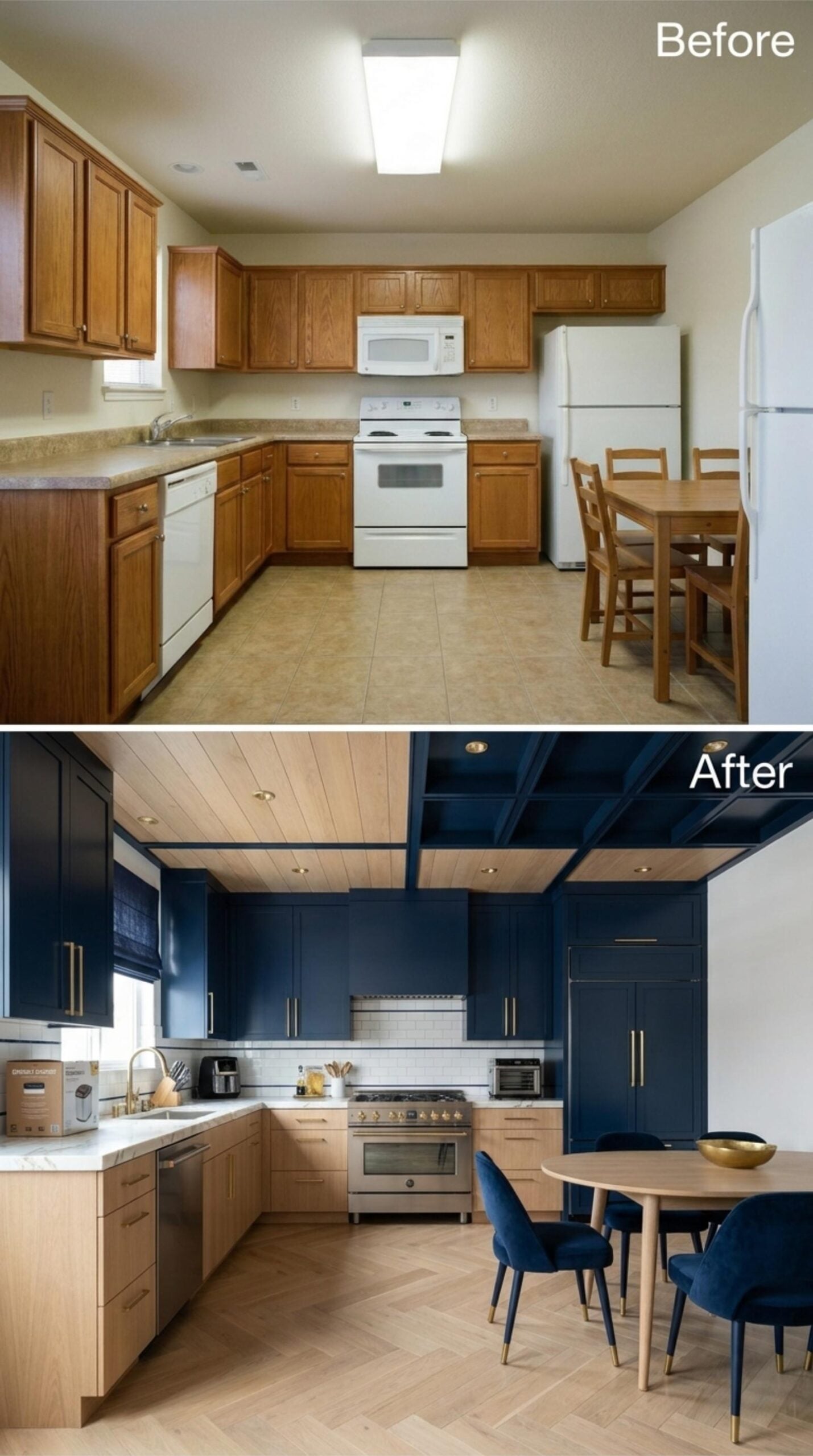
Navy lower cabinets pair with natural wood uppers, and the contrast actually holds. Gold pulls run floor to ceiling, and the herringbone wood floor grounds the whole room without competing. Velvet dining chairs in the same navy shade tie the dining area back to the kitchen without forcing it.
26. Slab-Front Cabinets, a Slatted Ceiling, and Toe-Kick Lighting That Means Business
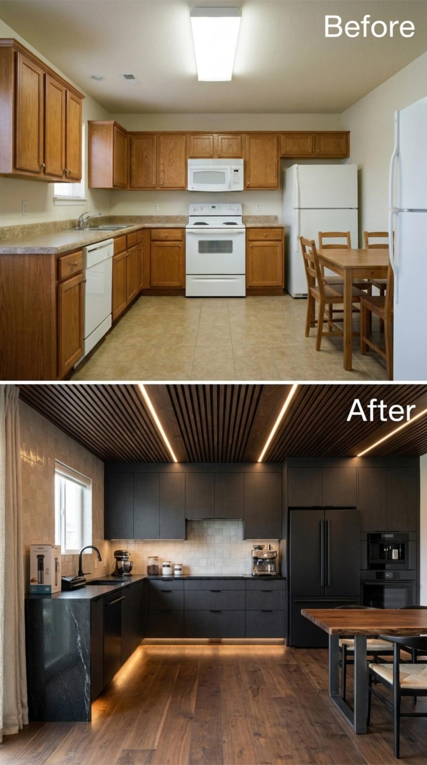
Matte black runs floor to ceiling here, but the warm hardwood floors keep it from tipping into cold territory. LED strips tucked into the slatted wood ceiling and along the cabinet toe-kicks do the actual work of making the space feel lit rather than moody. Slab-front drawers, a marble-veined dark countertop, and white subway tile backsplash give the eye enough contrast to land somewhere.
Worth Knowing: Toe-kick lighting isn’t purely decorative. It acts as low-level wayfinding at night without requiring overhead lights, which matters more than most people expect until they’re stumbling around at 2 a.m.
25. Sage Cabinets, a Slatted Ceiling, and One Very Confident Refrigerator Panel
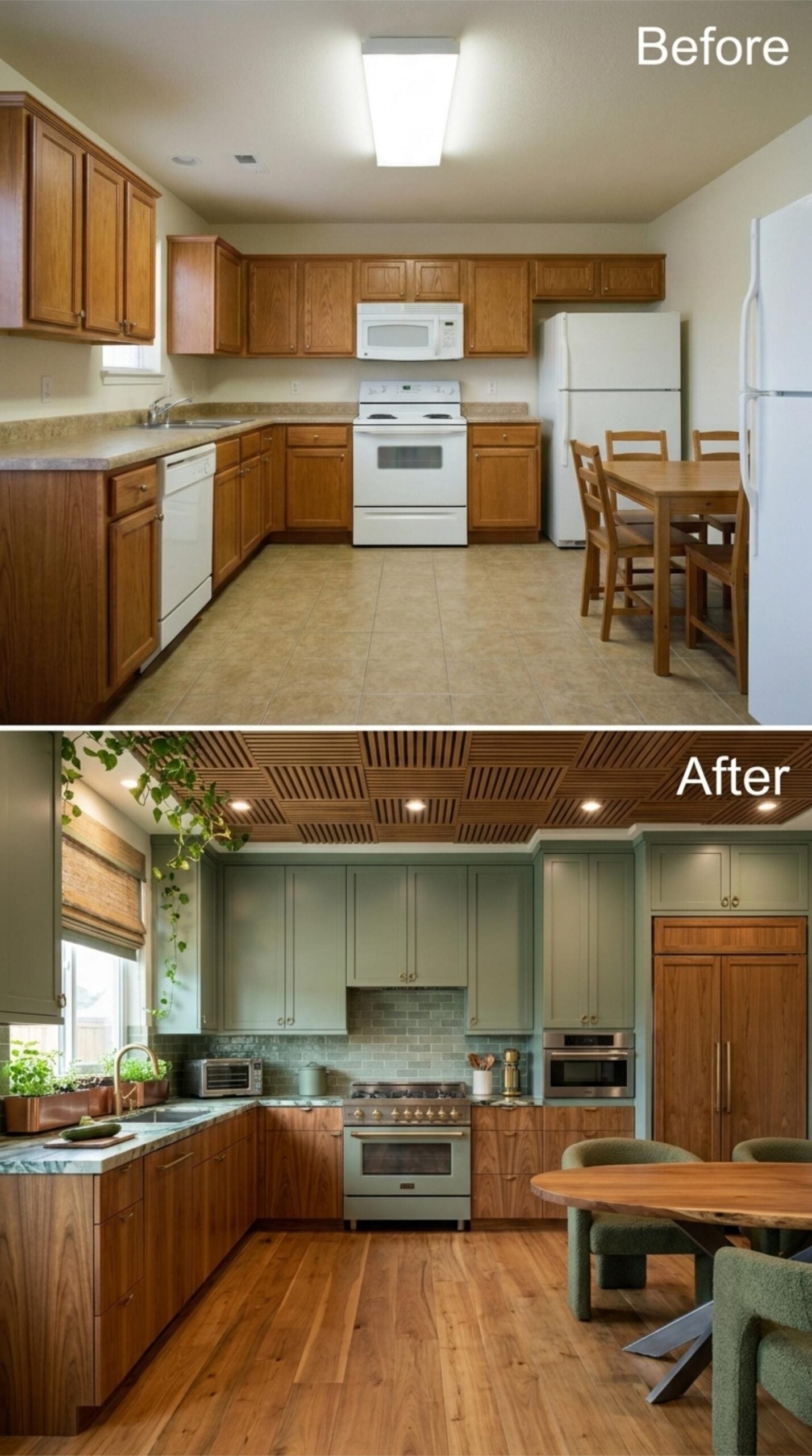
Sage green uppers paired with raw walnut lowers is a combination that sounds risky on paper and looks completely inevitable in person. The slatted wood ceiling adds texture overhead without adding visual weight, and the recessed lights drop into it cleanly. Marble countertops run the length of the perimeter, and the range hood gets a full brick tile surround that anchors the whole wall.
The paneled refrigerator blends into the cabinetry on the right side, which is the kind of detail that makes a kitchen feel finished rather than assembled. Brass hardware ties the two cabinet tones together. Wide-plank hardwood floors do the rest.
Why It Works: Paneling a refrigerator to match surrounding cabinetry costs more upfront but removes one of the most visually disruptive elements in a kitchen. Appliance garages and panel-ready designs work best when the surrounding cabinetry has enough visual complexity to carry the eye past them. Here, the walnut lower cabinets give the paneled fridge somewhere logical to land.
24. Gothic Vault Ceiling, Dark Cherry Cabinets, and a Lantern That Earns Every Inch
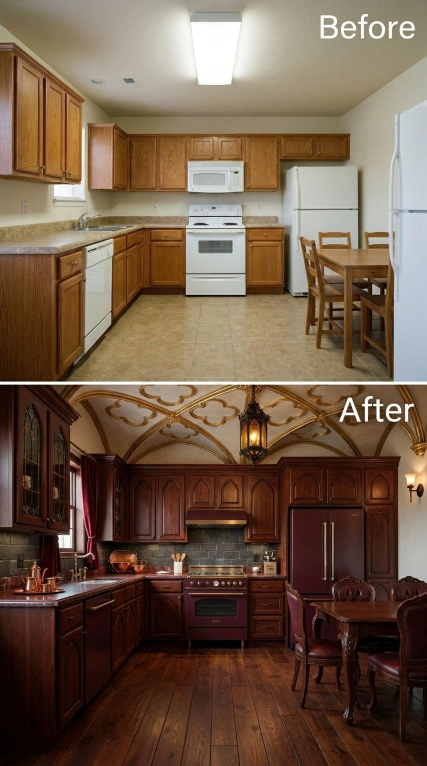
Dark cherry cabinetry with pointed arch detailing pulls the eye upward toward a vaulted ceiling traced in gold-painted Gothic ribbing. That ceiling alone would stop most designers cold. A wrought-iron pendant lantern hangs at center, casting amber light across copper vessels on the countertop and slate-toned subway tile on the backsplash.
The dining set matches the cabinet finish and features carved wood chairs with leather upholstery. Hardwood planks run the full length of the floor. A burgundy range anchors the cooking wall with the kind of confidence that doesn’t ask for approval.
Fun Fact: Gothic arch details in cabinetry originated in medieval monastery kitchens and ecclesiastical architecture, where pointed arches were structural necessities rather than decorative choices. Replicating that profile in wood cabinet doors is purely aesthetic today, but the visual effect still reads as deliberate and architectural rather than ornamental. It’s one of the few historical styles that gets heavier and more compelling as a room gets darker.
23. Handleless Cabinets, Cove Lighting, and a Neutral Palette That Refuses to Be Boring
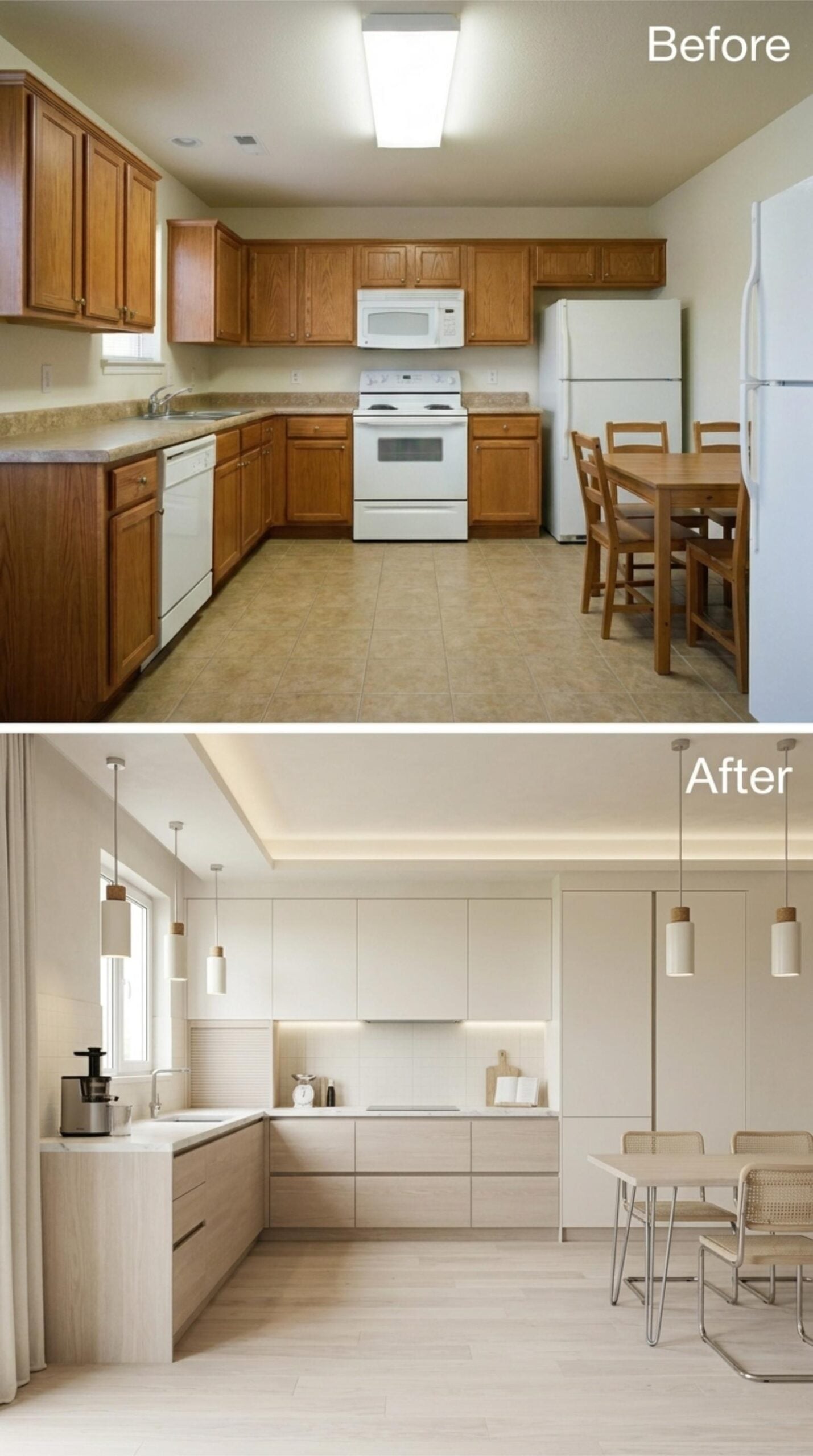
Cream flat-front cabinets run floor to ceiling without a single piece of hardware interrupting the surface. The upper cabinets wrap the perimeter in tall vertical panels, giving the room a proportion that feels more architectural than fitted. Cove lighting along the ceiling’s recessed tray washes the whole space in a glow that pendant fixtures alone couldn’t produce.
The dining area earns its place here. Hairpin-leg chairs with woven cane seats keep the seating from feeling too heavy against all that pale cabinetry. Wood-grain lower cabinets add just enough texture to prevent the room from reading as a blank page.
Cove lighting along the ceiling’s recessed tray washes the whole space in a glow that pendant fixtures alone couldn’t produce.
pull_quote: Recessed cove lighting distributes light across a ceiling rather than projecting it downward like a pendant or flush fixture. In a kitchen with pale surfaces, that indirect wash reduces harsh shadows on countertops and makes the room feel larger without adding a single square foot. It’s also easier to dim without the light source becoming visible, which matters at night when overhead glare is the last thing anyone wants.
22. Black Lacquer, Gold Trim, and a Chandelier That’s Not Here to Be Subtle
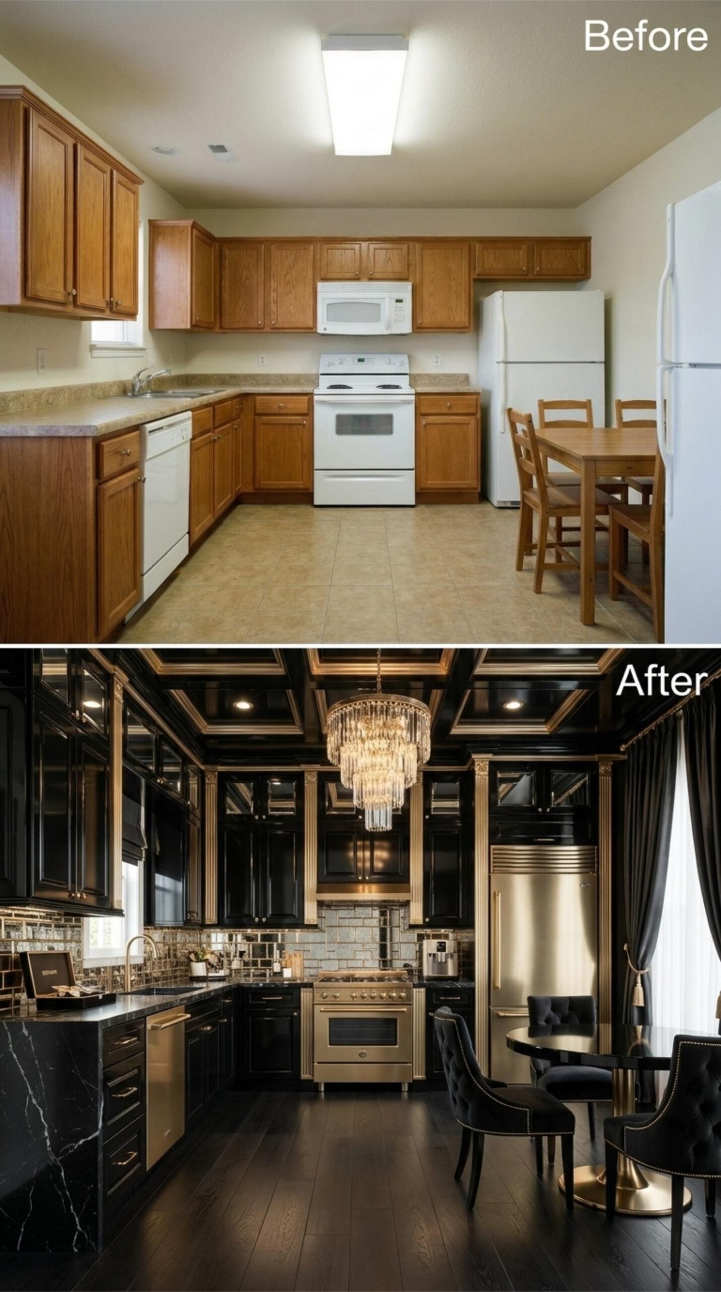
Gold-trimmed black lacquer cabinets run floor to ceiling, and the coffered ceiling above them is finished in the same palette, which keeps the drama from feeling accidental. A tiered crystal chandelier hangs dead center, scaled generously enough that it doesn’t disappear into the height. The mirrored tile backsplash behind the range picks up every light source in the room.
The appliances are gold-toned stainless, including a column refrigerator and a range that looks like it belongs in a private club. Black marble countertops with sharp white veining anchor the island. The dining corner gets tufted velvet chairs and a pedestal table. It commits completely, and that’s harder to pull off than it looks.
Trend Alert: Mirrored tile backsplashes reflect light differently than standard ceramic or stone because they respond to every fixture in the room simultaneously. In a kitchen with darker cabinetry, that reflectivity does more functional work than it might appear. It’s one of the few material choices that addresses both atmosphere and light distribution at the same time.
21. Flat-Front Cabinets, Cove Lighting, and a White Palette That Actually Has Somewhere to Go
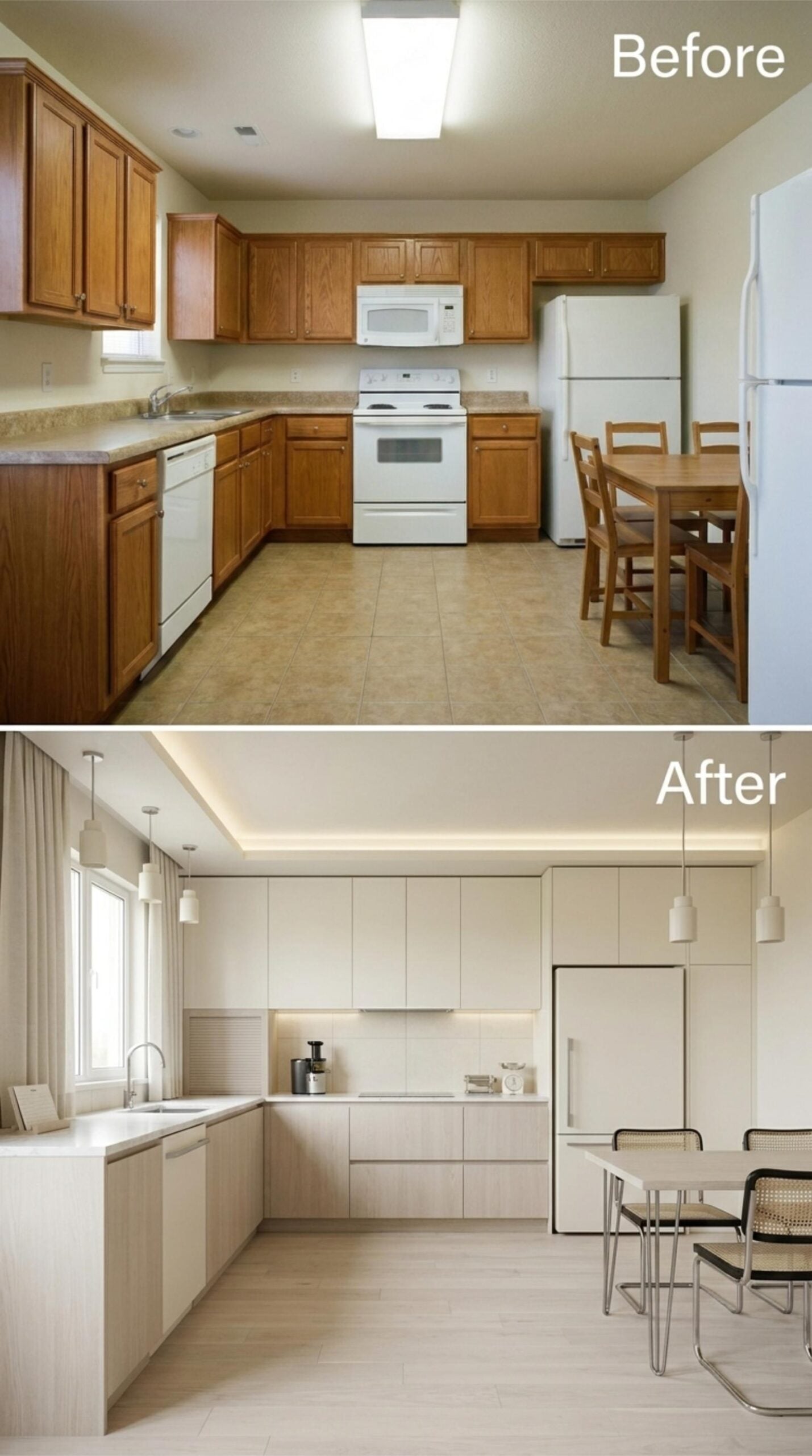
Floor-to-ceiling flat-front cabinetry in an off-white finish runs the full perimeter, with upper cabinets extending all the way to a dropped ceiling that conceals LED strip lighting along its edge. That cove detail does real work, washing the upper walls in diffused warmth without a single pendant doing the heavy lifting solo.
Two cylinder pendants hang over the dining area anyway, and they’re worth noticing. The table is sleek, the chairs are cane-back with chrome frames, and the whole dining corner holds its own without competing with the kitchen side.
Budget Tip: Repainting or refacing existing cabinet boxes instead of replacing them entirely can cut cabinet costs significantly, and flat-front door styles are among the cheapest to fabricate because they require no routing or raised-panel detailing. If the boxes are structurally sound, new doors and hardware can produce a look nearly identical to a full replacement at a fraction of the cost.
20. Cherry Cabinets, a Tin Ceiling, and a Burgundy Range That Commits Completely
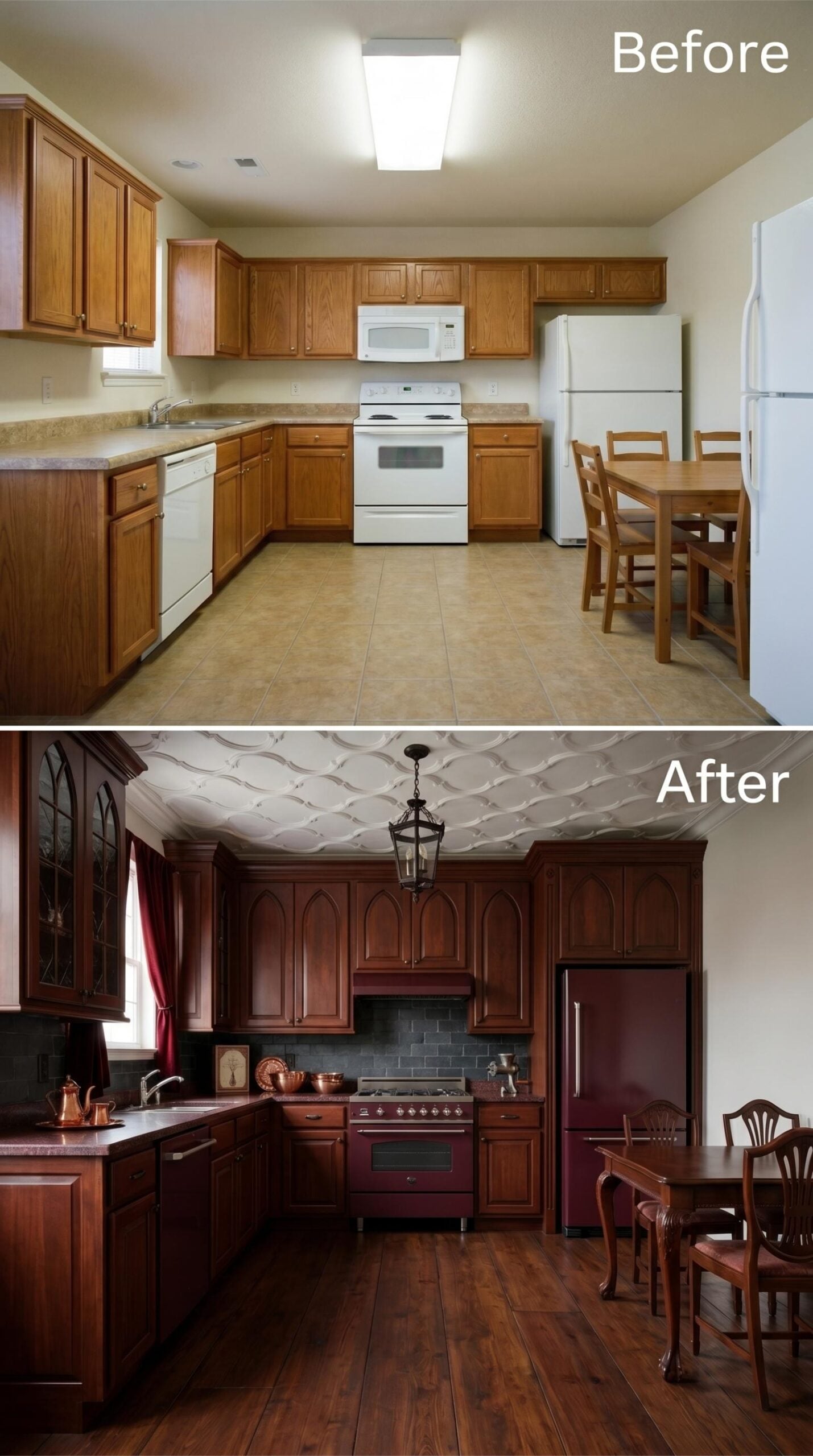
Rich cherry cabinetry with Gothic arch door panels runs the full perimeter, and the slate subway backsplash keeps it grounded without dulling the drama. A wrought-iron lantern pendant hangs from a pressed tin ceiling with an ogee medallion pattern, which is the kind of ceiling detail that usually gets painted over in beige by someone who didn’t know what they had.
The hardwood floor reads almost mahogany under the room’s low amber light. Burgundy appliances, including the range and refrigerator, were clearly chosen as part of the palette rather than an afterthought. Queen Anne dining chairs in matching cherry pull the whole room together without trying too hard.
Did You Know: Pressed tin ceilings were a common feature in late 19th-century American homes and commercial buildings, used as a cheaper alternative to ornate plaster. They’ve seen a revival in period-inspired renovations because modern reproductions install over existing drywall without structural work. The pattern depth and scale can significantly affect how formal or industrial the finished ceiling reads.
19. Cobalt Lacquer, a Patterned Backsplash, and Zero Apologies
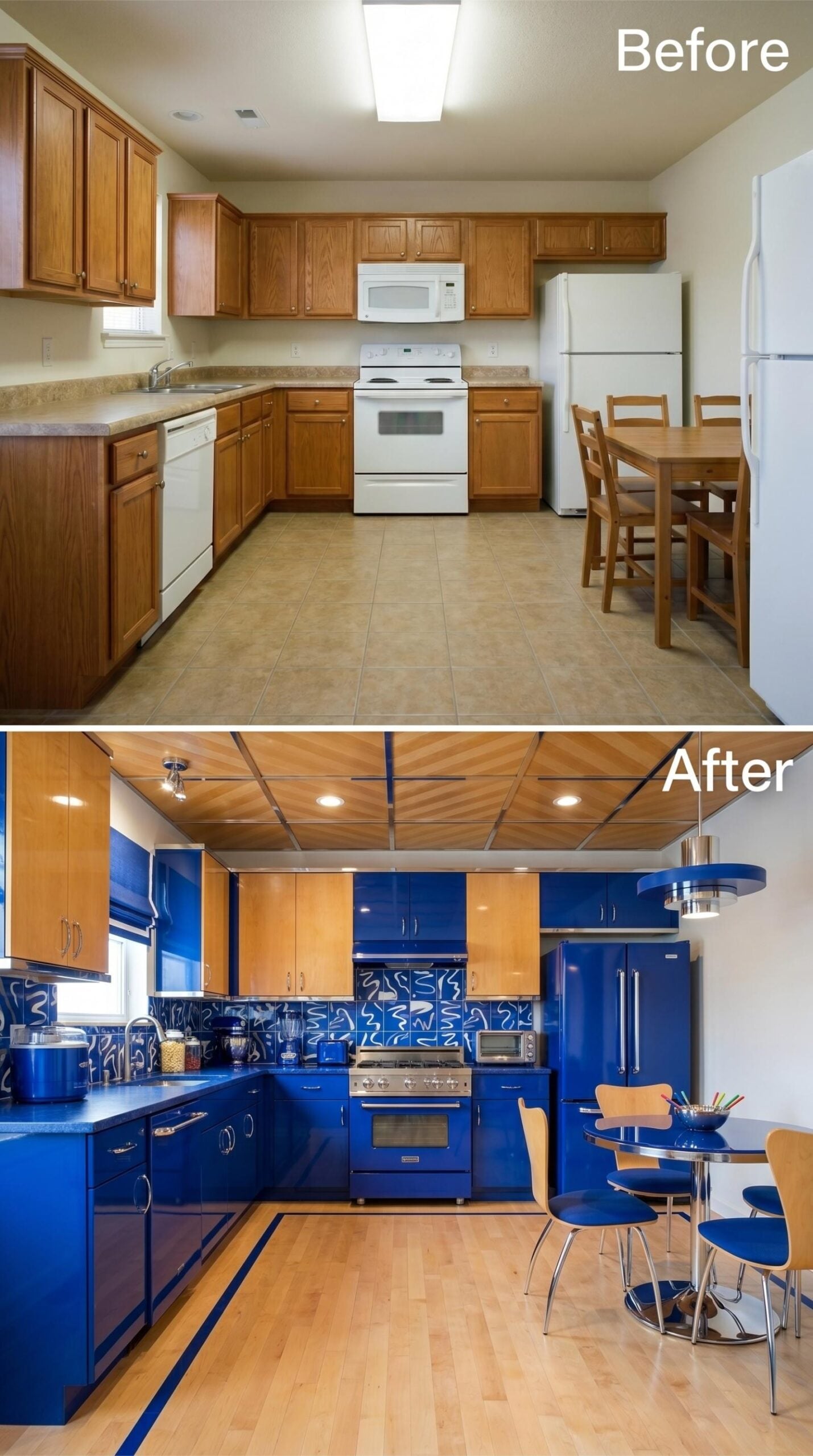
Cobalt blue runs wall to wall here, covering lower cabinets, the range, and even the refrigerator in the same high-gloss finish. Natural maple uppers keep it from tipping into sensory overload. The hand-painted blue-and-white backsplash tiles are doing real compositional work, bridging both tones.
Color Story: Cobalt and maple is one of the few high-contrast color pairings that reads warm rather than cold, because the yellow undertones in maple pull the blue toward richness instead of severity. Matching the range and refrigerator finish to the cabinetry is a commitment most homeowners avoid, but it’s what makes the palette feel intentional rather than assembled.
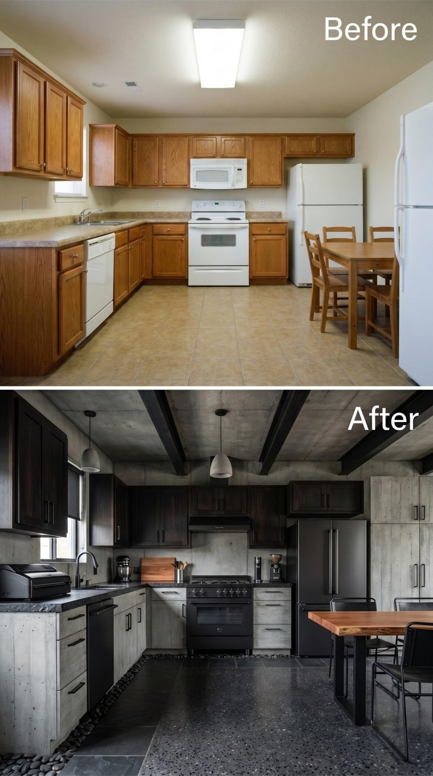
18. Concrete Cabinets, Exposed Ceiling Beams, and Black Appliances That Actually Pull Their Weight
🔥 Would you like to save this?
Raw concrete cabinet faces paired with black hardware give this kitchen a texture most renovations avoid entirely. The exposed ceiling beams are stained nearly black, which pulls the eye upward without making the space feel finished in a conventional sense. Pendant lights hang low over the range, and the black gas range sits centered under them like it was always supposed to be there.
- Concrete-finish cabinetry resists showing wear differently than painted wood because the texture absorbs minor scuffs rather than exposing them
- Exposed ceiling beams don’t require structural changes if they’re decorative additions applied over drywall, making them accessible for renovations without major construction
- Black appliances photograph darker than they appear in person, which can make a kitchen feel more dramatic in listing photos than it reads day-to-day
17. Dusty Rose Cabinets, a Pressed Tin Ceiling, and Stained Glass That Means It
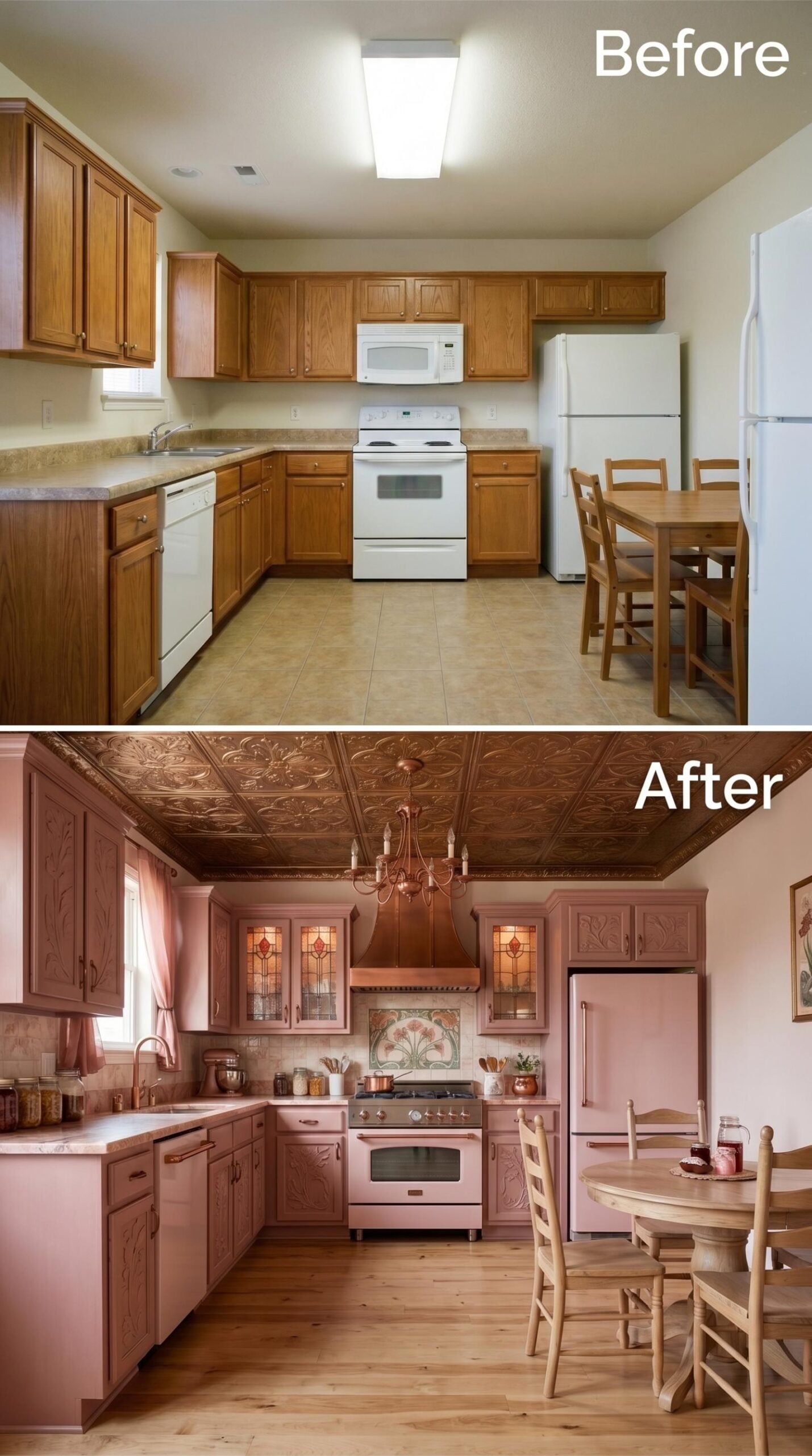
Carved cabinet faces in a muted rose-pink set the tone immediately. The ornamental pressed tin ceiling overhead picks up a warm copper tone that ties directly to the range hood below, which is a genuine copper finish rather than painted metal. Stained glass panels in the upper cabinet doors glow amber and red from interior lighting, which is a detail most kitchens don’t attempt and fewer pull off.
Hardwood floors replace what was clearly a tile surface, and they read warmer against the pink cabinetry than any stone would. A candle-style chandelier in the same copper-rose family drops from the tin ceiling without competing with it. The dining area stays simple, which is the right call.
Why Stained Glass Cabinet Inserts Work Here But Often Don’t Elsewhere
Stained glass inserts read as decorative rather than chaotic because the rest of the palette is controlled. When a kitchen already has multiple competing finishes, adding colored glass panels typically tips the room into visual noise. Here, the pink cabinets and warm copper tones create enough repetition that the stained glass reads as an accent rather than a distraction. The internal cabinet lighting behind the panels matters too. Without it, those inserts go flat.
16. Carbon Fiber Cabinetry, Linear Ceiling Lights, and Appliances That Actually Mean It
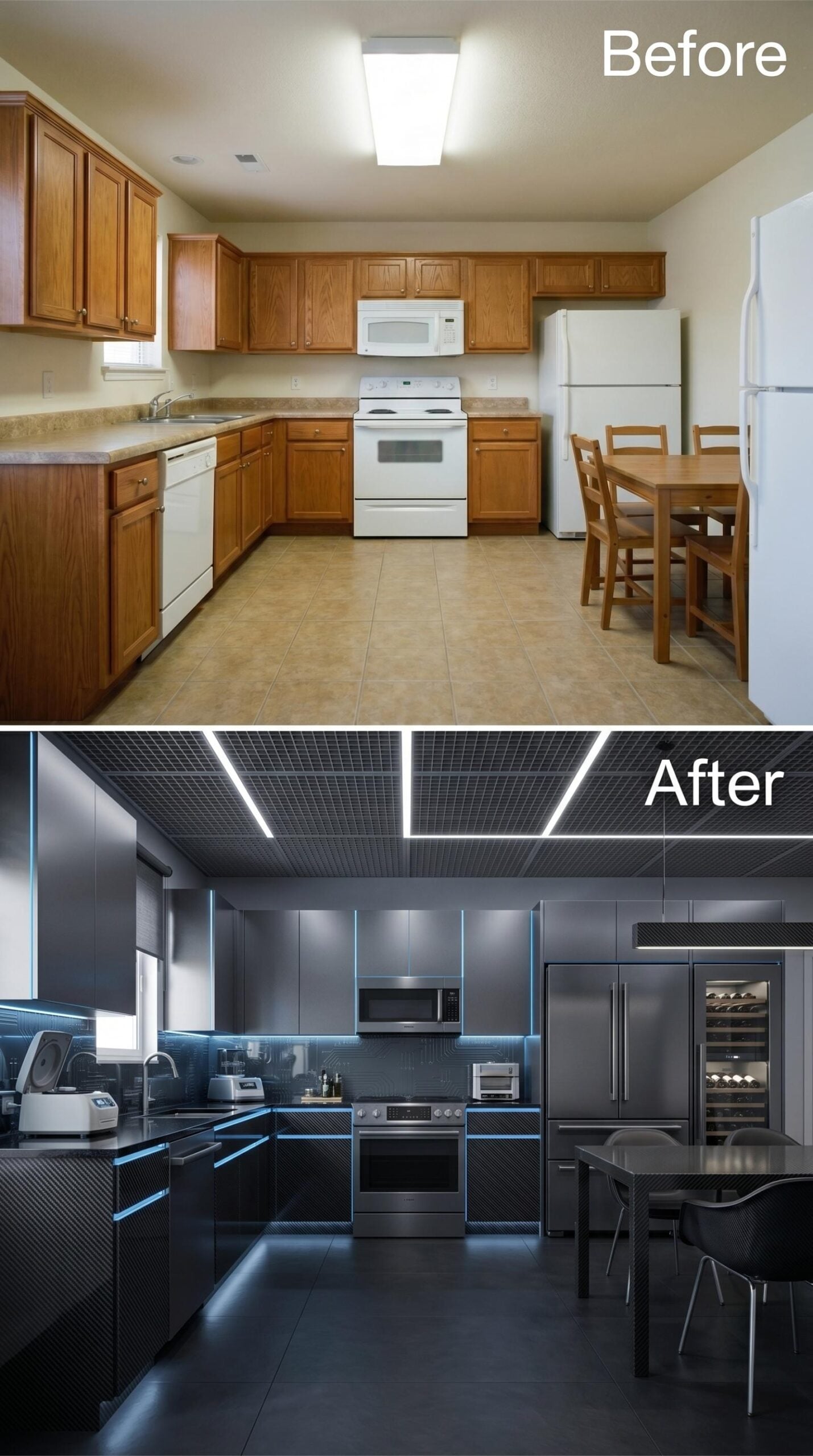
Every cabinet face in this kitchen is wrapped in carbon fiber texture, which sounds excessive until you see how it reads under blue LED edge lighting. The effect is somewhere between a cockpit and a very serious chef’s kitchen. It works.
Stainless appliances anchor the run: a built-in refrigerator column, a wine cooler, and a wall oven that don’t look like afterthoughts. Linear LED strips run across the grid ceiling in a geometric pattern, replacing any need for overhead fixtures. The toe-kick lighting pulls the whole floor plane forward, and the dark tile floor holds everything together without competing.
The Psychology Behind This: Spaces dominated by a single dark tone tend to feel more controlled than chaotic because the eye has fewer competing focal points to process. When contrast is introduced through light rather than color, as it is here with the LED strips, the brain reads it as structure rather than noise. It’s a quieter kind of drama.
15. Sage Green Cabinets, a Chandelier That Belongs, and Toile That Actually Works
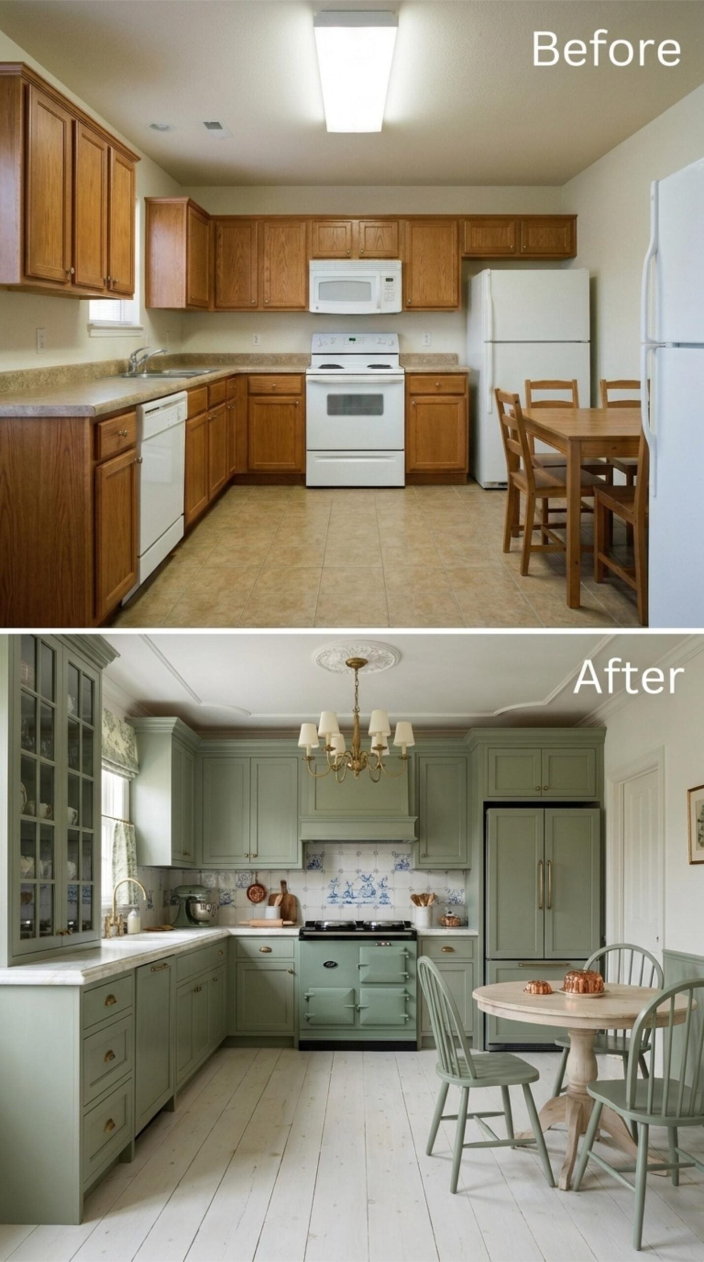
Painted in a soft sage green with brass cup pulls, the cabinets here run floor to ceiling and wrap the kitchen in a color that reads both muted and deliberate. The range is an AGA in a matching green, which is either a flex or a commitment depending on who you ask. White painted floorboards and marble countertops keep the palette from feeling heavy.
The backsplash does real work. Blue and white toile tiles behind the range give the wall a focal point without competing with the cabinetry color. Overhead, a brass chandelier with cream shades replaces what would’ve been a flat flush fixture, and the ceiling medallion around it earns its place.
Ask Yourself: If your kitchen has a dominant cabinet color, consider whether your appliance finish is working with it or against it. Matching a range color to cabinetry, as seen here with the AGA, removes a visual interruption that most kitchens just accept as inevitable. It’s a decision that requires commitment upfront but pays off every time you walk in the room.
14. Greige Cabinets, a Statement Hood, and Recessed Beams That Actually Justify Themselves
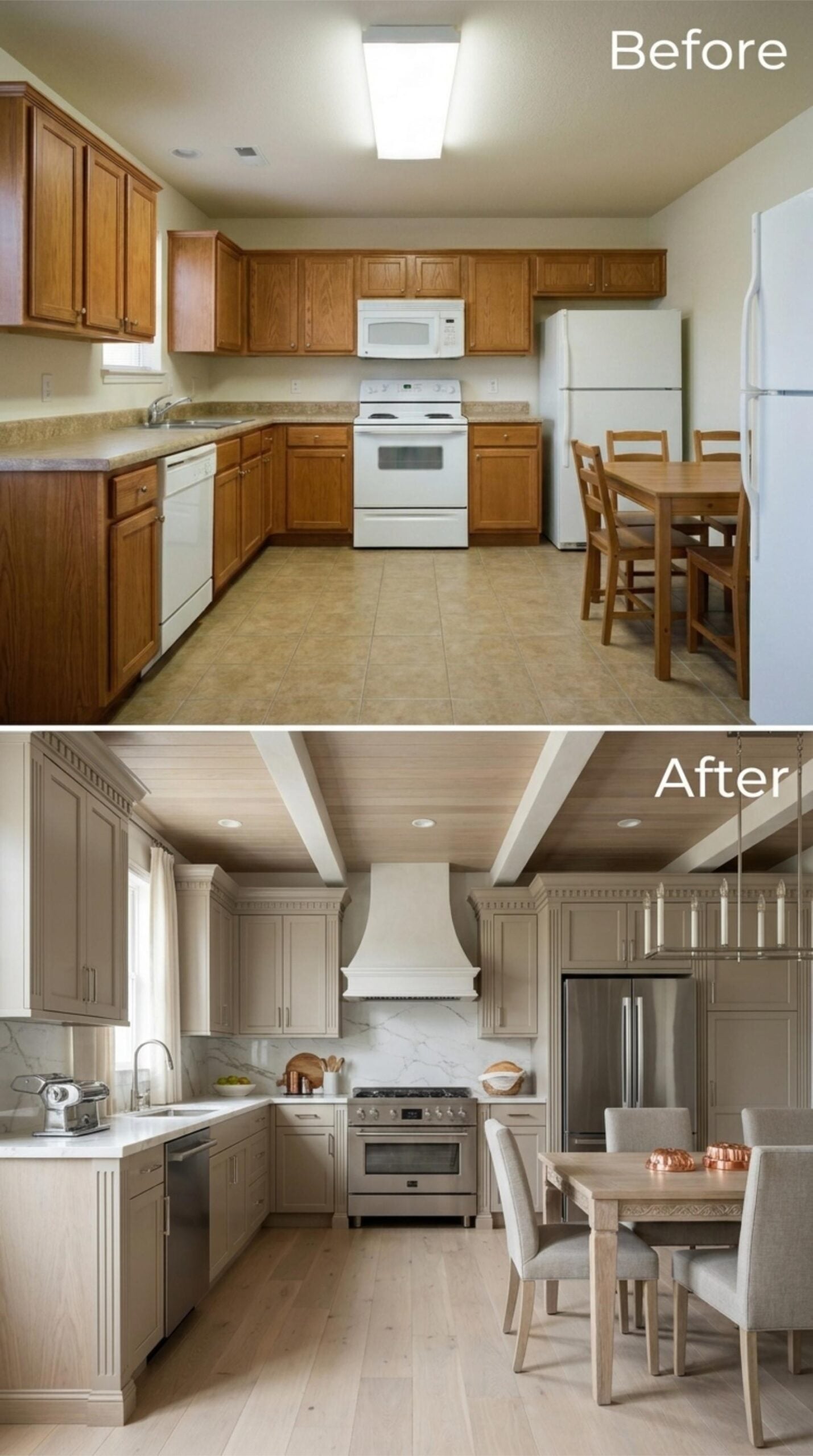
Greige-painted cabinetry with raised-panel detailing and crown molding runs the full perimeter, grounded by wide-plank light oak floors that keep the palette from reading too heavy. A custom white range hood takes the visual center of the room, flanked by a marble slab backsplash that extends floor-to-cabinet on both sides of the range.
The dining area stays in the same tonal family rather than breaking away from it. Upholstered chairs in a warm linen fabric, a light wood table, and copper accents on the surface keep things cohesive without feeling matched. Structural ceiling beams add definition overhead without competing with the hood below.
Why the Hood Works as Hard as It Does
Custom range hoods draw attention partly because of their scale, but mostly because of their detailing. This one uses a corbel-style bracket profile and a flat apron face with molded trim, which echoes the cabinet door styling directly below it. When a hood’s architectural language matches the surrounding cabinetry rather than contrasting it, the whole wall reads as one intentional composition instead of a focal point dropped into a room that wasn’t designed around it.
13. Navy, Burl Wood, and Baroque Molding That Decided Restraint Was Overrated
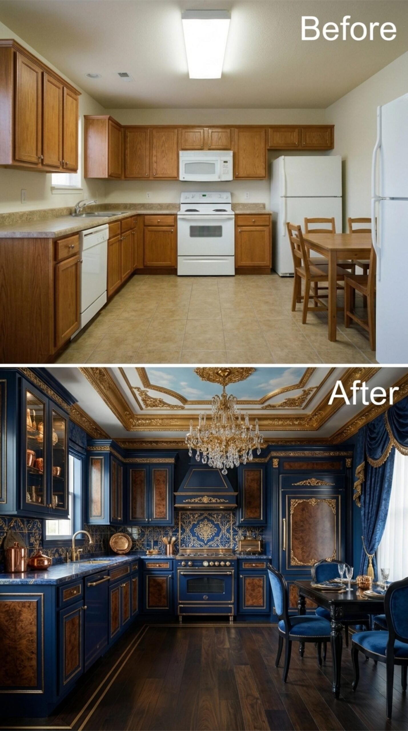
When a kitchen gets a tray ceiling painted like an open sky, the room has officially stopped pretending to be humble.
Navy lacquer cabinets with burl wood inset panels cover every wall, and the gold detailing applied to the frames and hood isn’t accent work, it’s structure. The range hood is a full architectural column. Intricate blue and gold tilework runs the backsplash, and the crystal chandelier hanging from a coffered ceiling with gilded molding pulls the whole thing into something closer to a Venetian palazzo than a place to make coffee. Blue velvet chairs sit at a dark dining table in the corner, and heavy draping at the window picks up the same fabric weight. It’s a lot, and it knows it.
bold_hook: Crystal chandeliers generate more maintenance than most homeowners expect. The individual drops collect grease and dust faster in a kitchen than they would in a living room, because cooking vapor rises. If you’re installing one above a dining area that’s separated from the range, the exposure is lower, but it’s still worth factoring cleaning access into the fixture height before installation.
Where the last kitchen leaned into restraint, this one goes the opposite direction entirely.
12. Adobe Red Cabinets, Live-Edge Lower Cases, and Turquoise Inlay That Earns Every Inch
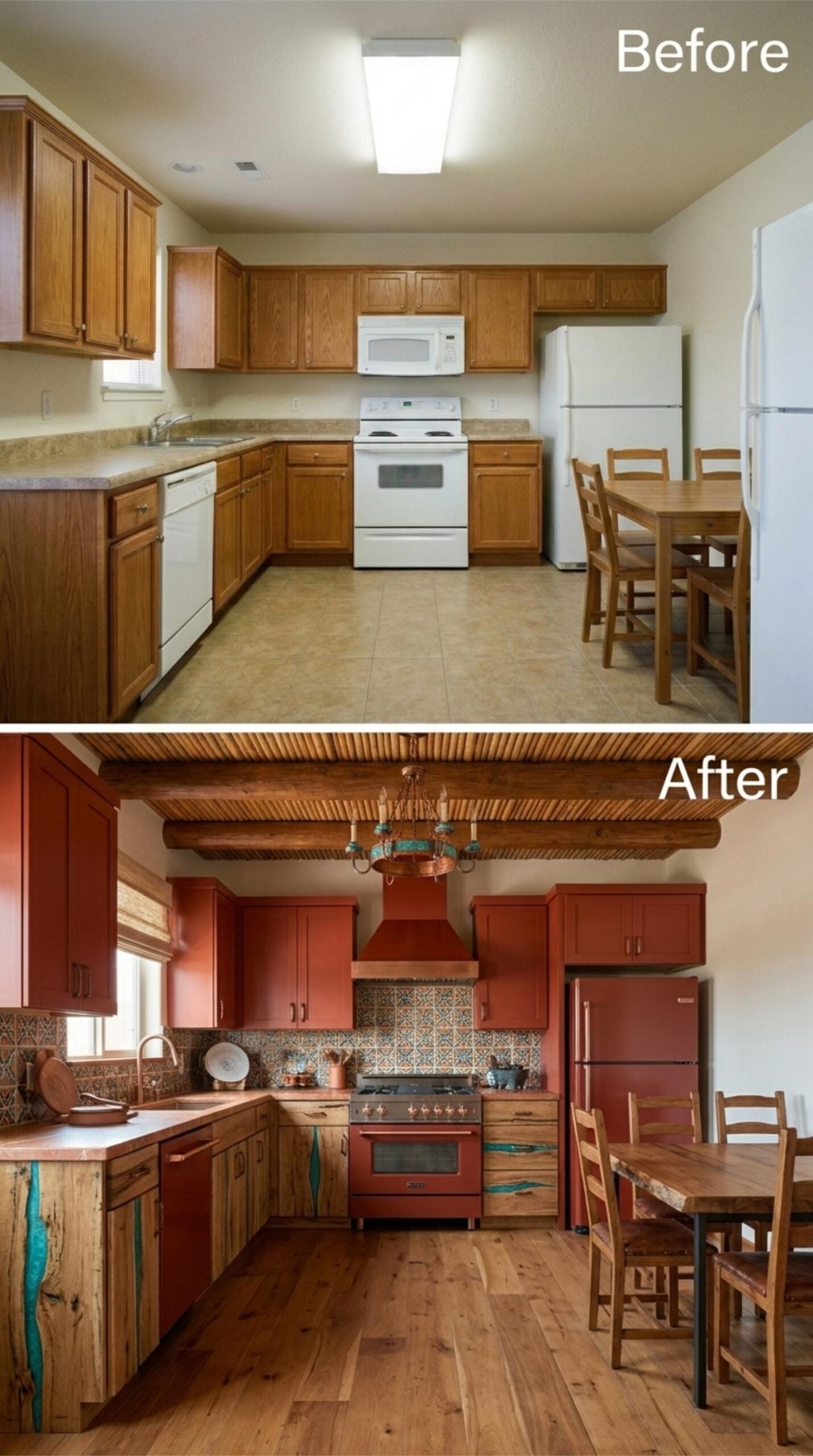
Terracotta-red upper cabinets sit above lower cases built from live-edge wood with turquoise epoxy fills running through the grain. The backsplash behind the range is hand-painted Talavera tile, and the hood matches the uppers exactly. Vigas overhead anchor the whole thing to the Southwest without apology.
transition: Turquoise epoxy resin fills in live-edge wood are poured into natural voids and cracks in the slab, then sanded flush with the surface. The color choice here isn’t random. In Southwestern design, turquoise carries material heritage tied to Native American silverwork and pottery, so its appearance in the cabinetry connects the kitchen to a regional tradition rather than functioning as a trend detail.
11. Mauve Cabinets, Slatted Ceiling Detail, and Pendant Lights That Don’t Apologize
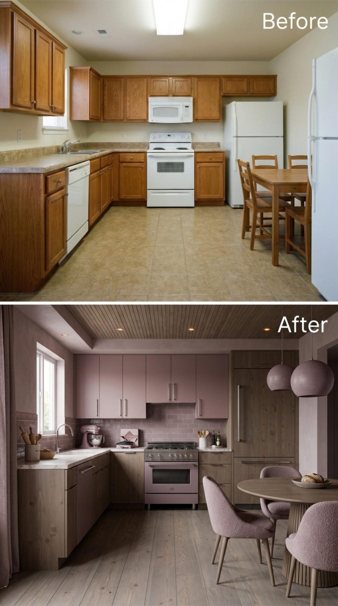
Dusty mauve cabinetry runs floor to upper wall in flat-front panels with brushed bar pulls, unified by a matching subway tile backsplash that keeps the color story consistent rather than interrupted. The slatted wood ceiling adds texture without competing. Globe pendants in the same mauve family hang over a round dining table surrounded by boucle chairs, and it all holds together because the palette never breaks its own rules.
10. Coffered Ceiling, Sculptural Hood, and Gray That Refuses to Be Boring
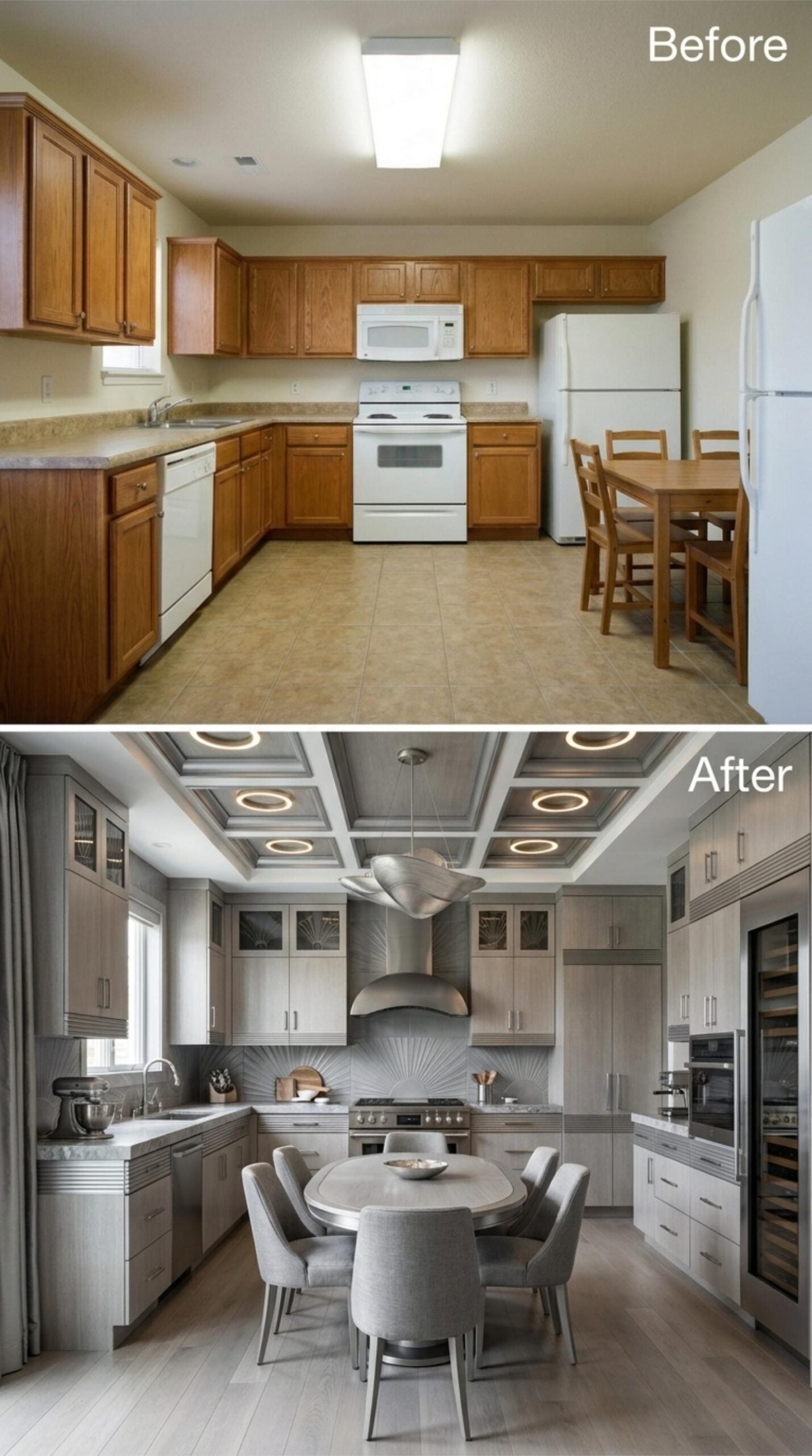
Pale gray cabinetry runs floor to ceiling here, and the coffered ceiling with circular recessed lighting is what actually makes it work. The sculptural range hood draws the eye before anything else does. Hardwood floors keep it from feeling cold.
9. Slate Blue Lower Cabinets, Exposed Ceiling Beams, and Copper That Holds the Room Together
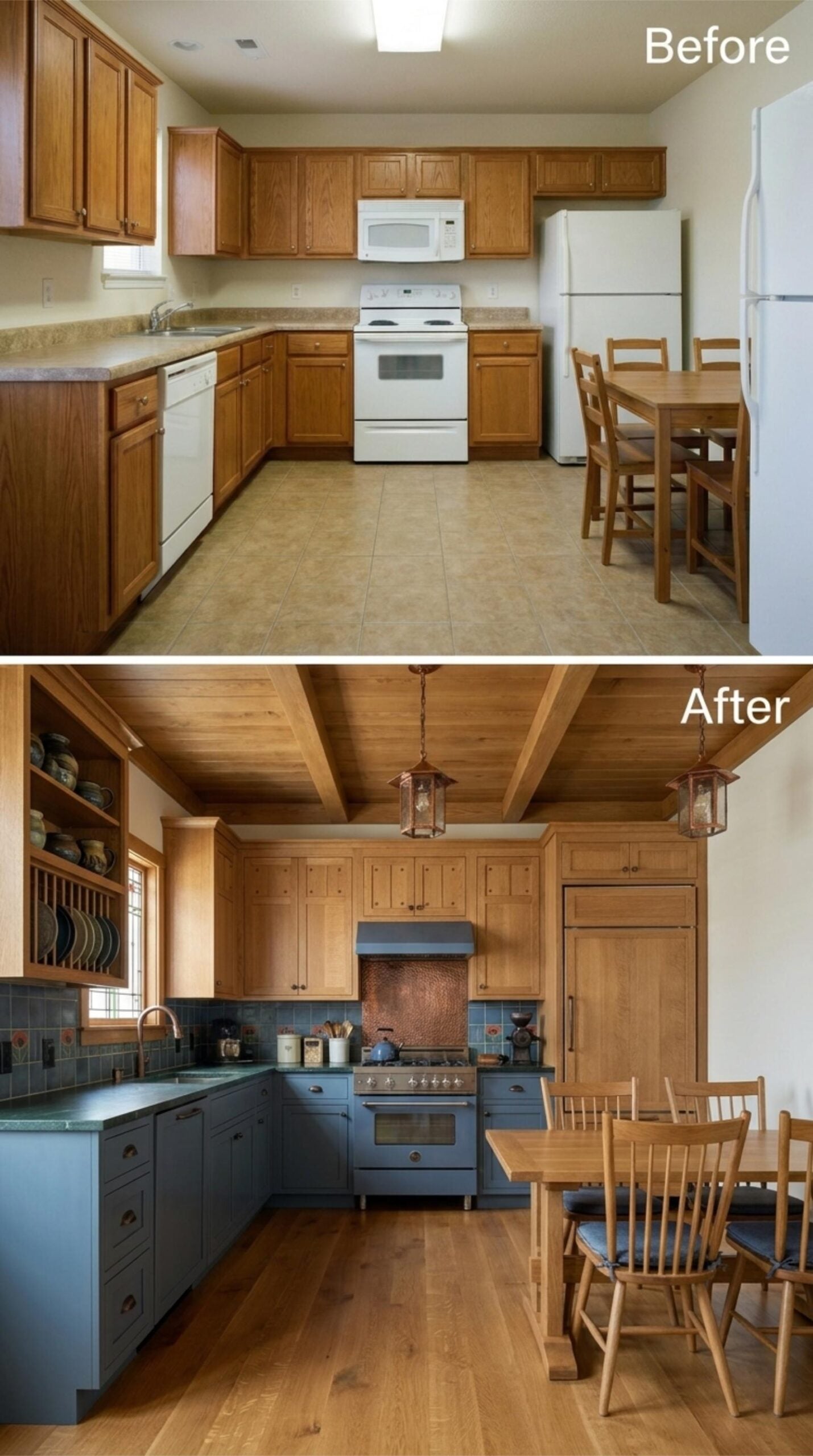
Slate blue lower cabinets pair with natural wood uppers in what reads as quarter-sawn oak, and the split finish shouldn’t work as well as it does. But the copper backsplash panel behind the range pulls both tones into the same warm register, so the contrast reads as deliberate rather than indecisive. Wide-plank hardwood floors run wall to wall, grounding the whole composition without competing with anything above them.
The ceiling is where the renovation earns its keep. Exposed wood beams with tongue-and-groove paneling between them add structure that a flat drywall ceiling could never fake. Copper lantern pendants hang from the beams, repeating the backsplash finish at eye level. The refrigerator disappears behind a full-height panel that matches the upper cabinets exactly.
8. Cream Cabinetry, Brass Hardware, and a Terracotta Range That Refuses to Blend In
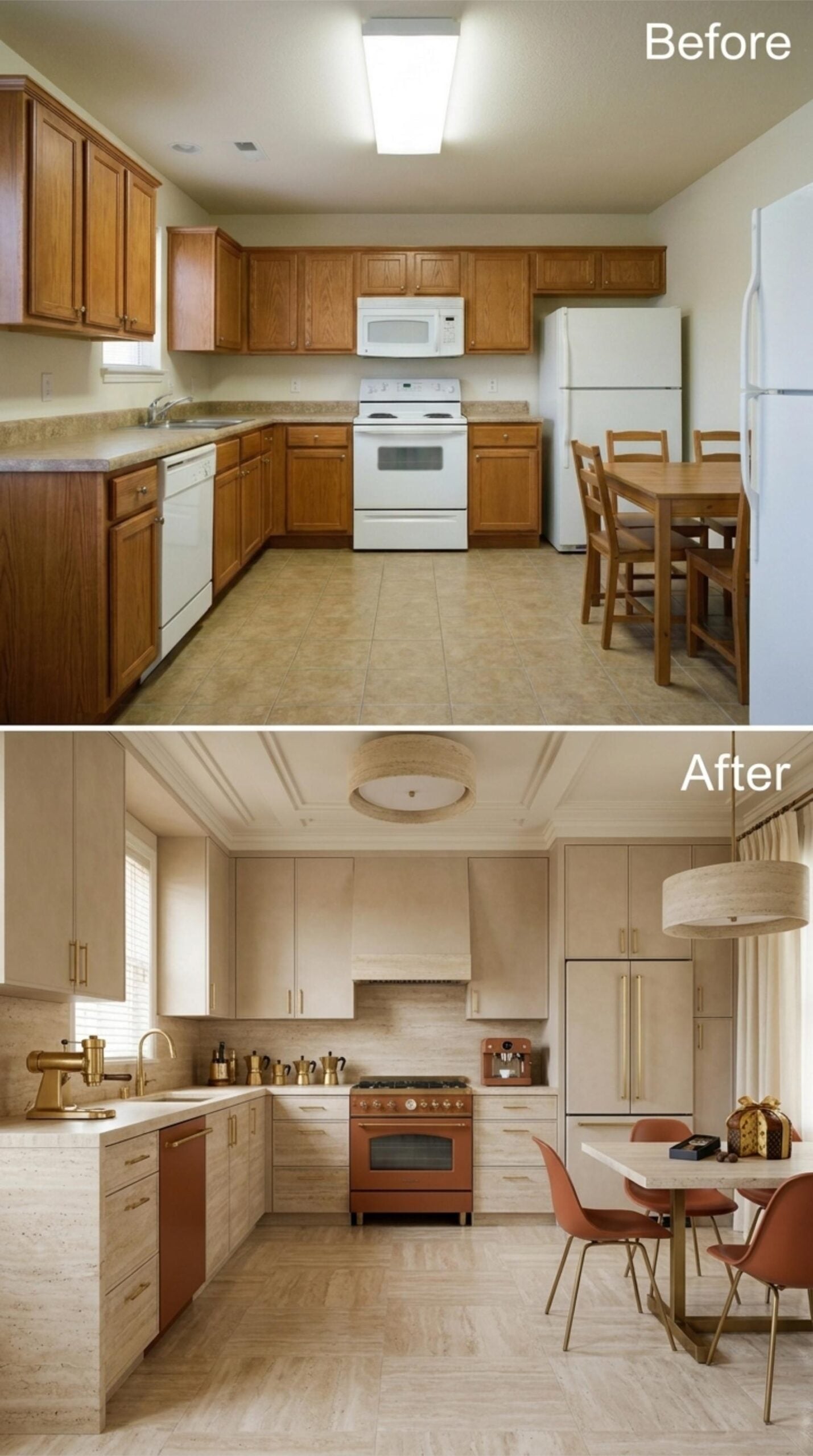
Linen-toned flat-front cabinets run floor to ceiling, and the brass pulls are doing real work keeping the palette from feeling sterile. A terracotta-finish range sits at center stage, and it’s specific enough that the whole room organizes around it. The drum pendants overhead stay muted so nothing competes.
7. Concrete Plaster, Cove Light, and Flat-Front Oak That Doesn’t Need to Try
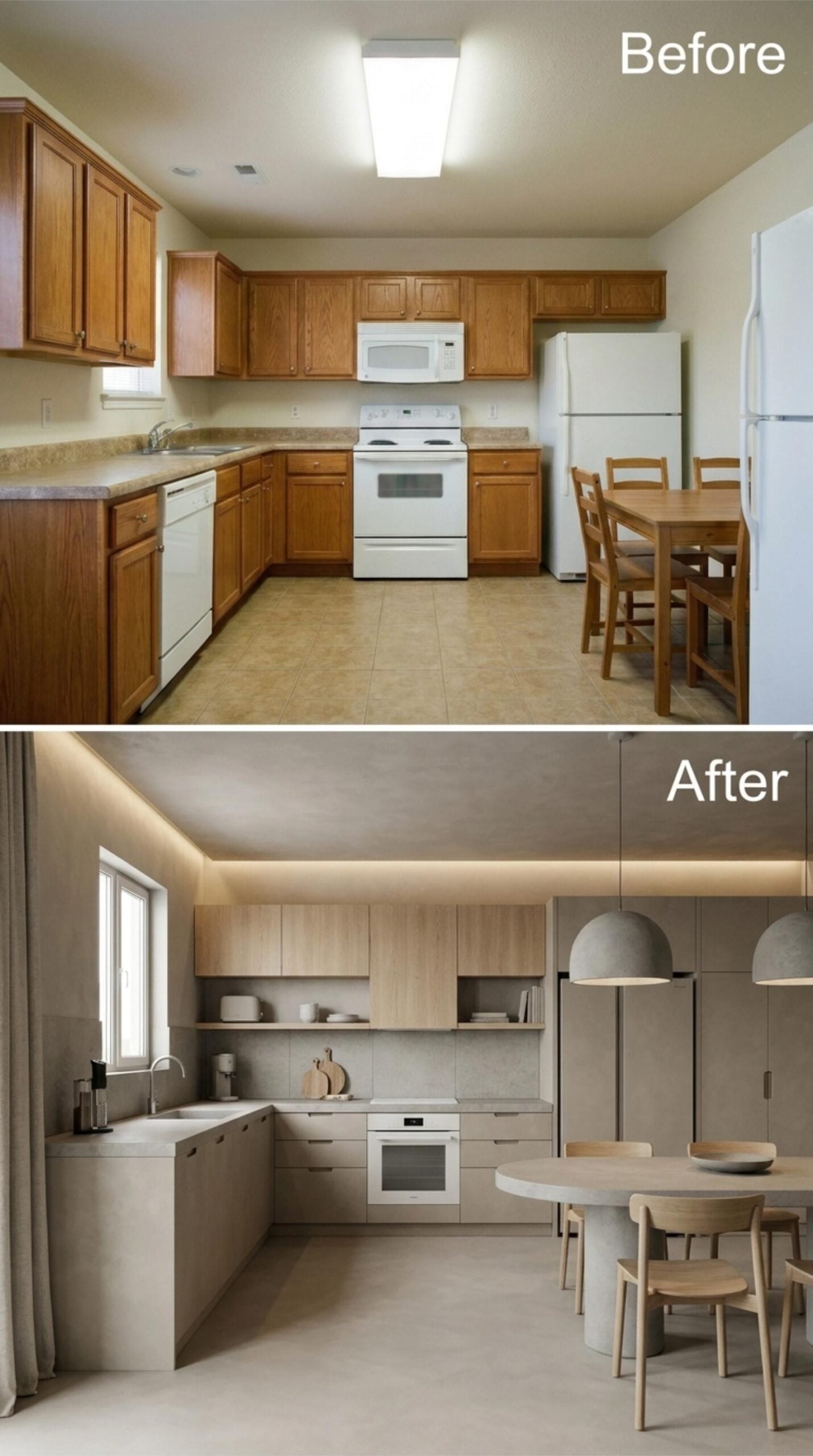
Warm cove lighting wraps the ceiling perimeter while flat-front oak cabinets and concrete-plaster surfaces keep everything else quiet. The round dining table earns its spot.
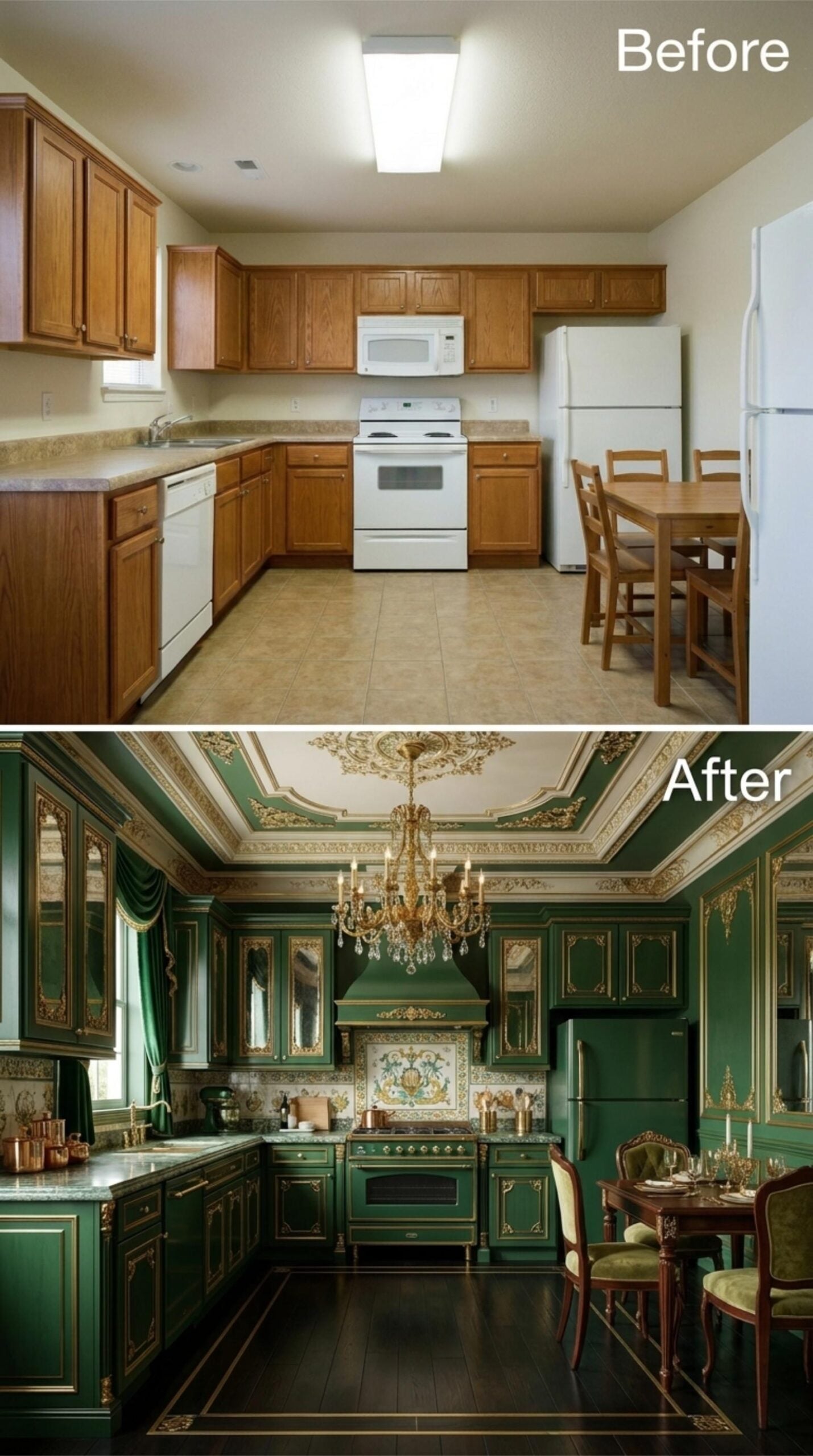
6. Emerald Cabinetry, Gold Molding, and a Chandelier That’s Not Kidding Around
🔥 Would you like to save this?
Deep hunter green runs the full length of this kitchen, from floor-to-ceiling paneled cabinetry to a custom range hood trimmed in gold leaf detail. The ceiling does a lot of work here: cream plasterwork with baroque floral motifs frames a brass chandelier fitted with candle-style arms and crystal drops. It’s a lot, and it commits completely.
Marble countertops in pale green-grey keep the surfaces from going heavy, while hand-painted floral tile above the range adds pattern without competing with the cabinetry color. Dark hardwood floors anchor the room. The dining area pulls in carved wood chairs upholstered in sage velvet, which connects back to the dominant color without repeating it exactly.
5. Dark Walnut Cabinetry, a Yellow Range That Commits Fully, and Green Marble That Anchors the Sink
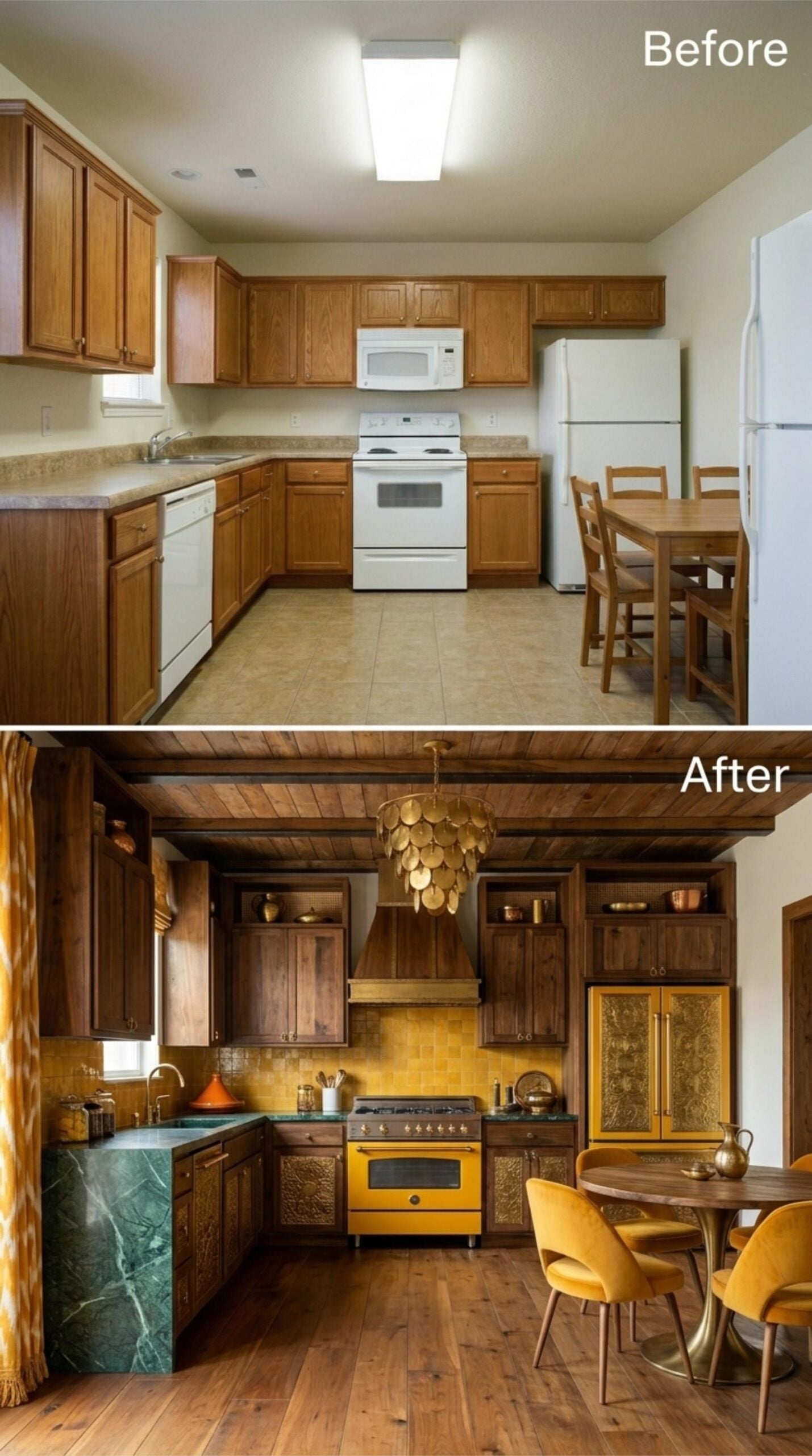
Gold spoon-shaped pendants hang from a wood-planked ceiling, and somehow that’s the least dramatic thing happening. A saffron-yellow range commands the back wall against yellow zellige tile, flanked by dark walnut cabinets with embossed brass panel inserts. Green marble wraps the sink peninsula like it owns the room.
4. Charcoal Cabinets, a Concrete Pendant, and Cove Light That Does the Heavy Lifting
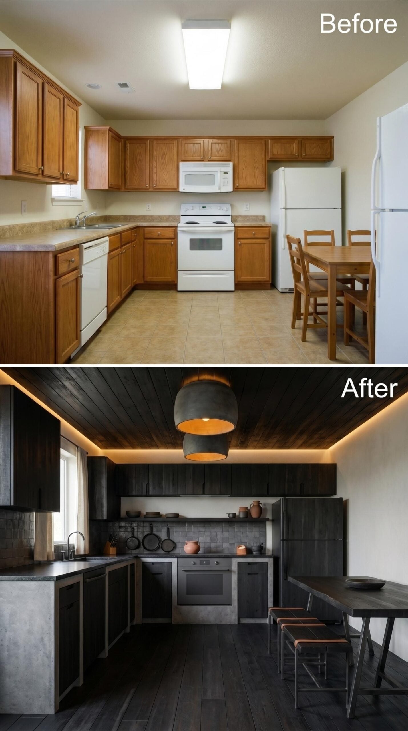
Dark-stained shiplap on the ceiling pulls the room down intentionally, and the warm amber cove lighting along the perimeter keeps it from feeling like a bunker.
3. Mauve Lacquer, Sunburst Ceiling Relief, and Crystal That Earns Its Place
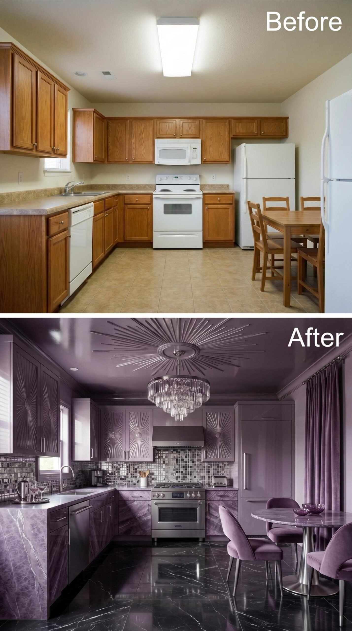
Every surface here commits to a single dusty violet, from the lacquered cabinet fronts to the ceiling, which carries embossed sunburst relief work radiating outward from a chrome medallion. The chandelier hanging beneath it layers tiered crystal drops, and against that monochromatic envelope, it doesn’t compete. It lands.
2. Knotty Alder Cabinets, Exposed Ceiling Beams, and Industrial Cage Pendants That Mean Business
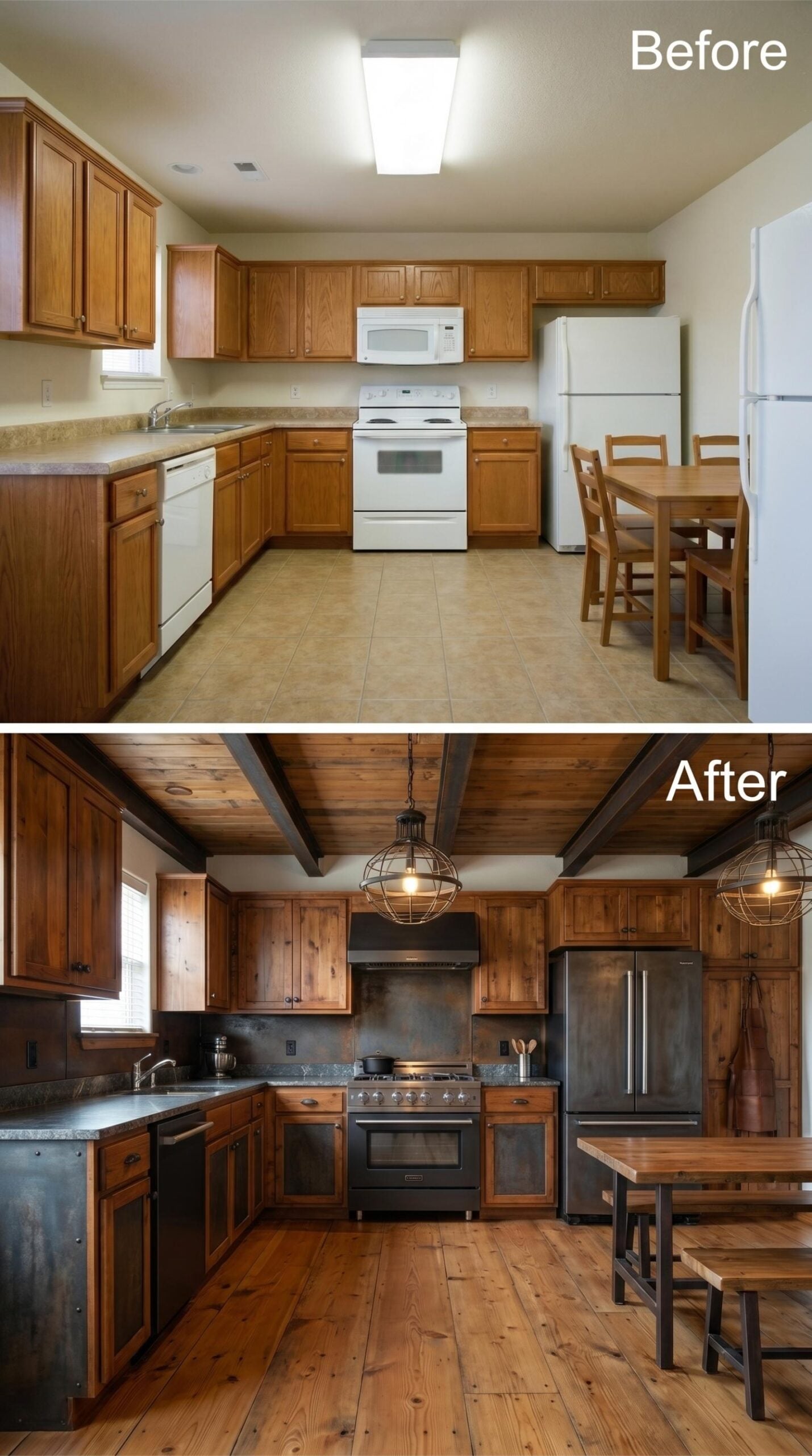
Rich knotty alder runs floor to ceiling, its natural grain and knots doing more visual work than any applied finish could. Concrete countertops in a cool gray keep the composition from going too rustic. Wide-plank pine floors and wood-planked ceiling lock the palette together. The cage pendants don’t fight for attention. They belong.
1. Flat-Front White Uppers, Walnut Lowers, and a Marble Backsplash That Earns the Drama
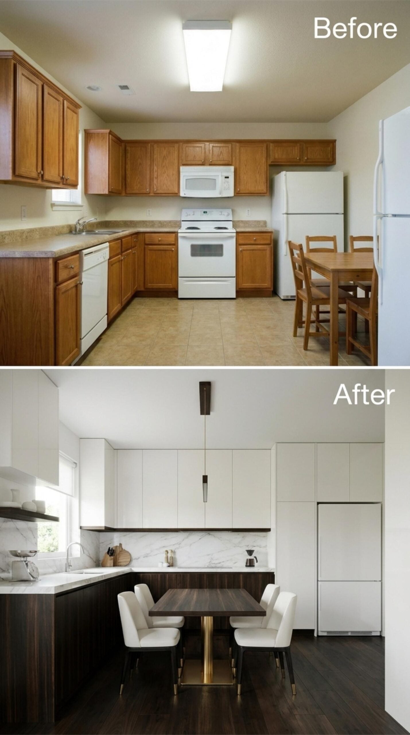
Crisp white flat-front cabinets run floor to ceiling, and the walnut lower cabinets ground the whole room without competing. A marble slab backsplash with bold grey veining pulls focus at counter level, exactly where it belongs. The pedestal dining table sits centered beneath a brass pendant, and the white upholstered chairs keep the seating from feeling heavy against all that dark wood.