
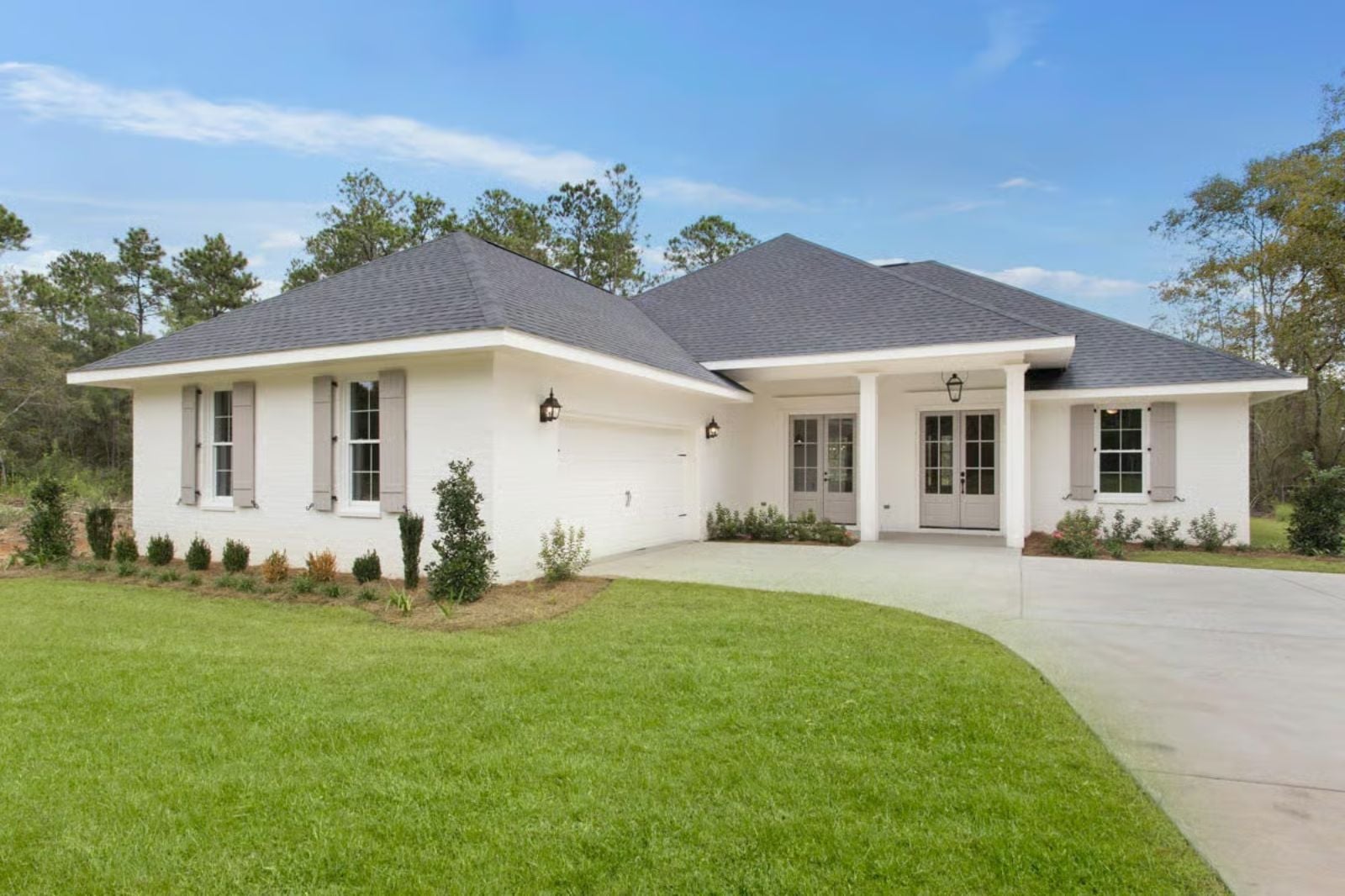
The flex room gives the whole plan away. These are the families who have been using their dining room as a homework station for two years, eating dinner on the couch because the table disappeared under science projects — and the Bayleaf Ranch is built around exactly that tension: a true flex room that closes off when someone needs quiet, an open main living area for the evenings when everyone lands in the same room at once, and an Acadian roofline that makes the whole thing feel settled rather than just large.
Specifications
- Sq. Ft.: 2,134
- Bedrooms: 3
- Bathrooms: 2.5
Floor Plan – Main Floor
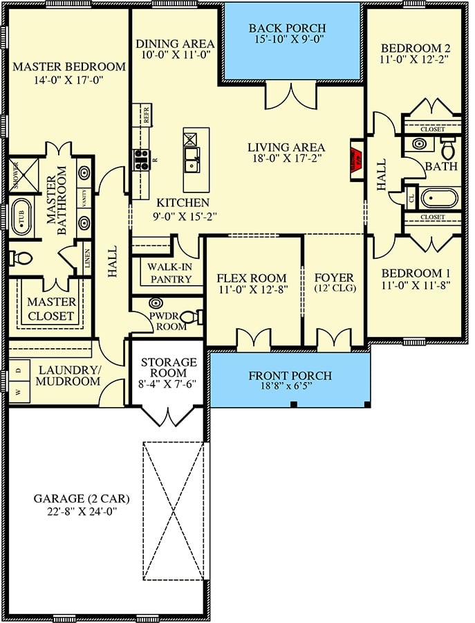
The master suite sits on the opposite side of the house from the kids’ rooms — real separation, not just a few feet of hallway. At the center, kitchen, dining, and living flow together without a wall to interrupt them. A flex room near the foyer handles office duty, playroom duty, or whatever the family needs that week. Walk-in pantry, mudroom, powder room, and a two-car garage cover the practical side.
Painted Brick Exterior with Covered Rear Patio Built for Southern Summers
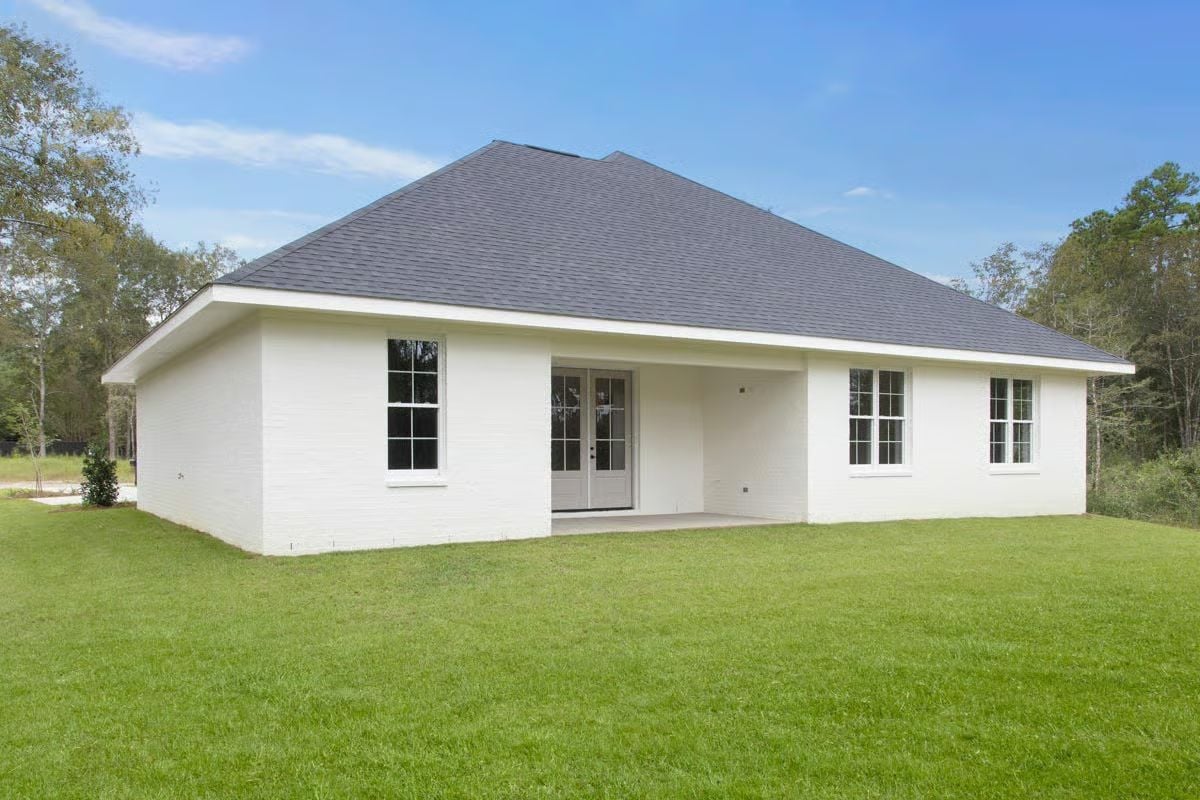
White-painted brick wraps the back elevation, paired with french doors opening onto a covered concrete patio.
Dark Hardwood Floors and a Lantern Pendant That Know What They’re Doing
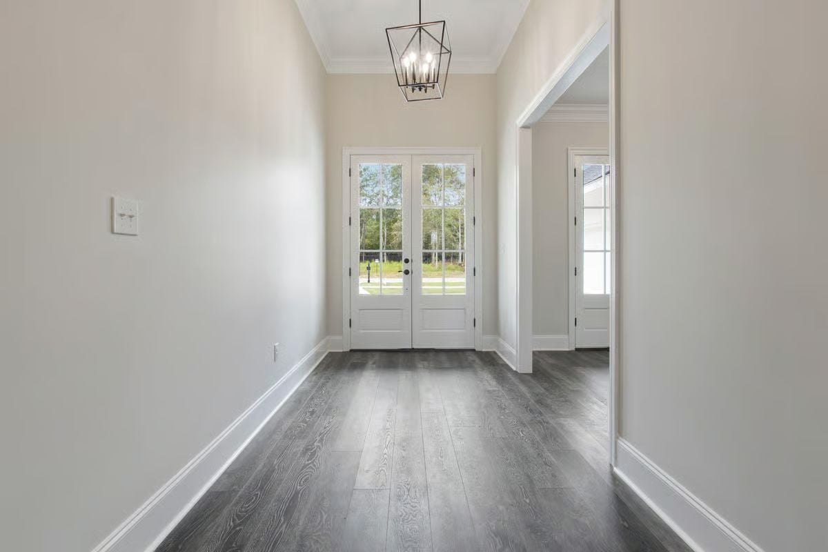
Gray-toned hardwood runs the full length of the foyer, grounding the pale walls without competing with them. That geometric pendant does real work overhead — french doors at the far end flood the entry with natural light, and the open doorway to the right keeps the whole thing from collapsing into a corridor.
Dark Floors, Open Sightlines, and a Kitchen Island That Earns Its Square Footage
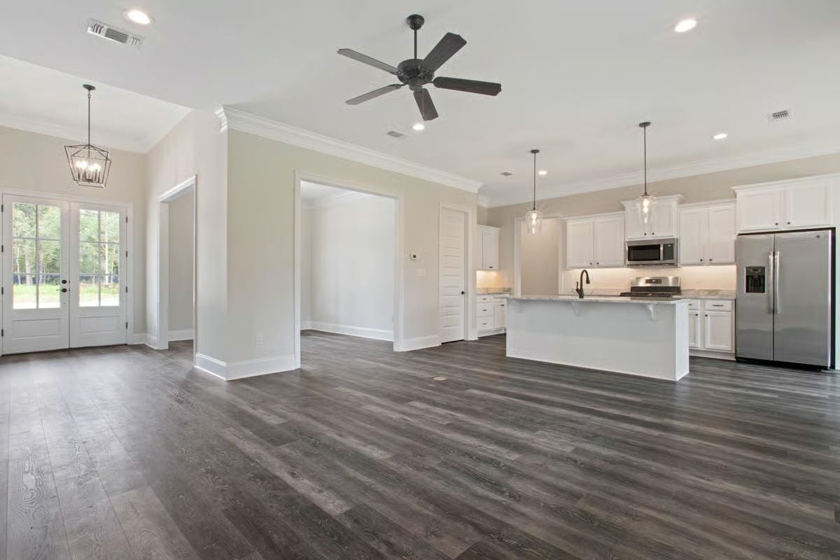
Gray hardwood runs uninterrupted from the entry straight into the kitchen, tying together what could easily feel like two separate rooms. Pendant lights over the island use clear glass so the sightlines stay open. White cabinetry, stainless appliances, marble-look counters — yes, it’s a predictable trio, but the scale of that island makes the whole thing worth it.
Designer’s Secret: Open-concept rooms live and die by flooring continuity. Running one hardwood species and finish across the living, dining, and kitchen zones makes the space read larger and keeps furniture arrangements flexible as your family’s needs shift. That small decision to skip a transition strip between rooms pays off every single day.
Marble Counters and Matte Black Hardware Doing Exactly What They Should
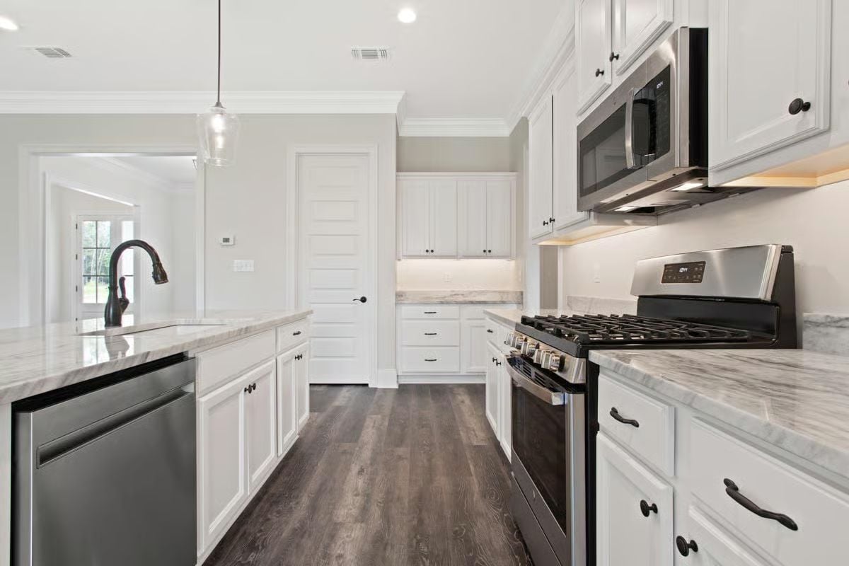
Stainless appliances anchor a kitchen where veined marble countertops run the full perimeter.
Why Under-Cabinet Lighting Earns Its Place Here
Those under-cabinet fixtures aren’t decorative. They fill the shadow zone between upper cabinets and countertop where most kitchen task lighting quietly fails — and on a perimeter this long, that coverage keeps prep surfaces usable all the way to the edges rather than dim where it actually counts.
Crown Molding and Dark Floors in a Primary Suite That’s Ready to Furnish
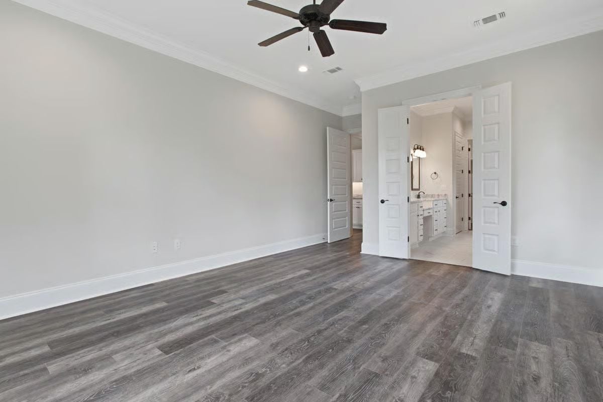
Charcoal-toned hardwood runs wall to wall without a seam, giving the room a grounded base before any furniture arrives. Double doors open straight into the ensuite, where vanity sconces and a mirror are already visible from the bedroom. Crown molding closes it all out. Nothing fussy about any of it — just a room that’s ready to move into.
Trend Alert: Ceiling fans with pull chains are making a quiet comeback in primary bedrooms, particularly in Southern climates where running the fan year-round is practical rather than optional. Matching matte black finishes across the fan hardware and door levers creates visual continuity without requiring any deliberate coordination during the selection process.
Dual Vanities, Marble Counters, and a Walk-In Closet Visible From Both Sinks
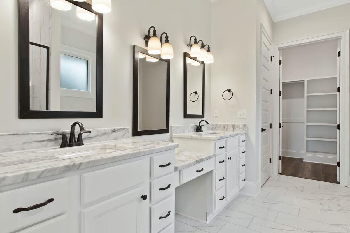
Matte black hardware runs consistent across faucets, drawer pulls, and light fixtures, which keeps the room from reading as scattered. Two separate vanity stations flank a knee-space makeup counter in the middle, and the open closet doorway at the far end makes the layout feel like someone actually planned it rather than just fit things in.
Common Mistake: Homeowners often over-light bathrooms by layering too many sources without thinking about direction. Wall sconces mounted above mirrors at eye level tend to cast shadows down the face. Placement that puts the bulb roughly at chin height when seated works better for daily use.
Storage is where laundry rooms either pull their weight or quietly fail every single day.
Marble Countertops and Upper Cabinets That Make Laundry Feel Less Like a Chore
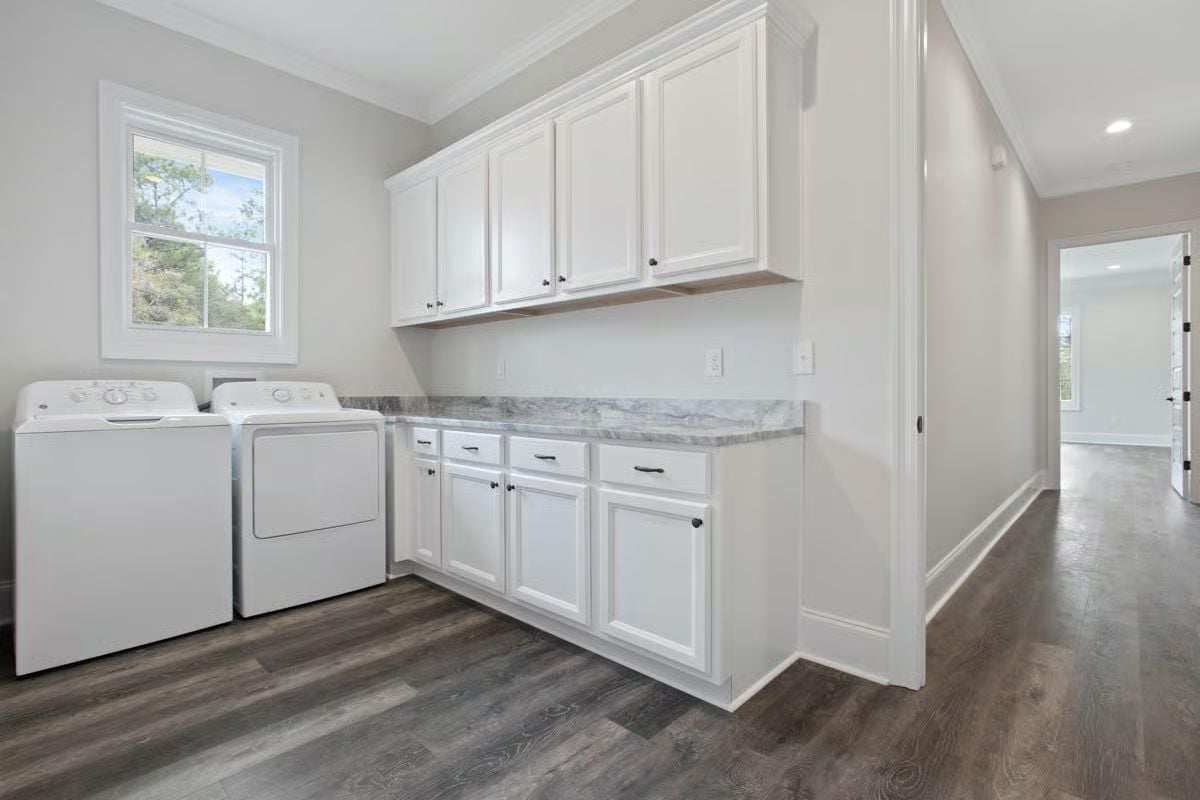
A folding counter with a veined marble surface gives this room real utility, and dark hardware on white cabinetry keeps it from feeling too precious for actual use.
transition: Upper cabinets in a laundry room tend to get crammed with overflow from every other space in the house. If you’re designing from scratch, dedicate at least one cabinet exclusively to laundry supplies so the folding counter below doesn’t become a dumping ground for things that belong somewhere else. That separation is what actually makes the room function.
Pin It
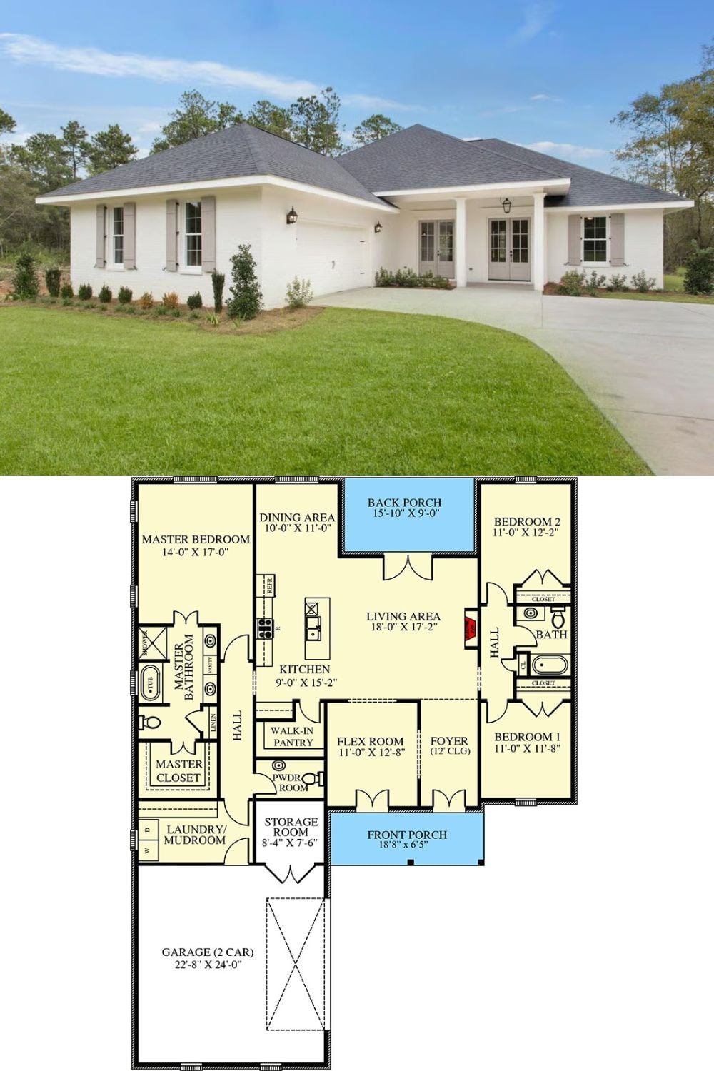
Exterior photo shows a white brick Acadian ranch with a two-car garage and covered front porch. The floor plan below reveals three bedrooms, a flex room, walk-in pantry, and a generous 18-by-17 living area.
Ask Yourself: If you’re eyeing the flex room as a home office, check whether it sits near the foyer before committing. A room that doubles as a workspace and a greeting space for guests is harder to keep presentable than one tucked farther from the front door.
