🔥 Would you like to save this?
The backsplash is the smallest surface in a kitchen and the one people agonise over most. It sits at eye level, it’s the first thing you see from the doorway, and it’s where every other choice in the room has to meet: the counter, the cabinets, the hood, the hardware and the light. Get it right and it ties the kitchen together. Get it slightly wrong and it nags at you every time you fill the kettle.
In order to come up with the very specific design ideas, we create most designs with the assistance of state-of-the-art AI interior design software. Also, assume links that take you off the site are affiliate links such as links to Amazon. this means we may earn a commission if you buy something.
None of the 33 kitchens below is ugly. Most of them are beautiful, with good cabinetry, real stone and carefully chosen lighting. Each one has a single backsplash decision that pulls against everything else, and these are the mistakes people actually make. For each one we explain why it doesn’t work and what would have worked in that same kitchen.
33. A Busy Patterned Tile Fighting a Heavily Veined Marble Counter
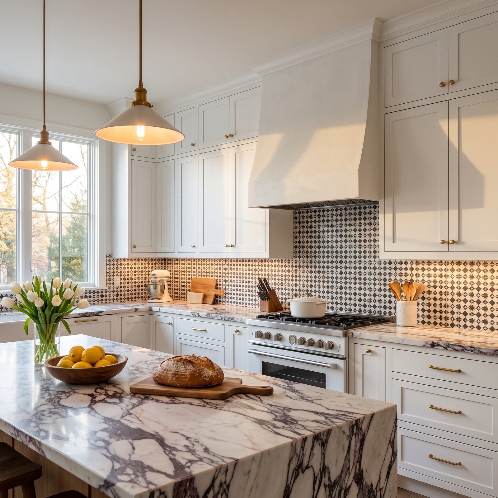
The cabinetry is calm and the hardware is perfect, and then two patterns meet on the counter line and argue for the rest of the room’s life. A bold, burgundy-veined marble is already the art in this kitchen. Laying a busy geometric tile directly above it means neither one gets to be the star.
Why It Doesn’t Work: the eye has nowhere to rest. Strong veining and a strong repeat pattern both demand attention, and side by side they make an expensive kitchen look restless and cluttered even when the counters are clear.
32. Tile That Stops Short of the Upper Cabinets
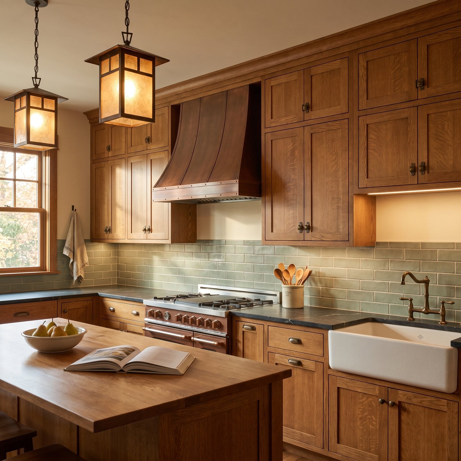
The tile is lovely, the oak is lovely, and then there’s a strip of painted drywall between the top of the tile and the bottom of the upper cabinets. It’s one of the most common backsplash shortcuts, usually made to save a box or two of tile.
Why It Doesn’t Work: that leftover stripe of paint looks unfinished. It breaks the wall into three horizontal bands, makes the uppers look like they’re floating, and it’s exactly where steam and splashes land, so the paint is the first thing to stain.
31. A Backsplash That Just Ends, Raw Edge and All
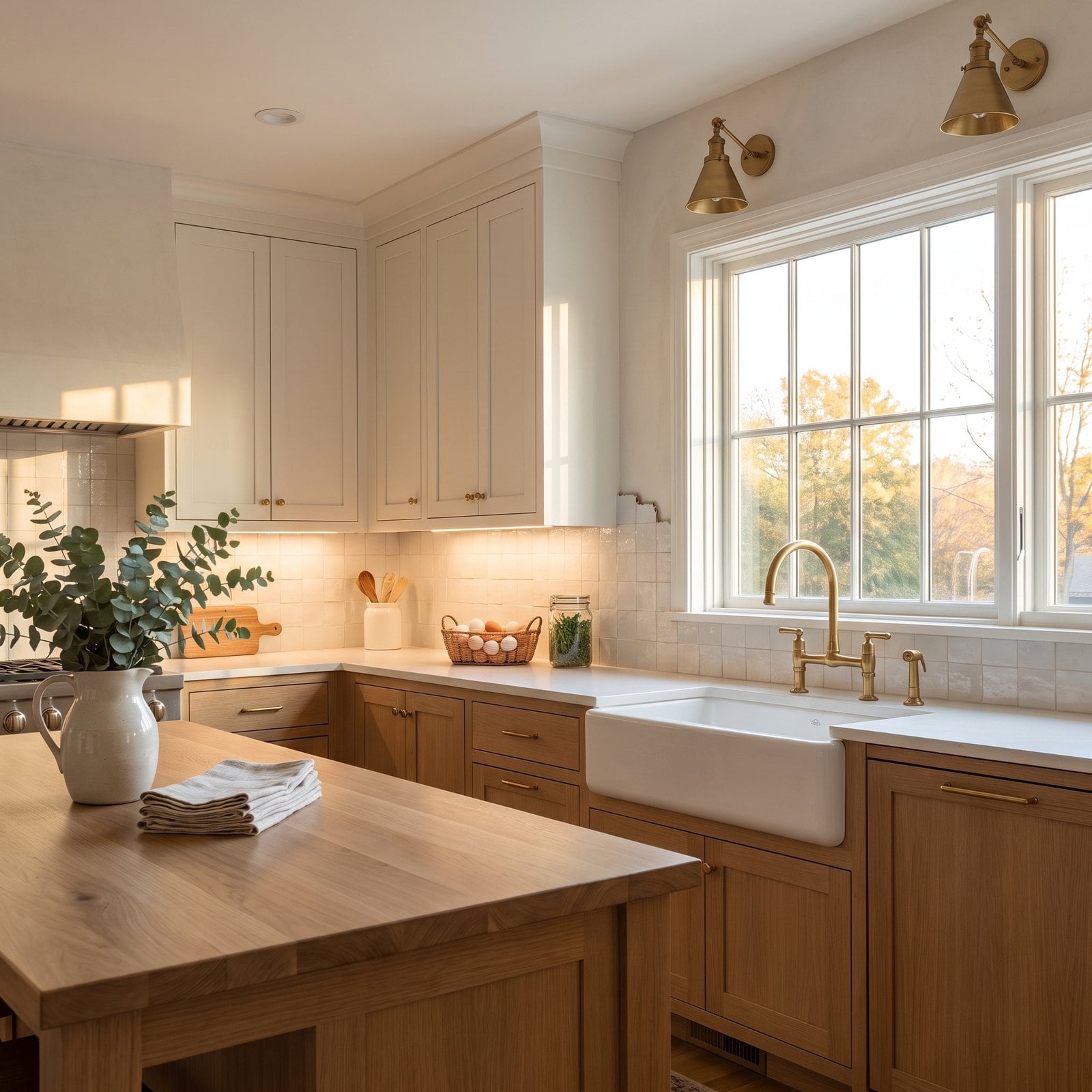
A good zellige backsplash shimmers, and this one does too, right up to the point where it simply stops partway along an open wall with its cut edges on show.
Why It Doesn’t Work: tile needs a reason to end. Stopping in mid-air with a raw edge makes it look as though the installer ran out of tile, and it draws the eye to the one unfinished spot in an otherwise finished kitchen.
30. Dark Grout That Turns Shimmering Zellige Into a Grid
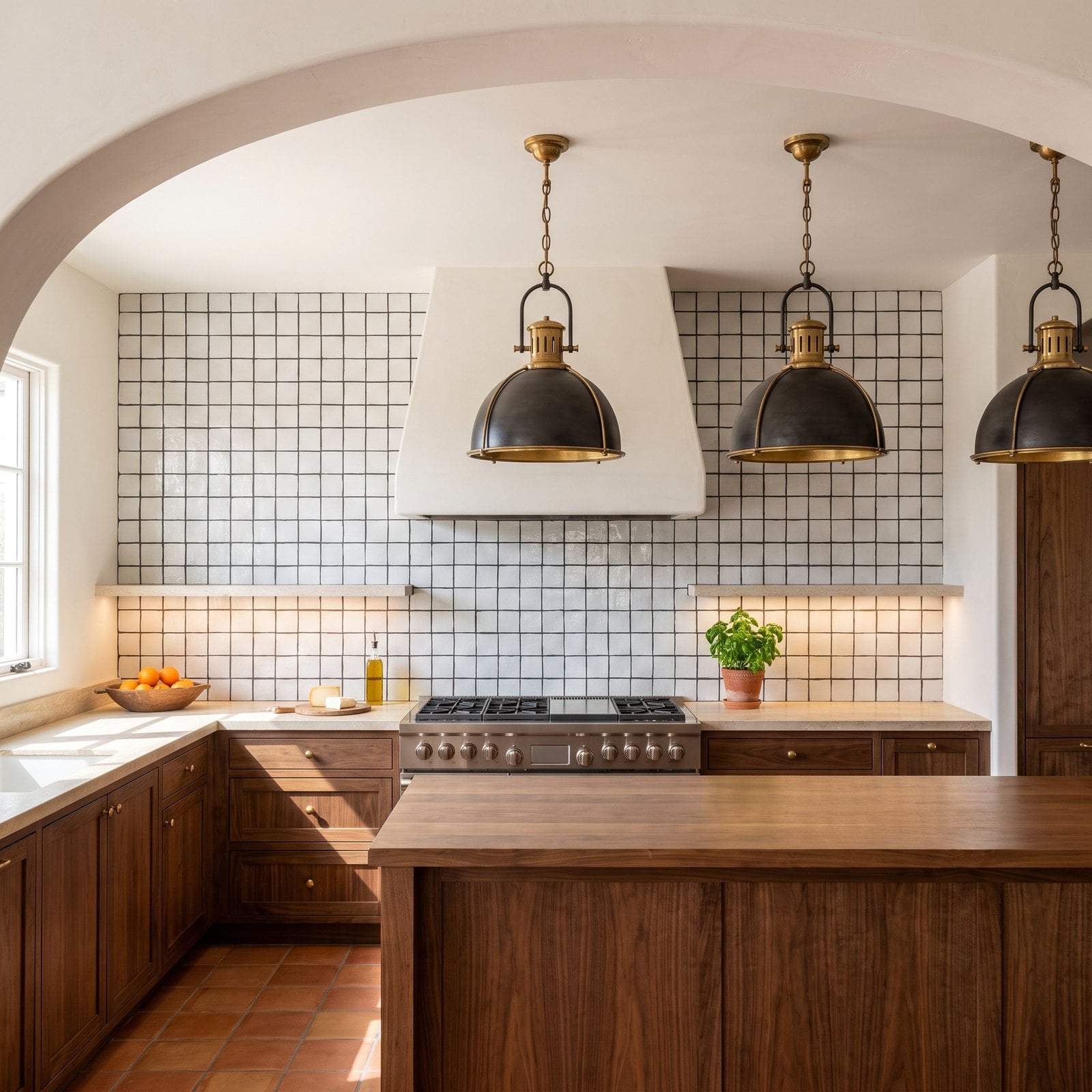
Zellige is prized because every tile is slightly different, and from a few steps away it should read as one soft, glinting surface. Here dark charcoal grout outlines every single tile.
Why It Doesn’t Work: high-contrast grout turns handmade tile into graph paper. Every wobble and gap is outlined, the shimmer disappears, and the wall reads as busy and dated instead of soft and Mediterranean.
29. The Glass Mosaic Accent Band Nobody Asked For
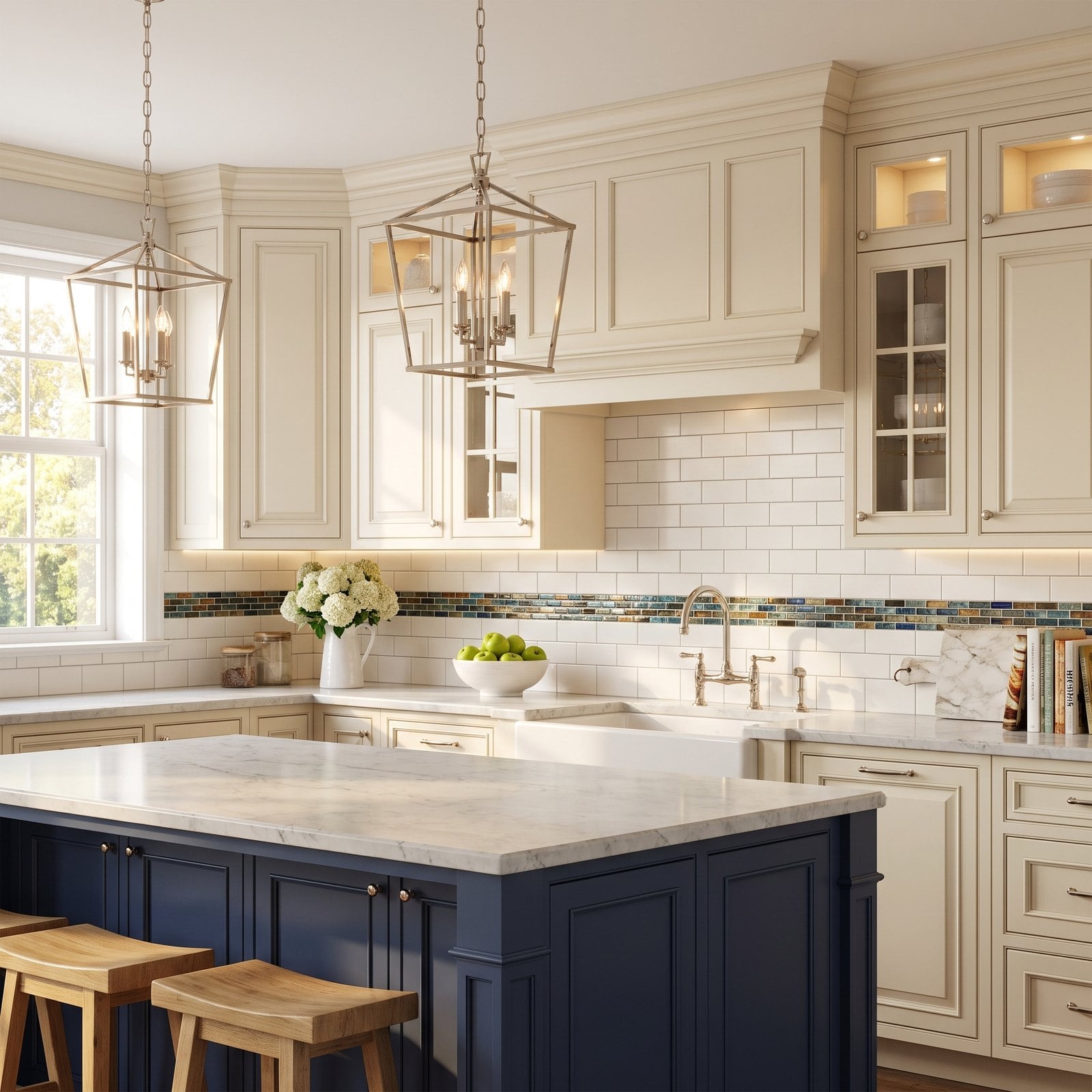
The kitchen is classically traditional, all cream panelled cabinetry and honed marble, but a stripe of shiny multicoloured glass mosaic runs across the middle of the subway tile like a belt.
Why It Doesn’t Work: the glass accent band was everywhere in the mid-2000s, and it dates a kitchen instantly. It also cuts the wall in half visually, so the backsplash looks shorter, and its colours don’t come from anything else in the room.
28. Two Unrelated Tiles Meeting at the Range
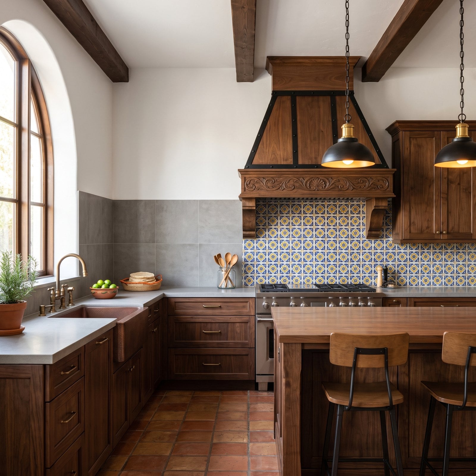
Each tile on its own is fine. The Talavera suits the house perfectly and the grey porcelain is perfectly nice. The trouble is that they meet at the corner, one on the sink wall and one on the range wall, as if two different kitchens were stitched together.
Why It Doesn’t Work: one backsplash should read as one decision. Switching material at an inside corner, especially between two styles this far apart, looks like a renovation done in stages or a tile shop running out of stock.
27. Cool Blue-Grey Tile Against Warm Cream and Oak
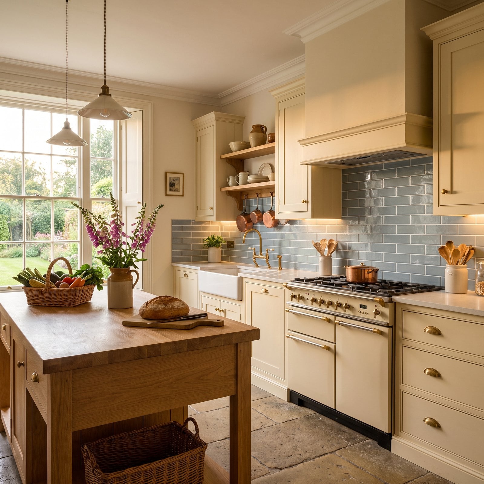
A warm English country kitchen with buttery cream cabinetry, honey oak and brass taps, and behind the range a tile with a cool blue-grey undertone. In the showroom it looked neutral. Next to cream it looks icy.
Why It Doesn’t Work: undertones decide whether colours get along. Cool blue-grey makes warm cream look yellow and slightly dirty, and the cream makes the tile look colder. Neither colour is wrong on its own; they’re wrong together.
26. Tiny Mosaic Stretched Across a Very Large Wall
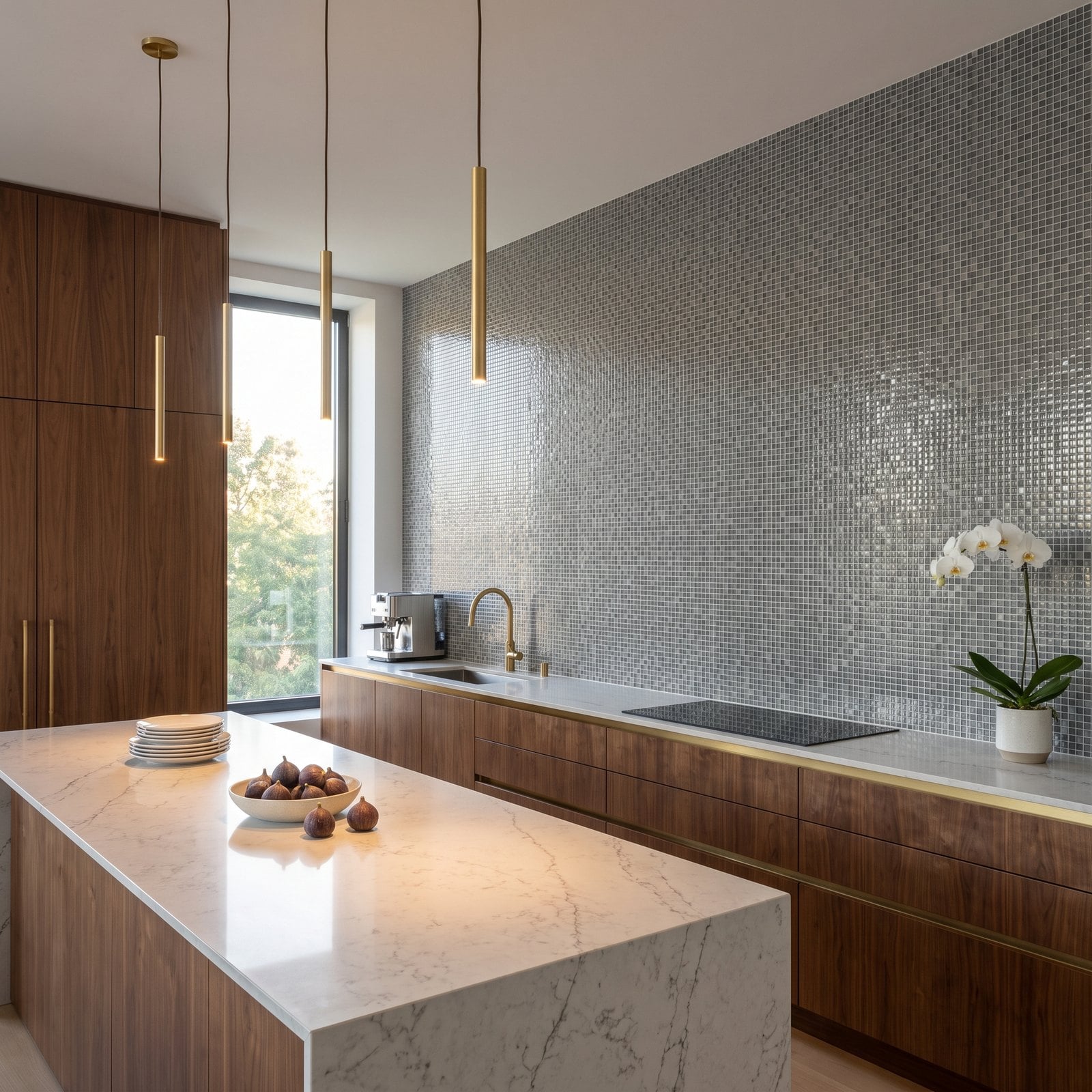
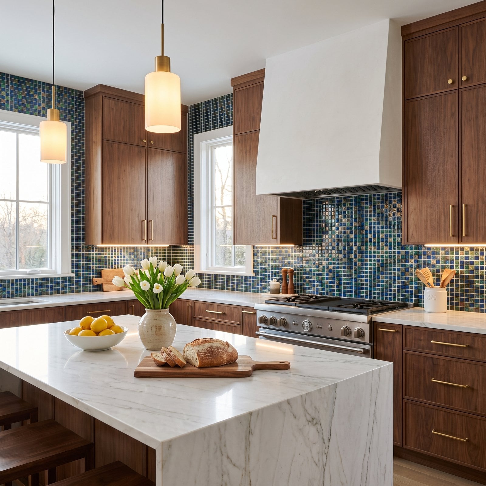
The walnut, the long island and the uninterrupted wall would make a striking kitchen, but the wall is covered from counter to ceiling in tiny glass mosaic, thousands of half-inch squares and grout lines.
Why It Doesn’t Work: scale. Small mosaic belongs in small areas. Across a twenty-foot wall it vibrates, it looks busy even from across the room, and it turns a calm contemporary space into a shower stall.
25. A Statement Slab Whose Veins Don’t Line Up
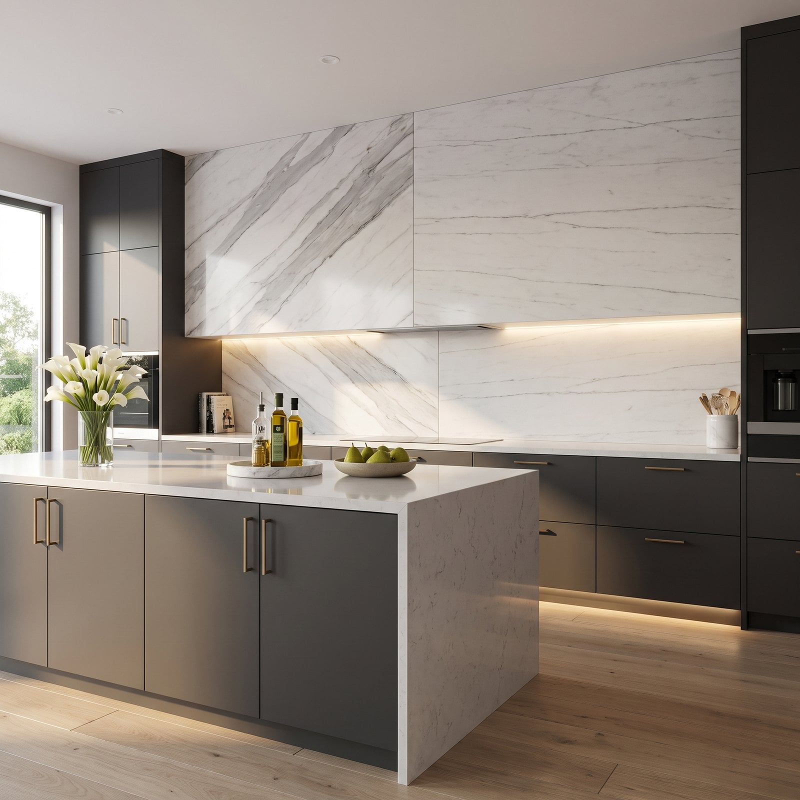
A full marble slab backsplash is one of the most luxurious things you can put in a kitchen, which is exactly why the seam stings. Two slabs meet in the middle, and the veins stop dead and restart going a different way.
Why It Doesn’t Work: a statement slab is all about the movement of the stone. When the veining breaks at a joint, the eye goes straight to the seam and the wall reads as two pieces rather than one sheet.
24. Rustic Stacked Stone Behind a Sleek Modern Range
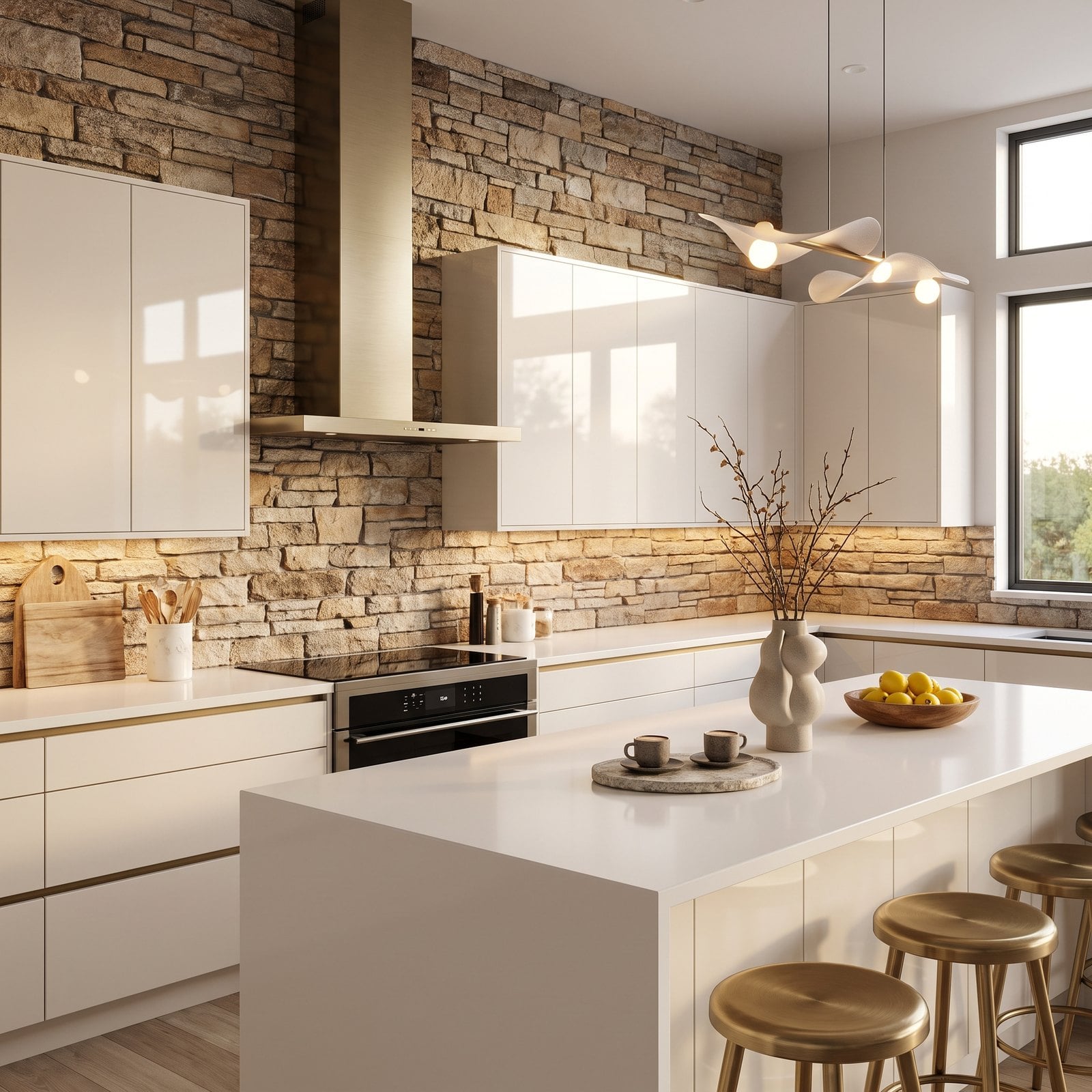
Everything in this kitchen is sleek: handleless lacquer, wafer-thin quartz and a slim brass hood. Then the backsplash is rough, chunky stacked ledgestone, the kind you’d expect on a mountain-lodge fireplace.
Why It Doesn’t Work: the backsplash has to speak the same language as the cabinets. Rustic stone in a minimal kitchen looks borrowed, and practically, its deep crevices trap grease and food behind a cooktop and are almost impossible to clean.
23. Herringbone That Isn’t Centred on the Range
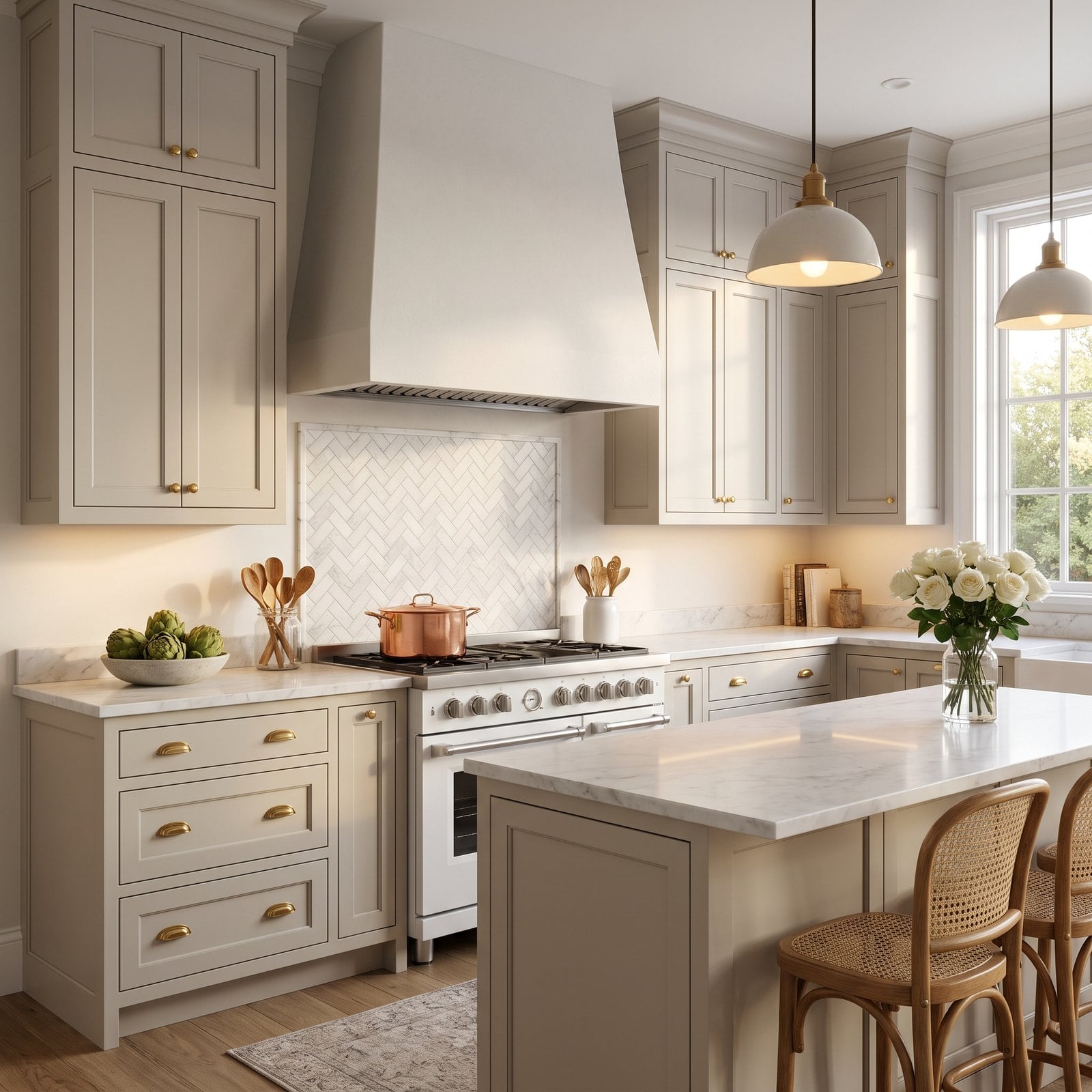
Herringbone behind the range is a classic, and this panel is beautifully laid in honed marble. The problem is that the zigzag spine of the pattern sits a few inches off the centre line of the range and hood.
Why It Doesn’t Work: a range wall is symmetrical by nature, and the eye immediately notices when a strong pattern on it is off-centre. It’s a few inches, but it makes the whole focal wall look slightly crooked.
22. Beige Outlets Punched Through a Showpiece Wall
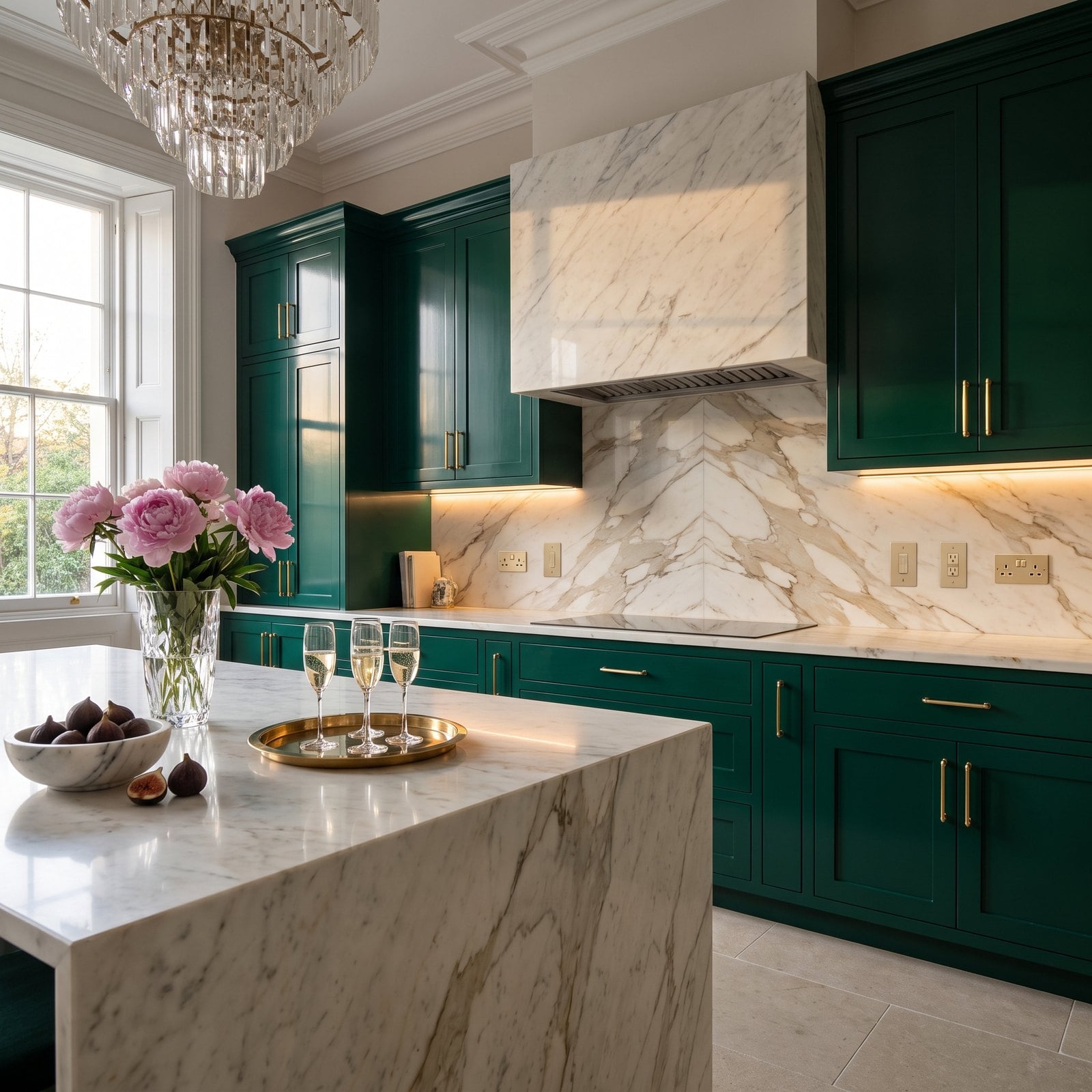
A book-matched marble slab, emerald lacquer and a crystal chandelier: this kitchen spent its budget in all the right places. Then four beige plastic outlets were punched straight through the middle of the marble.
Why It Doesn’t Work: outlets are the most overlooked detail in a backsplash. Builder-beige plates in a showpiece slab look like an afterthought, and their random spacing breaks up the veining you paid for.
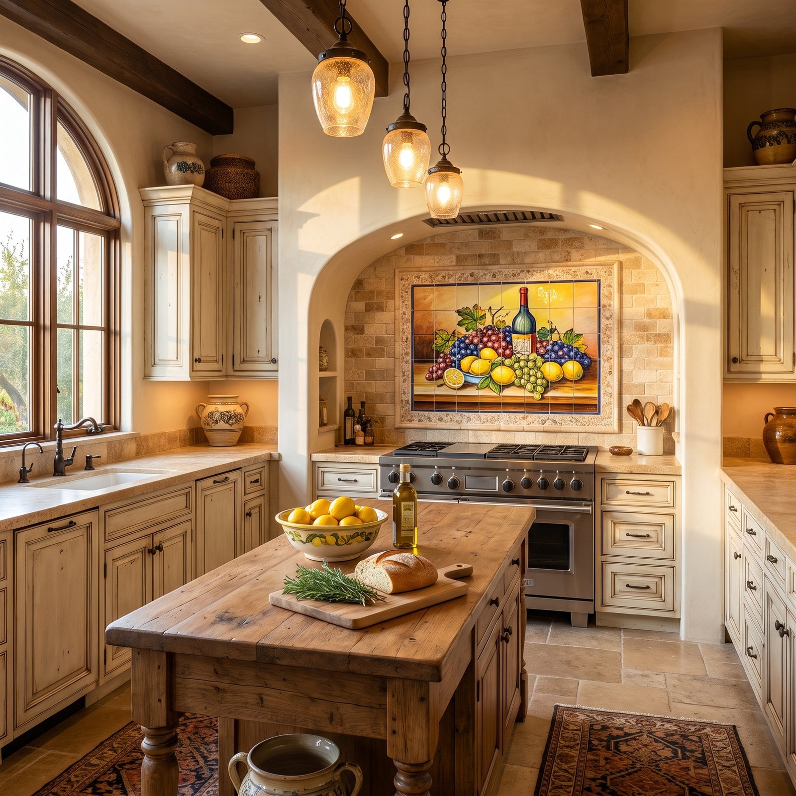
21. The Fruit-Bowl Mural Behind the Range
🔥 Would you like to save this?
Tuscan kitchens done well are all warm stone, timber and plaster. This one is close, until you reach the range alcove and find a framed ceramic mural of grapes, lemons and a wine bottle.
Why It Doesn’t Work: a picture mural tells the room what style it is supposed to be, which is the opposite of letting the materials do it. It also became a cliché of 2000s builder ‘Tuscan’ kitchens, so it dates the whole room.
20. A Mirror-Tile Backsplash in a Kitchen With Three Other Metals
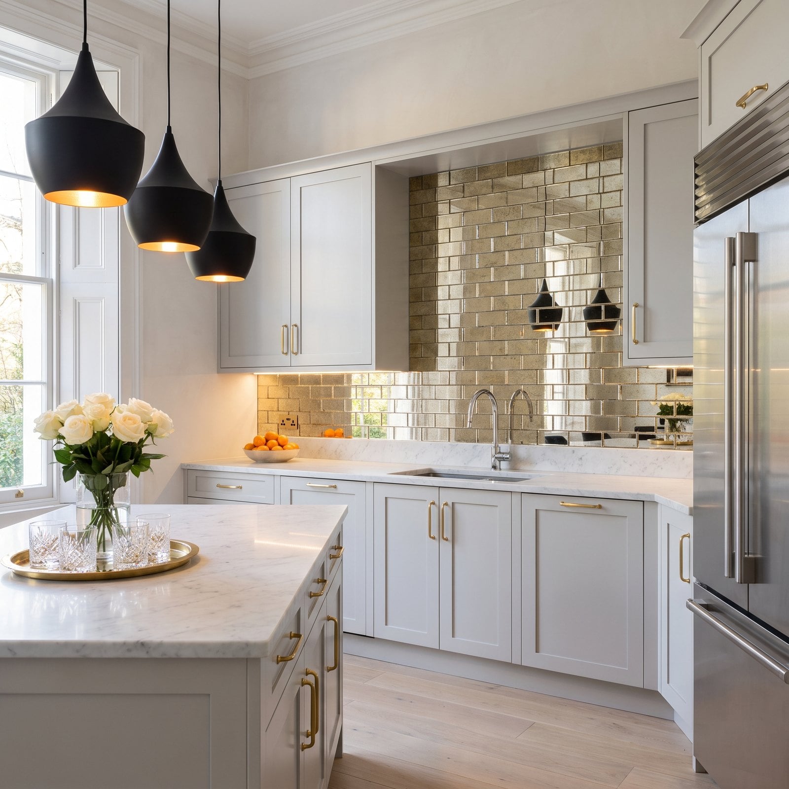
Mirror tile can be glamorous in a bar or a powder room. Here, behind the counter, it adds a fifth metal to brass handles, a chrome faucet, black pendants and a stainless fridge.
Why It Doesn’t Work: mixed metals need a rule, and five finishes without one look accidental. Mirror also reflects everything on the counter, so every bottle and the toaster appear twice and the wall always looks cluttered.
19. Open Shelves Hung on Bare Drywall
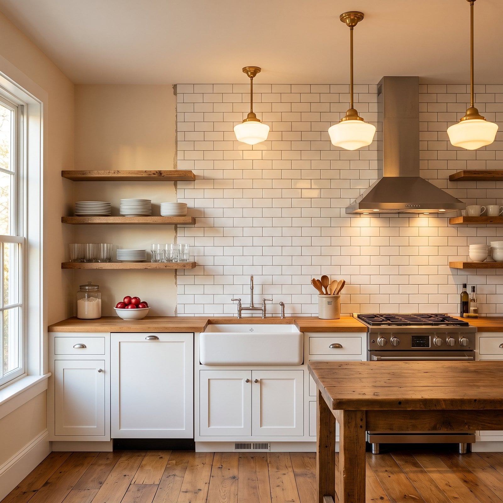
Open shelving is lovely in a farmhouse kitchen, and these reclaimed oak shelves are the right choice. But the tile stops where the shelves begin, so the shelves are hung on bare painted drywall beside a tiled wall.
Why It Doesn’t Work: open shelves turn the wall behind them into part of the display, and painted drywall looks unfinished there. It also scuffs and marks every time a plate goes back, and the tile edge beside it looks like a mistake.
18. Unsealed Marble Behind the Burners, Already Etched and Stained
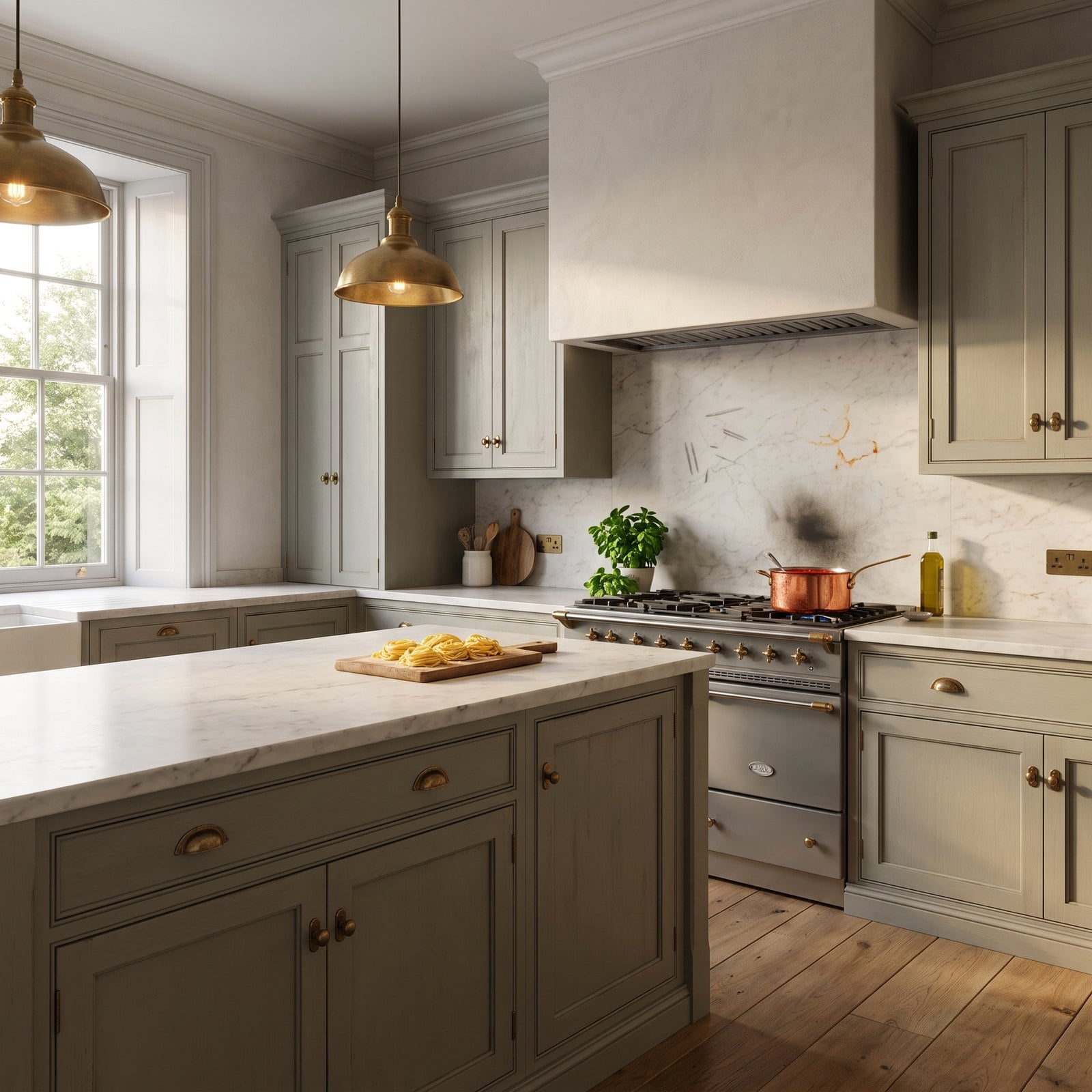
Honed marble looks wonderful, and in this kitchen it’s the right stone almost everywhere. The trouble is directly behind the burners, where tomato sauce, oil and lemon have already left etch marks and stains.
Why It Doesn’t Work: marble is calcium carbonate, so acids etch it and oils soak in. Behind a busy range it takes the worst of every meal, and unsealed honed marble shows it within weeks.
17. A Patterned Backsplash Above an Equally Patterned Floor
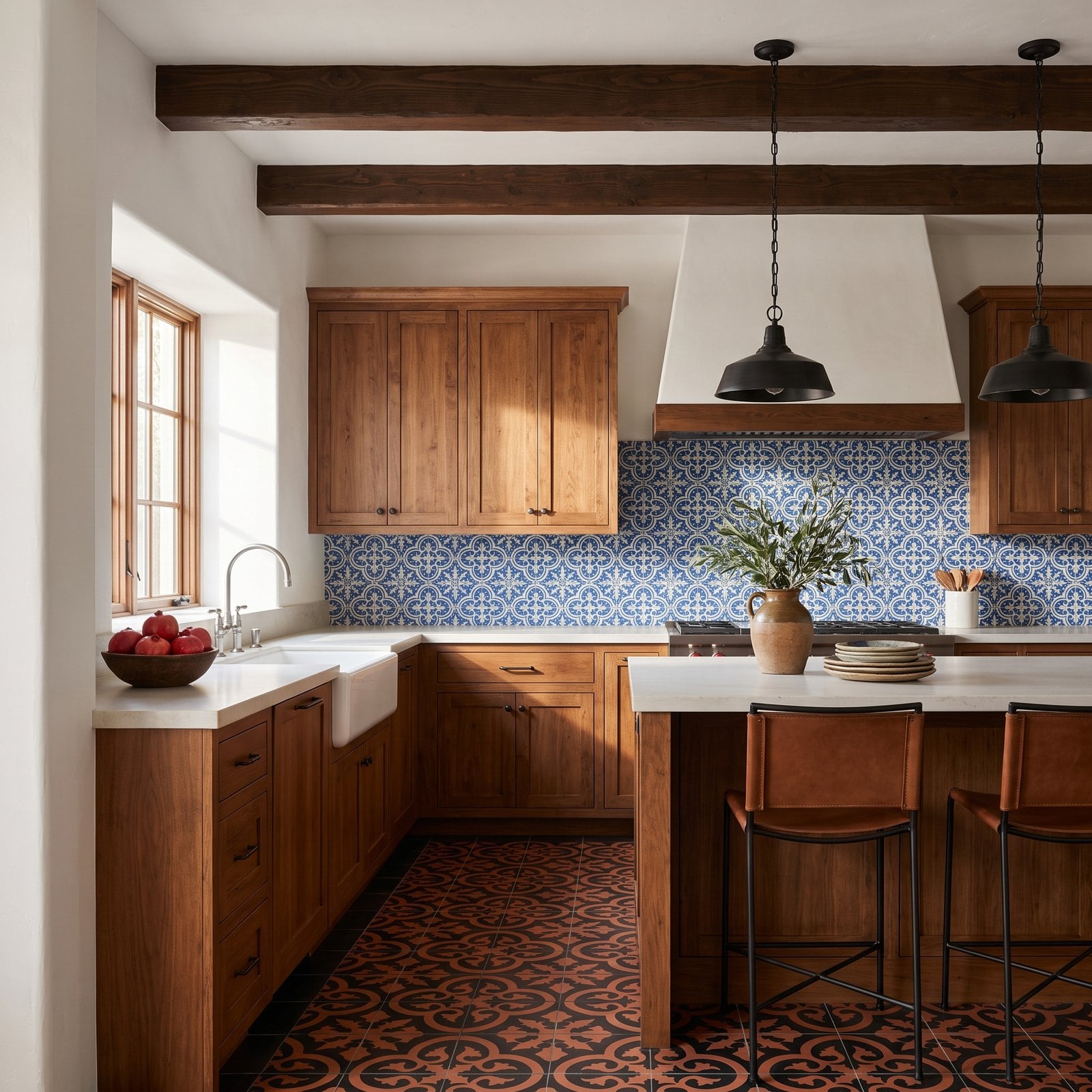
Encaustic cement tile is one of the great Spanish materials, and either of these patterns would make the kitchen. Using a bold blue-and-white tile on the wall and an unrelated black-and-terracotta pattern on the floor means both fight for the same view.
Why It Doesn’t Work: pattern needs a quiet partner. Two strong, unrelated designs at different scales make the room feel busy, the colours never quite agree, and the eye has nowhere to land.
16. Tile That Stops Halfway Up the Window Trim
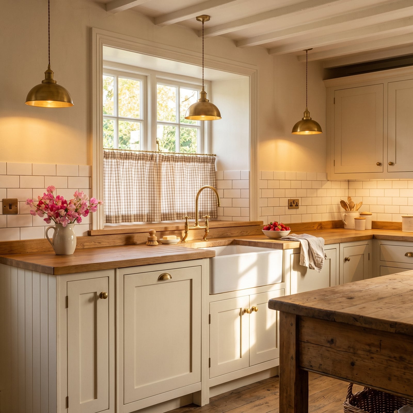
The window over the Belfast sink is the heart of this cottage kitchen, but the tile stops at a height that runs into the middle of the window casing, neither at the sill nor at the top.
Why It Doesn’t Work: backsplash height should line up with something. When the tile ends partway up the trim, it looks like a measurement error and makes the window look as if it’s sinking into the wall.
15. Contrasting Bullnose Trim Outlining the Tile Like a Picture Frame
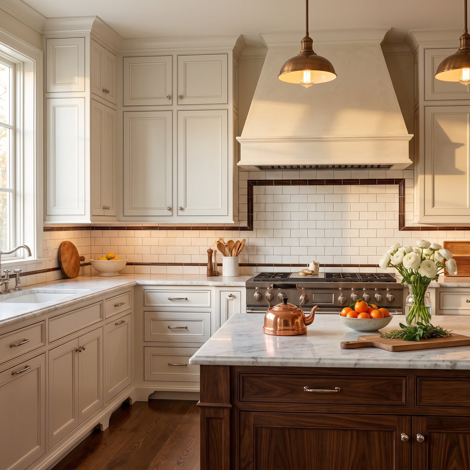
This is a beautifully restrained traditional kitchen, and the white subway tile is the right choice. Then a dark brown pencil trim outlines every edge of the tile, framing it like a picture.
Why It Doesn’t Work: contrasting edge trim draws a line around the backsplash, which makes it look smaller and busier and highlights every place the tile stops. It was a builder favourite twenty years ago and looks dated now.
14. Black Tile in a Small Kitchen That Barely Gets Light
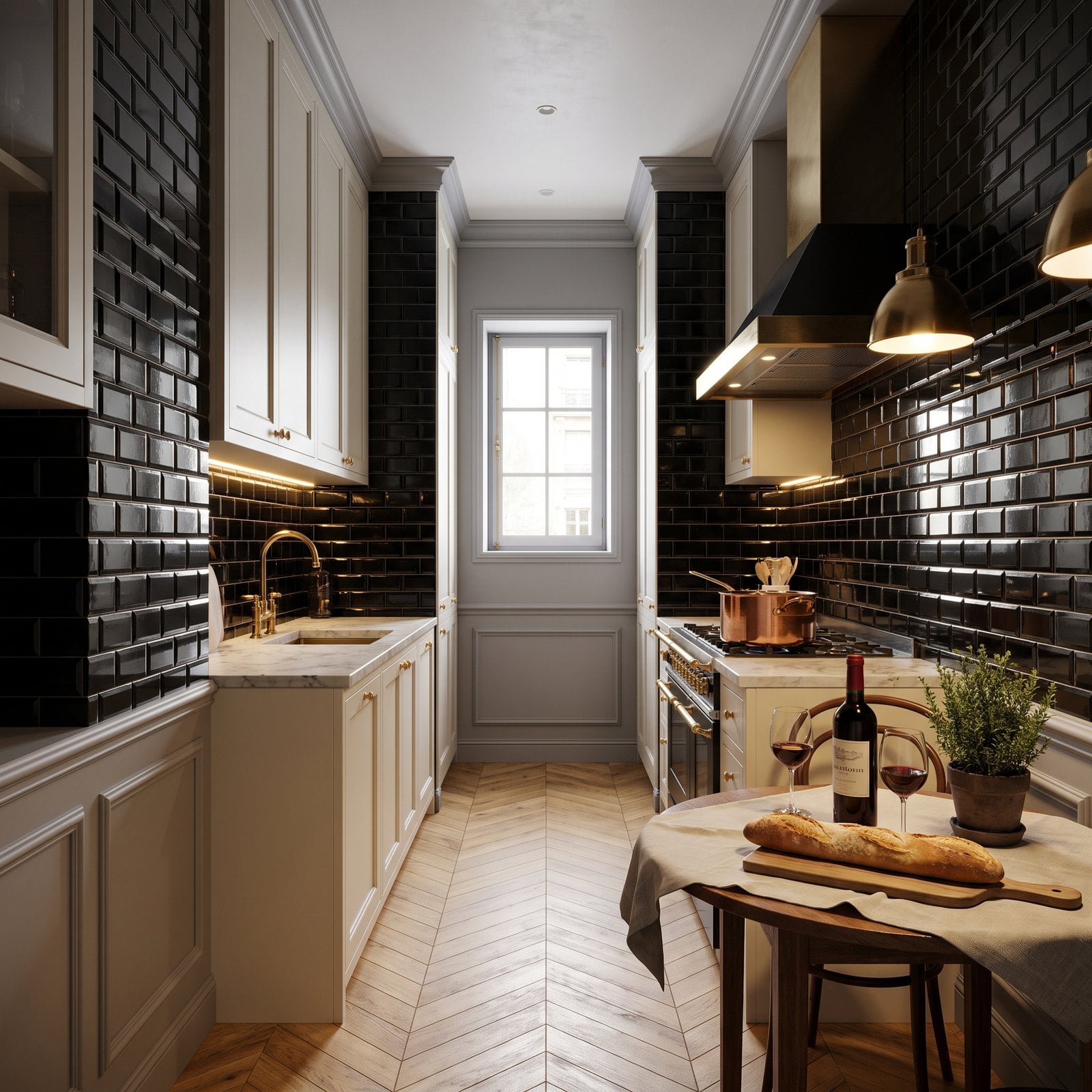
A Paris galley kitchen with parquet, boiserie and cream cabinets, with jet-black tile on both long walls. In a big bright kitchen black tile can be dramatic. In a small one with a single window it swallows the light.
Why It Doesn’t Work: dark, glossy tile absorbs light and shows every water spot, and on both walls of a narrow room it makes the space feel tighter and the counters look dim even at midday.
13. The Four-Inch Granite Strip in a Custom Kitchen
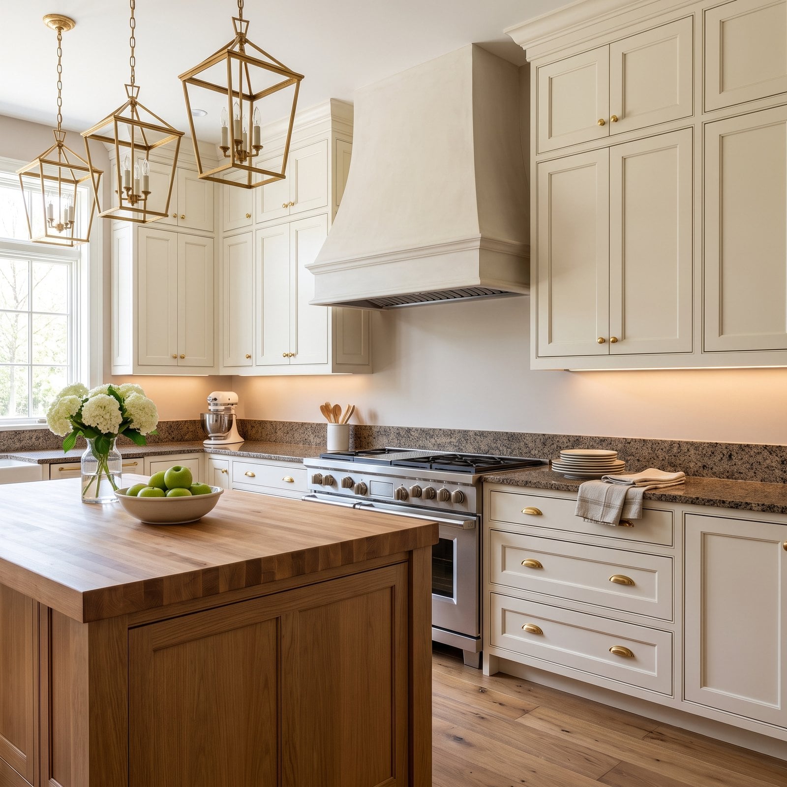
Custom cabinetry to the ceiling, brass hardware and a professional range, and the backsplash is a four-inch strip of speckled granite with painted drywall above it. It’s the builder default, and it shows.
Why It Doesn’t Work: a four-inch strip protects only the joint between counter and wall. It leaves the area that actually gets splashed as bare paint, and it cuts the wall with a heavy line that makes a high-end kitchen look like a spec house.
12. Glossy Tile Under Grazing Light That Shows Every Wave
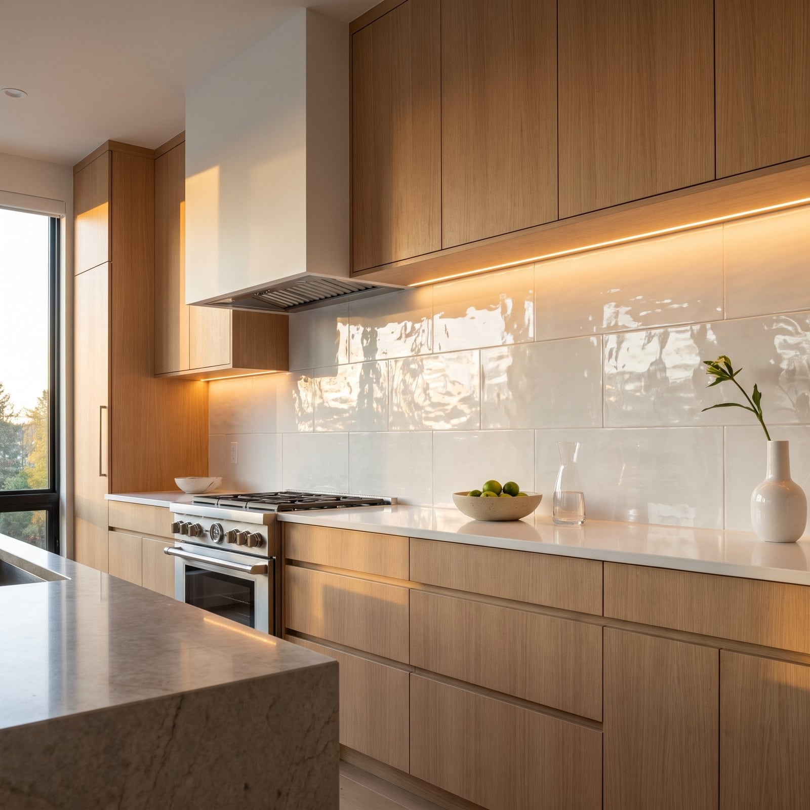
Clean oak, thin quartz and a smooth white backsplash should make a calm modern kitchen. But under-cabinet strip lights graze across the glossy tile and pick out every uneven edge and wavy reflection.
Why It Doesn’t Work: grazing light, meaning light that runs along a surface, exaggerates every imperfection. Large glossy tile set slightly out of plane looks wavy and cheap, even if it’s expensive tile.
11. Fish-Scale Tile on Every Inch of Wall
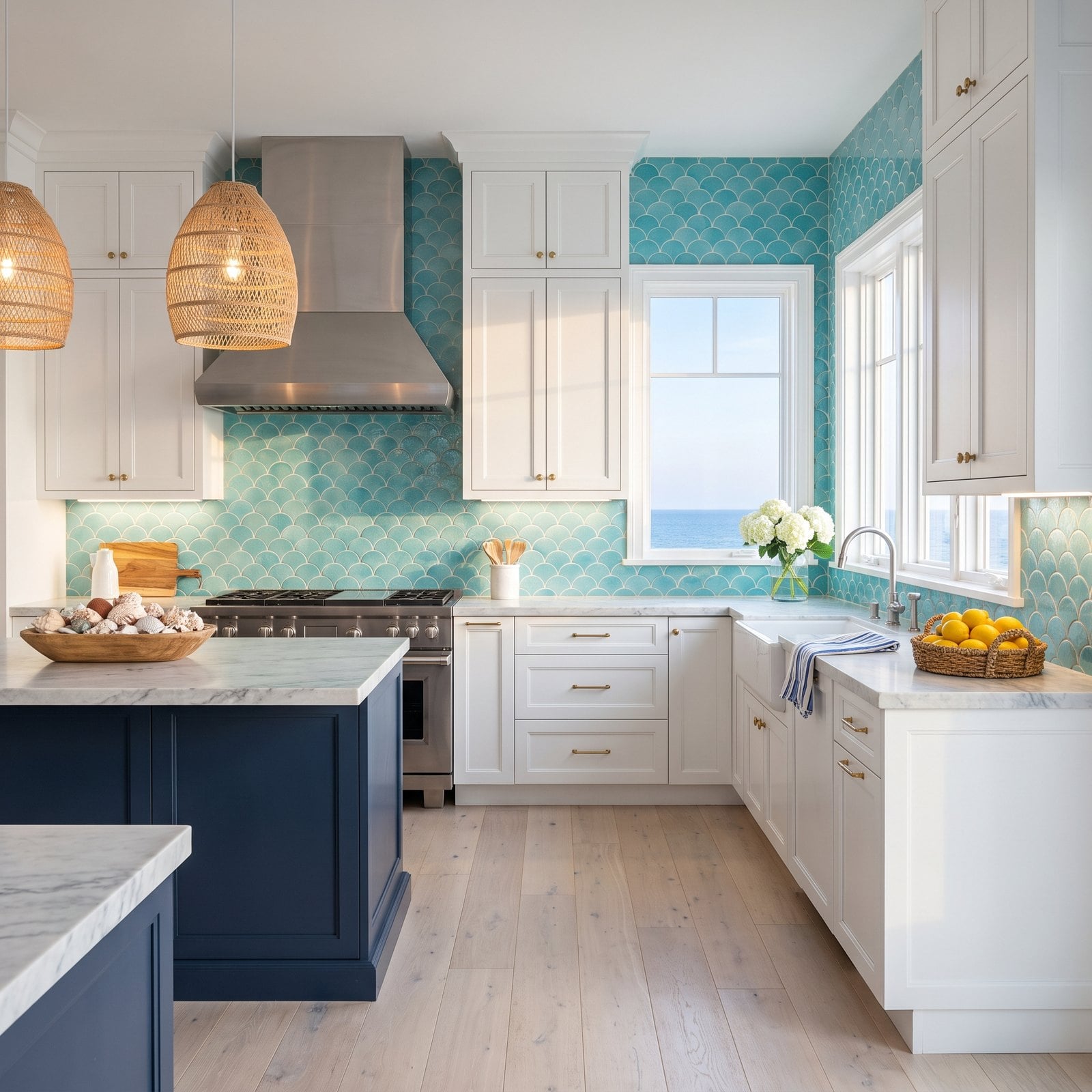
Fish-scale tile is pretty and suits a beach house, but here it’s on every wall surface in the kitchen, from the counters to the ceiling, around the window and onto the side walls.
Why It Doesn’t Work: a statement shape is best in a small dose. Covering every wall in a trendy tile makes the room feel themed rather than designed, and it will date fast as the trend passes.
10. Wallpaper Behind the Sink
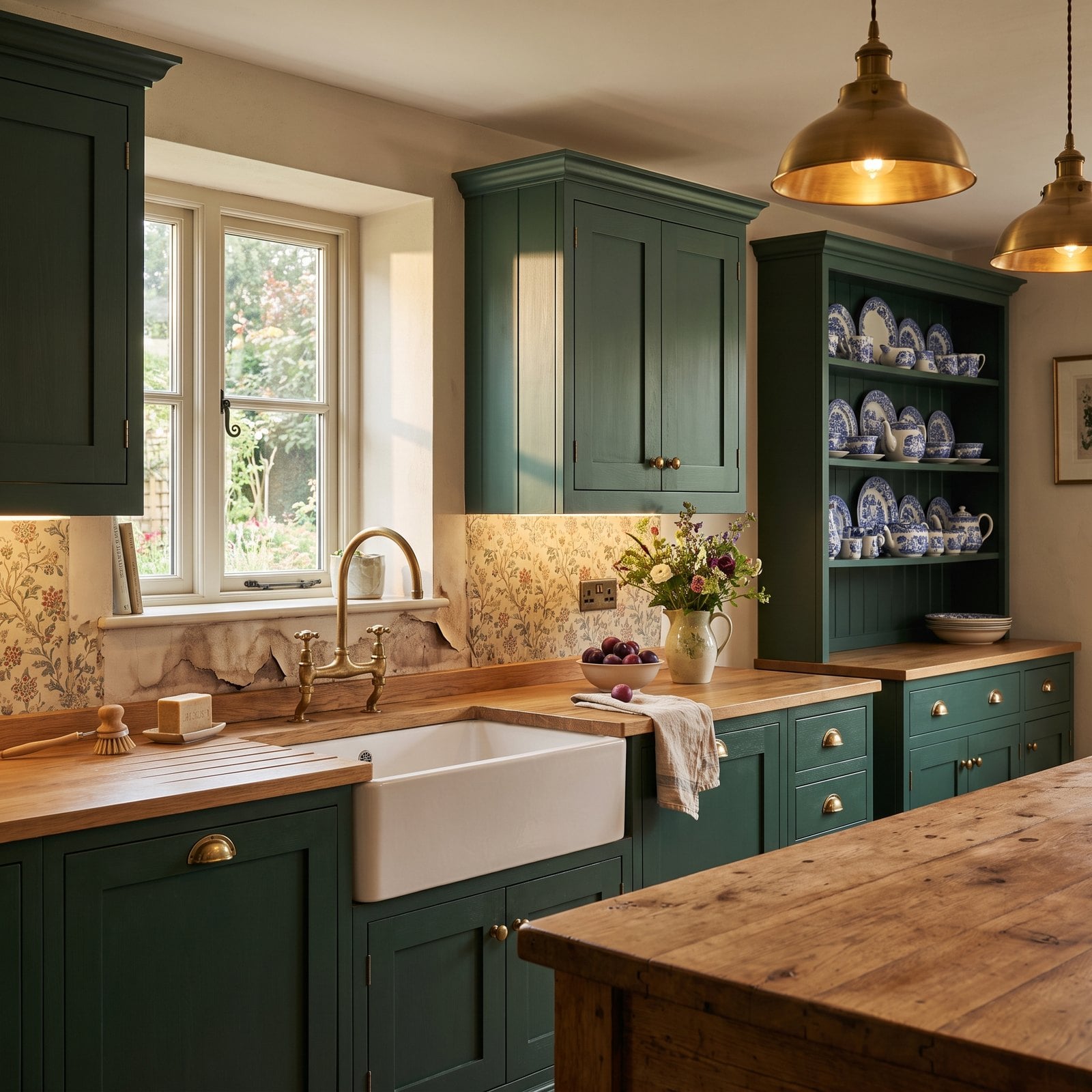
Floral wallpaper suits an English country kitchen, and above the dresser it looks perfect. Directly behind the sink, though, it’s already showing water marks and a seam that’s starting to lift.
Why It Doesn’t Work: the wall behind a sink takes splashes every day. Even ‘washable’ paper eventually lets water into the seams, and once it lifts, the stain spreads.
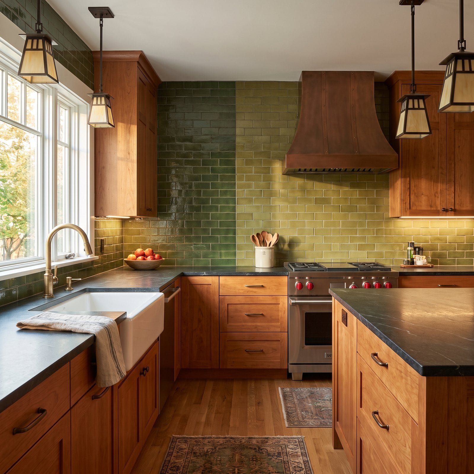
9. Two Dye Lots Meeting Halfway Across the Wall
🔥 Would you like to save this?
The cherry and soapstone are classic craftsman, and the handmade green tile is exactly right, until the halfway point, where it switches to a noticeably lighter and yellower green.
Why It Doesn’t Work: handmade tile varies from batch to batch (each one is called a dye lot), and if a second order arrives from a different batch, it can be noticeably different. A visible line between two greens looks like a repair, not a design.
8. A Tile That Fights the Countertop
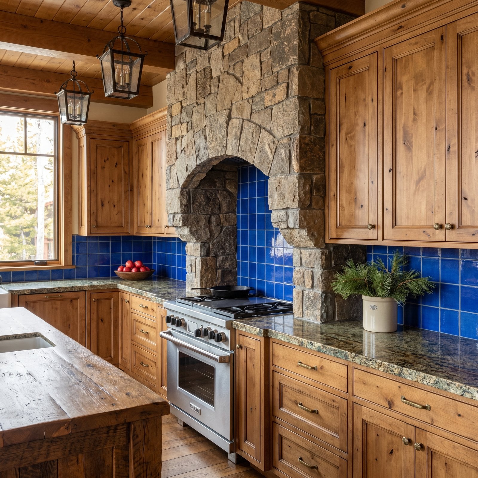
Knotty alder and timber ceilings make a cozy lodge kitchen, and the speckled green granite fits that mood. The cobalt-blue tile on top of it does not.
Why It Doesn’t Work: the counter and backsplash meet along a single line at eye level, so they’re always seen together. A saturated blue against speckled green and brown granite looks like two separate choices that never met.
7. A Slab Backsplash With a Thick Exposed Edge
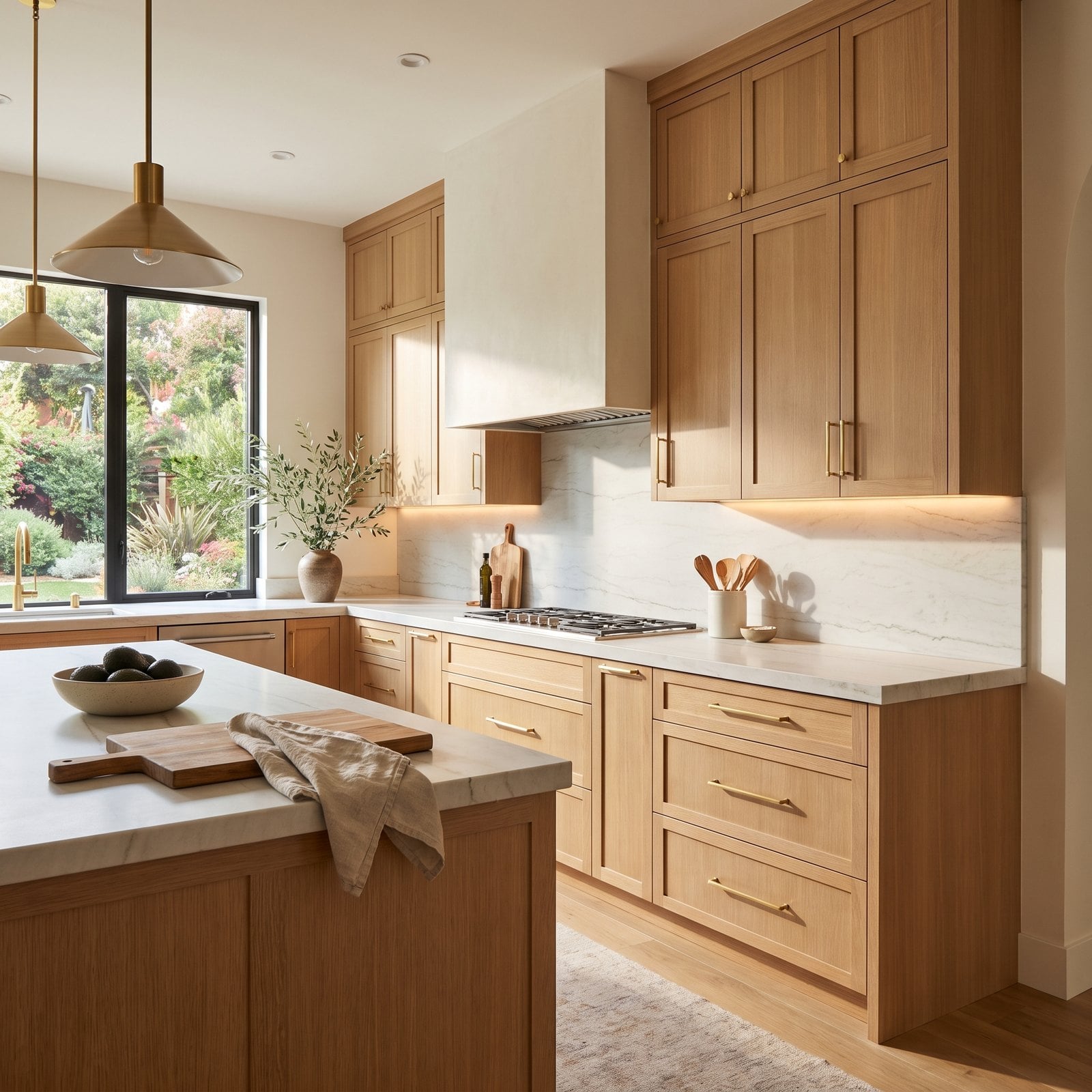
A slab backsplash in honed quartzite is pure California modern, but here the slab stops at the end of the counter and its thick raw edge sticks out from the plaster wall like a shelf.
Why It Doesn’t Work: a slab is about three-quarters of an inch thick, and if it ends in the open, that edge is very visible. It makes a luxurious material look like a panel stuck on the wall.
6. The Mosaic Medallion Behind the Range
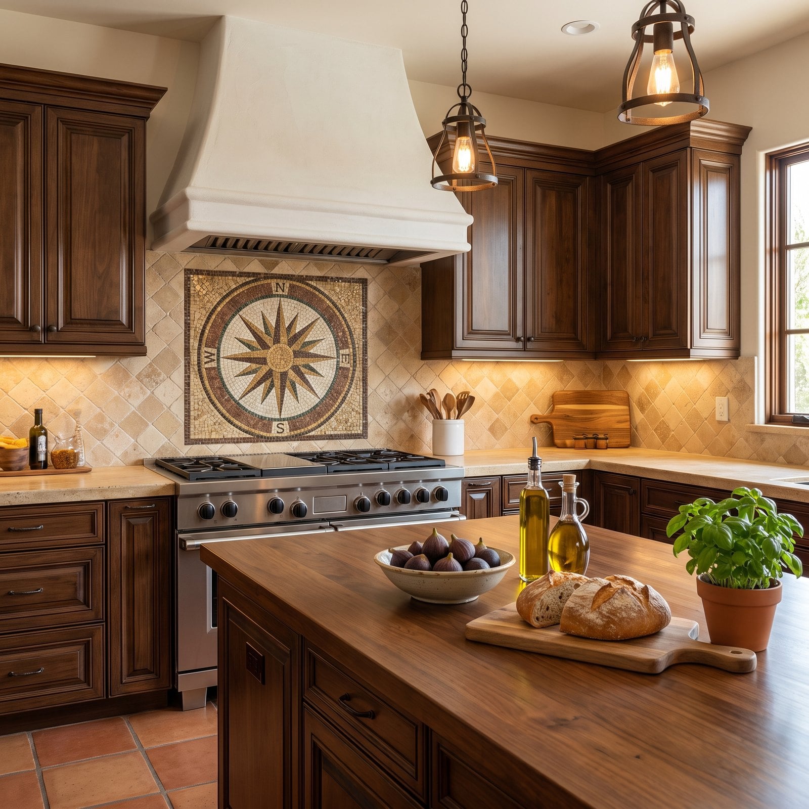
The walnut, travertine and plaster hood are the right ingredients for a Mediterranean kitchen. The large mosaic medallion behind the range, a compass rose in browns, golds and greens set into diagonal travertine, is not.
Why It Doesn’t Work: medallions were the signature move of 2000s ‘old world’ kitchens, and now they look of their time. The busy diagonal setting around it makes the most important wall in the room the most cluttered.
5. A Backsplash That Fights the Window
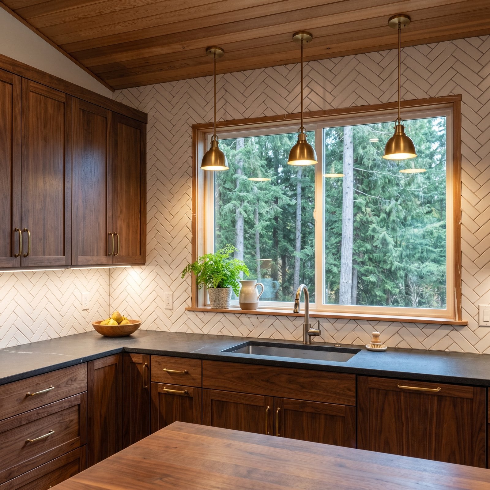
The picture window onto the firs is the best thing in this kitchen, and the herringbone wrapped around it does its best to pull attention away, leaving a row of tiny, awkward slivers along every edge.
Why It Doesn’t Work: complex patterns produce lots of small cuts where they meet a window or cabinet, and slivers look messy and crack easily. Around a feature window, they frame the view in clutter.
4. A Spice Niche Cut Right Behind the Burners
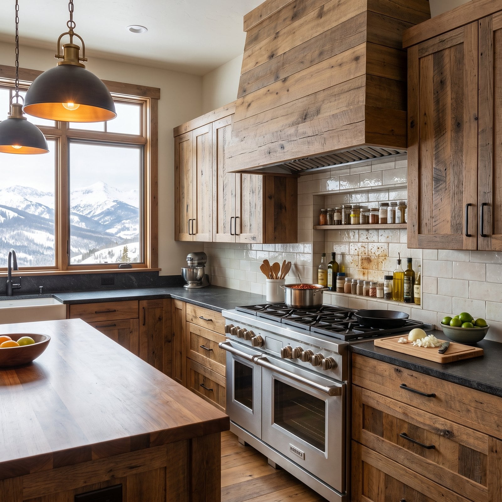
A spice niche behind the range sounds like a smart idea: everything you need within reach while you cook. In this ski lodge kitchen it sits right behind the burners, and the jars are already greasy.
Why It Doesn’t Work: heat and light are the enemies of spices, and the area behind a cooktop is the hottest, greasiest spot in the kitchen. Oils go rancid, spices lose flavour, and the niche becomes the hardest thing in the room to clean.
3. Tumbled Travertine in a Mid-Century Kitchen
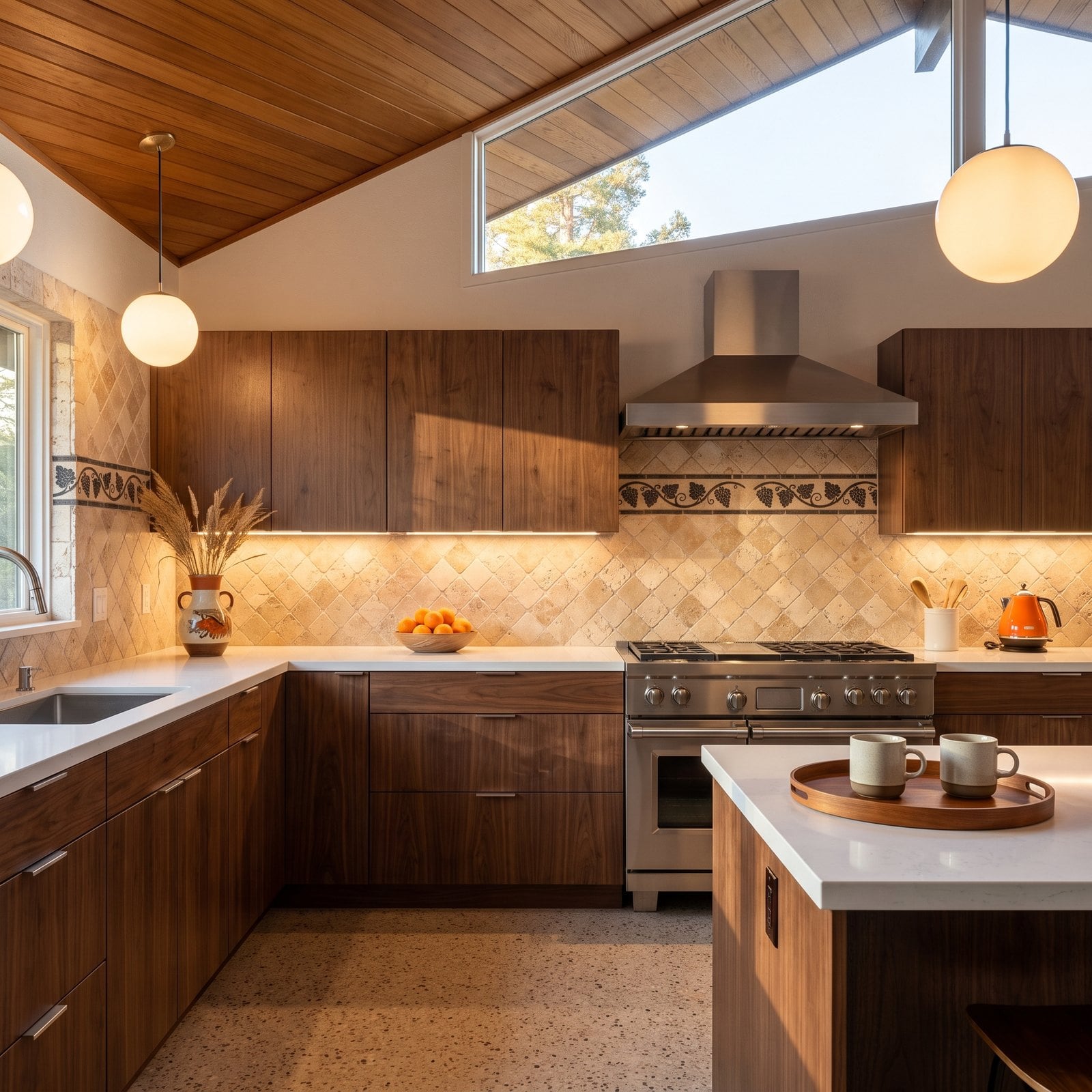
Long walnut cabinets, terrazzo and a teak ceiling: this is a beautiful mid-century kitchen with a rustic Tuscan backsplash of diagonal tumbled travertine and a scrolled vine border.
Why It Doesn’t Work: the backsplash belongs to a different house. Mid-century design is about crisp lines and graphic simplicity, and soft-edged tumbled stone with an ornamental border fights every horizontal line in the room.
2. Subway Tile Set With Wide, Uneven Grout Joints
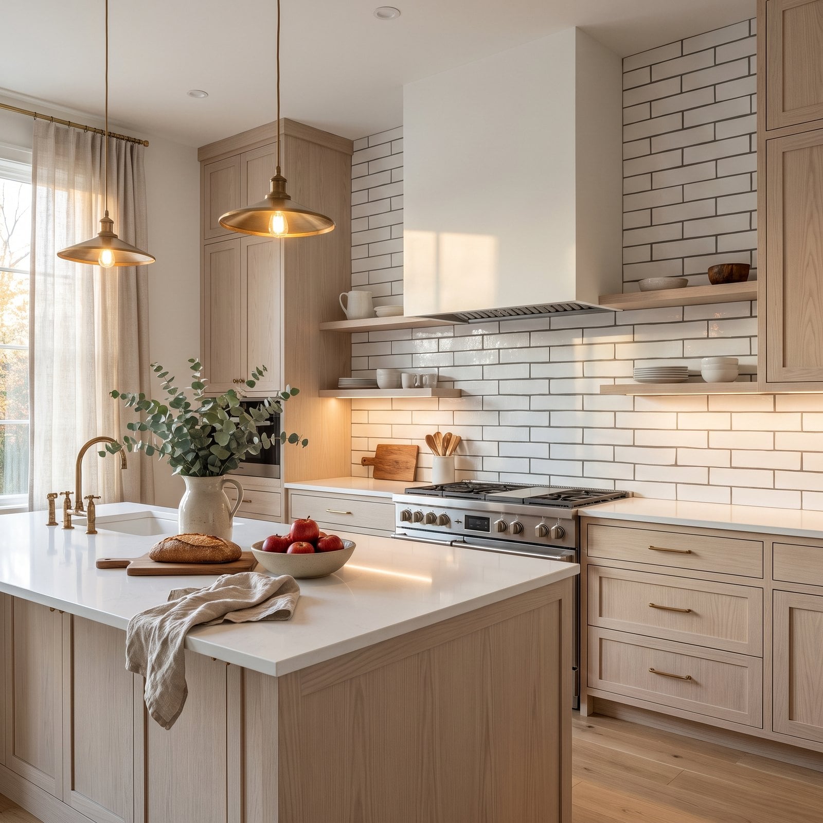
A pale ash Scandinavian kitchen is about simplicity, so the plain white subway tile is a good choice. But it’s set with wide joints in a dark grey grout, and the grid shouts louder than the tile.
Why It Doesn’t Work: in a minimal kitchen the installation is the design. Wide, dark grout lines make a simple tile look homemade, and the grey grid draws more attention than the tile itself.
1. Four Backsplash Materials on One Wall
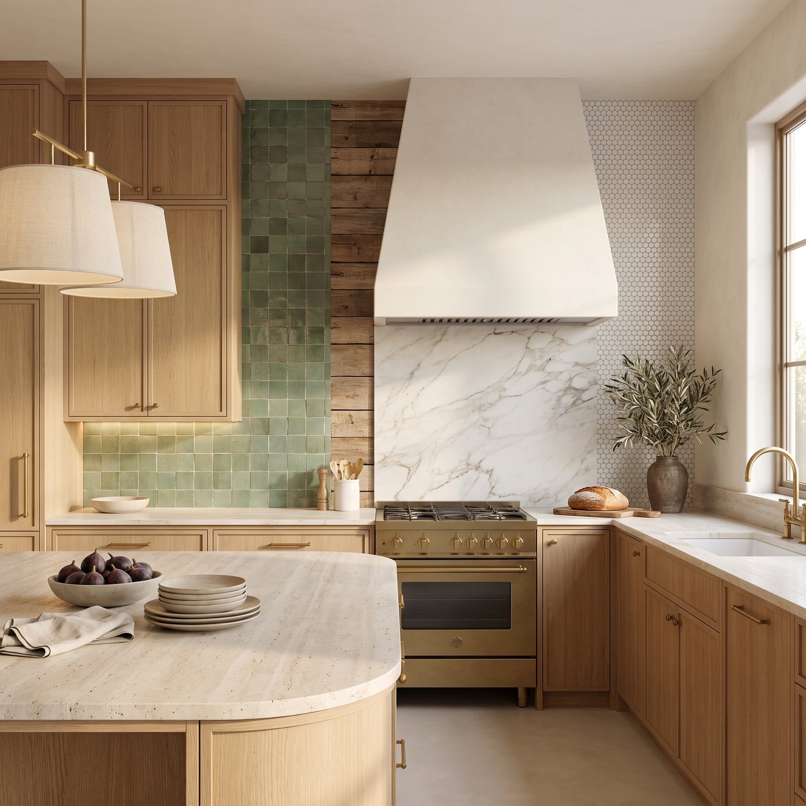
The number one backsplash disaster is the most tempting one: falling in love with too many materials. Here a single wall has green zellige, a strip of reclaimed wood, a marble slab behind the range and a panel of hexagon tile, each one beautiful on its own.
Why It Doesn’t Work: every change of material is a seam, a decision and a place for the eye to stop. Four on one wall makes a modern organic kitchen, a style built on calm, feel chopped up and chaotic.