
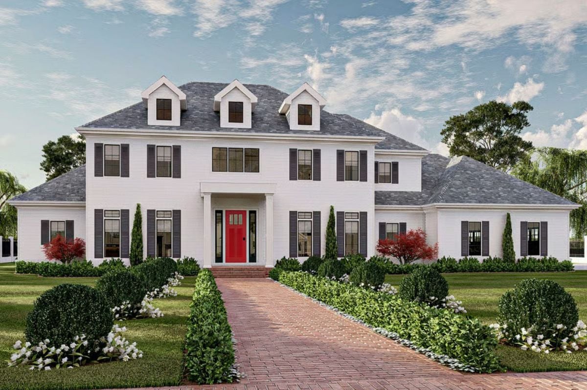
Families who always end up hosting holidays don’t volunteer for it — they just have the house everyone shows up to. Ashworth Hall is built for that reality: the dining table that needs two leaves by November, the kitchen with two ovens going at once, the cousins spilling into the garage between courses, and a main-floor primary suite so the people running the whole operation can actually get some sleep.
Specifications
- Sq. Ft.: 4,311
- Bedrooms: 3-5
- Bathrooms: 4.5
Floor Plan – Main Floor
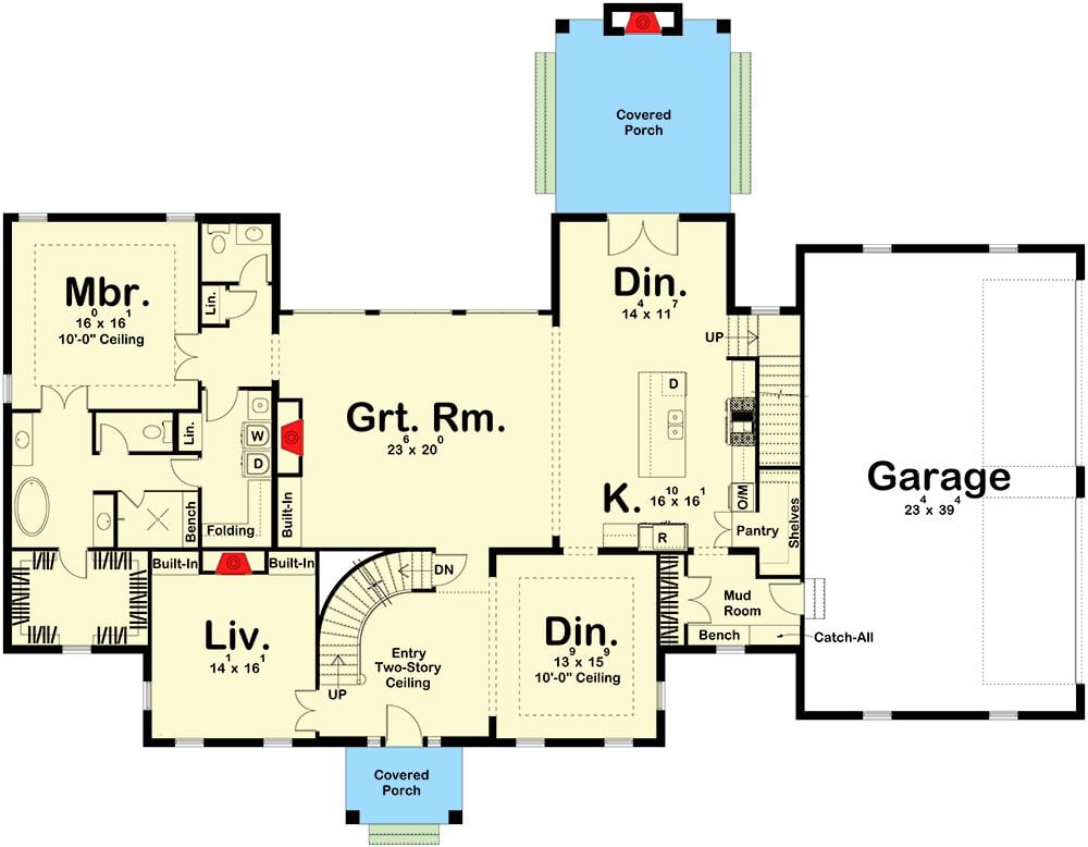
The first floor puts a central great room at the core, with the main-floor primary suite, a living room, and two dining areas branching off it. The kitchen connects directly to the mud room and pantry, with garage access on one end and two covered porches bookending the whole thing.
What Our Readers Say
- Home Stratosphere readers who picked brass door hardware were more likely to choose a floor plan with separate rooms, 52% versus 33% of readers who picked another finish.
From Home Stratosphere reader polls and votes.
Floor Plan – Second Floor
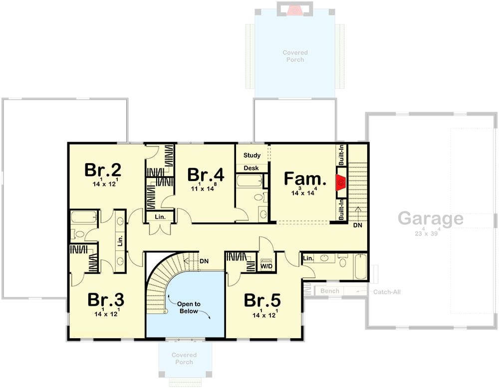
The upper level holds four bedrooms and a family room with built-ins flanking the fireplace. A study nook and W/D closet handle daily logistics without eating into usable square footage.
White Brick and Black Shutters Pull Off That Southern Curb Appeal Without Trying Too Hard
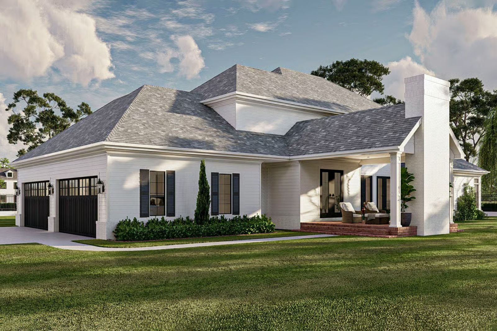
Painted white brick wraps the exterior while dark shutters and black garage doors keep things grounded. The covered side porch with brick steps and wicker seating reads as genuinely usable outdoor space rather than decorative filler. That chimney stack rising clean above the roofline is a nice anchor — the kind of detail that reads as substance, not ornament.
Try This: Swap standard black shutters for board-and-batten ones in deep navy to add texture without changing the color palette. It’s a small shift that reads as intentional rather than builder-grade. Look for exterior-rated wood or composite versions that won’t warp through humid Southern summers.
Curved Staircase, Crystal Chandelier, and a Foyer That Sets the Whole Tone
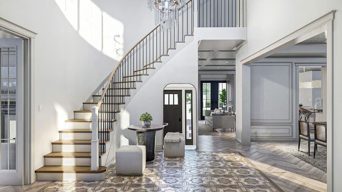
Warm oak treads and iron balusters on a sweeping curved staircase anchor the two-story foyer. The geometric tile inlay underfoot transitions into herringbone hardwood as you move toward the living spaces — a subtle shift that most people feel before they notice it. Two ottomans tucked under a pedestal table keep the entry functional without crowding it.
In The Details: That arched opening framing the front door does something subtle but effective: it gives the foyer a sense of enclosure that makes it feel like its own room rather than just a pass-through corridor. If you’re building or renovating, an arch costs relatively little compared to the character it adds to a tall entry like this one.
Tufted Leather, a Marble Fireplace, and Panel Molding That Earns Its Keep
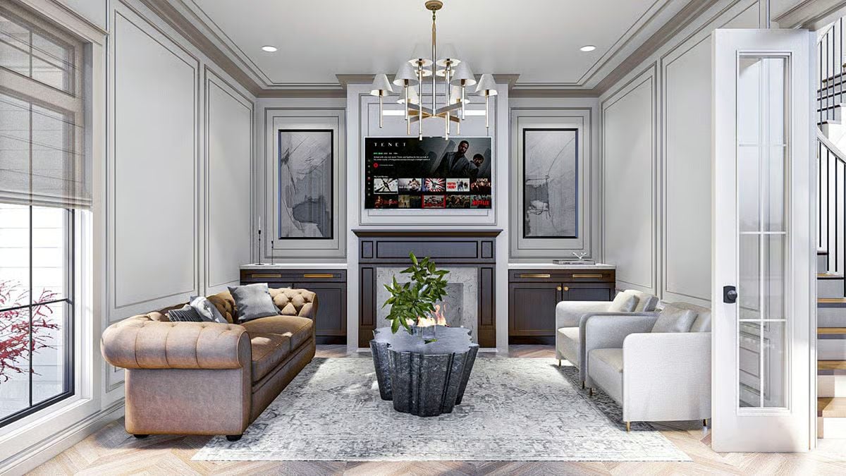
That Chesterfield sofa does a lot of heavy lifting against the lighter gray sectional across from it. The fireplace surround reads marble, and dark cabinetry flanking it grounds what could’ve been an overly pale room. Crown molding with shadow gaps runs the perimeter, giving the walls structure without competing with everything else going on. The sculptural coffee table pulls the eye down before the chandelier pulls it back up — good rooms do that kind of thing without announcing it.
Material Matters: Tufted leather benefits from a conditioner applied twice a year. Skip it and the creases that give a Chesterfield its character eventually become cracks. Ten minutes of maintenance, and you add years to the piece.
Cane-Back Chairs and Panel Molding Make This Dining Room Work Harder Than It Looks
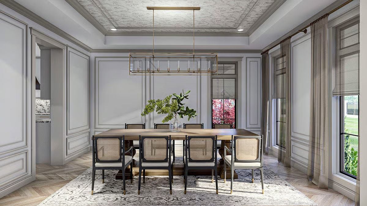
Rattan-panel chairs with black frames bridge traditional wall molding with something lighter and more relaxed — a combination that shouldn’t work as well as it does. The brass rectangular pendant reads almost industrial against the ornate ceiling medallion above it. That contrast is deliberate. A single plant in a glass vase keeps the table from feeling staged.
The Psychology Behind This: Dining rooms with symmetrical molding on all four walls create a contained, almost ceremonial feeling that makes guests naturally slow down and settle in. Rooms that signal “stay” tend to produce longer meals and better conversation — and that’s not an accident of design.
Cane Stools, Brass Drops, and a Range Hood That Steals the Room
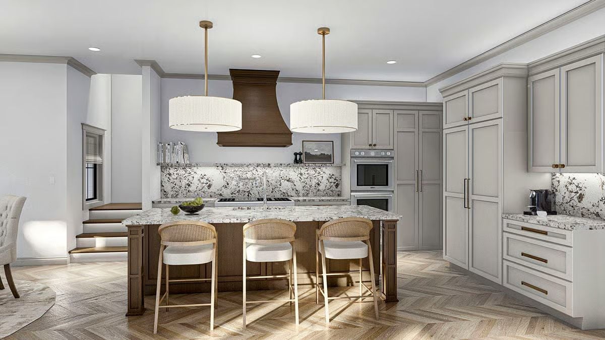
White granite with dark veining runs across both the island and backsplash, tying the two surfaces together without making them identical. The walnut range hood is the room’s real statement — substantial enough to anchor a kitchen this large. Three cane-back counter stools keep the island side from feeling too formal.
- Matching your island base wood tone to your range hood creates visual cohesion without custom cabinetry costs
- Drum pendants with fabric shades soften the acoustics in hard-surface kitchens
- Herringbone hardwood floors draw the eye toward the island rather than toward the perimeter walls
Move through that front door and the formal dining room opens up just off the entry.
Bubble Glass Chandelier and a Round Table That Makes Every Seat the Best Seat
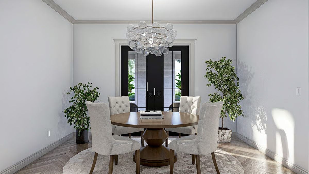
A pedestal table removes the head-of-table hierarchy entirely. Everyone’s equidistant, and that changes how conversation moves around a room — subtly but noticeably. The bubble-glass chandelier pulls focus without competing with the tufted linen chairs below it, and two potted trees in the corners stop all that white from making the space feel like it’s floating.
Coffered Ceiling, Gold Chandelier, and a Headboard Wall That Anchors the Whole Room
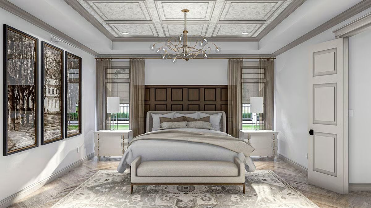
Dark wood panel headboard wall, soft gray bedding, brass branching chandelier overhead. Simple lineup, strong result.
Worth Knowing: Coffered ceilings trap sound differently than flat ones, which can make a bedroom feel quieter without any acoustic treatment at all. Deeper boxes pull more shadow and read as more formal than shallow ones — a detail that changes the character of a room more than most people anticipate before actually living with it.
Freestanding Tub, Panel Molding, and a Vanity That Doesn’t Match (On Purpose)
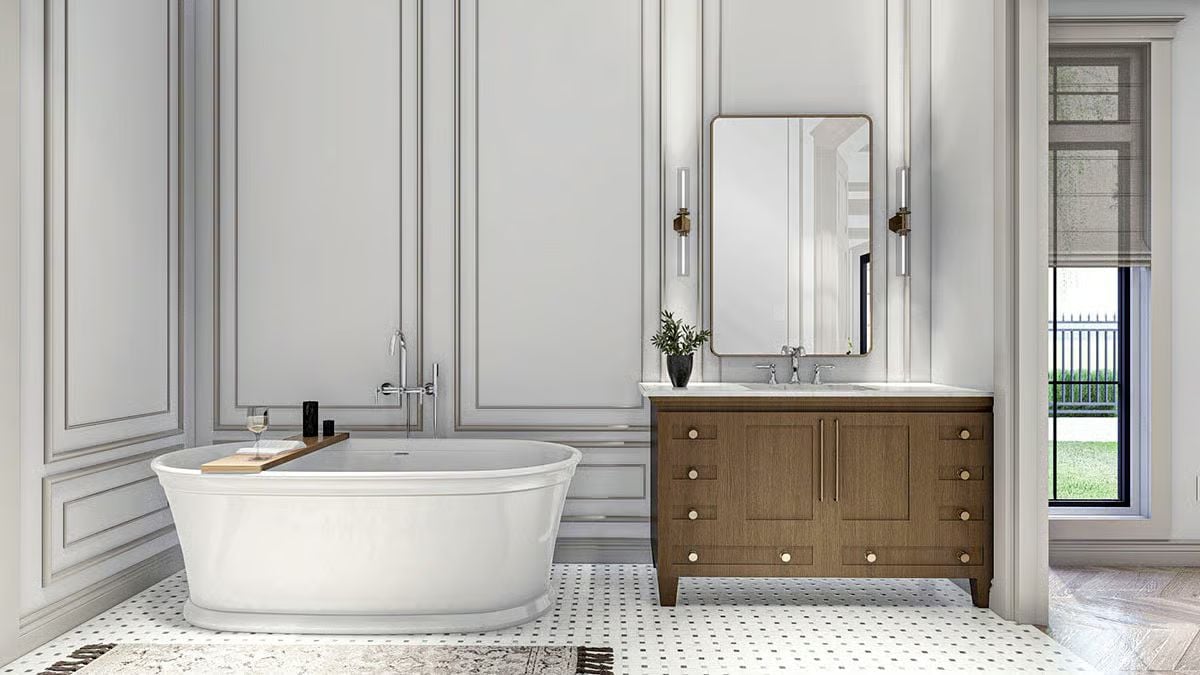
Warm oak vanity against bright white wainscoting — the contrast is what keeps the room from feeling like a hotel bathroom. Brass hardware ties the two finishes together without forcing them to match.
Common Mistake: Freestanding tubs look best when the floor filler or wall-mount faucet is positioned so the spout reaches over the drain without stretching. Get that placement wrong and the water hits the side of the tub instead of the center. It’s also louder than you’d expect — something you only discover after the tile is set.
When we asked our readers which bathroom faucet finish they would buy, brass came out on top at 44%, ahead of chrome at 33% and black at 19%.
Brick Patio, Outdoor Fireplace, and Wicker That Actually Holds Up to Real Use
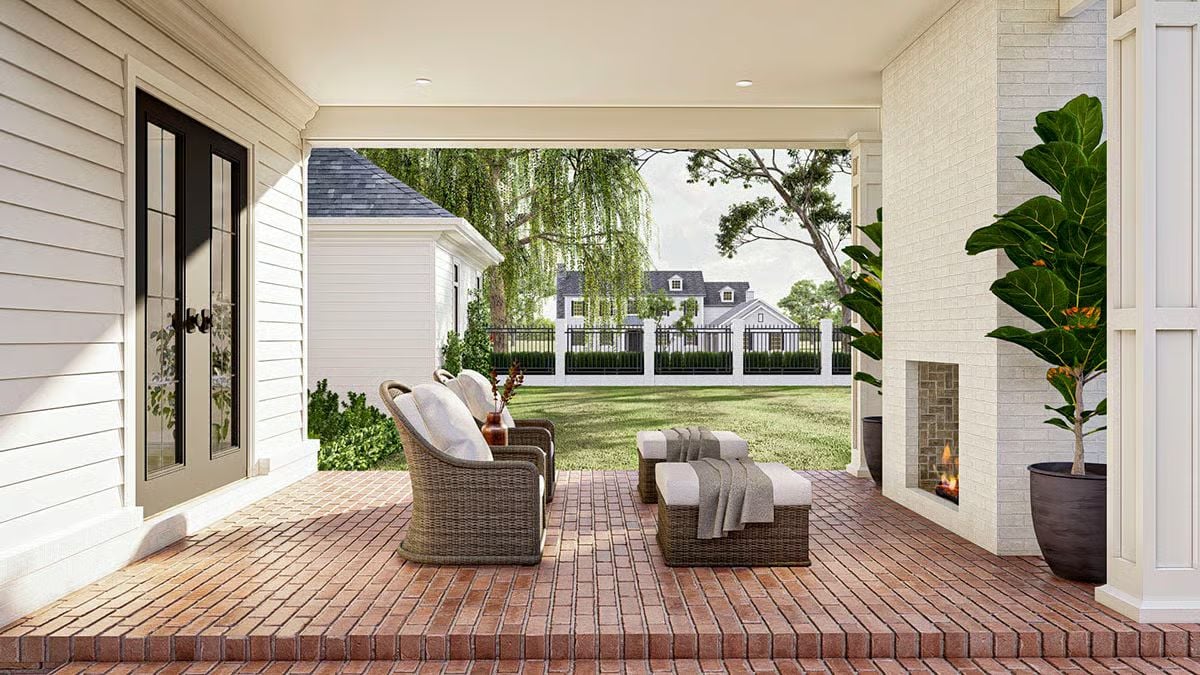
Herringbone brick underfoot, a built-in fireplace faced in painted brick, wicker seating with cushions substantial enough to stay put in a breeze. A covered porch that hosts a crowd without asking anything of you beforehand.
Pin It
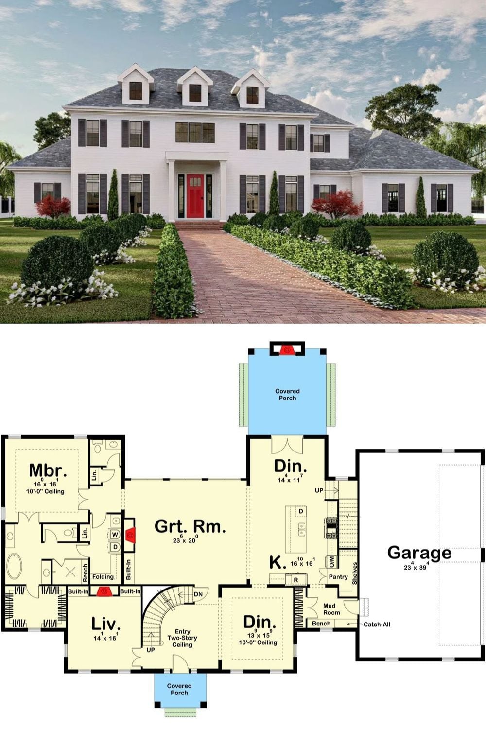
Exterior rendering shows the classic Southern facade above the first-floor plan, with the main-level primary suite visible at a glance.