
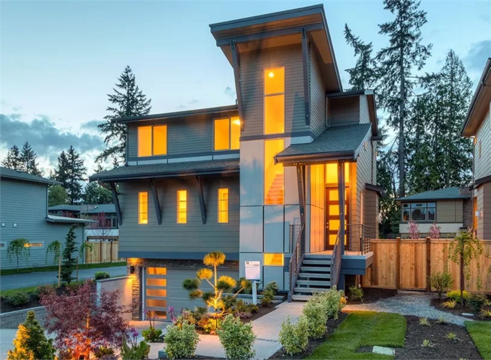
Teenagers don’t need a bedroom — they need a wing, and most floor plans refuse to admit it. The Archibald is built around exactly that: a rec room where the group chat becomes an actual gathering, an under-drive garage that swallows bikes and boards without touching the main entry, and enough vertical separation that dinner conversation stays downstairs while the homework chaos, the YouTube at full volume, and the midnight snacks stay put.
Specifications
- Sq. Ft.: 2,877
- Bedrooms: 4
- Bathrooms: 3.5
Floor Plan – Main Floor
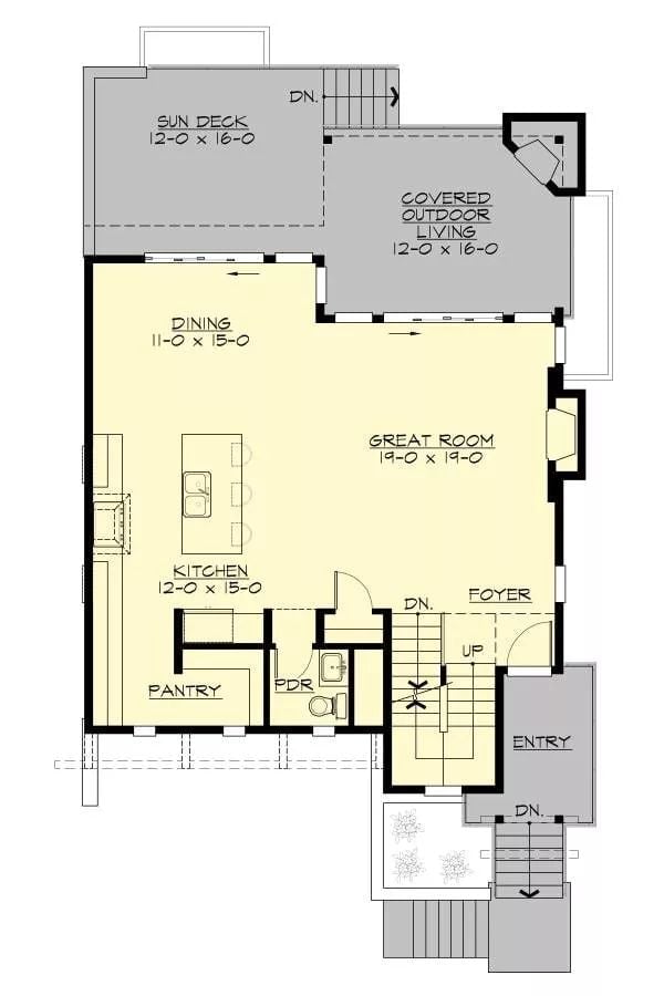
The main living level puts the great room front and center at 19×19 feet, open to a dining area and kitchen, with a pantry and powder room tucked neatly off the back of the kitchen. The foyer connects stairs going both up and down, and covered outdoor living plus a sun deck are accessible from the rear.
Floor Plan – Second Floor
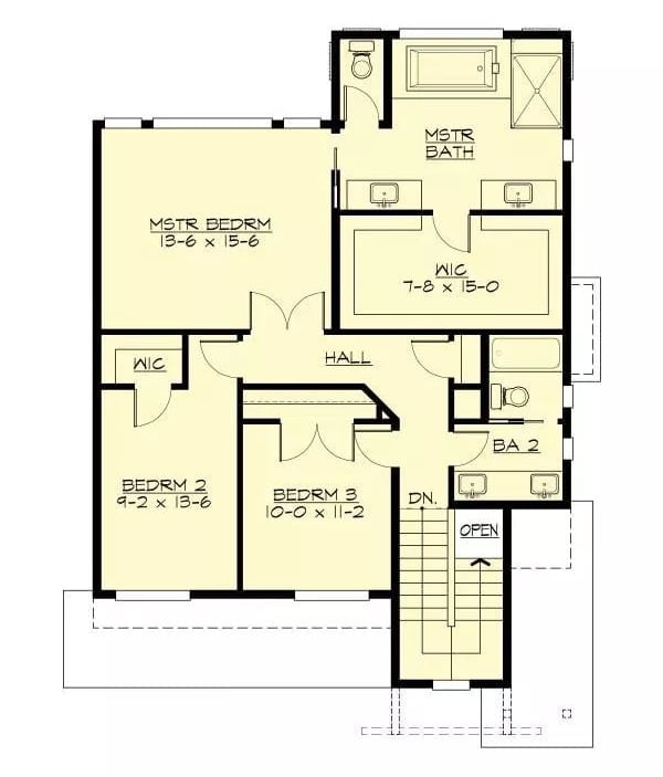
Three bedrooms share the upper level with a hall bath. The master suite claims its own corner with a walk-in closet sized at 7-8 by 15 feet, a private bath, and enough buffer from the other rooms to actually feel like a retreat. Bedroom 2 gets its own WIC as well, and because the stairs land centrally, through-traffic stays out of the sleeping areas entirely.
Floor Plan – Ground Floor
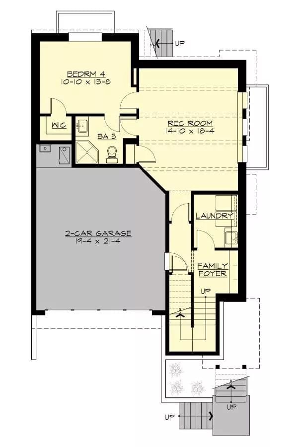
Ground level holds the 2-car garage, a 10×13 fourth bedroom with walk-in closet, and a full bath. The rec room stretches nearly 15×18 feet — real square footage, not an afterthought. Laundry and a family foyer sit near the stairwell, so teenagers coming and going have their own orbit down here without constantly brushing past the main living floors.
Built-In Bench and Open Shelving Keep the Entry Hall Actually Functional
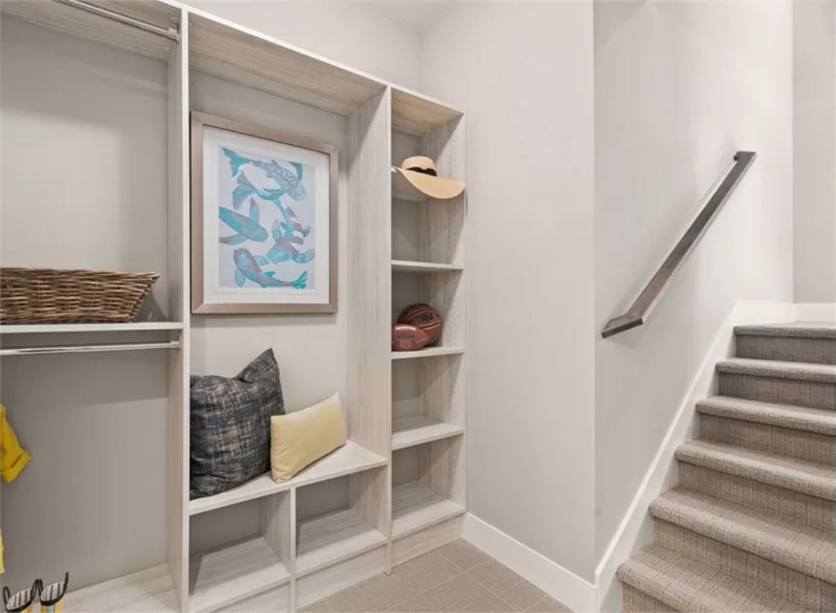
Light wood built-ins combine hanging rods, open cubbies, and a bench seat with pillows. A football and sun hat signal that this space is already doing its job.
Did You Know: Mudroom-style built-ins near a staircase landing are a hallmark of family-focused floor plans, giving kids a dedicated drop zone before they head upstairs. Open cubbies outperform closed cabinets here because nothing gets forgotten behind a door — and builders typically position this storage wall right beside the garage entry so the path from car to coat hook is as short as possible.
Stacked Stone Fireplace Wall Earns Every Inch of Attention It Gets
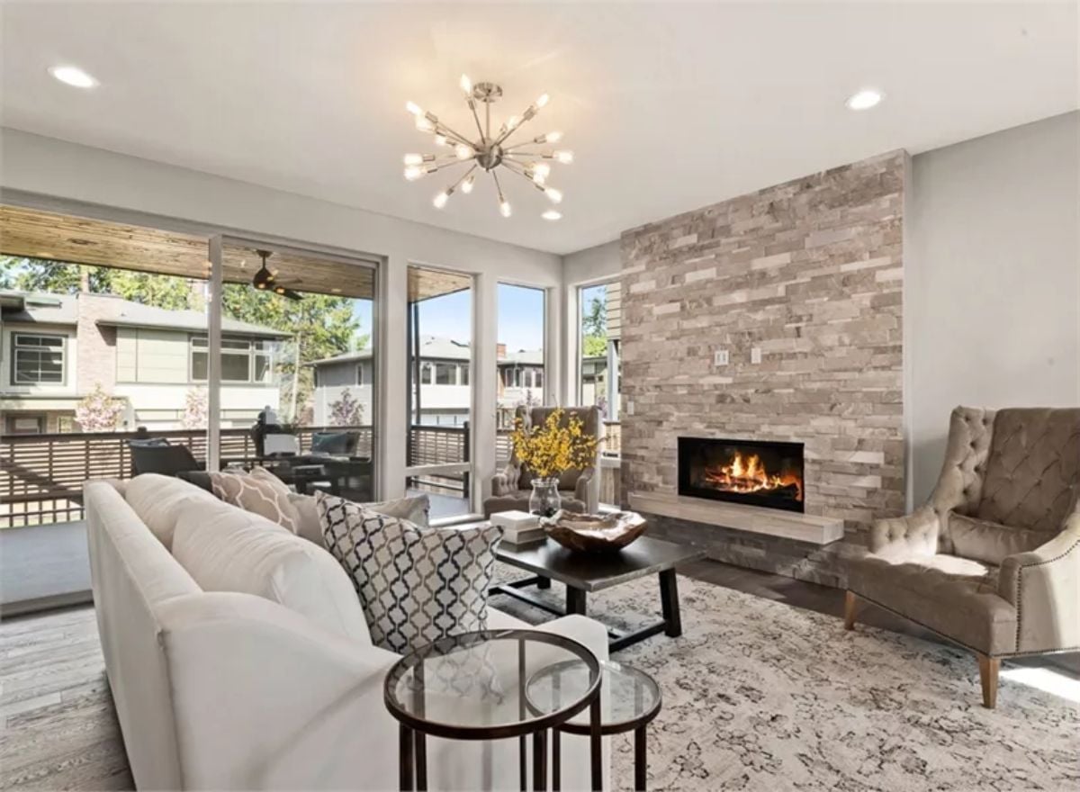
Floor-to-ceiling ledger stone wraps the fireplace surround and keeps climbing, so the linear firebox reads as anchored rather than floating. A sputnik chandelier pulls the eye back toward center. The tufted wingback chair, white sectional, and that yellow forsythia vase handle the rest without overreaching.
History Corner: Stacked stone veneers caught on in American residential design during the mid-20th century as a way to bring the visual weight of natural stone into homes without the structural demands of full masonry. Early versions relied on hand-split fieldstone. Manufactured ledger panels eventually put the look within reach of tract housing, and today’s versions often use real stone cut thin enough to mount directly over drywall.
Wavy LED Pendant Over a Live-Edge Table Is a Combination That Actually Works
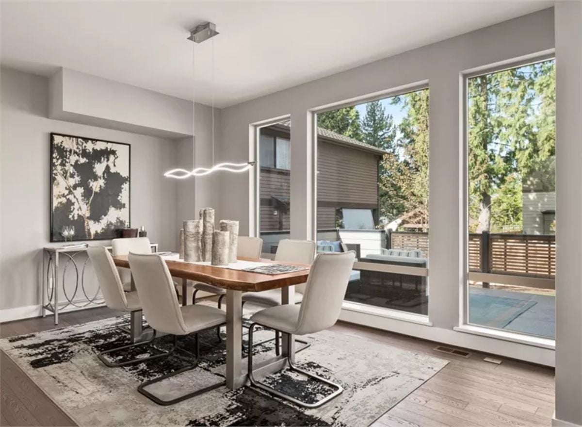
Cantilever chairs in cream leather pair with a wood dining table that keeps its raw edge intact, and the abstract rug anchors the space without competing with either. Large windows pull the evergreens right into the room — no art required.
Why the Live-Edge Table Works Here
Live-edge slabs retain the natural silhouette of the original timber, which gives them a visual weight that polished furniture simply can’t replicate. Pair one with sleek chrome-base chairs and the contrast reads as deliberate rather than accidental — it doesn’t happen by luck, it happens because one element is rough and the other isn’t. The format is popular in Pacific Northwest interiors, where bringing raw wood indoors reflects what’s just outside the glass.
Warm Wood Cabinets and a Waterfall Island That Pulls the Whole Kitchen Together
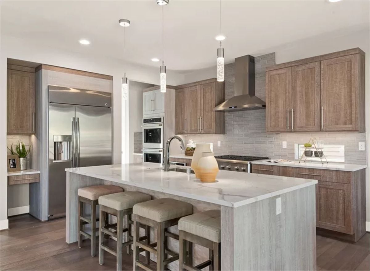
Quartzite countertops wrap over the island edge in a full waterfall drop, grounding the space without competing with the wood-grain cabinetry above. Four upholstered stools tuck in neatly, and the range hood’s brushed steel finish ties back to the fridge hardware so the whole run of appliances feels considered rather than assembled piecemeal.
Quartzite countertops wrap over the island edge in a full waterfall drop, grounding the space without competing with the wood-grain cabinetry above.
Tufted Headboard and White Bedding That Actually Let the Room Breathe
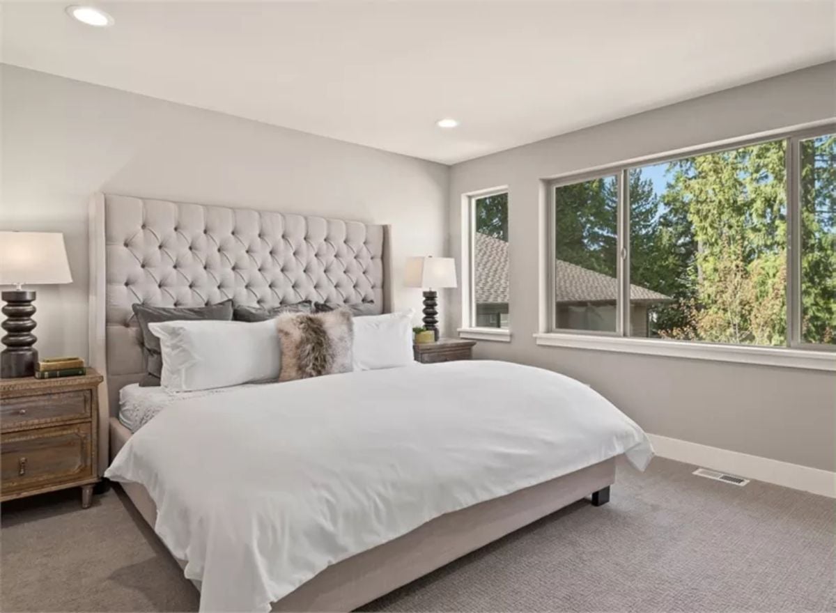
Gray carpet, soft walls, and a towering button-tufted headboard keep the palette cohesive without tipping into sterile. The faux fur pillow drops in some texture where everything else stays smooth, and the window views hit treetops and a neighboring roofline rather than a blank sky — which matters more than people admit.
Worth Knowing: Button-tufted upholstered headboards became a mainstream bedroom staple in the 2010s and have stuck around because they solve a genuine comfort problem: they’re soft enough to lean against while reading in bed. Pair one with all-white bedding and the headboard does the decorating on its own, without anything else in the room needing to compete.
Frameless Glass Shower and Wood-Look Tile That Don’t Try Too Hard
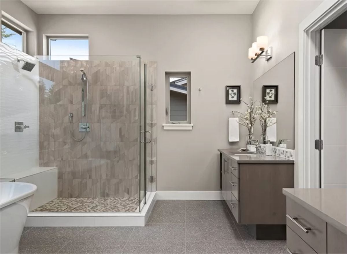
Textured wood-look tile wraps the shower walls with enough variation to hold interest without getting busy. The pebble floor inside the enclosure is a smart material shift — different enough to register, quiet enough not to shout. Dark vanity cabinetry grounds the whole neutral palette from below.
- Frameless glass doors make a smaller bathroom read larger without any renovation required
- Pebble tile shower floors provide natural slip resistance compared to polished stone
- Handheld shower heads mounted on a slide bar accommodate users of different heights
Navy Wingbacks and a White Sofa Pull Off a Pairing That Earns Its Keep
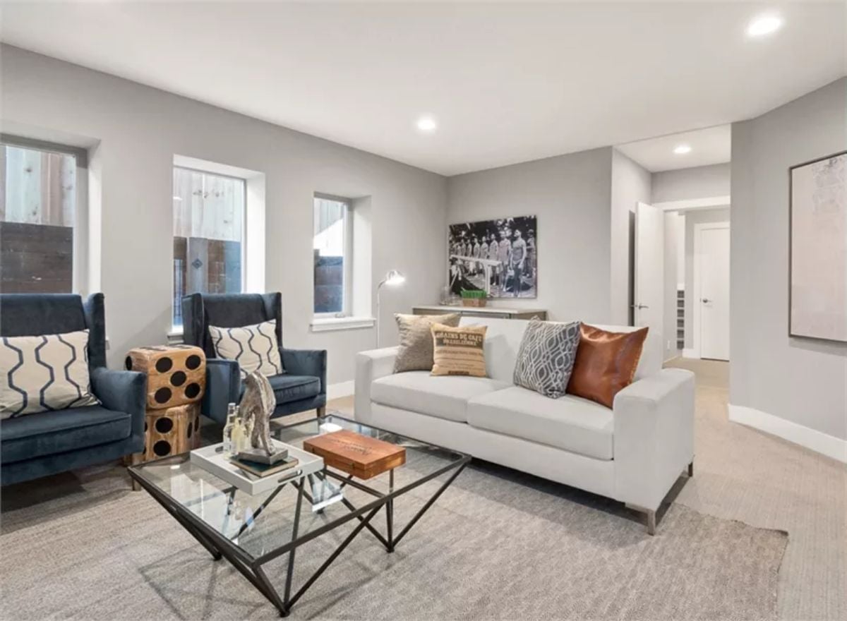
Two navy wingback chairs face a white sofa across a glass-and-metal coffee table, and the contrast holds without feeling forced. The wooden dice stool is the kind of unexpected piece that keeps a room from looking too composed — one object that didn’t come from the same mood board as everything else. Warm rust pillows anchor the sofa without overworking the palette.
Editor’s Note: Rec rooms designed for teenagers tend to work best when seating is arranged around conversation rather than a single screen. Bold accent chairs opposite a neutral sofa give multiple people places to settle without the room feeling crowded, and that small layout decision pays off every time the space actually gets used.
Pin It
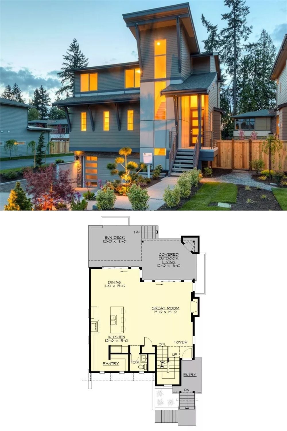
The exterior photo shows a modern Pacific Northwest home with dramatic vertical windows and warm interior lighting glowing through large glazing at dusk. Below it, the main-level floor plan lays out the 19×19 great room anchored by a kitchen, dining area, pantry, foyer, and covered outdoor living space with a sun deck alongside.
Designer’s Secret: A great room running nearly 20 feet in both directions lives or dies by furniture placement. Anchor one end with a distinct dining configuration, keep a clear sightline to the covered outdoor space, and the room stops feeling like one undifferentiated blob. Zoning with rugs rather than walls holds the layout open while still letting each area read as its own.
