
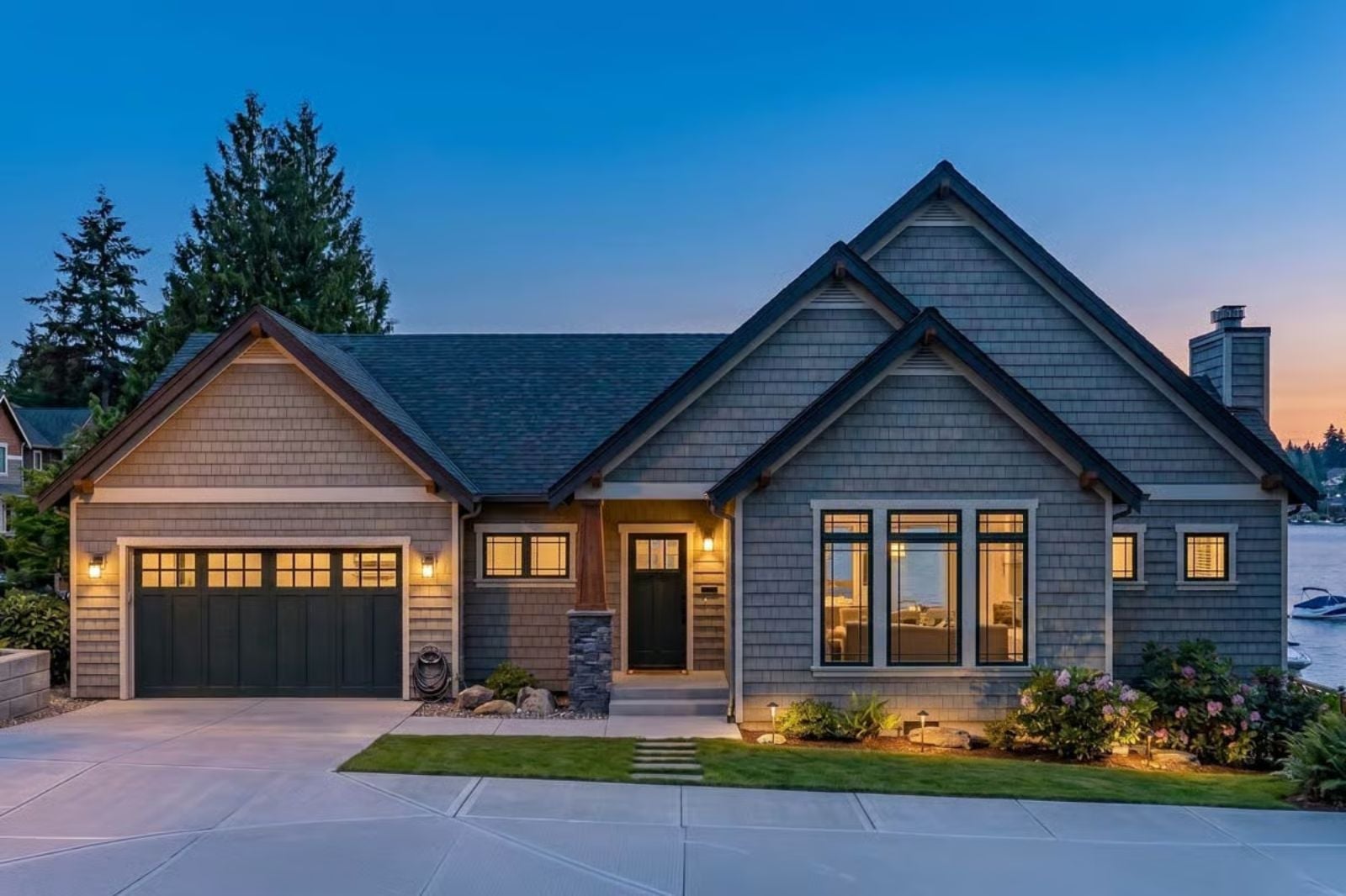
Families who live for the lake do not actually live for the lake — they live for the part where everyone is still there at nine o’clock, someone is refilling drinks, and nobody has anywhere to be tomorrow. The Alcyone is built around exactly that: a covered deck wide enough for the whole crew to collapse onto after the boat comes in, an open main level that keeps the cook in the conversation, and a walkout lower level that gives the kids their own world without losing them entirely.
Specifications
- Sq. Ft.: 1,803
- Bedrooms: 2-4
- Bathrooms: 2-4
Floor Plan – Main Floor
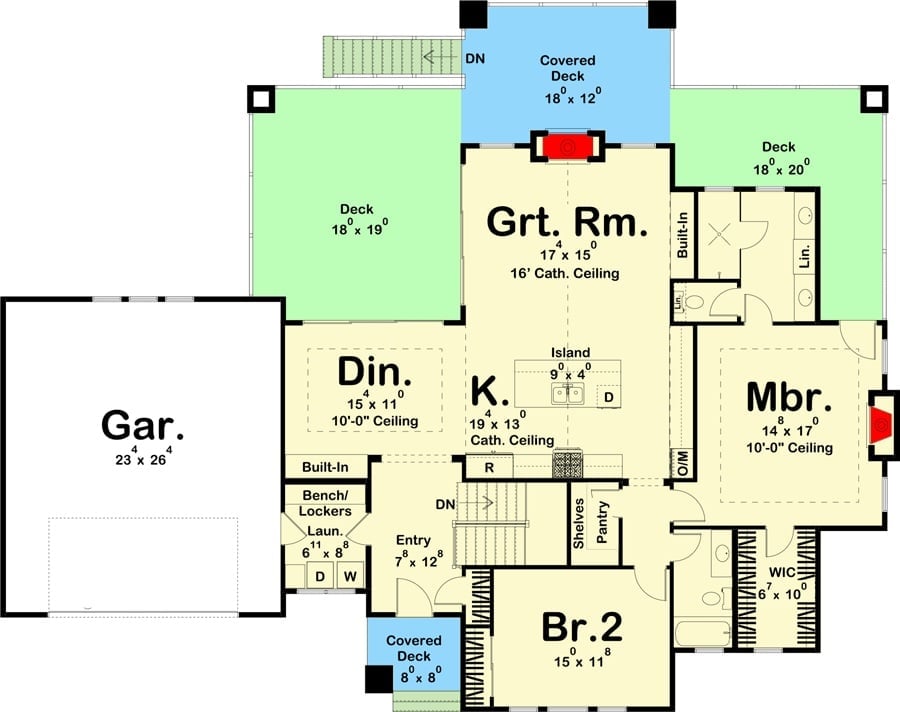
The main level puts a great room with a 16-foot cathedral ceiling at the center, open kitchen with island alongside it, master suite and second bedroom on either end, and three decks wrapping the exterior — plus garage and laundry tucked where they belong.
Floor Plan – Basement
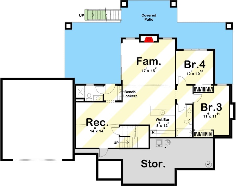
Down on the walkout level, two bedrooms share a full bath on the right side while the family room opens toward a covered patio. A wet bar sits near the rec room, bench lockers mark the entry point, and storage plus a garage occupy the lower portion — everything a second generation of house guests could need without ever coming upstairs.
Stone Pillars, Layered Decks, and a Backyard Built for Every Season
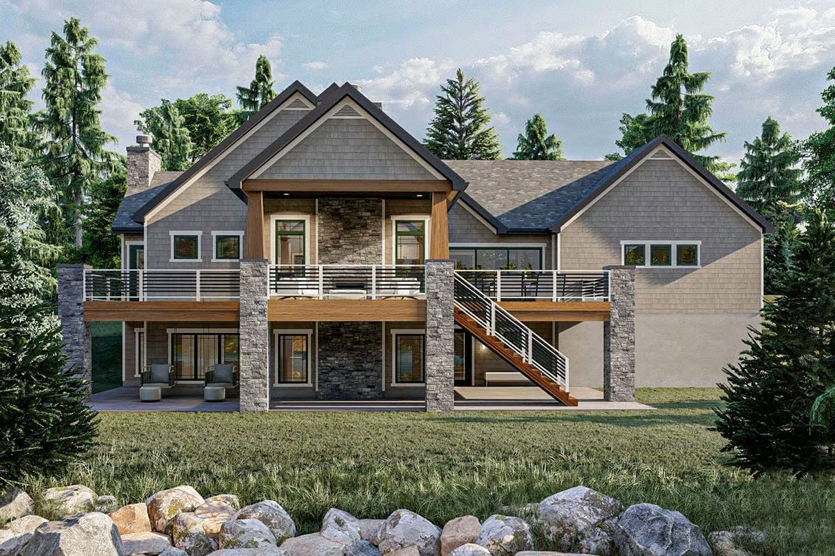
Stacked decks on a walkout lower level change how a family actually uses a house.
You get two distinct outdoor zones instead of one — upper deck for the adults nursing coffee, lower patio for whoever dragged the cornhole boards out. Stone pillars anchor the upper level while wood-toned railings and shingle siding give the rear elevation real warmth without fussiness.
Floor-to-Ceiling Stone and a Fireplace That Earns the Room
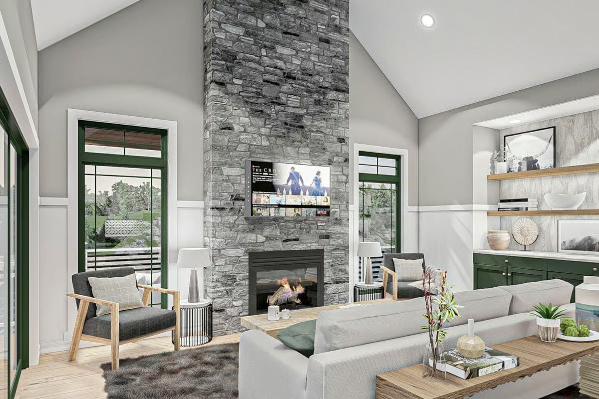
Gray stacked stone climbs the full height of the vaulted ceiling, anchoring a TV mount above the fireplace that was clearly planned from the start rather than bolted on later. Mid-century wood-frame chairs and a shaggy charcoal rug pull the seating area back toward warmth. Green cabinetry grounds the far wall and keeps the palette from going cold.
Style Math: Gray plus forest green is doing real work here — the cool stone walls stay lively because the cabinetry pulls a color straight from the tree line outside. Natural wood tones on the chair frames and shelving sit between rustic and modern without committing hard to either, which is harder to pull off than it looks.
Forest Green Lower Cabinets and a Wood Island That Anchors the Whole Kitchen
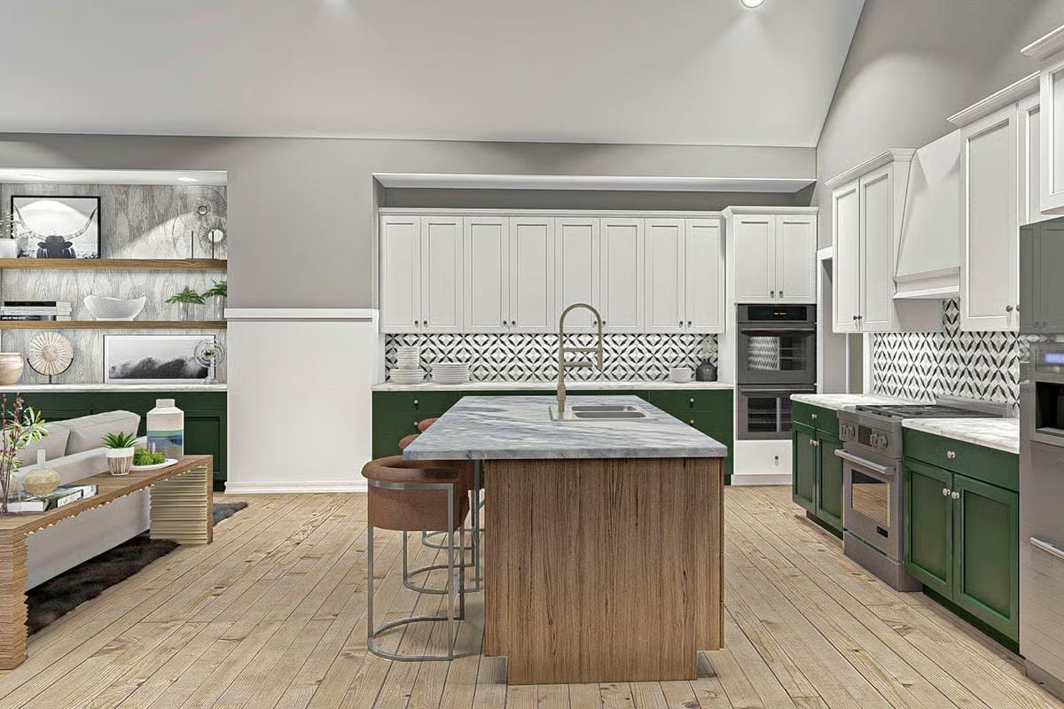
A marble-look island countertop, gooseneck faucet, and forest green lower cabinets give this open kitchen a grounded, collected feel — the kind of kitchen that looks like someone made actual choices rather than just picking everything from the same neutral palette.
Why the Two-Tone Cabinet Split Works Here
Keeping the upper cabinets white draws the eye toward the vaulted ceiling without competing with the bold color below. The green lowers read almost like furniture rather than built-ins, which softens the formality of the space in a way that matters when your kitchen sits right alongside the living area with no wall to hide behind. Open-plan layouts punish kitchens that feel too commercial. This one doesn’t.
Botanical Prints, a Ring Chandelier, and Dining Chairs Worth Keeping Forever
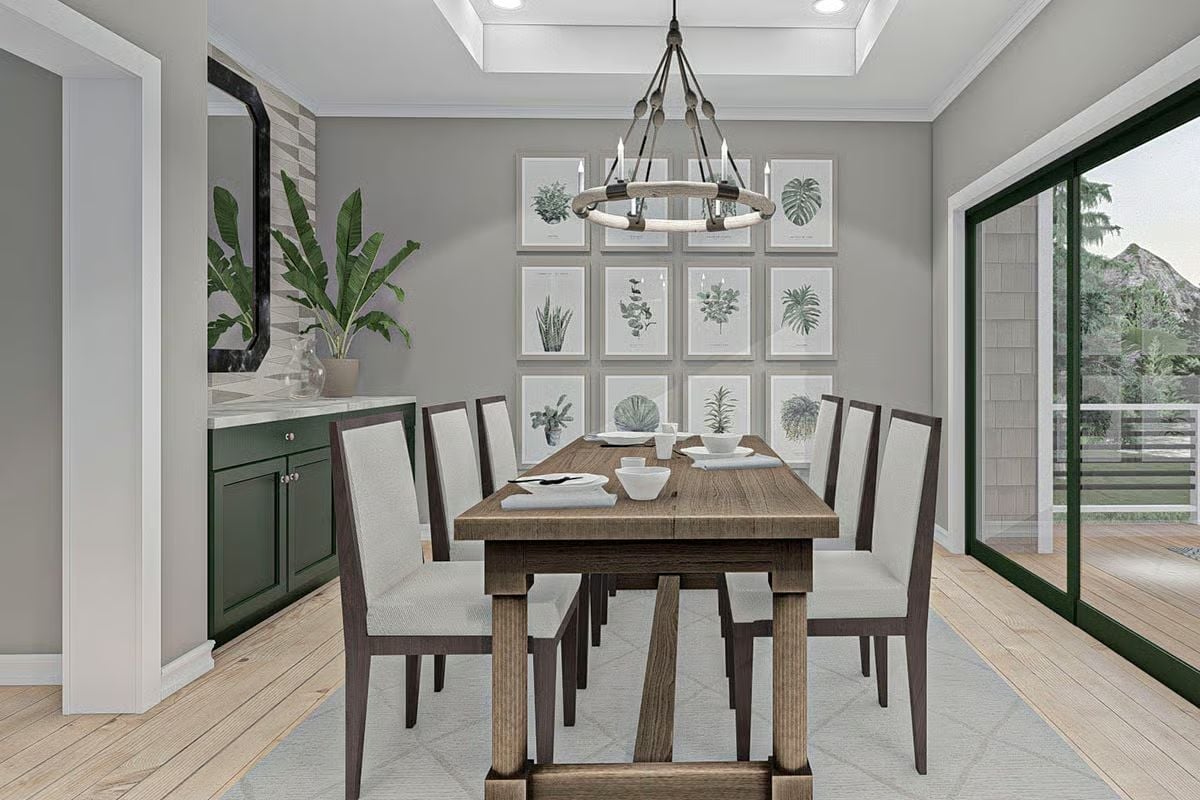
Nine framed botanical prints in a tight grid give the room a focal point that holds attention without shouting. Above the table, a rope-wrapped ring chandelier keeps the mood casual — appropriate for a lake house where someone will inevitably show up still in a swimsuit. White upholstered chairs paired with a weathered wood trestle table round it out without overthinking it.
History Corner: Botanical illustration as wall art traces back to the 1500s, when European explorers commissioned detailed plant drawings to document species discovered during expeditions. By the 1700s, collections produced for places like Kew Gardens had made the format so widely recognized that framed prints became a fixture in domestic interiors across Britain and America — which is probably why they still feel at home on a dining room wall three centuries later.
Star-Print Tile, a Lit Fireplace, and a Rocking Chair That’s Clearly the Best Seat in the House
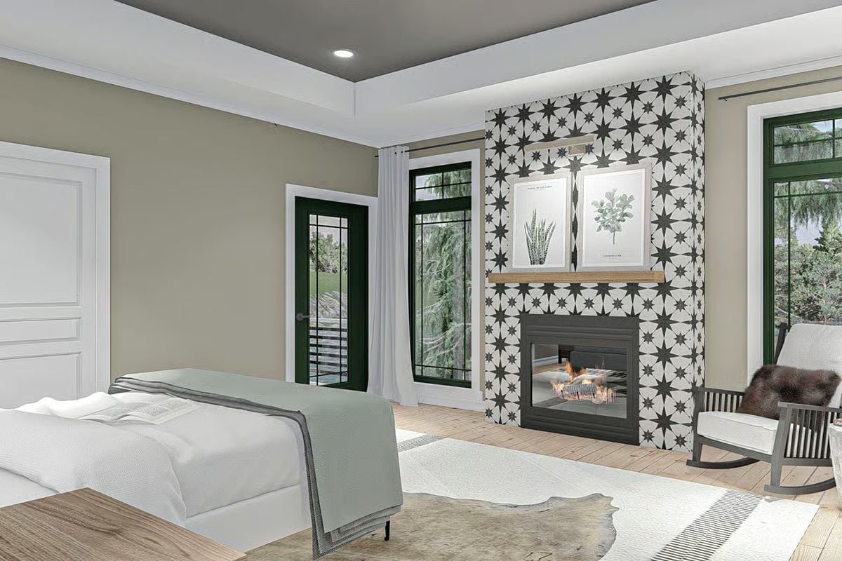
Black-and-white star-pattern tile covers the entire fireplace wall, floor to ceiling — bold enough that you notice it immediately, geometric enough that it doesn’t wear out its welcome. The wood mantel and lit firebox keep it from tipping into cold territory.
Color Story: Warm taupe walls hold back just enough to let the graphic tile do its thing rather than competing with it. Pairing a bold pattern with a neutral surround is one of those moves that looks intentional precisely because it requires discipline — and here, the discipline paid off.
Pin It
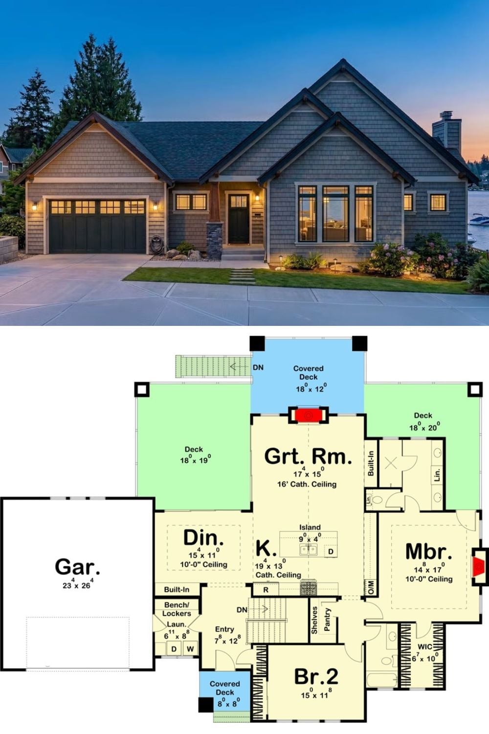
The exterior shot shows a gray shingle Craftsman with a two-car garage photographed at dusk. The floor plan below maps out the main level: great room, kitchen, two bedrooms, and those multiple decks that make the whole thing worth building near water.
