
🔥 Would you like to save this?
Dated kitchens are getting gutted younger now, and the 1990s are officially next in line.
In order to come up with the very specific design ideas, we create most designs with the assistance of state-of-the-art AI interior design software. Also, assume links that take you off the site are affiliate links such as links to Amazon. this means we may earn a commission if you buy something.
She didn’t wait for the oak cabinets to collapse or the laminate counters to surrender. The kitchen still functioned, which is precisely what makes the transformation interesting. Beige surfaces, honeyed wood, fussy door profiles, brass that had lost its charm — none of it was catastrophic. It was simply a room whose decade had become impossible to ignore.
So she kept going. Color, stone, lighting, cabinet profiles, islands, floors, range walls: nearly every decision gets reconsidered across these 31 before-and-afters, and the best part is how rarely the room arrives at the same answer twice.
31. Navy, Copper, and Walnut Turn the Old Kitchen Inside Out
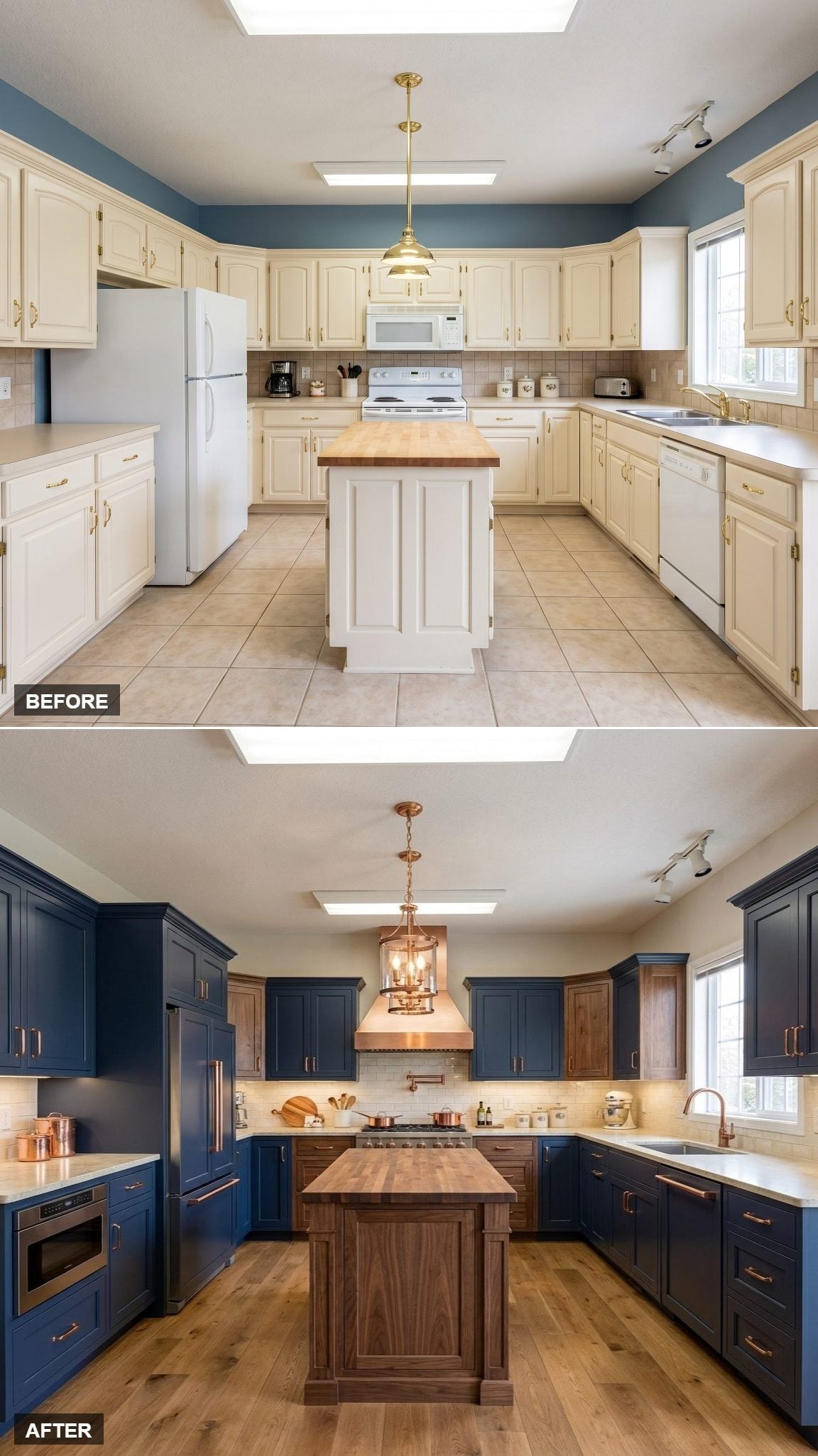
Inky navy cabinetry replaces the old oak wall-to-wall, and the shift is immediate. Copper-toned hardware flashes against the dark paint, while the walnut island introduces a warmer grain at the center instead of repeating the perimeter.
A substantial range and copper hood give the back wall a focal point, but the white counters keep the room from collapsing into darkness. The old kitchen was a collection of matching surfaces; this one works by letting dark blue, warm wood, metal, and white occupy separate jobs.
Bold color doesn’t always mean dark, but sometimes dark is exactly the right call.
30. White Oak and Reeded Wood Strip the Room Back Without Making It Bland
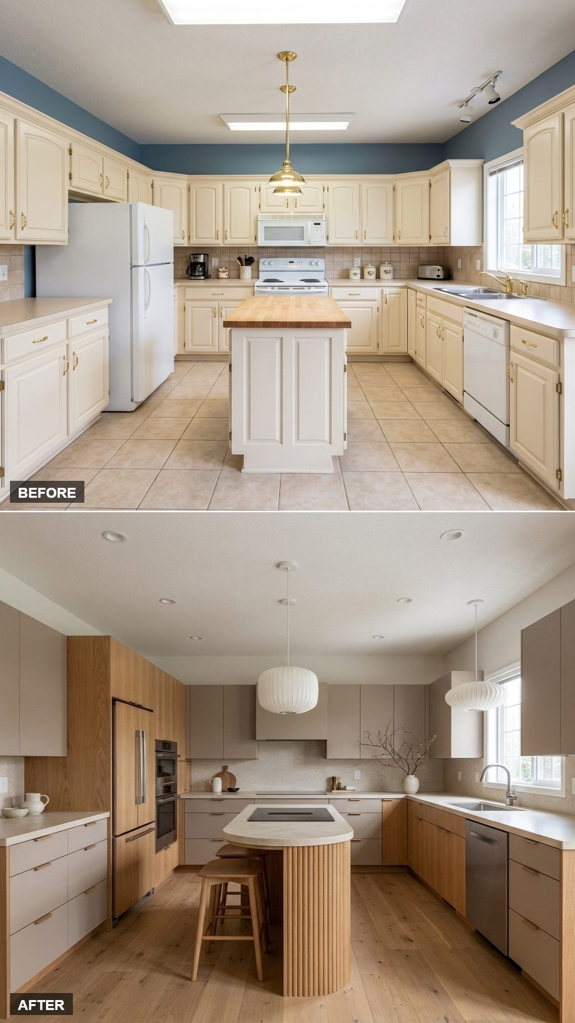
Pale oak, putty-colored flat fronts, and a reeded island base give this version a softer, almost tactile character. The grain is visible, but no single cabinet door is asking to be admired on its own.
A ribbed paper globe hangs over the island like a lightweight counterpoint to all that wood. White counters and recessed lighting keep the room bright, and the restrained palette gives the textures enough room to register.
29. Olive Cabinets and Talavera-Style Tile Give the Range Wall Its Own Architecture
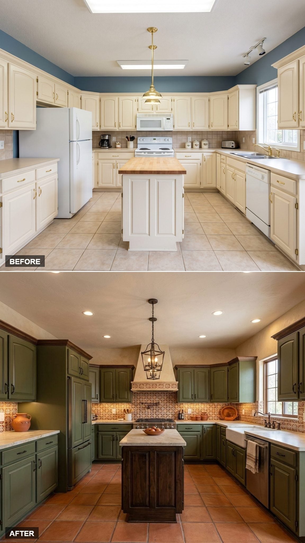
Dusty olive cabinetry sets a completely different temperature from the original oak. Dark bronze pulls sharpen the color, while Talavera-style tile wraps the range hood and continues behind the stove in one concentrated burst of pattern.
Terracotta underfoot deepens the warmth, and the darker wood island keeps the green from becoming too sweet. The apron-front sink and blackened lantern move this one toward a Mediterranean-farmhouse mix, but the palette is controlled enough to keep the room from turning thematic.
Pattern Note: Concentrating decorative tile around the cooking zone gives a busy pattern a clear boundary. The surrounding olive cabinetry then acts as a solid field rather than another competing surface.
28. Dark Walnut, Veined Stone, and Cove Light Make the Ceiling Part of the Plan
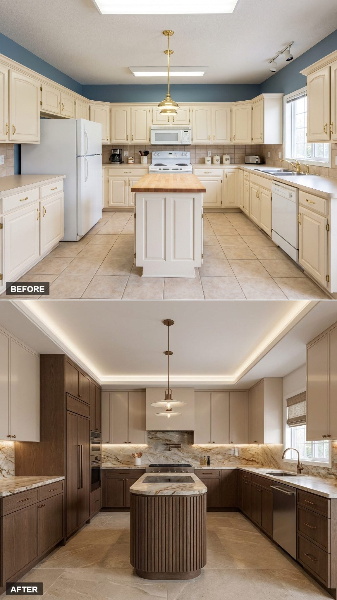
Curved fluting gives the island a softer profile against the dark walnut cabinetry, while cream uppers prevent the upper half of the room from becoming one continuous brown wall.
The real drama is vertical. Strongly veined stone climbs from counter to hood, then concealed cove lighting washes the tray ceiling above it. Instead of relying on a single pendant for spectacle, the room builds its effect from surfaces and light.
27. Terracotta Cabinets and White Oak Bring Heat Without Going Rustic
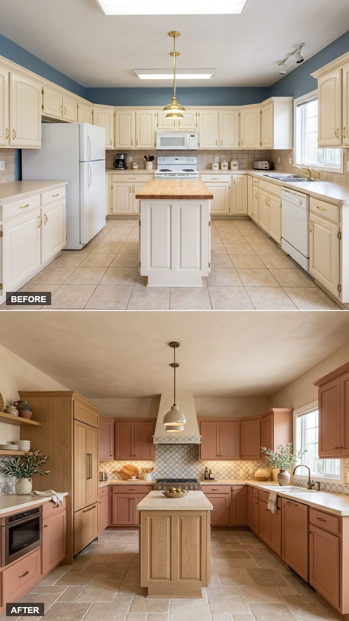
Muted terracotta wraps the perimeter in a color that feels sun-warmed rather than loud. A patterned backsplash is confined to the range wall, framed by a simple hood surround instead of spreading across every visible surface.
The white-oak island introduces a cooler natural grain, while pale stone counters keep the terracotta from becoming too dense. Under-cabinet lighting traces the work zones after dark and gives the warm color a different life at night.
26. White Cabinets and Navy Millwork Sharpen the Room With One Dark Block
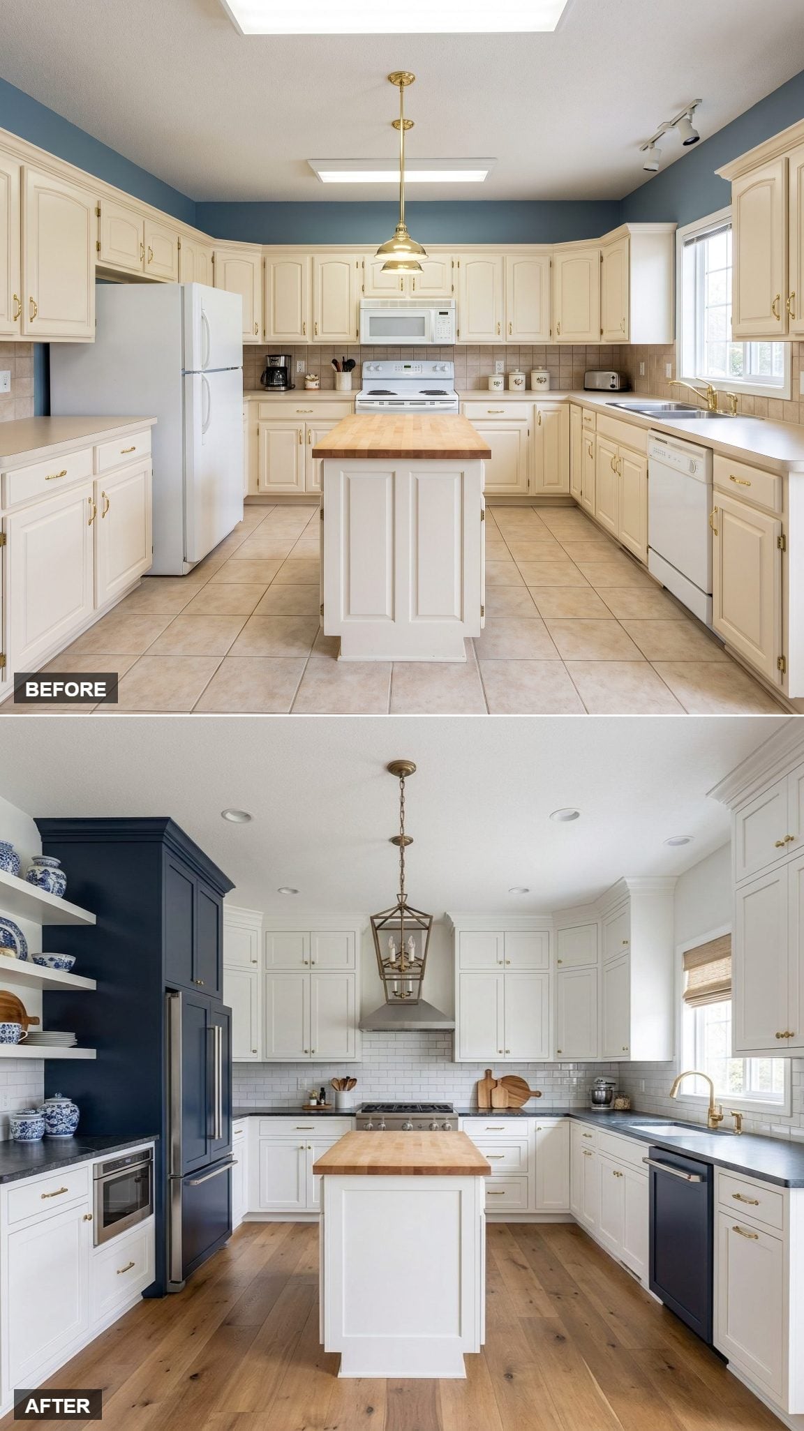
Crisp white cabinetry dominates the perimeter, but a navy refrigerator surround and matching dishwasher panel interrupt the brightness with a clean block of color. Brass hardware gives both finishes the same warm punctuation.
The butcher-block island and wide-plank floor keep the room relaxed, while the lantern pendant adds a more traditional note overhead. Compared with the original kitchen, the biggest change is not one expensive object; it is the clearer separation between light surfaces, dark cabinetry, and natural wood.
25. Butter Yellow Cabinets Make the 1990s Footprint Feel Almost Cheerful
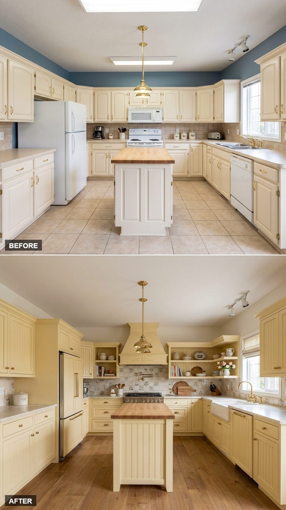
Pale butter yellow replaces the old beige with something far more specific. The range hood repeats the cabinet color but adds carved detail, while floral tile behind it gives the cooking wall a playful old-house note.
A butcher-block island, beadboard sides, open shelves, and a bridge faucet push this one firmly toward cottage territory. That contrast is useful in the series: the footprint barely changes, yet color and detailing send the room somewhere entirely different.
24. Walnut and Graphite Stone Push the Kitchen Into a Darker Register
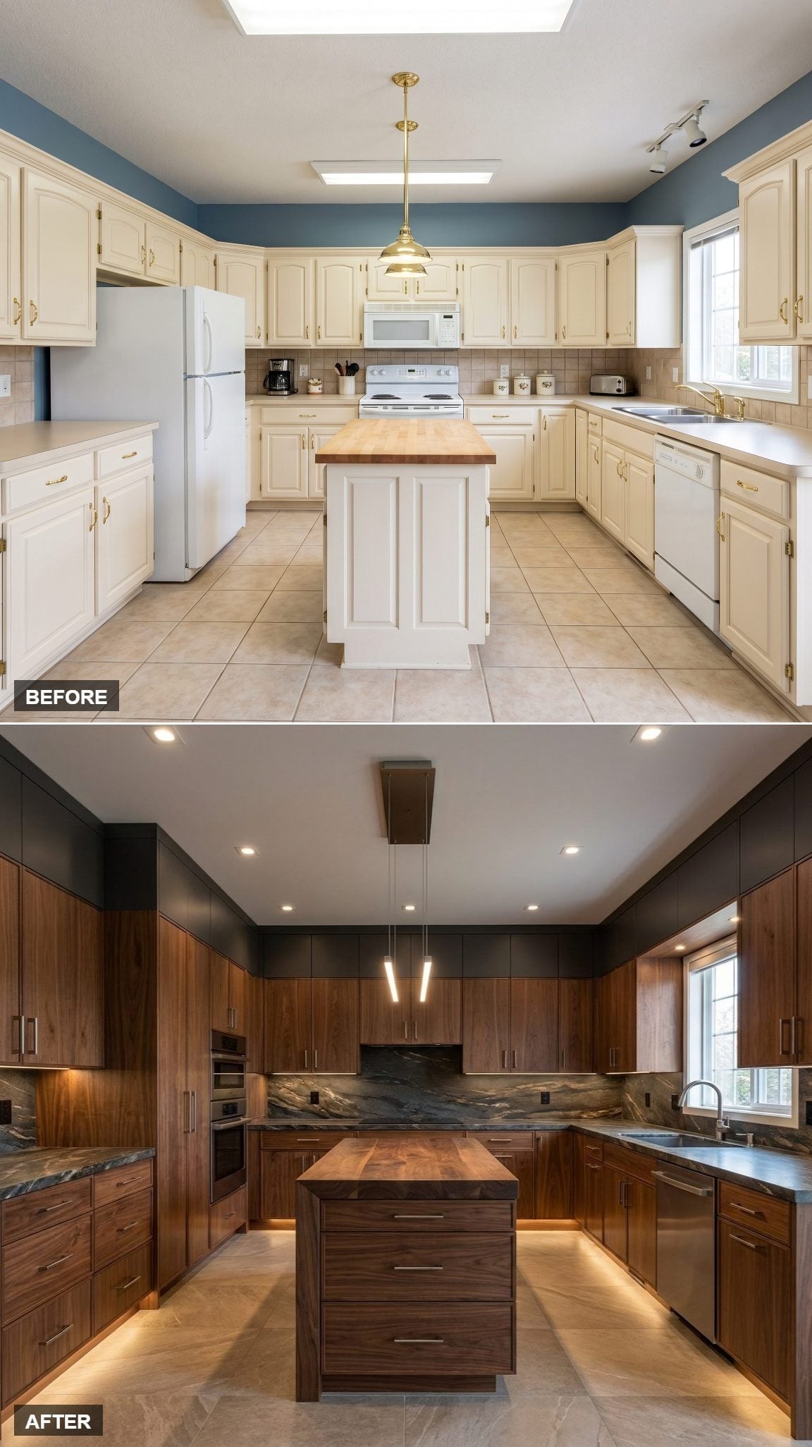
Floor-to-ceiling walnut cabinetry creates a nearly continuous wood envelope, interrupted by dark stone counters that approach graphite in the lower light. The same stone continues behind the range, turning the backsplash into part of the architecture rather than a decorative strip.
Two narrow pendants keep the ceiling spare, while amber under-cabinet lighting skims the floor and counter edges. The butcher-block island stays within the wood family but changes the grain and tone enough to avoid looking copied-and-pasted.
23. Dusty Blue Cabinets Put the Butcher-Block Island Back in the Spotlight
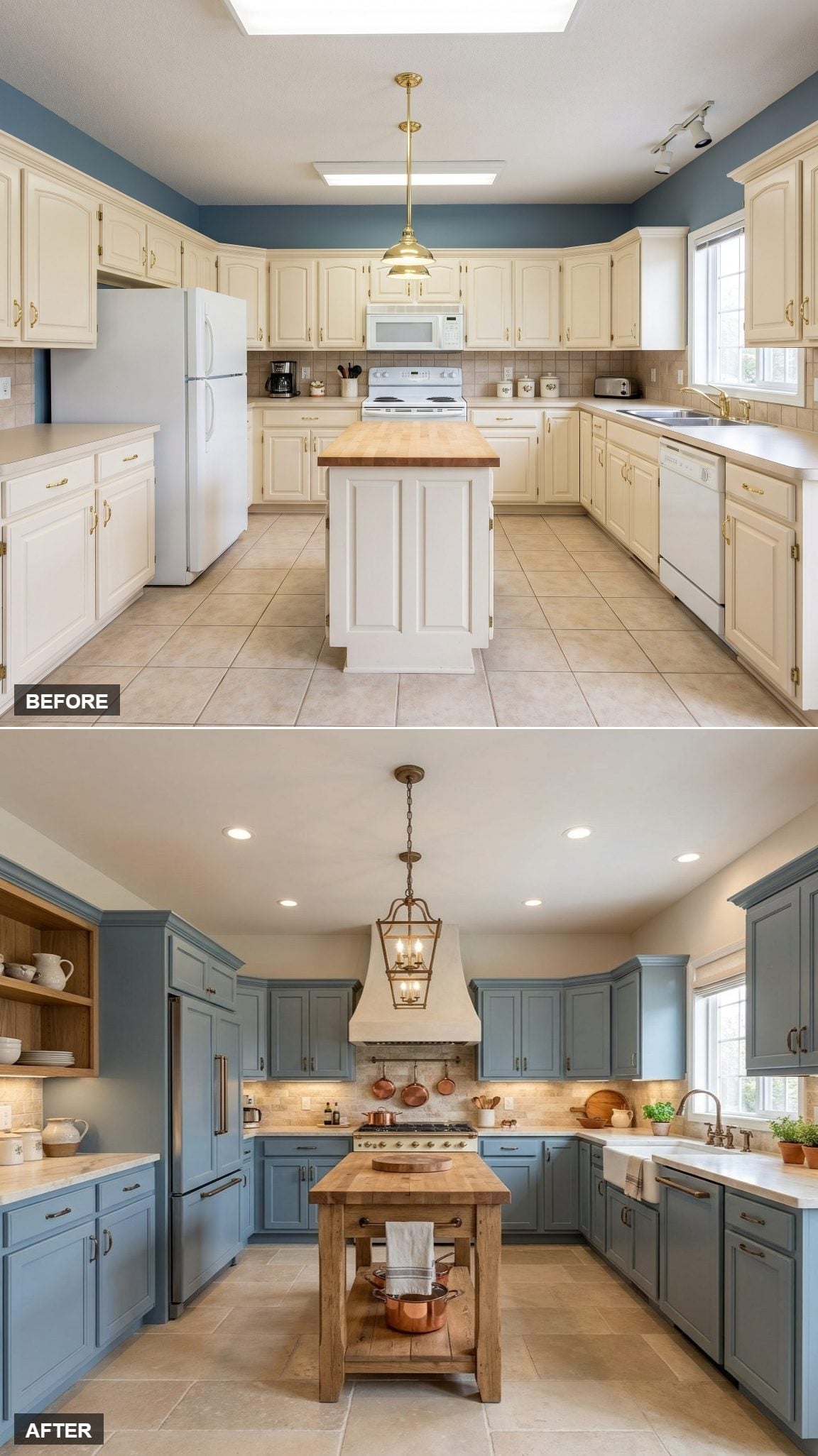
Slate-blue perimeter cabinetry gives the room a cooler base, warmed by bronze hardware and the broad grain of a freestanding butcher-block island. Instead of matching every surface, the design makes the island look more like a piece of furniture dropped into the room.
Copper pans beneath the hood add another warm note and, whether decorative or in daily use, make the cooking wall feel active rather than pristine. White perimeter counters keep the blue and wood from crowding each other.
22. Quarter-Sawn Oak and Forest Green Give the Island a Proper Counterpoint
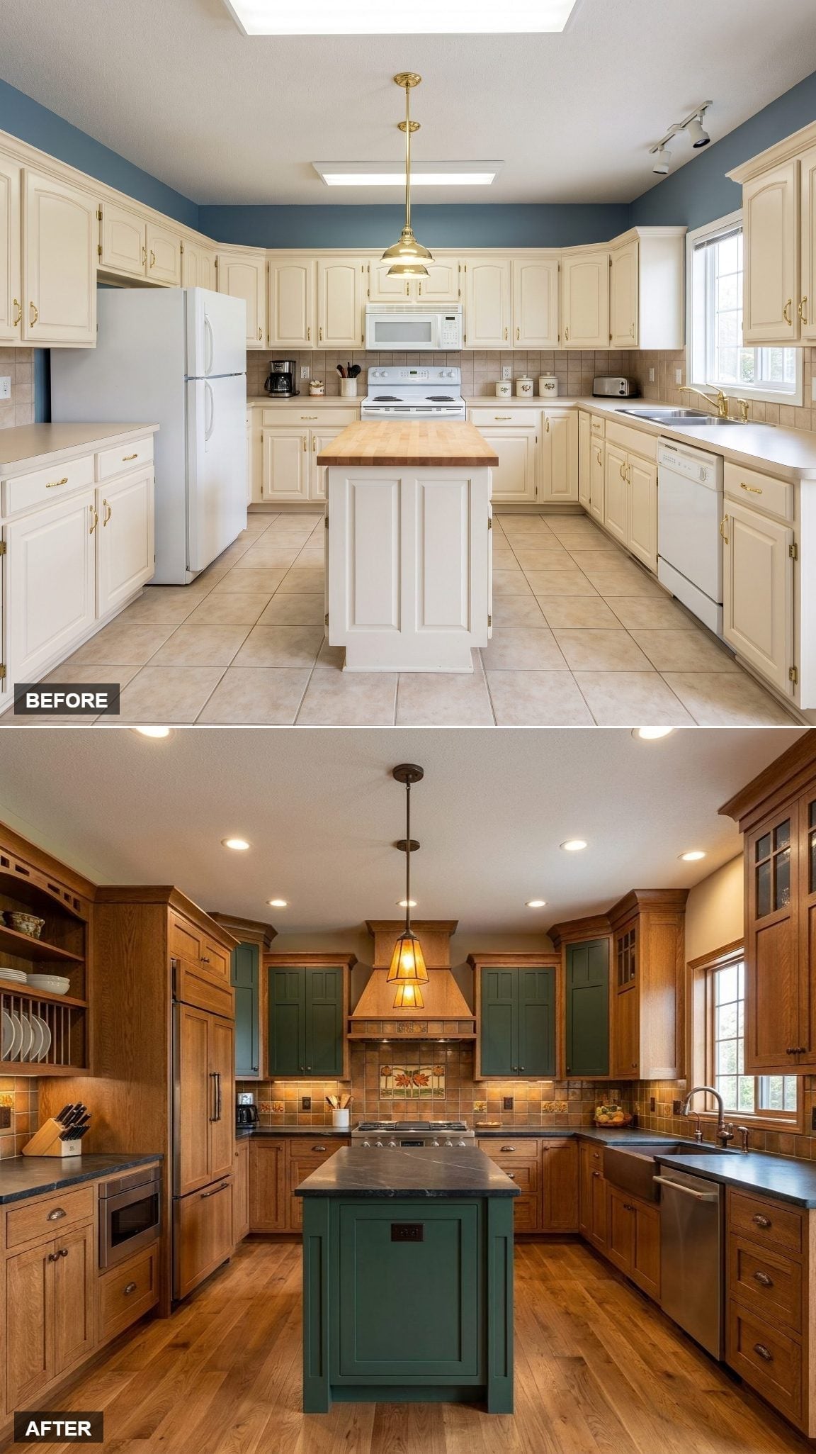
Quarter-sawn oak wraps the perimeter with straighter, more disciplined grain than the original honey-oak doors. A forest-green island cuts through that warmth with one saturated block, while a custom wood hood gives the range wall a distinct center.
Soapstone appears across the work surfaces, adding a dark, matte counterpoint to both oak and green.
Material Note: Soapstone can be left natural to lighten and gray with time or treated with mineral oil to deepen its color. The change is cosmetic rather than a requirement for the stone to perform.
21. Bare Maple and Flush Details Give the Kitchen Room to Breathe
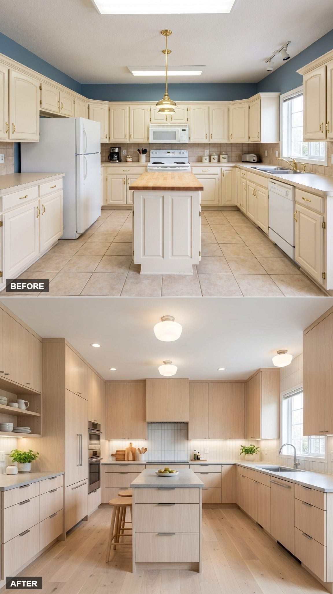
Natural maple cabinetry runs to the ceiling with flat fronts and slender brushed pulls. The island repeats the pale wood under a cool white counter, creating a light, almost monochrome shell without falling back on beige.
Pale hardwood, simple globe flush mounts, and a softly lit subway-tile backsplash keep the surfaces legible without adding another focal point. Nothing is fighting for first place, which is exactly why the maple grain becomes noticeable.
20. Deep Teal and Mosaic Tile Give the Center Island Real Architecture
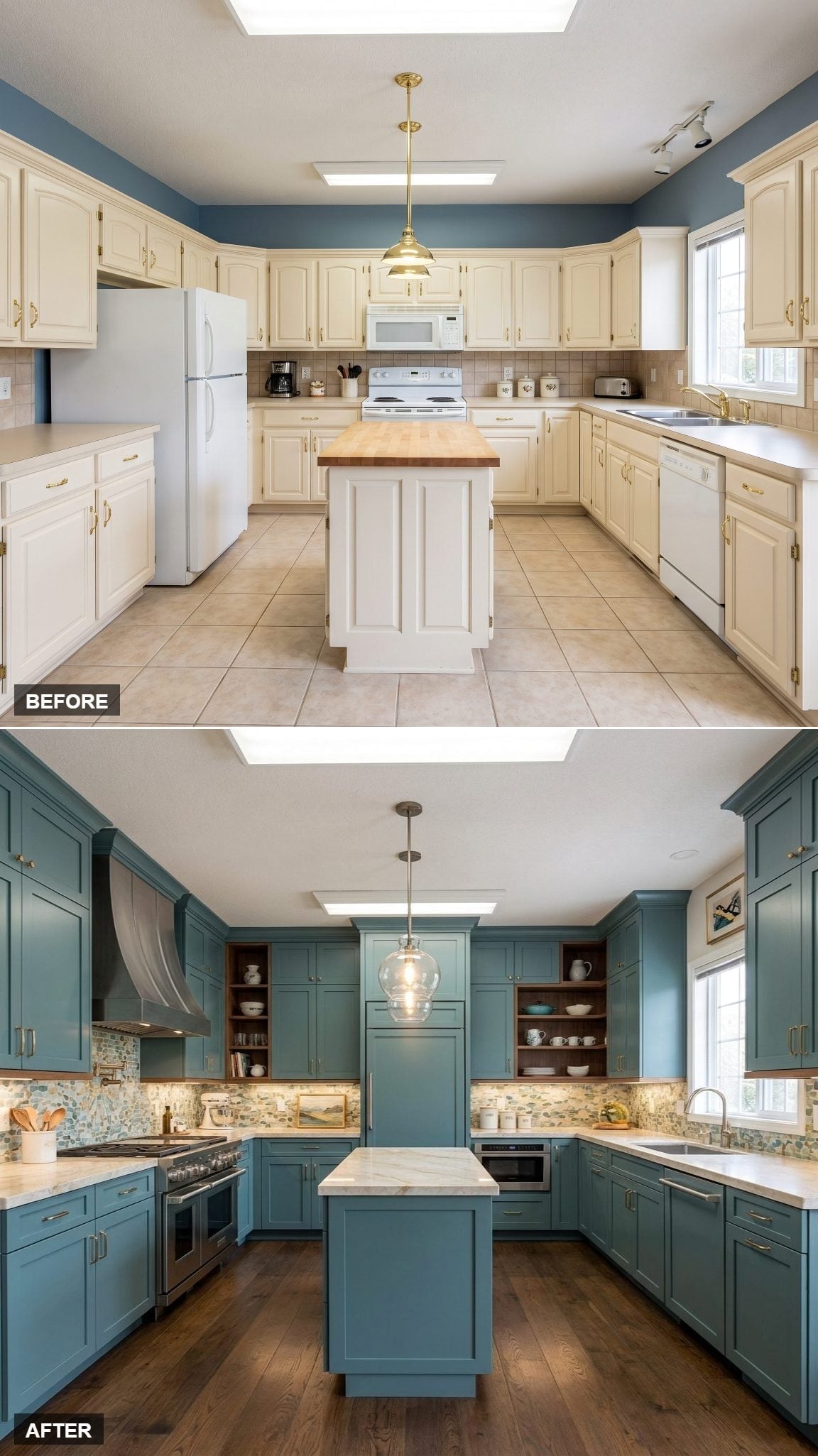
Deep teal cabinetry wraps the walls, but open shelving interrupts the color before it becomes oppressive. From across the room, the backsplash looks restrained; closer in, scattered blue and green pieces emerge from the mosaic.
The island’s column-like detail is the surprise. Instead of another plain rectangular box, it introduces a strong vertical element at the center and gives the prep surface a more built-in, architectural presence.
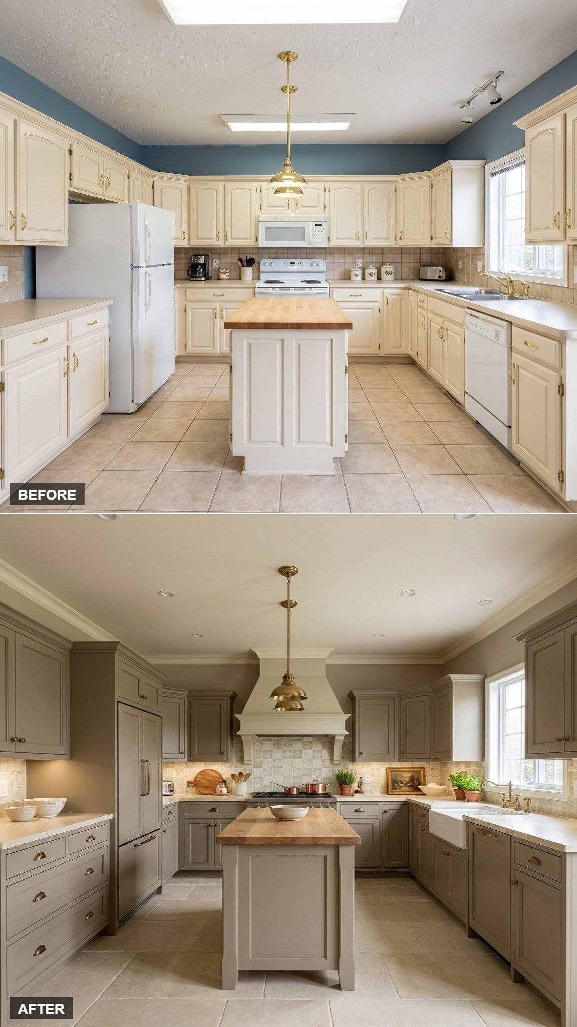
19. Sage-Taupe Cabinets and Butcher Block Give the Old Layout a Softer Landing
🔥 Would you like to save this?
Muted sage-taupe cabinetry keeps some of the traditional door detailing but loses the honey-oak cast of the original. A custom wood hood and aged-brass hardware introduce warmer notes, while the butcher-block island sits against lighter perimeter counters.
The color is the subtle part worth watching: in bright daylight it can approach a warm neutral, then show more green as the light changes.
Ask Yourself: If you’re repainting existing cabinetry, test the color in the actual kitchen before committing. Gray-green and sage paints can shift noticeably between daylight, warm evening lamps, and under-cabinet lighting.
18. Plum Cabinetry and Herringbone Parquet Turn Up the Formality
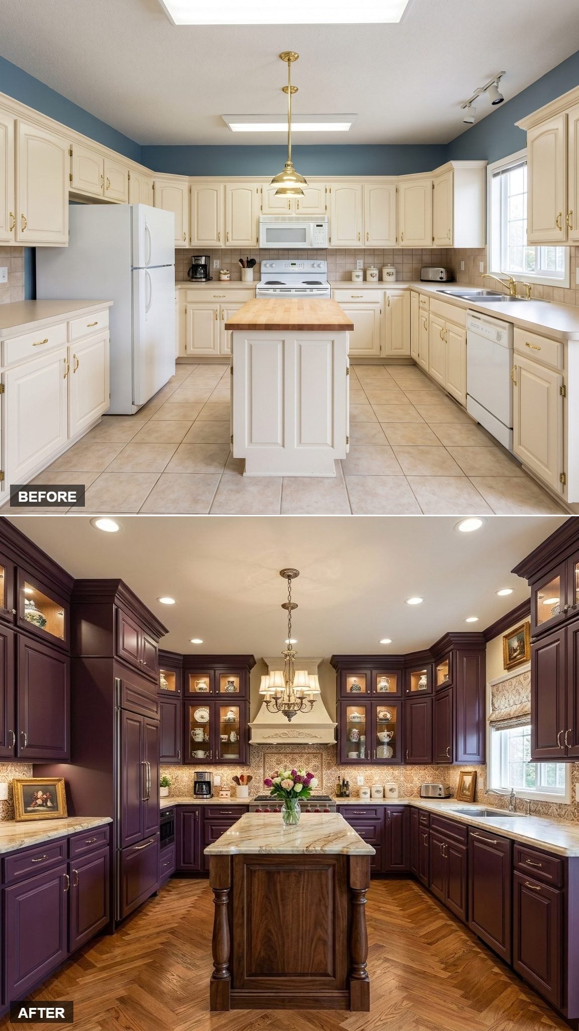
Eggplant-toned cabinetry runs all the way to the ceiling, with illuminated glass fronts breaking the saturation near eye level. Brass hardware catches against the dark color, while herringbone parquet sends a strong diagonal pattern across the floor.
The island changes character completely with turned dark-wood legs and a pale stone top. A candelabra chandelier pushes the room toward tailored, slightly theatrical traditionalism — a bold detour after the cleaner kitchens around it.
17. Walnut Cabinetry and a Granite Island Let the Wood Take Center Stage
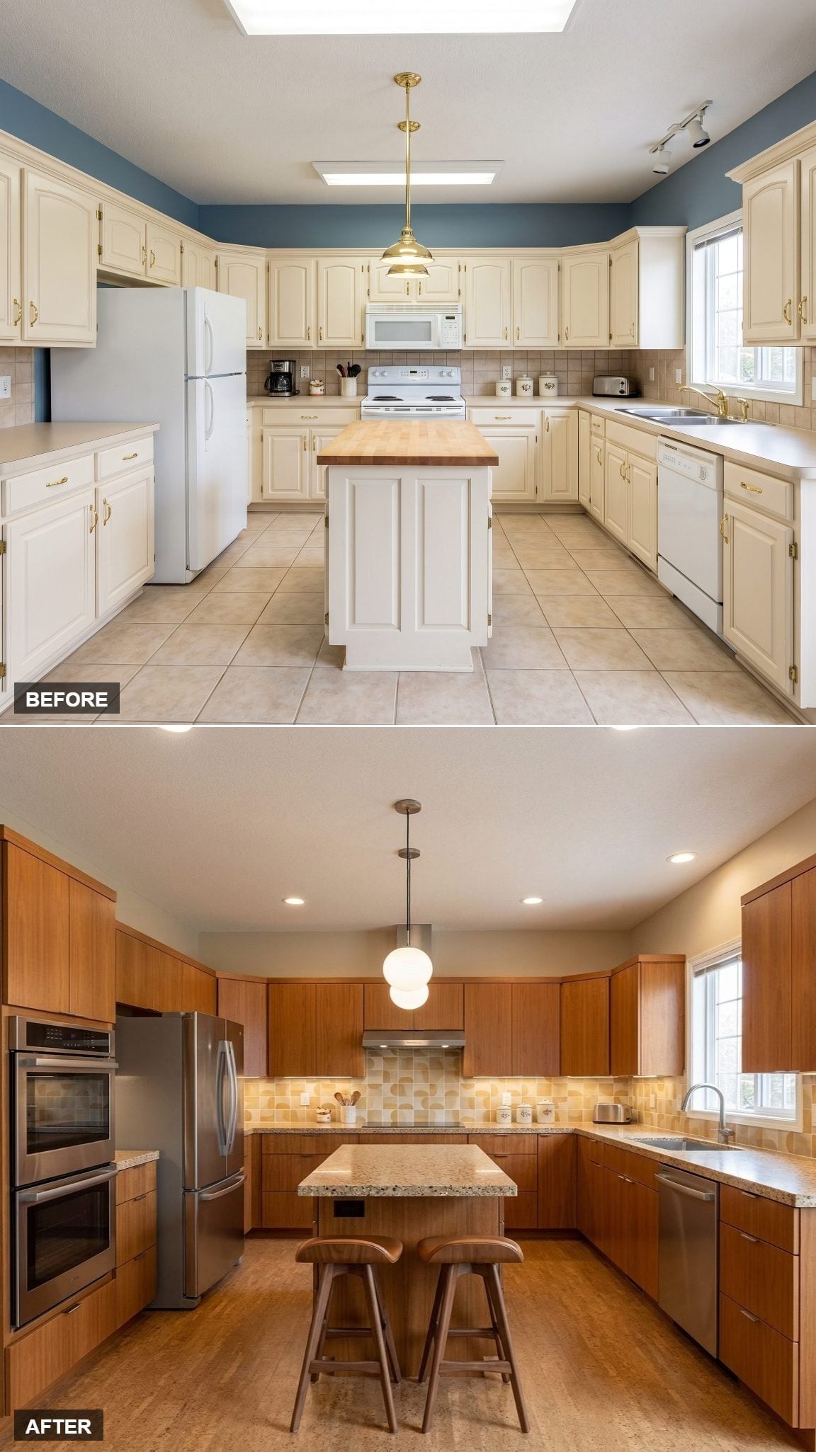
Flat-panel walnut runs floor to ceiling, making the grain itself the decorative element. The doors are simple enough that the room never slips back toward the raised-panel heaviness of the original kitchen.
A granite-topped island sits in the middle with two wood stools tucked beneath it, while stainless wall ovens break the cabinetry with a cool metallic strip. The small globe pendant is deliberately modest beside such a strong wall of wood.
Warm wood and stainless steel can share a room without either one pretending to be neutral.
16. Powder Blue and Natural Wood Make a Cooler, Lighter Reset
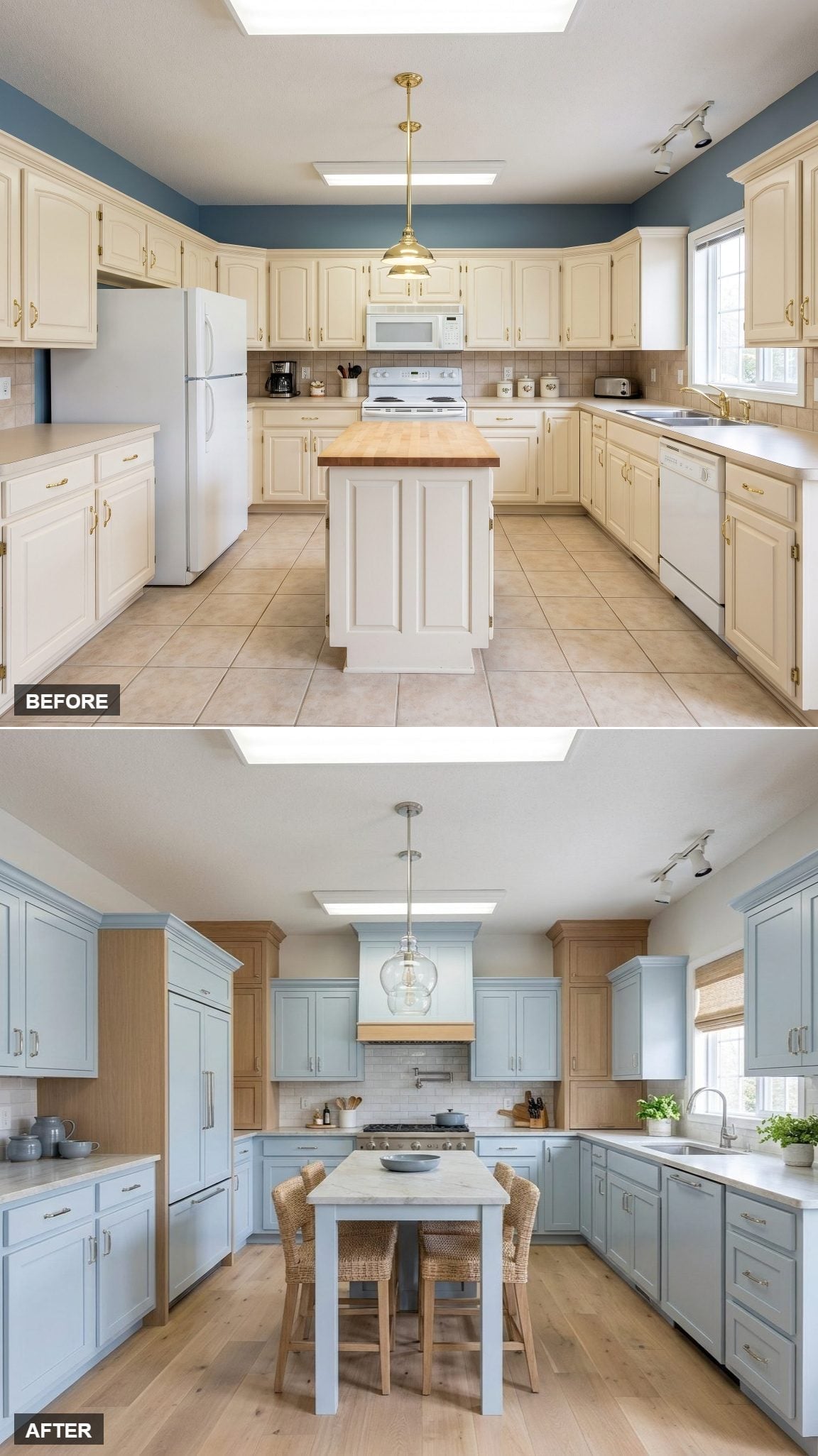
Soft blue-gray cabinetry shifts the kitchen toward the cool end of the spectrum, while natural wood fillers and the wood-wrapped hood keep the room from feeling chilly. White quartz clears visual space along the counters.
A simple glass globe pendant is almost transparent against the ceiling. After the darker kitchens, this one feels like opening a window — not because it is sparse, but because the palette leaves more light in the room.
15. Greige Cabinets and an Open-Shelf Island Make Storage Part of the View
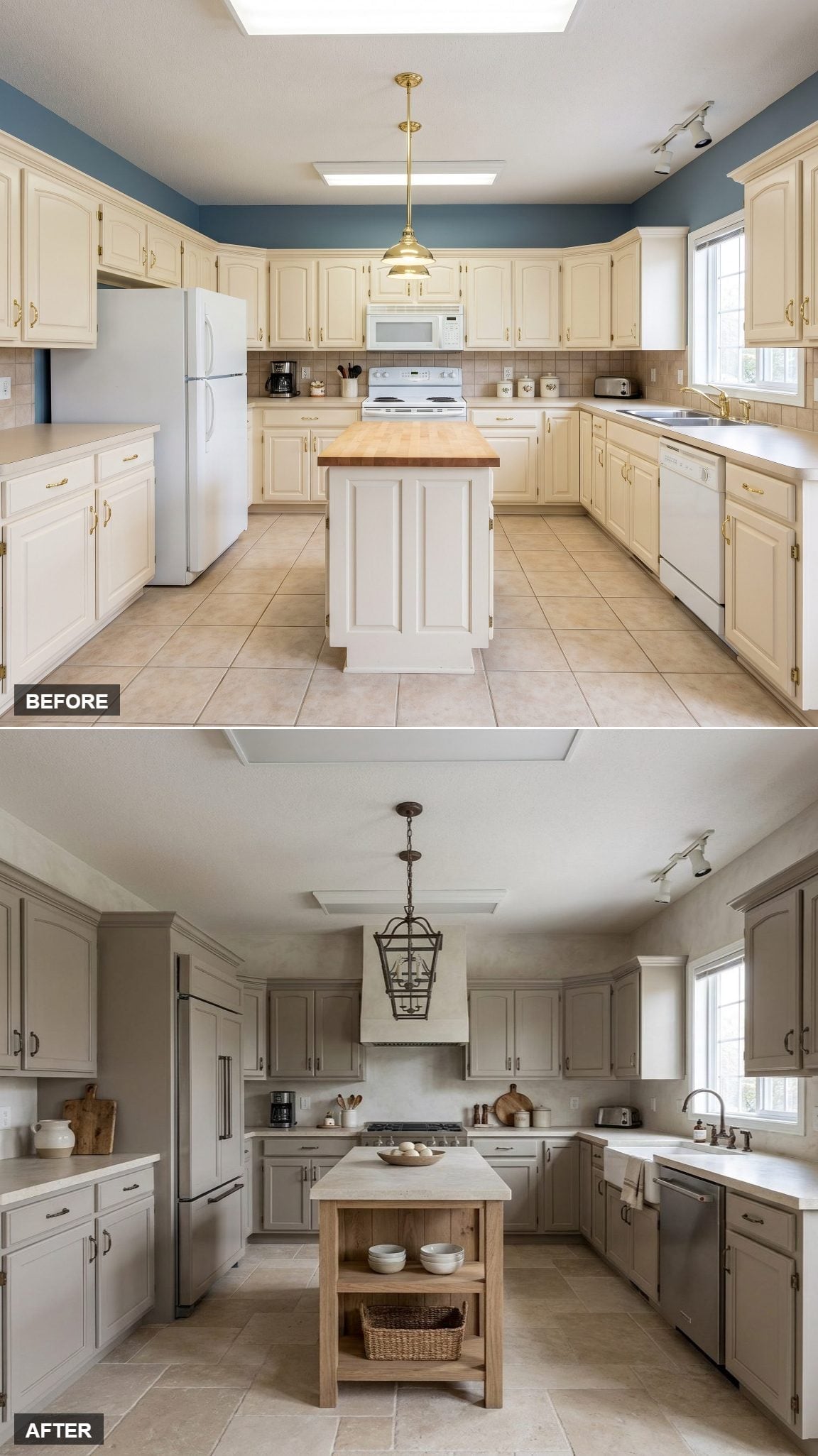
Warm greige cabinetry quiets the perimeter while aged-bronze bar pulls give the doors a cleaner rhythm than the original brass hardware. The hood is broader and simpler, giving the cooking wall a stronger outline.
The island is the useful departure: open oak shelving exposes baskets and everyday pieces instead of hiding everything behind doors. Honed stone replaces butcher block on top, so the wood shows up as structure rather than another work surface.
Hardware Check: Paint and metal finishes affect one another. Test cabinet color beside the actual pull or knob before committing; a green, beige, or gray undertone can become much more obvious once brass, bronze, or nickel is beside it.
14. Burgundy Cabinets Make the Backsplash Look Brighter by Comparison
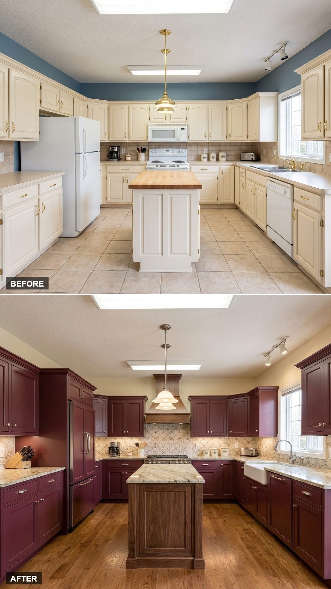
Rich burgundy cabinetry turns the perimeter into a deep color field, while a walnut island keeps the center warm rather than introducing another painted finish. Pale veined stone above the island gives the room a necessary flash of light.
Behind the range, patterned tile has enough contrast to stand up to the cabinetry. Burgundy is doing something beige never could here: making every lighter surface look sharper.
13. Rift-Cut Oak Gives the Island Seating Without Turning It Into a Bar
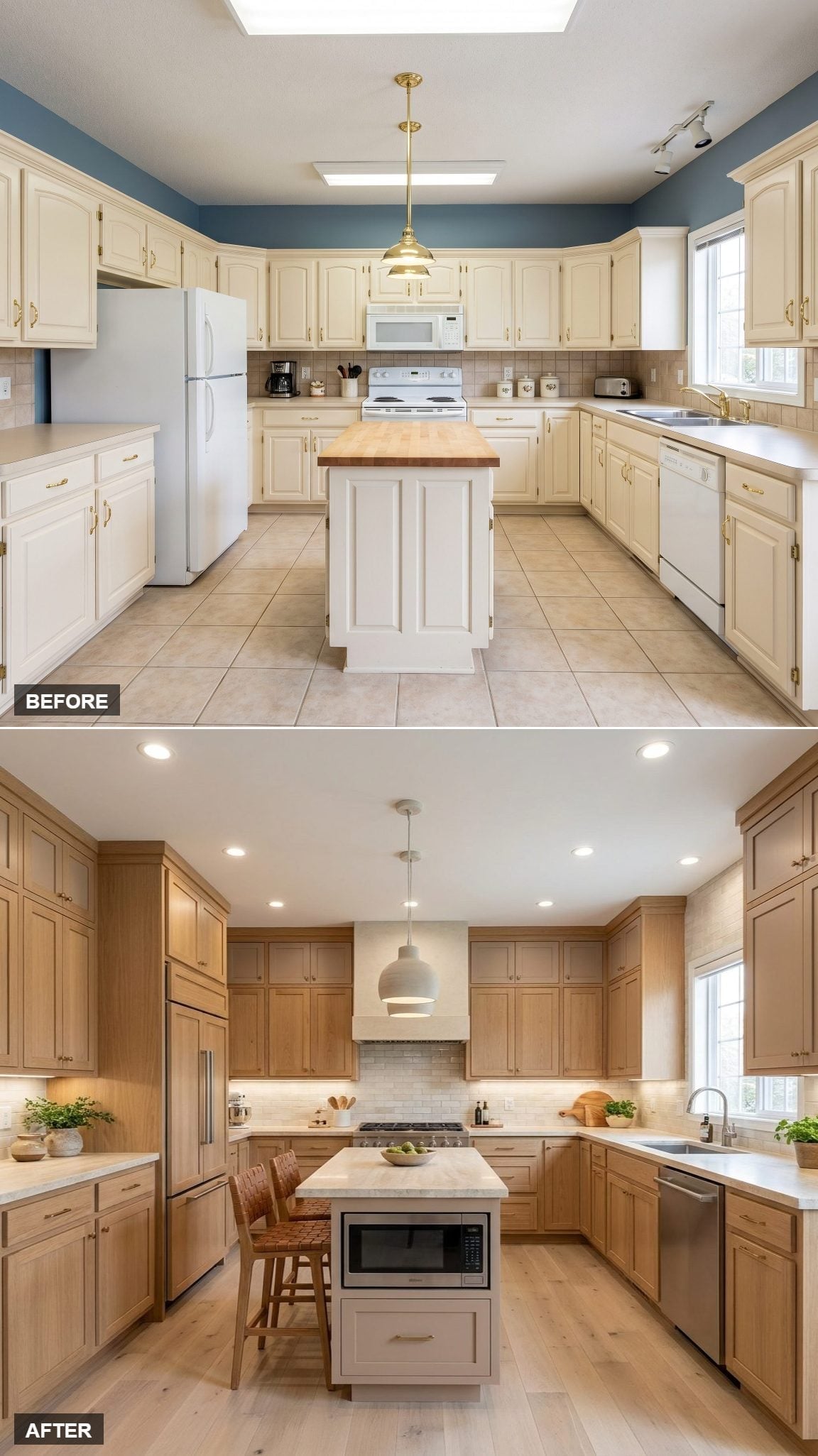
Rift-cut oak runs cleanly to the ceiling, replacing the original decorative door profiles with straighter grain and simpler cabinetry. White counters brighten the perimeter and continue onto an island that now has a practical seating edge.
A microwave drawer is tucked below counter height instead of interrupting the upper cabinetry. The result is less about spectacle than proportion: taller storage, cleaner faces, and an island that comfortably accommodates someone sitting down.
12. Forest Green Cabinets and Reeded Wood Make the Backsplash Hit Harder
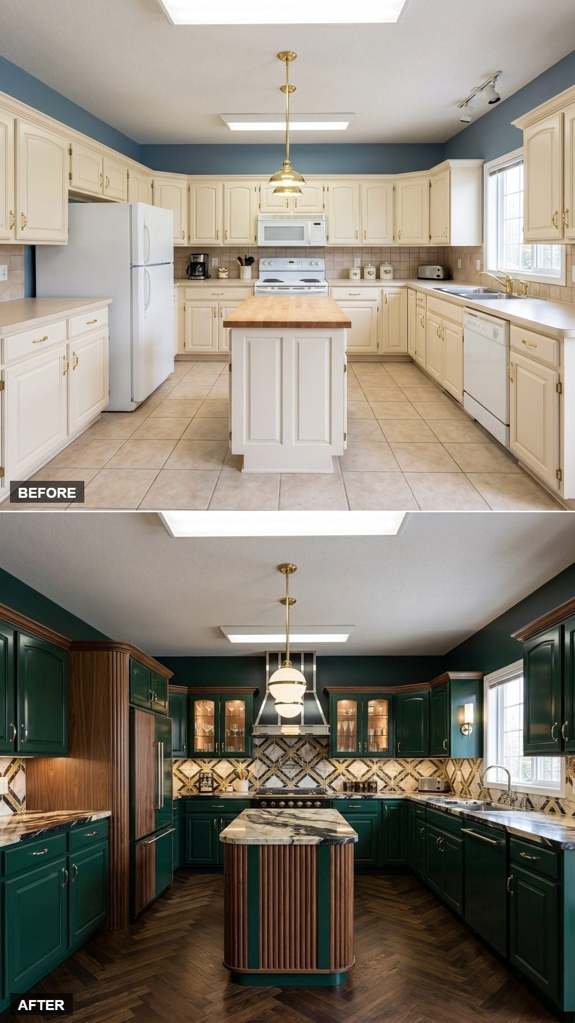
Deep forest-green cabinetry establishes a dense backdrop, while the reeded wood island adds narrow vertical texture at the center. Brass hardware and sconces bring small flashes of warmth without trying to match the green.
The gold-and-cream geometric backsplash behind the range is the sharpest pattern in the room. Because it is contained to one wall, it can be bold without turning every surface into competition.
11. Warm Linen Cabinets, Espresso Island, and Herringbone Floors Layer the Neutrals
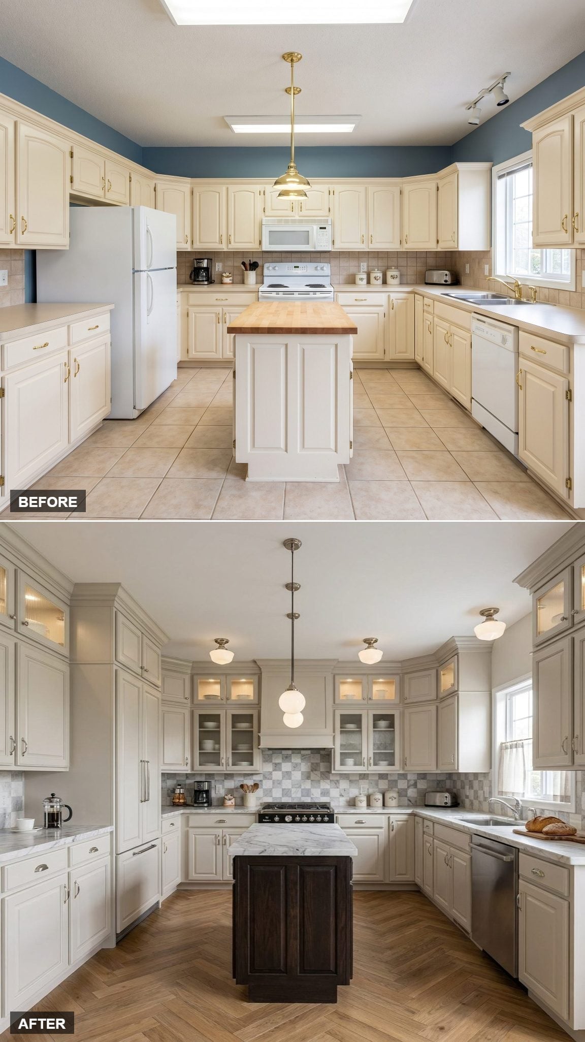
The upper cabinetry lands closer to warm linen than stark white and reaches the ceiling, which removes the dusty dead zone common in older kitchens. Lit glass-front doors break up the solid cabinetry with a little depth.
Below, an espresso-stained island sits against herringbone hardwood, while a checkerboard backsplash and globe cluster introduce two different patterns at different scales. There is a lot happening, but the restricted cream-brown palette keeps it coherent.
10. Knotty Alder, Slate Gray, and Rough Stone Go Deliberately Earthy
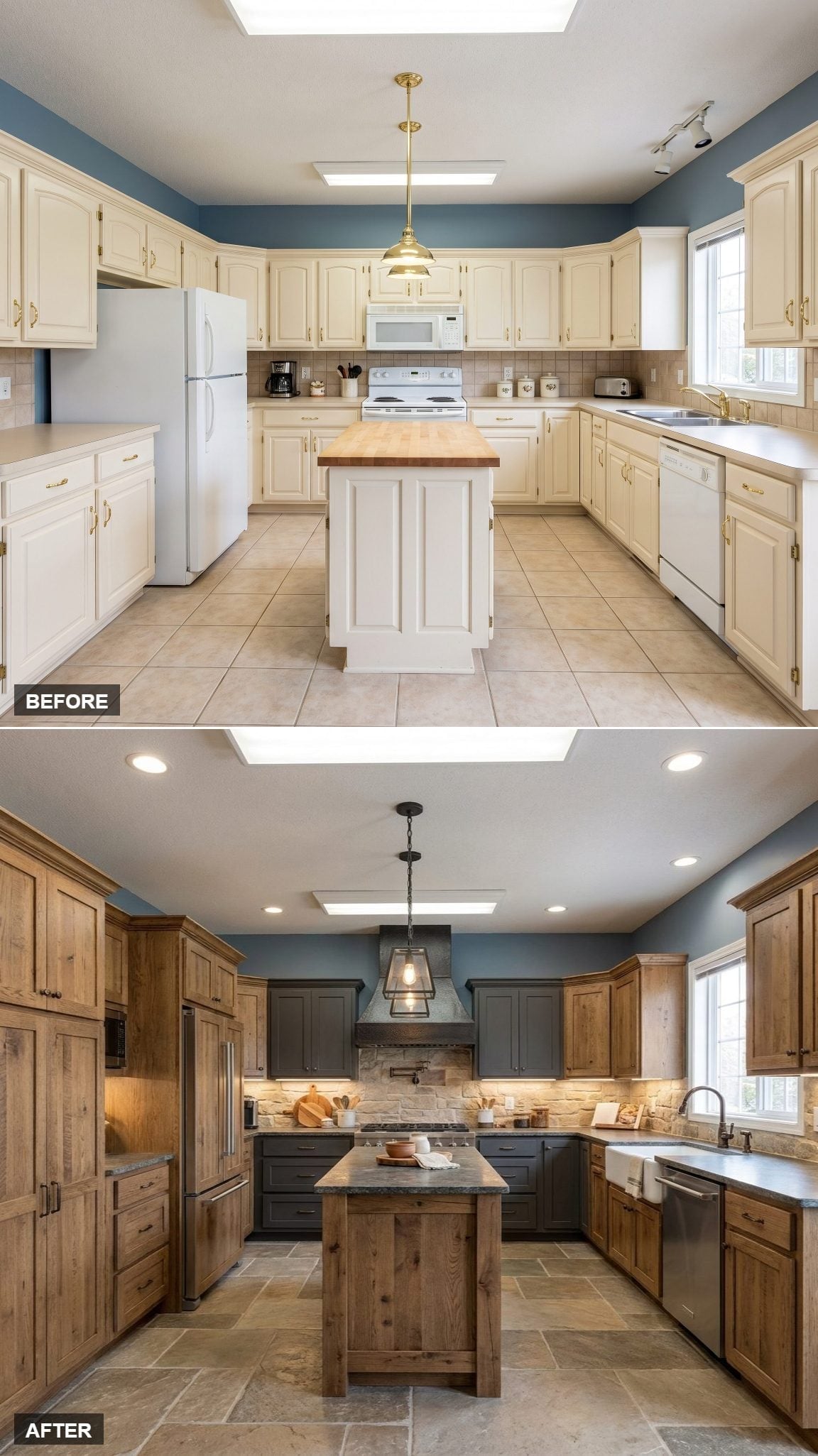
Knotty alder across the upper cabinets and island gives this kitchen visible grain, knots, and variation rather than polished uniformity. Slate-gray Shaker lowers create a darker band beneath the worktops.
Behind the range, rough dimensional stone brings a texture none of the smoother kitchens in the series attempt. A cage pendant, apron-front sink, and natural stone floor push the room toward rustic-industrial territory, but the limited gray-and-wood palette prevents it from becoming a jumble.
9. Greige Flat-Fronts and One Walnut Tower Keep the Palette From Going Flat
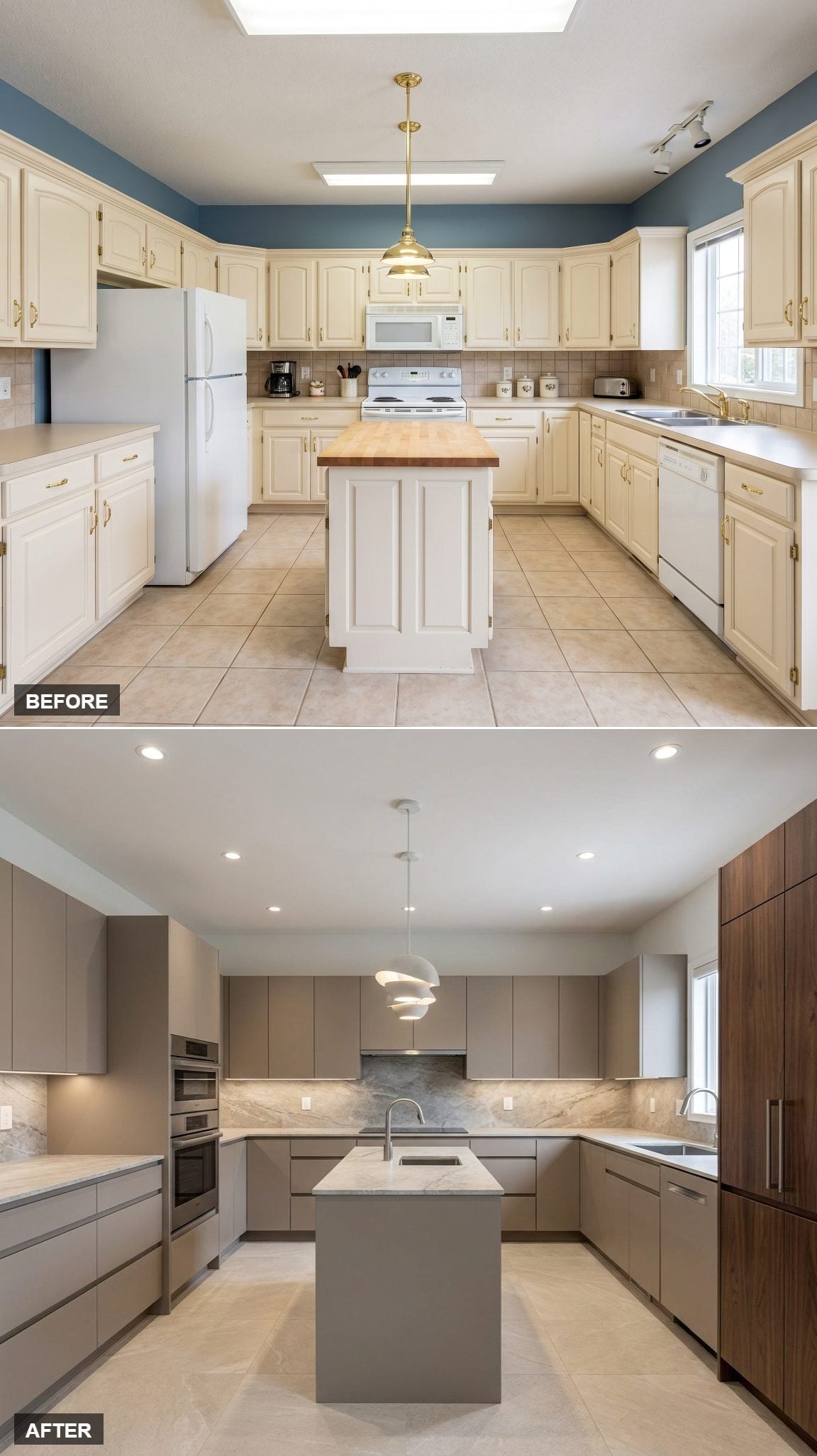
Warm greige slab cabinetry wraps the perimeter beneath a pale stone backsplash. The surfaces are intentionally close in value, so the tall walnut cabinet at the far right becomes a strong vertical interruption.
That single wood element is enough to change the balance of the room. A sculptural spiral pendant adds movement overhead without asking the cabinetry to become more complicated.
8. Sage Cabinets and a Freestanding Wood Island Loosen Up the Layout
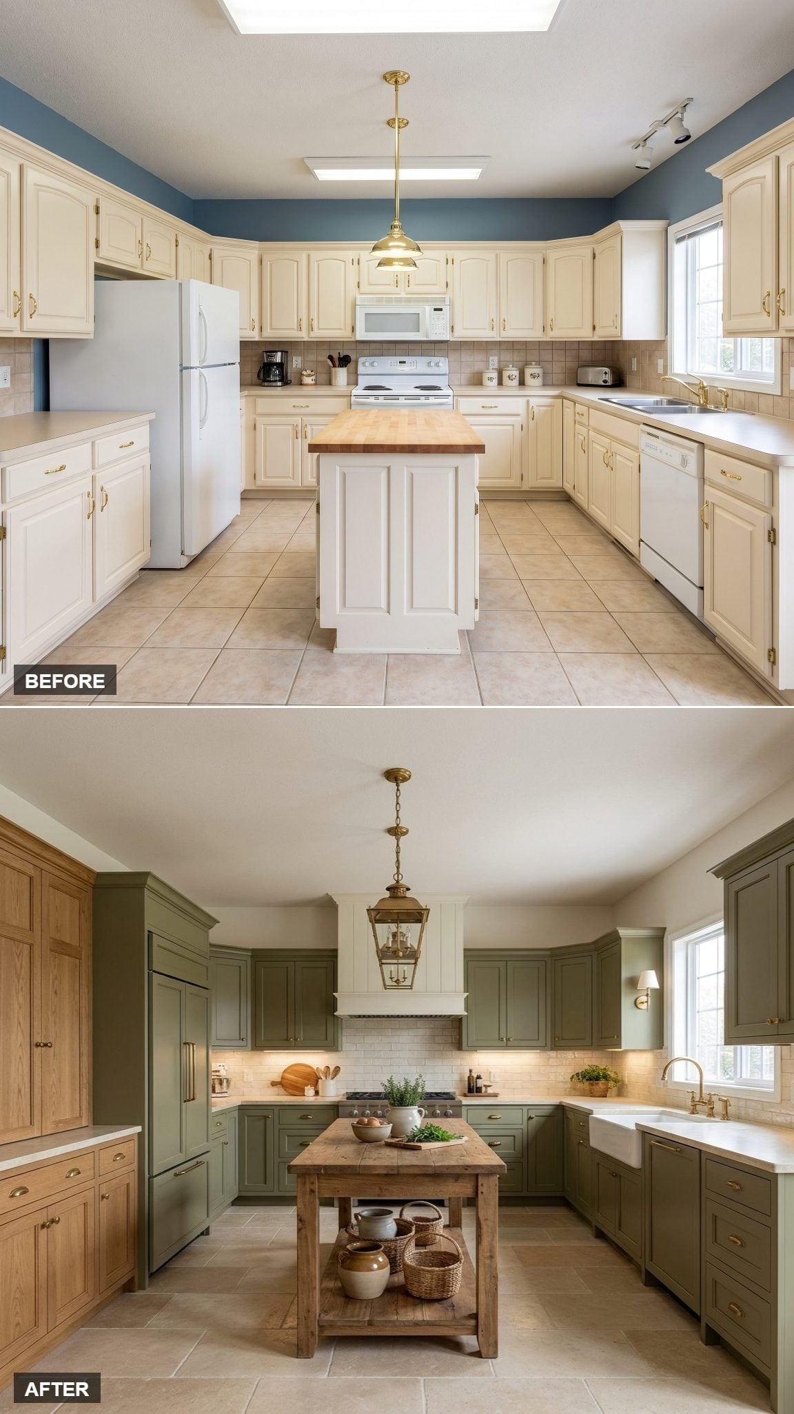
Muted sage cabinetry gives the perimeter an even wash of color, warmed by brass hardware. The freestanding island is much rougher: knotted wood, open shelves, baskets, and ceramics make it feel more like a worktable than built-in millwork.
A farmhouse sink, white subway tile, and lantern pendant complete the relaxed country direction. It is intentionally less sleek than the surrounding makeovers, which gives the sequence a needed change of pace.
7. Slate Blue Cabinetry and Open Shelves Give the Walls Some Breathing Room
🔥 Would you like to save this?
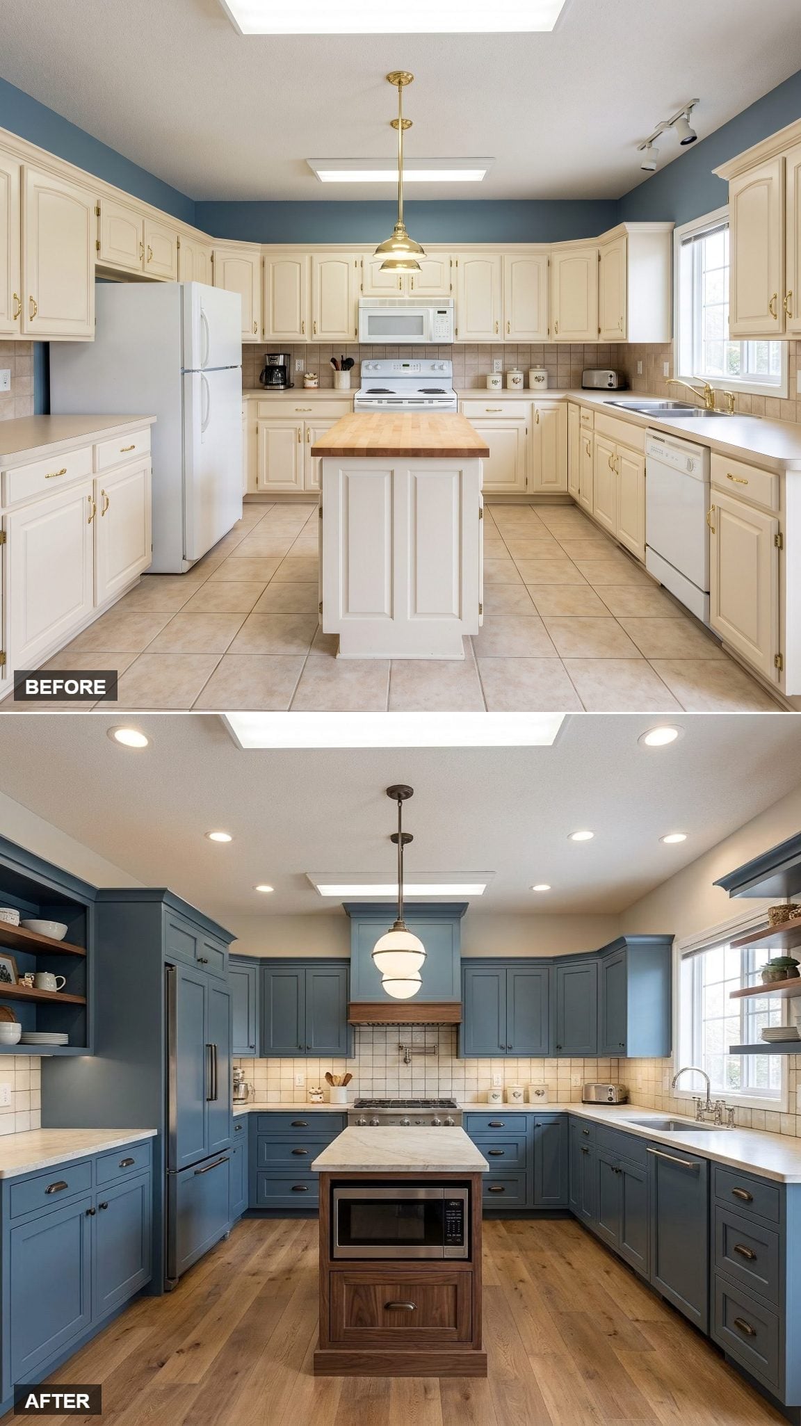
Muted slate blue wraps most of the room, but open shelves at the ends interrupt the cabinet mass and create places for smaller objects to live. The walnut island adds a warmer center, with a microwave drawer tucked beneath the pale counter.
An opal globe pendant and gridded backsplash introduce simple geometry, while bronze hardware gives the blue cabinetry a warmer edge. The old kitchen filled every wall; this version knows where to stop.
6. Light Oak Above Charcoal Lowers Makes the Two-Tone Split Feel Graphic
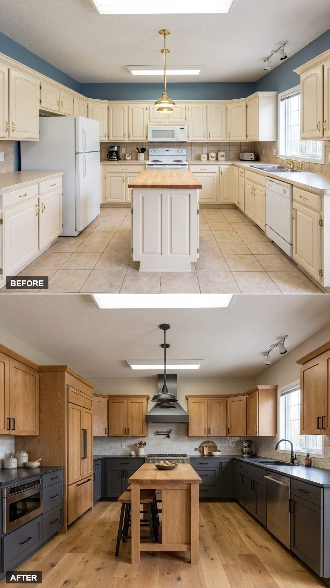
Honey-toned oak occupies the upper half of the cabinetry while charcoal lowers create a dark band below. The division is crisp enough to feel intentional rather than like two cabinet orders accidentally met in the same room.
A stainless hood and metal pendant sit comfortably between the two tones, and the wood floor adds a third brown without matching the uppers exactly. The contrast comes from value first — light above, dark below — which gives the room a strong horizontal read.
5. Sage-Green Cabinets and Open Shelving Give the Schoolhouse Pendant a Better Stage
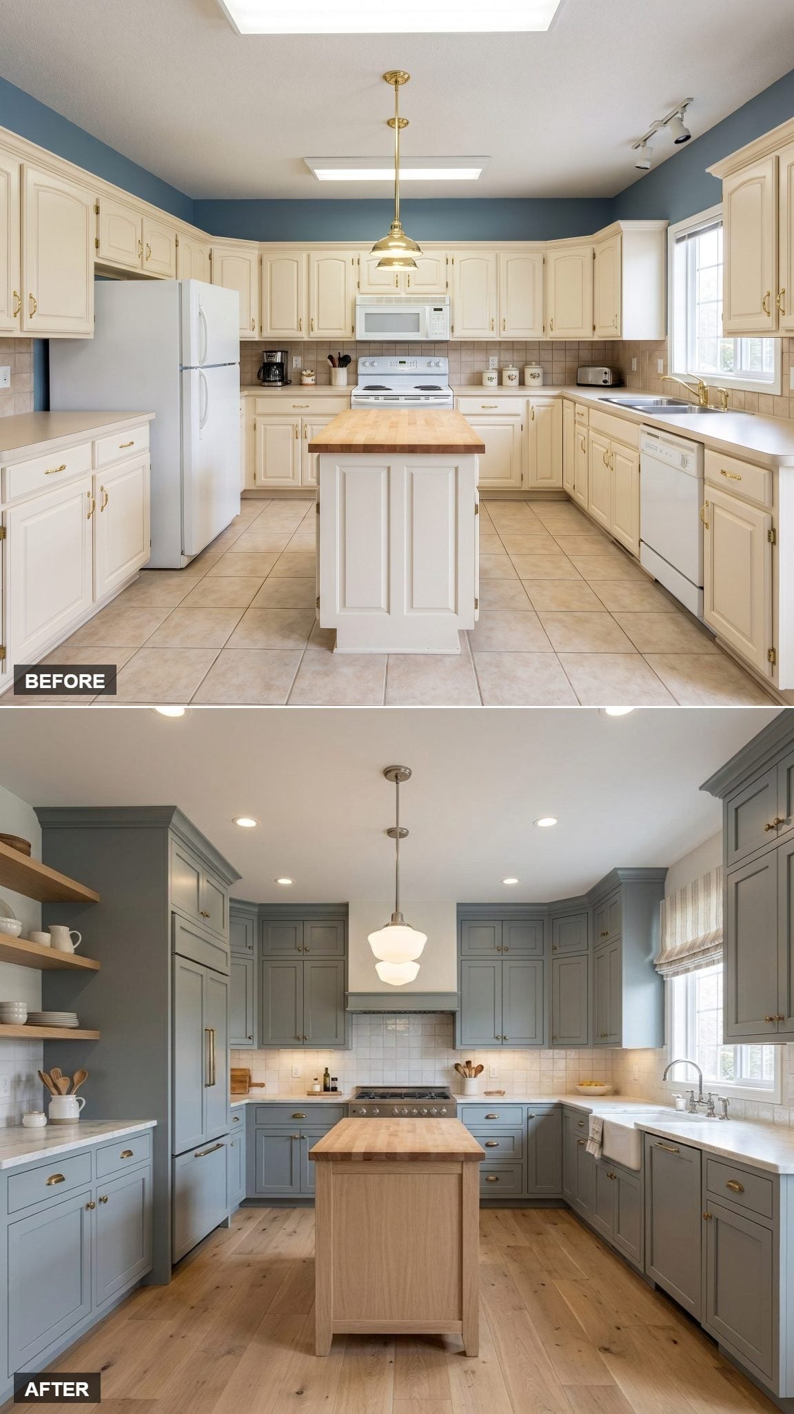
Gray-green Shaker cabinetry reaches the ceiling, while open shelving on the left breaks one side of the composition before the room becomes too symmetrical. Brass hardware picks up the warmth of the butcher-block island.
A schoolhouse pendant over the island gives this version a distinctly vintage note without needing a dozen nostalgic accessories. The room feels familiar, but the taller cabinetry and cleaner organization pull it decisively away from the 1990s.
4. Greige Cabinetry and Fluted Panels Make Texture the Main Event
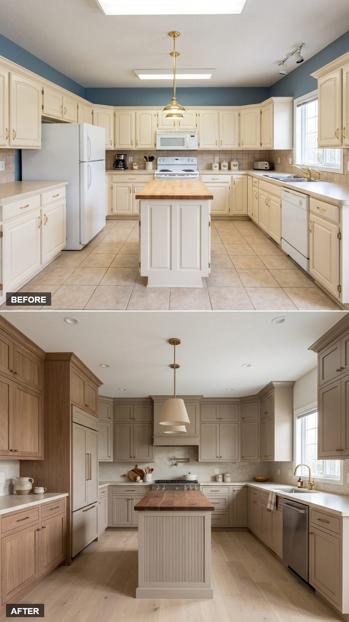
Greige cabinetry provides a neutral perimeter, but the island base is cut with narrow vertical fluting that catches light differently as you move through the room. The retained butcher-block top adds warmth without repeating the cabinet finish.
Hardwood replaces the old patterned flooring, and the range hood is simplified into a stronger central form. This makeover is less about color than relief: smooth cabinet faces around the edges, ribbed wood at the center.
3. Rift Oak and Slate Green Meet Over a Dark Soapstone-Look Island
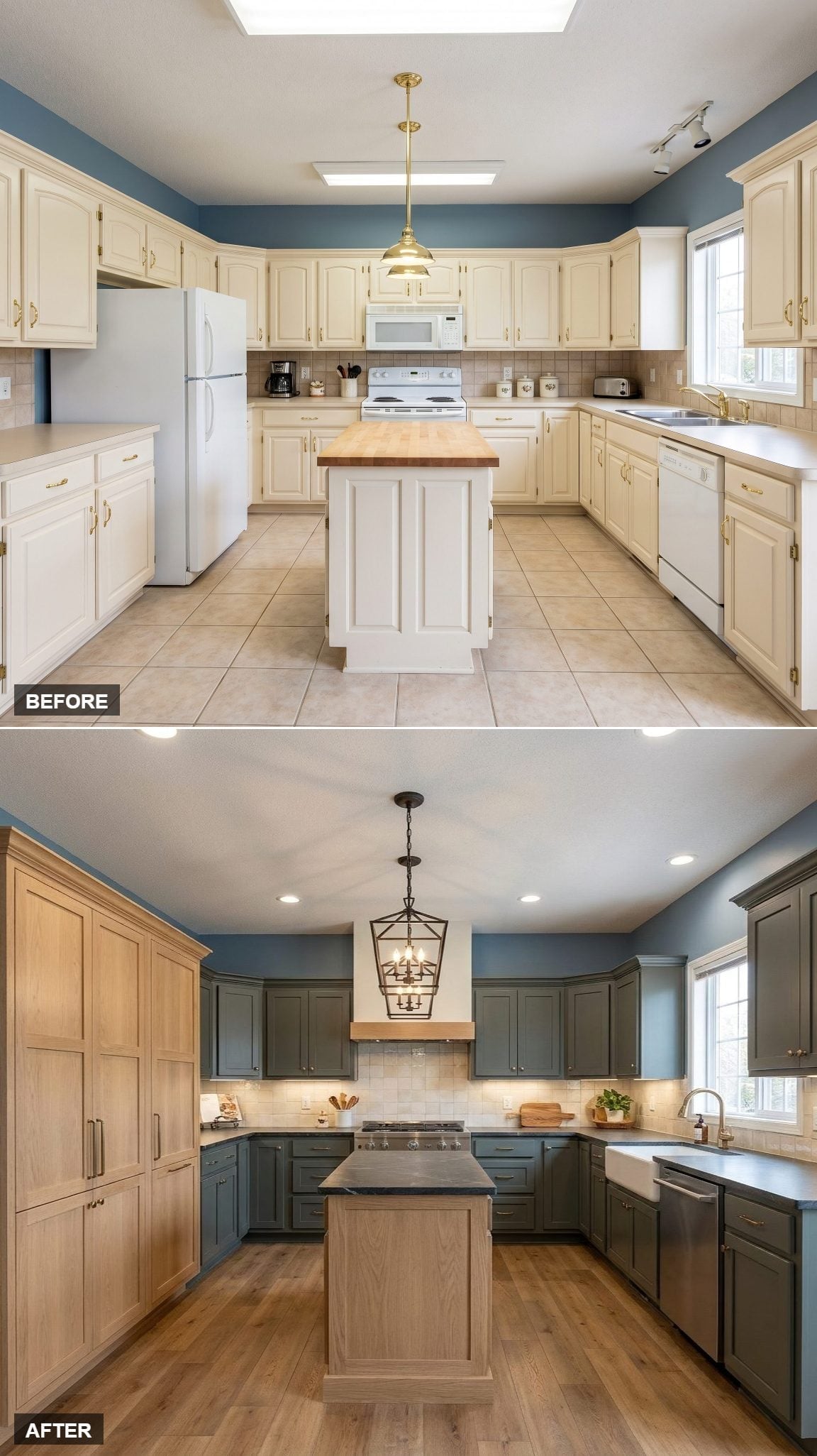
Warm rift-oak cabinetry on the left sits against slate-green lowers around the perimeter, giving the room an asymmetrical material split instead of another matching cabinet scheme.
The island repeats the oak beneath a dark soapstone-look top, creating a strong light-dark boundary at counter height. A lantern pendant adds a traditional note overhead, but the wood grain and deep stone keep the room from feeling sugary.
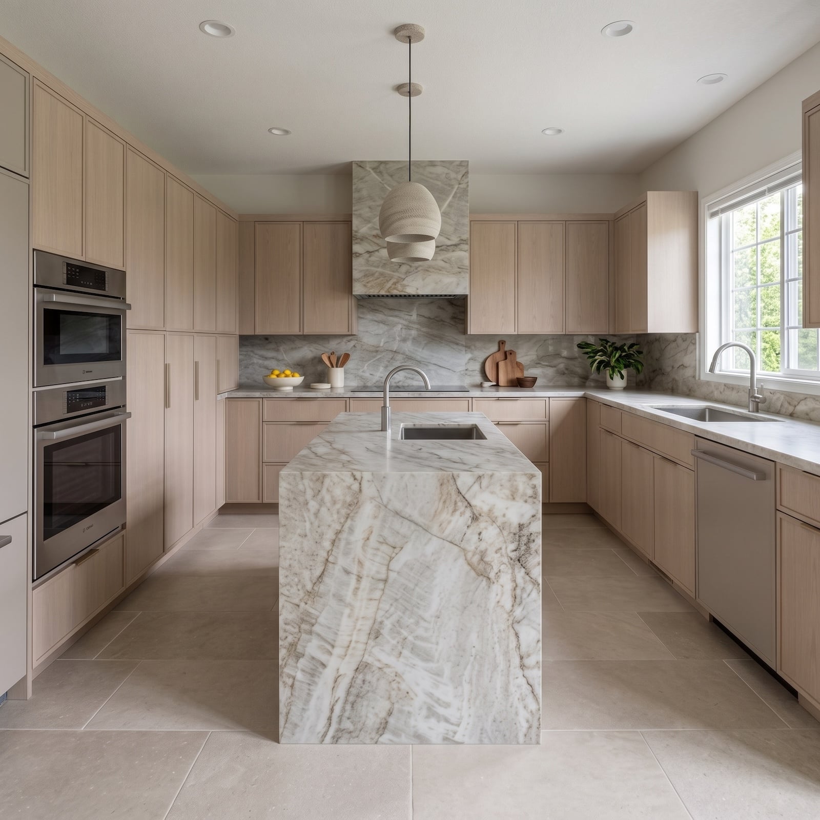
2. Bleached Oak and a Waterfall Stone Island Go Almost Monolithic
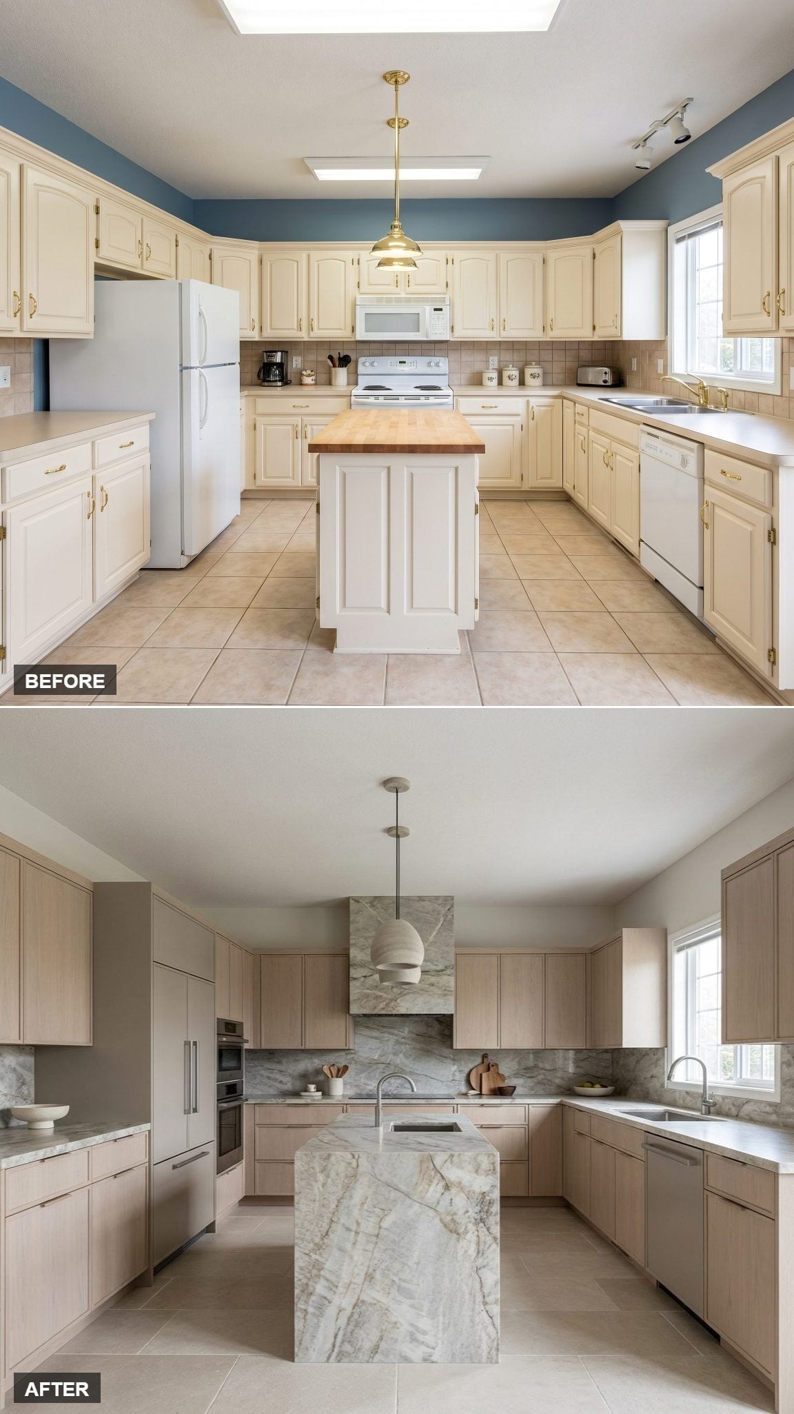
Bleached-oak cabinetry runs to the ceiling with flat, hardware-free faces, turning the perimeter into a pale wood plane. At the center, dramatically veined stone wraps the island from top to floor in a continuous waterfall treatment.
The same stone climbs the hood, so the kitchen repeats one assertive material instead of introducing another accent. A matte white globe pendant recedes overhead and lets the stone pattern carry the drama.
1. Charcoal Cabinetry and a Mustard-Gold Hood Finish on a Riskier Note
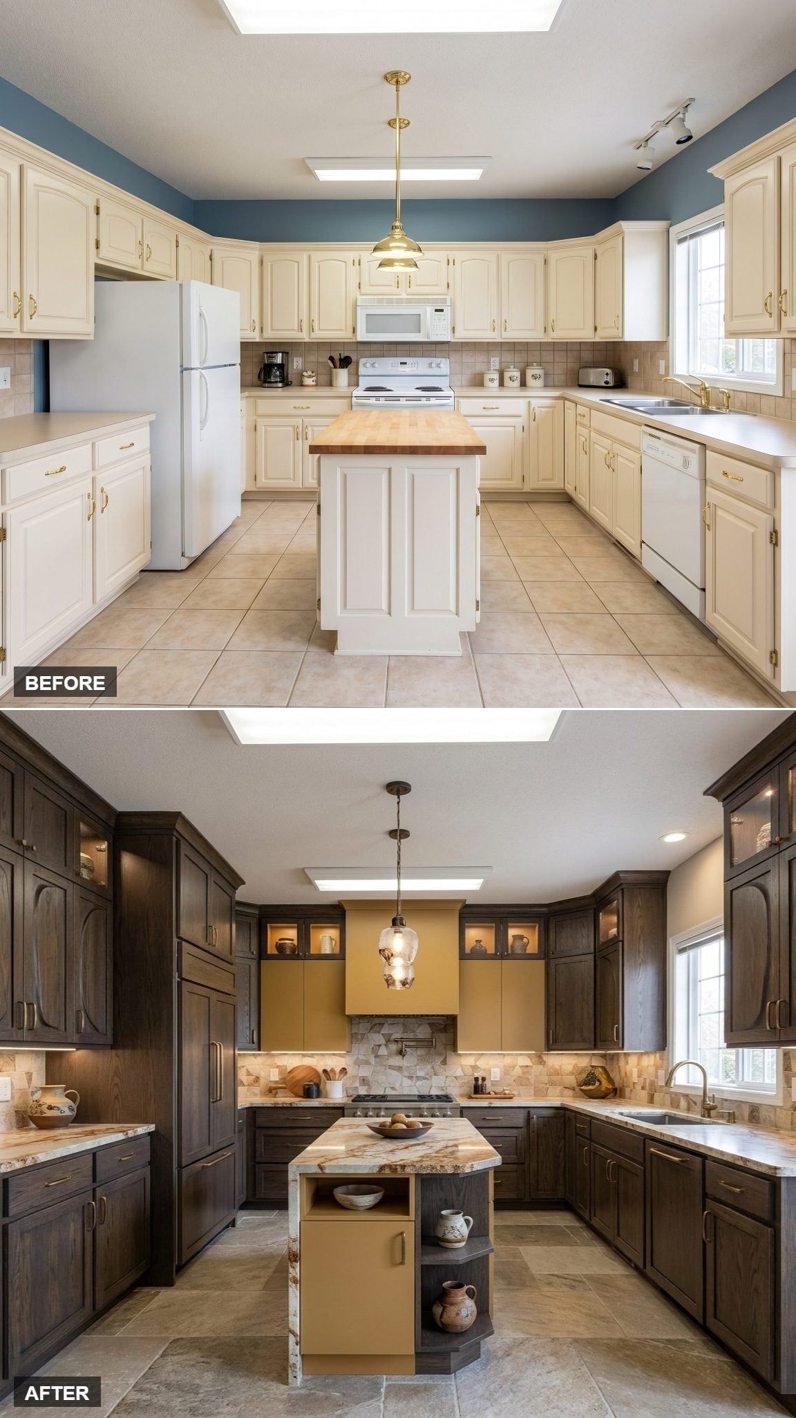
Charcoal-stained cabinetry takes the room to its darkest point, then a mustard-gold hood cuts straight through it. The color combination is the kind of decision that either lands or doesn’t. It lands.
Stone tile underfoot keeps the room from becoming a wall of dark wood, while pale veining across the island adds movement at the center. Lit glass-front uppers, an Edison-style pendant, and a textured stone backsplash make this the busiest finish in the series — appropriately, the renovation ends with the homeowner no longer playing safe.












