🔥 Would you like to save this?
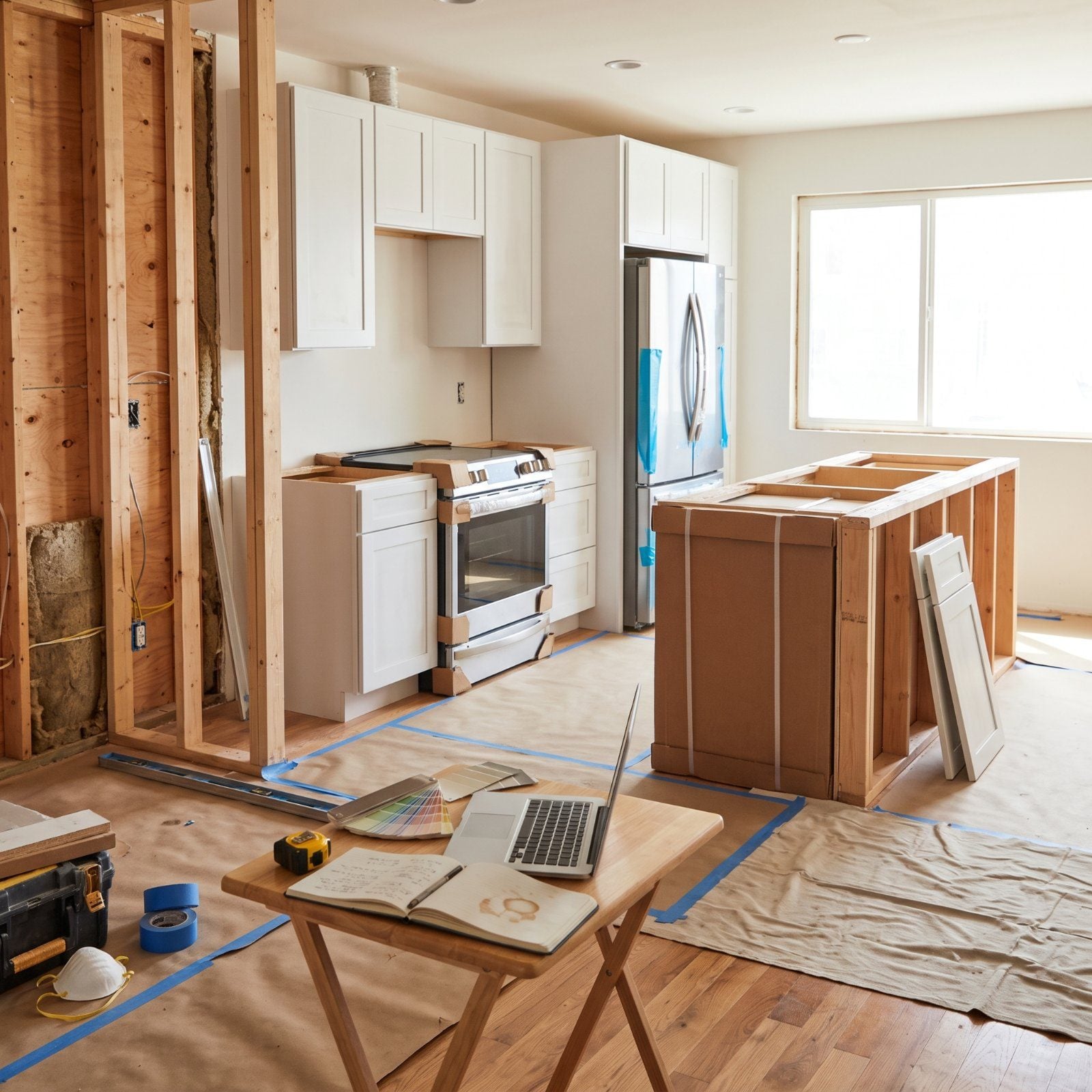
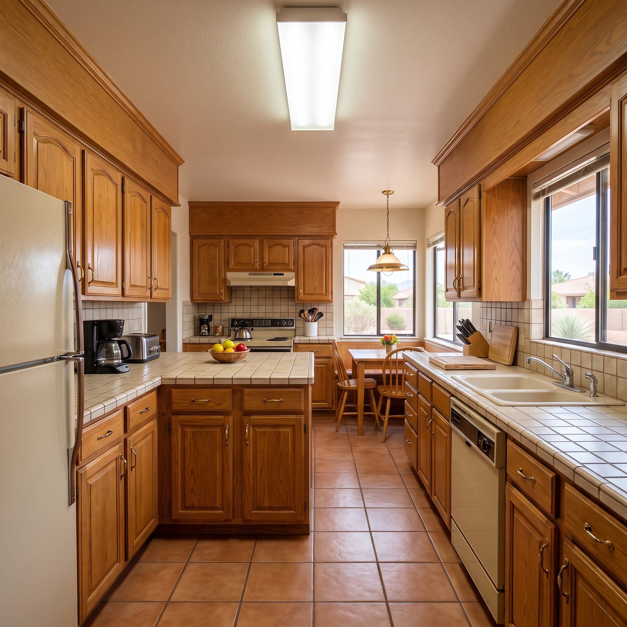
Size isn’t this kitchen’s real problem. The room already has the things designers usually wish they could add later: a long footprint, generous windows, plenty of wall length, and enough floor area to support a serious work zone. What dates it is the way those assets are organized — honey oak drifting toward orange, tiled counters broken up by grout lines, a projecting peninsula that interrupts circulation, and a fluorescent ceiling box flattening everything beneath it.
That makes the kitchen more interesting than a simple before-and-after. The structure is useful; the design language is not. Across these 36 transformations, the same basic room is pushed in completely different directions: walnut-and-plaster Santa Fe, severe sandstone minimalism, dark desert glamour, old-world Spanish, sculptural curves, quiet Japandi, a cook-first professional layout, and one deliberately oversized finale. Some versions work mainly through finish and proportion. Others rethink circulation, appliance placement, seating, storage, and where the room’s visual weight belongs.
In order to come up with the very specific design ideas, we create most designs with the assistance of state-of-the-art AI interior design software. Also, assume links that take you off the site are affiliate links such as links to Amazon. this means we may earn a commission if you buy something.
The fun isn’t finding one correct answer. There isn’t one. It’s seeing what happens when every decision starts supporting the same idea. Lower the contrast and the room becomes quieter. Concentrate the drama in one slab of stone and suddenly the rest can disappear. Change the island geometry and the whole room moves differently. One version whispers. Another arrives wearing marble. A few make the original kitchen look as though it has been waiting 40 years for somebody to notice what it could become.
36. Tuscan Warmth Without the Rooster Wallpaper
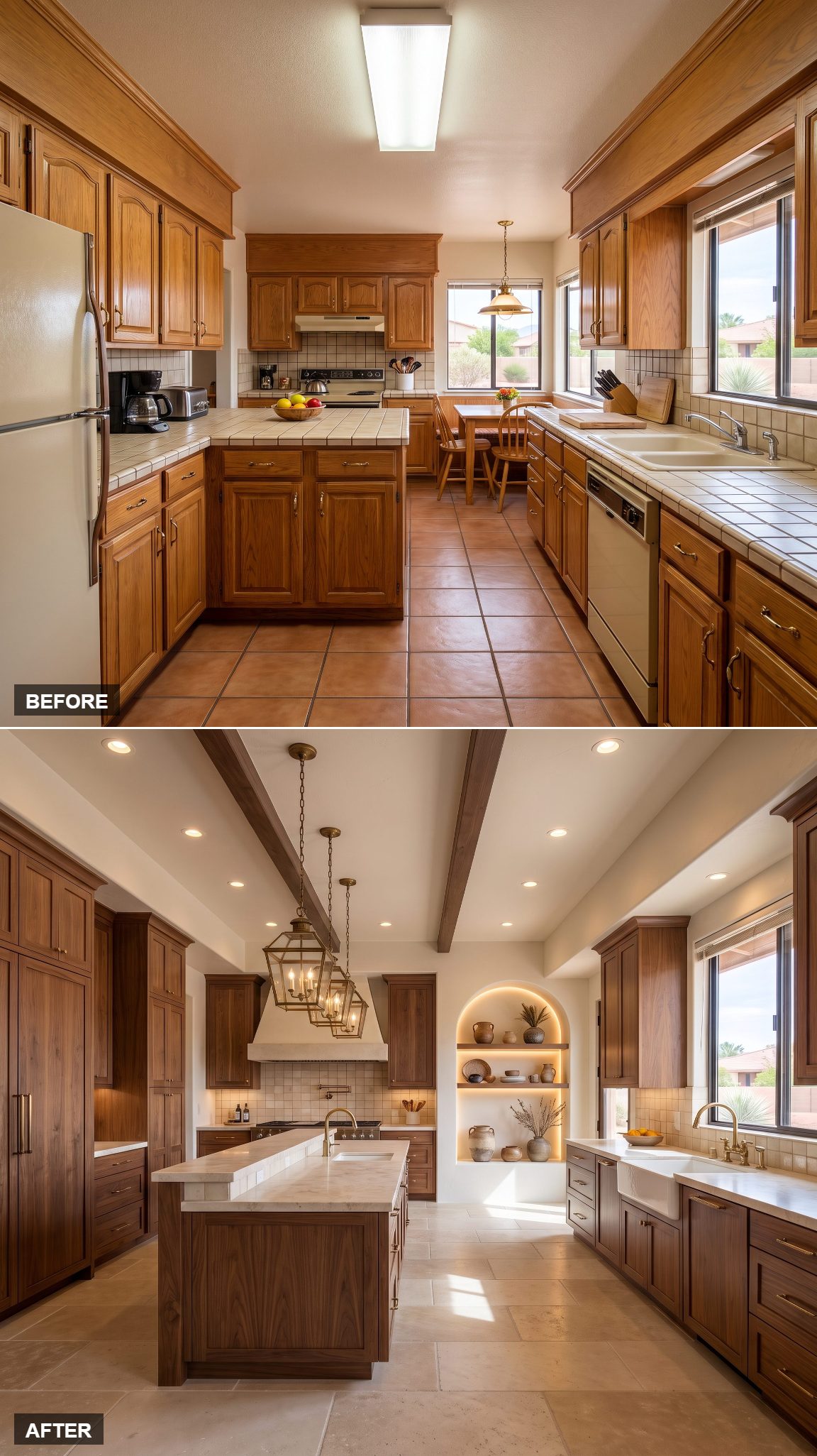
Old-school Tuscan kitchens could get heavy fast: faux-finished walls, wrought iron on every available surface, grapes appearing where grapes had no business being. This version keeps the warmth and loses the stage set.
Walnut cabinetry, aged terracotta, creamy stone, and a softly modeled plaster hood give the room weight without stuffing it full of props. Muted olive and ochre feel believable in desert light, while the stainless range tucks beneath the hood, the dishwasher blends into the cabinetry, and the refrigerator settles into the far run instead of announcing itself.
For more of the rustic side of this language, the rustic kitchen ideas archive is worth a scroll. Here, though, rustic gets edited hard enough to feel grown up.
35. Dark Desert Luxury That Never Feels Heavy
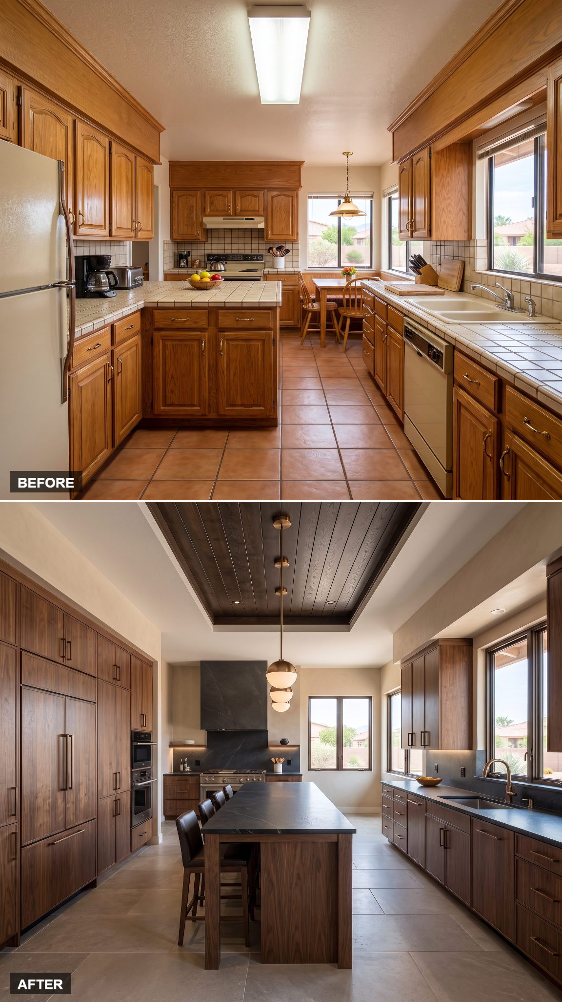
Going dark in a bright Sun Belt kitchen sounds like an excellent way to build a cave. This one proves the materials matter more than the warning label.
Smoked walnut, charcoal stone, bronze fixtures, and warm plaster all lean brown rather than blue-gray. Daylight still has plenty to work with, but now it lands on surfaces with depth instead of bouncing around a room full of pale sameness.
The darkness isn’t trying to make the kitchen moody. It makes the sunlight look expensive.
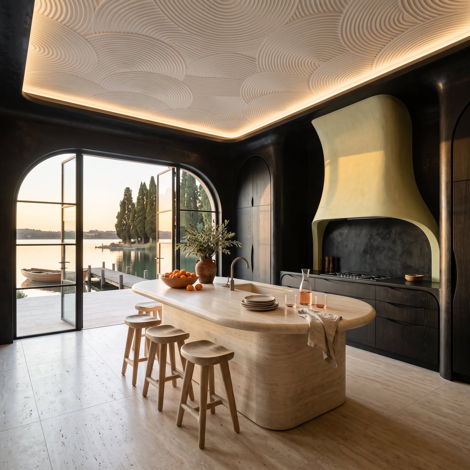
34. Soft Curves in a Room That Used to Be All Corners
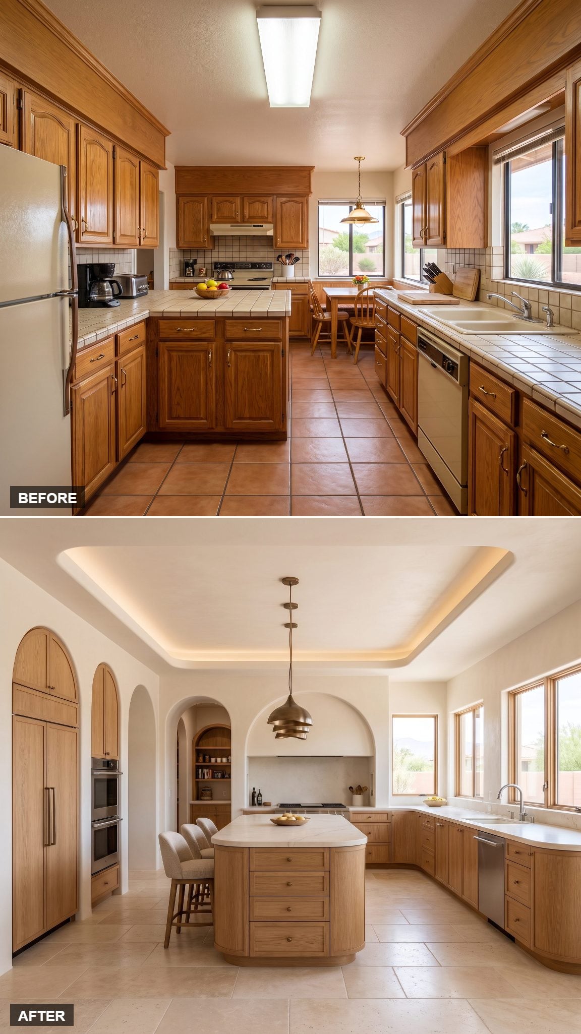
Curves are having a moment. This is the restrained version, not the melted-marshmallow treatment that can make a perfectly good kitchen look as though gravity got involved.
Rounded cabinet ends, an arched pantry opening, and a broad niche over the range soften the architecture while leaving the window arrangement familiar. The new character happens inside the room rather than depending on some heroic change to the exterior.
Pale plaster and warm oak keep those arches tied to the Southwest rather than some anonymous showroom. If you want to explore the centerpiece further, these kitchen island ideas show how strongly shape and proportion can affect the way a kitchen flows.
33. The Chef’s Kitchen That Still Feels Like Home
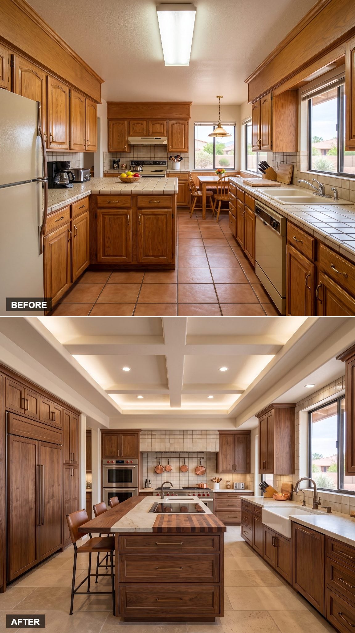
Professional kitchens are very good at cooking and sometimes remarkably bad at making anyone want to linger. All stainless, all edges, nowhere to lean while the pasta water takes its sweet time.
This version brings the serious work into an oversized central island with induction cooking and a prep sink. The dishwasher sits beside that sink, while the range, hood, and paneled refrigerator stay on the perimeter. Suddenly the walls aren’t carrying every task at once.
Warm walnut fronts and honed stone keep the equipment from taking over visually. The result has commercial logic without looking like the health inspector is due at four.
32. Mediterranean Blue, But Not the Coastal Cliché
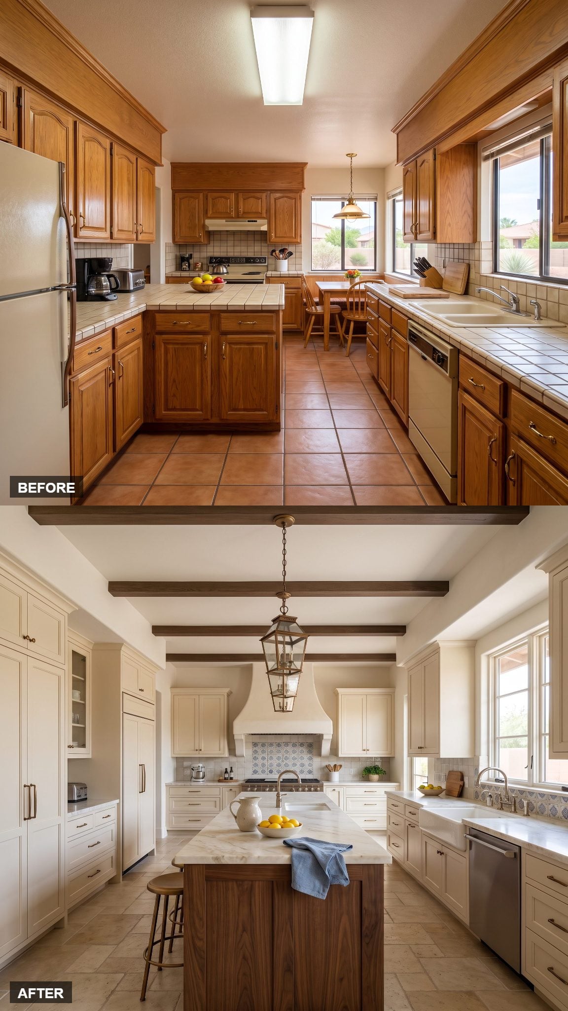
The blue here is dust, not sky.
A muted mineral shade slips into the handmade backsplash and island detailing without sending the room anywhere near nautical. Against ivory plaster and walnut, it behaves more like an old pigment than a decorating theme.
Push it several shades brighter and you’re suddenly ordering striped cushions. Keeping it grayed down lets the color belong to the stone, clay, wood, and dry light already in the room.
31. Monolithic Sandstone Kitchen With Nothing on the Counters
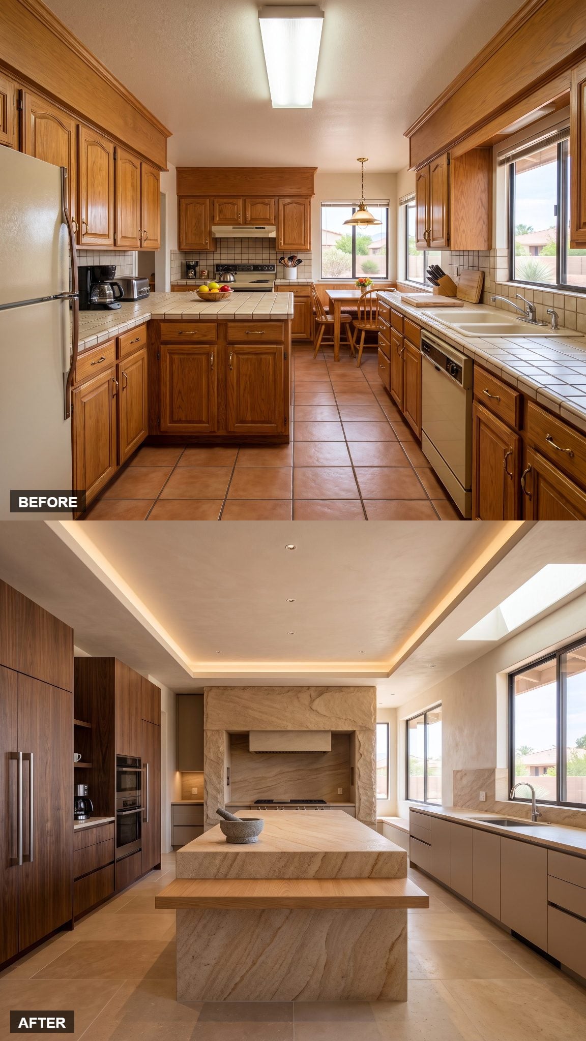
The nearly empty counters are the flex.
Appliance garages and hidden pantry storage let the sandstone read as one uninterrupted horizontal plane, which is a very different kind of luxury from adding more decorative material. Nothing is fighting for a patch of countertop because the clutter finally has somewhere else to live.
No pendants either. Recessed lighting and a floating plaster ceiling keep the sightlines clean and the stone in charge.
30. Southwestern Art Collector’s Kitchen With an Illuminated Niche
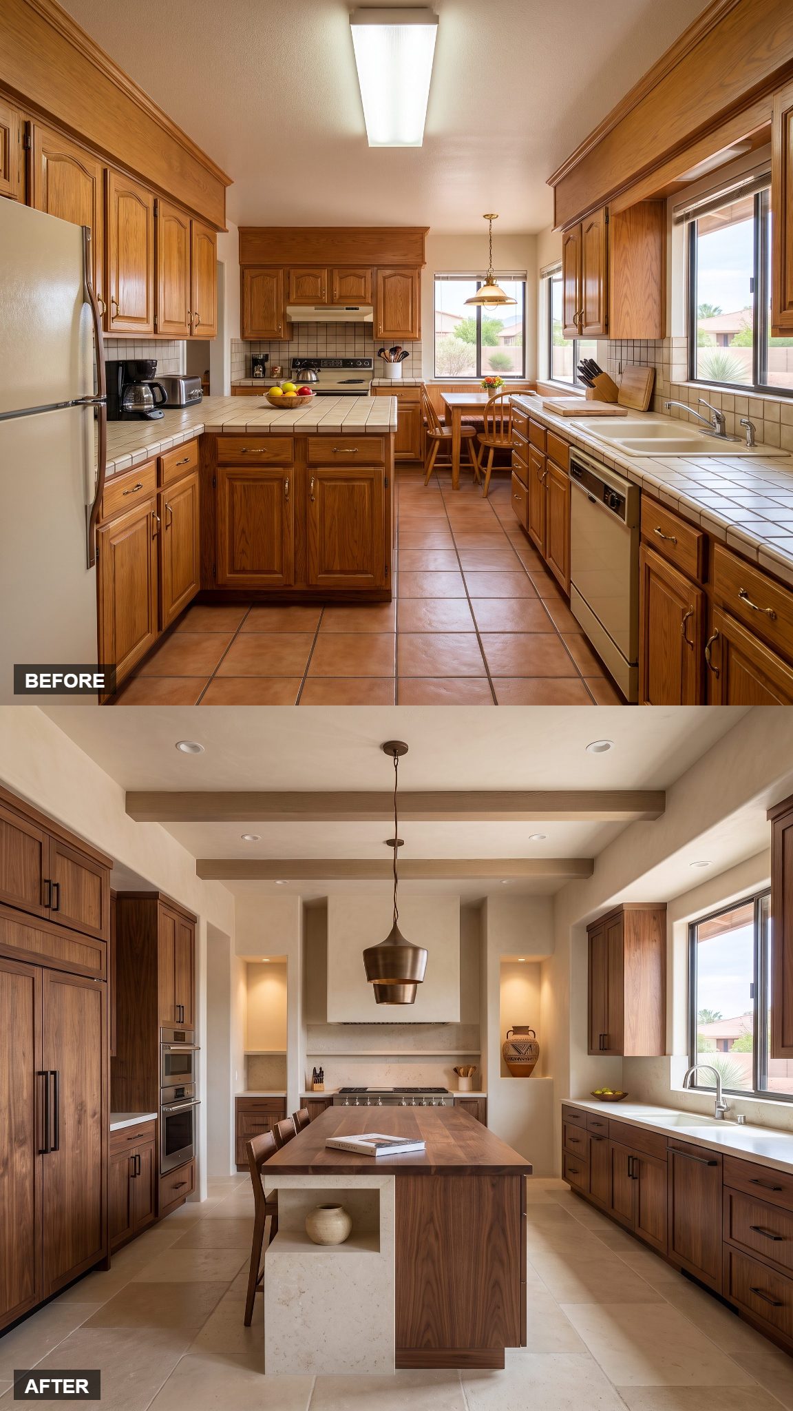
One lit niche changes the room’s job.
Instead of a kitchen that happens to contain art, this feels like a collector’s room that also happens to contain a range. A single ceramic vessel gets its own recess and its own light, while the walnut and plaster around it deliberately stay quiet.
The island even incorporates a stone display plinth at one end. That’s the collector move: give the object a stage, then stop decorating around it.
29. White Oak Canyon House
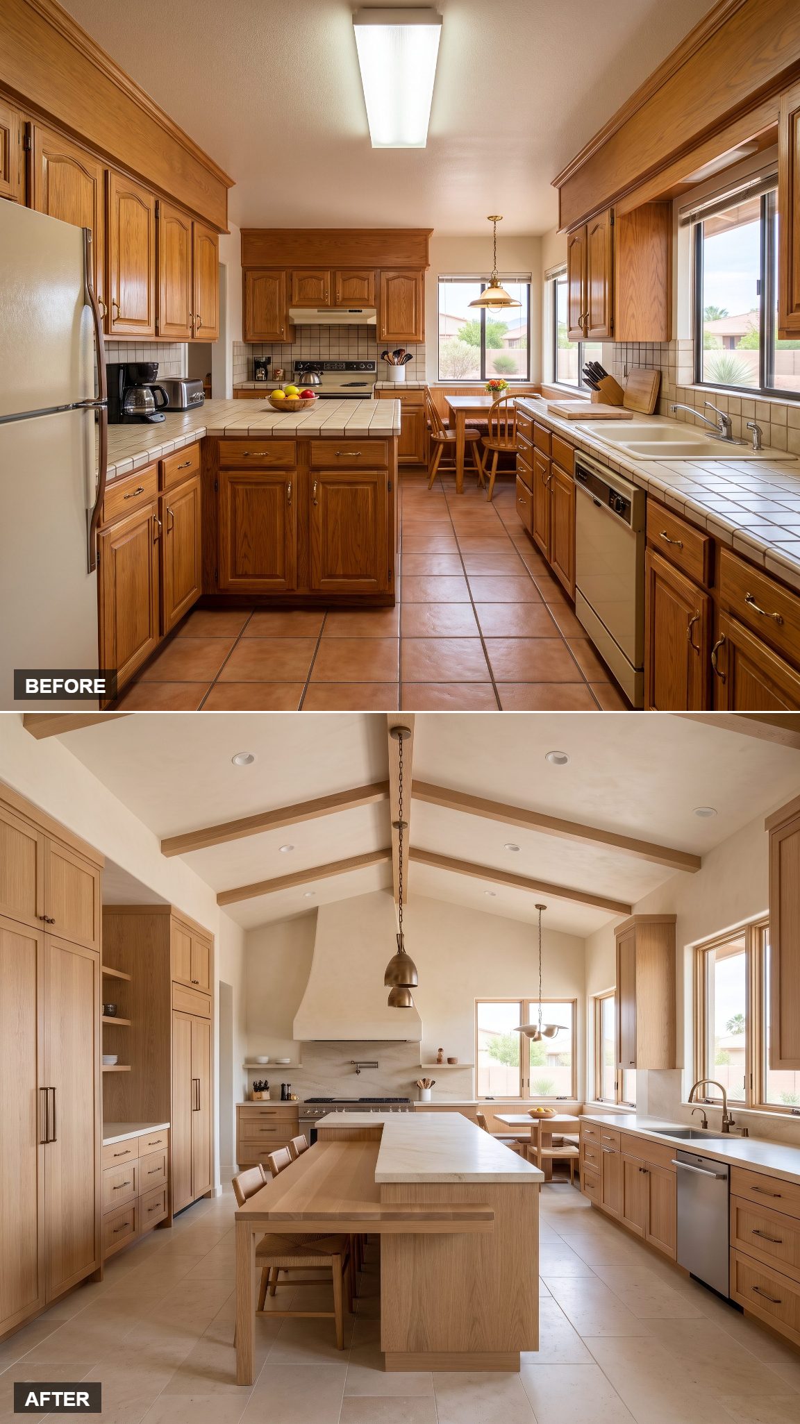
Airy is the entire assignment.
White-oak cabinetry, pale sandstone, creamy plaster, and restrained bronze make the most of the available daylight. A T-shaped island creates a long prep surface plus a proper place to sit without turning the seating side into an afterthought.
The starting kitchen stacks mid-tone brown against more mid-tone brown until every surface seems to stop at the next one. Here the palette opens the room visually without bleaching it into anonymity.
28. Old-World Spanish, Brought Into This Century
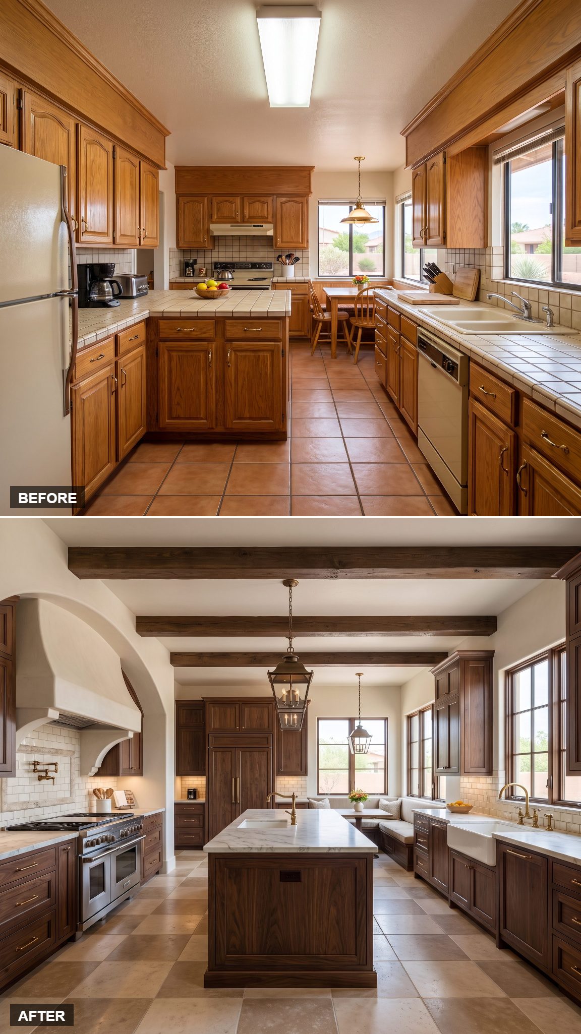
Dark walnut inset cabinetry against ivory plaster gives this room instant gravity, while handmade cream tile keeps the cooking wall from turning into one smooth brown mass.
It leans into dark kitchen design without letting the cabinetry eat every scrap of daylight. Aged brass and limestone make the whole thing feel older than the design actually is.
The peninsula gives way to a more open center, but the bigger improvement is proportion: fewer chopped-up surfaces, stronger vertical cabinetry, and a range wall that finally deserves to be looked at.
27. The Quiet Sonoran Kitchen
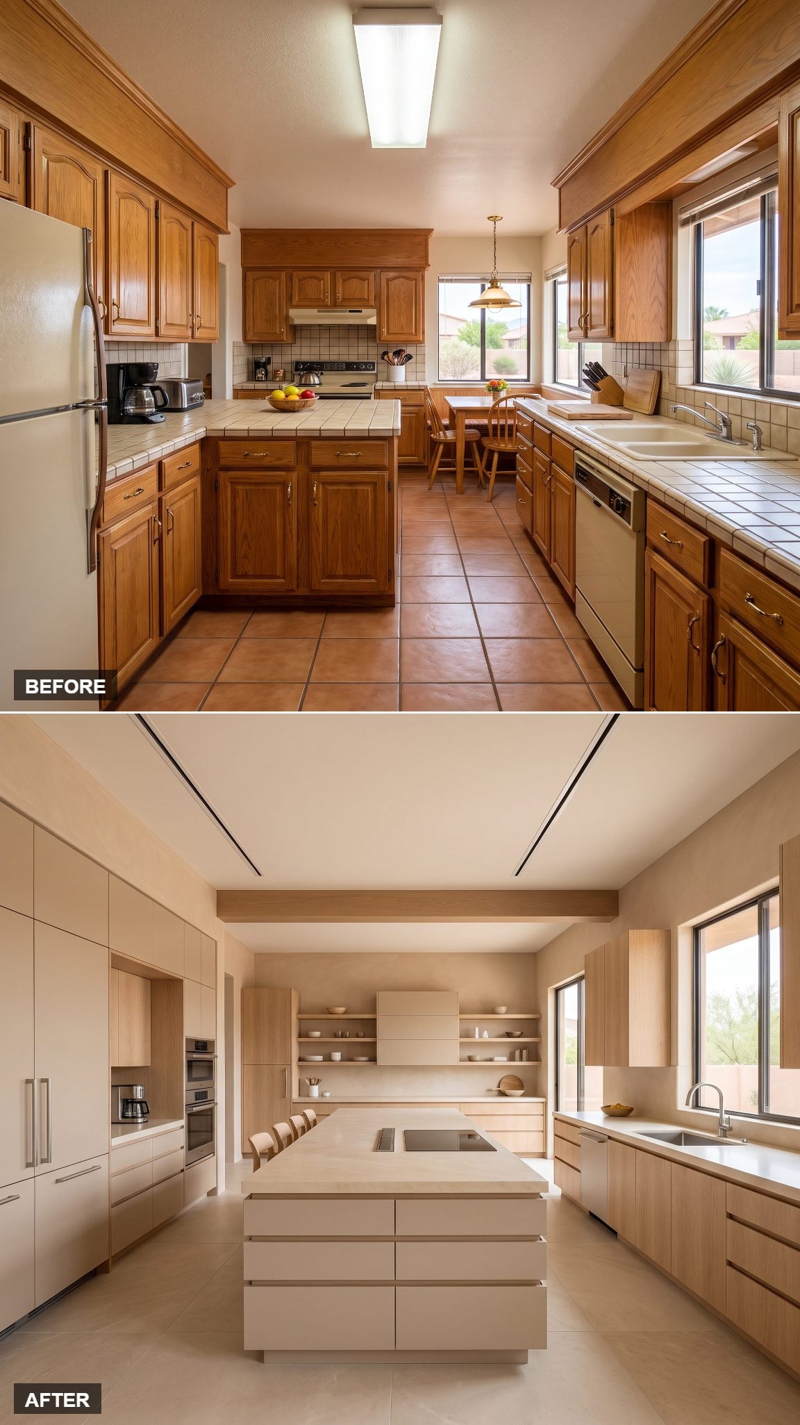
No pendants. That’s the move.
Sand-colored cabinetry, pale oak, and warm cream stone run almost uninterrupted beneath soft recessed lighting. Nothing hangs in the sightline, and the extra-wide island gets to remain one long horizontal surface rather than a stage beneath three decorative fixtures.
You have seen the opposite kitchen: three pendants squeezed over four feet of counter because somebody decided islands legally require them. This one declines.
26. One Monumental Quartzite Island Runs the Show
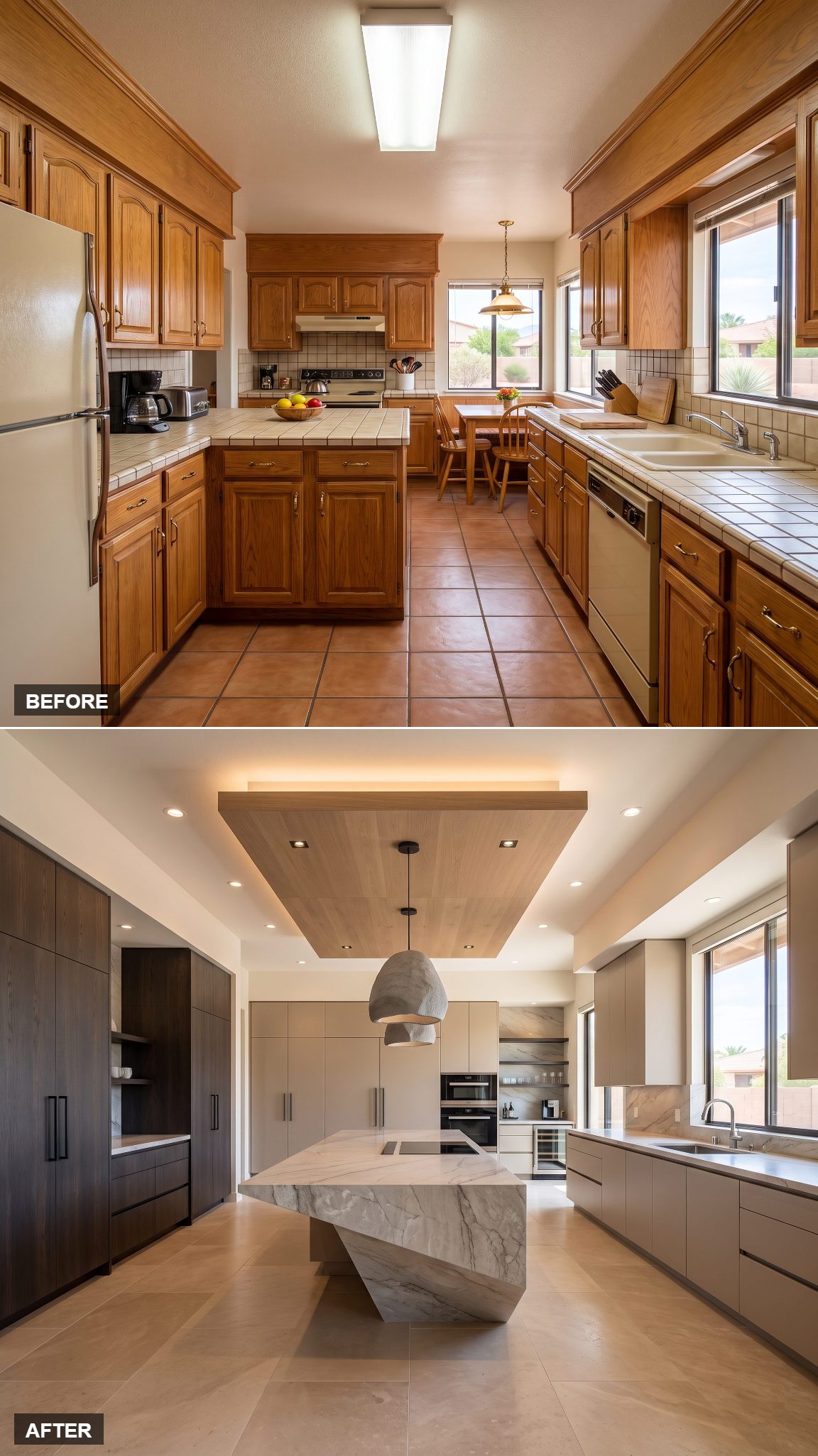
This kitchen makes one expensive decision and lets it be obvious.
A monumental quartzite slab becomes the island, complete with a cantilevered seating end that appears to float over the floor. The stone is full of movement — the sort of surface you’d frame if it weren’t more useful horizontal.
Everything around the quartzite island steps back. If you’re considering a similar intervention, these kitchen island ideas show how much proportion matters once one object becomes the room’s center of gravity.
25. Contemporary Santa Fe With Sculpted Plaster and Walnut
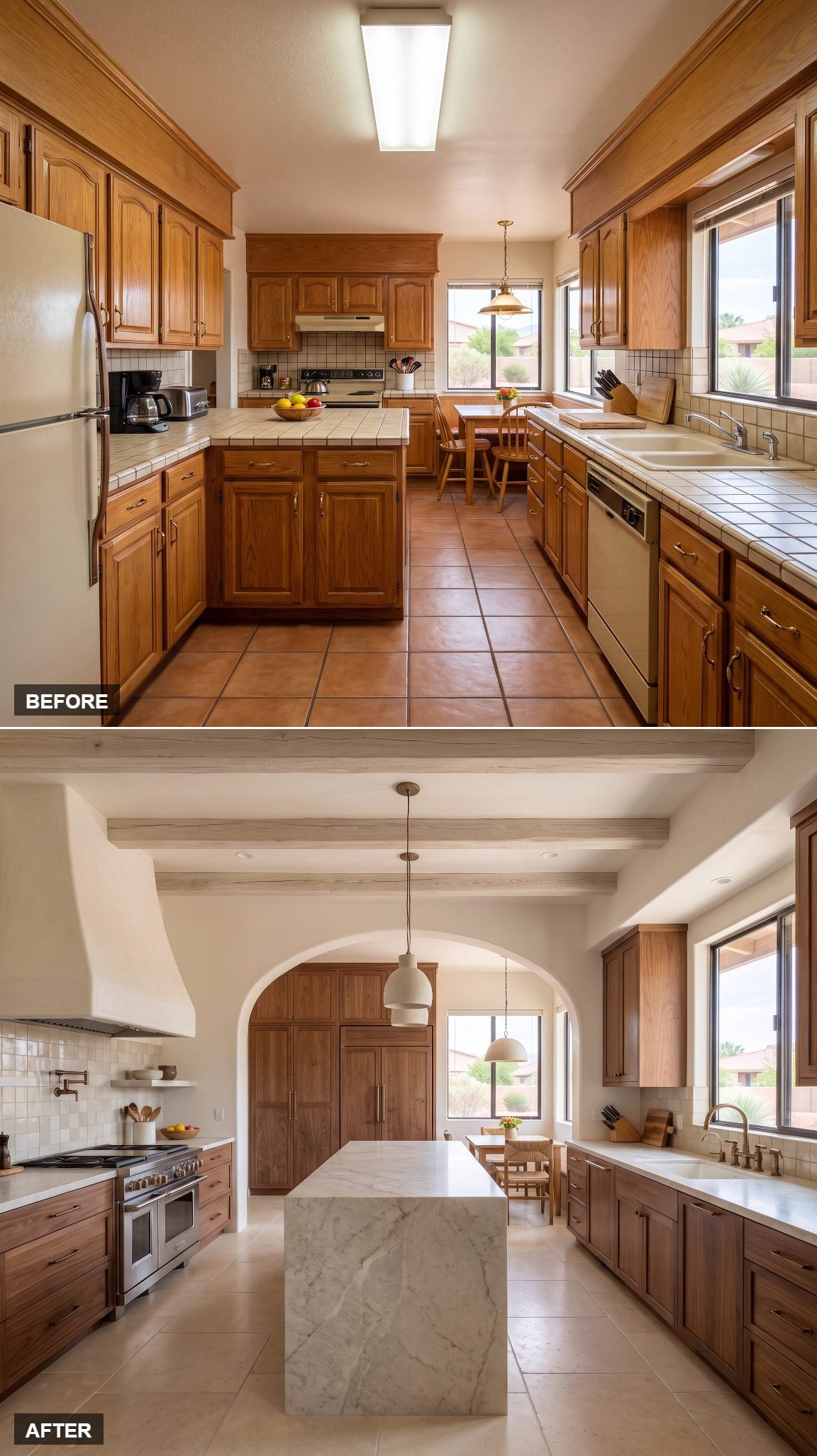
Santa Fe used to get reduced to turquoise, chili ristras, and a decorative cow skull having a difficult afternoon. This keeps the regional language and drops the souvenir shop.
Hand-troweled warm-white plaster rounds gently into the ceiling. Natural walnut runs long across the cabinetry. Irregular cream tile catches light differently from piece to piece, and a pair of clay pendant lights brings another handmade surface overhead.
The pleasure is tactile. Nothing needs to yell “Southwest” because the plaster, clay, wood, and light already know where they are.
24. Scottsdale Contemporary Polish
🔥 Would you like to save this?
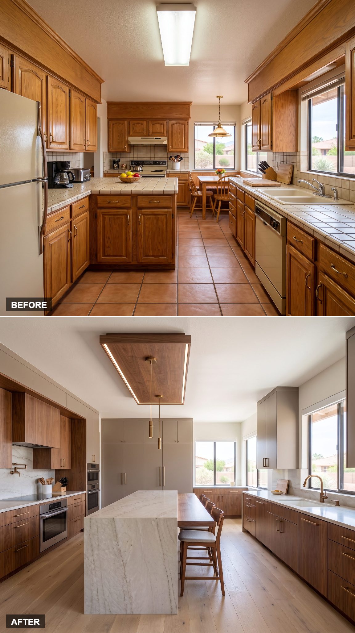
Warm walnut. Matte taupe. Pale quartzite. Bronze pulls small enough to know their place.
The large rectangular island gives the kitchen a proper center without competing with the cabinetry behind it. Matte finishes also soften hard reflections in a bright room, particularly where strong afternoon light hits cabinets at an angle.
23. Warm Adobe Contemporary, Hand-Troweled and Grounded
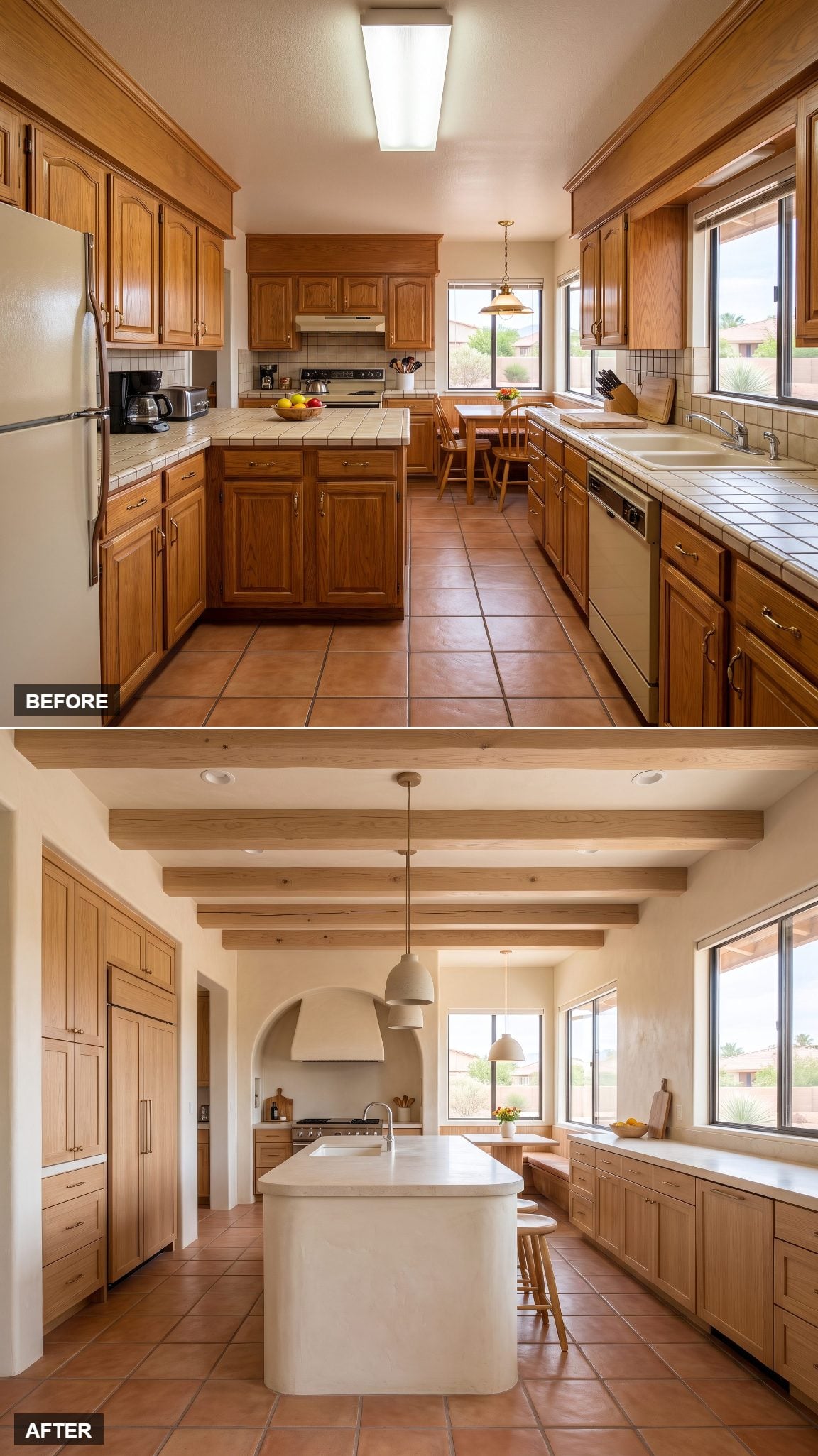
Go back to one of the region’s oldest material languages: earth, plaster, stone, and shade.
Creamy hand-troweled walls carry soft irregularities that catch afternoon light. Natural oak cabinetry, pale stone counters, terracotta accents, and arched openings make the room feel tied to the landscape rather than decorated after the fact.
The footprint doesn’t need to become grander for the kitchen to feel completely transformed.
22. Dark Walnut, Pale Stone, and Zero Apology
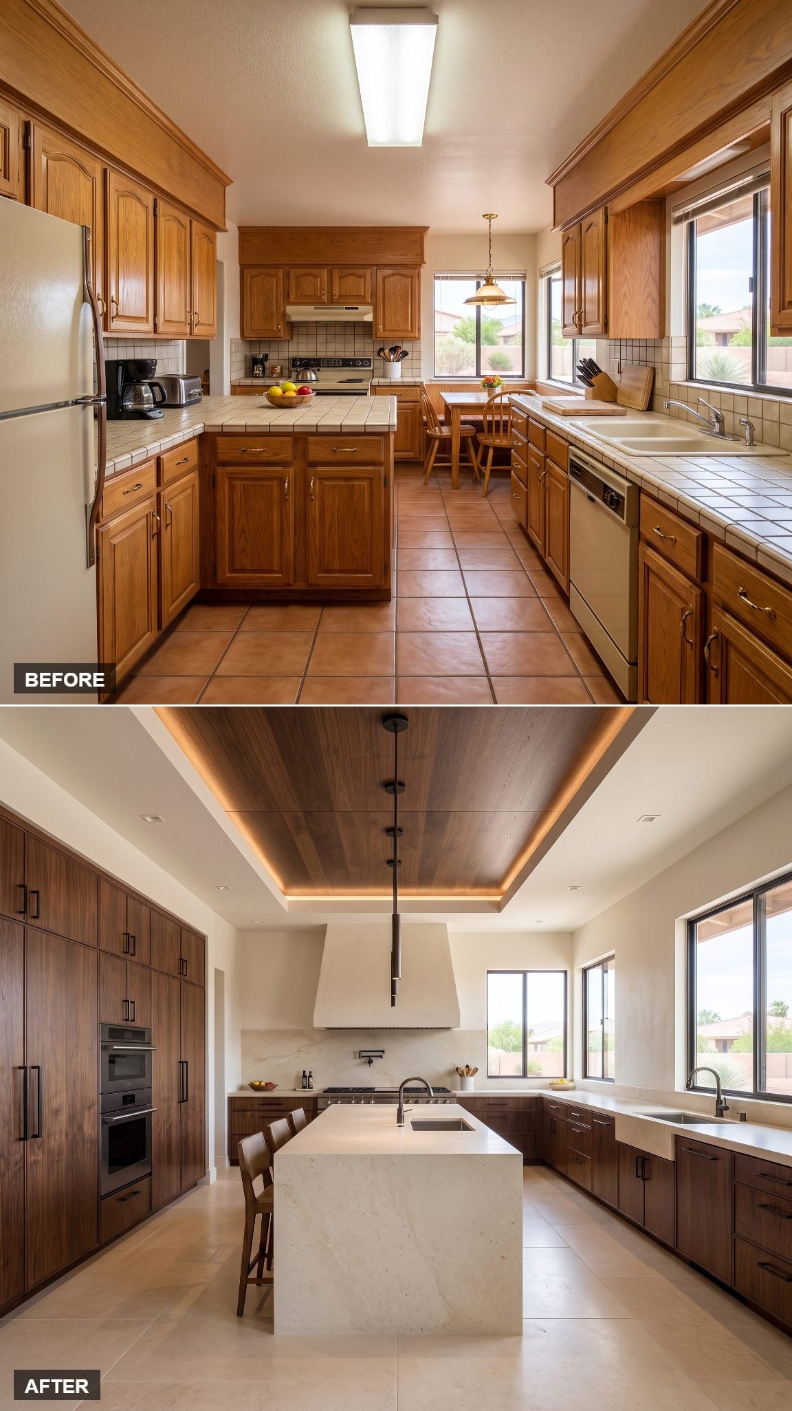
One of the highest-drama options in the gallery, and it doesn’t spend a second pretending otherwise.
Full-height walnut cabinetry climbs almost to espresso, then gets cut by creamy limestone and warm-white plaster. Blackened bronze acts like stitching on a good leather bag: visible, necessary, never the reason you bought the thing.
The contrast is deliberate. Dark cabinetry supplies weight; the pale backsplash catches daylight and keeps the cooking zone readable. If you love dark kitchen design but worry about losing brightness, this is the useful compromise.
21. Desert Japandi: Southwest Meets Its Quieter Cousin
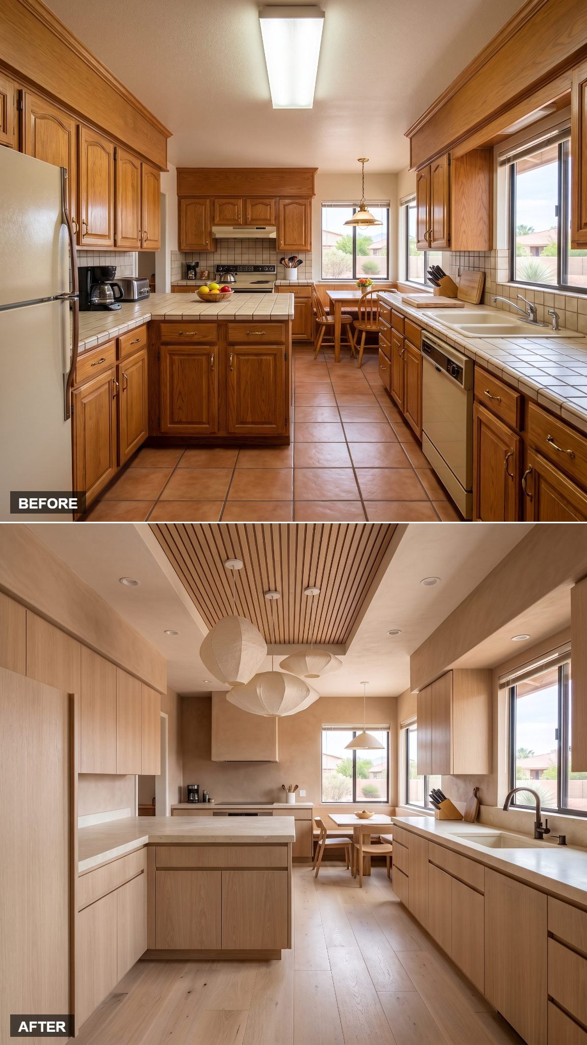
Pale white oak, warm clay plaster, creamy limestone, dark bronze. Nothing here needs a speech.
The peninsula arrangement gives way to a low, clean island with almost nothing sitting on it. The Southwest contribution is material and color; the Japandi influence is restraint, proportion, and the refusal to fill every blank surface simply because it exists.
20. A Limestone Arch Steals the Show
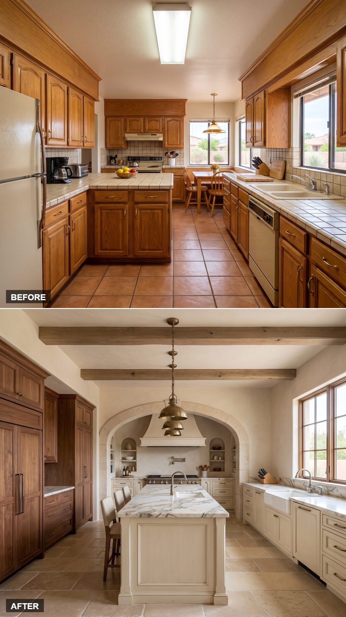
Build one broad limestone arch around the cooking wall and the room suddenly has architecture.
Everything else can afford to be quiet because that single gesture gives the kitchen a focal point. The window arrangement remains familiar, so the light still enters from roughly the same places; now it lands on curved stone instead of a long flat run of salmon-colored tile.
One architectural move, and the room stops looking assembled from parts.
19. Palm Springs Resort Mediterranean, Poolside Energy Indoors
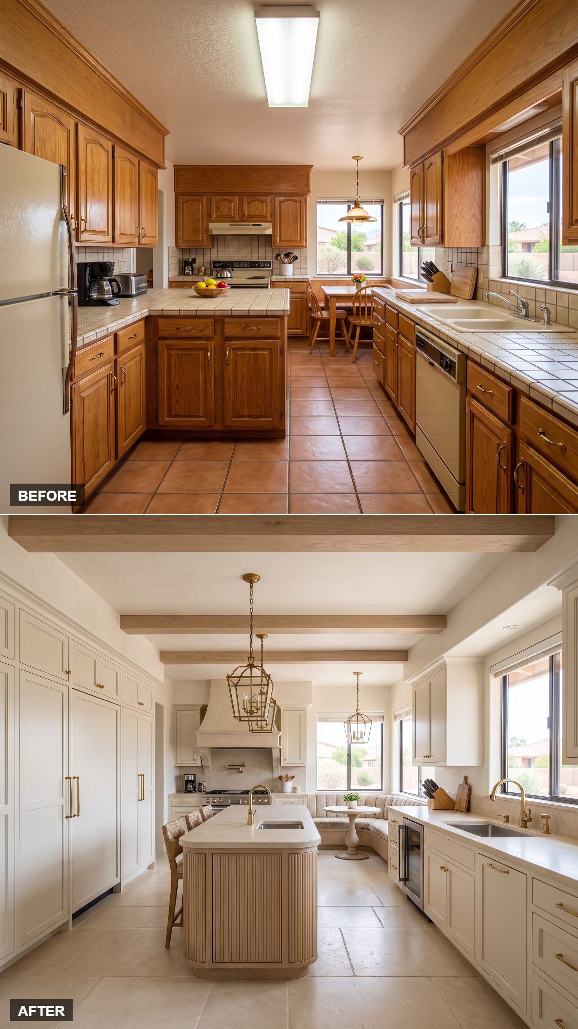
This version trades the breakfast-table-and-peninsula arrangement for one broad creamy-stone island with the relaxed proportions of something you might eat lunch beside while still wearing wet sandals.
Pale plaster, sun-faded wood, terracotta accents, and a rattan counter stool or two push the kitchen toward resort territory without turning it into a themed cabana.
The point isn’t resale. It’s circulation. A freestanding island works only when the room has enough clearance around it; here the new arrangement creates more open routes through the kitchen instead of funneling everyone past one projecting counter.
18. One Island, Two Jobs, Zero Wasted Steps
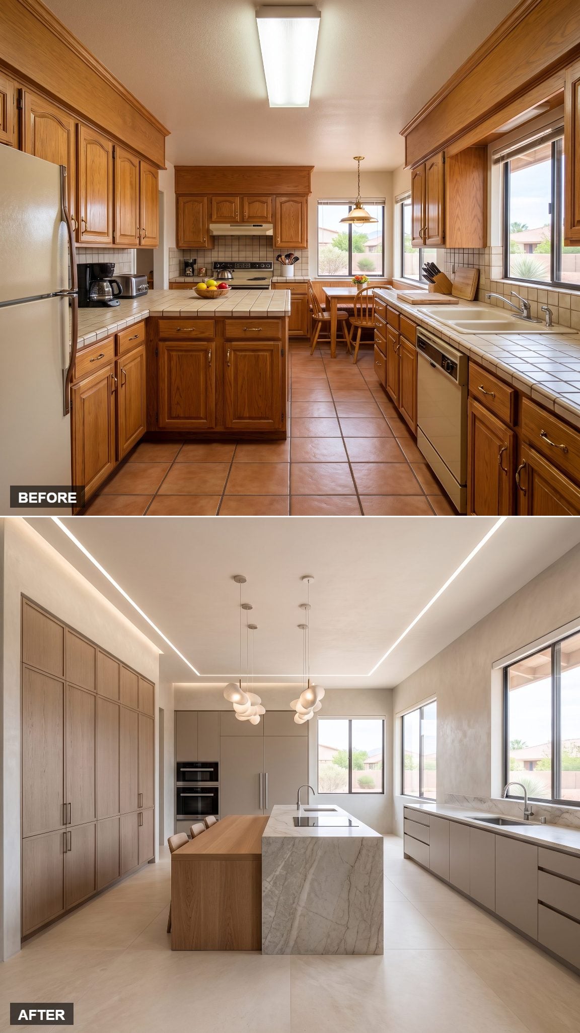
The deeper design problem isn’t appearance. It’s choreography.
When nearly every task is pushed to the perimeter, cooking can involve a lot of turning, crossing, and retracing. This version divides the island into two distinct zones: stone for prep and cooking, warm wood for sitting and eating.
A downdraft induction surface occupies the work side, the dishwasher tucks beneath the prep sink, and the range and paneled refrigerator stay on the back wall. The social side gets its own edge, so people aren’t parked where the cook needs to move.
17. Terracotta and Travertine, Done With Restraint
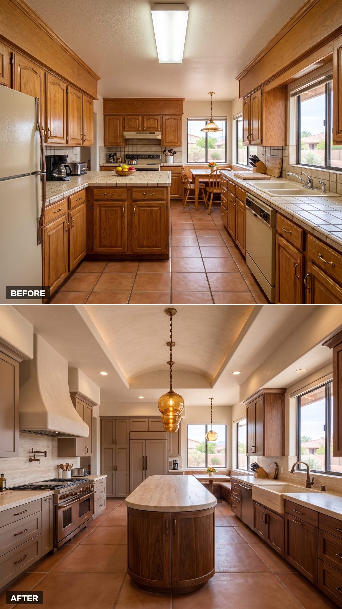
Southwest color, minus the theme-park version.
Muted clay cabinetry joins natural walnut and a substantial travertine island with vein-cut movement running across the surface. Aged bronze connects the materials without becoming another competing finish.
The clay is unmistakably color, but it has enough earth in it to sit beside stone and wood without looking freshly selected from a trend forecast. This is how you reference the desert without dressing the kitchen in a poncho.
16. The Gallery Kitchen With One Long Monolithic Island
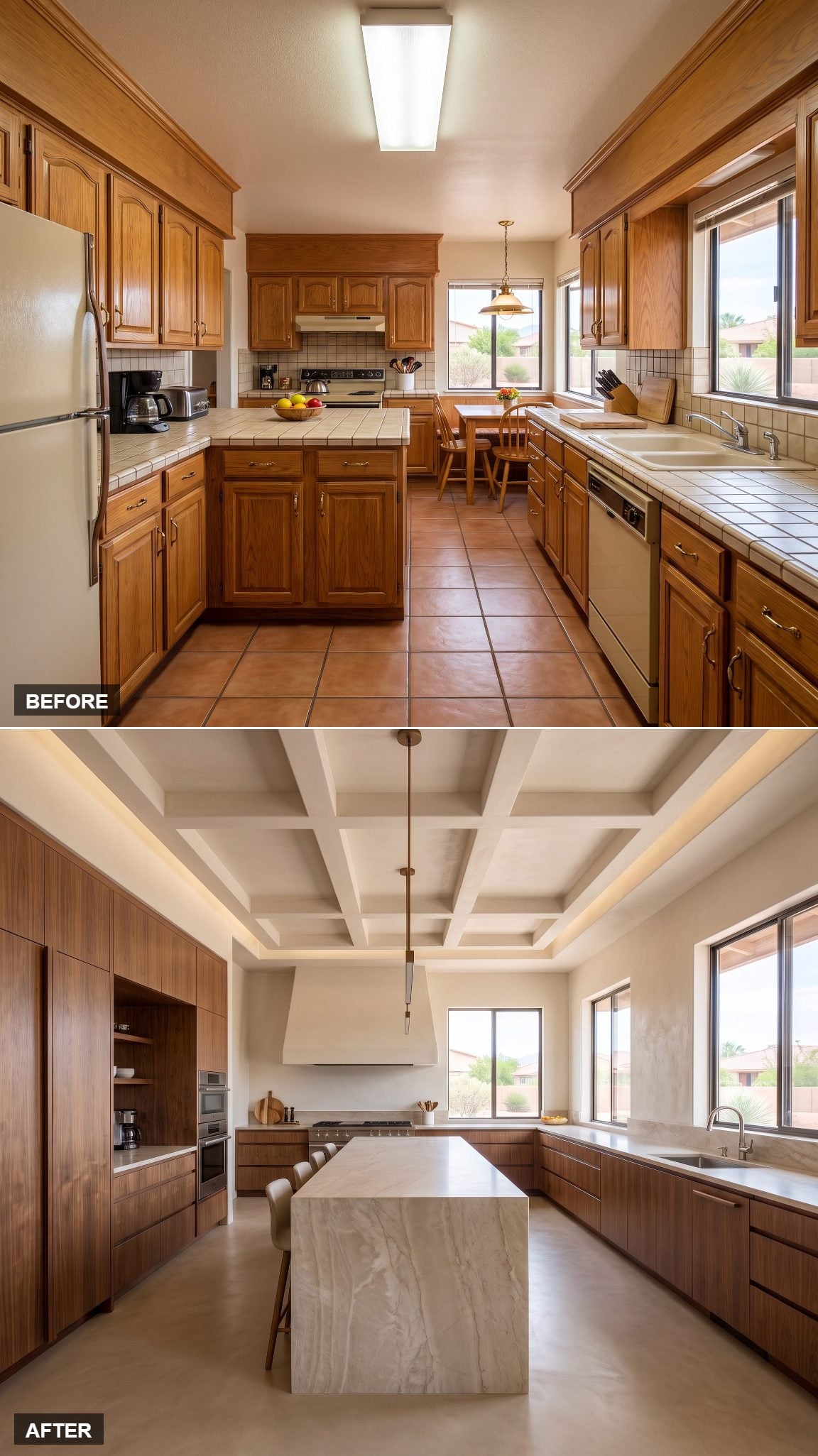
Long rooms want a strong longitudinal line. This one gets exactly that.
A narrow island runs down the center like a spine, with clear circulation on either side. Minimal upper storage and full-length stone emphasize the same direction instead of chopping the kitchen into short visual segments.
The idea translates even when the footprint shrinks. These small kitchen inspiration examples show the same principle: a clear route through the room matters more than simply squeezing in the largest island that fits.
15. Luxury Hacienda Revival
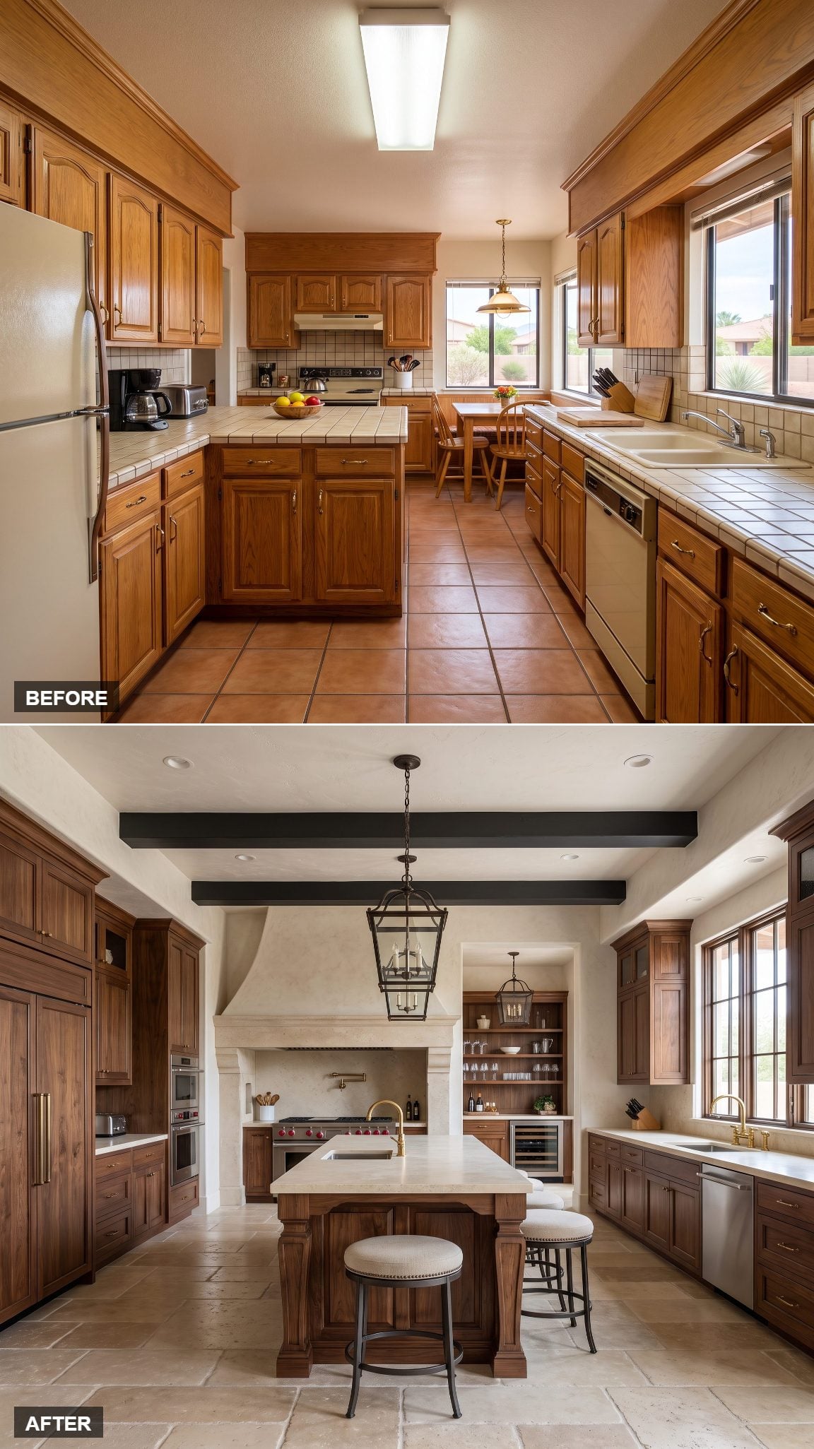
Substantial walnut cabinetry has the visual weight of furniture. Creamy limestone settles the floor. Hand-forged iron works against plaster textured enough to catch shadow without looking artificially distressed.
The more open center helps circulation, but the real character comes from scale and finish. Flat drywall would make this kitchen feel newly assembled. The irregular plaster gives the room the suggestion of age without forcing every surface to join the historical reenactment.
14. Adobe Resort Kitchen With a Glowing Ceiling Well
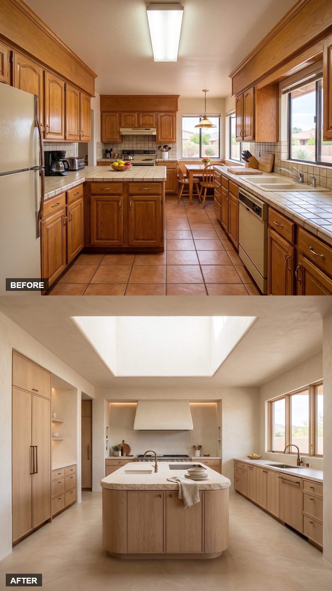
Look up. That luminous ceiling recess changes the whole room.
Rather than requiring an actual skylight, the glowing well creates the suggestion of daylight overhead and pulls attention vertically. The kitchen feels taller and more atmospheric even though the effect comes from lighting and ceiling design rather than a new opening in the roof.
Rounded limestone and lime-plaster surfaces soften the perimeter, while bronze fixtures keep all that cream from drifting into spa waiting room.
13. Spanish Mediterranean in Walnut and Honed Marble
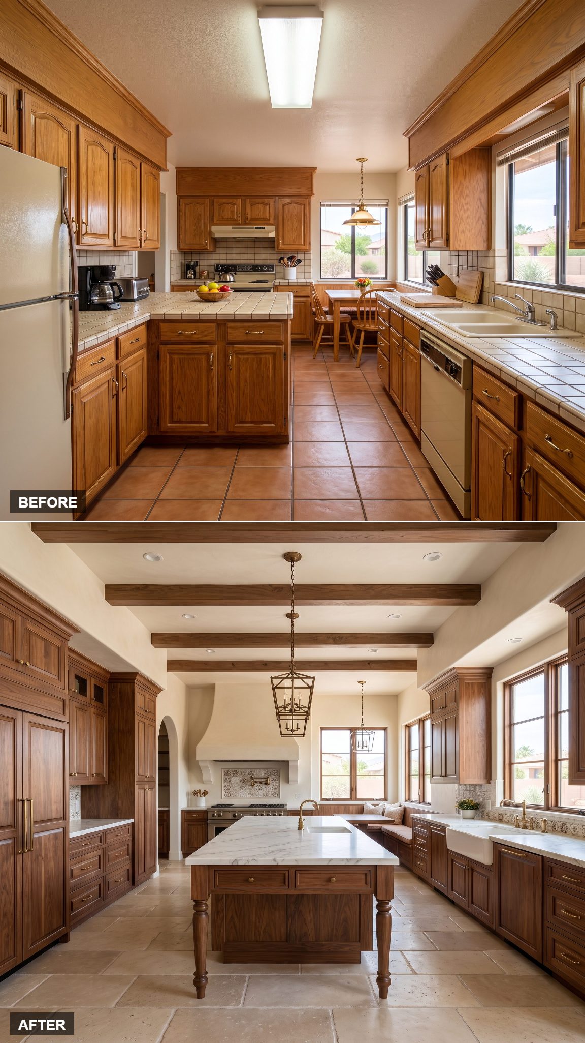
Take the same kitchen idea toward Seville.
Dark walnut cabinetry meets creamy plaster and honed Calacatta marble with enough gray movement to prevent the surfaces from turning sugary. Warm brass returns in an unlacquered finish meant to change rather than remain showroom-perfect forever.
The honed Calacatta marble runs from counter to backsplash and does most of the visual lifting. The combination leans into dark kitchen design without letting the room become chilly or severe.
12. Desert Transitional Luxury for People Who Hate the Word Rustic
🔥 Would you like to save this?
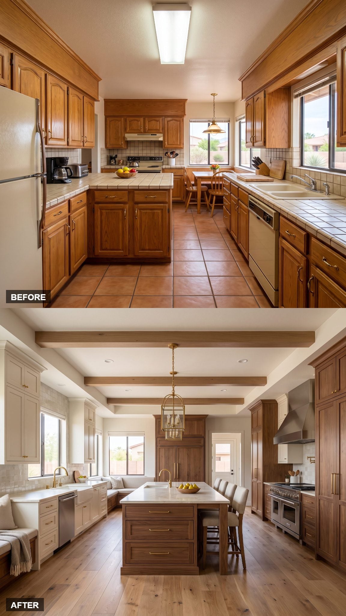
This is the middle path: warm without the barnwood theatrics.
Walnut concentrates on the island, warm-white cabinetry sits around the windows, and brushed brass links the two without making itself the main event.
The upholstered banquette is the smartest move in the room. It turns an awkward edge into real seating, accommodates more bodies than a scatter of chairs, and introduces softness where the kitchen would otherwise be stone and millwork all the way down.
11. Southwest Marble Statement Kitchen, Where One Slab Does All the Talking
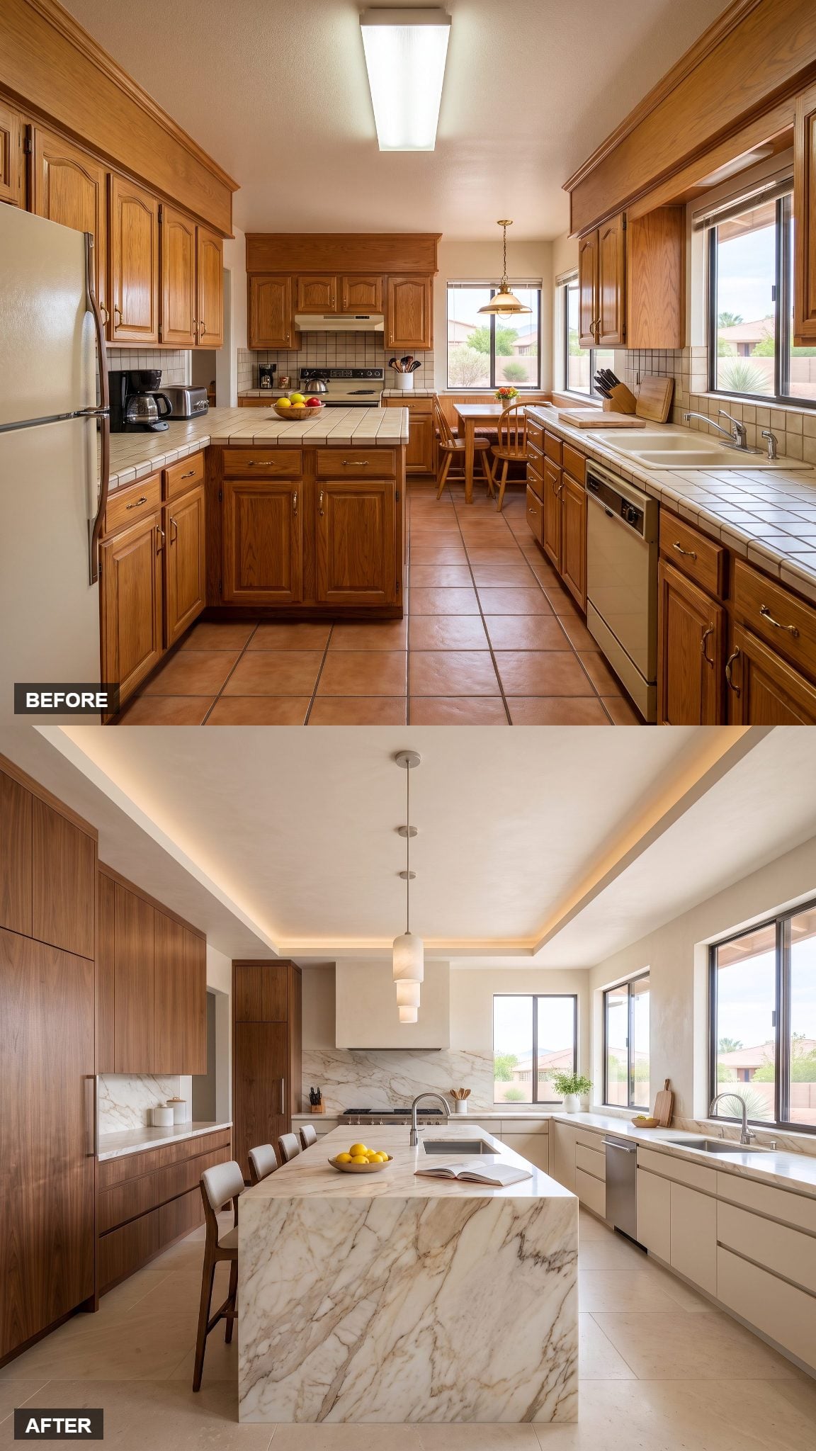
The starting room spreads attention across a lot of small surfaces without giving the eye one obvious place to land. This version does the opposite.
One richly veined marble slab becomes the event while walnut and warm-white cabinetry deliberately fade behind it. Waterfall ends turn the island into a continuous stone object rather than a cabinet box wearing a countertop.
10. Organic Southwest Curves and a Pill-Shaped Island
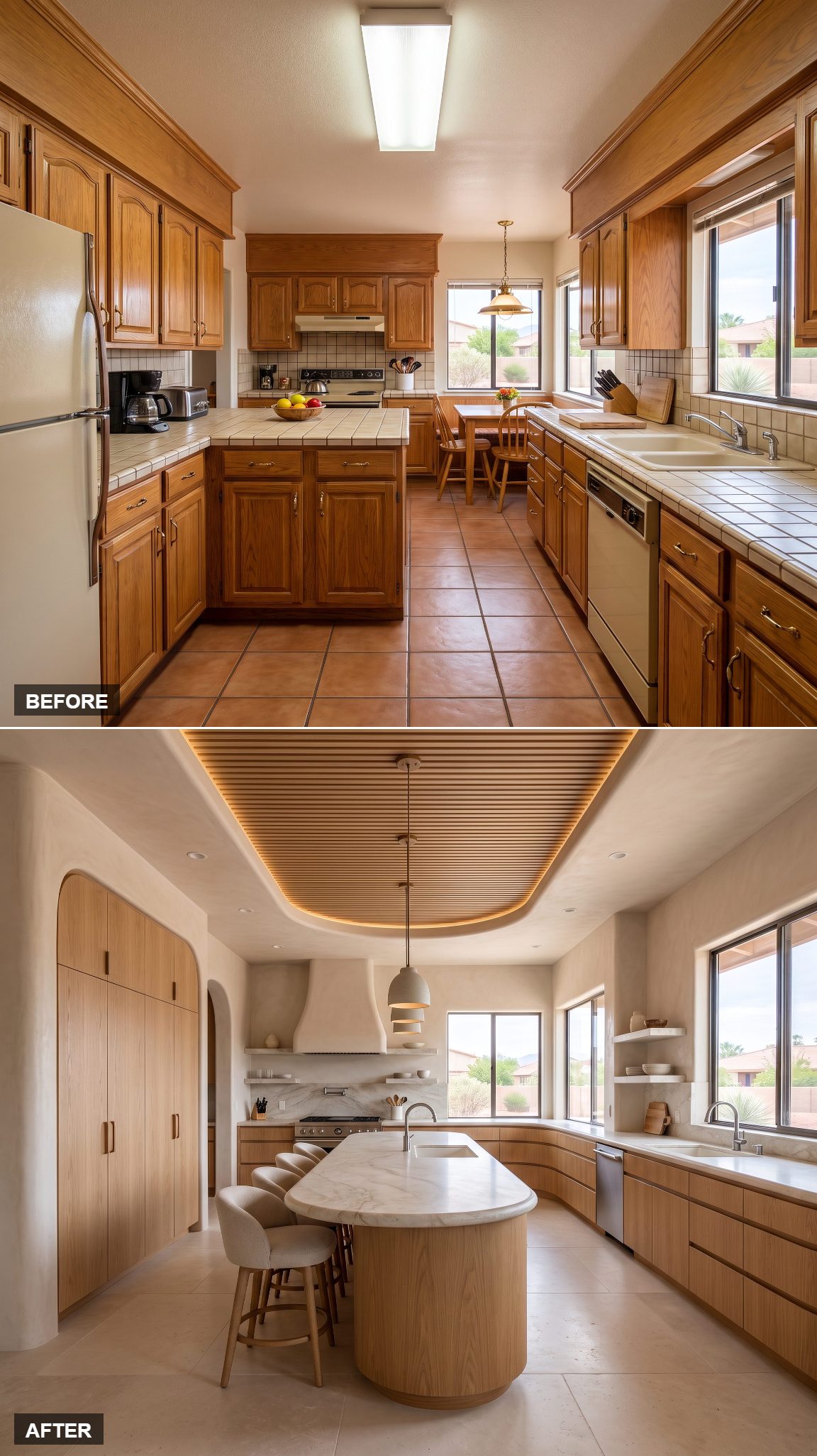
Almost every hard 1980s edge has been negotiated out of the room.
The centerpiece is a long pill-shaped island in warm plaster, more river stone than cabinet box. Curved fronts and arched niches continue the language without adding a dozen unrelated gestures.
Warm sand tones stop the shape from becoming novelty furniture. The curves are the architecture; the palette knows enough to stay out of the way.
9. From Honey Oak to Desert Modern Limestone and Rift Oak
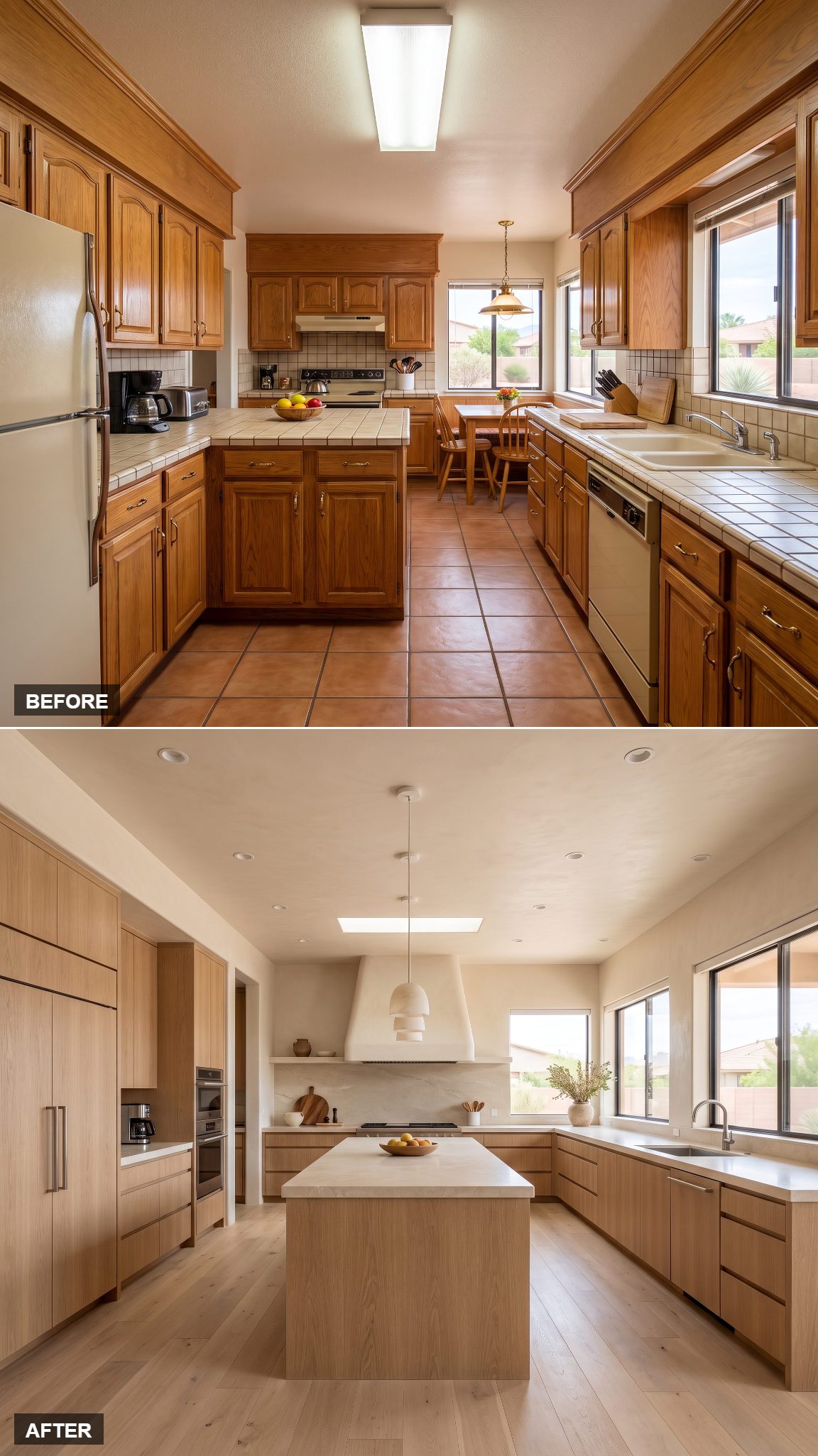
The most important change isn’t the cabinet color. It’s overhead.
In this version, the fluorescent box gives way to a cleaner ceiling treatment, and the entire room immediately feels less like office infrastructure. After that, the materials can afford to be quiet: rift-cut oak fronts, pale limestone counters, integrated appliances, and a slab backsplash where the dusty rose tile once dominated the wall.
Nothing is begging to be noticed individually. That’s why the room feels expensive.
8. Mediterranean Courtyard Kitchen in Ivory Plaster and Handmade Tile
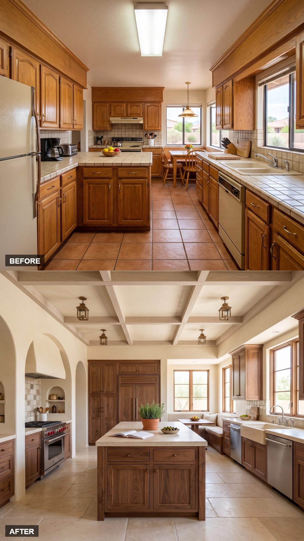
Here the circulation changes more than the color palette.
A four-sided island takes the place of the more directional peninsula arrangement, allowing movement around the work surface instead of forcing every trip past the same choke point. Handmade tile and arched plaster niches build the courtyard mood, while bronze lanterns age the room in a way polished chrome never would.
There’s a useful small kitchen inspiration lesson buried in the luxury: an island is only helpful when the clearances around it let you use every side.
7. Palm Springs Desert Glamour Moves In
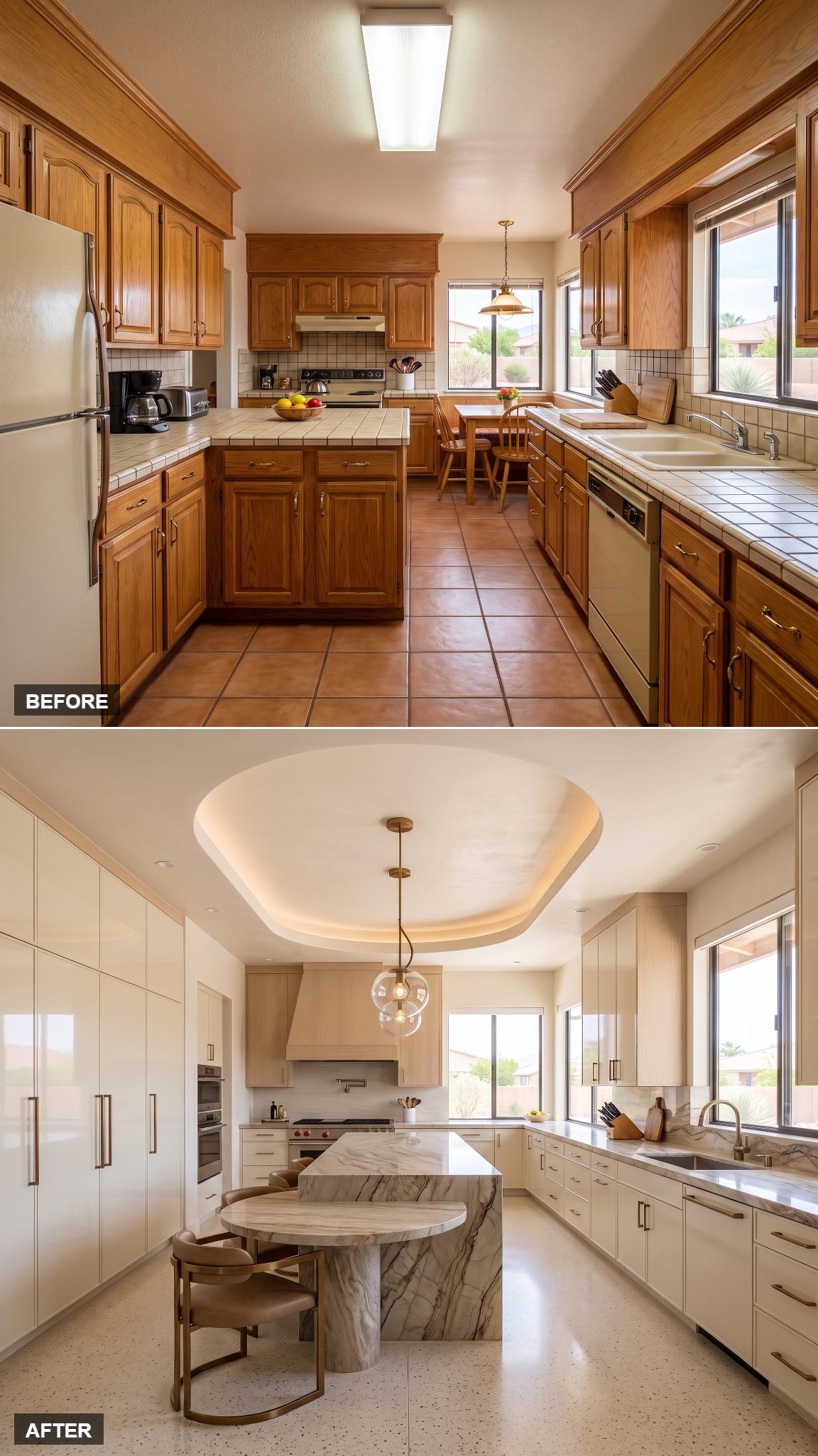
Pale oak, ivory lacquer, and stone veined like a dry riverbed. This is 1980s Sun Belt design after several years of excellent financial decisions.
The restrained bronze hardware is almost incidental, which is exactly right. The oversized island brings enough swagger on its own.
This version doesn’t try to look handmade or historic. It takes desert color and pushes it firmly into polished contemporary territory.
6. Sculptural Contemporary Southwest With a Curved Ribbed-Oak Island
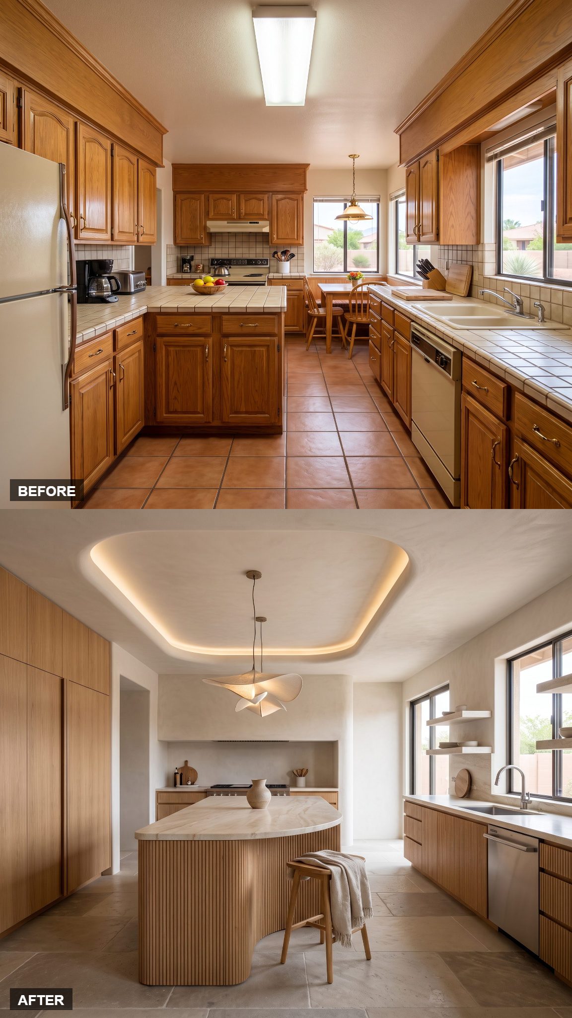
That sweeping social edge is the entire reason this island exists.
The working side stays straight for prep and cooking. The opposite side bows outward to gather stools around it, so the same object handles two completely different behaviors without becoming two separate pieces of furniture.
Ribbed oak catches shadow across the curve and gives the island texture even when the light is low. Instead of another slab-sided box in the center of the room, you get something with an actual profile.
5. Travertine Southwest Minimalism, Stripped to the Essentials
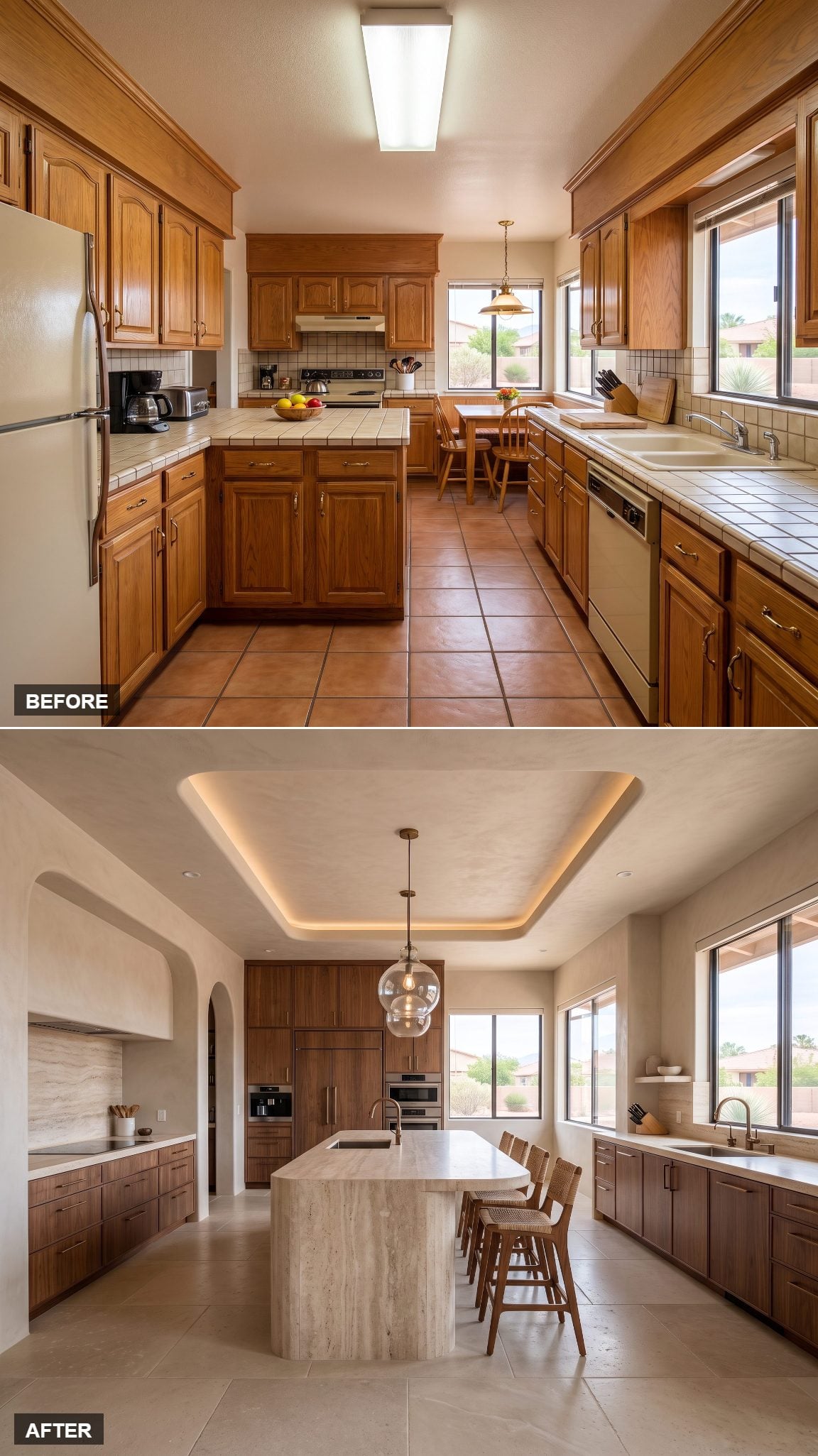
Take almost everything decorative away.
Travertine runs across the floor and returns at counter height in the same biscuit family. Cabinet fronts go flat, pale, and handle-free. No brass jewelry, no statement pendants, no heroic backsplash asking for its own Instagram account.
Those honed travertine counters supply enough warmth and variation to keep the minimalism from becoming sterile.
This is one of the quietest rooms in the gallery, which makes it particularly useful after all that walnut and marble.
4. The Desert Entertainer’s Kitchen With a Guest Flow That Actually Works
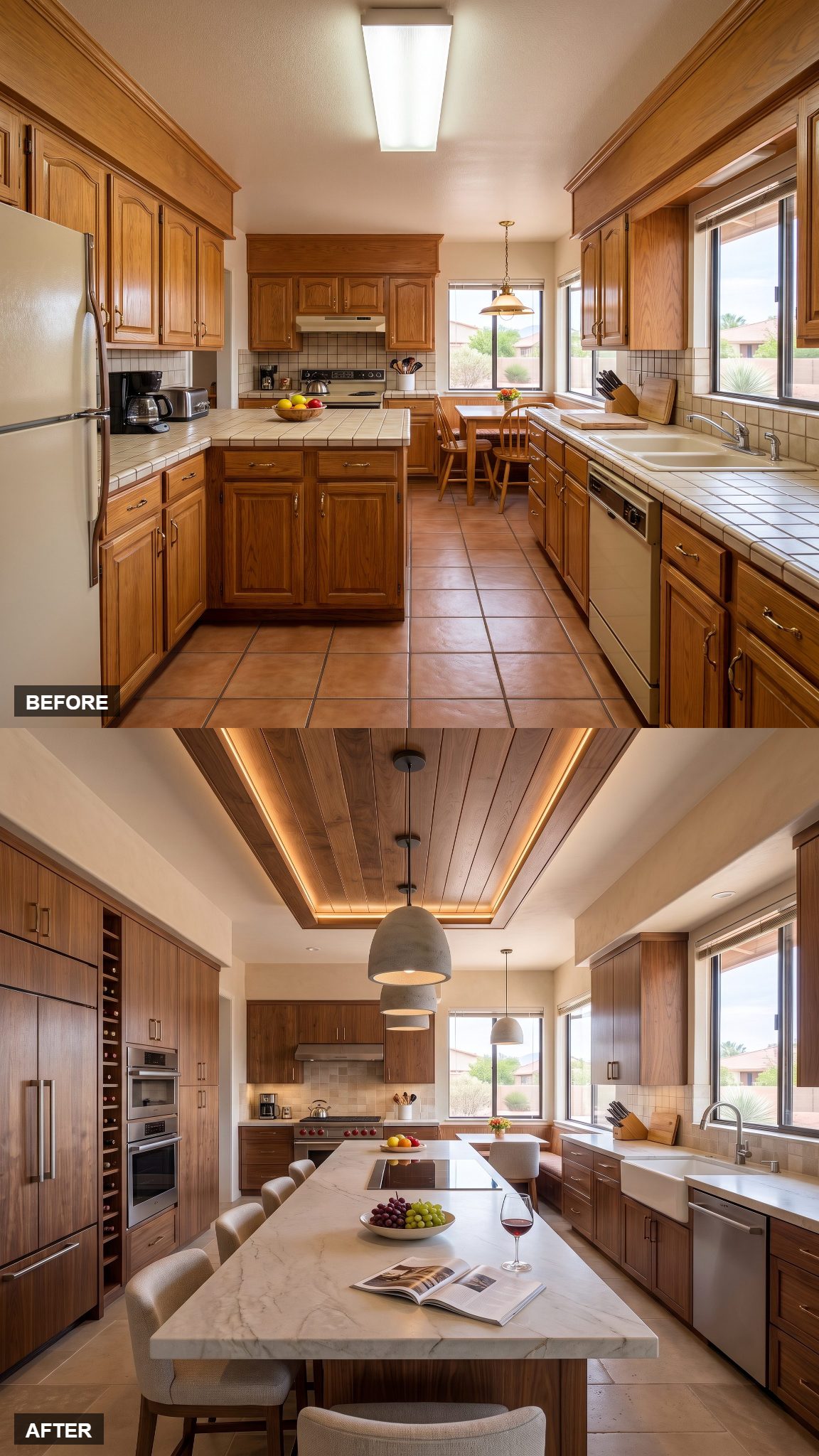
This plan starts with a rule more useful than any backsplash choice: guests should not have to cross the cook’s path every time they want another drink.
Seating wraps the social end of the island, the working side stays clear, and a pocket-door beverage station gives people somewhere to gather without drifting into the prep zone.
Compared with the starting peninsula arrangement, this kitchen separates hospitality from production without banishing either one.
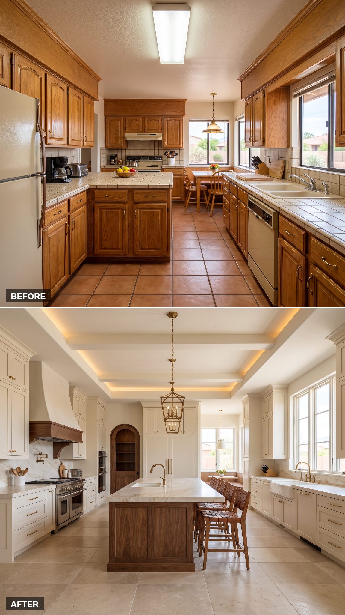
3. From Salmon-Tile Time Capsule to Cream-and-Walnut Mediterranean
🔥 Would you like to save this?
The salmon tile dates the starting room before anything else has a chance.
This transformation swaps that visual noise for honed limestone, cream plaster, and one strong run of walnut at the island rather than medium-brown wood scattered across every vertical surface. The color temperature stays warm, but the references stop screaming 1987.
The peninsula arrangement gives way to a more open central work surface, creating a cleaner path toward the refrigerator instead of leaving a leftover ledge in the middle of the plan.
2. Soft Minimal Mediterranean in Bleached Oak and Honed Travertine
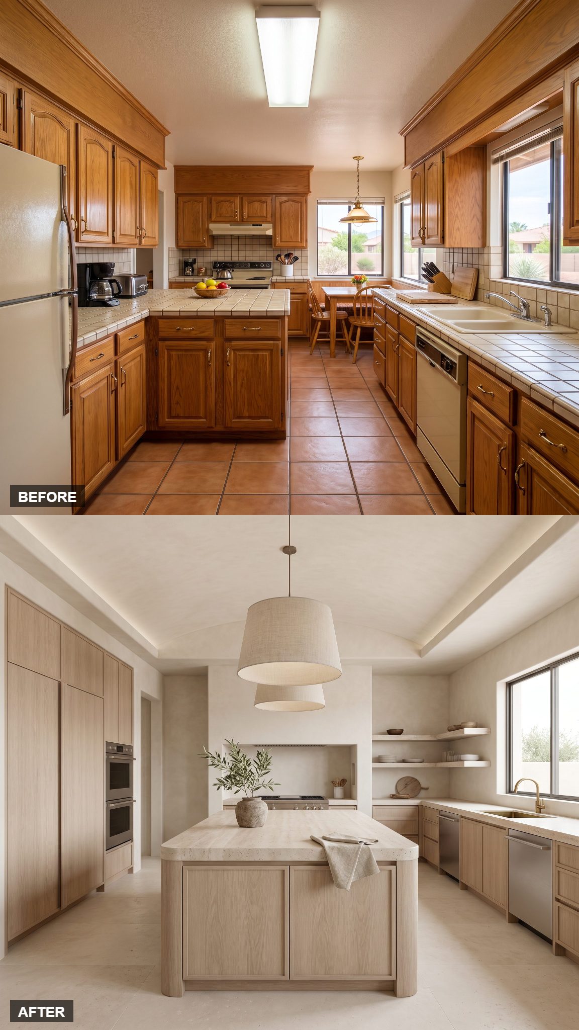
Everything comes down a notch.
The island sits low and broad with softened corners. Bleached oak and honed travertine stay close in value, so the room feels tonal rather than graphic. The aisles remain generous and the surfaces almost refuse to perform.
Some people will find this too quiet. That’s the point. After a gallery full of rooms competing for your attention, this one is perfectly happy to lower its voice.
1. The Transformation That Goes Bigger Without Losing Its Calm
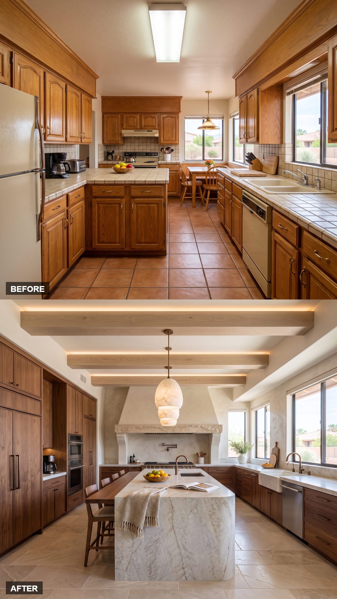
This is the no-limits version, and every inch knows it.
Book-matched Taj Mahal quartzite wraps the island while a walnut dining extension grows directly from the stone, turning cooking and eating into one continuous piece of furniture. The extravagance is obvious, but the clutter isn’t.
The entire left wall becomes disciplined walnut paneling. Refrigerator columns, ovens, coffee station, pantry — all accounted for, almost none of them visually advertising themselves. Across the room, a monumental plaster hood anchors the cooking wall while the circulation lanes remain broad enough to survive a dinner party without arbitration.
Then look back at the honey oak, almond appliances, tile counters, and fluorescent box in the starting kitchen.
One recognizable 1980s Sun Belt shell. Thirty-six completely different ideas for what could live inside it.