🔥 Would you like to save this?
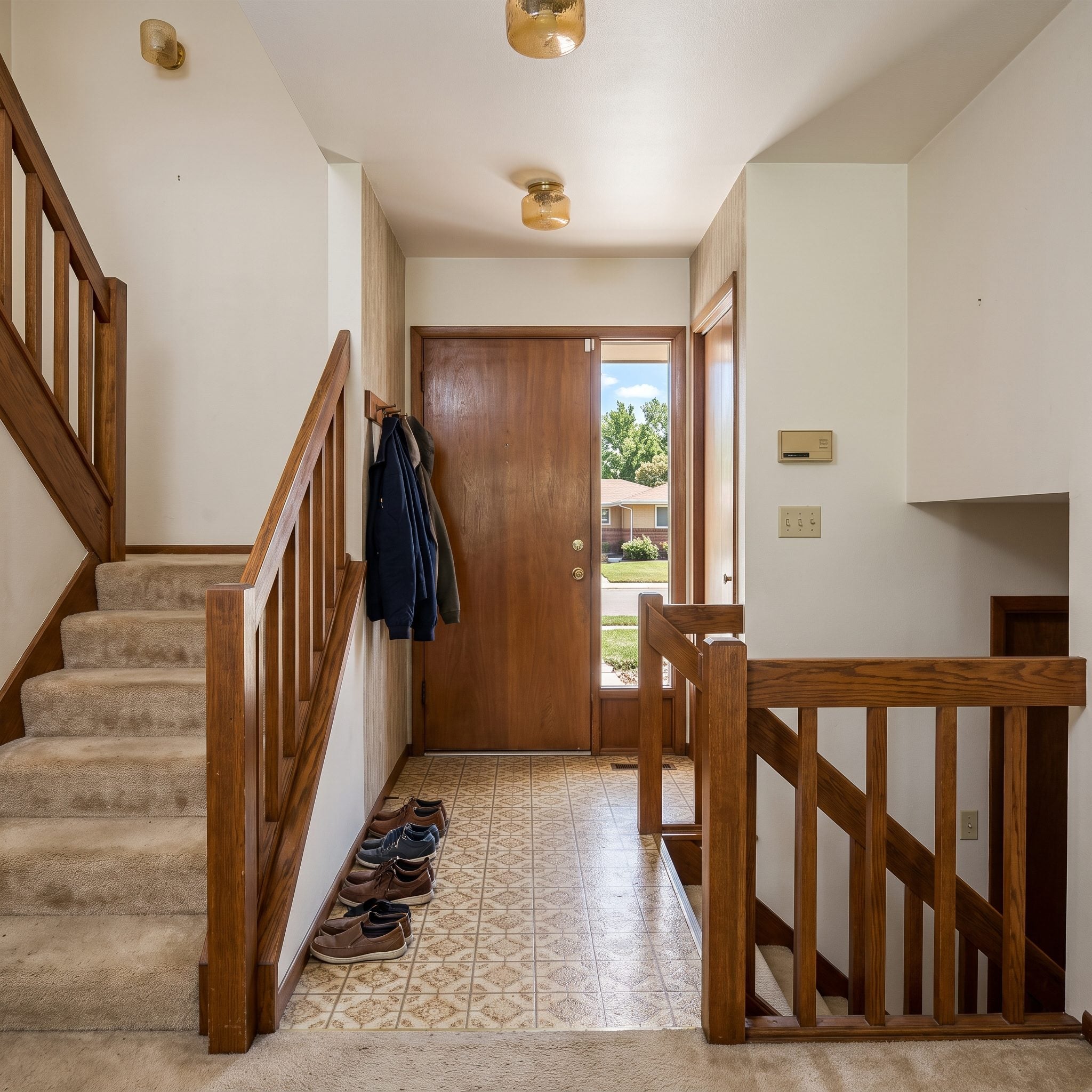
Open the front door and the house immediately hands you a multiple-choice question. Up? Down? Stand awkwardly in the middle while somebody behind you tries to get their shoes off? Carpeted stairs climb to one side, another flight drops away on the other, and thick oak railings spend an astonishing amount of a very small foyer explaining where the edges are.
That is the peculiar genius and aggravation of the 1970s split-level entry. The basic idea is efficient. The arrival is not. Too much railing, too many competing routes, nowhere convincing to pause, and suddenly the first ten seconds inside the house feel like traffic management.
In order to come up with the very specific design ideas, we create most designs with the assistance of state-of-the-art AI interior design software. Also, assume links that take you off the site are affiliate links such as links to Amazon. this means we may earn a commission if you buy something.
So this one entry gets 31 different futures. The first transformations prove how far better materials, lighter guards, stronger color, improved lighting, and smarter screening can take the existing idea. Then the interventions start getting bolder. Walls curve. Portals appear. Storage becomes architecture. Landings move. Stair openings are reshaped. By the end, we are no longer redecorating the problem — we are rebuilding the entire arrival around it.
31. Moody Bronze and Charcoal Stone Turn the Awkward Landing Into a Night Move
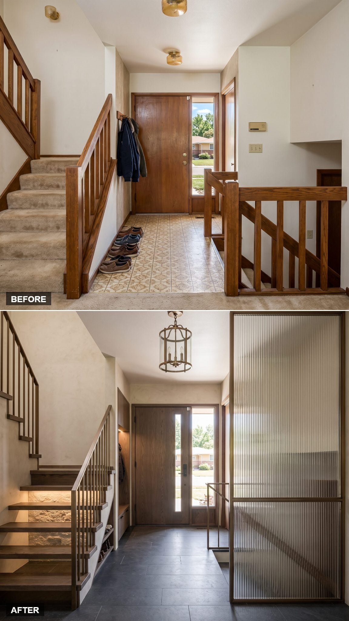
Not every entry needs to be rescued with white paint and more daylight. This one goes the other direction and commits.
Honed charcoal stone, smoked oak, bronze metalwork, and deep mineral plaster turn the split-level into something closer to a very good hotel bar. The stairs are still right there. They simply stop looking like leftover circulation and start behaving like part of a deliberately dark composition.
30. Glass Balustrades and Floating Treads Make the Railings Almost Disappear
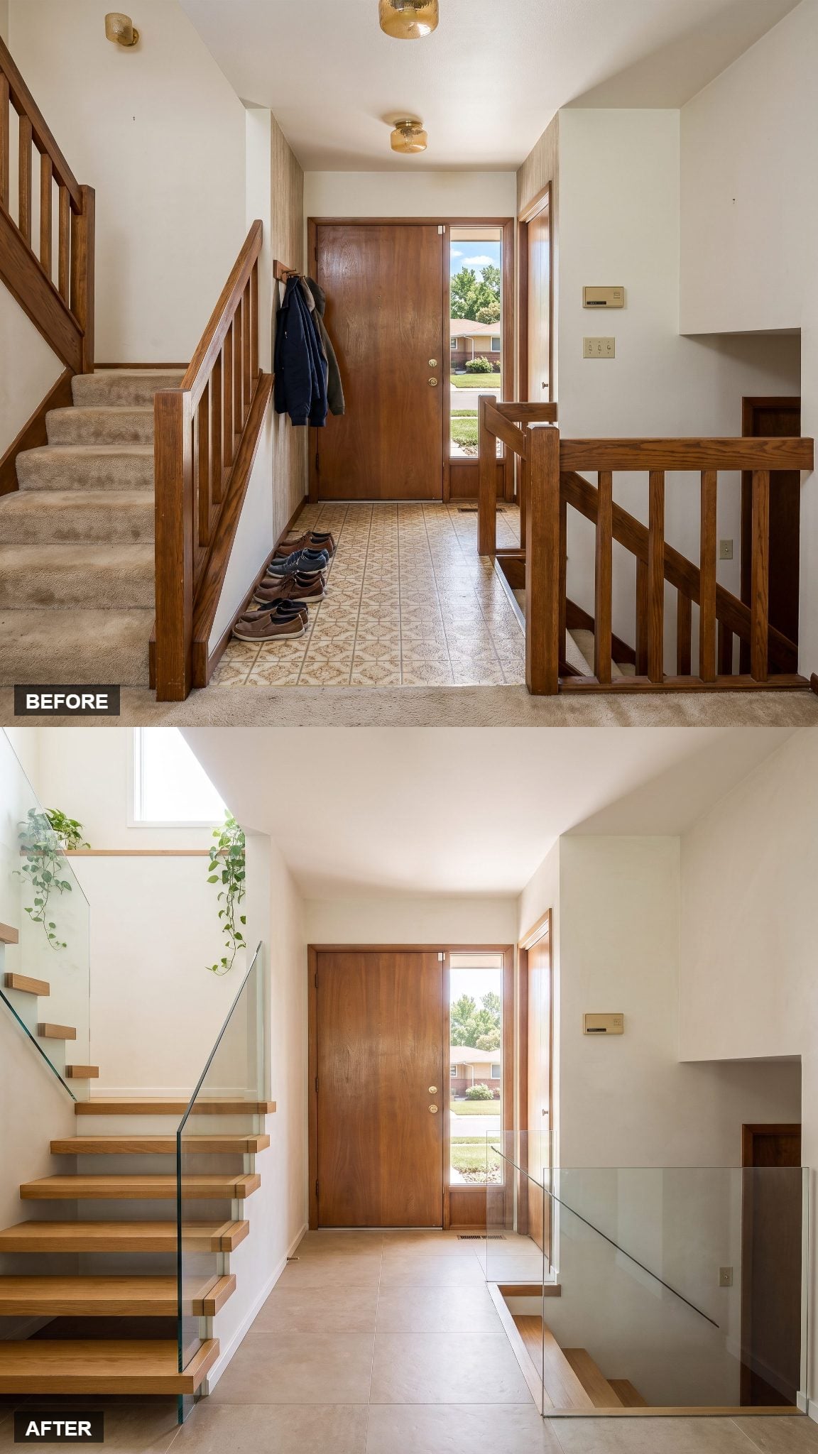
In the original entry, the railings occupy almost as much visual territory as the stairs themselves. Remove that bulk and the room changes before a major structural move even enters the conversation.
Frameless glass guards hold the necessary edges without chopping up the sightline, while floating oak treads introduce warmth without bringing the old spindle pattern back. From the front door, you can see across the landing instead of meeting a wooden fence.
29. Contemporary Southwest Works Better Once the Cactus Clichés Leave
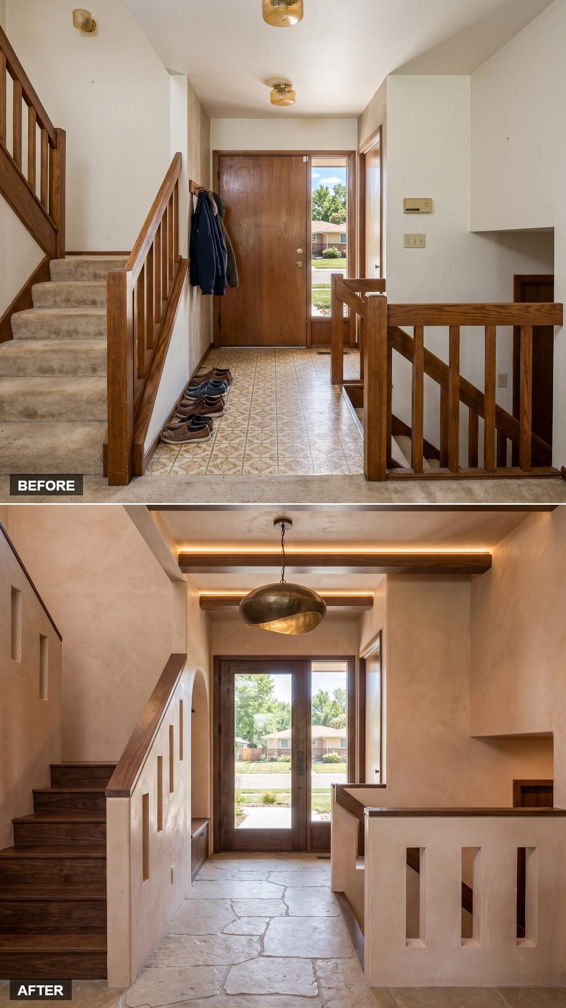
Southwestern design goes wrong quickly when every regional reference arrives at once. Kokopelli tiles. Orange terracotta on every available surface. A cactus standing around like it was hired for the photo shoot.
This version keeps the climate and loses the costume. Hand-troweled plaster in a warm sand tone catches the daylight almost like adobe, while pale limestone gives the landing the irregular character of flagstone without turning rustic. Dark walnut defines the stairs and rails against all that soft plaster. It feels regionally grounded without announcing the theme at the door.
28. Blackened Steel Turns the Staircase Into the Thing Worth Looking At
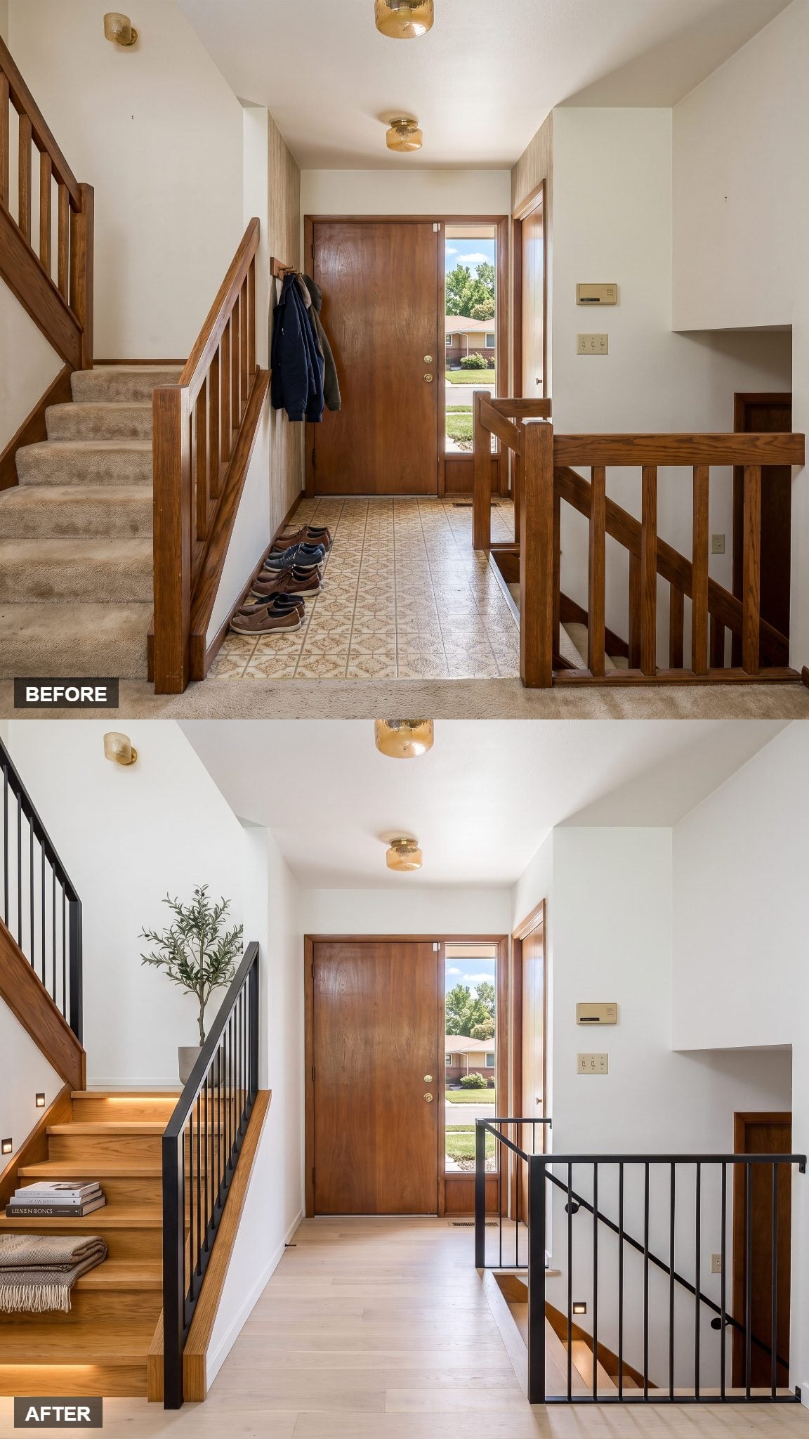
Sometimes the right move is not to conceal the split-level at all. Make the stairs good enough to deserve the attention.
Slender blackened-steel uprights replace the chunky wood guards, drawing crisp dark lines against pale walls and warm oak treads. The contrast is almost graphic — ink against paper — and suddenly the staircase looks designed rather than inherited.
27. European Limestone Gives the Entry the Calm of a Much Older House
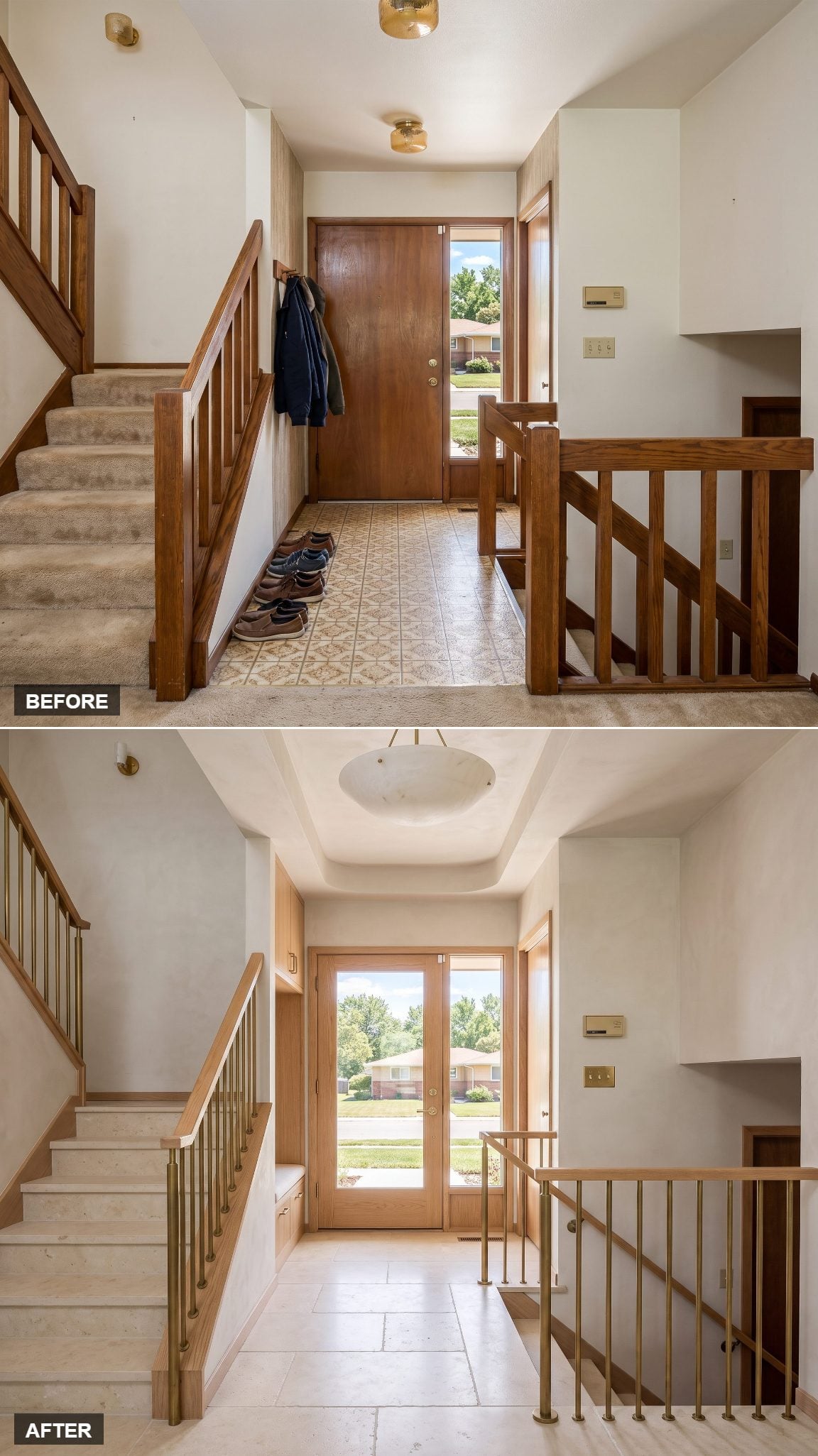
Creamy limestone underfoot, mineral plaster on the walls, natural oak joinery, aged-brass fittings: almost everything sits in the same warm, chalky family.
That narrow palette is the point. The split-level geometry is complicated enough already; the finishes do not need to add another argument. Soft variation in stone and plaster gives the hall depth while allowing the stairs to recede into one continuous architectural envelope.
26. A Breezeblock Screen Gives the Front Door Something Better to Look At
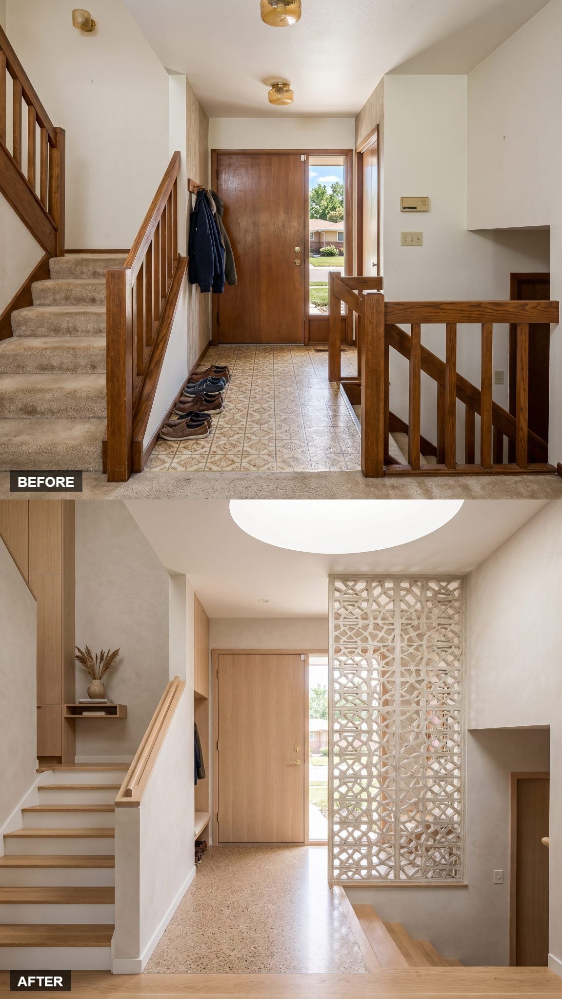
The original entry sends your eye straight toward the downward stair opening. This one puts an object in the way — but importantly, not a wall.
A cast-stone screen block partition creates a foyer edge while allowing light and partial views through its pattern. Warm terrazzo and mineral plaster keep the screen from looking like an exterior patio wall transplanted indoors.
25. One Backlit Onyx Panel Gives the Foyer All the Drama It Needs
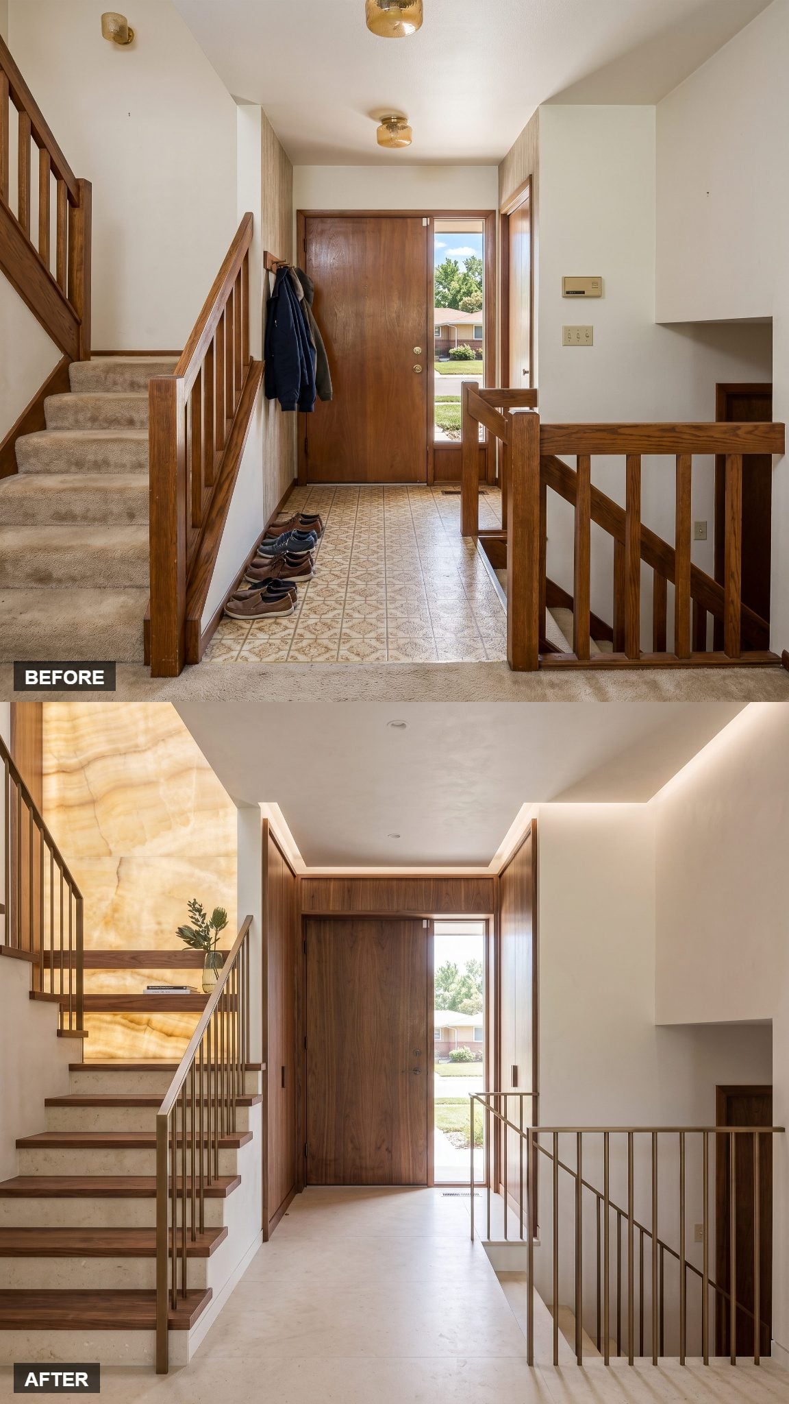
Instead of spreading luxury across every surface, this version spends almost all of its visual capital in one place.
A honey-colored onyx panel framed in walnut glows from behind after dark, turning the stone itself into the fixture. Limestone flooring and quiet walls withdraw around it. The old entry had no real focal point; this one gives the eye exactly one.
24. Art Deco Geometry Shows Up Without Turning the Foyer Into a Film Set
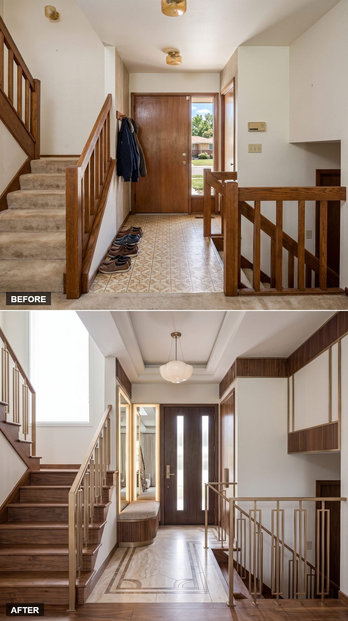
Art Deco can tip into costume quickly. Too much gold, too many fans and zigzags, and suddenly the entry starts expecting cocktails at eight.
This version keeps the underlying geometry. Book-matched stone creates mirrored movement across the walls, ribbed walnut supplies a vertical rhythm, and champagne-bronze rails trace the stairs with almost jewelry-scale precision. Pattern stays concentrated at the floor instead of climbing every surface. Deco, edited.
23. A Library Landing Gives the Entry a Reason to Exist Between Trips Upstairs
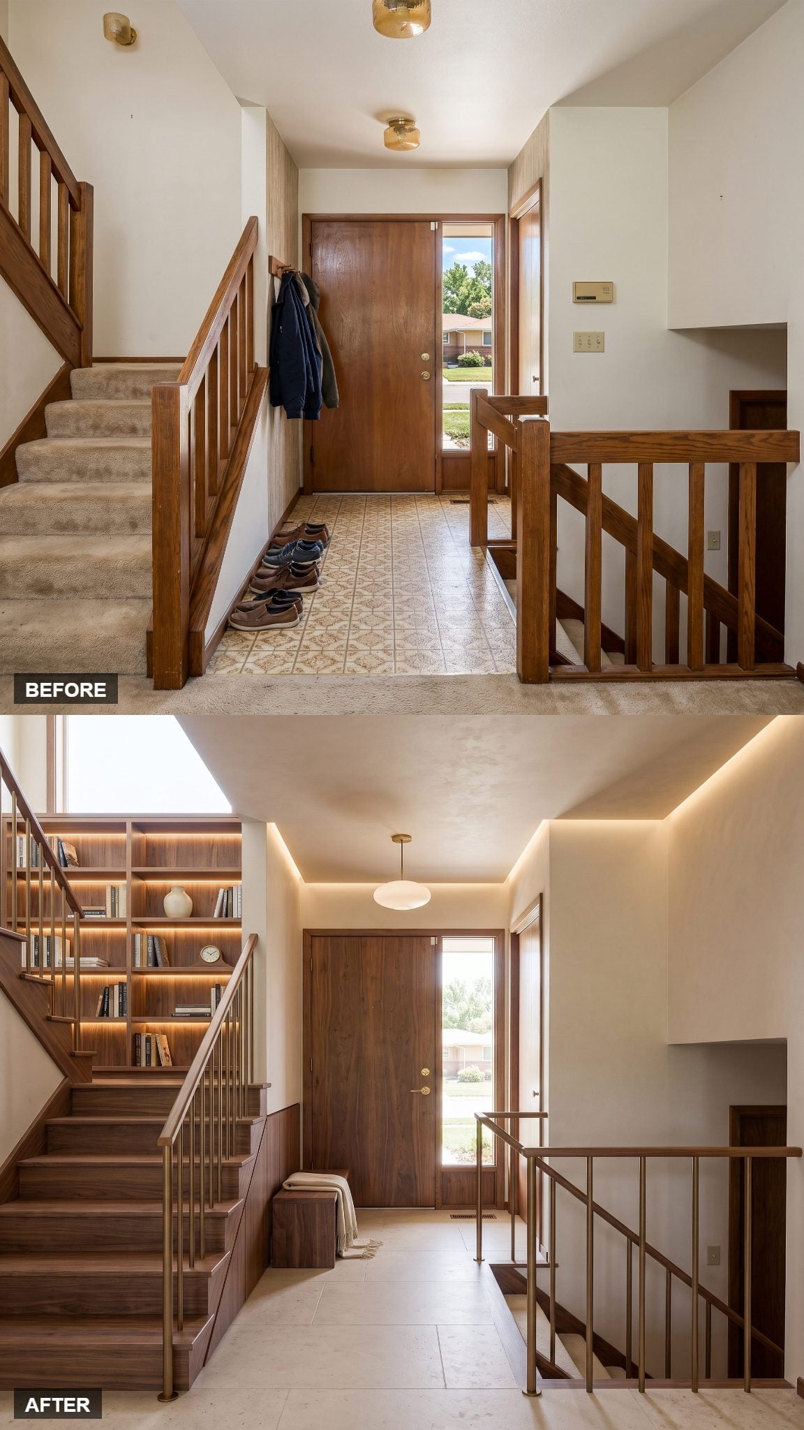
Most foyers do nothing between arrivals. This one steals a blank stair wall and turns it into illuminated walnut shelving.
The built-ins remain shallow enough to keep the route clear, while concealed lighting makes the wall useful after dark instead of creating another shadow beside the stairs. Honed limestone prevents all that walnut from becoming heavy.
An entry with books tells you something about the house before you’ve even taken off your coat.
22. The Japanese-Influenced Version Wins by Refusing to Fill Every Surface
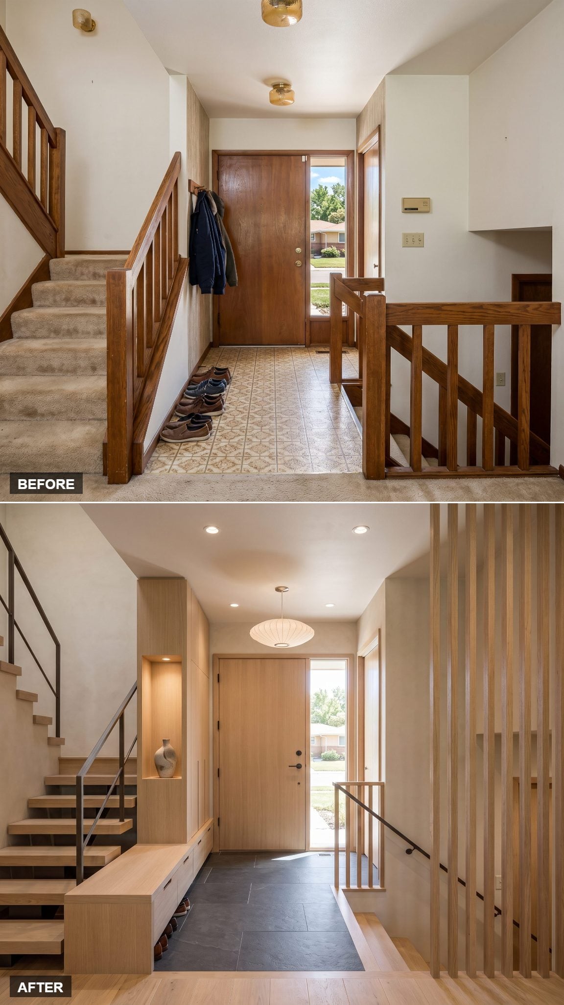
Discipline is the whole design. Pale oak, warm plaster, charcoal stone, and joinery so precise it almost disappears.
Low-profile stair treads and one continuous handrail handle the circulation. A single ceramic vessel and branch handle nearly all the decoration. Shadow gaps where plaster meets stone supply detail without adding another object.
It is one of the quietest versions in the gallery, and that restraint gives the split-level geometry room to settle down.
21. Fluted Glass and Brass Hide Just Enough of the Lower Stair
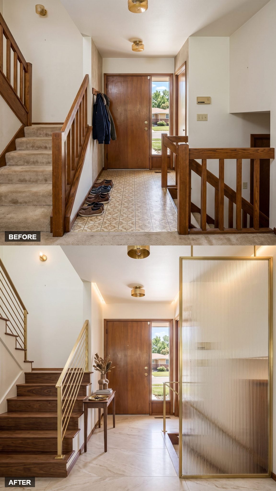
Creamy quartzite, walnut stairs, and brushed brass establish the luxury quickly, but the best move is more practical than glamorous.
A fluted-glass screen obscures the downward stair just enough to create a composed backdrop from the front door. You still perceive depth and light through the glass, but the foyer no longer opens directly onto a hole in the floor. The brass frame turns that functional screen into part of the room’s jewelry.
20. A Stone Arch Finally Gives the Upper Level a Proper Entrance
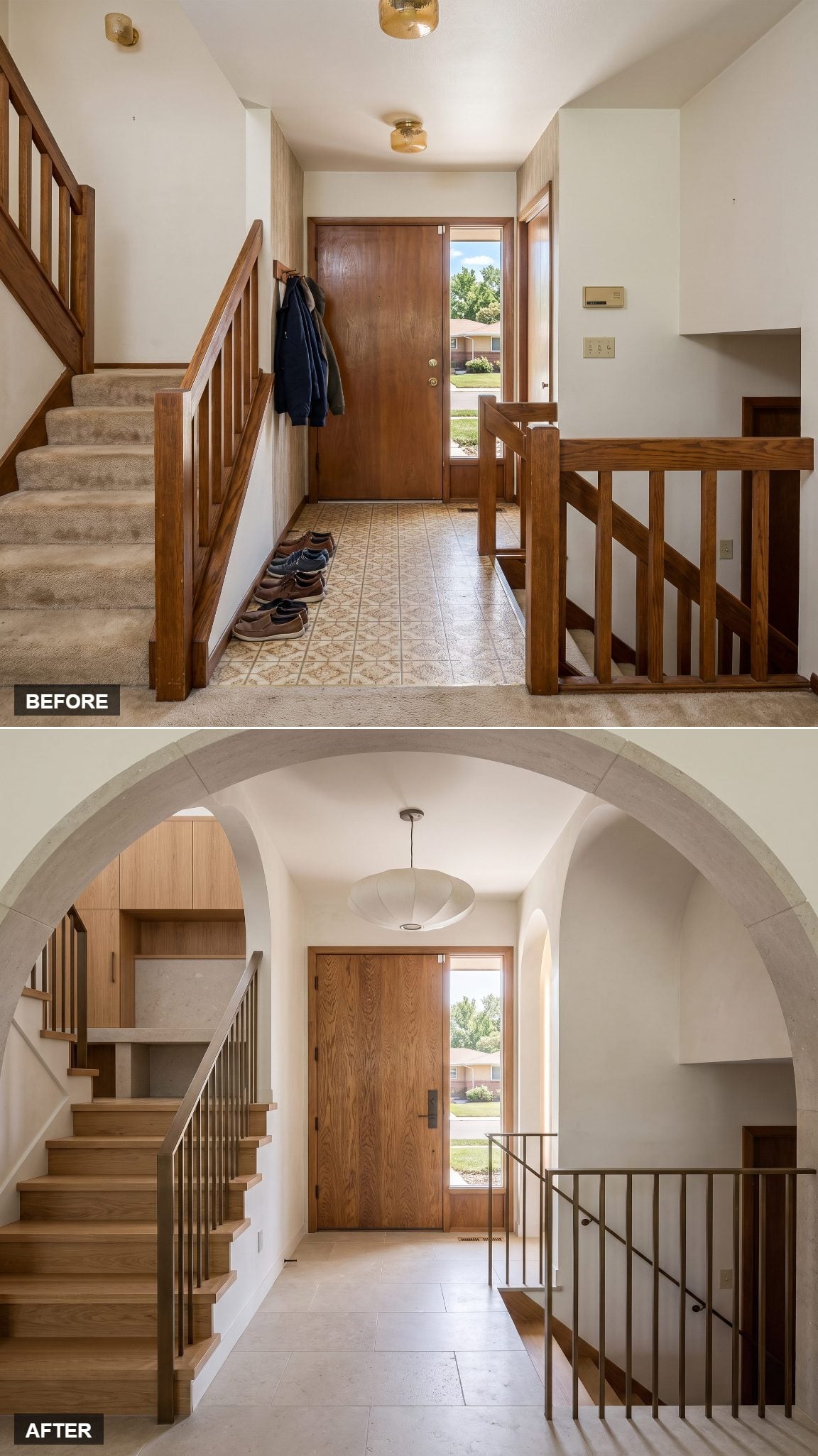
Split-levels often make circulation visible without making any route feel important. You arrive, see stairs, and improvise.
A broad stone-framed opening changes that. The upper route now has an actual threshold, so moving toward the main floor feels like entering another part of the house rather than simply climbing the first available flight. The stairs themselves barely need explanation once the architecture starts doing the pointing.
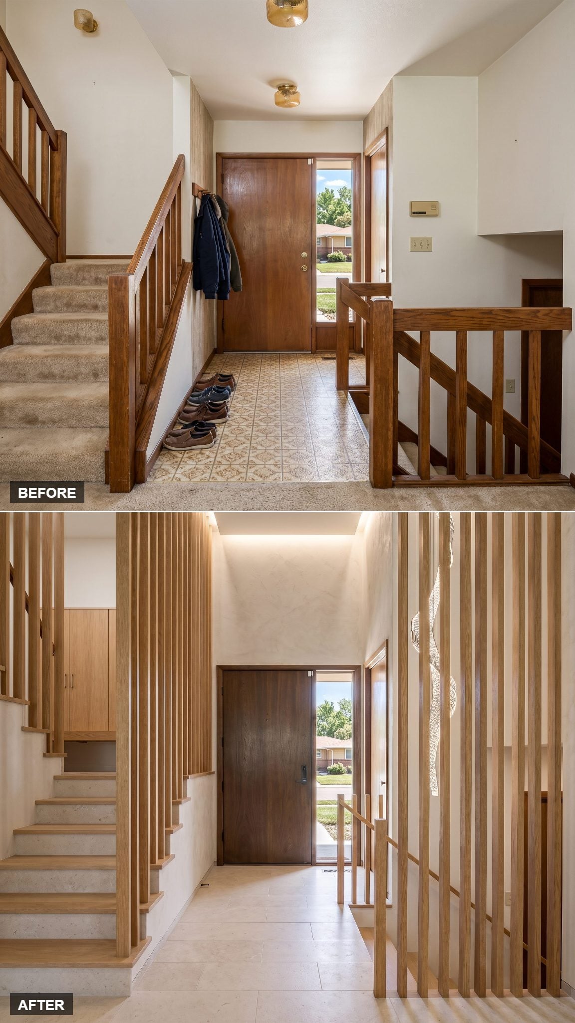
19. Vertical Lines Pull the Entry Up Instead of Letting the Landing Spread Out
🔥 Would you like to save this?
Tall paneling and a long pendant make the height more obvious, but this is not merely an optical trick. The old railing language is simplified and the stair zone feels more integrated with the full wall height around it.
A slim vertical pendant light drops through the stairwell, while uninterrupted wall treatments pull attention upward instead of allowing the landing to dominate the composition.
18. A Stone Vestibule Gives the Front Door an Actual Beginning
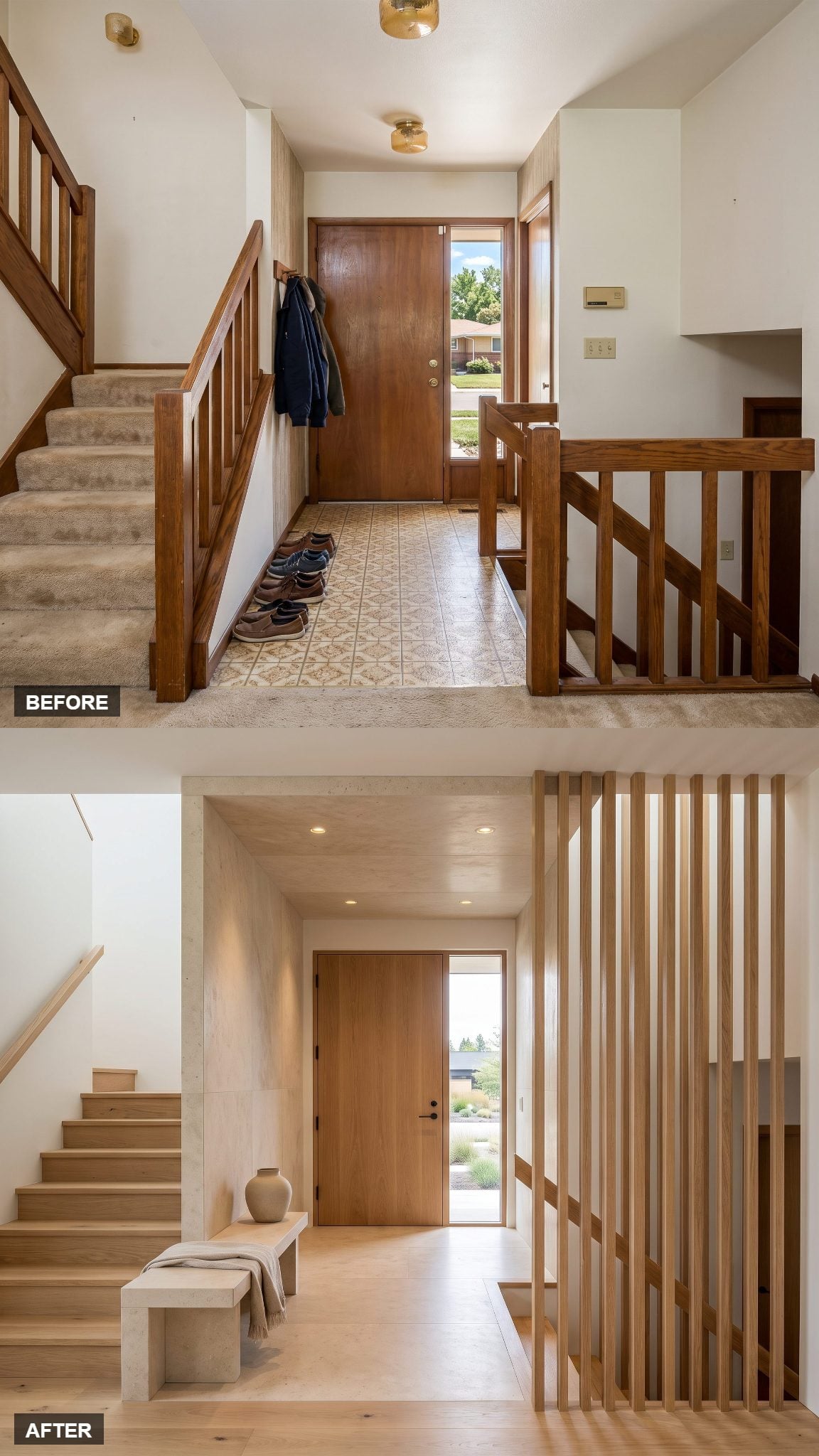
A limestone portal wraps the floor, wall, and part of the ceiling immediately around the front door. Suddenly the entry has something the original never bothered to provide: a defined beginning.
Beyond that stone zone, oak flooring and stair treads shift the material language toward the interior of the house. A vertical oak screen partly shields the lower stair without severing it from the landing.
17. Curved Plaster Makes the Split-Level Forget How Angular It Used to Be
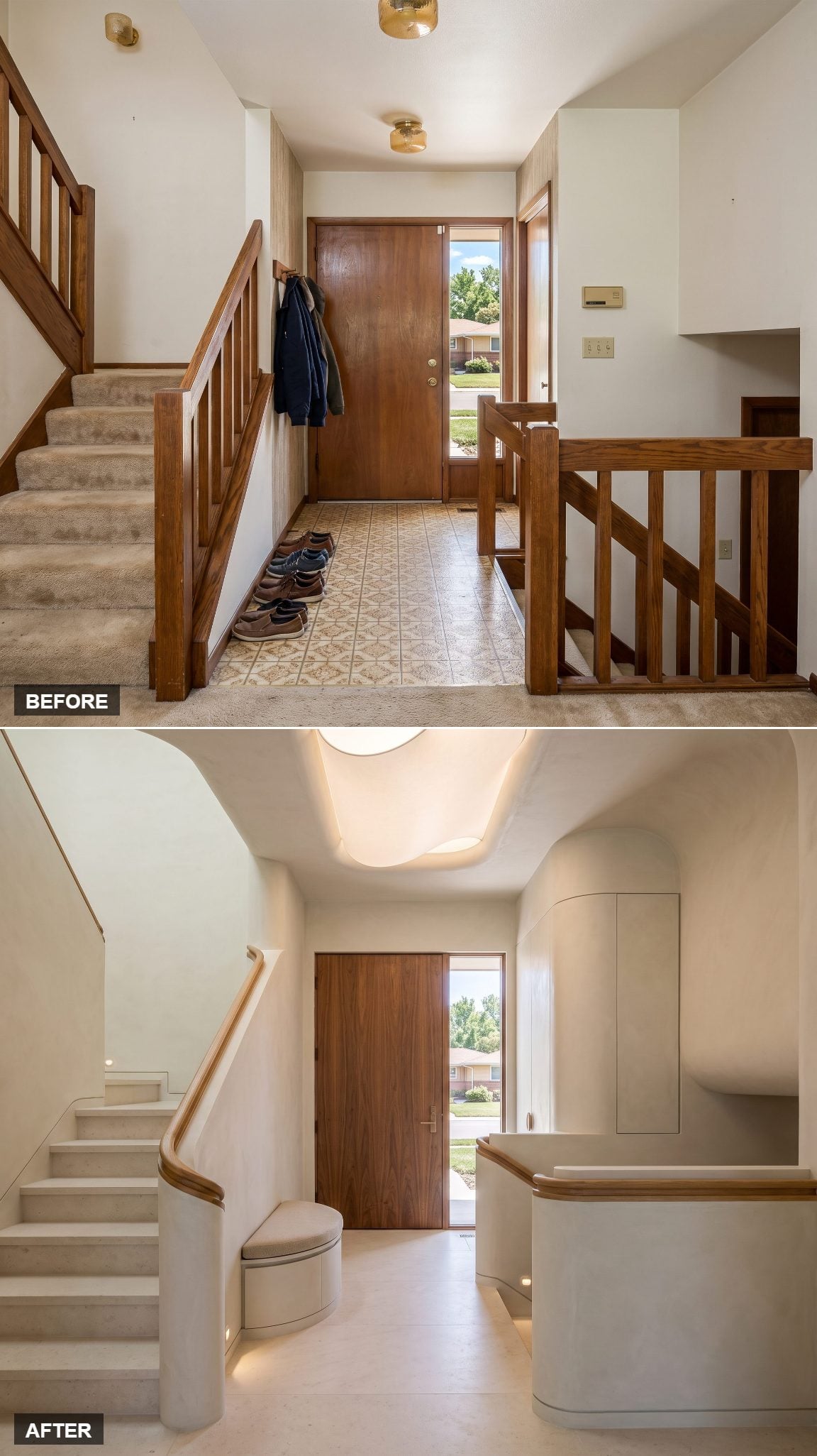
The original entry is essentially a collection of right angles competing for the same narrow view. This version starts erasing them.
Plaster stair walls roll gently into the landings, the handrail follows the curve, and even the built-in bench tucks into a rounded corner. Warm cream tones let shadow define those shapes rather than relying on contrasting trim.
The result is not simply softer-looking. The circulation feels more continuous because the guards guide the eye through turns instead of stopping it at another post.
16. Paneled Stair Walls Give the Split-Level a More Formal Set of Manners
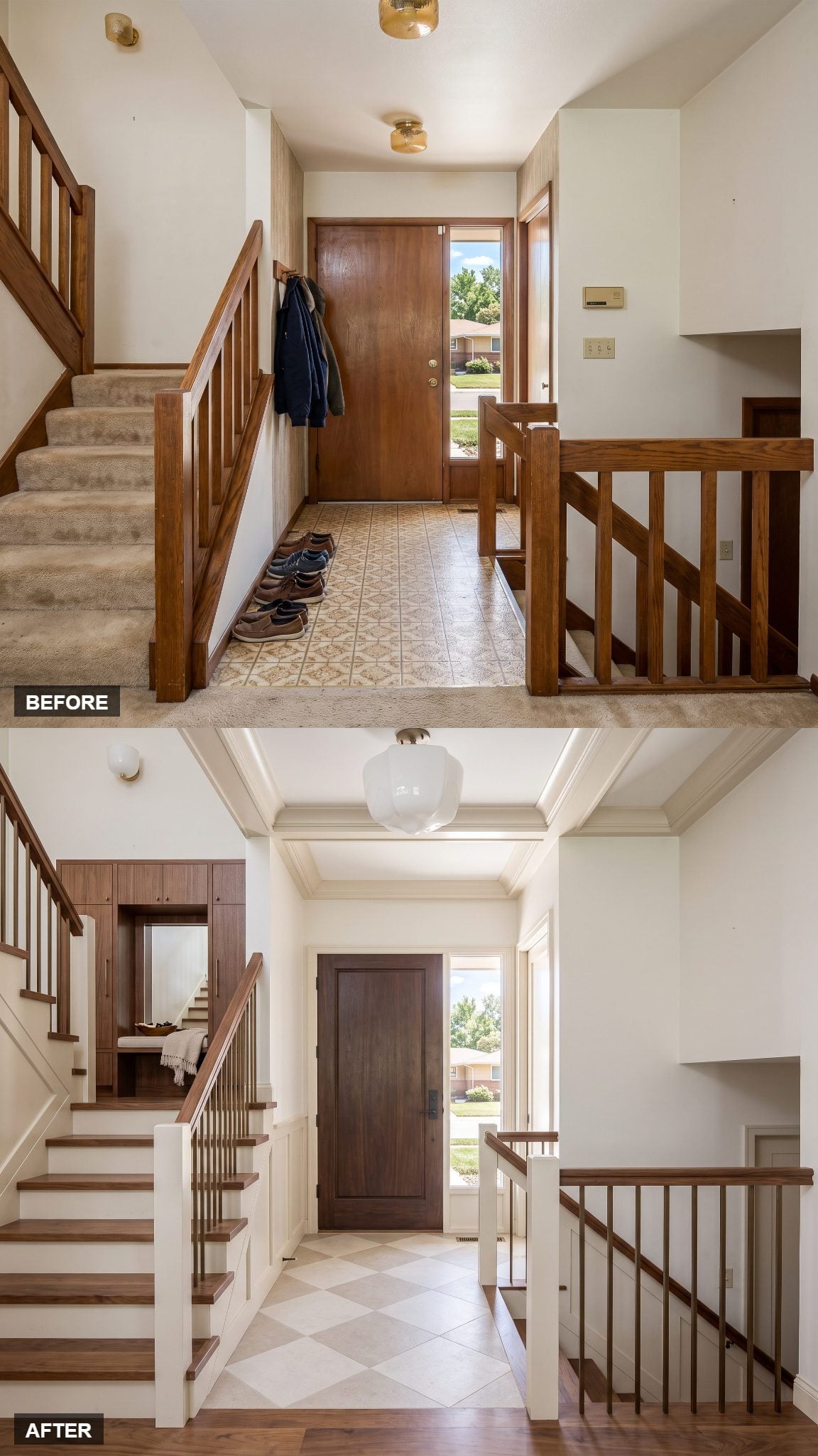
Transitional design can slide into fake-traditional territory with alarming speed. This one avoids the trap by keeping the detailing broad and architectural.
Ivory paneled stair walls replace most of the exposed railing, with slender walnut caps and selective bronze balusters preserving sightlines where they matter. A subtle two-tone limestone floor gives the landing pattern without shouting, while the milk-glass lantern supplies just enough period familiarity.
15. Monolithic Limestone Makes the Stair Hall Feel Carved From One Block
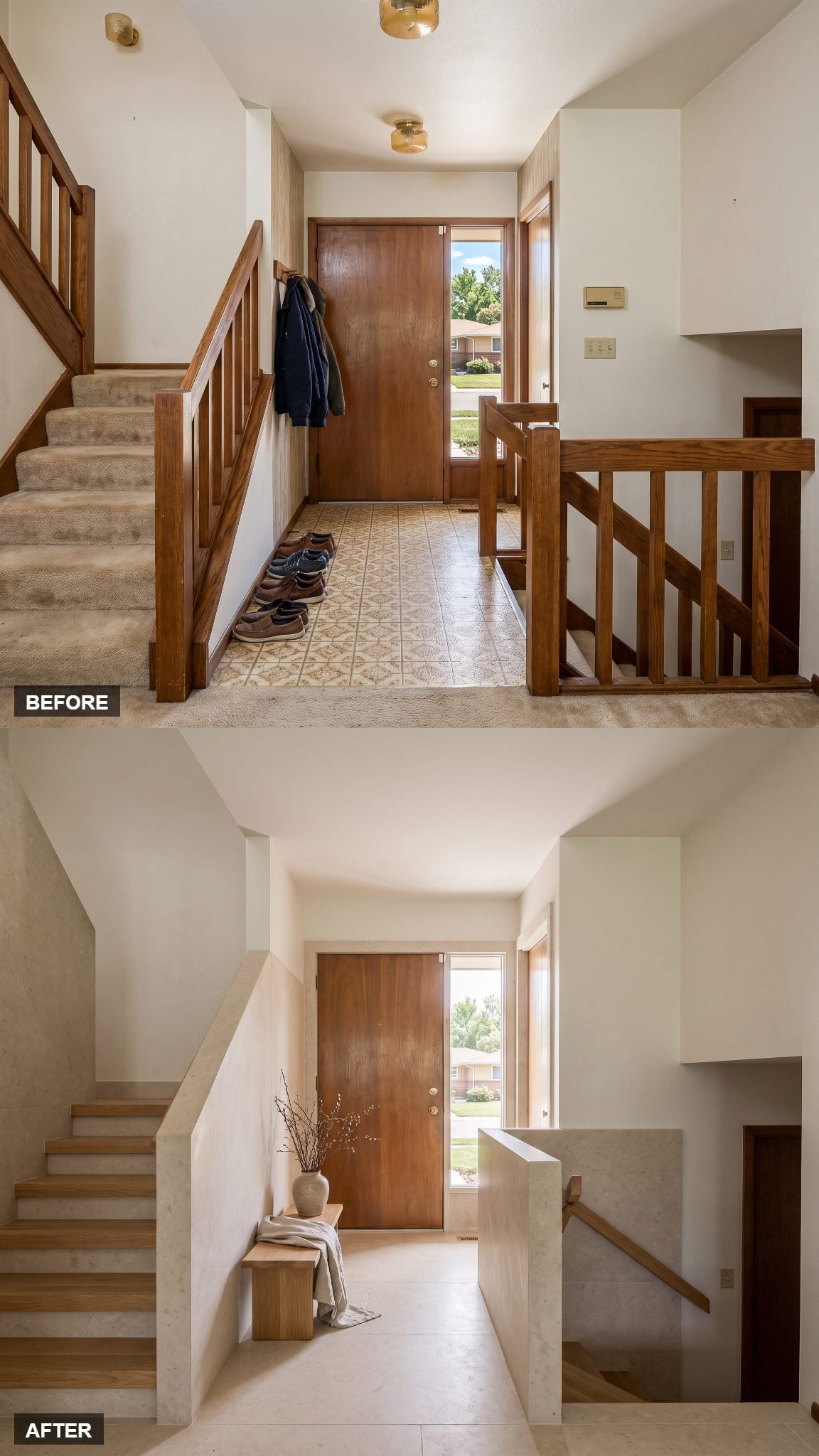
Big stone, few seams, almost no decorative interruption. That is the entire idea.
Pale limestone wraps the landing and continues onto portions of both stair flights, making the entry feel less assembled from parts and more carved out of one material. Thick oak treads appear inserted into the stone rather than laid over it.
14. One Sculptural Stair Ribbon Finally Makes Up and Down Belong Together
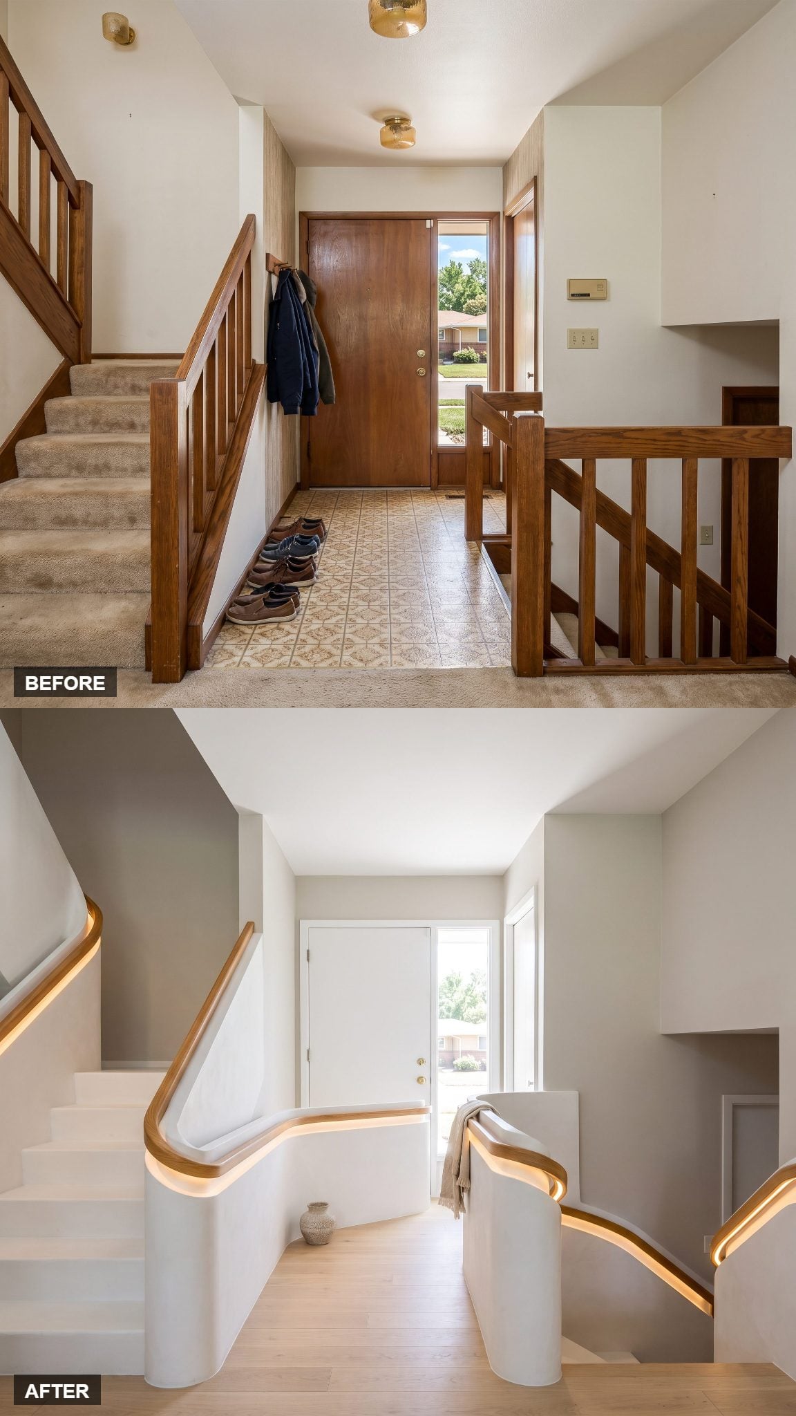
The original entry treats the upper and lower stairs like separate pieces of carpentry sharing a landing.
One continuous plaster guard now sweeps around the landing, carrying an oak rail through the turn and down the second flight. Concealed lighting traces the same path at night. The circulation itself becomes the decorative gesture.
13. A Pale-Oak Portal Gives the Main Floor First Billing
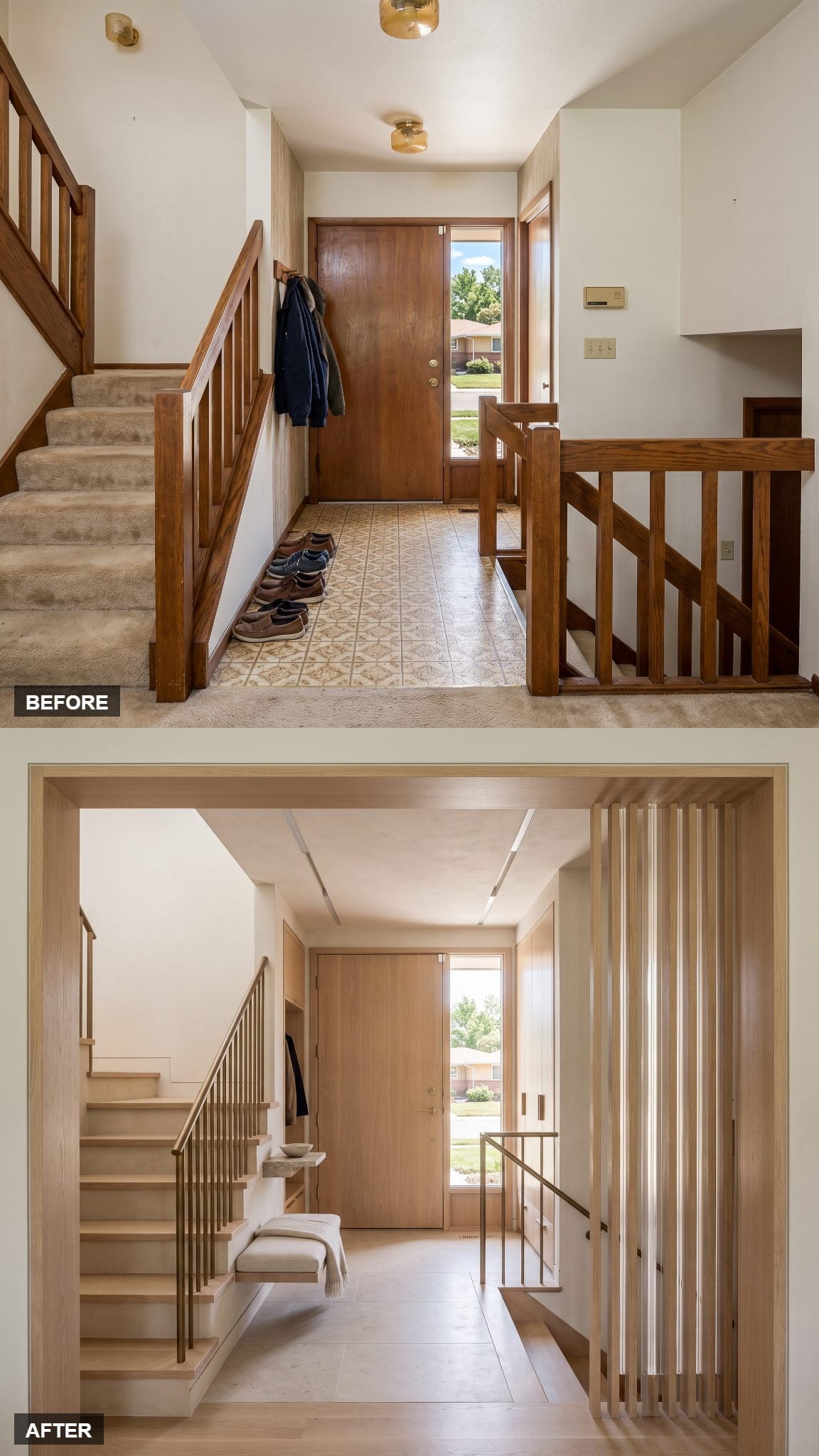
Now the interventions begin affecting more than the surfaces around the stairs. The relationship among landing, storage, guard, and stair opening is reorganized so the route toward the living level gets first billing.
A pale-oak portal frames that upward movement while a slatted screen pulls the descending stair into the background. Built-in seating and concealed shoe storage turn the arrival edge into usable architecture rather than leftover wall.
12. Reeded Glass Turns the Dead Corner Into a Lantern After Dark
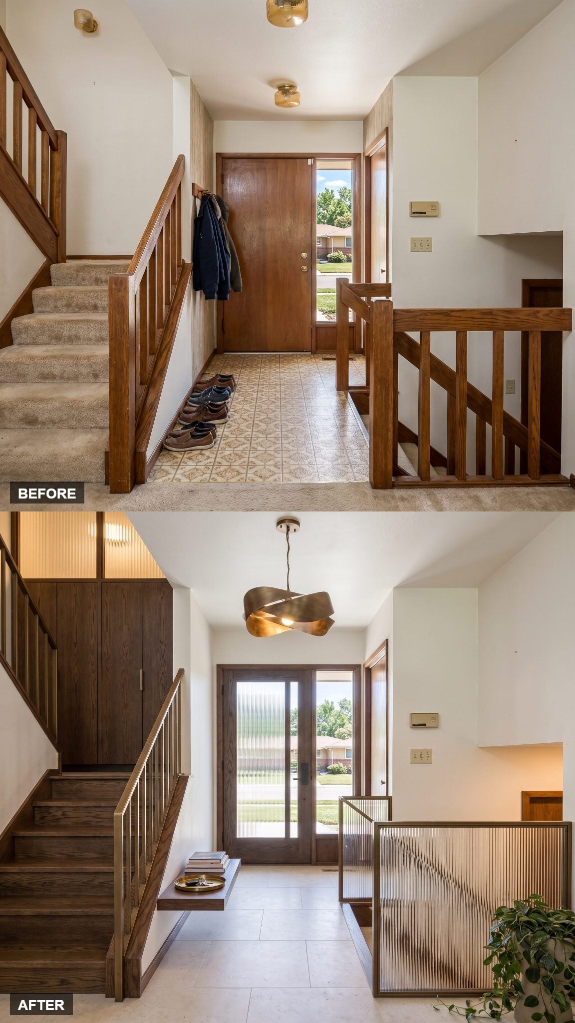
The original sidelight provides daylight, but it also offers a clear view straight into the entry from outside.
Reeded glass blurs that relationship while continuing to admit light. The same vertical texture appears in the bronze-framed partition around the lower stair, so glazing at the door and screening at the landing feel like one idea instead of two unrelated fixes.
Backlit at night, the glass becomes the room’s softest source of drama.
11. Floating Storage Comes With a Much Bigger Rethink of the Landing
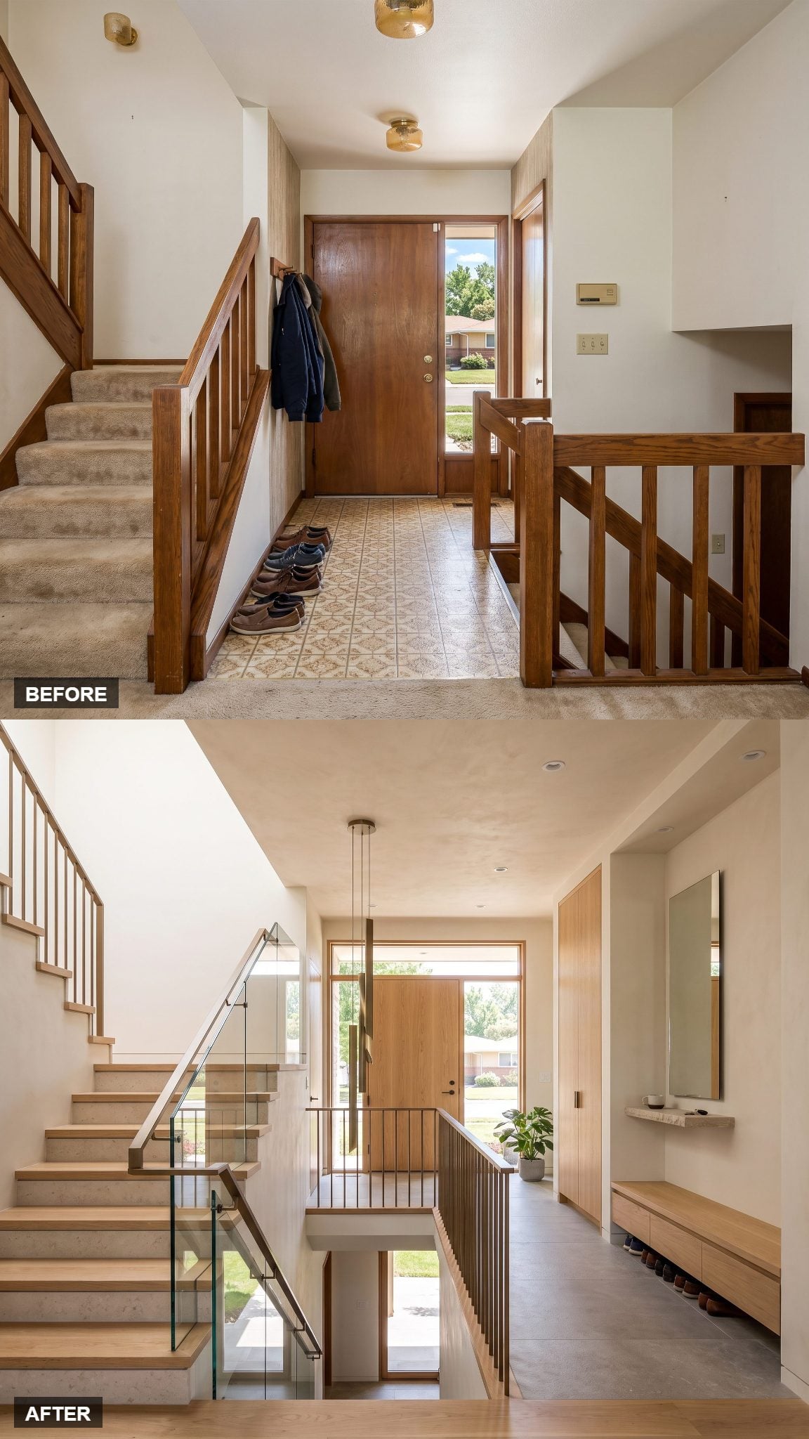
The built-ins are the obvious practical win, but this is not simply a cabinetry upgrade. The landing, guards, stair opening, and usable circulation zone have all been reconsidered.
Storage gets pushed into the perimeter, the center is cleared, and lighter guards allow both levels to stay in view. The new oak door and expanded glazing then pull daylight into a landing that finally has enough visual room to use it.
An entry doesn’t need to be bigger. It needs to stop fighting the people walking through it.
10. A Curved Walnut Screen Rewrites the Landing, Not Just the View
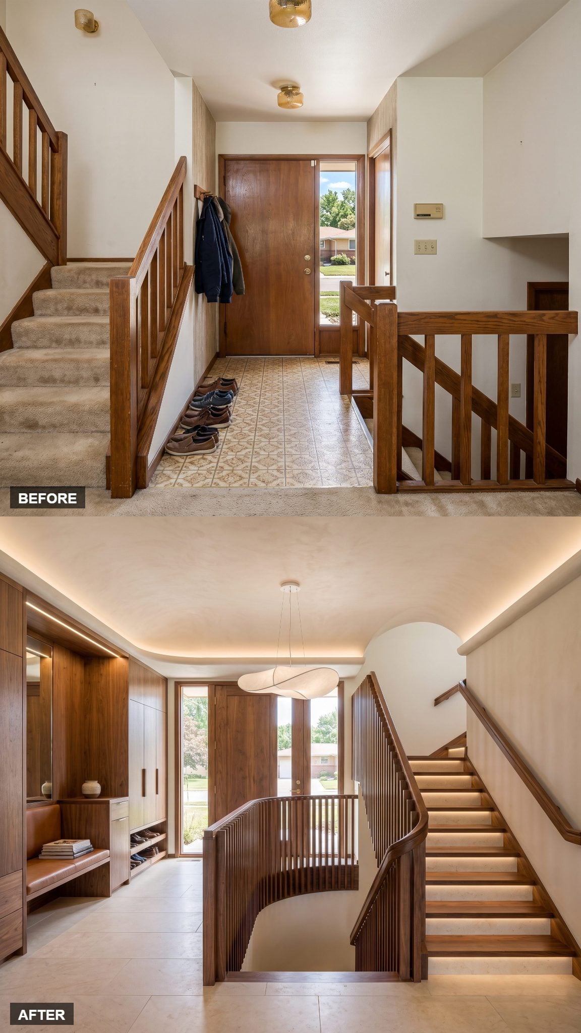
The curve may be the first thing you notice, but the change is larger than a decorative screen dropped into the old plan.
The stair edge and landing become part of one newly shaped composition, with walnut fins sweeping from the arrival toward the upper route. Creamy limestone and a recessed leather bench give that circulation zone somewhere to pause instead of treating every inch as passage.
The curve does not simply hide the stair. It gives the whole landing a direction.
9. Charcoal Stone and White Oak Redraw Where Arrival Ends and the House Begins
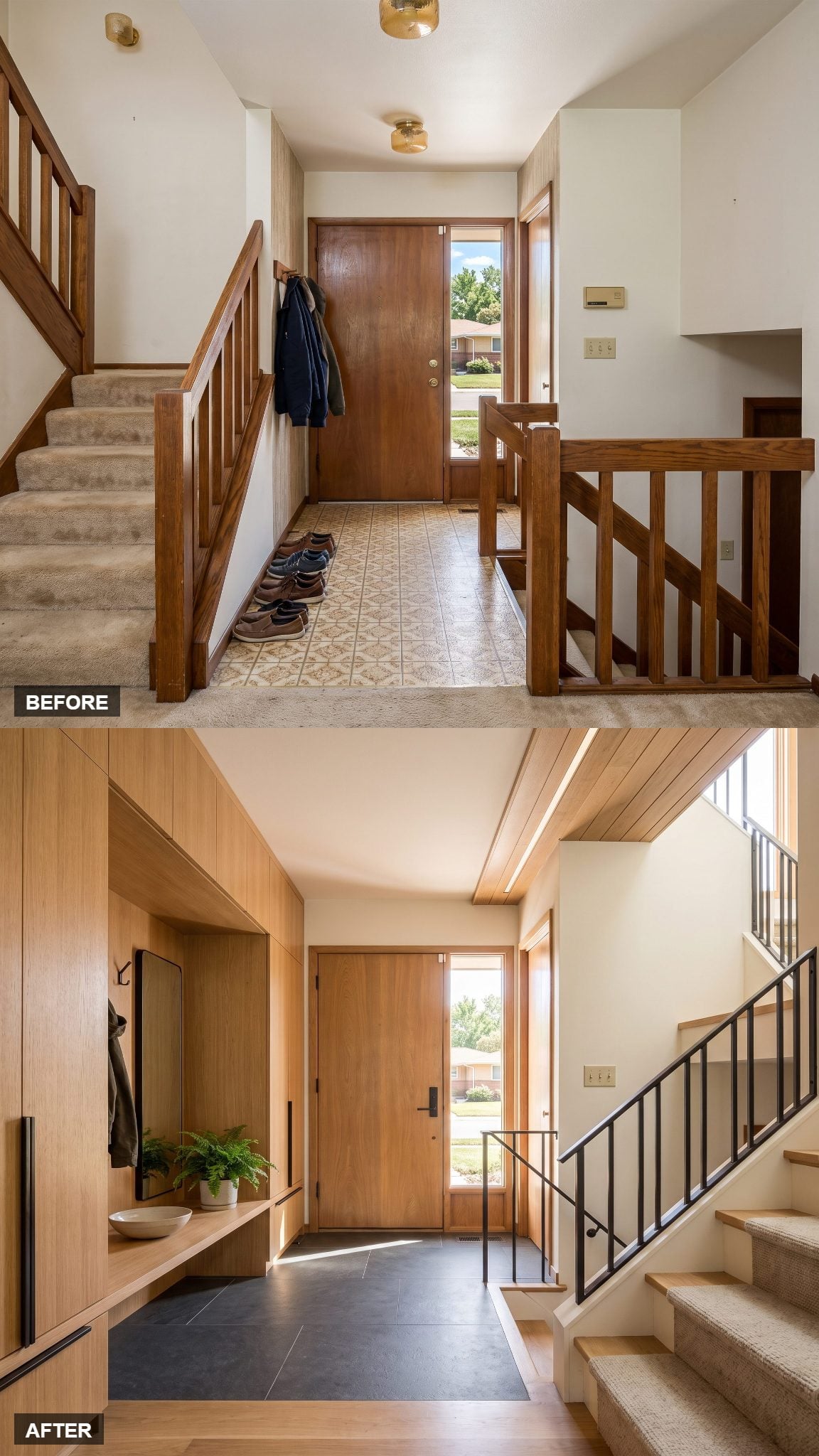
There is a material story here — dark stone at the door, warm oak beyond — but the larger move is spatial. The stair opening and landing around it have been substantially reworked.
The arrival zone becomes broader and more deliberate, with the darker floor defining the threshold while rebuilt stair edges and lighter timber pull movement toward the house. A blackened bronze stair railing threads the different levels together without pretending this is merely a finish swap.
8. One Working Wall Comes With a Full Rethink of the Mudroom Side
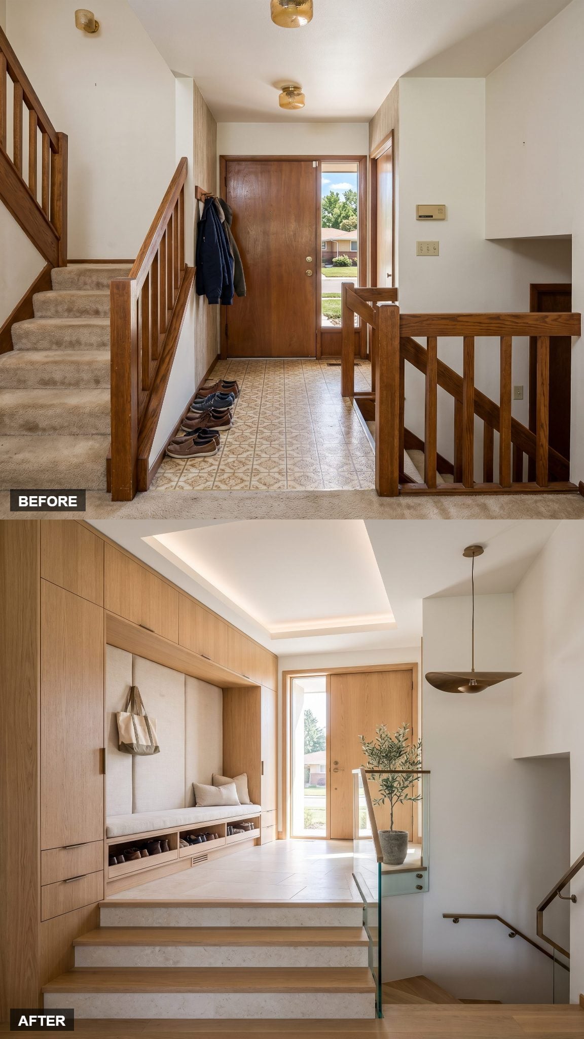
It looks at first like a storage story. It is more than that.
The stair opening and landing are reorganized so one side of the foyer can become a proper working wall rather than a collection of coats and shoes stranded beside circulation. A long run of rift-cut oak cabinetry absorbs the mess while the center of the room is deliberately reclaimed.
The result is not simply tidier. The entire arrival has been redrawn around what people actually do when they come through the door.
7. A Sculptural Oak Guard Wall Rebuilds the Edge of the Lower Stair
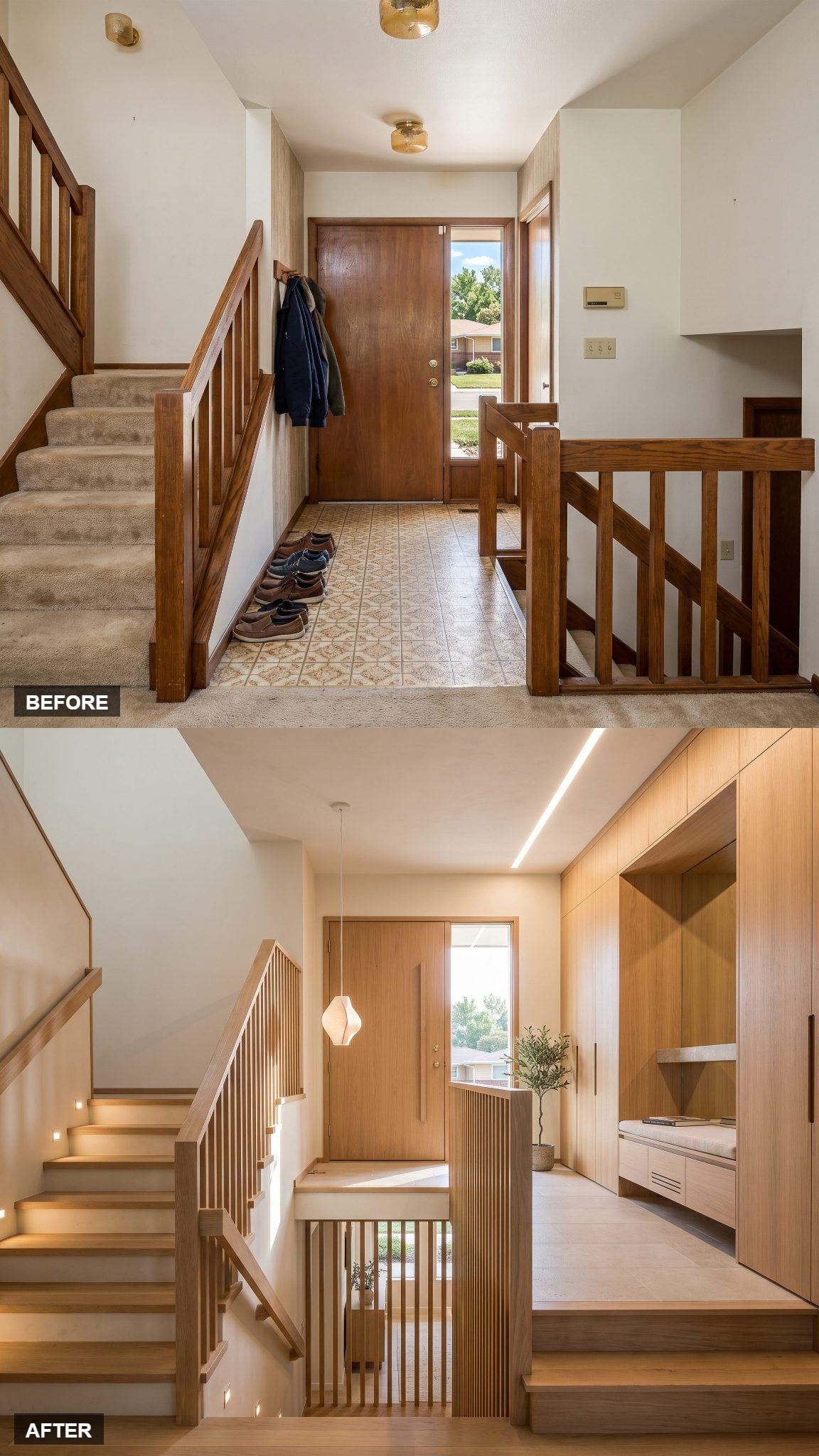
🔥 Would you like to save this?
What looks at first like a millwork move reaches much farther than a replacement railing.
The lower-stair edge, storage wall, guard, and usable landing have all been reconsidered as one composition. Staggered oak fins filter the descent without sealing it off, while a full-height storage wall and recessed upholstered bench turn the opposite side into a proper arrival zone.
6. Travertine Turns Two Leftover Staircases Into One Formal Stair Hall
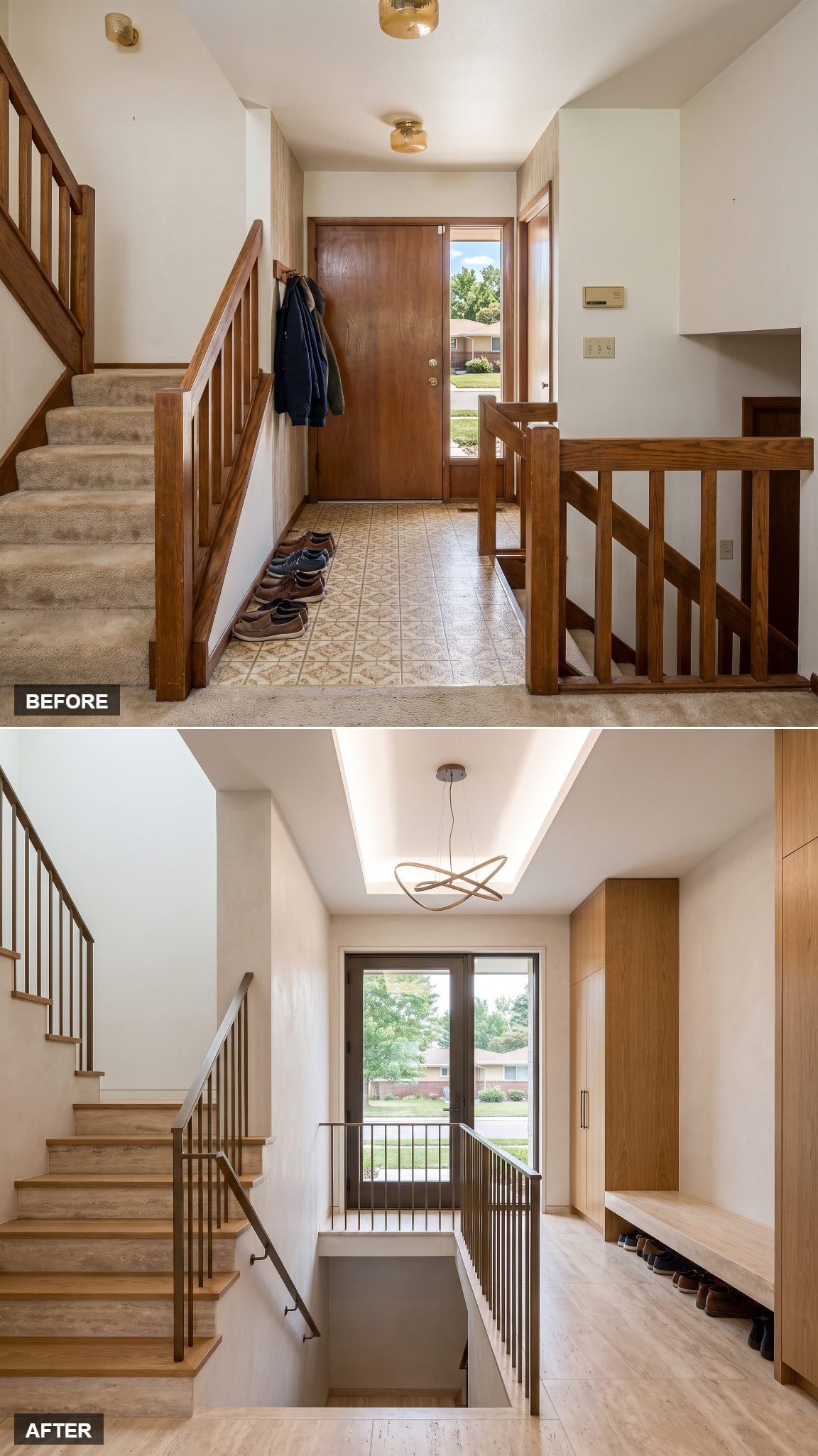
The stone is dramatic, but by this point the bigger story is architectural. The landing and guards have been substantially rebuilt so both stair flights finally look as though they belong to the same composition.
Honed travertine runs through the entry and onto the stairs, while thick plaster guards replace the old spindle railings. The reconfigured edges give the circulation real mass and direction rather than leaving two staircases to meet awkwardly at the door.
5. A Raised Entry Platform Changes the Section, Not Just the Flooring
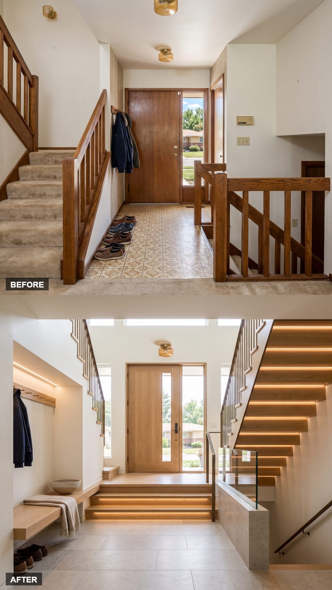
Now we are firmly beyond surface renovation. The arrival level and its relationship to the upper stair are reworked so the front door gets territory of its own rather than simply opening between two flights.
Limestone defines the new threshold and landing, while a low parapet capped in frameless glass protects the lower opening without turning it into the first thing you see. The shift in level does more than add drama. It reorganizes how the entire entry is understood.
4. Two Clear Routes Finally Untangle the Split-Level at Its Source
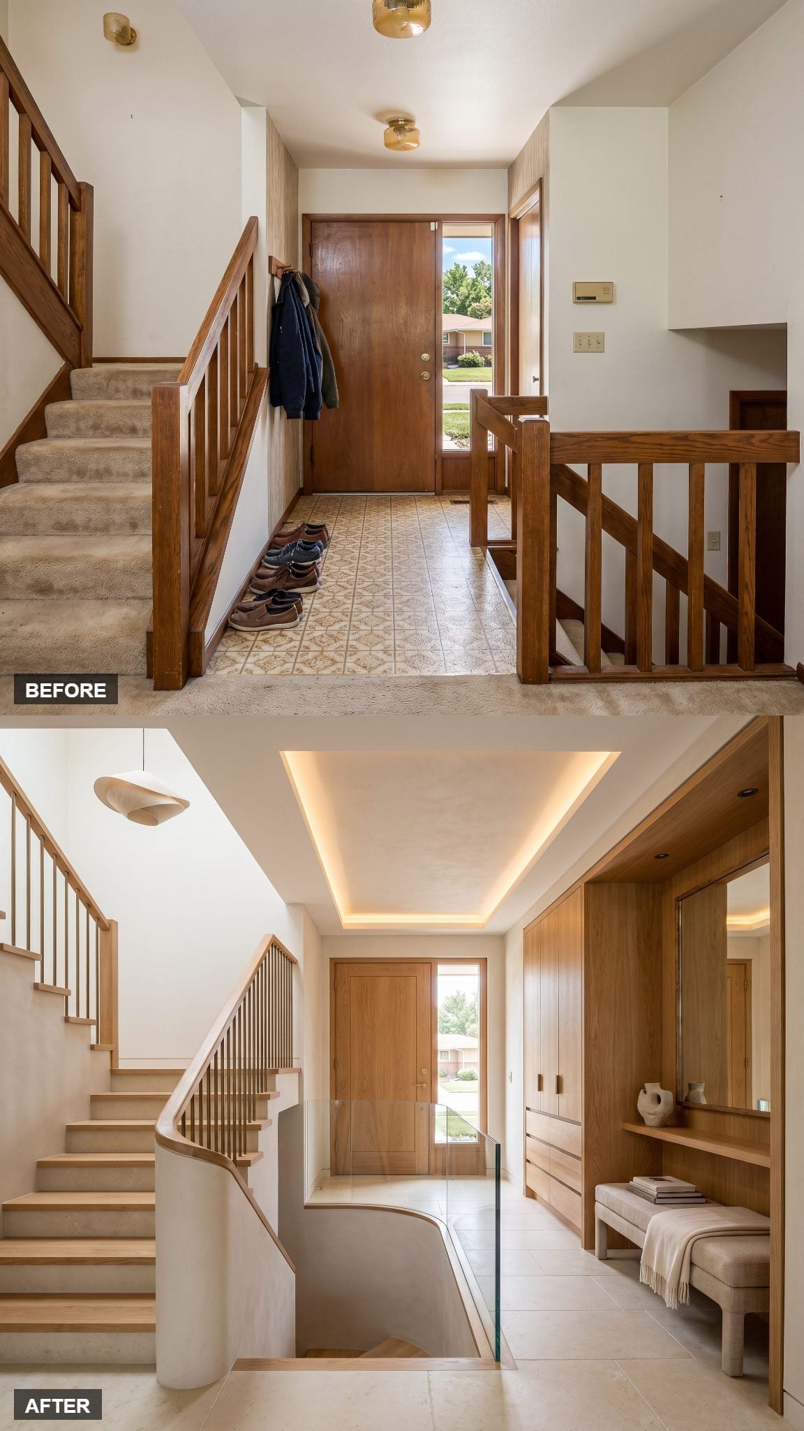
A nicer railing was never going to be enough here. The stair opening, landing edges, and relationship between the upper and lower routes are substantially reworked.
The upper flight becomes broader and easier to read, while the lower stair is gathered behind a curved plaster guard that eases into glass. Instead of three circulation paths colliding in the same few feet, each route gets a clear boundary and hierarchy.
3. A Luminous Glass Pavilion Rebuilds the Downstairs as Its Own Architectural Volume
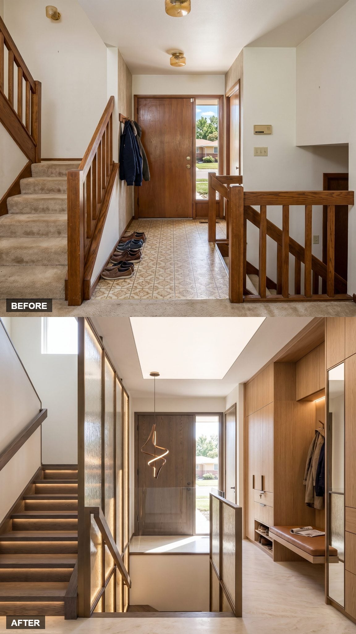
This is no longer a cosmetic rescue. The lower stair becomes architecture in its own right.
The opening is reworked and wrapped in textured glass, turning what once felt like an exposed drop beside the front door into a luminous interior pavilion. Opposite it, integrated storage and seating reshape the usable landing rather than simply occupying it.
Smoked oak keeps the glass from becoming sterile, while the enclosure lets the lower level remain visibly connected without dominating the arrival.
2. Layered Stone and Framed Sightlines Turn the Split-Level Into Full Architectural Theater
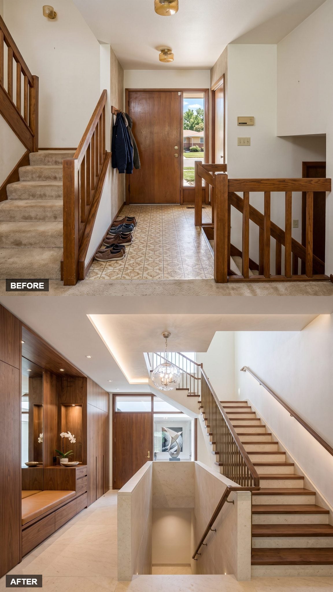
Now almost nothing about the arrival is being treated as untouchable.
The stair void, surrounding guards, landing, and relationship to the upper flight have been substantially rebuilt. A broad limestone enclosure frames the descent, while new stair geometry turns circulation itself into the dominant composition.
Book-matched stone, walnut millwork, a blown-glass chandelier, and grazing wall light take the project well past practical renovation. The split-level is no longer being disguised. It has become the source of the drama.
1. Light, Oak and Limestone Give the Split-Level an Entirely New Arrival Sequence
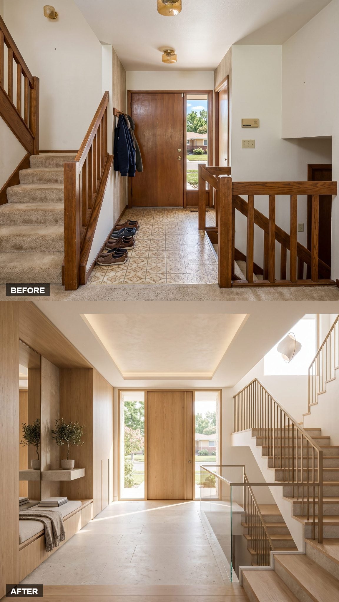
The final transformation does not merely open the sightlines. It rethinks the landing and stair relationship so completely that the front door now opens onto an arrival court rather than a narrow strip of floor caught between railings.
The lower stair becomes a clean architectural void edged in limestone and glass, while the upper route rises beside it in white oak and slender metal. Expanded glazing at the front door sends daylight through the newly opened composition instead of asking it to squeeze between heavy guards.
Most important, the center is allowed to stay empty.
Arrive. Stop. Look around. Then choose a direction.
That tiny pause is what the original 1970s entry was missing all along.