
🔥 Would you like to save this?
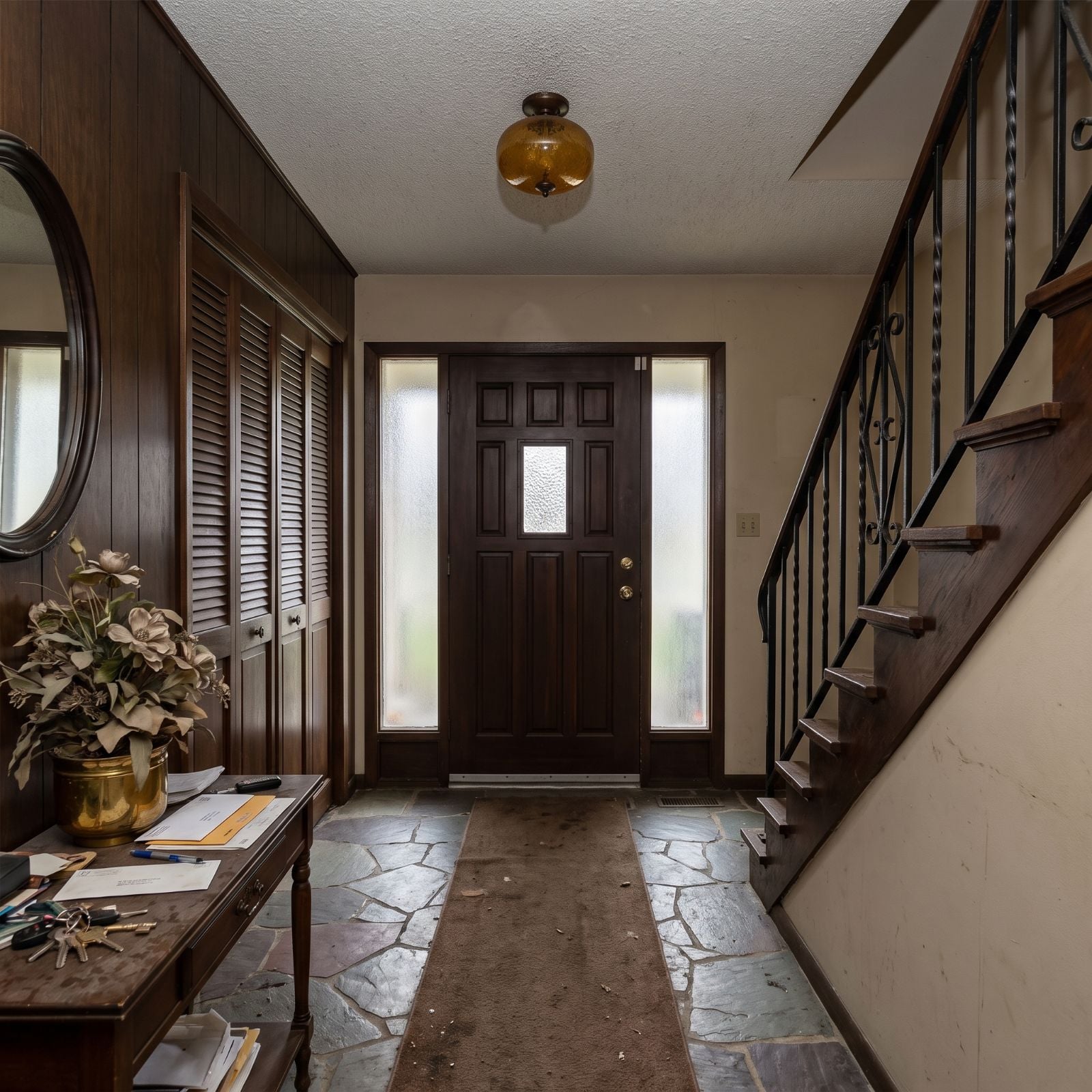
Dark wood paneling wasn’t automatically the villain. The trouble came when it met a nearly black front door, iron scrollwork, mottled stone flooring, an amber ceiling globe, and walls the color of a manila envelope. Many surviving 1970s foyers stacked every heavy idea in the same few square feet, then wondered where the daylight went.
In order to come up with the very specific design ideas, we create most designs with the assistance of state-of-the-art AI interior design software. Also, assume links that take you off the site are affiliate links such as links to Amazon. this means we may earn a commission if you buy something.
These 31 before-and-after concepts attack that problem from almost every direction. Some strip the entry back to oak, plaster, and better light. Others answer the gloom with coral doors, banana leaves, blue toile, terrazzo, stained glass, brass, or enough pattern to make restraint reconsider its career choices. The interesting part isn’t that every foyer gets lighter. It’s how many completely different rooms were hiding inside essentially the same dark box.
31. A Fanlight, Brass Lantern, and Checkerboard Floor Change the First Impression Completely
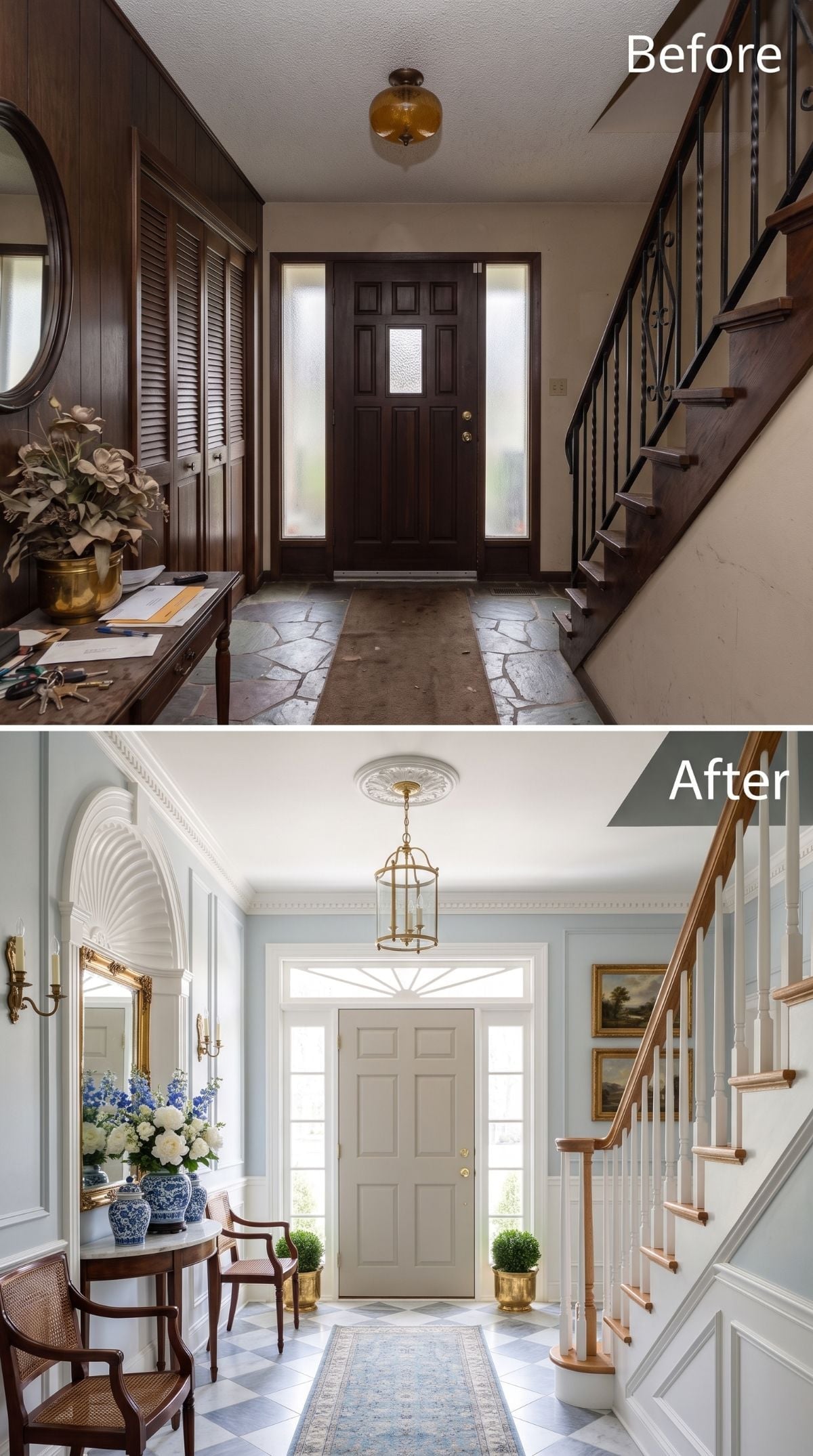
This is the kind of transformation that makes the before feel almost implausible. Brown paneling disappears beneath pale blue-gray walls and crisp white millwork, while a brass lantern replaces the amber flush fixture that once left the ceiling looking low and forgotten.
The fanlight transom above the painted door is the bigger move. Divided glass brings daylight in high on the wall, where it can wash across the entry instead of stopping around eye level. A blue-and-white painted checkerboard floor gives all that pale architecture a graphic base, while white stair balusters and a gold-framed landscape keep the brass from becoming a solitary flash of metal.
Nothing here depends on one miracle finish. Door, glass, paint, floor, railing, and light fixture all start pulling in the same direction.
30. Marble, Symmetry, and Crystal Show Just How Far the Old Foyer Can Travel
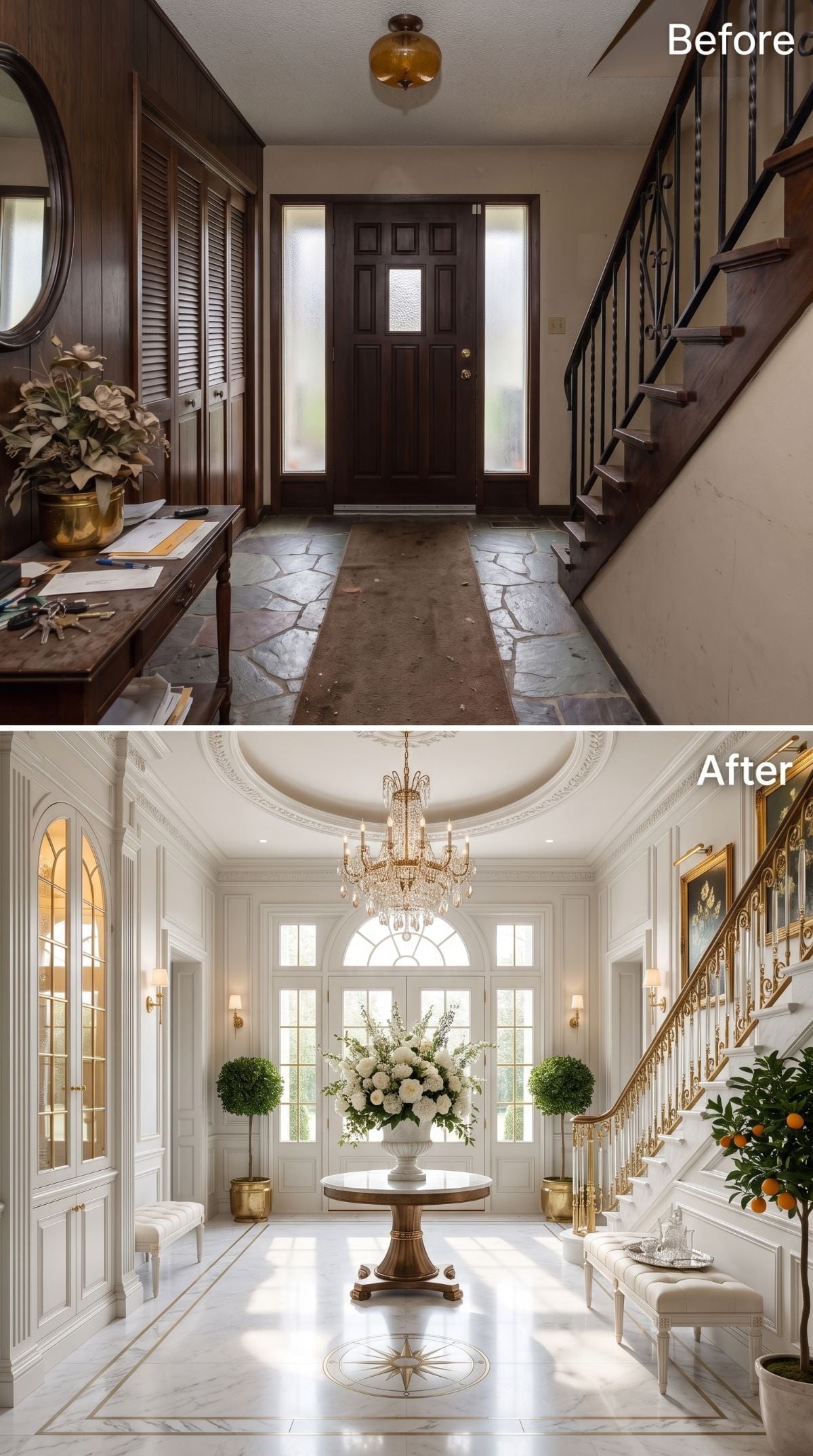
Two topiaries flank a central pedestal table like sentinels, and the symmetry immediately changes the scale of the room. A pale marble-look floor carries a compass-rose-style inlay beneath it, while gold-trimmed railings pull the eye toward the staircase.
Above, a crystal chandelier sits within a coffered tray ceiling rather than floating beneath a blank lid. The larger architectural framework gives a fixture this dramatic somewhere to belong.
The old foyer had enough space. What it lacked was hierarchy. This version gives almost every axis a center, then makes sure you notice it.
29. White Oak and Real Storage Prove the Makeover Doesn’t Need a Chandelier
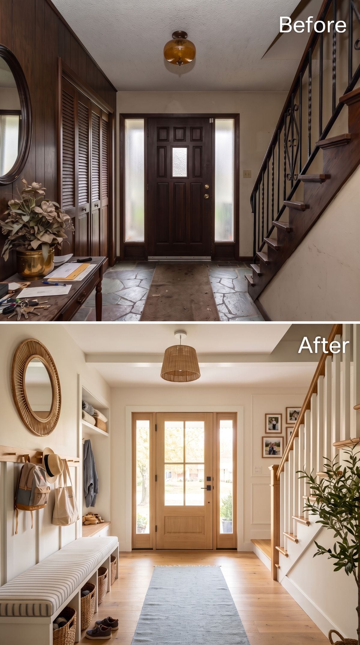
The third transformation takes almost the opposite route. No medallion floor. No crystal. No wallpaper climbing toward the ceiling. Just pale materials, daylight, and a serious answer to the question of where everybody’s shoes are supposed to go.
White-painted walls and white-oak-look flooring replace the dark surfaces, while a light-stained Shaker-style door with full-length sidelights brings the front wall into the same pale material family.
The built-in mudroom storage on the left is the part worth studying: open shelves, hooks at two heights, a cushioned bench, and woven baskets underneath. A rattan pendant and round rattan-framed mirror add warmth without bringing another heavy wood surface back into the room.
The staircase shifts to white balusters and a photo gallery wall. A faded-blue runner supplies just enough color. Completely different foyer. Same square footage.
28. The Dark-Wood Foyer Gets Its Clean Break
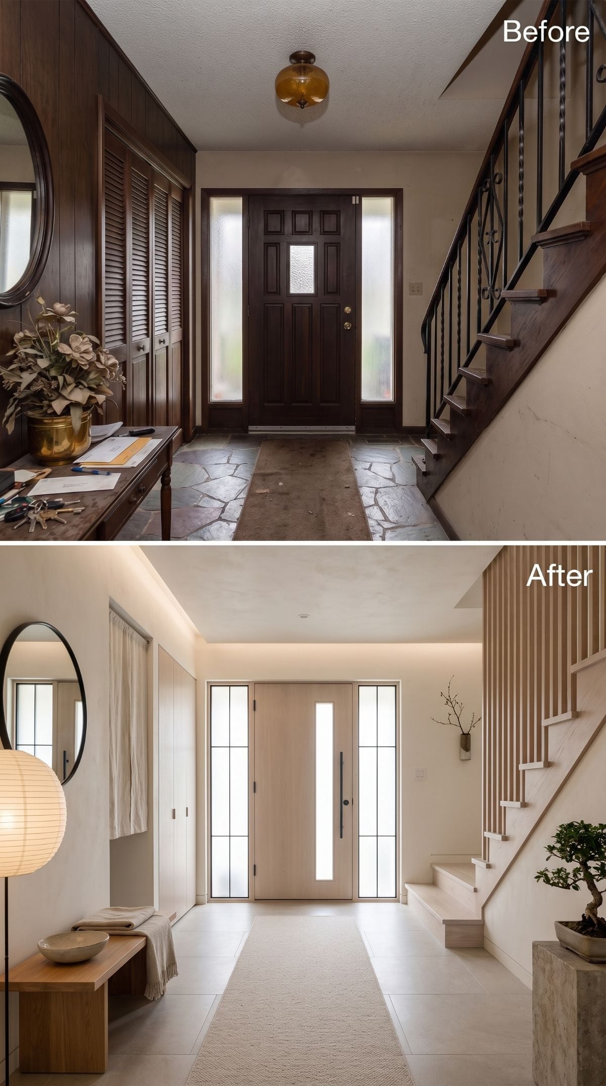
Dark walnut paneling covered the vertical surfaces, louvered doors flanked a heavy six-panel entry, and decorative ironwork tightened the staircase beside it. Add the amber globe overhead and the room felt less like an arrival than a holding pattern.
The after goes straight for clarity. Pale maple slats replace the iron railing, a blonde-wood pivot-style door with a full sidelight opens the front wall visually, and large-format pale tile gives the floor one continuous surface. Concealed perimeter lighting replaces the little amber pool overhead. Nothing here is especially loud. That’s exactly why it works.
27. A Skylight Turns the Former Cave Into a Greenhouse
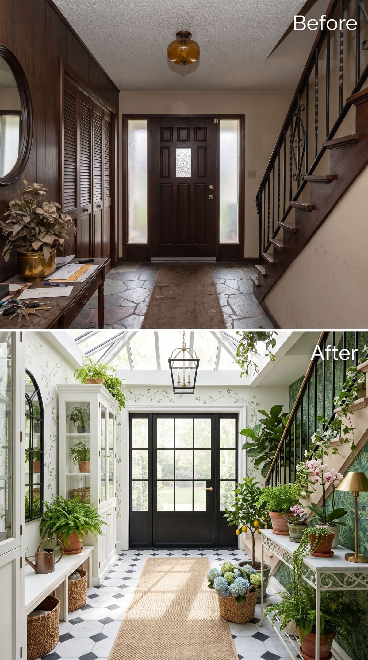
Botanical wallpaper climbs toward new overhead glazing, and suddenly the entry has permission to become lush. Black-and-white diamond tile replaces the old flagstone, a French-style glass door opens the view toward the garden, and an aged-brass-look lantern hangs where a small ceiling fixture once barely registered.
The plants matter, but the daylight matters first. Ferns and trailing greenery can now occupy the room without disappearing into shadow, while the wallpaper carries the botanical idea even where living foliage stops. Plants aren’t decoration here. They’re practically co-workers.
Why the Overhead Glass Changes the Whole Composition
Adding substantial glazing above an entry is a structural intervention, not a styling trick. In this concept, it changes the balance of every surface below it: dark foliage gains definition, patterned walls read more clearly, and the narrow floor feels less enclosed. The room could still function with strong artificial lighting, but the overhead daylight is what makes this particular greenhouse effect convincing.
26. Mustard, Terrazzo, and Gold Give the 1970s a Better Second Act
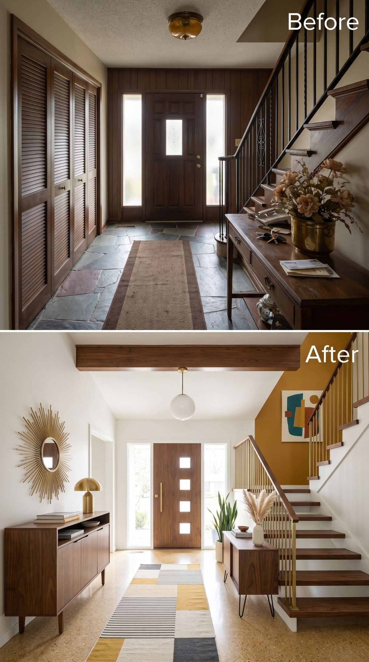
Instead of erasing every trace of warmth, this renovation redirects it. Walnut-toned cabinetry on slender legs replaces bulky storage, while pale terrazzo-look flooring moves the room away from dark slate without turning the whole foyer white.
The staircase makes the bolder move. Vertical dowel-style balusters in a gold-toned finish stand against a mustard wall, and a geometric runner in charcoal, white, and ochre carries the palette onto the floor. Abstract art above the console completes the mid-century conversation without turning the foyer into a theme park.
- Replacing decorative ironwork with simpler vertical balusters reduces visual clutter around the staircase.
- A pale terrazzo-look floor can bounce more light than a dark matte slate surface while keeping plenty of texture underfoot.
- Repeating mustard and ochre in the wall, runner, and artwork keeps the strong color from becoming a one-off accent.
25. Blue Toile Makes the Foyer a Destination Instead of a Passage
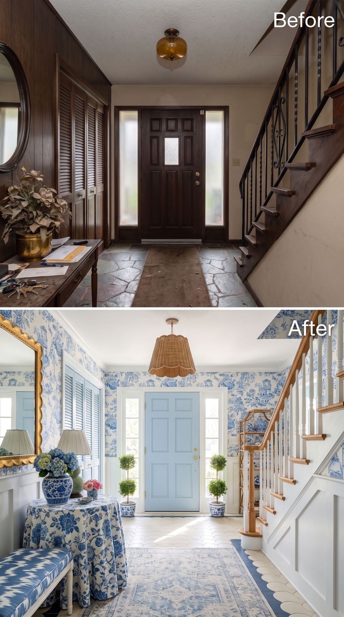
Powder-blue-and-ivory toile-style wallpaper takes over the walls, turning what had been dark paneling into an actual decorative room. White balusters and a natural wood handrail loosen up the staircase, while a dusty-blue door connects directly to the wallpaper.
Across the entry, blue-and-white upholstery, porcelain, and a skirted table keep pushing the same palette through different patterns. A wicker drum pendant warms the ceiling without adding another ornate shape. It’s a lot, deliberately. The narrow color range is what keeps it from turning into visual static.
Editor’s Note: Pattern-heavy rooms become easier to read when the colors stay disciplined. Here, wallpaper, upholstery, ceramics, and paint keep circling the same blue-and-ivory family, so variety comes from scale and motif rather than a dozen unrelated hues.
24. Oak Slats Make the Narrow Entry Look Taller Without Moving a Wall
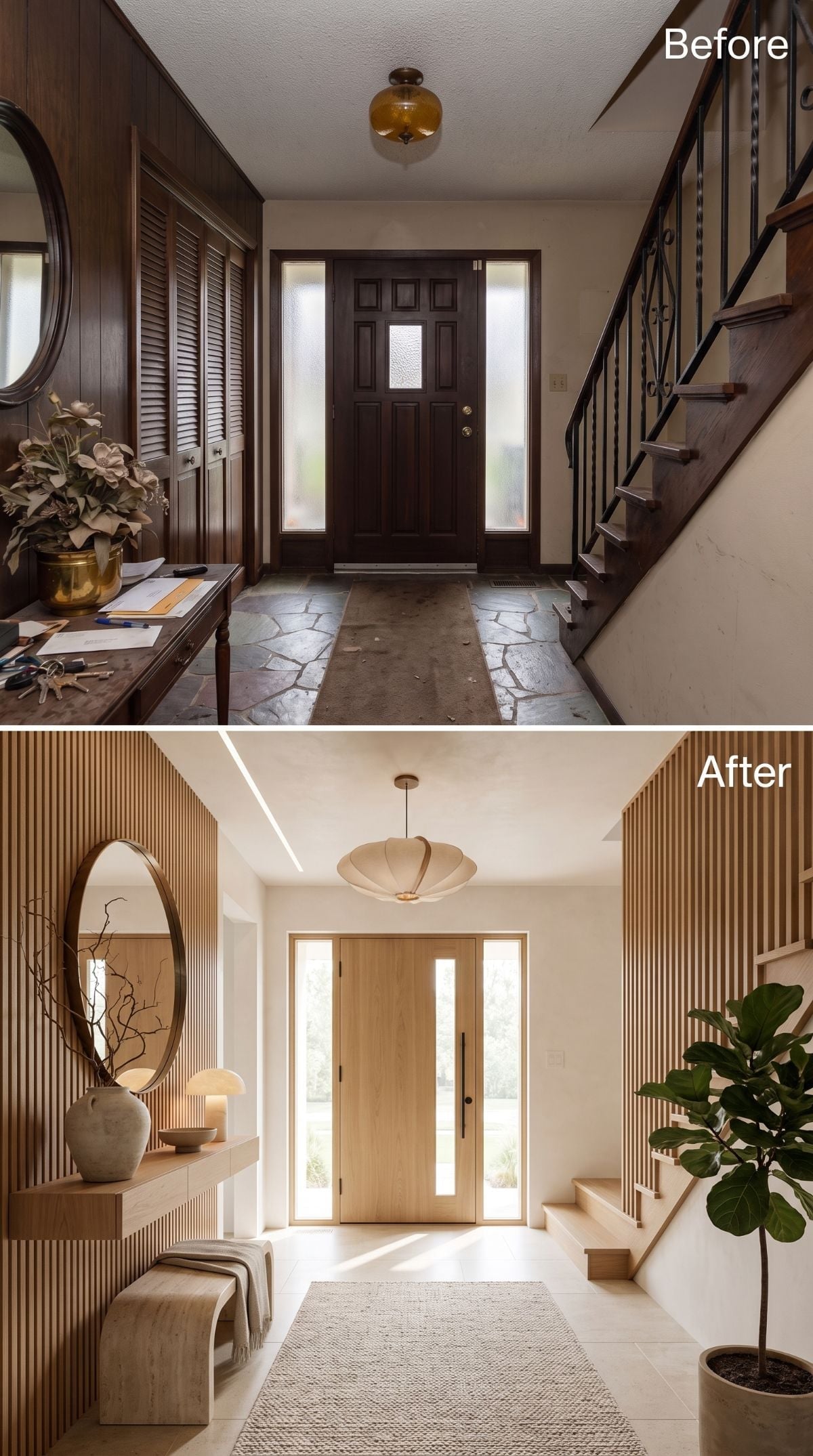
Vertical oak slat panels replace broad expanses of dark paneling, and the direction of the grain changes the way the walls are read. Instead of one heavy horizontal box, the foyer gets a repeated vertical rhythm from floor to ceiling.
A folded-fabric pendant gives the ceiling a softer focal point, while a woven runner and a tall fiddle-leaf fig continue the natural-material story below. The room didn’t gain square footage. It gained a better set of lines.
In the Details: Vertical slats emphasize height because the repeated lines lead the eye upward. Horizontal slats would emphasize width instead, which can be useful in a different room. In this narrow entry, the uninterrupted floor-to-ceiling treatment makes the vertical effect especially strong.
23. Coral, Chinoiserie, and Mint Tile Refuse to Whisper
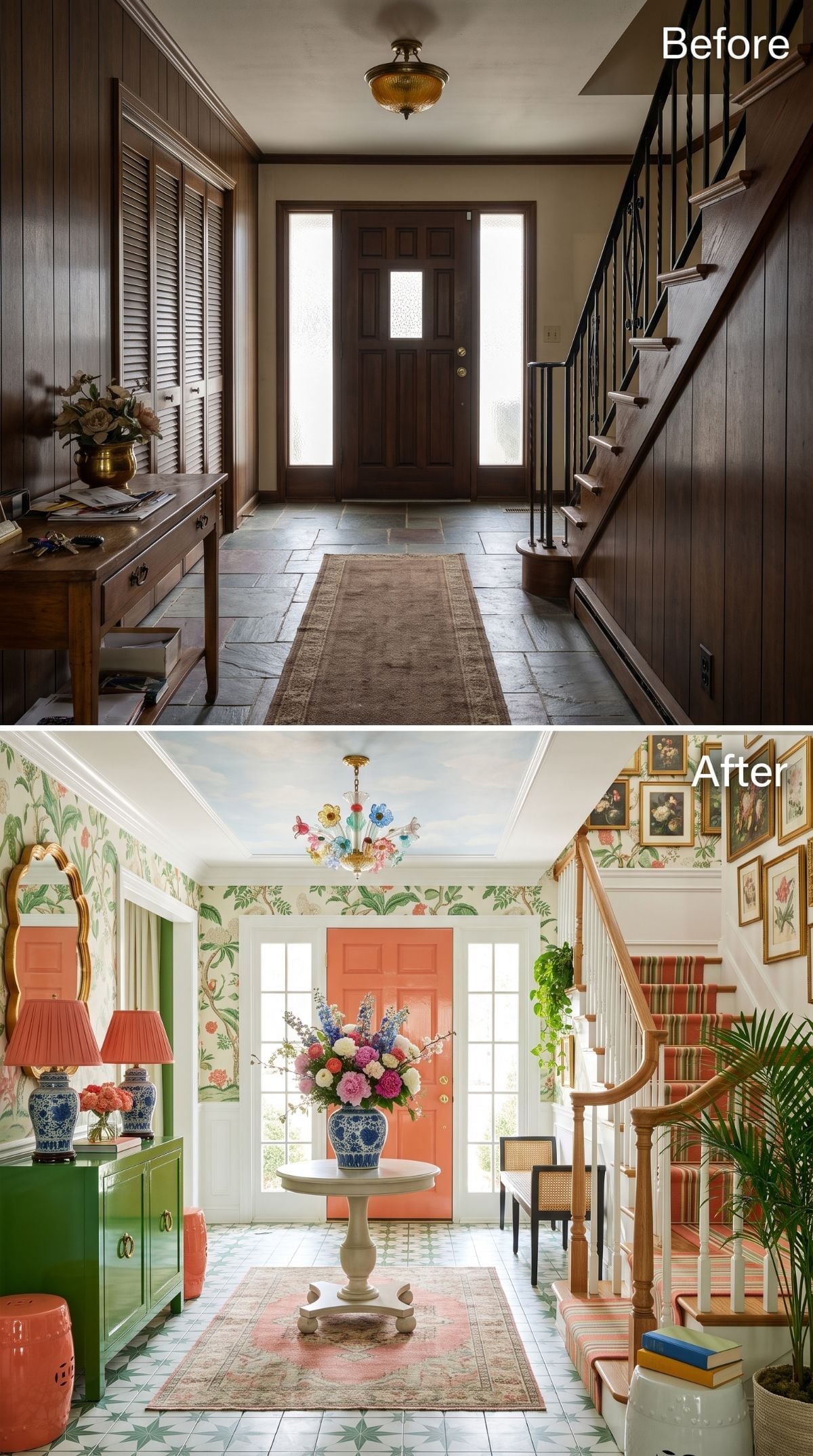
Chinoiserie-style wallpaper in blush, coral, and leafy green covers the walls above crisp white wainscoting, instantly replacing the old brown envelope with something closer to a garden party.
The front door goes coral-salmon and picks up the stripe in the stair runner. A green lacquer-look console carries blue ginger jars beneath coral shades, while a central pedestal table supports a blue-and-white vase overflowing with flowers.
Overhead, a floral glass chandelier gets to be theatrical because the patterned mint-and-white encaustic-look floor is already committed to the idea. This one doesn’t solve the old foyer through restraint. It overwhelms the memory of it.
22. Natural Oak, Limewash, and Glass Let Daylight Take Over
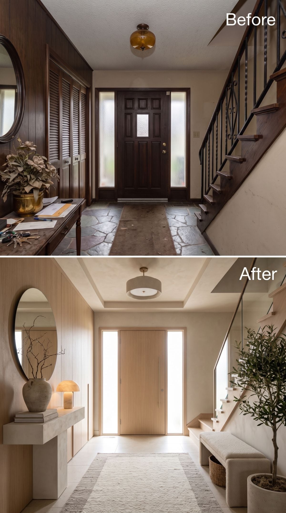
The old louvered doors, dark paneling, and amber fixture disappear. In their place: limewash-look plaster walls, a flat-panel oak pivot-style door, full-height sidelights, and a quiet brass-toned flush mount.
The staircase changes just as radically. Open risers and clear glass railing panels allow sightlines and borrowed light to move through the center rather than stopping at iron balusters. A low concrete-look console and arched mirror keep the left wall sparse enough for the architecture to remain visible.
Light Study: Glass railing panels and larger sidelights don’t create daylight, but they can allow more of the available light to travel across an entry. In a foyer with limited windows, removing opaque barriers can change where that light reaches as much as changing the wall color.
21. Banana Leaves Take the Foyer Somewhere Entirely Else
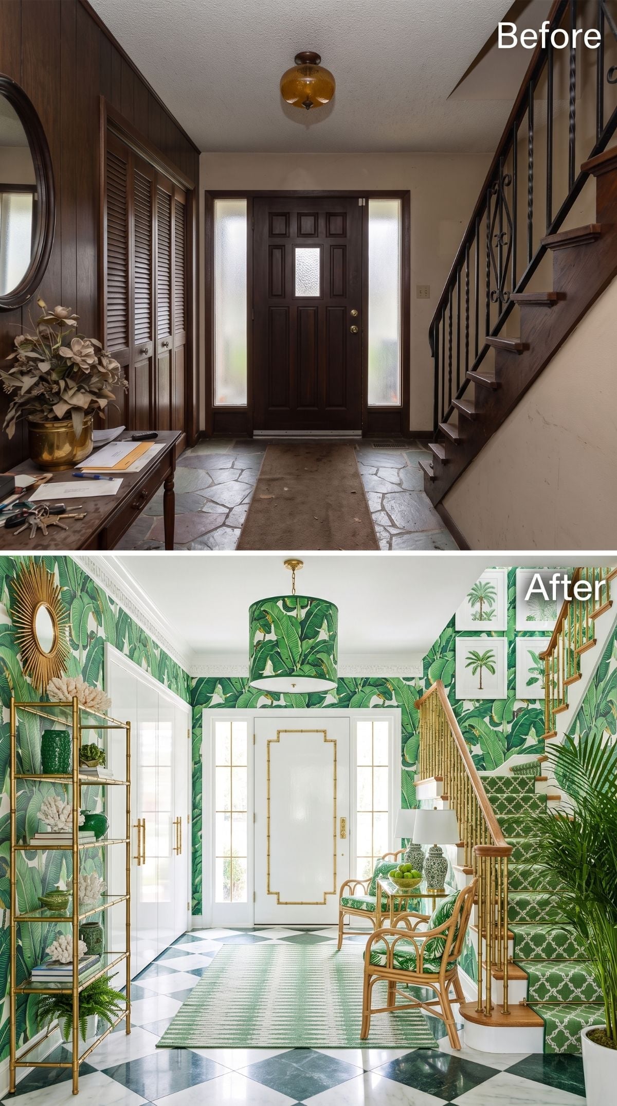
The after does not dabble. Banana-leaf wallpaper runs through the entry, interrupted by white trim that gives all that foliage a little breathing room.
A white front door carries a gold bamboo-motif appliqué, rattan seating echoes the tropical geometry, and a brass shelving unit holds coral-toned objects, ceramics, books, and ferns. The green-and-white trellis stair runner keeps the theme marching upward.
Then comes the pendant shade: more leaves. When a room picks a theme and refuses to flinch, it tends to win.
History Corner: Tropical leaf motifs became closely associated with glamorous American resort interiors in the mid-20th century. One of the best-known examples is CW Stockwell’s Martinique pattern, famously used at the Beverly Hills Hotel during its Don Loper-era redesign. The look helped turn oversized tropical foliage into an enduring decorating vocabulary rather than a passing novelty.
20. Terracotta and Honey-Toned Wood Warm the Entry Without Bringing Back the Gloom
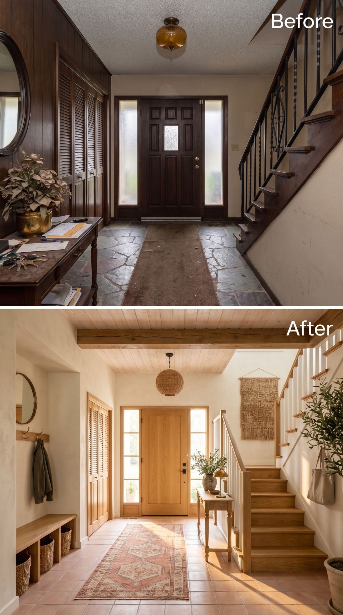
A honey-toned wood door immediately softens the entry wall, while terracotta-look tile replaces irregular dark slate underfoot. White balusters and an oak handrail take the staircase away from decorative iron without making it feel anonymous.
Above, a planked wood ceiling and exposed beam keep the new palette warm, and a rattan pendant adds texture where the old globe fixture had little presence. Woven baskets beneath the built-in bench give coats, shoes, and everyday clutter somewhere to disappear.
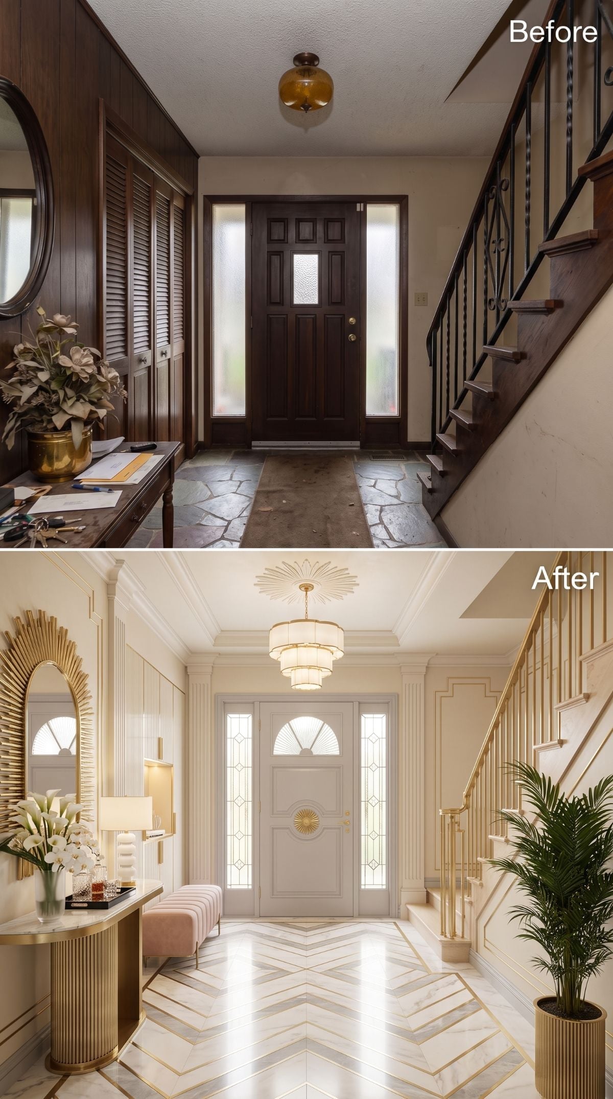
19. Chevron Stone and Gold Turn the Entry Into a Proper Arrival
🔥 Would you like to save this?
Cream fluted pilasters replace dark paneling, and a warm-gray door with a sunburst medallion becomes the first object you notice rather than the darkest.
The floor carries the bigger gesture: chevron-patterned pale stone with brass-look inlay connects the gilded-look railing, sunburst mirror, and tiered drum pendant. The metallic line isn’t merely another accent. It travels through the room at floor level and makes the decorative details above feel related rather than randomly gold.
Why It Works: Repeating the same metallic tone in several locations creates visual continuity without requiring every object to match. Here, the floor inlay establishes the gold note first, then the railing, mirror, and pendant echo it at different heights.
18. A Jade Door Gives Chinoiserie a Cooler Center
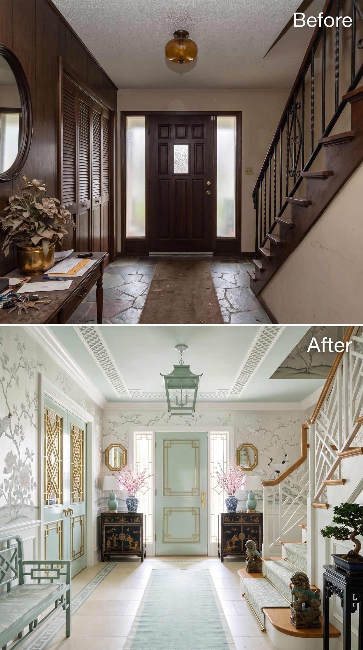
Silver-and-white chinoiserie-style floral wallpaper replaces the dark paneling from floor to crown, while a celadon-jade door gives the pale room one cool block of color.
The ceiling picks up lattice-like trim, and the rebuilt staircase shifts to white bamboo-style balusters beneath a honey-oak handrail. Lacquer-look cabinets flank the entry with blue-and-white porcelain and flowering branches above them.
A pagoda-style lantern at center makes the Asian-inspired direction clear without asking every object in the foyer to repeat the same motif.
Color Story: Celadon, ivory, and silver-gray sit close enough in value that none has to dominate. Pulling paint colors from an existing wallpaper is one practical way to build this kind of restrained palette because the relationships are already established in the print.
17. Terracotta, Plaster, and an Arched Door Go Warm Without Going Retro
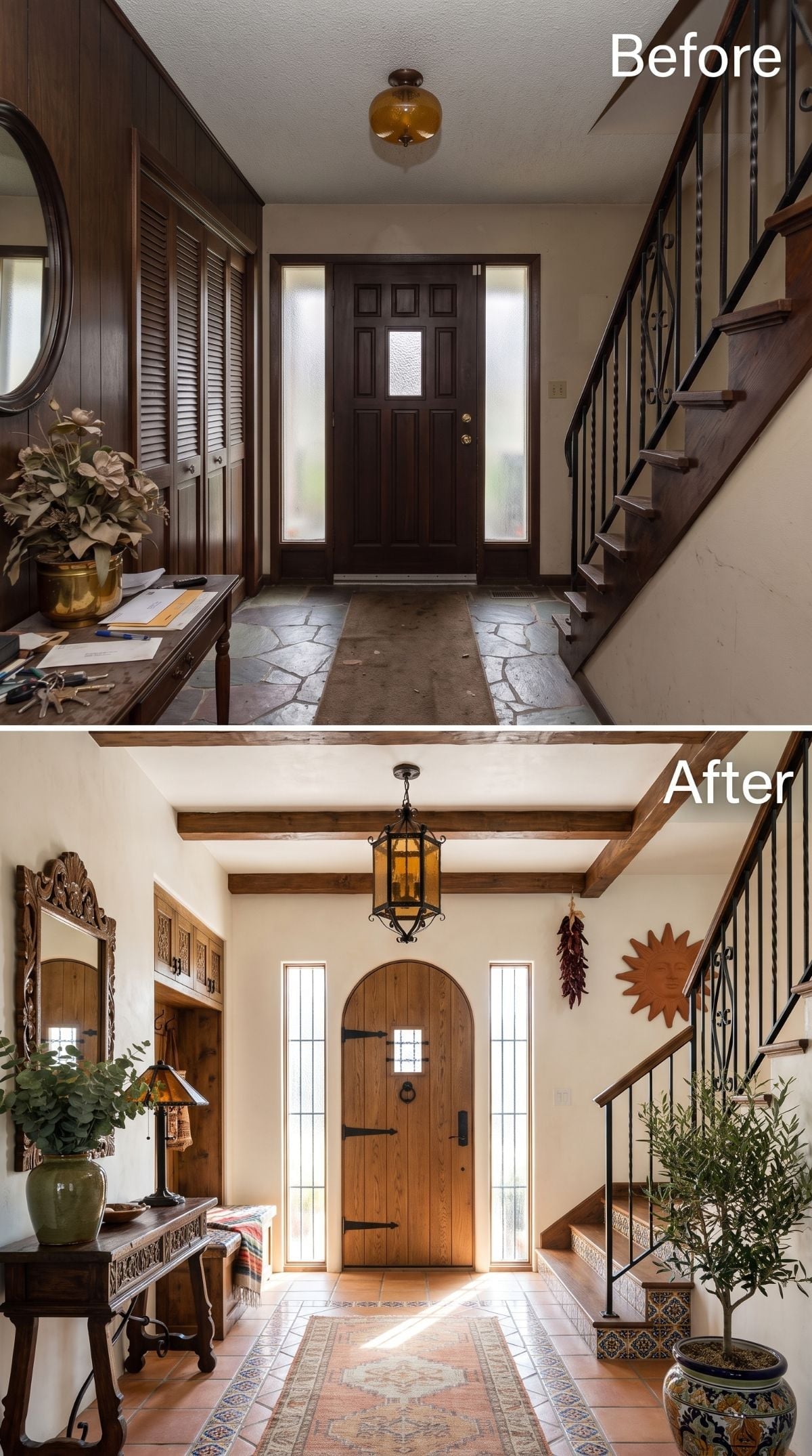
The dark paneling disappears entirely beneath warm plaster-finish walls. Adobe-toned terracotta-look tile now runs through the entry toward an arched knotty-alder-look door with dark strap-hinge details.
Exposed ceiling beams deepen the earthy palette overhead, while a wrought-iron-look lantern brings a single dark shape back into the room without recreating the heaviness of the original.
Material Note: Traditional terracotta can be glazed, unglazed, factory-sealed, or left porous depending on the product. For an entry, check the manufacturer’s installation and sealing requirements before treating every terracotta tile the same way. High-traffic floors are not the place for improvisation after the grout dries.
16. Navy Cabinetry Gives the Old Entry a Much Stronger Backbone
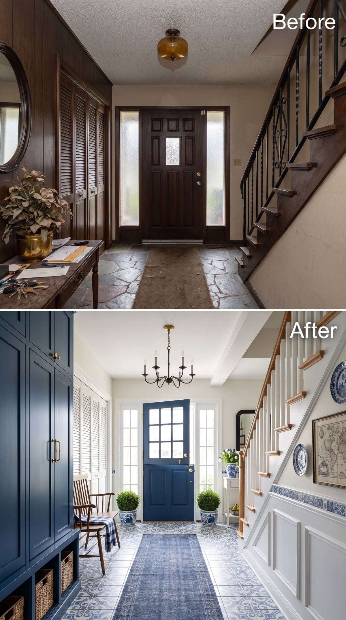
Heavy wood paneling and one small amber fixture had turned the old entry into a dark tunnel. The redesign answers with navy Shaker-style cabinetry, brass-toned pulls, and a front door painted in the same saturated color.
Blue-and-white geometric cement-tile-look flooring runs the length of the space while crisp white walls prevent the navy from swallowing the room. Overhead, a candle-style wrought-iron-look chandelier adds shape without introducing another major color.
It reads lighter. Considerably.
Style Tip: Repeating one saturated paint color across a door and built-in cabinetry can make separate architectural pieces feel related. Here, the surrounding white walls provide enough contrast that the navy becomes a deliberate frame rather than an uninterrupted dark field.
15. Moroccan Pattern Replaces the Brown Box With Layers of Blue and Brass
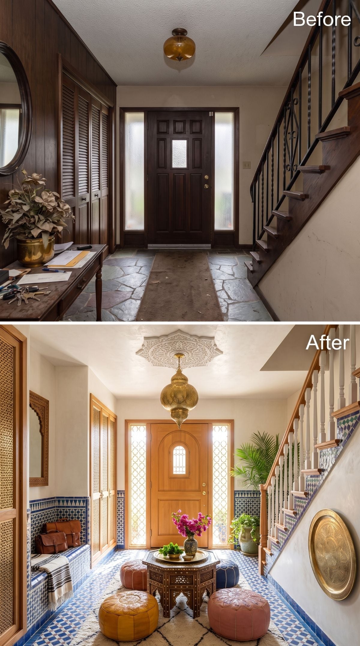
Blue-and-white zellige-look tile rises from the floor to wainscot height, replacing broad expanses of dark paneling with a glossy, irregular-looking surface that catches light from dozens of angles.
Warm plaster-finish walls continue above, and an ornate ceiling medallion frames a brass Moroccan-style lantern. The new honey-toned oak door carries arched glazing and latticed sidelights, while leather poufs and an inlaid octagonal table make the center of the room feel furnished rather than merely passed through.
A large brass tray on the stair wall finishes the composition with one unapologetically round gesture.
14. Black-and-White Diamonds Give Shiplap Something to Argue With
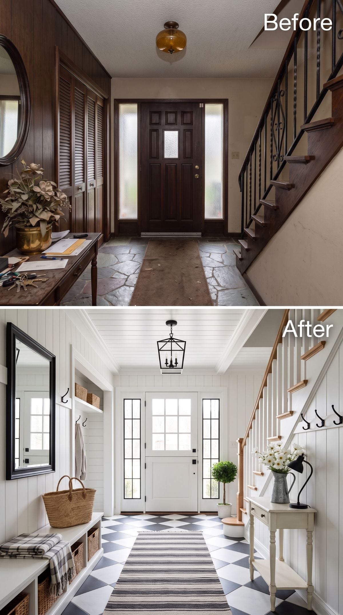
White shiplap-style walls take the room almost all the way to blank canvas, then the floor refuses to cooperate.
A painted black-and-white diamond pattern gives the entry its graphic structure, softened by a striped runner down the center. The dark door and iron railing disappear in favor of a white French-style entry door, gridded sidelights, and a natural wood handrail.
A matte-black lantern pendant and black hardware give the pale room several sharp punctuation marks, while built-in cubbies and wicker baskets handle the practical side.
- Gridded sidelights bring more daylight into the entry than the smaller opaque-looking panels they replace.
- Black hardware repeats the floor’s darkest note without requiring another large black surface.
- Wicker baskets and textiles keep the high-contrast room from becoming too hard-edged.
13. Crystal and Parquet Make the Former Hallway Feel Like a Room
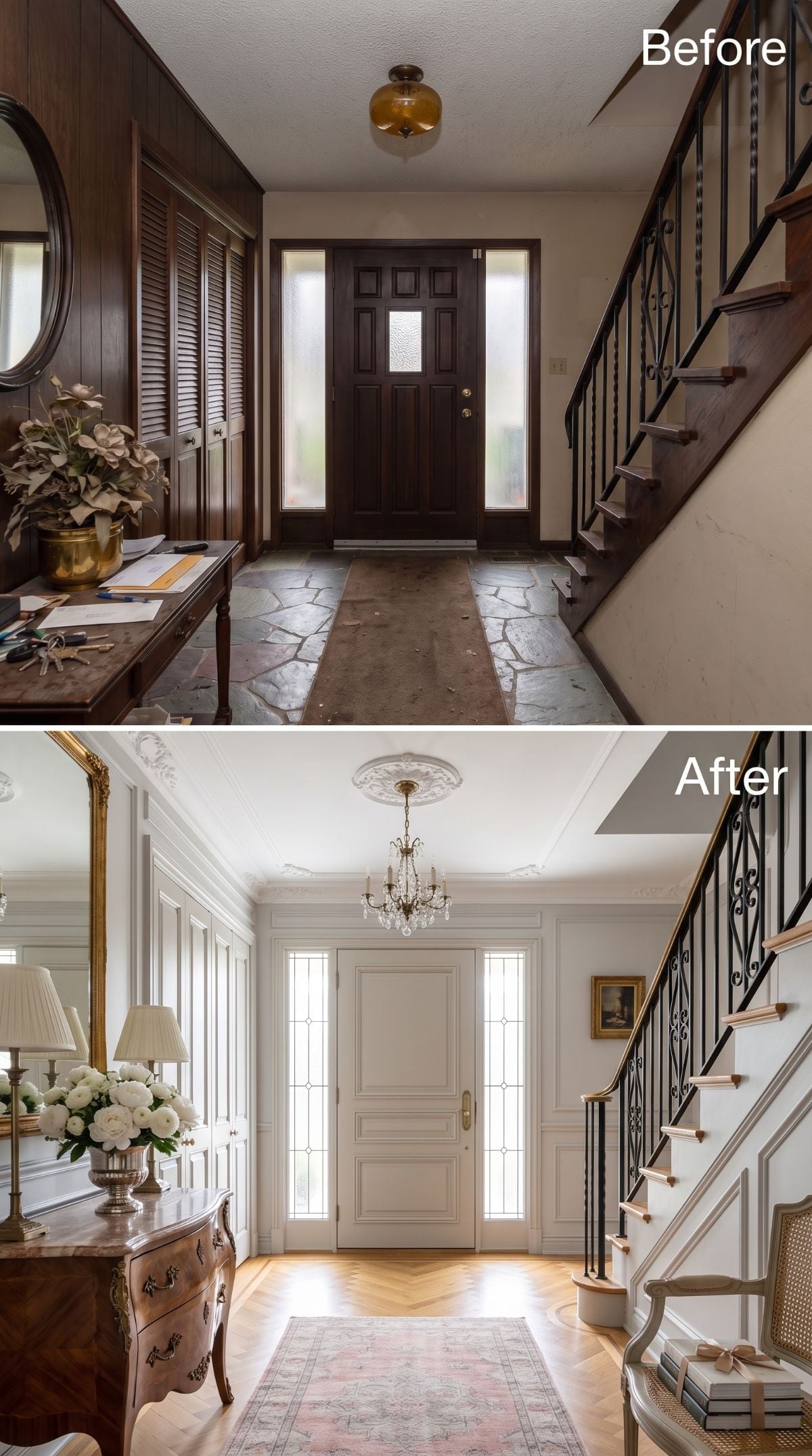
The problem with the before wasn’t one disastrous finish. It was the pileup: dark paneling, mixed flagstone, an amber ceiling globe, and an almost-black door all competing for the little available light.
White panel molding now runs around the room, and the front door is painted into the same pale wall family rather than functioning as another dark rectangle. A brass-and-crystal chandelier throws highlights across a ceiling medallion while herringbone parquet-look flooring brings warm geometry below.
The new foyer is still formal. It just stopped feeling sealed shut.
Design Note: Painting a door close to the wall color can reduce contrast at the end of a narrow hall and make the surrounding millwork read more continuously. A contrasting door can be equally successful when you want a focal point; the useful question is whether the door should dominate the view or disappear into the architecture.
12. Peach and Sage Rescue the Amber Globe Instead of Throwing It Away
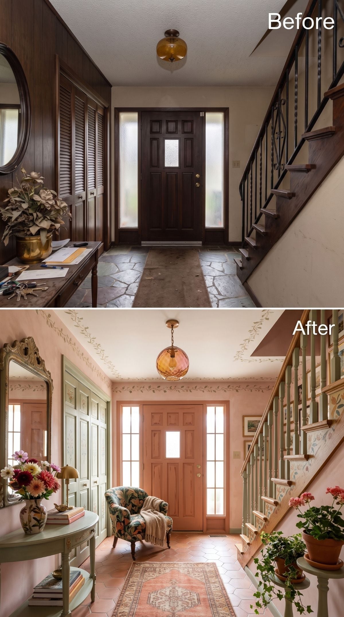
Soft terracotta-peach walls meet sage wainscoting, with vine garlands tracing the cornice overhead. The old brown entry is still gone, but this version doesn’t reject every period reference.
The amber globe-style pendant remains part of the story, now hung from a chain with brass-toned fittings so it reads as a deliberate object instead of leftover ceiling hardware. Hexagonal terracotta-look tile and a faded runner bring more warm color below.
A floral armchair by the door is the detail that changes the room from passageway to place. Somebody could actually sit down here.
Paint Detail: Carrying the sage from the wainscoting onto the stair balusters visually links two separate architectural elements. Durable trim paints are available in several sheens, so the finish can be chosen for the look as well as the amount of handling the railing receives.
11. Onyx-Look Stone and Glass Turn the Staircase Into the Main Event
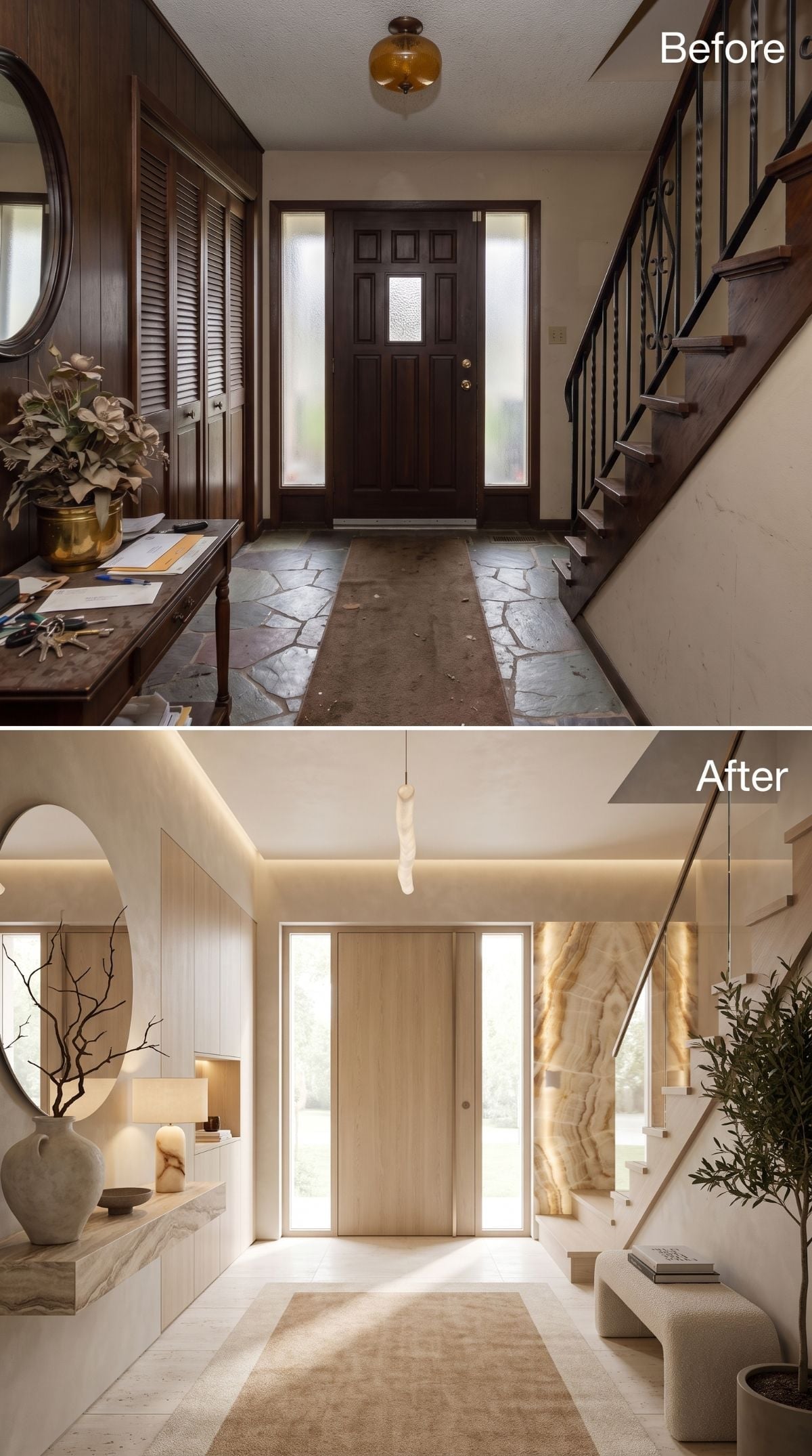
Natural oak tones, pale stone, and glass replace nearly every visually heavy surface — then one dramatic wall brings the darkness back on purpose.
The old foyer was a stack of dark paneling, decorative iron, slate flooring, and frosted sidelights. The after swaps the iron for clear glass stair panels with brushed-metal posts, exposing the staircase instead of outlining it in black.
A book-matched onyx-look slab rises behind the stairs as the room’s single major flourish. Concealed perimeter lighting gives the pale surfaces a soft glow, while an organic stone-look pendant hangs in the center like something excavated rather than installed.
10. Swedish Gray Turns the Foyer Down Without Making It Bland
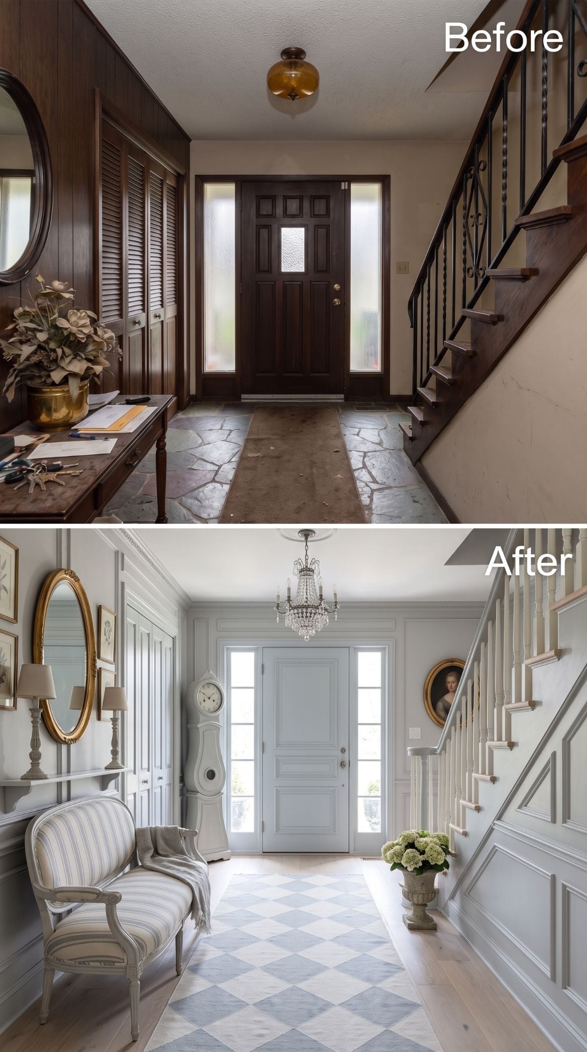
The after leans toward a Gustavian-inspired palette: blue-gray walls, white woodwork, pale painted paneling, and a two-tone harlequin floor that keeps the quiet room from becoming anonymous.
A crystal chandelier introduces just enough formality to support the striped upholstered bench below, while a Mora-style tall clock adds vertical presence near the door without consuming much floor space.
White-painted stair spindles complete the transformation. Nothing has to shout because the room has contrast where it needs it.
9. Fluted Panels and Terrazzo Push the Entry Straight Into the Present
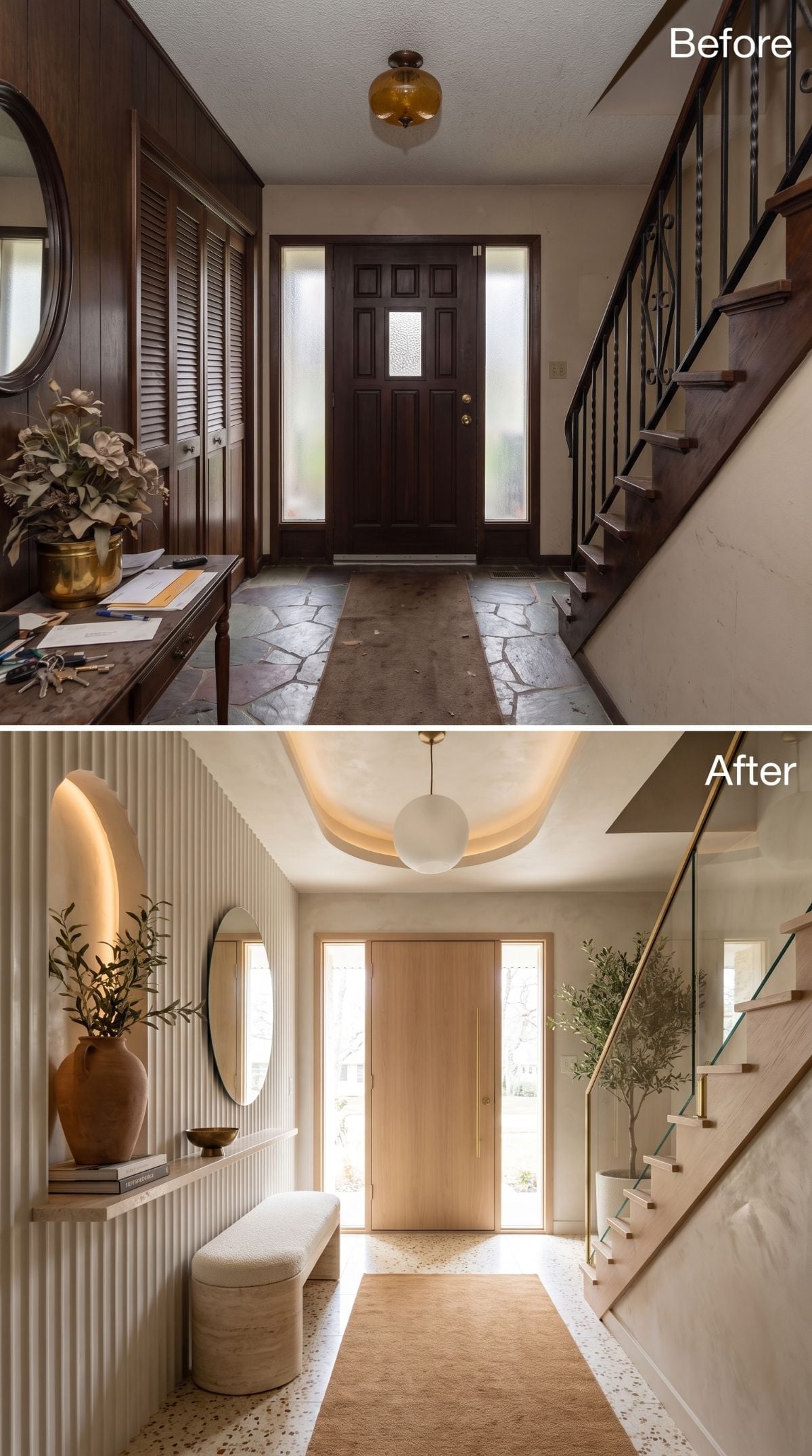
Amber glass and dark-stained wood once made every surface feel heavier than its actual size. The redesign reverses that with white fluted panels, terrazzo-look flooring, and a matte-white globe pendant suspended beneath an arched ceiling recess.
Glass stair panels replace the iron railing, while a brass-toned top rail keeps one warm line moving through the pale room. Integrated uplighting above adds depth without another visible fixture.
It’s the kind of makeover where the 1970s aren’t remodeled so much as politely escorted from the premises.
8. A Navy Door and Cyanotype Gallery Give White Shiplap a Coastal Direction
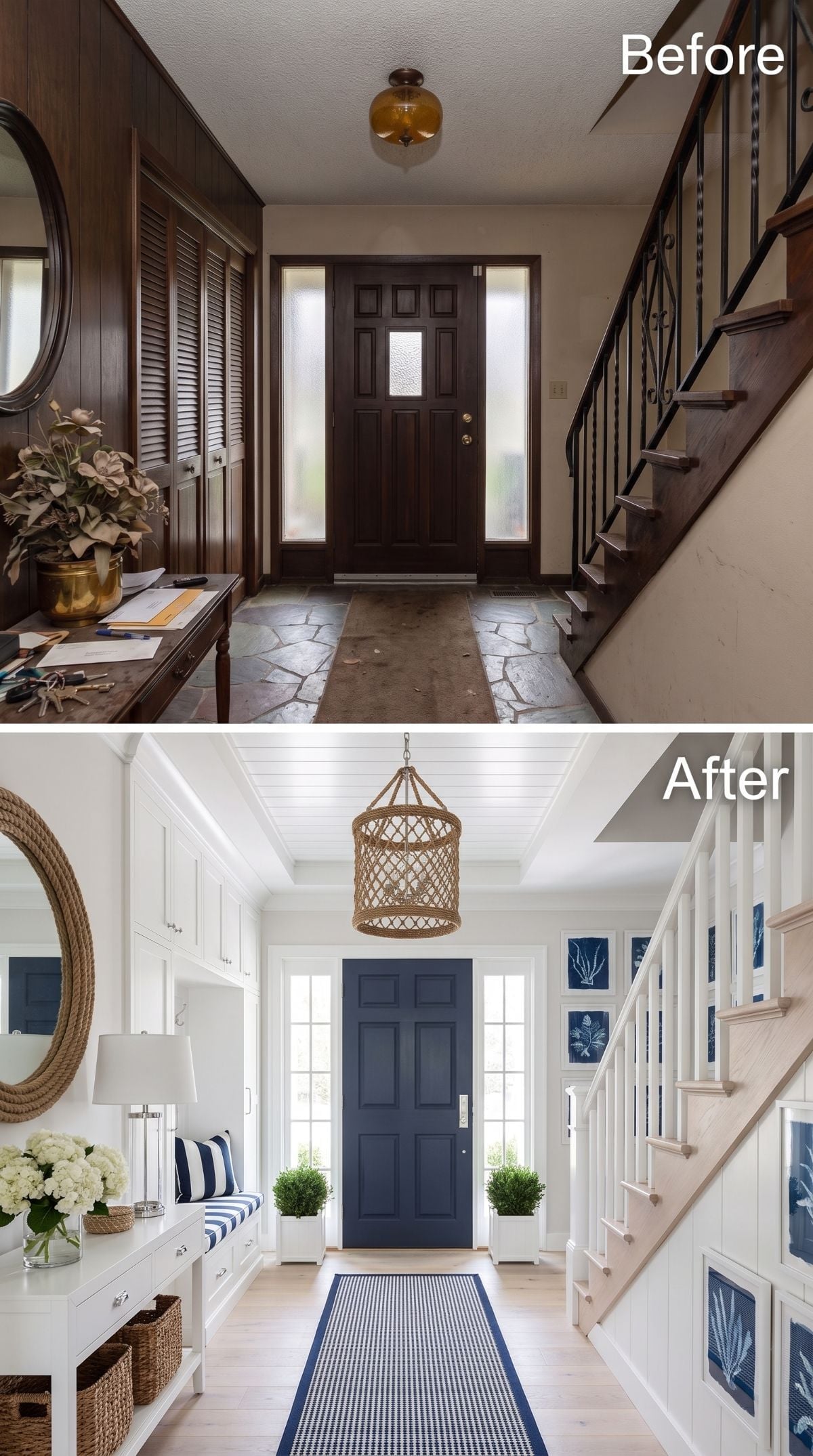
White shiplap-style ceiling boards and painted built-ins reverse the old dark-wood effect immediately, then navy gives the room its identity.
The front door carries the color first. A striped runner repeats it below, and blue botanical prints climb the staircase wall in a gallery that feels collected rather than perfectly matched. A rope pendant moves the room toward coastal without requiring shells, anchors, or anything with a sailor’s knot diagram.
Hydrangeas on the console don’t hurt.
Print Note: Cyanotypes use a photographic process that produces characteristic blue-and-white imagery. Botanical versions naturally suit coastal and nature-inspired interiors, and repeating similarly colored prints up a staircase can create cohesion even when the frames themselves are not identical.
7. Arches and Plaster Give the Old Stone Floor a New Context
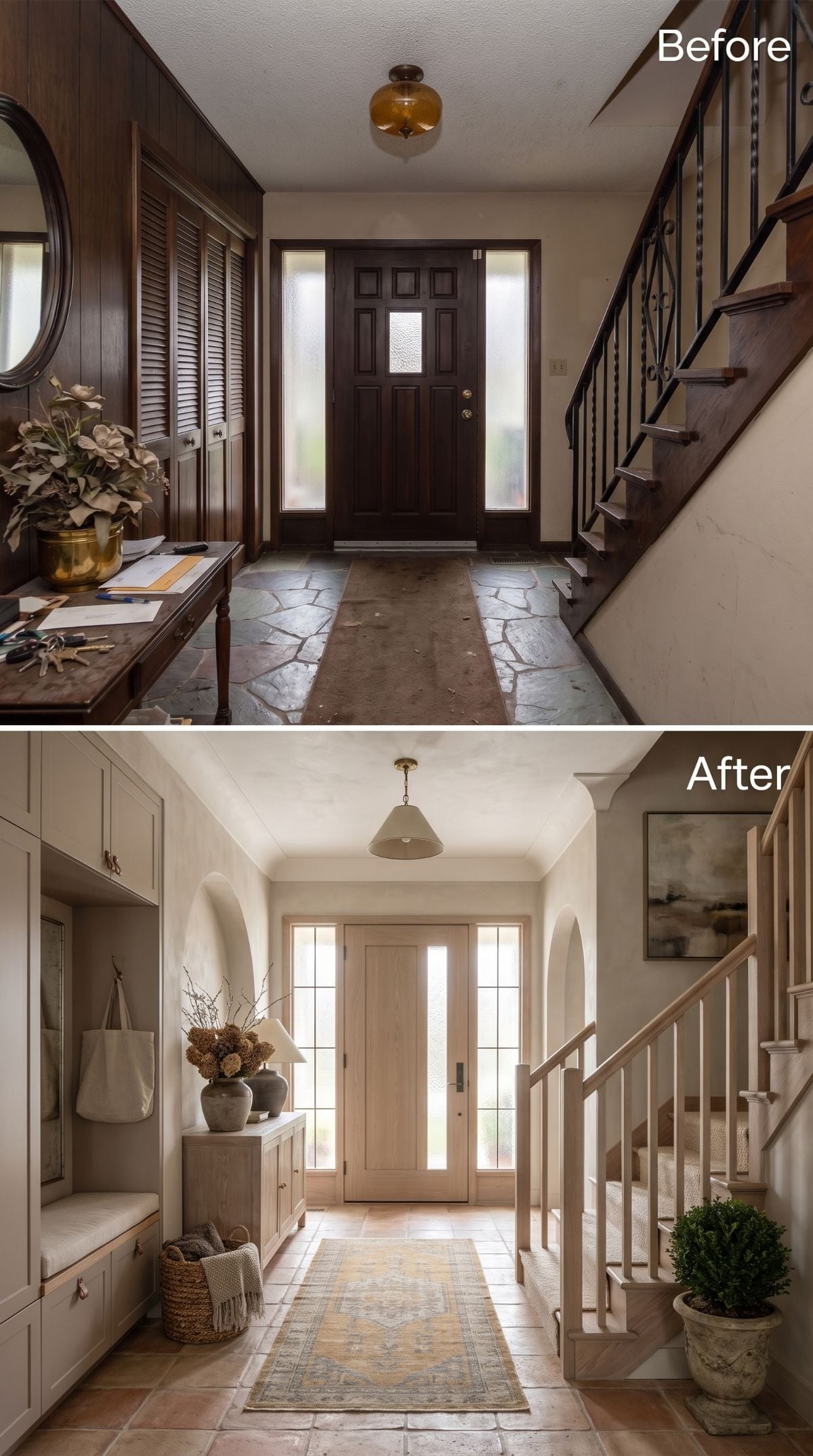
🔥 Would you like to save this?
The stone flooring remains while nearly everything around it changes. Dark paneling becomes plaster-finish walls, decorative iron gives way to painted wood balusters, and an aged-brass-look cone pendant replaces the old amber globe.
Floor-to-ceiling greige cabinetry fills the left wall with a bench built into the base, giving the entry storage without another loose furniture piece. Dried botanicals and low ceramics keep the surfaces sparse.
The old stone no longer looks like evidence from another decade. It looks deliberate because the room around it stopped fighting it.
Pro Tip: A decorative arch can sometimes be introduced without altering a load-bearing structure, but what is possible depends on framing, wiring, mechanical runs, and the existing opening. The design idea is simple; the construction details still deserve to be checked before drywall starts disappearing.
6. Stained Glass and Woodwork Give the Foyer a Past It Never Had
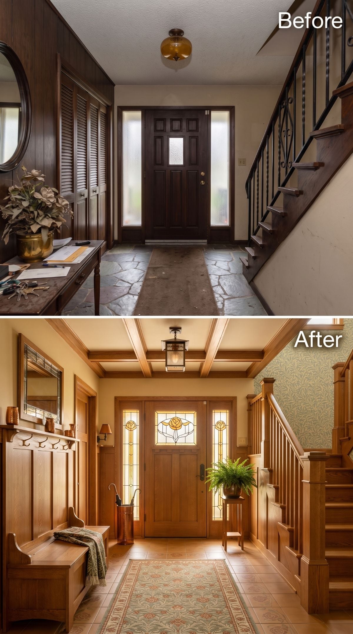
A medium-toned oak door fitted with rose-pattern stained glass immediately changes the age the room seems to belong to. The warm-cream coffered ceiling adds another layer of architectural history overhead.
Turned wood newel posts and open wood railings replace the iron balusters, pushing the entry toward an Arts and Crafts vocabulary. A Morris-style runner carries pattern across the floor while complementary wallpaper climbs the stairwell.
Nothing here looks newly stripped down. The trick is the opposite: the renovation invents a richer past.
5. Sage Built-Ins and a Lantern Make the Entry Feel More Like a Room
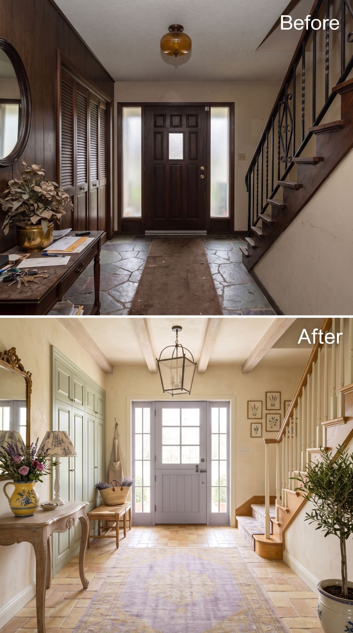
Warm plaster walls and exposed beams take over where dark-stained paneling once dominated, while sage cabinetry replaces the old louvered closet treatment with flatter, calmer door fronts.
A hung lantern-style fixture gives the ceiling more presence than the original flush globe, but the important change is how the elements are distributed: warm walls, painted storage, dark metal overhead, and enough open surface between them to keep the entry from becoming visually packed.
Lighting Note: Replacing a flush fixture with a pendant may be straightforward in some existing locations, but the junction box, fixture weight, wiring, clearances, and local electrical requirements still matter. The design lesson is scale: an open-frame lantern can occupy more visual space overhead without becoming a solid block.
4. Greek Key Brass and Harlequin Stone Take the Entry Full Glamour
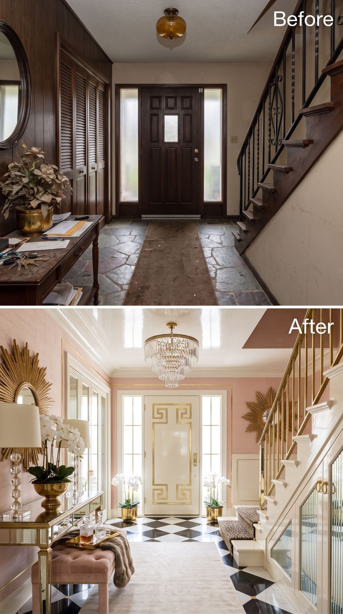
Blush walls replace the dark corridor effect, while a tiered crystal chandelier and gold sunburst mirrors give the entry enough sparkle to stop pretending it’s merely a passage.
The door carries a brass Greek-key motif, and the black-and-white harlequin stone-look floor gives all the pale pink and gold a hard geometric counterpoint.
Did You Know: Contrasting black-and-white stone floors have a long history in European and American formal interiors, with checkerboard and lozenge patterns appearing across multiple periods. Porcelain can reproduce the graphic effect while offering a different maintenance profile from natural marble, particularly where staining and moisture are concerns.
3. Plaster and Oak Strip the Foyer Down to Material and Light
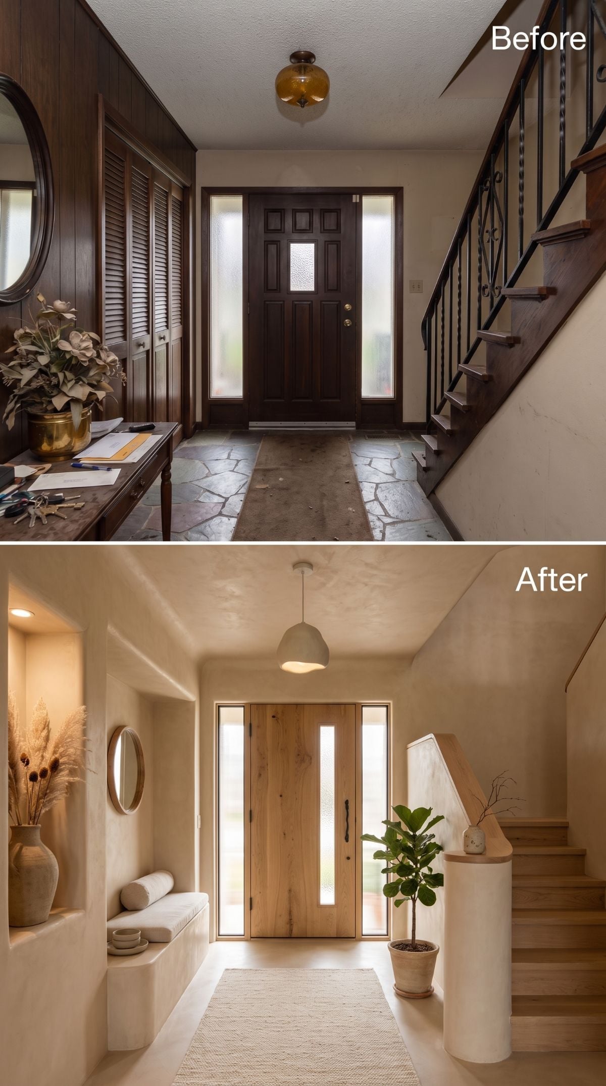
The old combination of dark paneling and amber light gives way to smooth plaster-finish walls, open wood treads, and an oak entry door with enough natural grain to carry the room without coating every wall in it.
The built-in bench on the left appears to grow directly from the plaster wall rather than arrive as separate furniture. A single concrete-look pendant hangs overhead, throwing warm light across the irregular wall texture.
This is wood returning after the wood-paneled foyer supposedly taught us to fear it. The problem was never the material. It was saturation.
The built-in bench reads less like furniture placed in a niche and more like part of the wall itself.
2. Gold Railings and a Crystal Chandelier Push the Foyer Into Full Ceremony
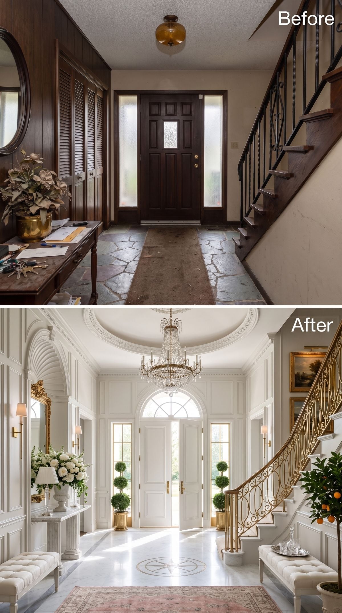
The redesign replaces the dark paneling and muddy-looking flagstone with crisp wall paneling, pale stone, and enough reflective detail to make the entry feel almost ceremonial.
A marble-look floor carries a central medallion, while a tiered crystal chandelier hangs beneath an oval coffered ceiling treatment. The staircase gets gilded-look scrollwork rather than plain dark iron, turning the rail into decoration rather than just enclosure.
Topiaries in gold-toned planters flank the entry, and brass sconces continue the metallic note at eye level. Subtle this is not. The foyer has other plans.
1. A Mint Door Makes the Quietest Transformation the Last One You See
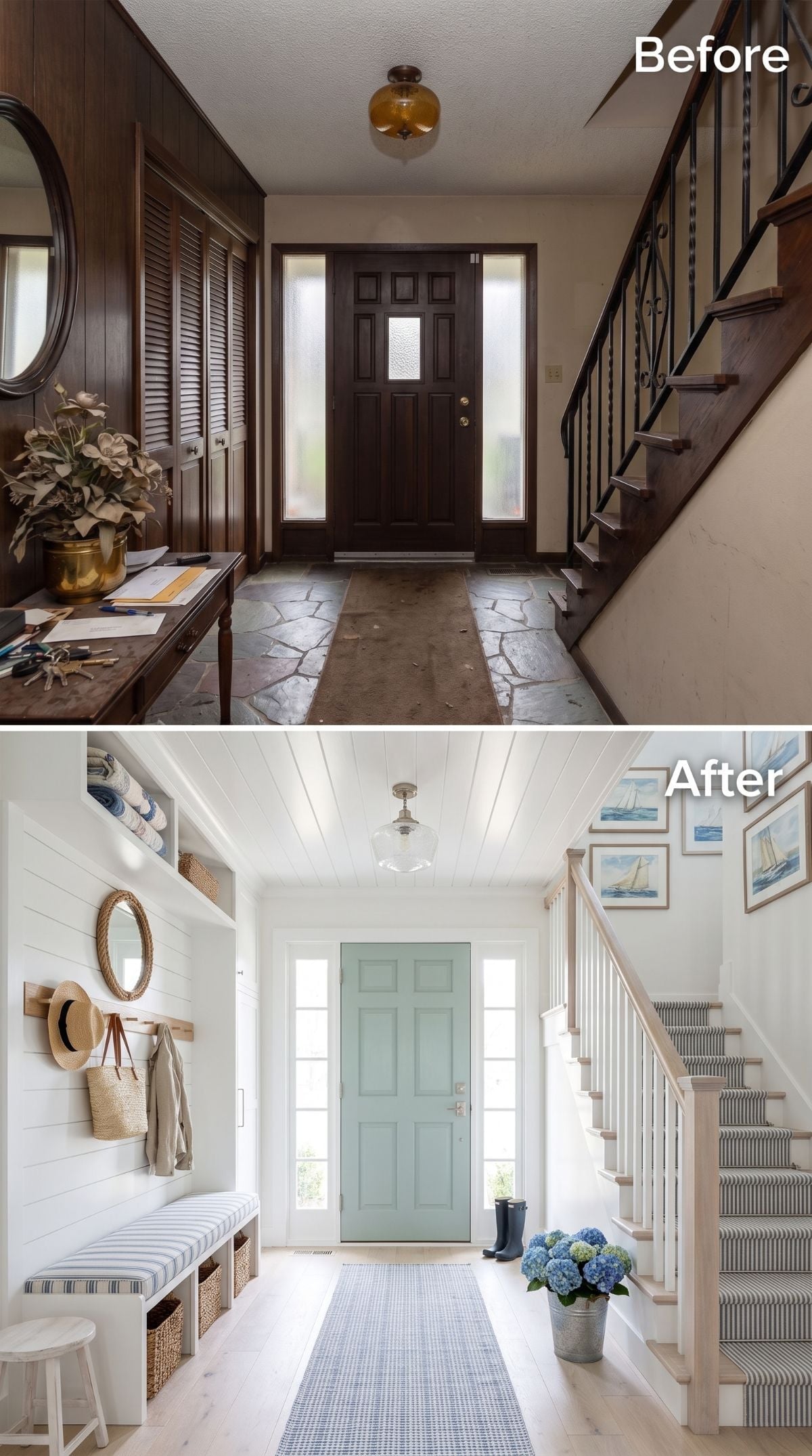
After marble medallions, banana leaves, chinoiserie, onyx-look stone, crystal chandeliers, terrazzo, stained glass, and enough brass to keep a polishing cloth permanently employed, this one almost feels mischievously simple.
Bright white shiplap-style walls, shelving, and stair rails create the neutral field. Then the front door turns muted sage-mint and claims nearly all the color for itself.
There is no need to repeat the mint six more times. One colored rectangle at the end of a clean white entry is enough when everything around it agrees to stand down.
That makes it a useful place to finish the 31 ideas. A 1970s foyer doesn’t always need to be gutted, gilded, glazed, or given an entirely new architectural identity. Sometimes the most convincing transformation is simply knowing which parts of the room need to speak — and which ones can finally be quiet.












