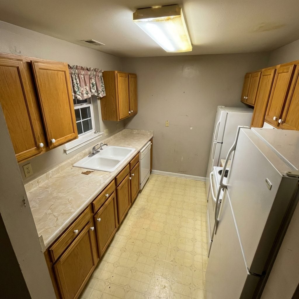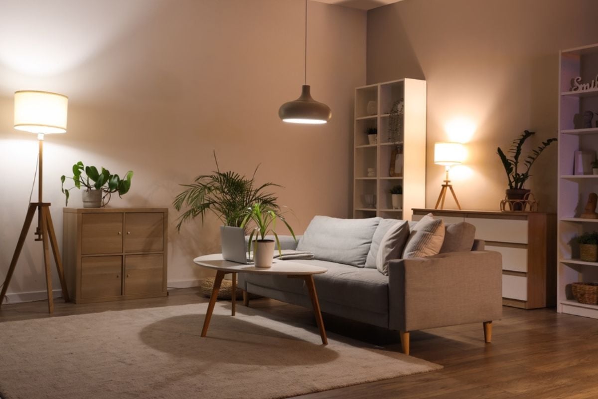
Lighting has the power to completely transform how your home feels, yet it’s one of the most overlooked aspects of design. The wrong choices don’t just create awkward shadows or glare—they can actually make an otherwise beautiful house feel cheap, dated, or poorly planned.
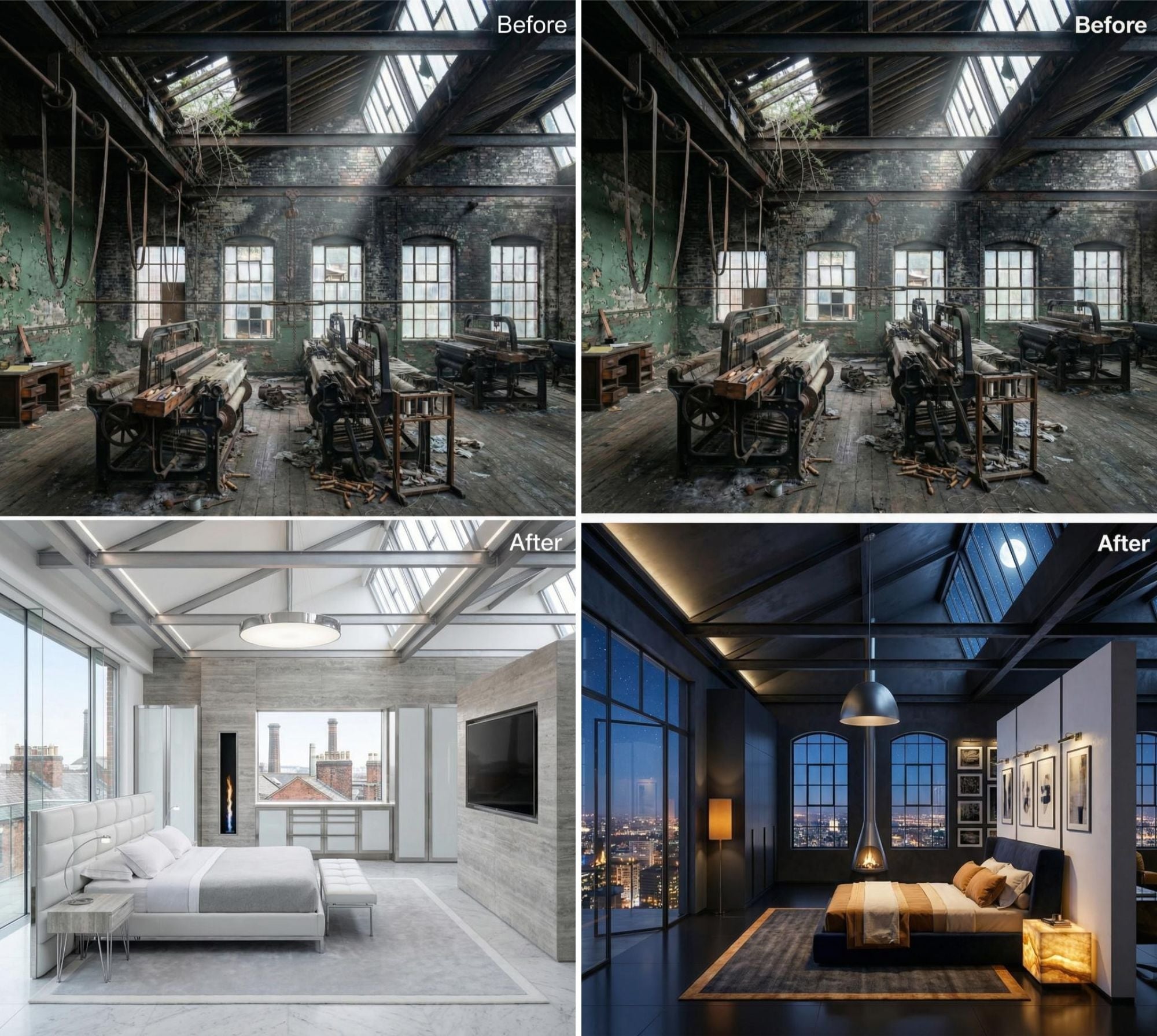
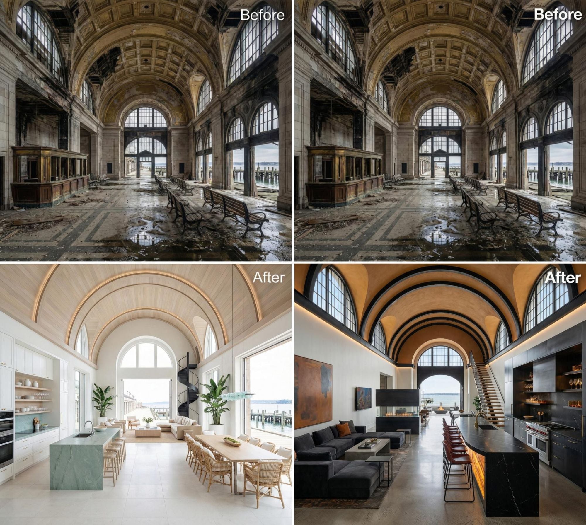
In order to come up with the very specific design ideas, we create most designs with the assistance of state-of-the-art AI interior design software. Also, assume links that take you off the site are affiliate links such as links to Amazon. this means we may earn a commission if you buy something.
From mismatched color temperatures to underwhelming builder-grade fixtures, these small missteps quickly add up to a big downgrade in atmosphere and value. To help you avoid the most common pitfalls, we’ve gathered the 25 lighting decisions experts agree can instantly cheapen your entire home—and what you should be doing instead.
25. Going all-in on smart bulbs without unified controls or consistent scenes

Smart lighting can make your home feel futuristic, but when every bulb has its own app or color scheme, the experience quickly becomes frustrating and disjointed. Visitors can tell when there’s no unified control system, because one lamp may glow warm while another blasts cool white just a few feet away.
Instead of impressing people with cutting-edge tech, the inconsistency makes your house feel like a chaotic lighting showroom. Without a cohesive plan, all those smart features actually end up cheapening the overall vibe of your space.
24. Relying on exposed cords, adapters, and plug-in puck lights as “solutions”
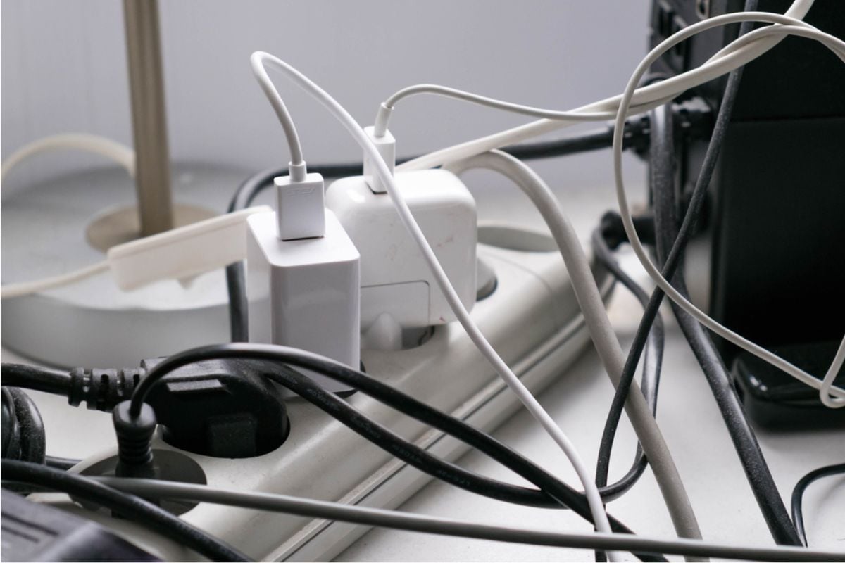
Nothing screams “temporary” quite like extension cords snaking across walls or stick-on puck lights struggling to pass for real fixtures. While they may work in a pinch, these makeshift solutions draw attention to the fact that proper planning or investment was skipped. Guests will notice dangling cords long before they notice the décor you’re trying to highlight. In the end, visible wiring and quick fixes give your home an unfinished, bargain-basement appearance.
23. Leaning on quickly dated trend pieces (e.g., mason-jar or cage fixtures)
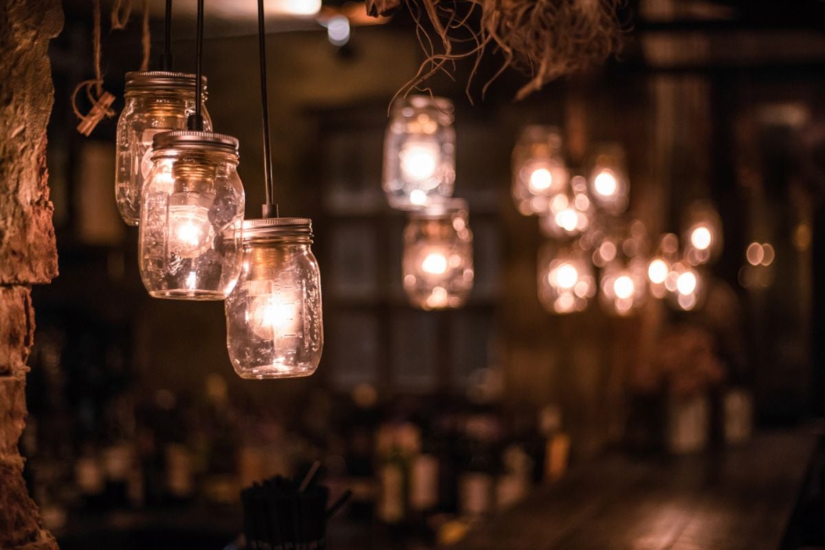
Lighting trends can be fun, but some styles go out of fashion as quickly as they arrive. Mason-jar pendants, for example, once felt charming but now read as cliché and overplayed. When fixtures date themselves so fast, they drag the whole room down with them, no matter how modern the rest of the design is. The best lighting choices stand the test of time, so sticking with overly gimmicky fixtures often backfires.
22. Skipping accent lighting for art, millwork, or architectural features
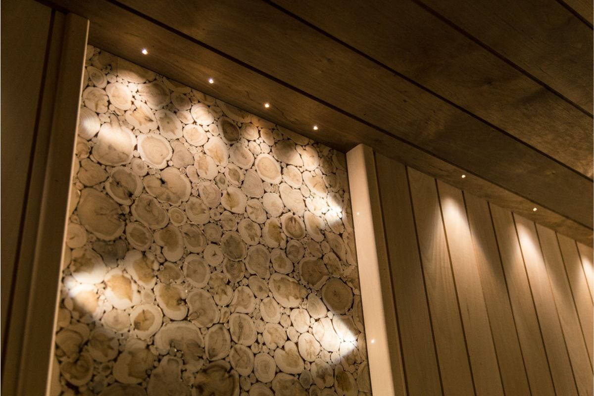
Accent lighting adds depth and drama to a space by highlighting the details that make your home unique. Without it, artwork and architectural elements fade into the background, leaving your home looking flat and uninspired. Buyers and guests alike will notice when a beautifully framed piece or elegant archway sits in dull shadow. Properly placed accent lights transform a room from merely functional to truly memorable.
21. Neglecting front-entry and path lighting (poor curb appeal and safety)
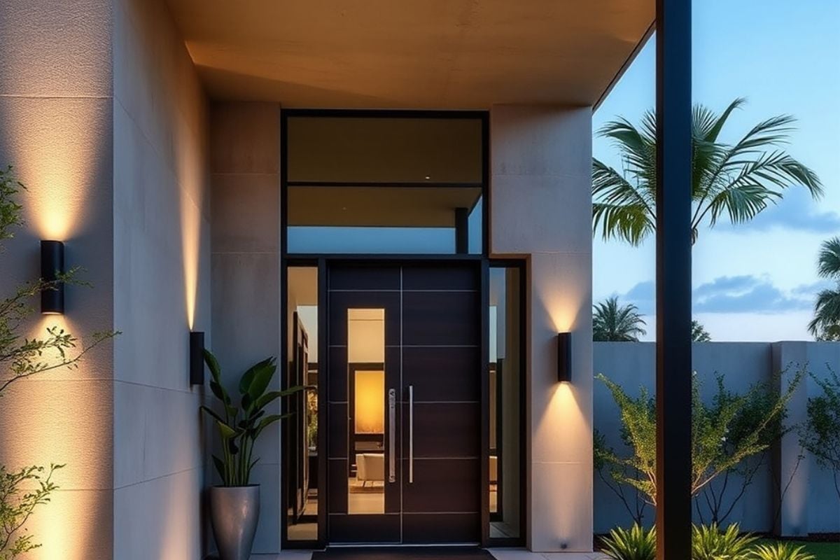
The front entry sets the tone for your entire home, yet many people leave it dark and uninviting. Poor lighting doesn’t just hurt curb appeal; it also creates safety risks for visitors and residents. A dim pathway or unlit porch sends the wrong message about how the home is cared for. Well-placed sconces and pathway lights make the property feel welcoming, secure, and thoughtfully maintained.
20. Mounting exterior floodlights that blind neighbors and you
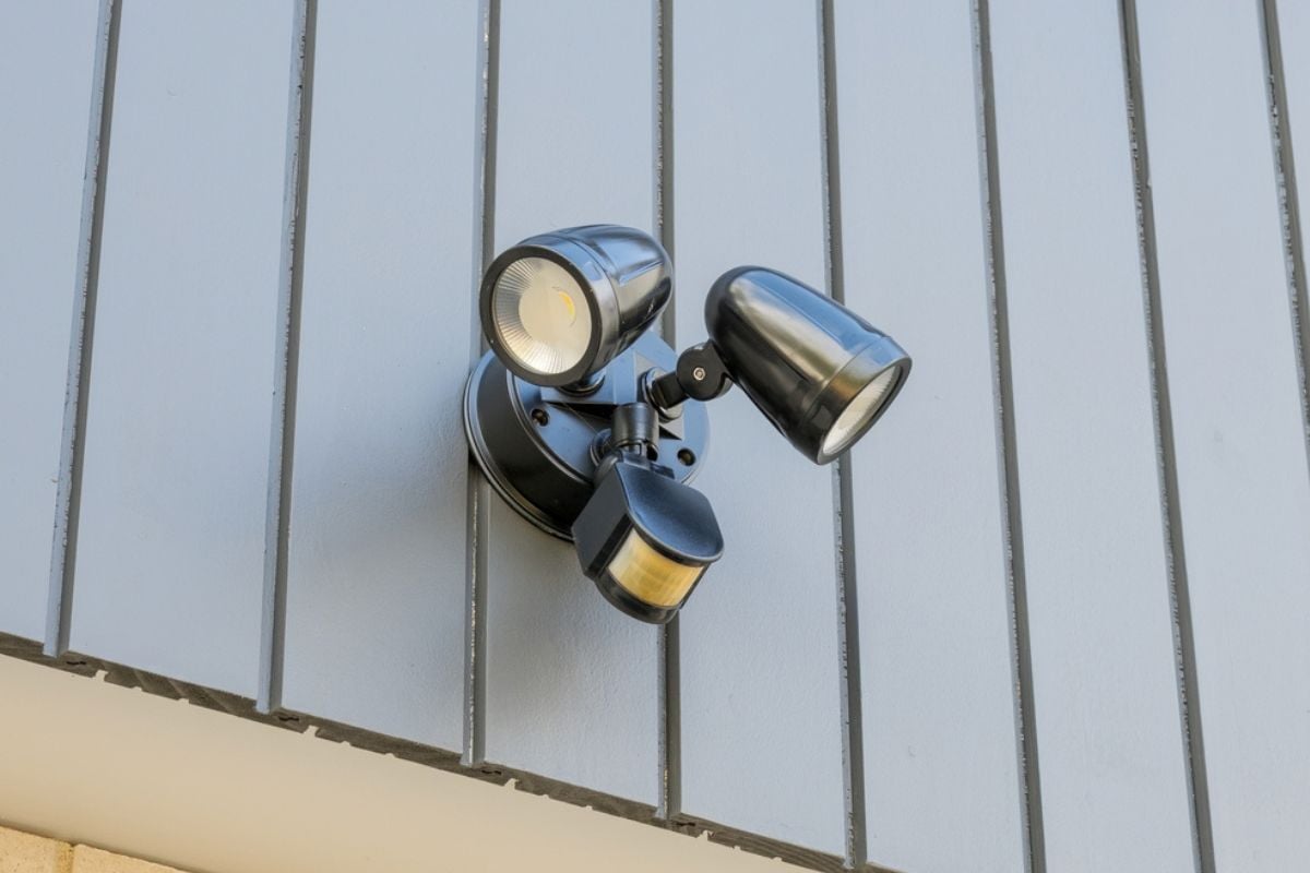
Good exterior lighting should provide safety without creating glare, but poorly angled floodlights often do the opposite. Instead of illuminating the yard or driveway, they shine directly into eyes, windows, and even across property lines. This kind of “light pollution” not only frustrates neighbors but also makes the home feel less refined. Proper shielding and placement ensure brightness where it’s needed without turning your exterior into a runway.
19. Turning main living areas into RGB “party mode” with novelty strips
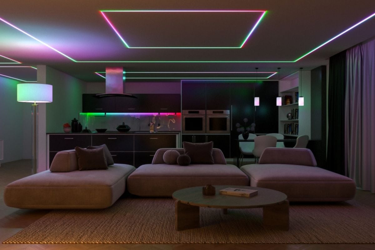
Color-changing LED strips may be fun for game rooms or kids’ spaces, but they cheapen the atmosphere in main living areas. A family room that cycles between neon purple and electric green feels more like a college dorm than a sophisticated home. While these lights are playful in moderation, overuse makes it seem like design choices were an afterthought. Stick to warm, layered lighting in shared spaces to keep them feeling comfortable and inviting.
18. Leaving halls and stairwells underlit and shadowy
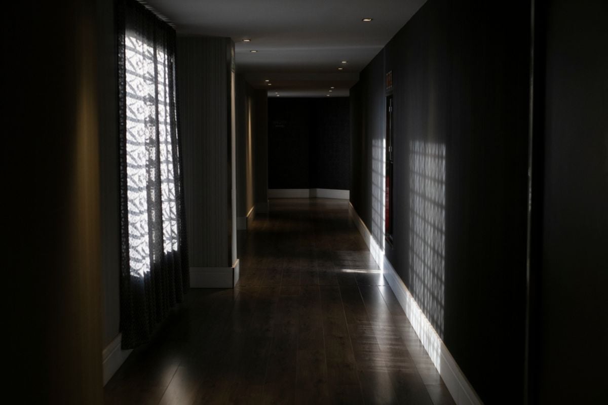
Hallways and staircases are high-traffic areas, but they’re often treated like an afterthought when it comes to lighting. Dim fixtures create shadows that not only look unappealing but also pose safety hazards. Guests navigating your home notice these neglected spaces, and the lack of lighting makes the whole interior feel incomplete. Brightening these areas with sconces or recessed lights adds both practicality and polish.
17. Using only an overhead light bar at the bathroom vanity (no side lights)
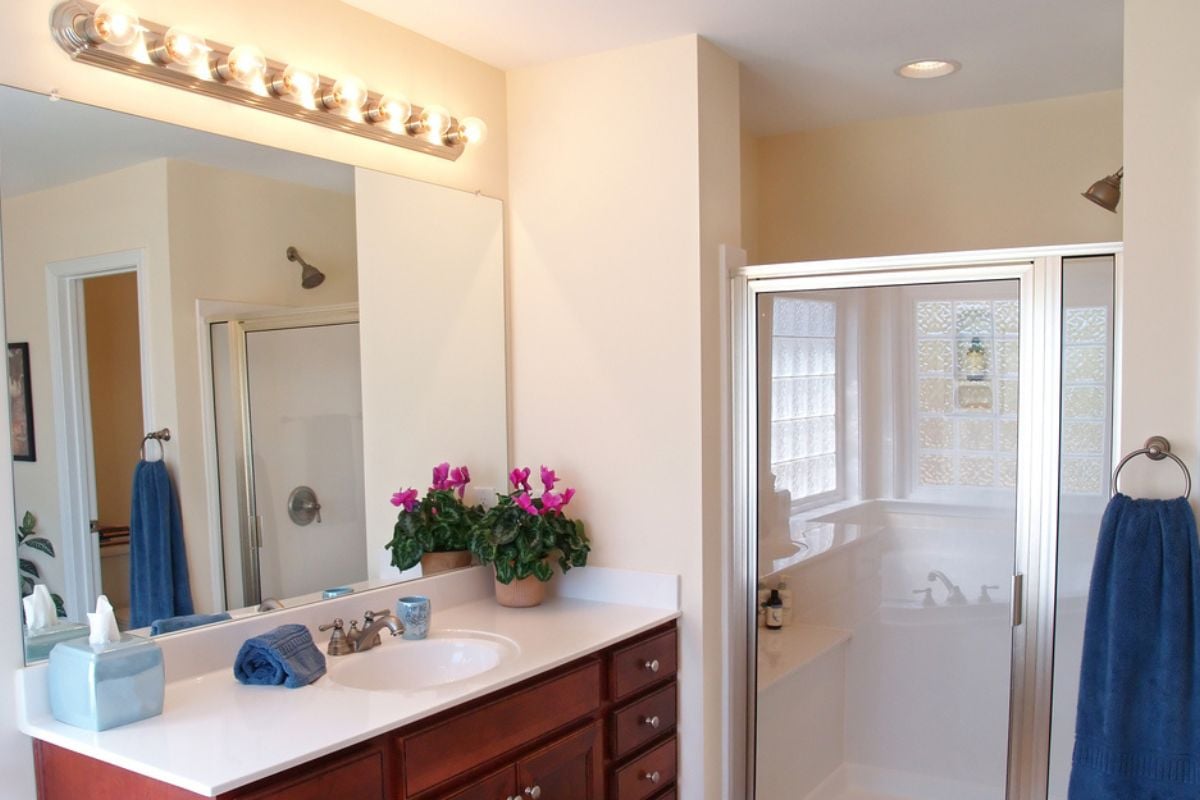
Lighting only from above at a bathroom mirror casts harsh, unflattering shadows on the face. This setup not only makes getting ready more difficult but also feels cheap compared to a balanced design. Professionals know that side lighting creates even illumination and elevates the space instantly. Without it, your bathroom ends up looking more like a public restroom than a private retreat.
16. Living with flicker from cheap drivers or aging CFLs
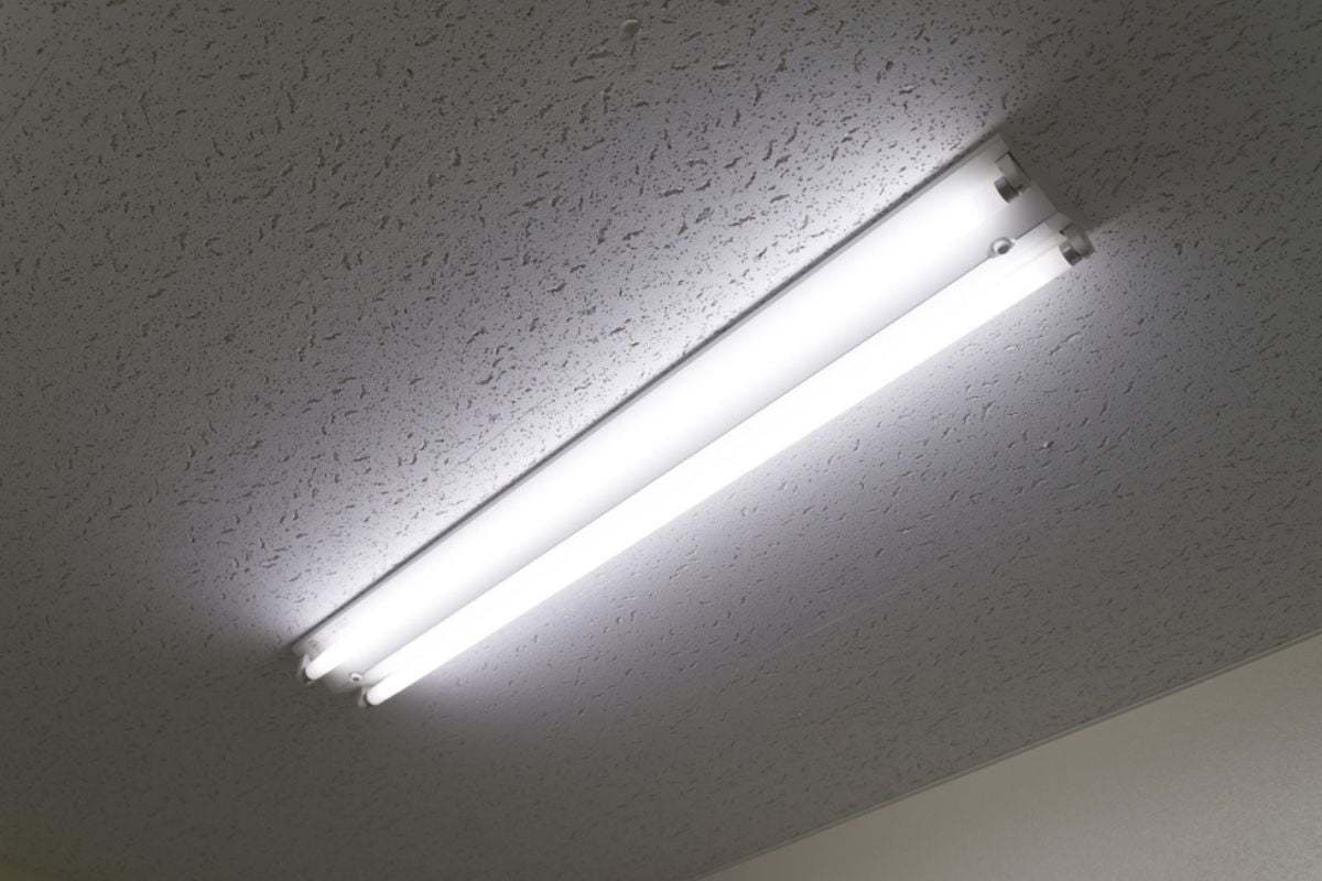
Flickering lights may seem like a small annoyance, but they make a space feel uncomfortable and poorly maintained. Often caused by cheap components or outdated bulbs, this issue is visible to both residents and guests. Flicker also strains the eyes and undermines any effort to create a warm, inviting atmosphere. Updating to high-quality LED drivers eliminates the problem and communicates attention to detail.
15. Mixing clashing fixture styles and metals without a plan
Eclectic design can be beautiful, but mixing styles without intention quickly reads as chaotic. A modern chrome pendant hung next to a rustic bronze chandelier creates visual confusion rather than charm. Inconsistent finishes and mismatched styles make it clear the lighting wasn’t part of a cohesive vision. By keeping fixture styles complementary, you create harmony instead of visual clutter.
14. Installing LED strips without diffusers so every “hotspot” shows

Raw LED strips with visible diodes may add light, but they also create harsh hotspots that cheapen the effect. Instead of a smooth wash of illumination, you get distracting dots that look unfinished and unrefined. Diffusers are inexpensive but make a huge difference in creating a professional, polished appearance. Without them, even a brand-new installation can look like a DIY project gone wrong.
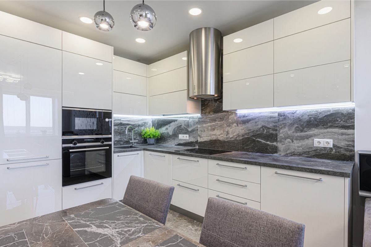
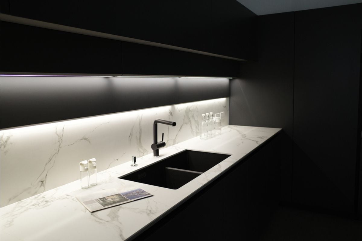
13. Forgetting task lighting—especially under-cabinet in kitchens
🔥 Would you like to save this?
General ceiling lights alone can’t adequately light countertops where most cooking actually happens. Without under-cabinet task lights, you’re left working in your own shadow, which feels inconvenient and careless. Kitchens are the heart of the home, and people expect them to be both functional and stylish. Skipping task lighting makes the space feel unfinished and far less practical.
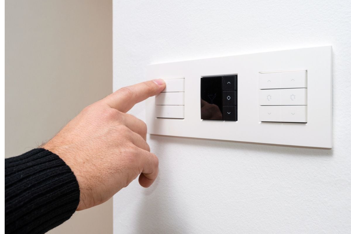
12. Skipping dimmers on primary lighting circuits
Dimmers are one of the simplest ways to instantly upgrade lighting, yet many homeowners neglect them. Being stuck with only one brightness level makes a space feel rigid and less adaptable. Guests notice when a dining room can’t shift from “homework bright” to “dinner cozy” with the turn of a knob. Without dimmers, your home misses out on a critical layer of comfort and versatility.
11. Hanging pendants at the wrong height over islands and tables
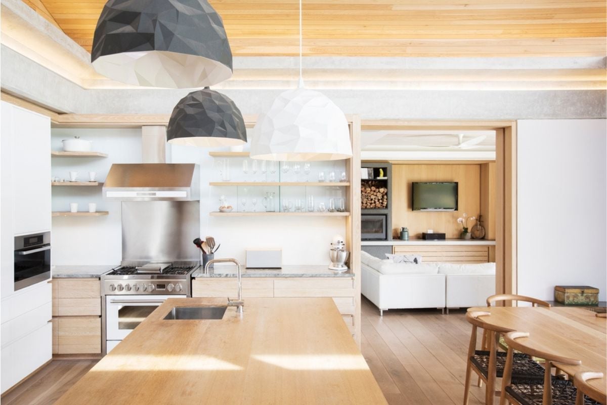
Pendants hung too high disappear into the background, while those hung too low feel intrusive and awkward. This common mistake throws off both the proportions of the room and the usability of the space. When pendants hover at the wrong level, they draw attention for all the wrong reasons. Proper placement ensures they frame the area beautifully while still being functional.
10. Oversizing fixtures that crowd low ceilings and sightlines
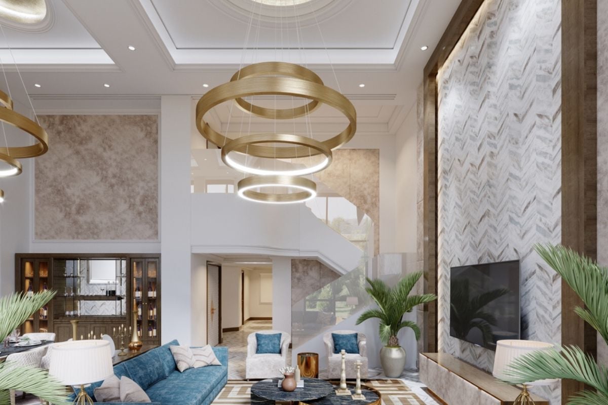
A dramatic chandelier may seem glamorous, but in a low-ceilinged room it quickly overwhelms the space. Oversized fixtures create visual bulk that makes ceilings feel even lower and rooms more cramped. Instead of elevating design, they become obstacles that visitors can’t help but notice. Choosing appropriately scaled fixtures keeps rooms feeling balanced and inviting.
9. Undersizing fixtures for large rooms and long dining tables
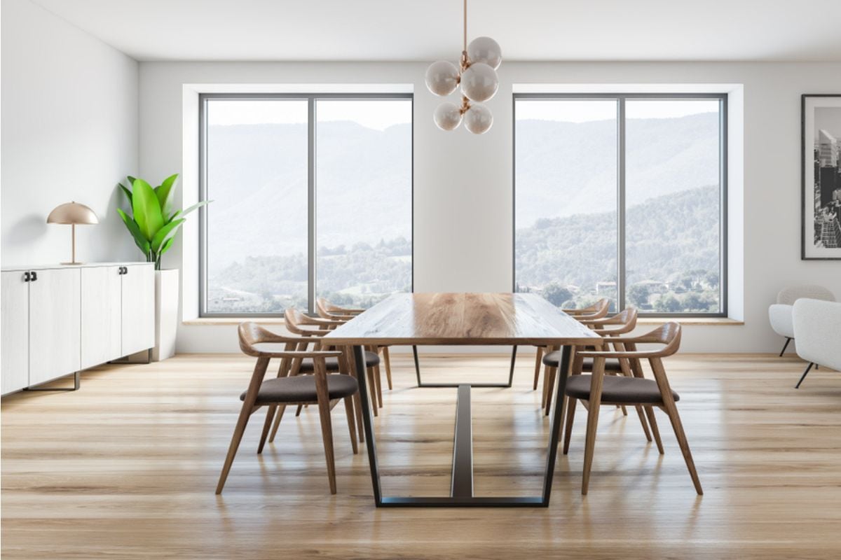
On the flip side, fixtures that are too small for a big space look cheap and out of place. A tiny chandelier over a long dining table creates the impression of cutting corners. Proportions matter in lighting, and undersized pieces make a room feel incomplete. The right scale communicates intention, while the wrong one undermines the entire design effort.
8. Buying fixtures with cheap faux-metal or plastic “crystal” finishes
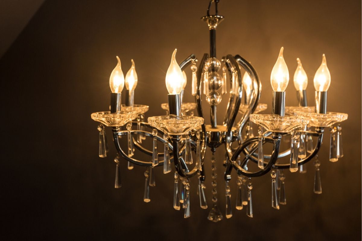
Lighting is often called the jewelry of a room, and fake finishes are the equivalent of costume pieces that fool no one. Shiny plastic disguised as chrome or brittle acrylic pretending to be crystal instantly cheapens a space. Guests may not know exactly what feels off, but they’ll sense the lack of quality. Investing in authentic finishes ensures your fixtures enhance rather than drag down the room’s appeal.
7. Exposing bare bulbs (including glarey “Edison” styles) where diffusers are needed
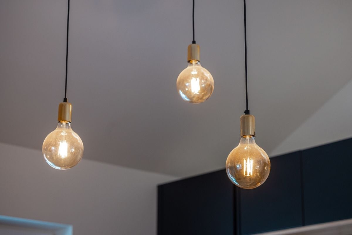
Exposed bulbs can look edgy in the right context, but too often they just produce glare and discomfort. Edison bulbs in particular may photograph well but are unpleasant to live with long-term. Without shades or diffusers, they throw harsh light that cheapens rather than elevates a space. Properly shielded bulbs provide both style and comfort, which is what people ultimately want in a home.
6. Choosing low-CRI bulbs that make finishes look dull and gray
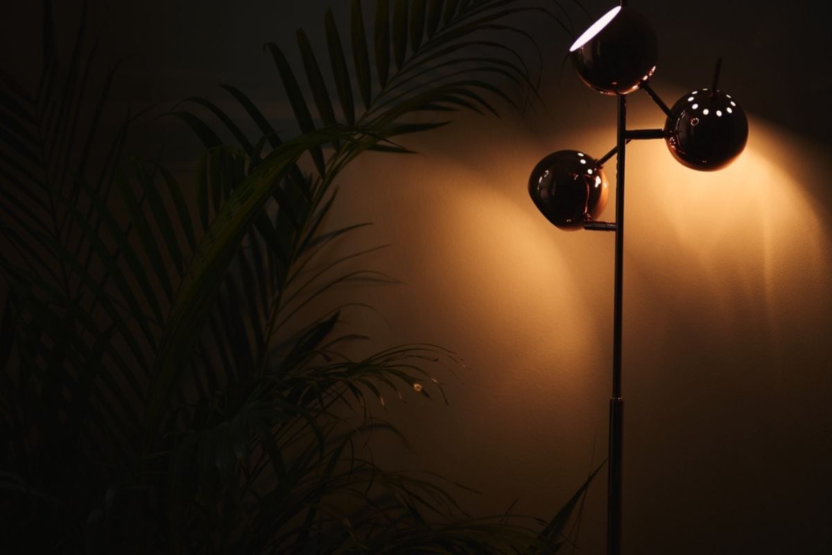
Color Rendering Index (CRI) measures how accurately a light source shows true colors, and cheap bulbs often score low. Low-CRI lighting can make hardwoods, paint, and even skin tones appear washed out or lifeless. This subtle flaw dramatically affects how people perceive your home without them even realizing it. High-CRI bulbs, on the other hand, bring out the richness of materials and instantly upgrade the feel of a room.
5. Mixing color temperatures across an open floor plan
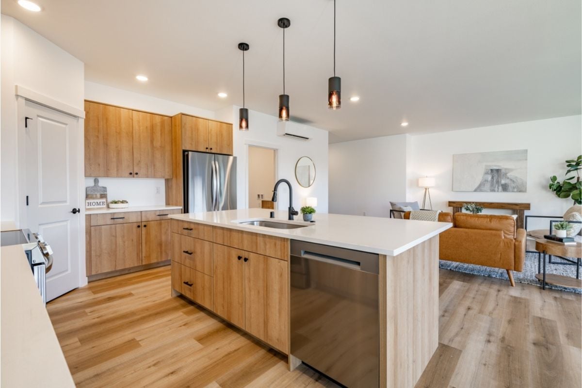
Walking from a warm, cozy living room into a cool, sterile dining area feels jarring. When different spaces in an open plan clash in color temperature, the home loses cohesion. This inconsistency gives the impression that lighting choices were haphazard rather than deliberate. Keeping bulbs consistent in tone creates flow, harmony, and an upscale atmosphere.
4. Using harsh 5000K “daylight” bulbs in living and bedroom spaces
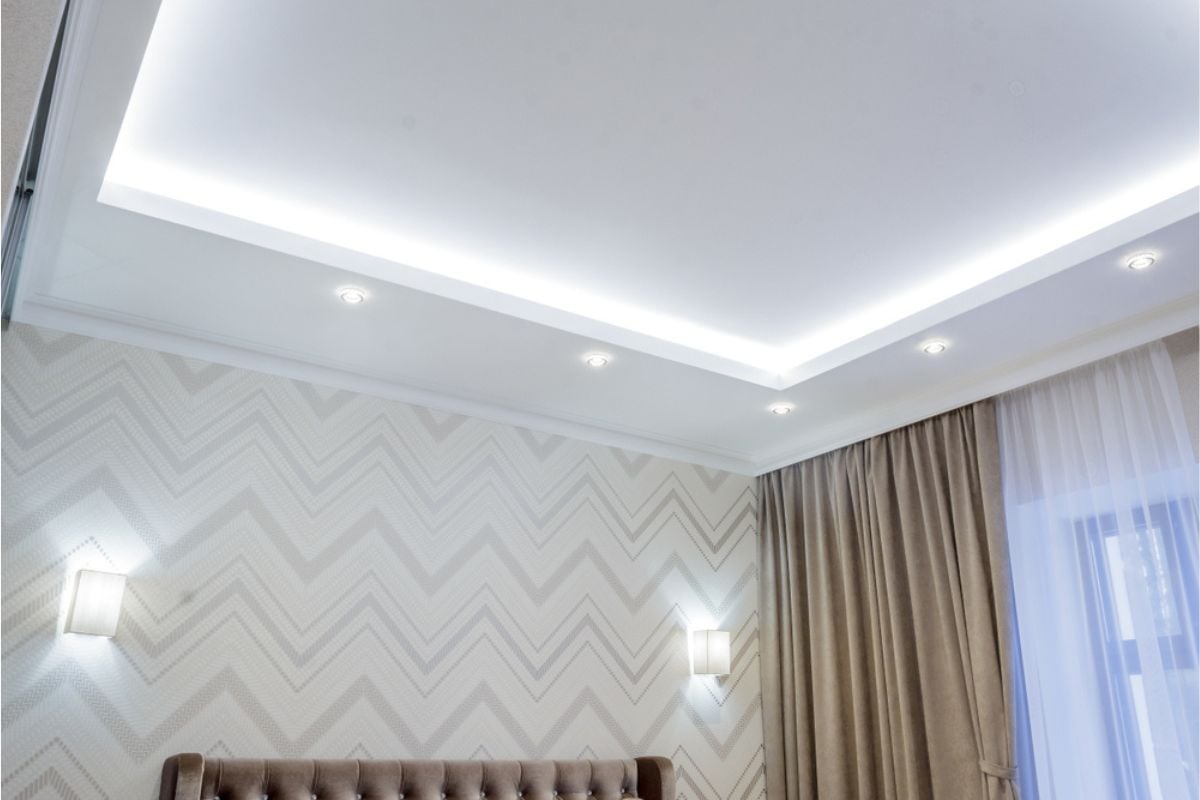
Daylight bulbs may be great in a workshop, but in living rooms and bedrooms they feel clinical. Instead of cozy and inviting, these spaces end up looking more like offices or hospital waiting rooms. Harsh white light also makes it harder to relax, which is the whole point of these rooms. Switching to warmer tones instantly adds comfort and makes the home feel thoughtfully lit.
3. Sticking with generic builder-grade dome flush mounts
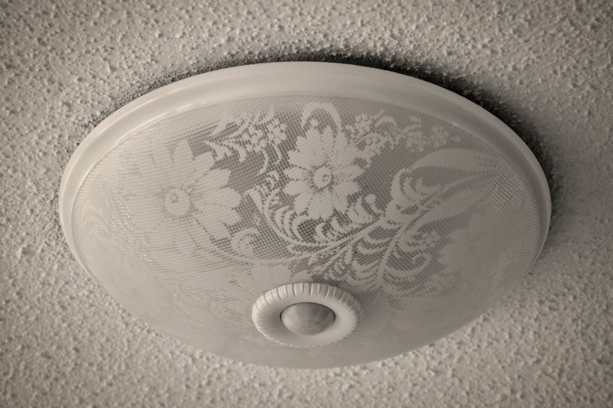
Those cheap dome fixtures, often called “boob lights,” are notorious for making interiors look bland and unimaginative. They’re the default choice in budget builds, so leaving them in place signals zero design effort. Even if the rest of the home is stylish, these lights drag everything down. Replacing them with modern flush mounts or semi-flush fixtures is an easy way to elevate the entire space.
2. Overloading the ceiling with a “grid” of recessed cans
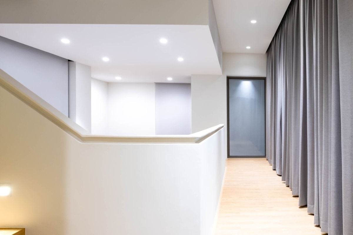
Recessed lighting has its place, but when ceilings resemble airport runways, the effect is sterile and overdone. Too many cans flatten a room’s character and make it feel utilitarian rather than inviting. Balanced lighting layers are far more effective than a grid of identical fixtures. By relying solely on recessed lights, you strip away the personality and warmth that make a home feel lived in.
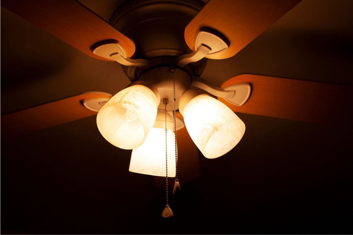
1. Relying on a single overhead light with zero layers
🔥 Would you like to save this?
The worst lighting mistake of all is expecting one central fixture to do all the work. A single overhead source creates harsh shadows and leaves corners looking dark and lifeless. Homes with only one light per room feel dated, cheap, and uncomfortable. Layering ambient, task, and accent lighting is the key to sophistication and ensures every space feels complete.

