Flooring can make or break a home’s value faster than almost any other design choice, and buyers notice it the moment they step inside. While some flooring trends start out stylish, many age poorly, leaving a home looking cheap, dated, or downright impractical. Experts agree that the wrong material, color, or layout can instantly drag down your property’s appeal and send potential buyers running for the door. Here are 23 flooring trends that do more harm than good, and why they could quietly sabotage your home’s resale value.
In order to come up with the very specific design ideas, we create most designs with the assistance of state-of-the-art AI interior design software.
23. Faux-Marble Sheet Vinyl in Living Zones
What might seem like an affordable way to add “luxury” often ends up looking like a costume version of the real thing. Faux-marble vinyl sheets crease easily, show seams at the edges, and never quite capture the depth of genuine stone. Buyers see it as a shortcut that screams budget rather than elegance, and it instantly dates a room. Instead of tricking the eye, it often triggers skepticism about what other corners were cut in the home.
22. Tile or Metal Stair Treads in Homes
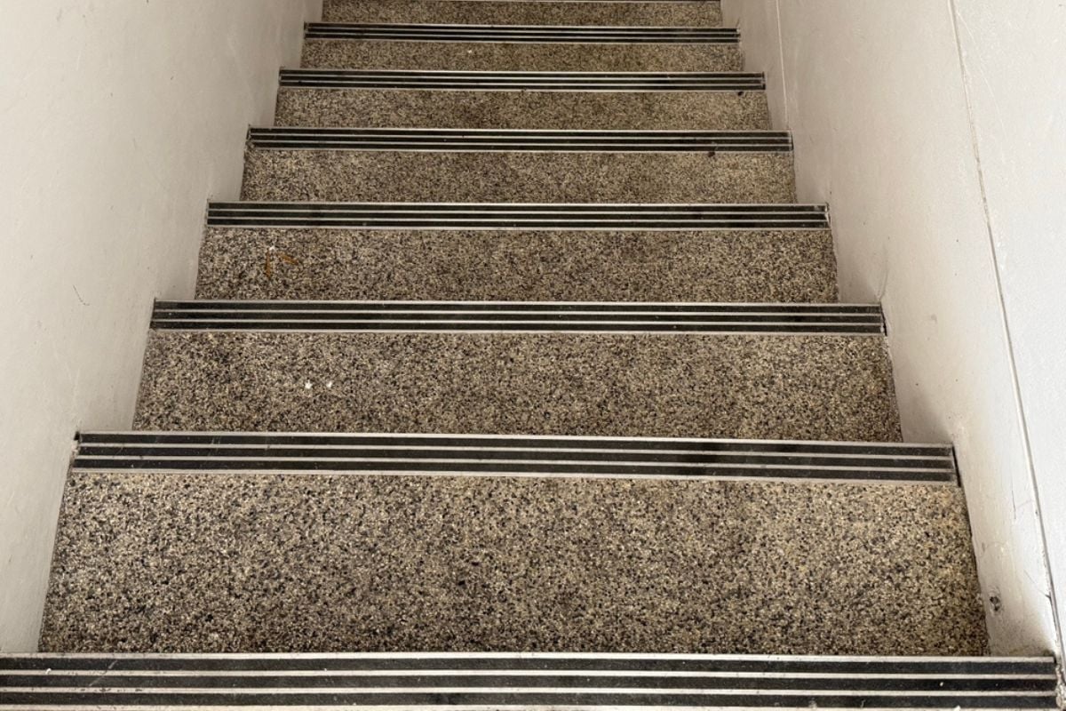
Tile and metal may feel creative or industrial at first glance, but on stairs they come across as unsafe and unwelcoming. These materials are slippery, loud, and uncomfortable underfoot, which makes them impractical for everyday use. Families with children or older adults see them as accidents waiting to happen, not a design feature. In a residential setting, they suggest gimmick over comfort, which can leave buyers second-guessing the whole property.
21. Diagonal Plank Layouts and Odd Patterns
Angled flooring layouts are supposed to add drama, but more often they just make a room feel visually confusing. These unusual patterns create wasted cuts, awkward transitions, and a sense that the installer was trying too hard. Buyers usually prefer clean, linear layouts that make a space feel larger and calmer. Instead, diagonal planks can leave them thinking they’ll have to rip it all out and start fresh.
20. Metallic or “River” Epoxy Art Floors
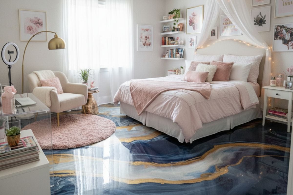
Artistic epoxy floors have gained a following online, but in a residential home they rarely stand the test of time. Swirling metallics and faux rivers may look flashy in photos yet feel overwhelming in a living room or bedroom. Buyers worry about how they’ll decorate around such a bold, immovable choice, and most can’t picture themselves living with it daily. What seems like a personal artistic statement quickly reads as a costly headache to undo.
19. Peel-and-Stick Vinyl Tile “Quick Fixes”
Peel-and-stick tiles are marketed as a weekend DIY miracle, but their low durability makes them a resale disaster. They tend to curl, shift, and discolor within months, giving floors a patchy, temporary look. Most buyers recognize them immediately as a band-aid solution rather than a long-term investment. Instead of seeing charm, they see dollar signs flashing for replacement costs down the road.
18. Fake Hand-Scraped Embossing on Budget Planks
Hand-scraped hardwood can be beautiful, but when the look is faked with shallow embossing on cheap planks, it’s a dead giveaway. The repeating texture pattern makes the floor look artificial, undermining the authenticity buyers expect in real wood. Up close, it can feel plastic and hollow, which instantly cheapens the overall room. What was meant to signal rustic character ends up broadcasting mass-produced shortcuts instead.
17. Wide, Dark Grout Lines Everywhere
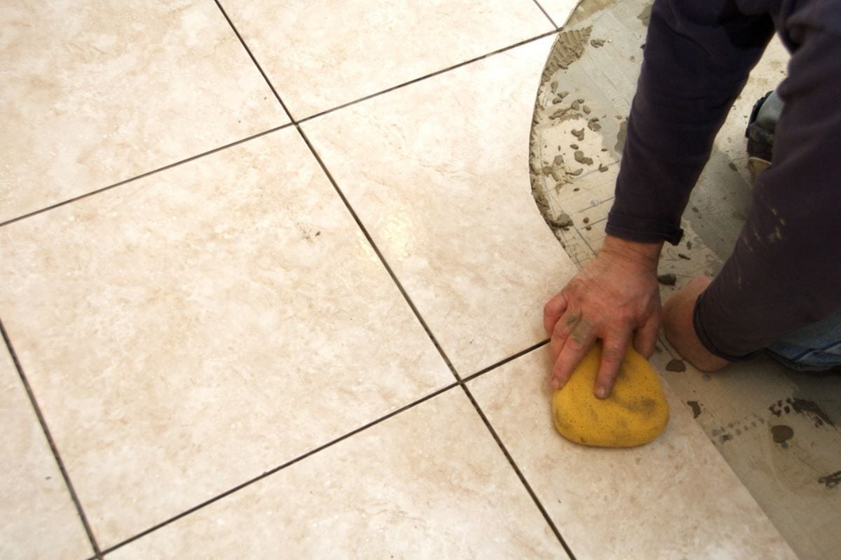
Heavy grout lines were once seen as practical, but they now make floors feel busy and dated. Dark, wide joints visually chop up a room, making even large spaces appear smaller and less cohesive. They also trap dirt, making floors look dingy no matter how much you clean them. Buyers often walk away imagining endless scrubbing, which is the opposite of a selling point.
16. Tumbled Travertine “Tuscan” Look
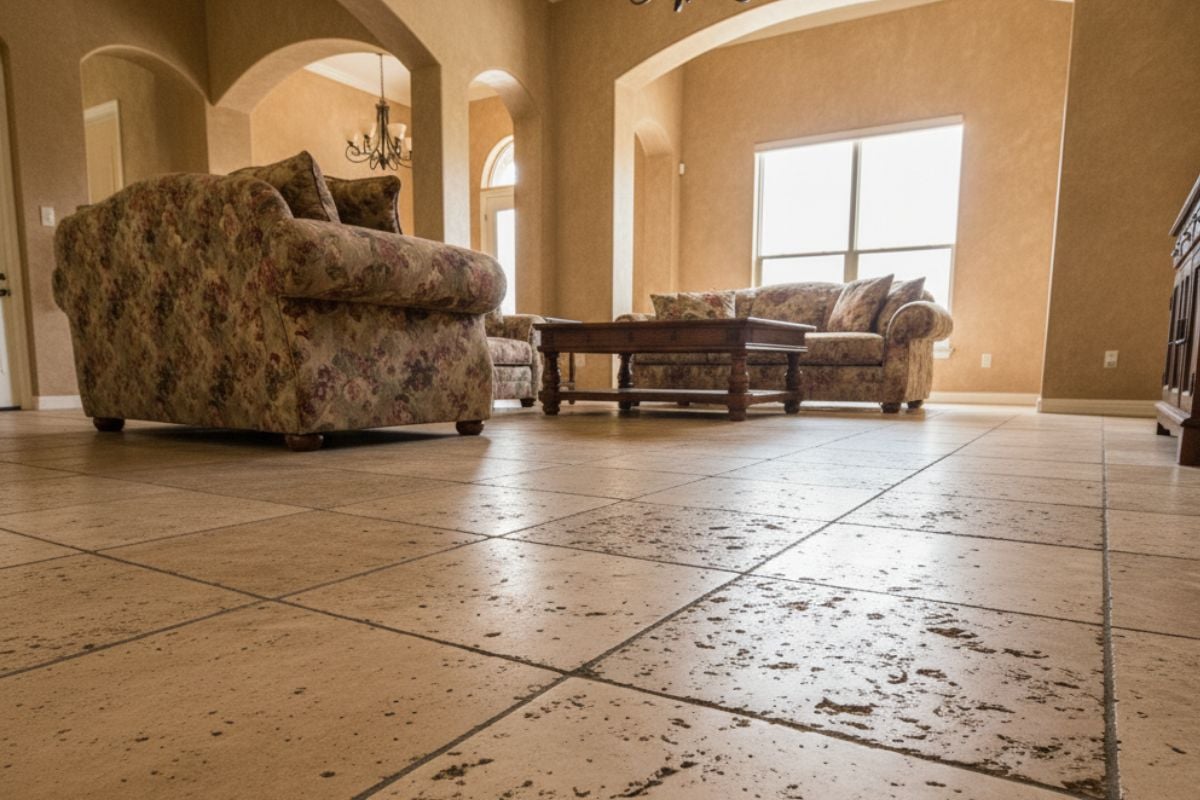
The faux-Tuscan craze of the early 2000s left behind a trail of beige, pitted travertine that now feels stuck in the past. These floors clash with today’s preference for cleaner, sleeker designs, making homes feel dated the moment buyers step inside. The uneven surfaces also catch dirt and can chip easily, adding to their maintenance headaches. Instead of Old World charm, they scream “remodel from another era.”
15. 12×12 Builder-Beige Ceramic Tile Grids
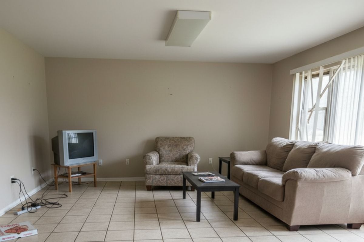
Nothing says cookie-cutter like a grid of beige 12×12 tiles stretched wall to wall. These floors were popular for their low cost, but they instantly make a space look basic and outdated. Buyers associate them with starter homes or rentals rather than well-designed properties. The uniform grid highlights grout stains and lacks any personality, which is why it drags down value today.
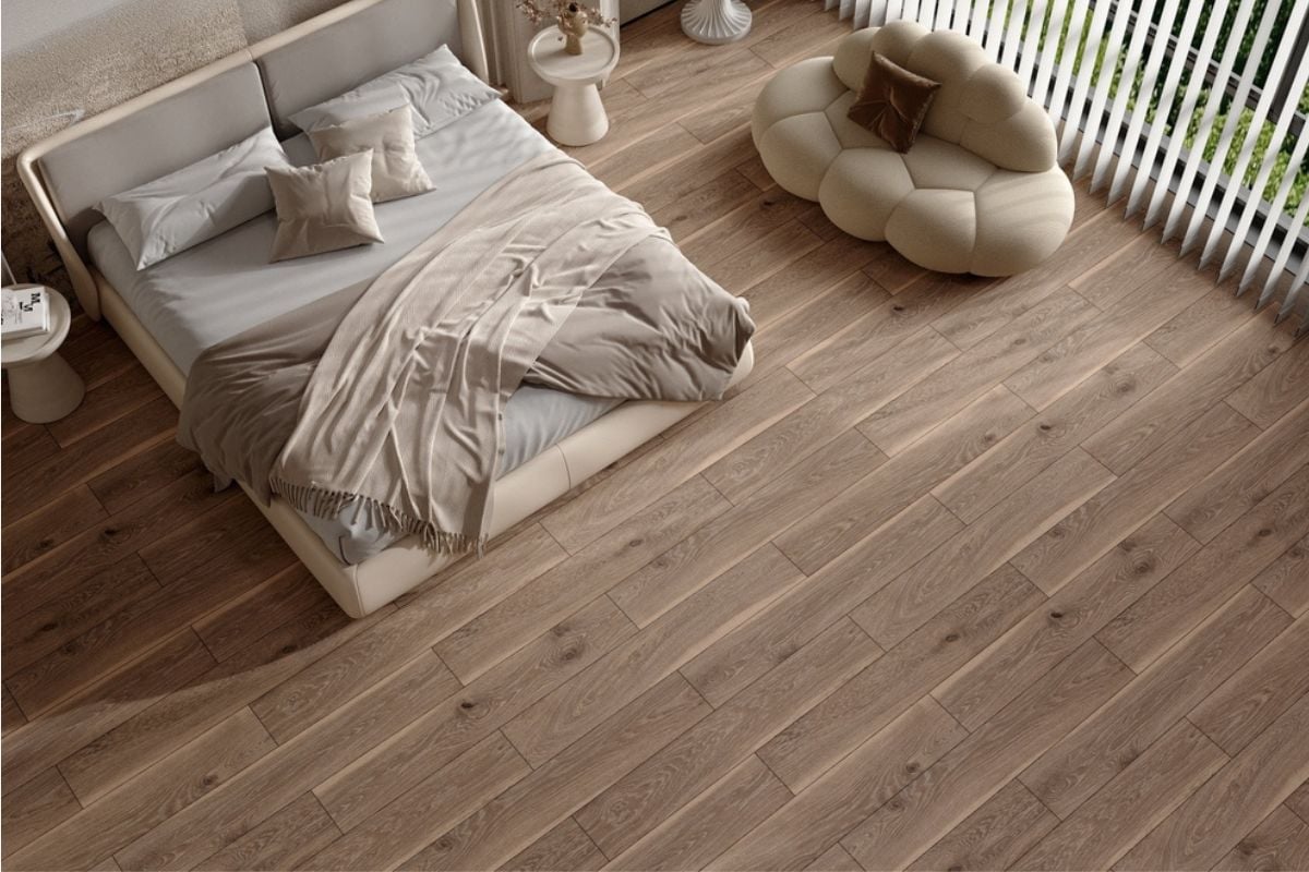
14. Yellowed 1990s Maple Finishes
What once seemed like a clean, bright look has turned into a glaring reminder of the late 1990s. Maple floors with ambered polyurethane now read as tired and plasticky rather than fresh and modern. They’re notoriously hard to refinish without going darker, which makes them an instant project for buyers. Instead of nostalgia, they inspire a mental note that says “renovation needed.”
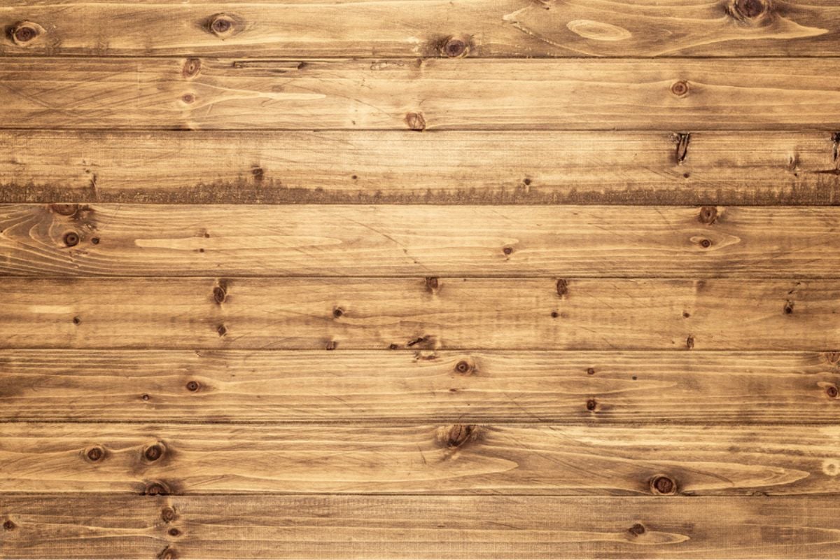
13. Orange-Amber Polyurethane on Red Oak
Red oak is a classic flooring material, but when coated in thick orange polyurethane it takes on an artificial glow. This finish once dominated suburban homes, but now it dates a property faster than almost anything else. Buyers see it as a relic of the 1980s and 1990s, clashing with today’s cooler palettes. Instead of timeless, it feels heavy and outdated, requiring sanding before a sale.
12. Shag or Frieze High-Pile Carpeting
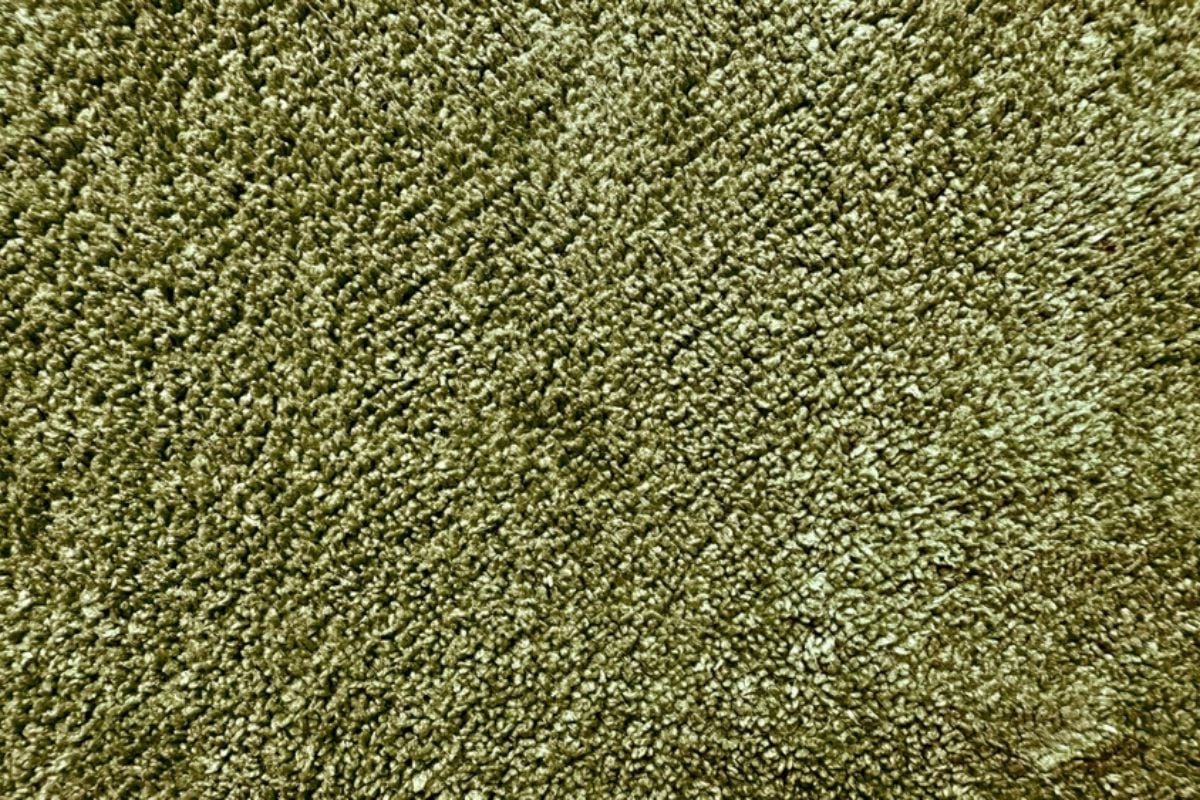
High-pile carpets were meant to feel luxurious, but in reality they trap dust, allergens, and every crumb imaginable. Their matted texture quickly looks dirty and impossible to vacuum cleanly, especially in high-traffic rooms. Buyers associate them with basements or outdated rec rooms rather than modern living spaces. What was once cozy now feels unhygienic and impractical for everyday life.
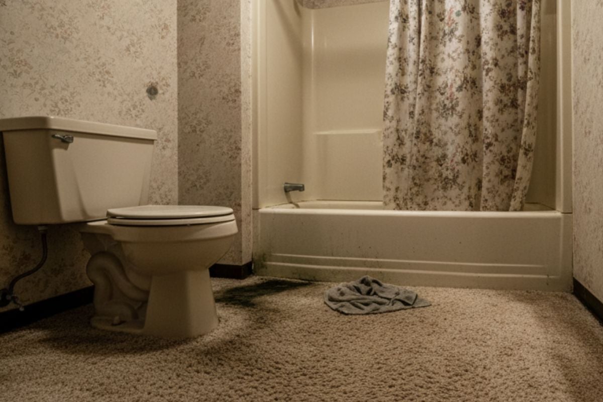
11. Carpeted Bathrooms (Moisture Magnets)
🔥 Would you like to save this?
Few flooring choices horrify buyers faster than walking into a carpeted bathroom. These floors trap moisture, odors, and bacteria, making them not only outdated but also unsanitary. Even with careful upkeep, the image of wet carpet around a toilet is impossible to shake. Most buyers mentally add “gut job” to the bathroom the second they see it.
10. Wall-to-Wall Carpet in Living Areas
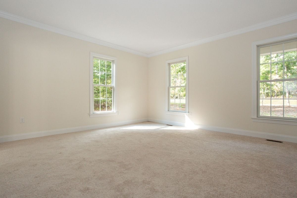
Once a symbol of comfort, wall-to-wall carpet now feels out of place in main living rooms. It stains easily, wears unevenly, and hides dust, which makes maintenance an ongoing battle. Buyers increasingly prefer hardwood or luxury vinyl that can be softened with rugs rather than permanent carpeting. Carpeted living rooms signal outdated design and extra work to modern eyes.
9. Stark Whitewashed Floors That Scuff
Whitewashed planks may look airy in magazines, but in real life they scuff, stain, and discolor quickly. Their pristine look is nearly impossible to maintain in homes with pets, kids, or even regular foot traffic. Buyers see them as fragile surfaces that demand constant upkeep. Instead of crisp and modern, they read as impractical and short-lived.
8. Jet-Black Hardwood in Small Spaces
Dark hardwood can be striking, but when pushed to a jet-black tone it overwhelms smaller rooms. These floors show every speck of dust and scratch, making maintenance feel endless. Rather than cozy, they create a cave-like effect that shrinks a home visually. Buyers tend to see them as high-maintenance design choices they’ll regret owning.
7. Over-Distressed “Barnwood” Farmhouse Planks
What was once rustic-chic has become overplayed and artificial when pushed too far. Over-distressed barnwood floors often look like they belong on a movie set rather than in a home. Buyers see them as theme-driven rather than timeless, and the extreme grooves trap dirt and pet hair. Instead of character, they add clutter and a sense of trying too hard.
6. Busy Encaustic or Cement-Pattern Tiles
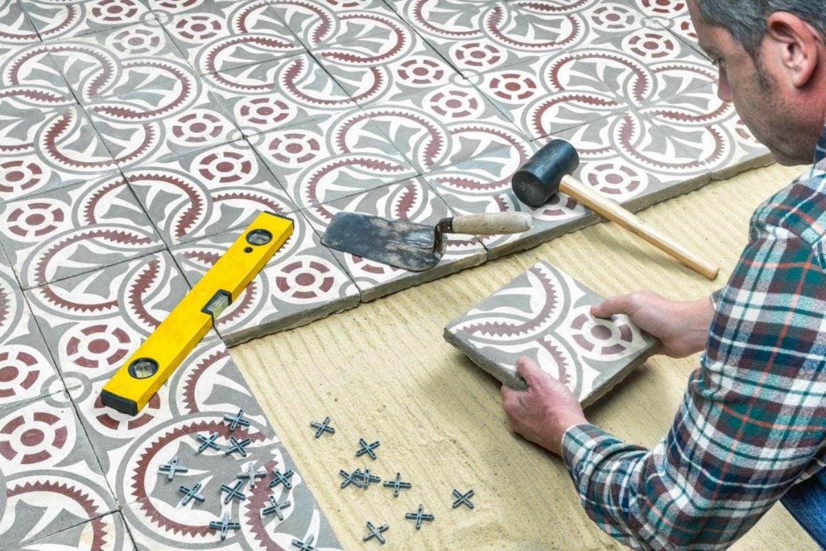
These patterned tiles can make a bold statement, but covering entire floors with them overwhelms the eye. In small doses, they’re striking, but used wall-to-wall they feel chaotic and limit decorating options. Buyers imagine the cost of ripping them out because the style is so polarizing. What feels trendy today is usually tomorrow’s design regret.
5. Wood-Look Porcelain Tile Everywhere
Wood-look tile promised durability with the appearance of natural planks, but when used wall-to-wall it feels cold and fake. Unlike real wood, it lacks warmth underfoot and can look repetitive due to pattern printing. Buyers see it as trying too hard to mimic something it’s not. Instead of elegant, it often feels sterile and mismatched to the rest of the home.
4. Mismatched Flooring in Every Room
Switching flooring types room by room breaks up the natural flow of a house. It creates harsh transitions that make spaces feel smaller and disjointed. Buyers crave consistency because it gives a home a sense of cohesion and higher-end finish. When every doorway means a new surface, it signals piecemeal updates rather than intentional design.
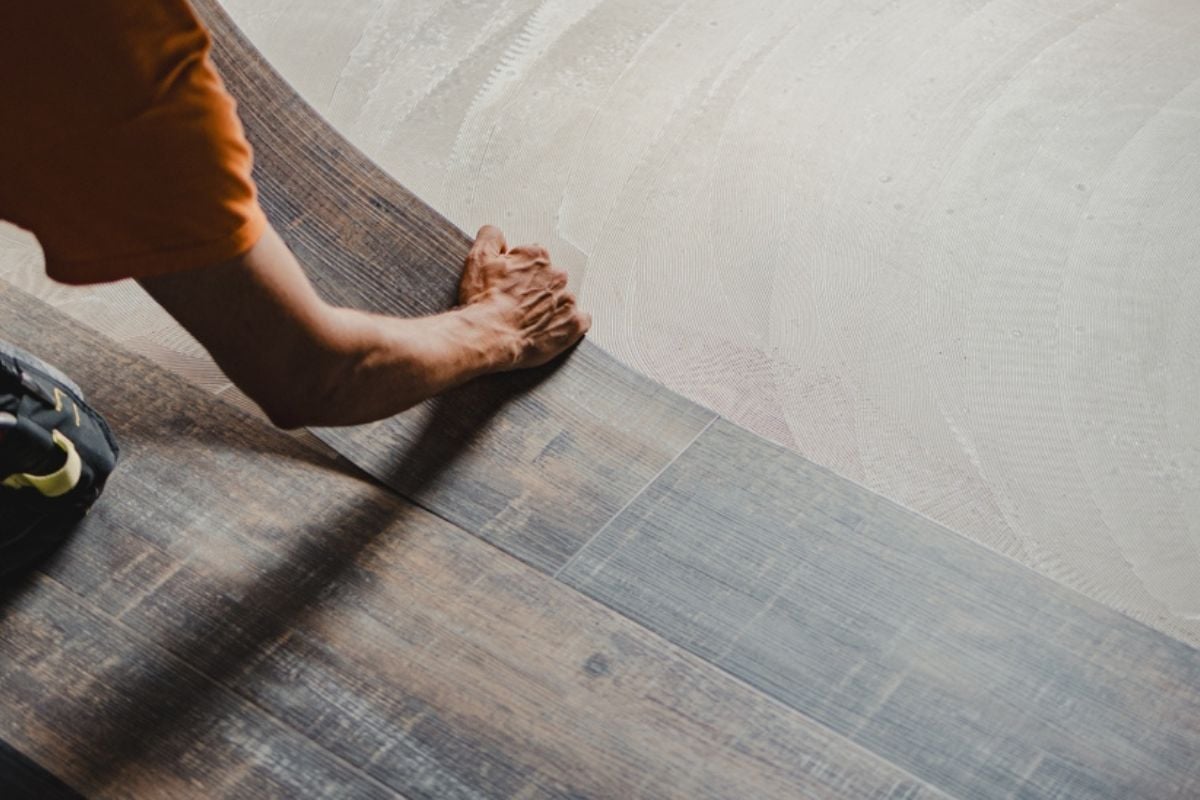
3. Cheap, Thin LVP That Sounds Hollow
Luxury vinyl plank can be a smart choice, but ultra-thin versions with no underlayment give themselves away immediately. They bend, sound hollow underfoot, and show wear quickly, all of which cheapen the impression of the home. Buyers notice the flimsy quality right away and assume cost-cutting throughout the property. Instead of durable, they read as disposable.
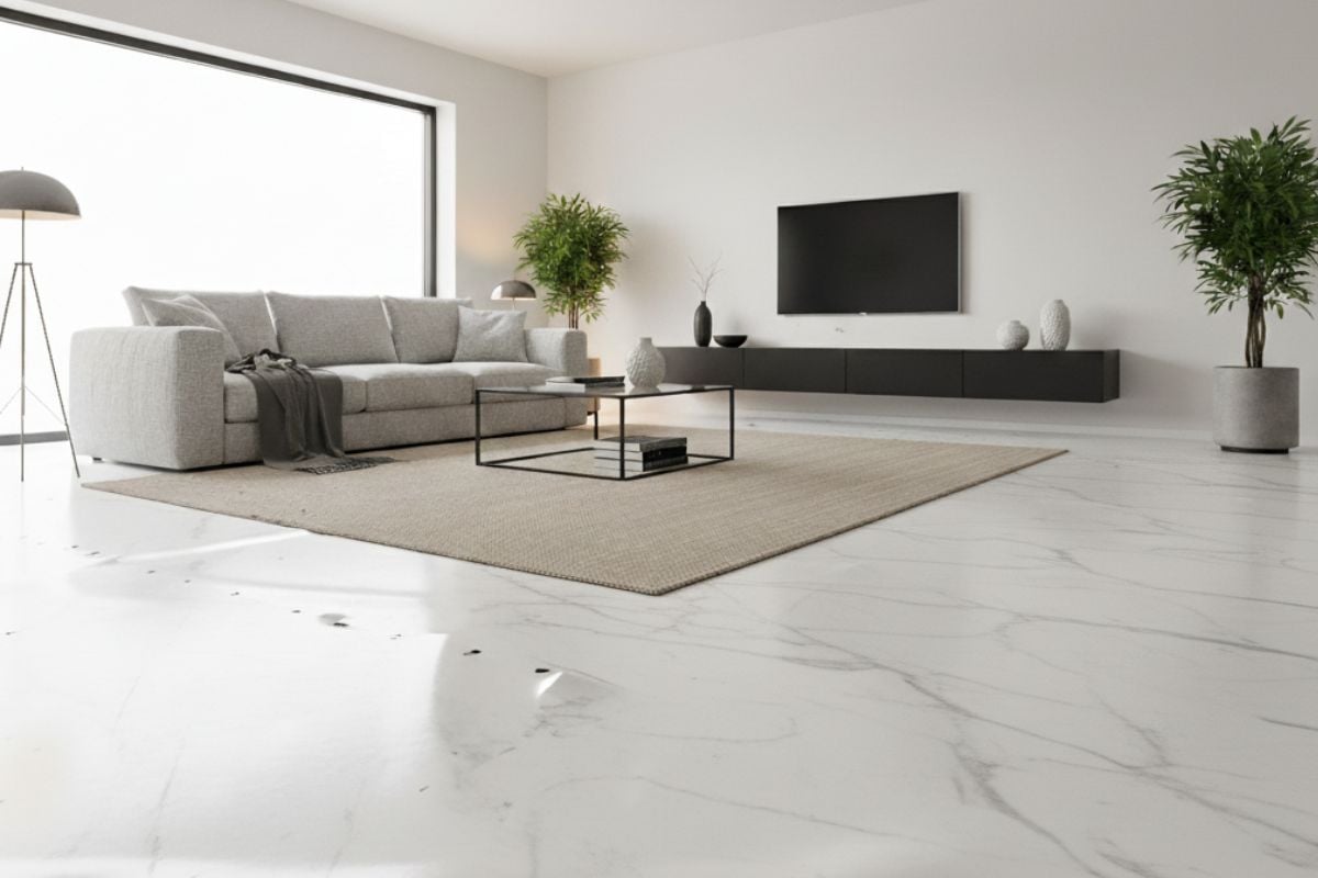
2. Super-Glossy Laminate or Tile Finishes
High-gloss floors may shine in photos, but in real homes they show every footprint, scratch, and streak. They also create glare that feels more like a showroom than a cozy living space. Buyers find them cold and impractical, and they tend to slip easily under socks or bare feet. Rather than luxury, the effect is slippery, dated, and exhausting to maintain.
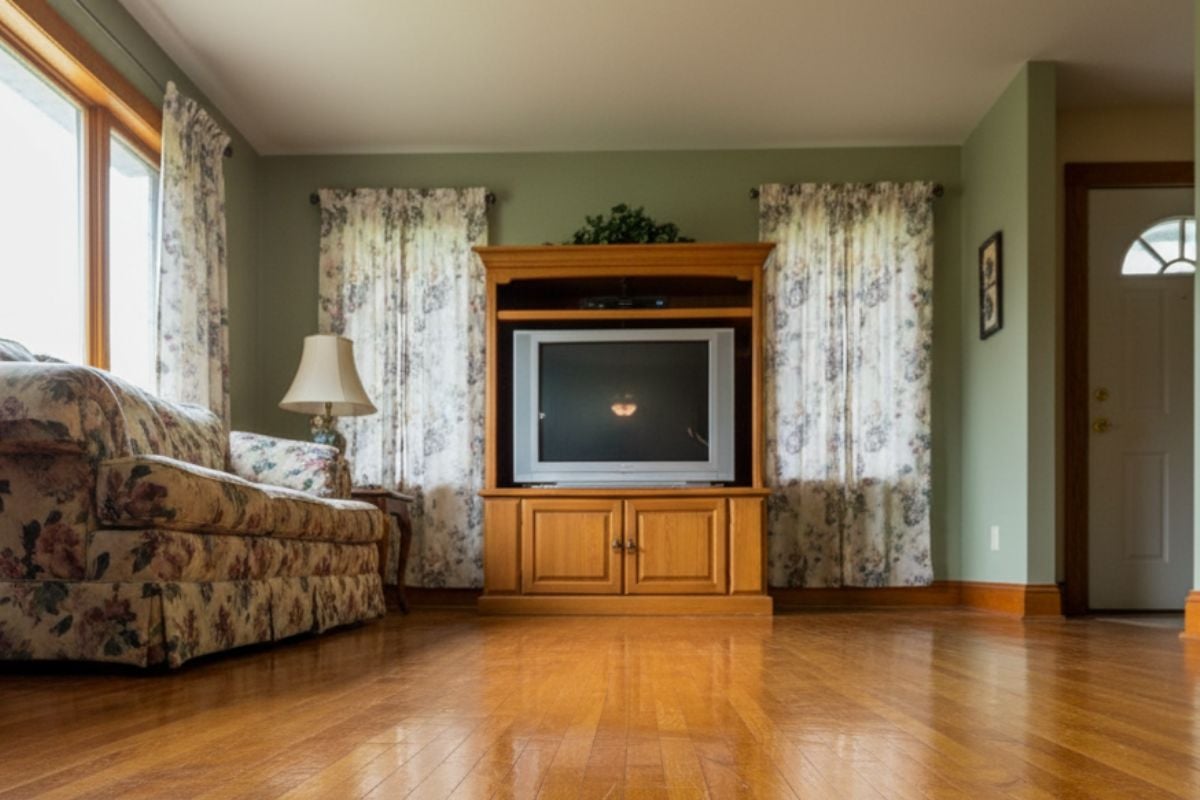
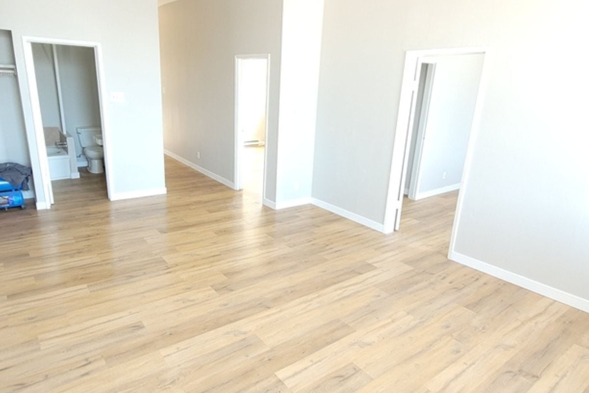
1. Cold Gray Wood-Look Planks
Gray wood-look floors had their moment as the go-to modern choice, but they’ve quickly become a symbol of dated design. Their cool tones often clash with warmer furnishings, leaving spaces feeling cold and lifeless. Buyers increasingly associate them with “builder basic” flips rather than thoughtful design. What was trendy just a few years ago now signals an update is overdue.