Some houses look expensive at first glance, but when you dig deeper, certain design choices and construction shortcuts make them feel more like overpriced stage sets than true luxury. These details are the kinds of things guests notice immediately, even if they can’t always put their finger on why the home feels off.
In order to come up with the very specific design ideas, we create most designs with the assistance of state-of-the-art AI interior design software. Also, assume links that take you off the site are affiliate links such as links to Amazon. this means we may earn a commission if you buy something.
Real estate pros and designers agree that these features don’t just raise eyebrows—they practically shout, “this buyer didn’t get what they paid for.” Let’s count them down from 26 to 1.
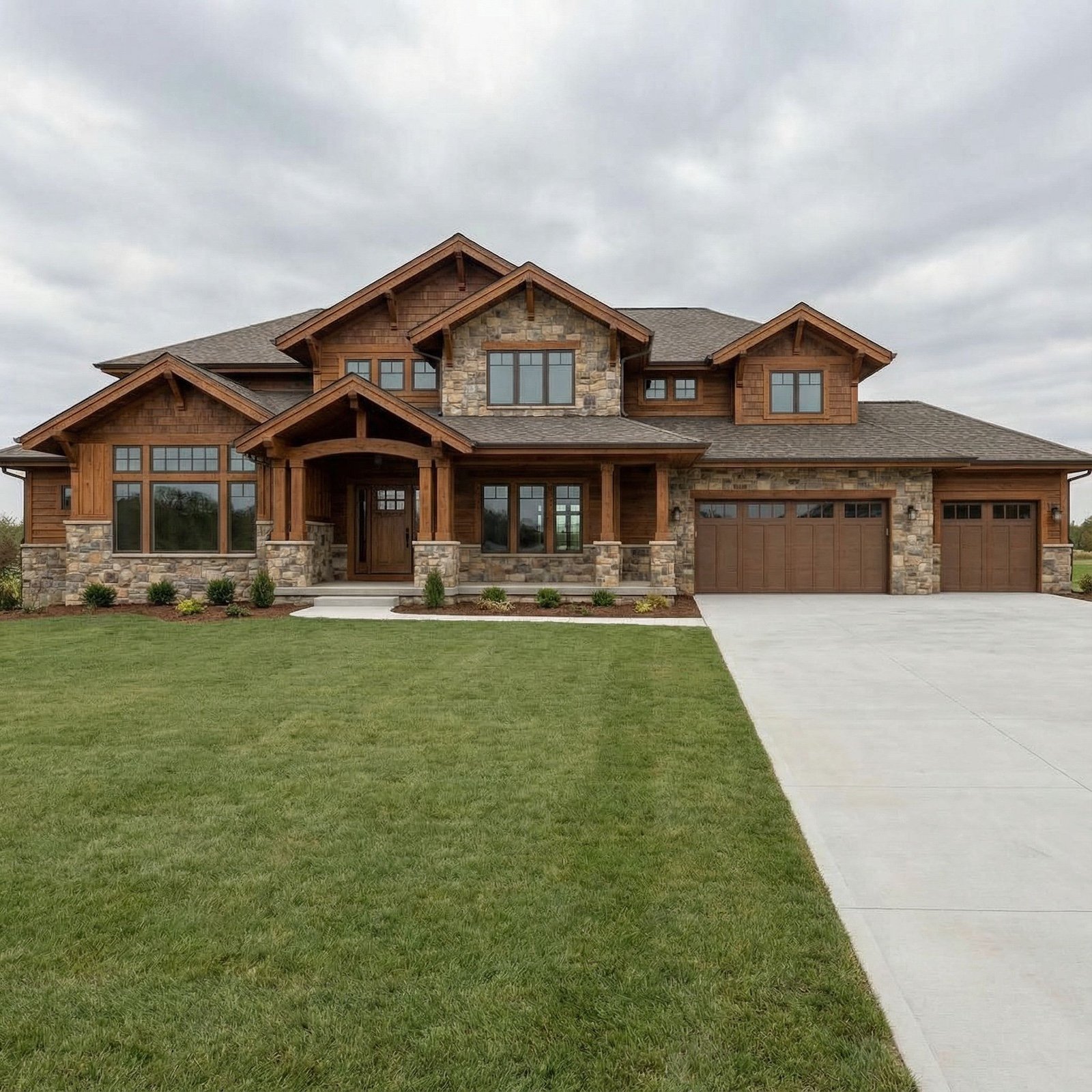
26. Faux “European manor” façade slapped on a vinyl-sided box
Slapping stone accents or faux-Tudor trim on a vinyl-sided box doesn’t make it a chateau; it makes it look like a costume party for houses. Visitors instantly spot the disconnect between the façade and the bones of the structure, and it feels like architectural catfishing. Real stone, proportionate detailing, and consistent materials communicate quality, while mixed signals scream shortcut. When people see it, they think less “dream home” and more “overpriced illusion.”
25. Wall of “built-ins” that are actually freestanding cabinets
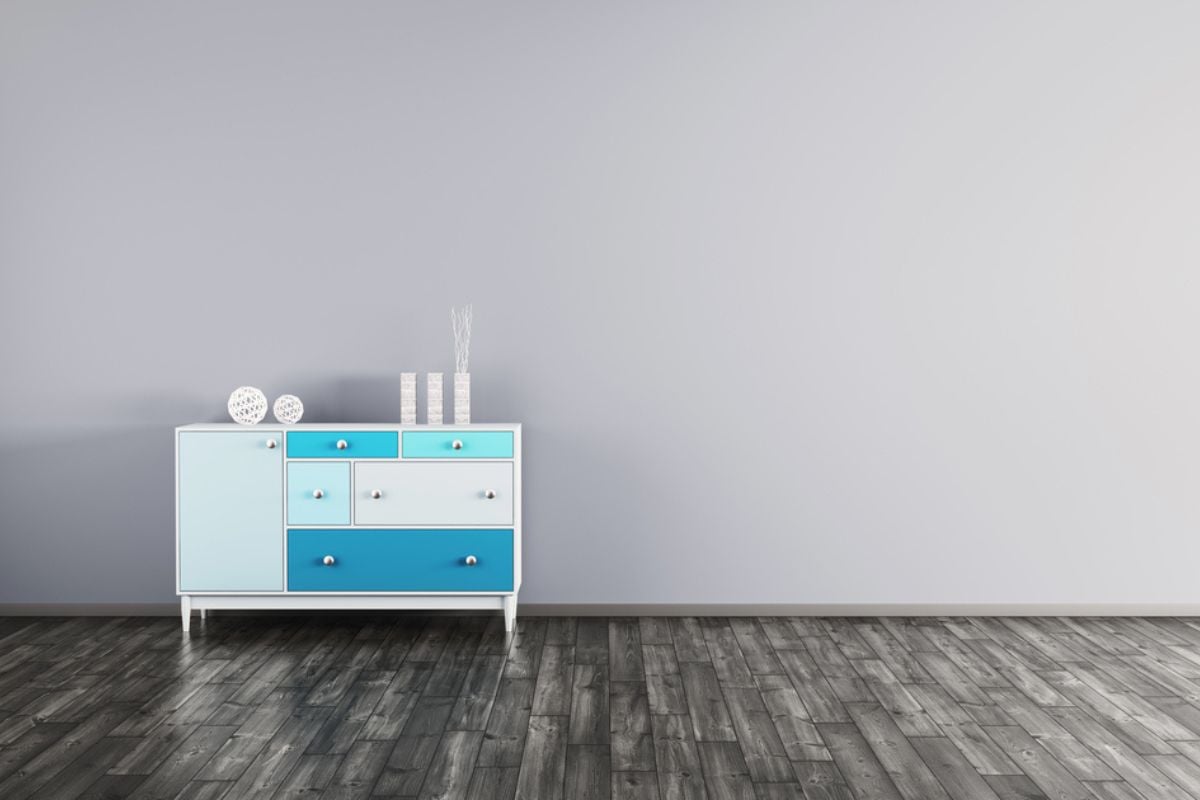
True built-ins are crafted to fit seamlessly into walls, adding function and character, while a row of big-box store cabinets shoved against drywall just looks fake. Buyers may have paid a premium for “custom storage,” but any visitor can see the gaps, trim pieces, or cheap finishes that give away the truth. The problem isn’t just aesthetics—it’s paying custom prices for off-the-shelf solutions. It’s like buying a knockoff handbag and expecting everyone to believe it’s designer.
24. Hotel-sized primary suite, shoebox-small secondary bedrooms
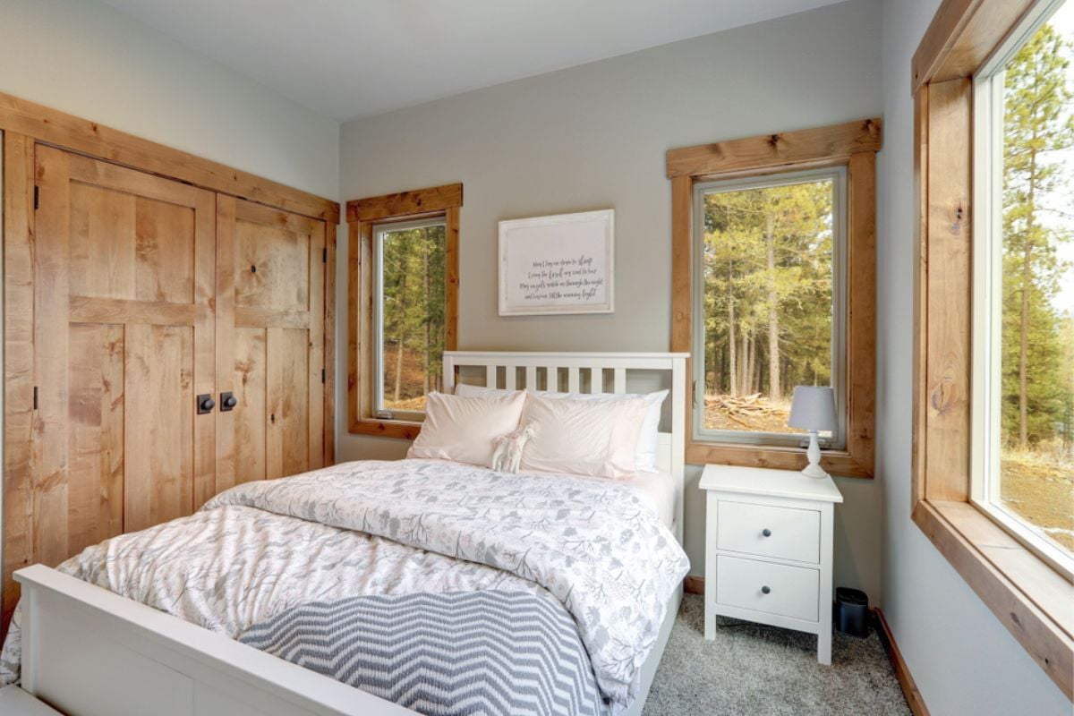
A primary bedroom that rivals a luxury hotel suite might impress on a tour, but when guests realize the kids’ or guest bedrooms are tiny, it feels like the design priorities are out of balance. Square footage should be distributed with some logic, not just poured into one space for bragging rights. This layout also hints at builders cutting corners to maximize “wow factor” without considering livability. Visitors see it and think, “you paid for wasted space and still shortchanged the rest of the house.”
23. Four-car garage, one-car driveway, and no mudroom
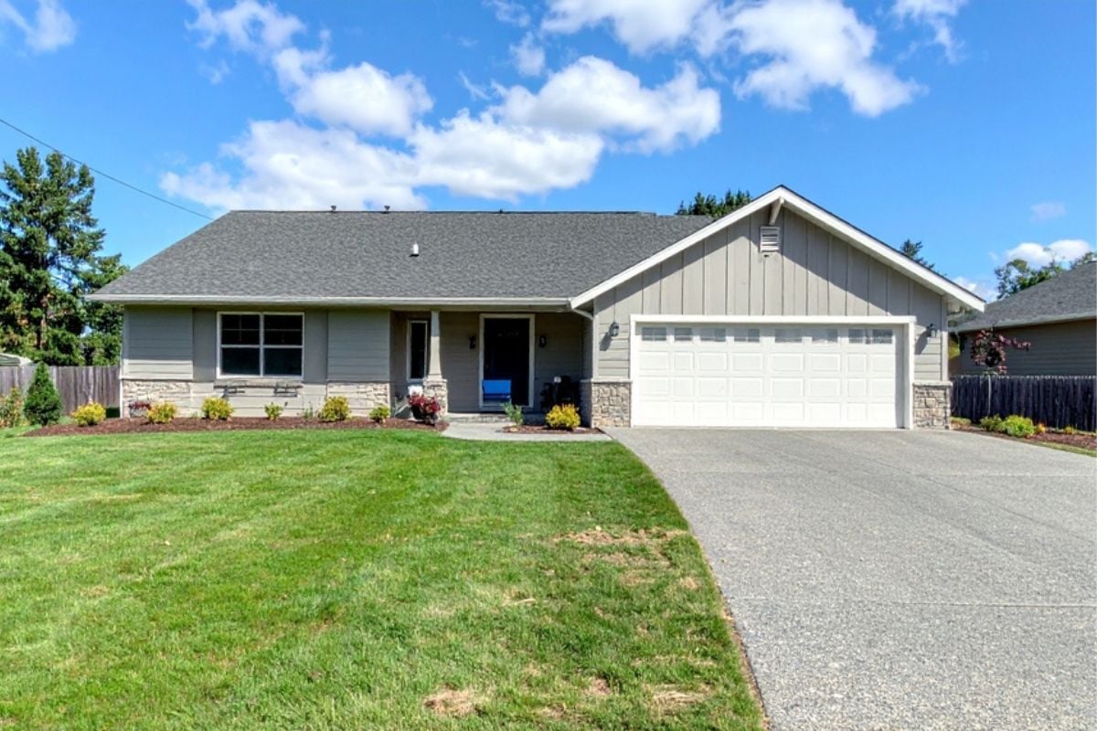
A massive garage might look good in a listing, but without enough driveway space or a practical entryway, it just feels like overcompensating. Guests immediately notice the bottleneck when they pull up, or the mess of shoes and coats that pile up inside because there’s no mudroom. It shows the builder was chasing square footage for resale value, not usability. To most visitors, that’s the very definition of overpaying: lots of shiny space with none of the everyday function.
22. “Smart home” hub with bargain switches and no low-voltage backbone

Slapping a tablet on the wall and calling it a “smart home” doesn’t fool anyone who’s ever used real automation. Visitors quickly realize when the switches feel flimsy, the Wi-Fi barely reaches the back rooms, or the system can’t be expanded. A true smart setup requires wiring, planning, and quality gear—not a grab bag of budget gadgets. Paying luxury prices for a knockoff tech package is a fast way to broadcast that you got upsold, not upgraded.
21. Glass railings and matte-black fixtures already smudged and spotted
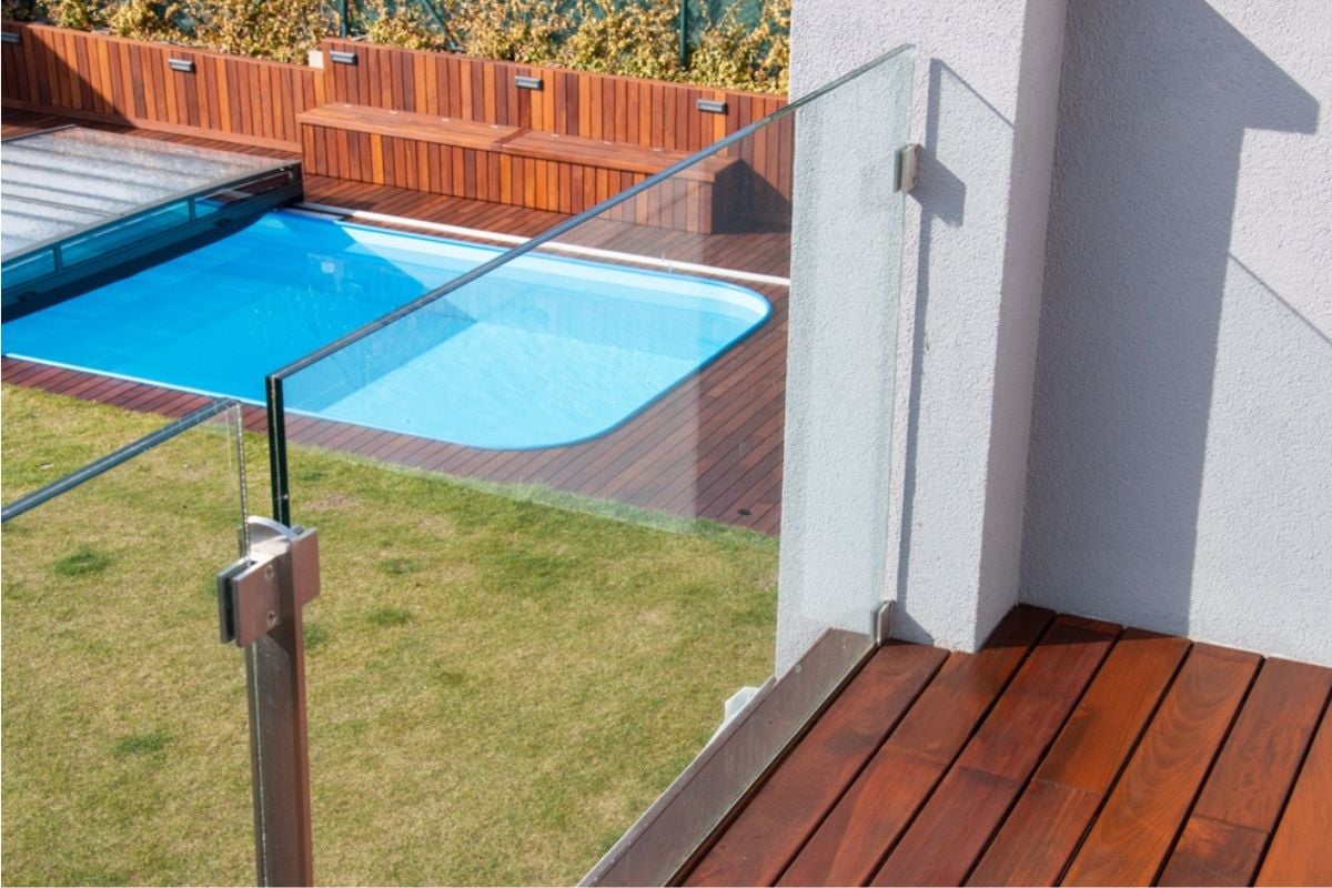
Glass railings and black finishes look sleek in photos, but in person they betray every fingerprint, scratch, and water spot. Visitors can tell instantly when something is more about Instagram than long-term livability. Paying a premium for high-maintenance finishes feels especially hollow when they look worn out within weeks. People walking through think: “If it already looks tired now, what will this place look like in five years?”
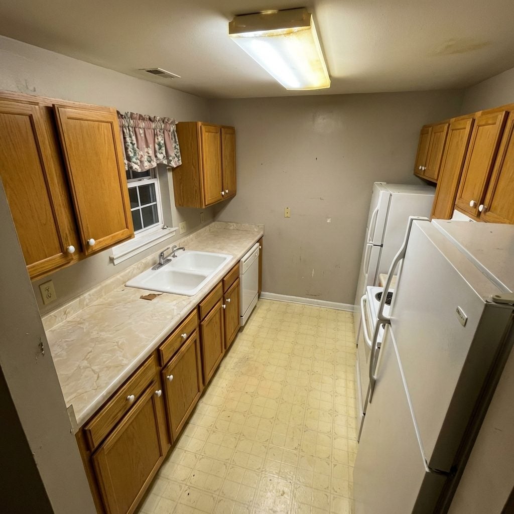
20. Two dishwashers… but no pantry
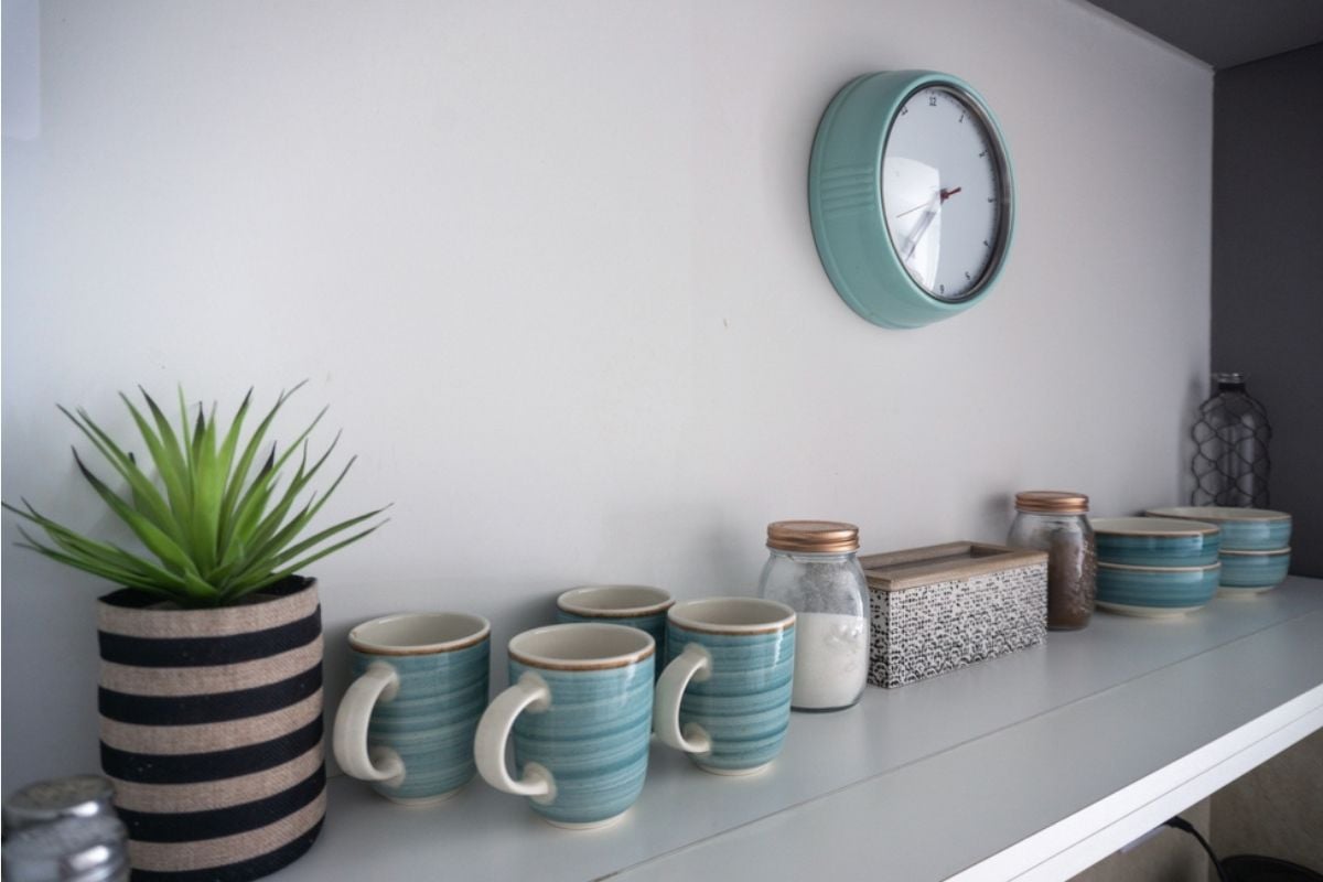
Two dishwashers sound glamorous until someone realizes there’s nowhere to store actual food. Guests pick up on these mismatches quickly—luxury features with no supporting basics make the whole design feel shallow. A pantry is one of the most functional spaces in a home, and skipping it for a second appliance screams misplaced priorities. It’s the kind of feature that makes people wonder if the buyers paid for showy checkmarks rather than real convenience.
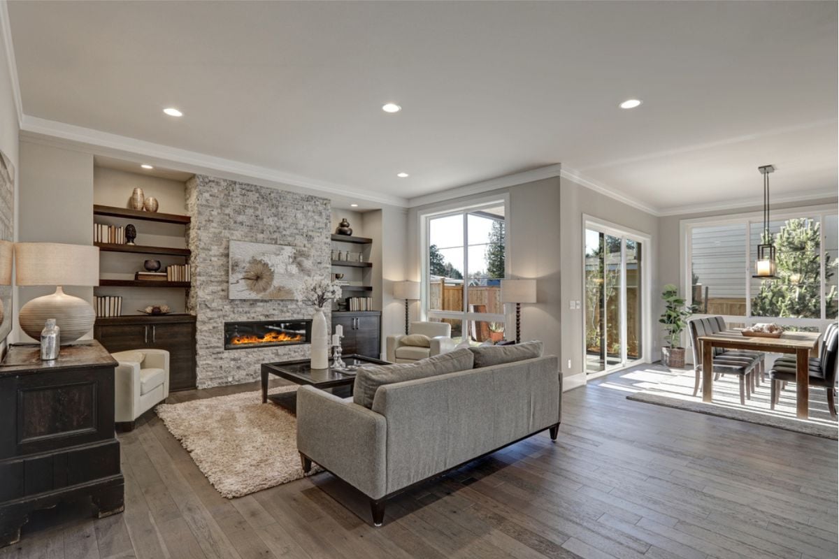
19. Grand “statement” fireplace that’s electric-only in a cold climate
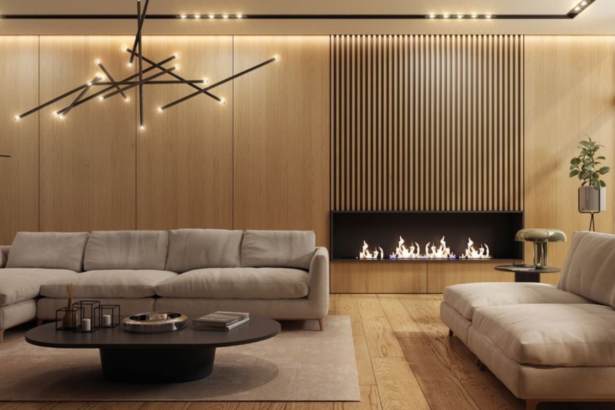
A 14-foot stone fireplace that produces as much heat as a space heater is a clear sign the design was all about looks, not function. Guests in colder regions will clock it immediately: it’s beautiful but useless. Real luxury marries aesthetics with practicality, and this mismatch just highlights overspending on style points. Visitors can’t help but think, “you could’ve had real warmth, but instead you paid extra for fake flames.”
18. West-facing glass wall with no shading (glare + heat)
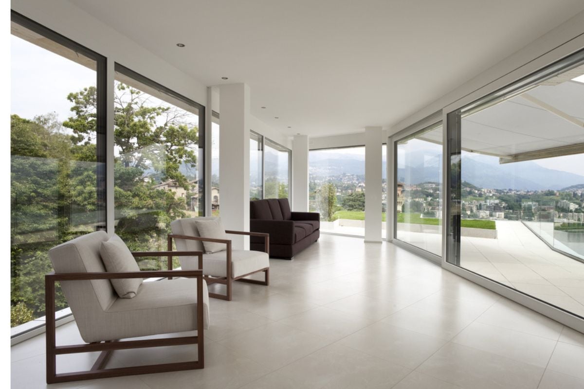
Floor-to-ceiling glass walls look like high-end architecture until the afternoon sun turns the space into a blinding, overheated sauna. Anyone sitting inside will instantly recognize that the design was photogenic but not livable. True high-dollar homes factor in orientation, shading, and energy performance, not just dramatic views. Guests notice the squinting and sweat, and they’ll quietly conclude the homeowners paid more for drama than comfort.
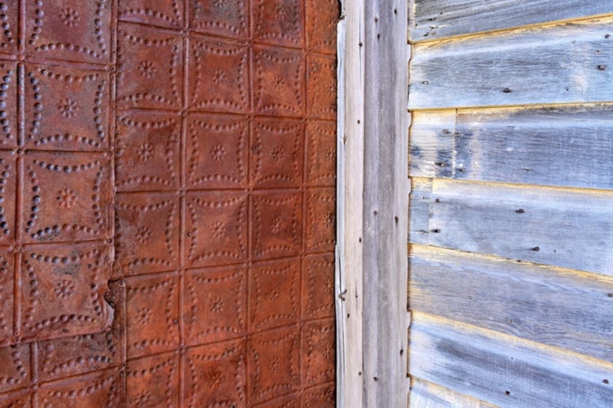
17. Stone veneer/stucco skins over visibly wavy framing

Stone veneer or stucco can elevate a facade—if it’s installed over a solid, well-framed surface. But when the underlying structure waves or bows, even expensive materials look cheap. Guests immediately catch on to the poor craftsmanship because the uneven lines ruin the illusion of quality. It feels like a shortcut that cost a lot, but delivered very little lasting value.
16. Thin click-lock “wood” floors sold as white-oak planks
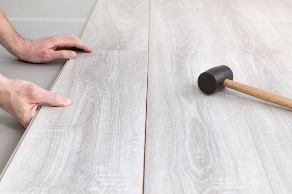
Visitors know when a floor that’s supposed to be luxury hardwood sounds hollow underfoot. Thin laminate or engineered boards may photograph like white oak, but in person they don’t have the warmth or heft of the real thing. Paying premium prices for budget-level materials is one of the quickest ways to make a house feel overpriced. Guests can literally feel the downgrade every time they walk across it.
15. Feature walls and LED strips plastered everywhere
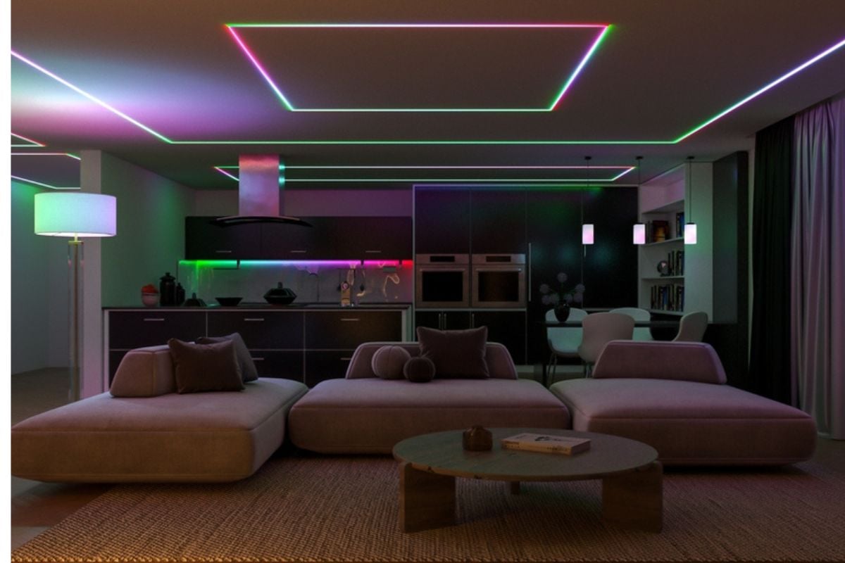
One accent wall or a subtle lighting strip can feel modern, but covering every room with gimmicky finishes makes a home look like it’s trying way too hard. Guests know the difference between timeless design and trend-chasing excess. When people see colored LED strips in every corner, they don’t think “luxury,” they think “club basement.” It’s an expensive way to devalue your home in the eyes of anyone walking through.
14. Ceiling peppered with can lights but no layered/task lighting
🔥 Would you like to save this?
Lighting is supposed to create ambiance and support daily tasks, but a ceiling covered in can lights looks more like a warehouse than a thoughtfully designed home. Visitors immediately notice when a “high-end” house feels flat and overlit. The lack of lamps, pendants, or layered light shows that corners were cut in design, not dollars. It screams “builder-grade shortcut” even if the buyers paid premium prices.
13. Bedroom count padded by windowless dens or closetless rooms
Calling a windowless den or a closetless alcove a “bedroom” doesn’t pass the sniff test for visitors. They instantly sense that the house was marketed with inflated numbers to justify the asking price. True luxury means honesty in design, not fudged square footage. When guests see it, they can tell the buyers paid for more bedrooms on paper, but not in reality.
12. Barn doors where sound privacy actually matters
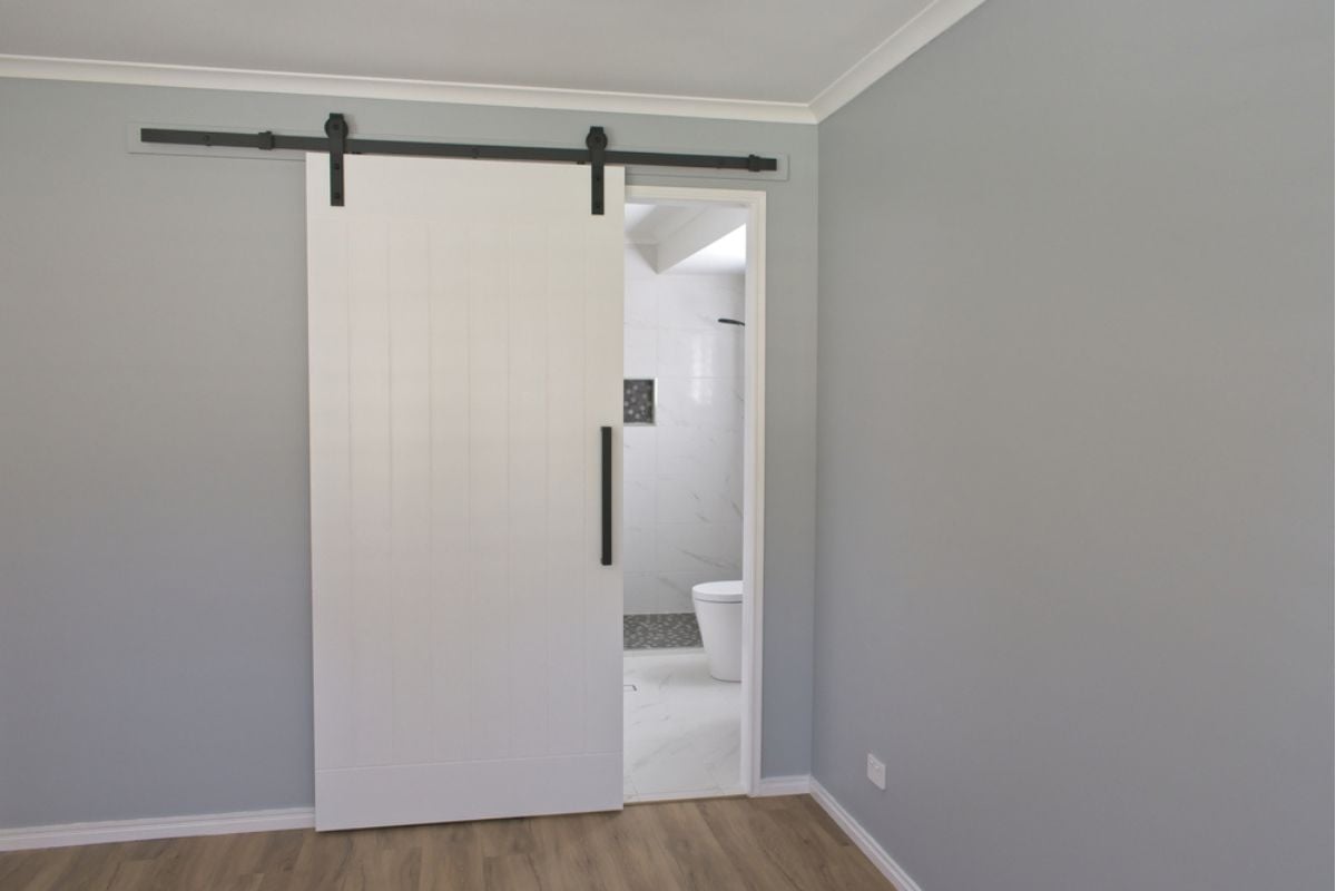
Barn doors are trendy, but they’re also terrible at blocking sound and light. Visitors quickly notice when they’re installed on bathrooms, bedrooms, or offices—spaces where privacy is non-negotiable. What was meant to look stylish instead makes the house feel poorly thought out. Guests leave thinking, “you paid designer prices for a door that doesn’t even close properly.”
11. Showy wine wall with zero climate control
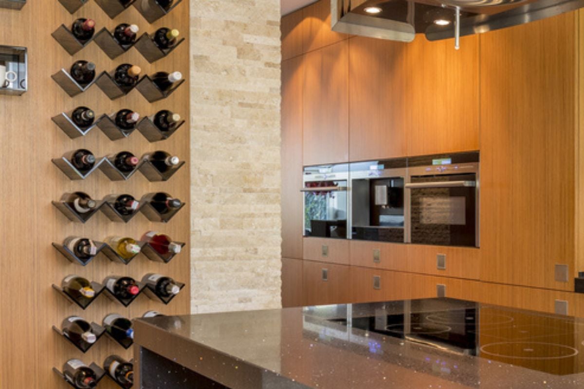
A wall of wine bottles looks like a luxury feature, but without climate control it’s just expensive storage that ruins good wine. Guests who know anything about collecting immediately spot the oversight. Real wine rooms regulate temperature and humidity; anything less is for show, not substance. People can’t help but think the homeowners paid for the look of sophistication without the follow-through.
10. Freestanding tub wedged into a primary bath with no real storage
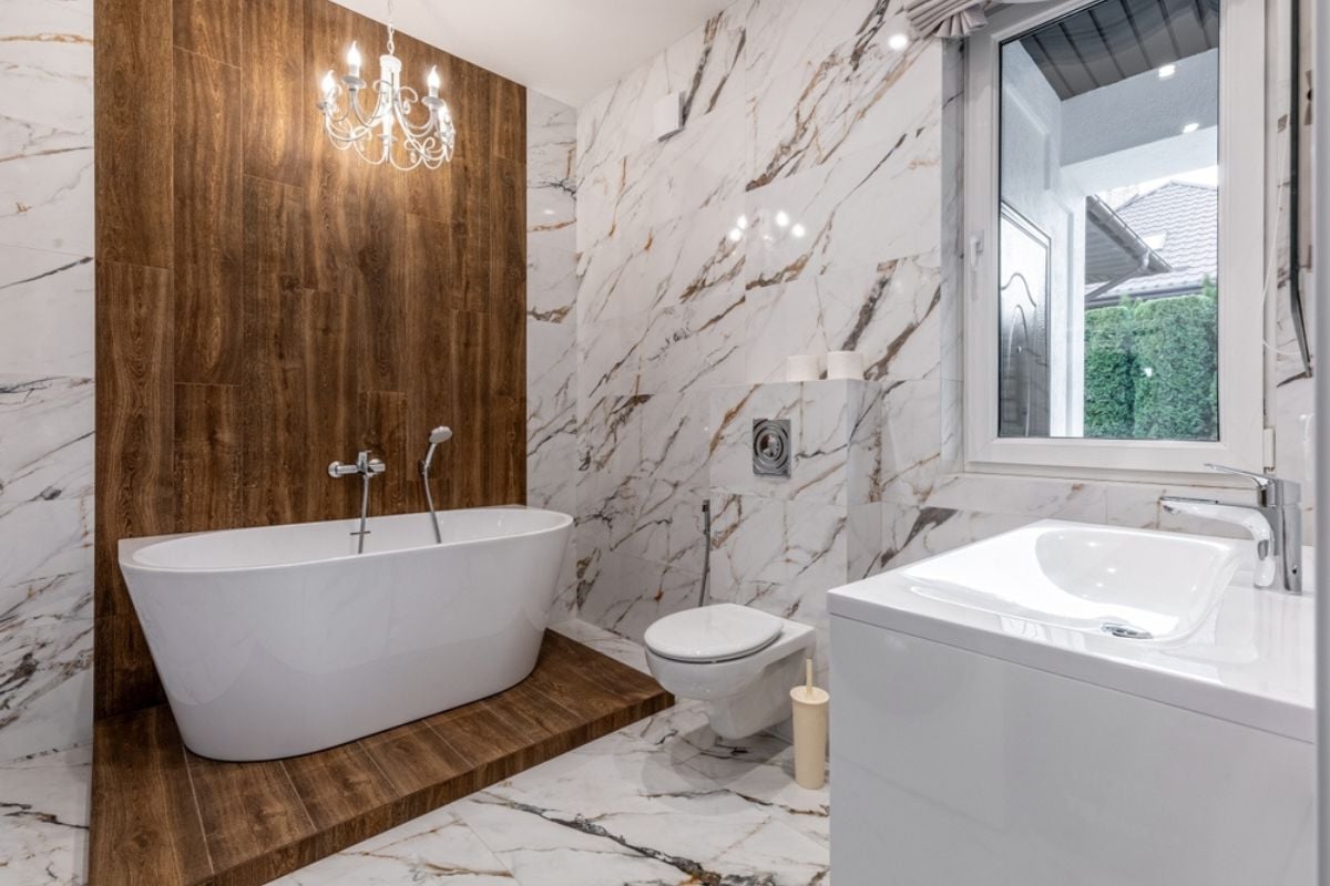
Freestanding tubs look glamorous in real estate photos, but when they’re crammed into small bathrooms with no cabinetry or shelving, the space feels impractical. Guests notice right away when there’s no place for towels, toiletries, or even a spot to set a glass of wine. True luxury is as much about function as it is form. This setup just makes people think the buyers paid for looks and sacrificed livability.
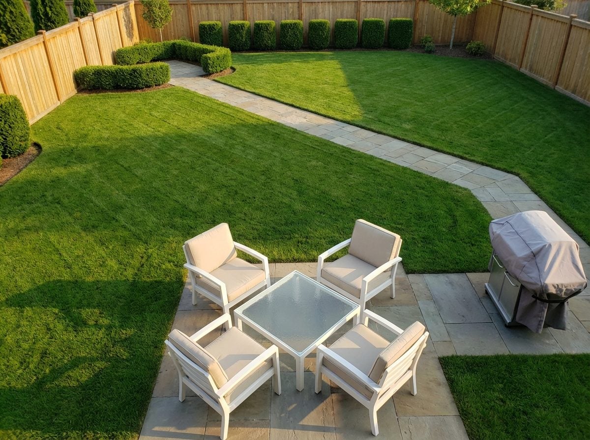
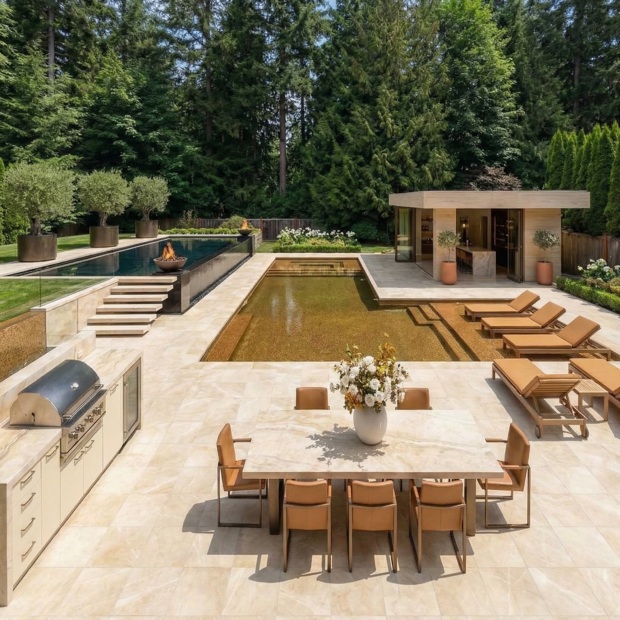
9. Tiny backyard crammed with a plunge pool and five “zones”
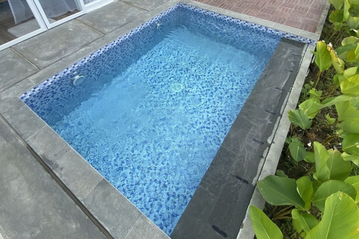
Outdoor living space is valuable, but overstuffing a small backyard with a pool, firepit, kitchen, and seating areas just makes it feel chaotic. Visitors sense the lack of breathing room immediately, even if everything looks brand-new. It suggests the homeowners or developers were chasing trends instead of balance. To most guests, it reads as expensive clutter rather than outdoor luxury.
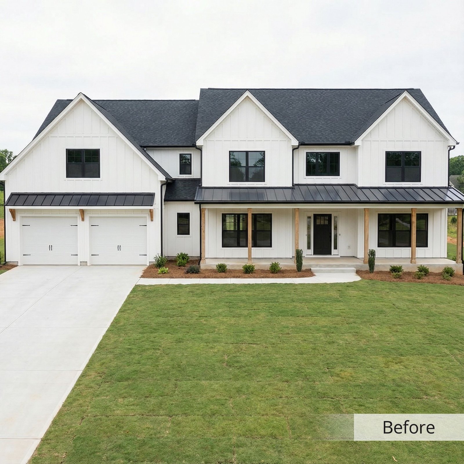
8. Micro-lot McMansion (house-to-lot ratio wildly off)
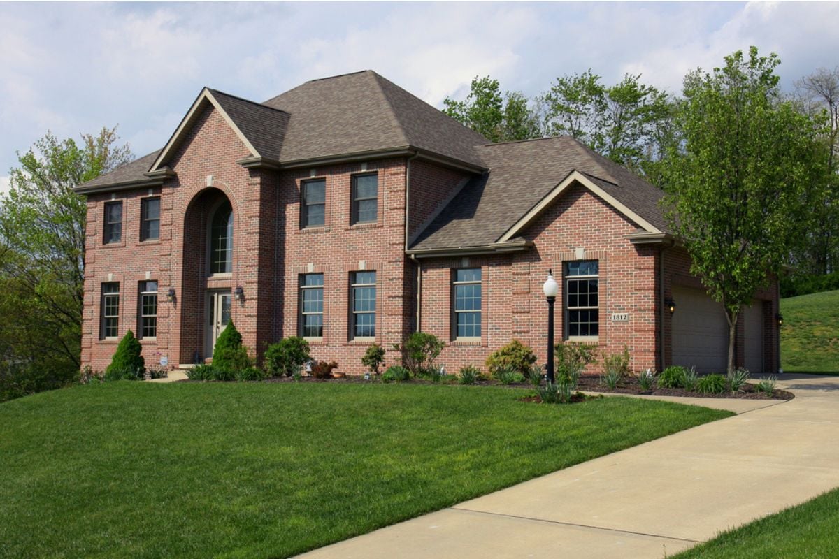
A massive house jammed onto a postage-stamp lot looks more like a billboard than a home. Guests can tell there’s no room to breathe, no yard, and no sense of proportion. Paying top dollar for square footage that overwhelms the property comes off as indulgent but poorly planned. People see it and think the buyers bought size, not lifestyle.
7. Echoey two-story foyer with cheap railings and trim work
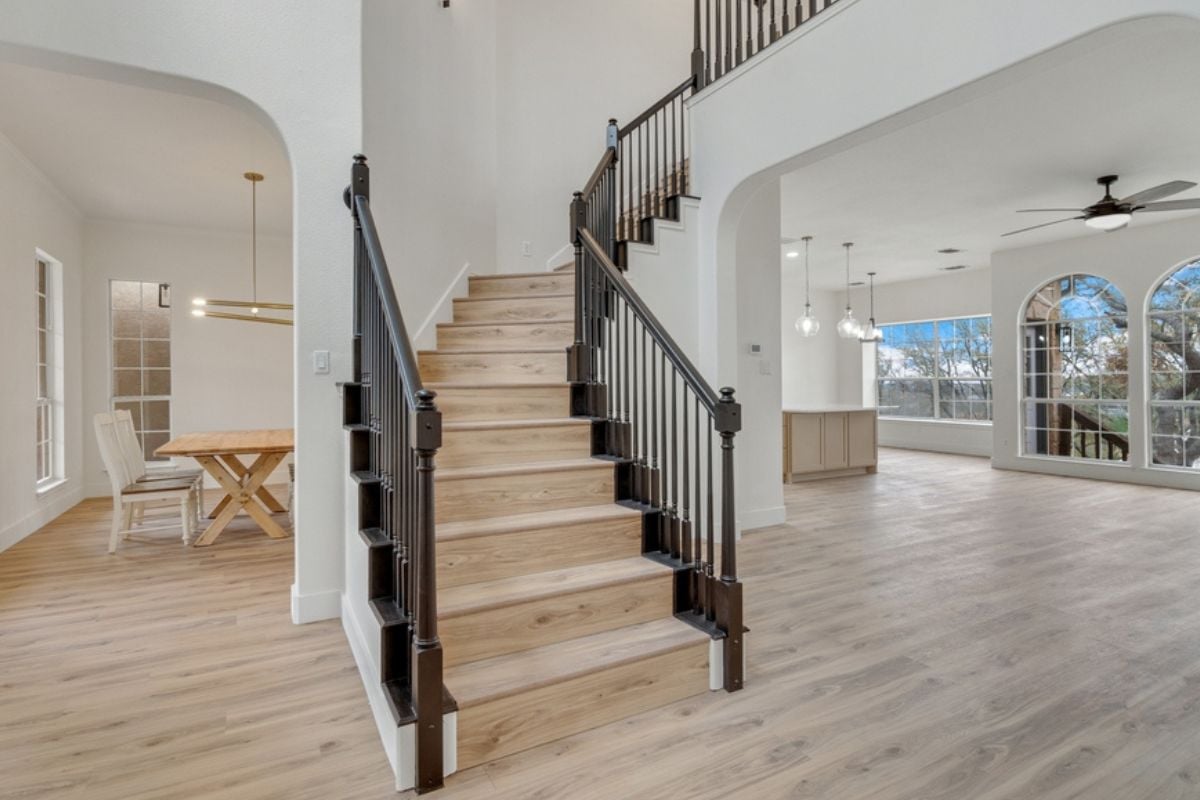
A grand two-story foyer can be impressive, but when it’s paired with flimsy finishes, it just highlights the contrast between scale and quality. Visitors pick up on the hollow echoes and the spindly railings right away. Luxury should feel substantial, not theatrical. Instead of awe, guests are left thinking, “all show, no substance.”
6. One-zone HVAC serving a large, multi-story house
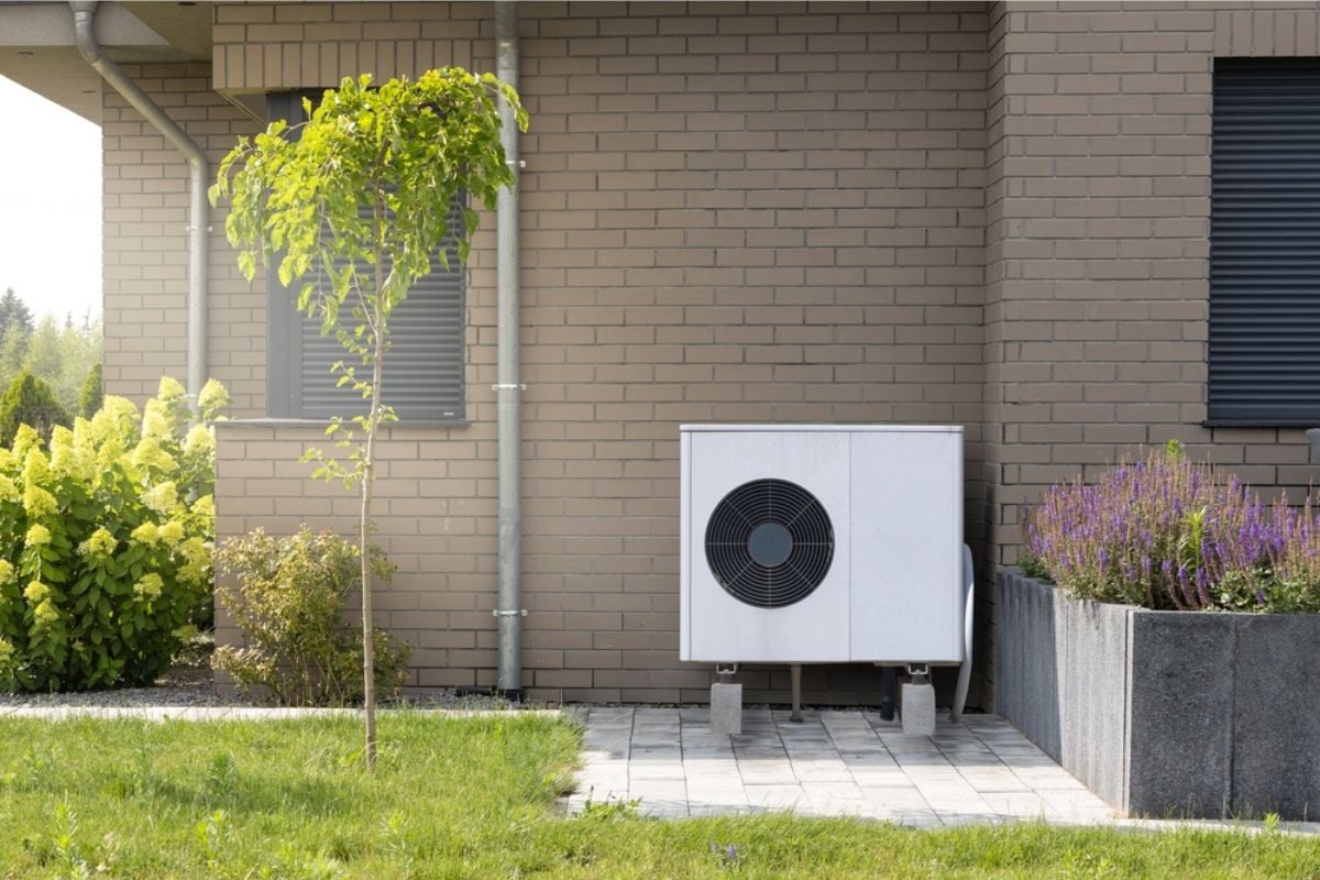
A large home with a single thermostat means someone upstairs is sweating while someone downstairs is freezing. Visitors immediately notice the temperature swings as they move from room to room. True luxury homes have zoned systems for comfort and efficiency. Skipping that essential upgrade makes it obvious that corners were cut where they mattered most.
5. Hollow-core interior doors in a so-called custom home

Lightweight, hollow-core doors are fine in starter homes, but in a “custom” build they scream cheap. Guests feel the difference the moment they close one and hear it rattle instead of thud. Solid doors add not just sound control but a sense of permanence. Paying luxury prices for paper-thin doors tells every visitor the budget went to surface finishes, not quality bones.
4. Glossy “marble” everywhere that’s really printed porcelain or laminate
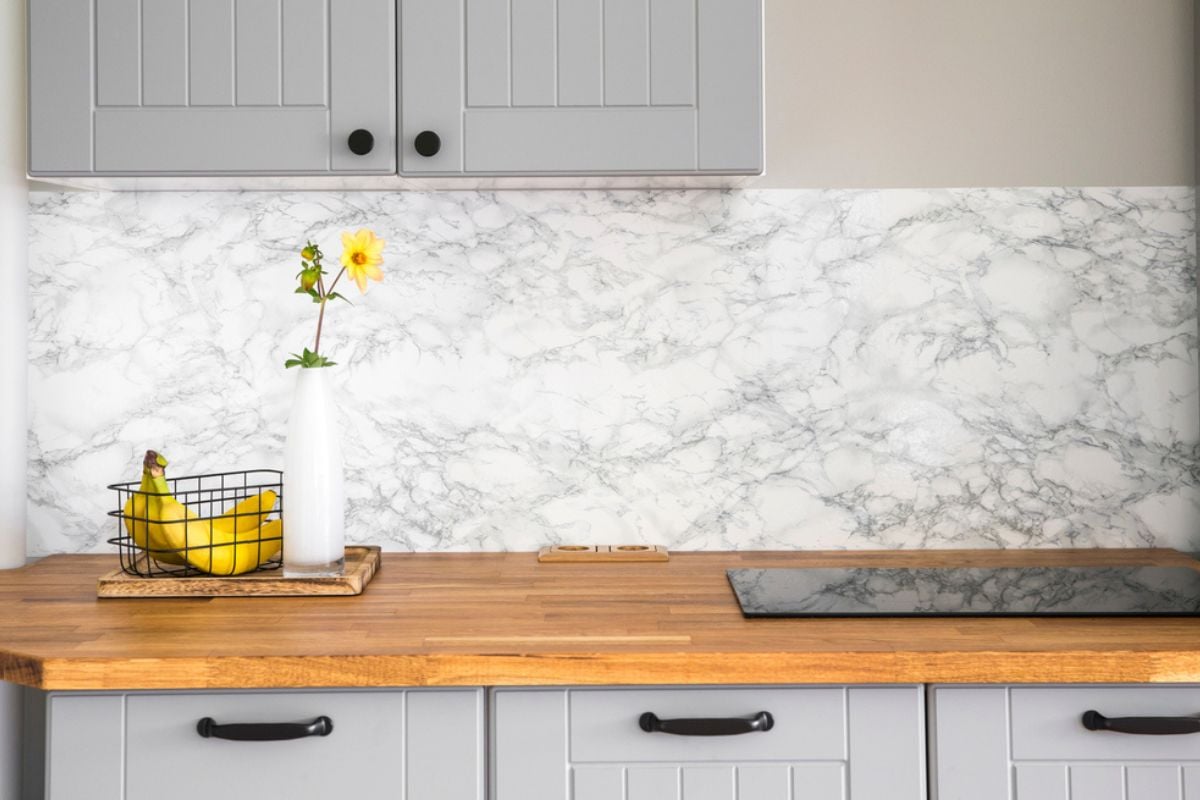
At first glance, shiny faux marble may pass, but visitors quickly realize when every surface is repeating patterns or doesn’t feel like stone. Real marble has depth and variation that can’t be faked. Covering an entire house in lookalikes feels more like a showroom trick than timeless design. People notice and think, “you spent big for a knockoff look.”
3. Pro-grade appliance badges on entry-level models
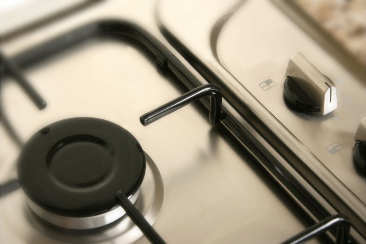
Manufacturers know slapping a stainless-steel badge on an appliance makes it look high-end, but anyone who cooks can spot the difference. Visitors notice when burners don’t heat evenly or oven knobs feel cheap. True pro-grade appliances justify their price with performance, not just looks. Paying for branding without substance is a dead giveaway of overspending.
2. Waterfall island so oversized it kills circulation
🔥 Would you like to save this?
Waterfall islands can be stunning, but when they’re too big for the room, they become obstacles instead of centerpieces. Guests pick up on the awkward shuffling, the lack of walking space, and the feeling of being boxed in. Luxury kitchens should balance form and function, not sacrifice one for the other. This kind of excess feels less “elegant” and more “expensive mistake.”
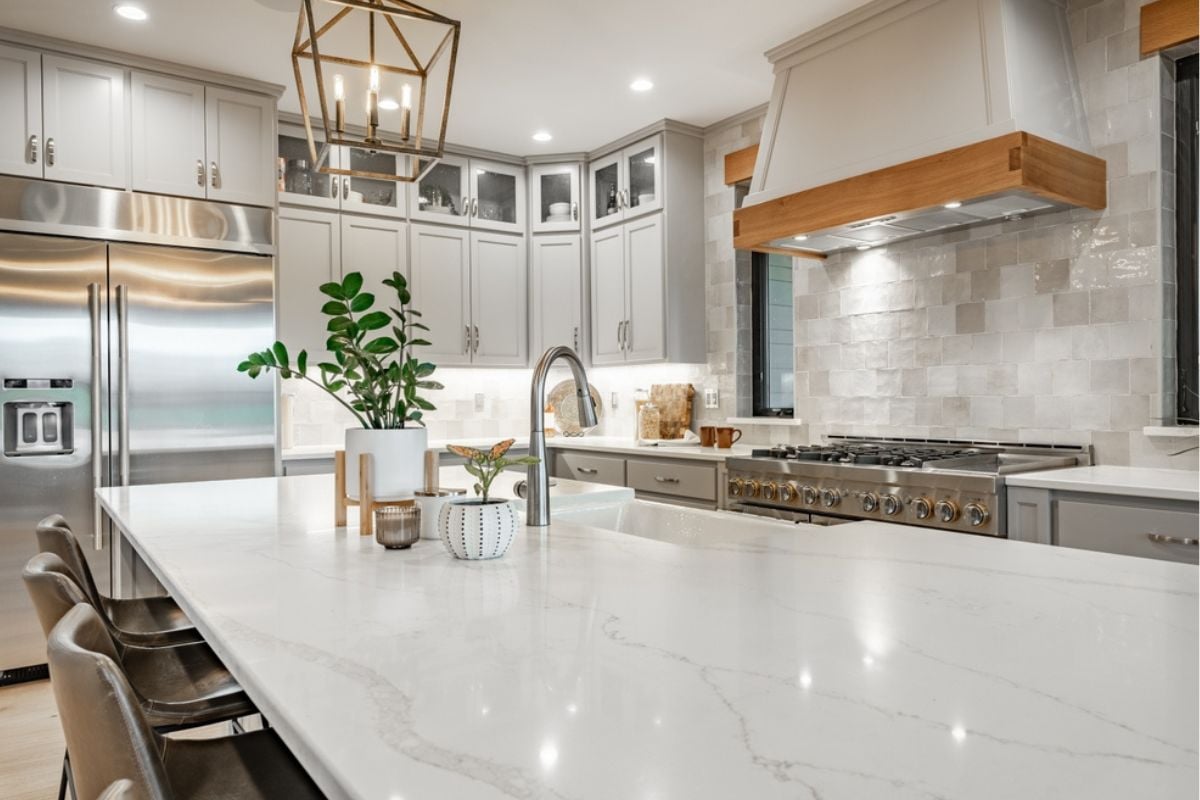
1. A “luxury” kitchen hiding builder-grade cabinets and hardware
A kitchen may shine with quartz counters and flashy fixtures, but when the cabinets and hardware are clearly builder-grade, it undermines the entire space. Visitors instantly notice flimsy drawers, peeling finishes, and cheap hinges that don’t match the supposed luxury price tag. True high-end kitchens are built from the inside out with quality at every layer. This bait-and-switch leaves guests thinking the buyers paid top dollar for a dressed-up starter kitchen.