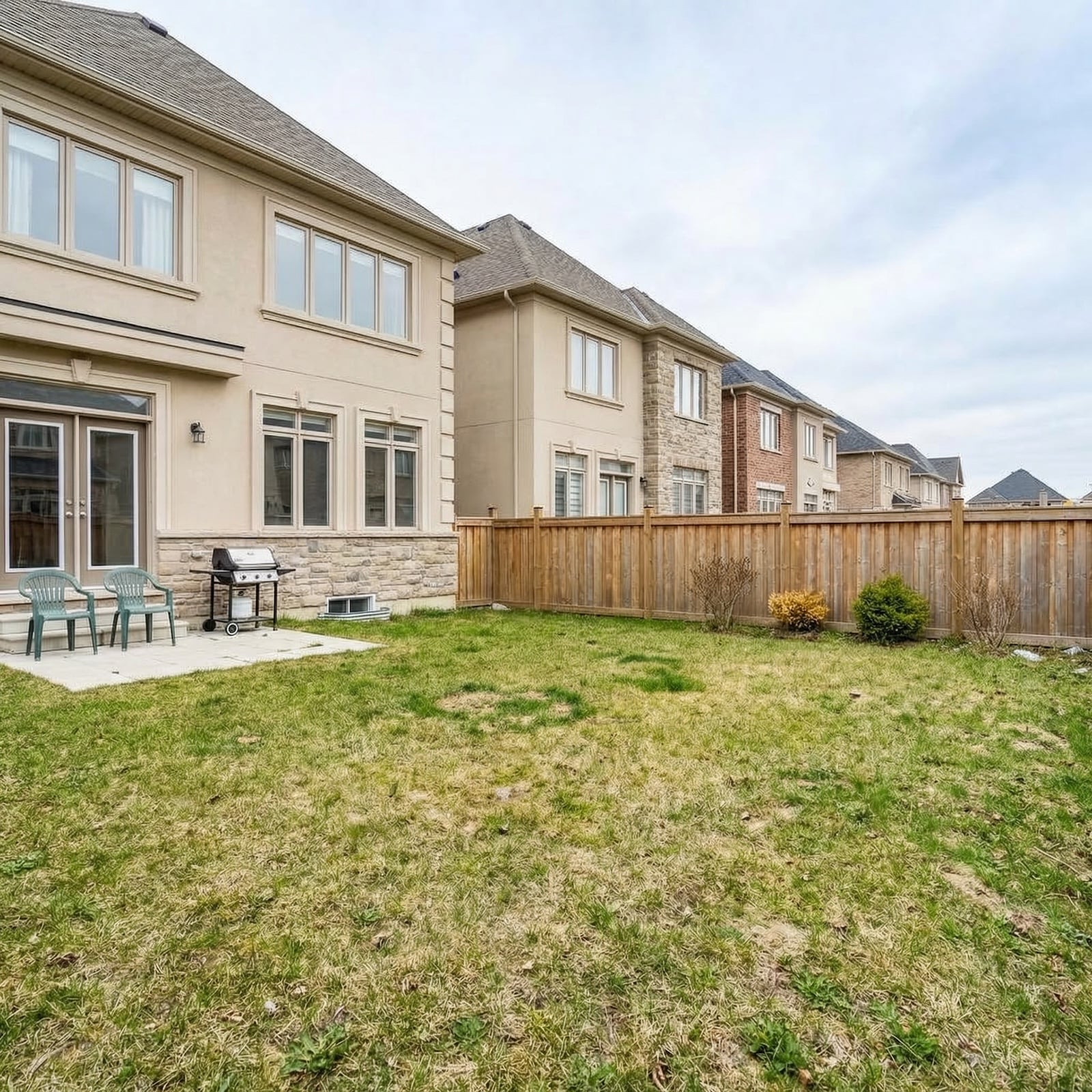
Paint can transform a space—but the wrong color can instantly sabotage resale value. Buyers react not just to hue, but to how it photographs, how it reflects light, and how it pairs with floors, counters, and trim.
In order to come up with the very specific design ideas, we create most designs with the assistance of state-of-the-art AI interior design software.
Loud brights and heavy darks shrink rooms, highlight flaws, and scream “repaint project,” while odd undertones can make finishes look stained or dated. High-gloss or gimmicky shades may feel bold, but they turn buyers off and chip away at offers.
Here are 41 paint colors experts agree can quietly kill your home’s value.
41. Glossy Black Ceilings Doom Rooms
High-gloss black on ceilings eats light, exaggerates shadows, and makes even generously sized rooms feel lower and cave-like in photos. Buyers equate darkness with costly lighting fixes and imagine repainting ladders before they’ve even made an offer. Unless it’s a deliberate theater room, the finish reads “project,” not “premium.”
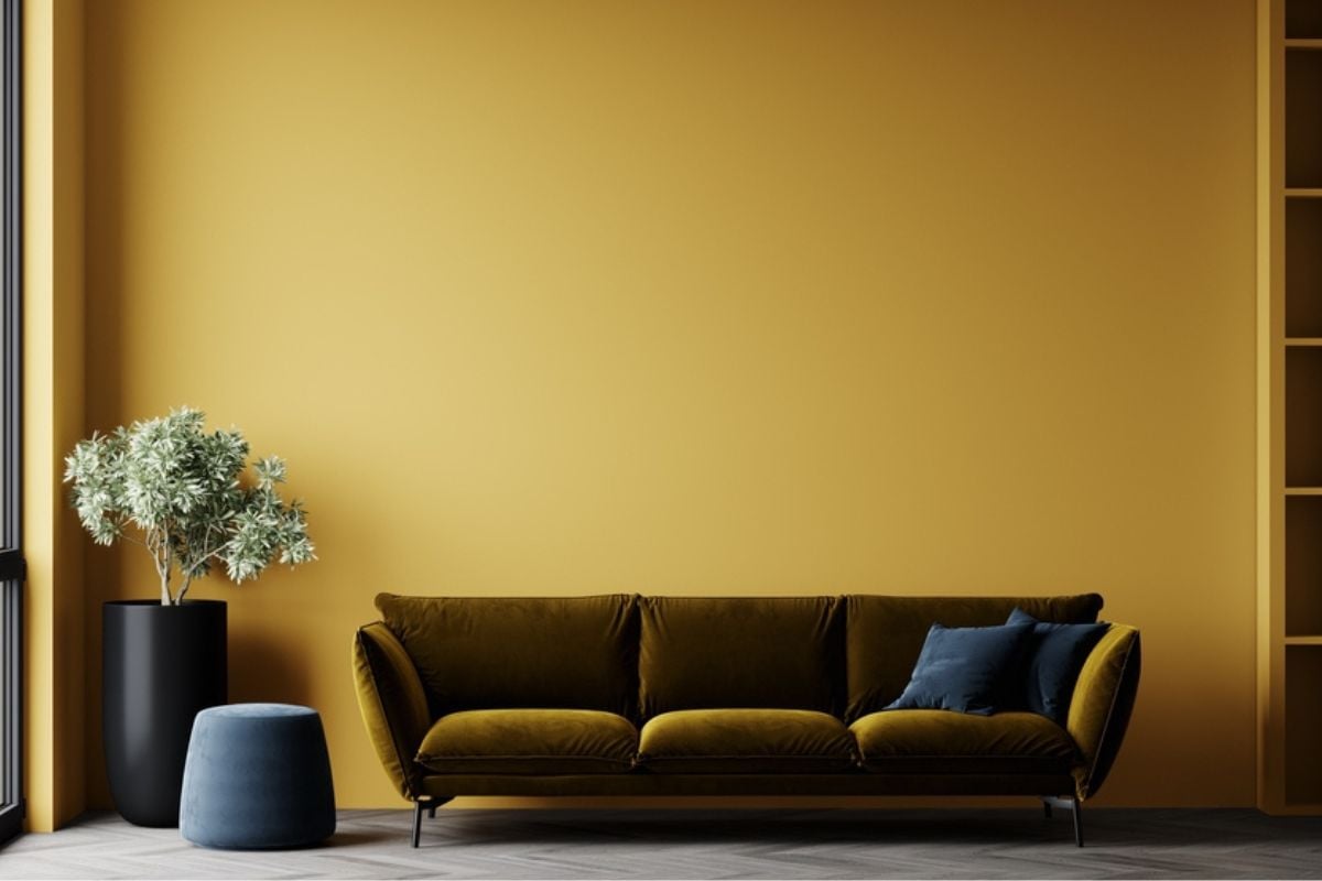
40. Metallic Gold Walls Overwhelm Spaces
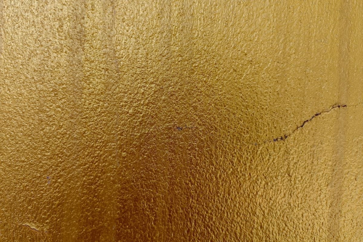
Metallic paint throws hot reflections that distort color balance and photograph poorly, leaving listing images looking blotchy and cheap. The finish screams themed decor, which narrows the buyer pool and suggests expensive stripping or priming to neutralize. Most appraisers advise tones that recede, not ones that compete with furnishings.
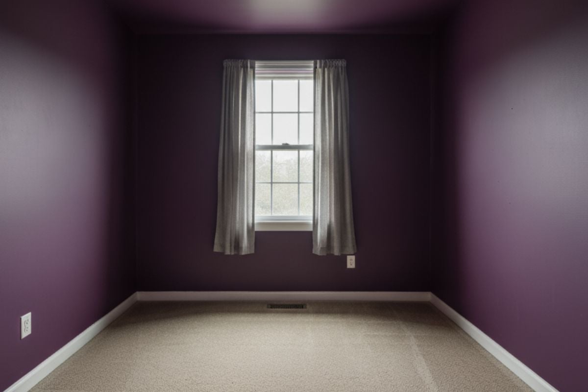
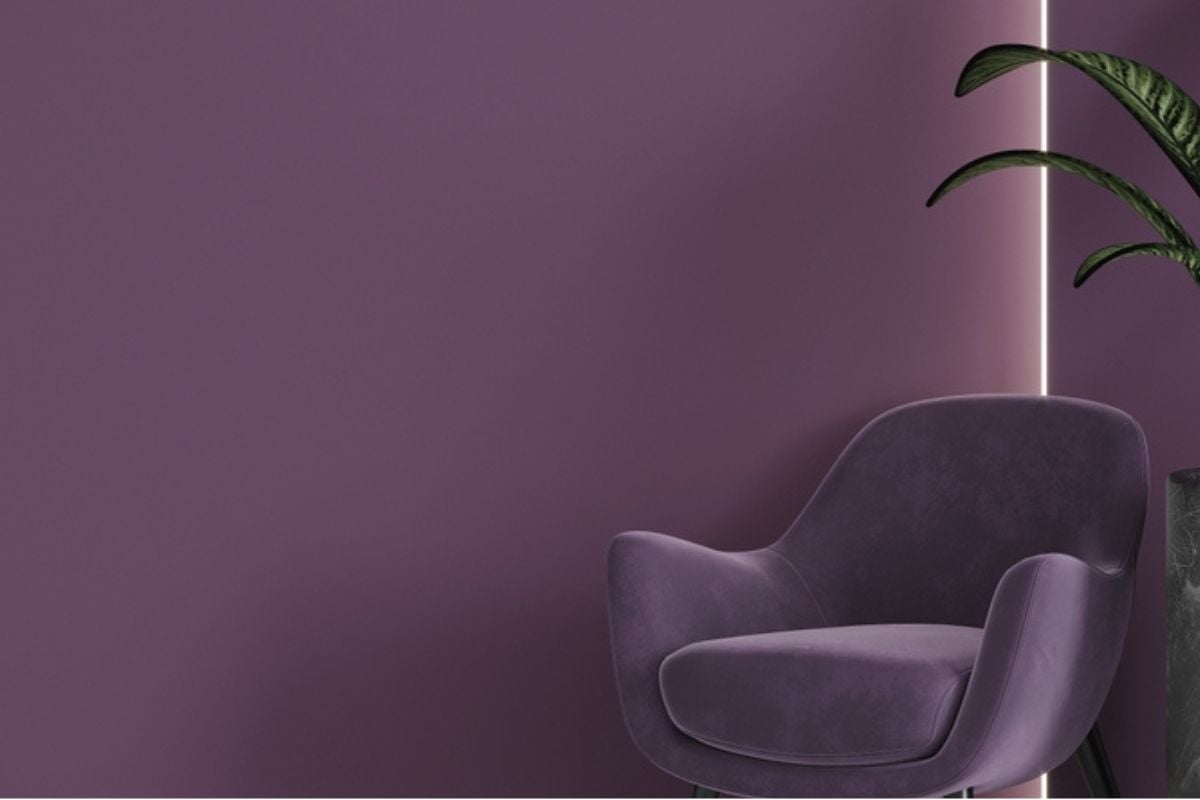
39. Royal Purple Bedrooms Feel Heavy

Deep purple skews red under warm bulbs and blue in daylight, causing moody shifts that many buyers interpret as gloomy or cramped. Dark saturated hues require multiple coats to cover, so shoppers mentally add repaint costs to the list price. Primary bedroom spaces sell best when they telegraph rest, not drama.
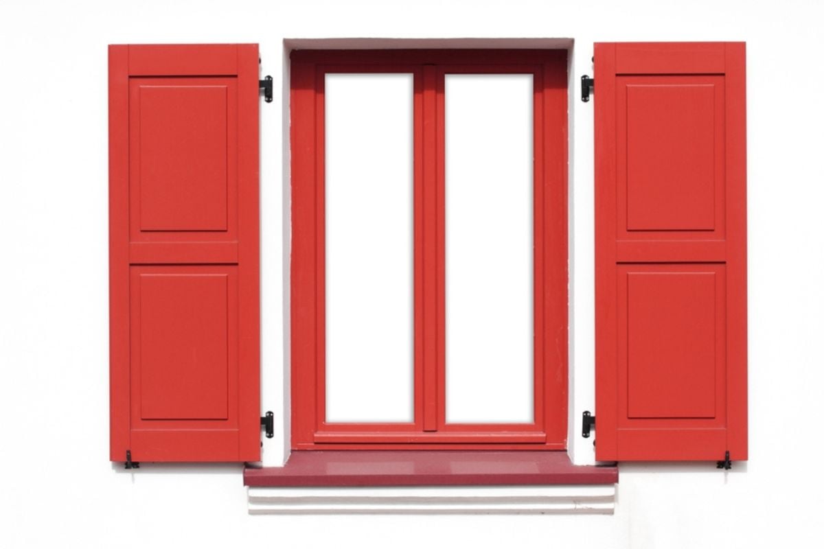
38. Canary Yellow Front Door Blinds
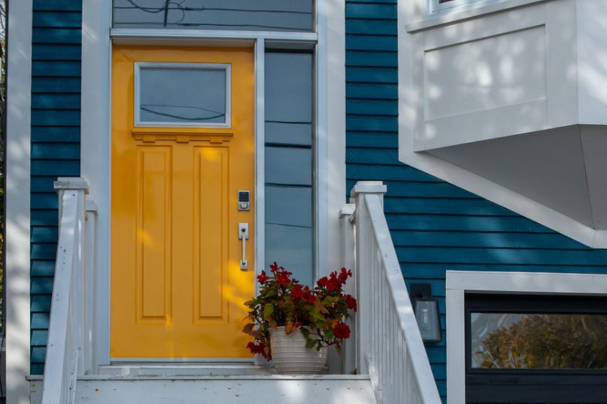
High-chroma yellow reads garish outdoors, bouncing glare onto trim and making neighboring colors look dingy. Curb appeal hinges on harmony, and this shade jars against brick, stone, and most roof tones. Buyers imagine HOA letters and a weekend with sandpaper; neither helps your offer count.
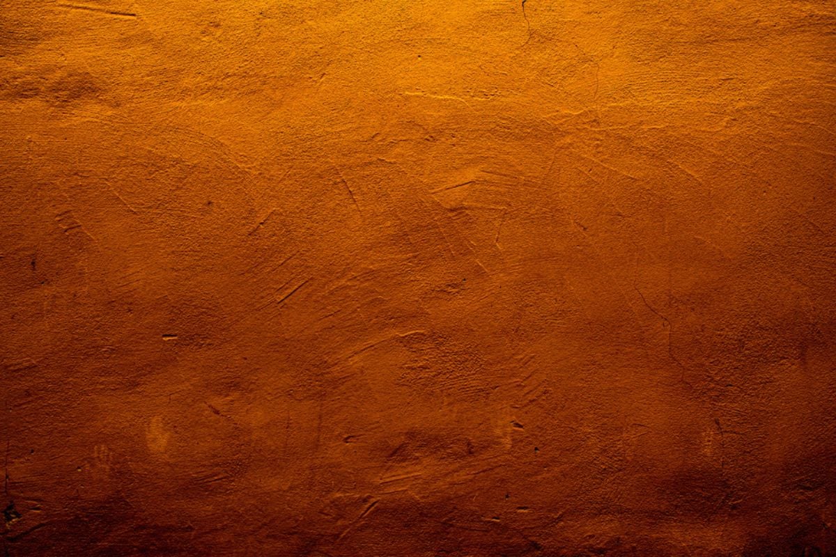
37. Rusty Terracotta Everywhere Fatigues
Southwest-inspired terracotta on every wall turns warm into oppressive, especially in smaller spaces with limited daylight. The color amplifies red undertones in floors and counters, making finishes look older than they are. Today’s buyers prefer a lighter Mediterranean nod—muted clay accents, not floor-to-ceiling kiln.
36. Muddy Taupe With Green Cast

What looks like sophisticated greige in the store can skew swampy on-site, especially under cool LEDs. That murky green undertone clashes with wood floors and beige carpets, leaving rooms feeling sickly. Buyers sense “off” even if they can’t name it, and they’ll budget to correct it.
35. Copper-Penny Orange Brown Dates
This penny-toned brown pushes orange highlights that make trim look pink and granite look blotchy. It photographs unevenly, exaggerating texture on otherwise smooth drywall. Most will see a 2000s Tuscan throwback and plan a full neutral reset before moving day.
34. Saturated Turquoise Aqua Distracts
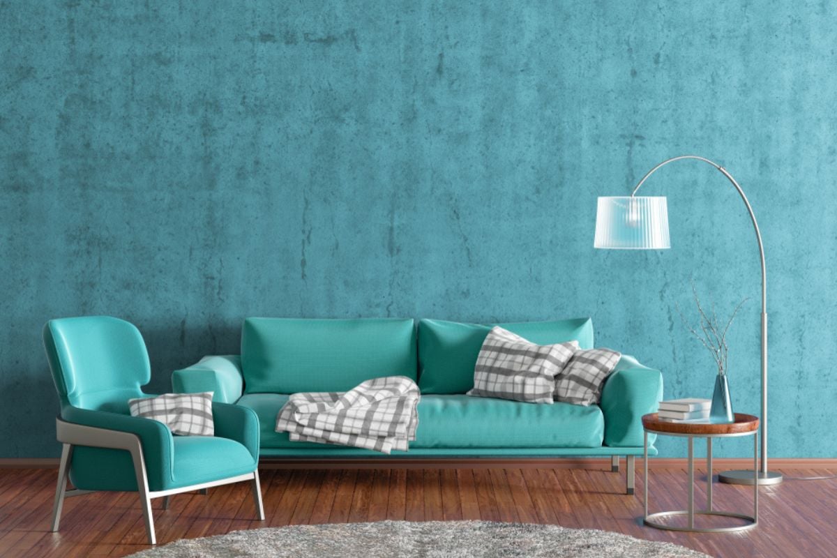
Bold tropical aqua dominates sightlines and fights with natural views outside the windows. It limits staging options because most upholstery and wood tones skew either too cool or too warm against it. Buyers think “vacation rental,” not “permanent home,” which can pull offers down.
33. Fuchsia Statement Walls Repel Buyers

Fuchsia and magenta spike saturation, causing skin tones to look odd during showings and in listing photography. They also cast color onto ceilings and adjacent rooms, magnifying repaint labor. Trend-forward in a boutique, sure—on living room walls it reads high-maintenance.
32. Chartreuse Accent Walls Startle
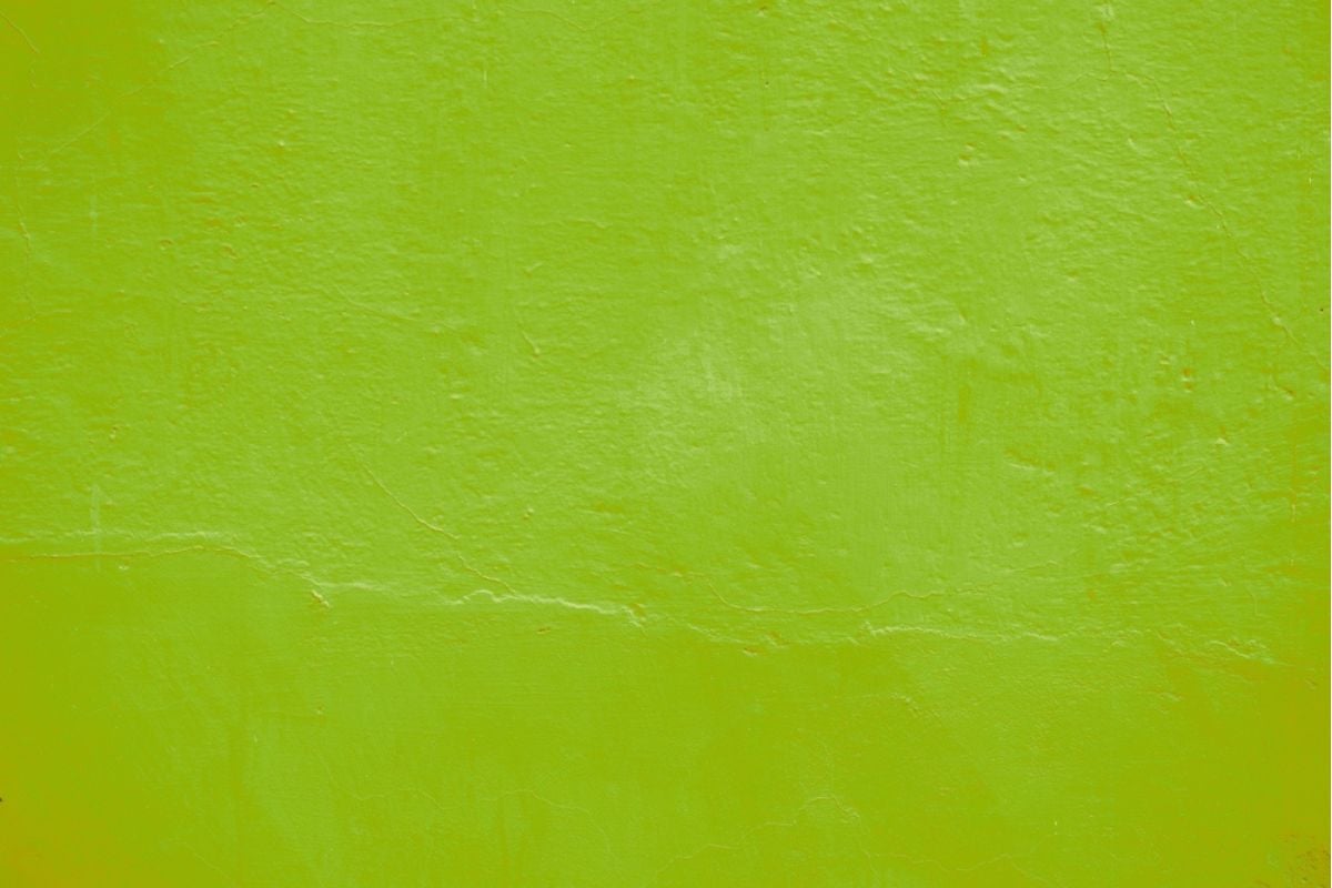
Chartreuse vibrates on camera and in person, creating visual fatigue that shortens tours. It also clashes with common fixed finishes like oak, maple, and warm tile. Buyers fear bleed-through and multiple primer coats, which quietly lowers perceived value.
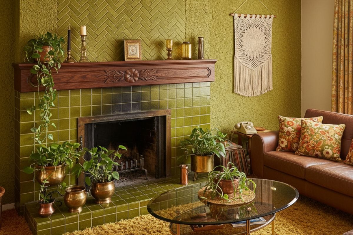
31. Olive Drab Military Green Depresses

Olive’s gray-brown base can feel muddy, particularly in rooms without bright southern light. It makes white trim look dirty rather than crisp, cutting into that fresh, move-in-ready impression. Unless you’re marketing a hunting lodge, it narrows appeal and pads the repaint budget.
30. Yellowed “Nicotine” White Ages
Off-whites with heavy yellowing read like residue, even in smoke-free homes, and they flatten natural light. They also highlight the age of ceilings and crown, making them seem poorly maintained. Buyers equate “needs brightening” with “needs work,” nudging offers south.
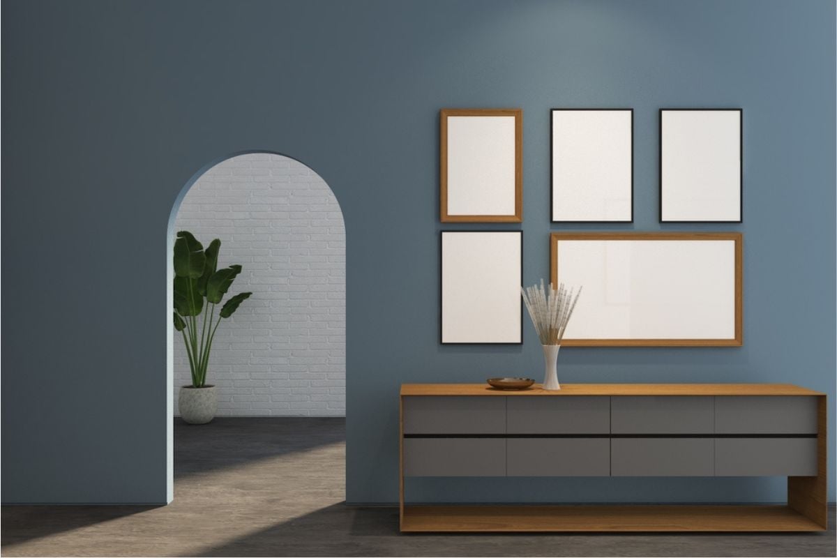
29. Cold Blue-Gray Everywhere Chills
🔥 Would you like to save this?
Blue-grays can look sleek in samples but go icy on whole-house applications, especially with cool LED bulbs. They push warmth out of wood floors and make beige rugs look dirty. The result is clinical, not calm—hardly the emotional cue that drives bidding.
28. Beige With Pink Undertones Misleads

Pink-leaning beiges turn trim and countertops salmon, throwing off every other finish. At dusk and under warm lamps, the rose cast intensifies, dating the space instantly. Buyers sense an uphill color-correction battle and discount accordingly.
27. Barn-Red Exterior Trim Narrows
Strong barn red frames windows harshly and bleeds visually into brick or cedar, making elevations look busy. It’s tough to match for future touch-ups and clashes with many roof shingles. Prospective buyers picture ladders, masking tape, and a long weekend—not a turnkey porch sit.
26. Maroon Dining Room Red Overpowers
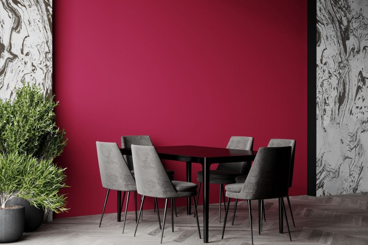
Maroon swallows light and exaggerates shadows around crown and chair rail, shrinking the room in photos. It also casts a red hue on table surfaces, making wood finishes look mismatched. Entertaining spaces sell better when they suggest versatility, not a wine cave.
25. Seafoam Hallway Green Skews Mint

Seafoam can tilt babyish in corridors, especially with cool daylight bouncing from exterior doors. It clashes with oil-rubbed bronze and antique brass hardware, creating a disjointed first impression. Buyers mentally repaint the circulation paths first—and price that labor in.
24. ’90s Mall Teal Dates Hard
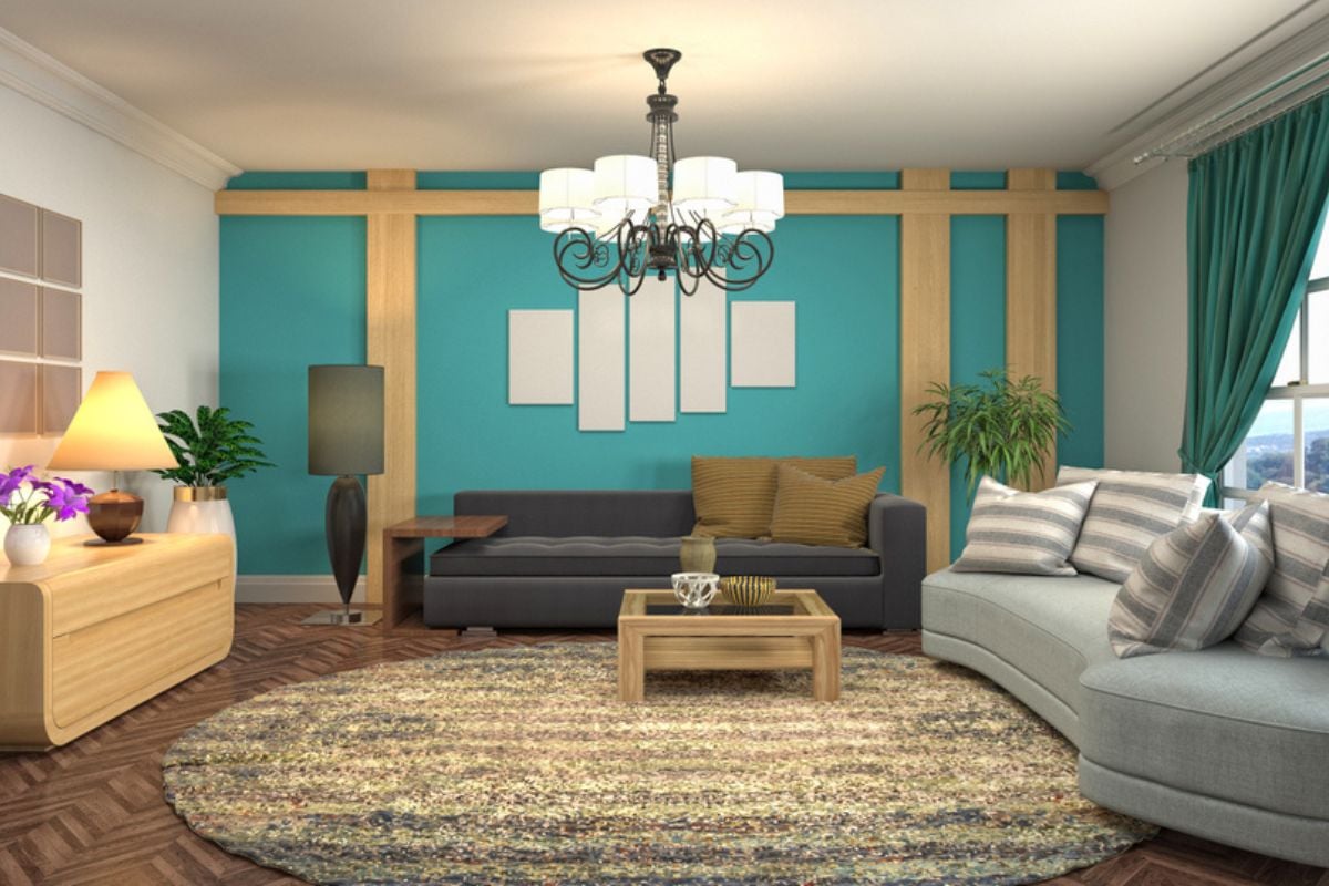
That saturated teal teleports buyers to food court aesthetics, overwhelming modern stone, quartz, and natural wood. It photographs like a filter, pulling focus from scale and layout. Fresh buyers want timeless backdrops, not nostalgia that requires a primer party.
23. Orange Sherbet Nursery Limits
Soft orange seems playful but reflects onto ceilings and trim, making whites look grimy. It also locks the room into a kid-only identity, which curbs versatility for offices or guest rooms. Family buyers prefer subtle, flexible palettes they can personalize later.
22. Overdone Kelly Green Clashes
Kelly green is powerful and hard to coordinate with common floor and cabinet finishes. On large surfaces it reads themed—think sports bar or holiday—rather than residential calm. Most stagers use it sparingly in pillows, not across drywall acreage.
21. Powdery Lavender Pastel Turns Cold
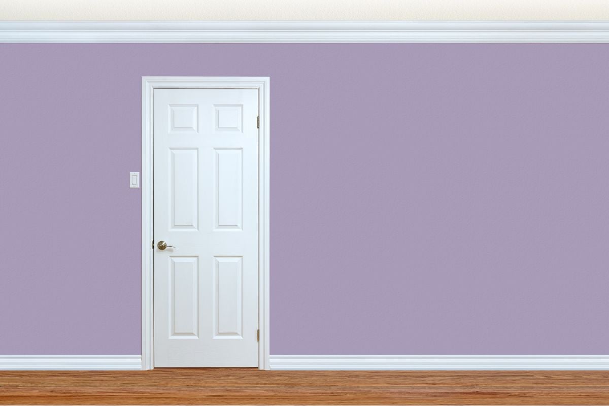
Lavender drifts blue under daylight and gray under LEDs, leaving bedrooms cool and slightly somber. It clashes with oak and maple tones, making wood look orange by comparison. Buyers imagine repainting before move-in rather than relaxing after closing.
20. Baby Blue Bathroom Feels Cheap
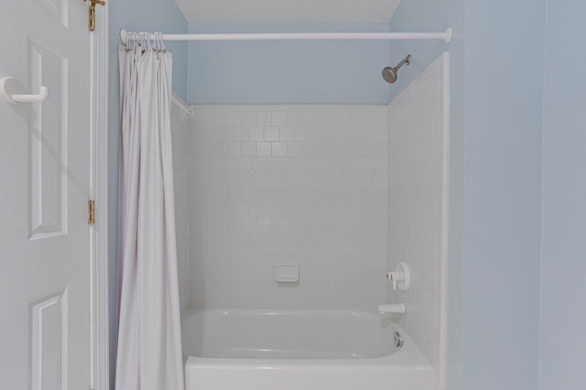
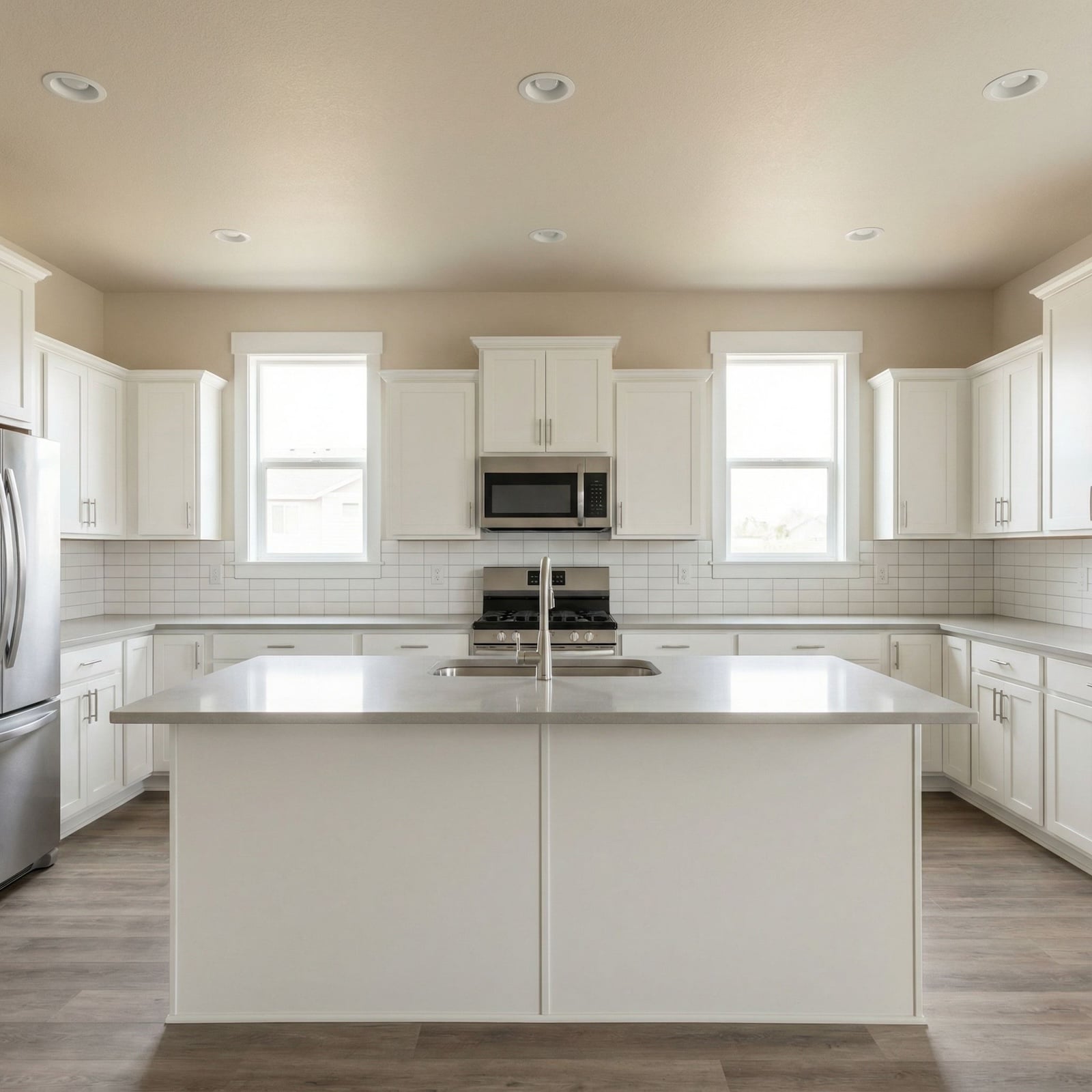
Pale blue can feel institutional when paired with white tile, echoing dated builder-grade palettes. It also makes warm metal finishes look mismatched and dull. Neutral spa tones—soft taupe, sandy beige, muted greige—outperform it in buyer surveys and photos.
19. Lime Sherbet Kitchen Green Tires

High-energy lime looks fun for a week and fatiguing by month’s end, especially in task-heavy kitchens. It competes with food colors and makes skin tones look odd under pendants. Buyers picture repainting around cabinets—a tedious, trim-heavy job.
18. Blinding Sunshine Yellow Overstimulates
Strong yellow elevates visual stress and casts a harsh glow onto ceilings and floors. It also fades unevenly in sunny rooms, telegraphing roller marks and patchwork. Calm neutrals hold better in listing photos and widen the offer pool.
17. Flesh-Tone Sandy Peach Awkward
🔥 Would you like to save this?
Peach with beige undertones too closely matches skin, producing uncomfortable, sallow reflections during showings. It can make counters and carpets read as stained even when spotless. Buyers react emotionally here, and that reaction is rarely “I’ll pay more.”
16. Hospital Mint Green Sterilizes
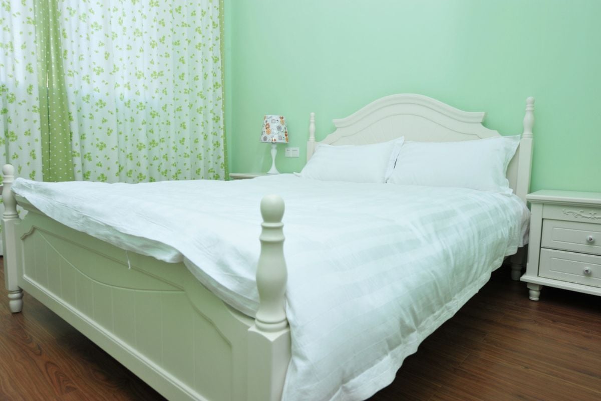
Minty pastels paired with white trim conjure clinical spaces instead of cozy ones. The hue drains warmth from wood and leather, undercutting staging investments. Shoppers prefer wellness, not ward—soft sages and warm neutrals outperform every time.
15. Jet-Black Bedroom Walls Oppress
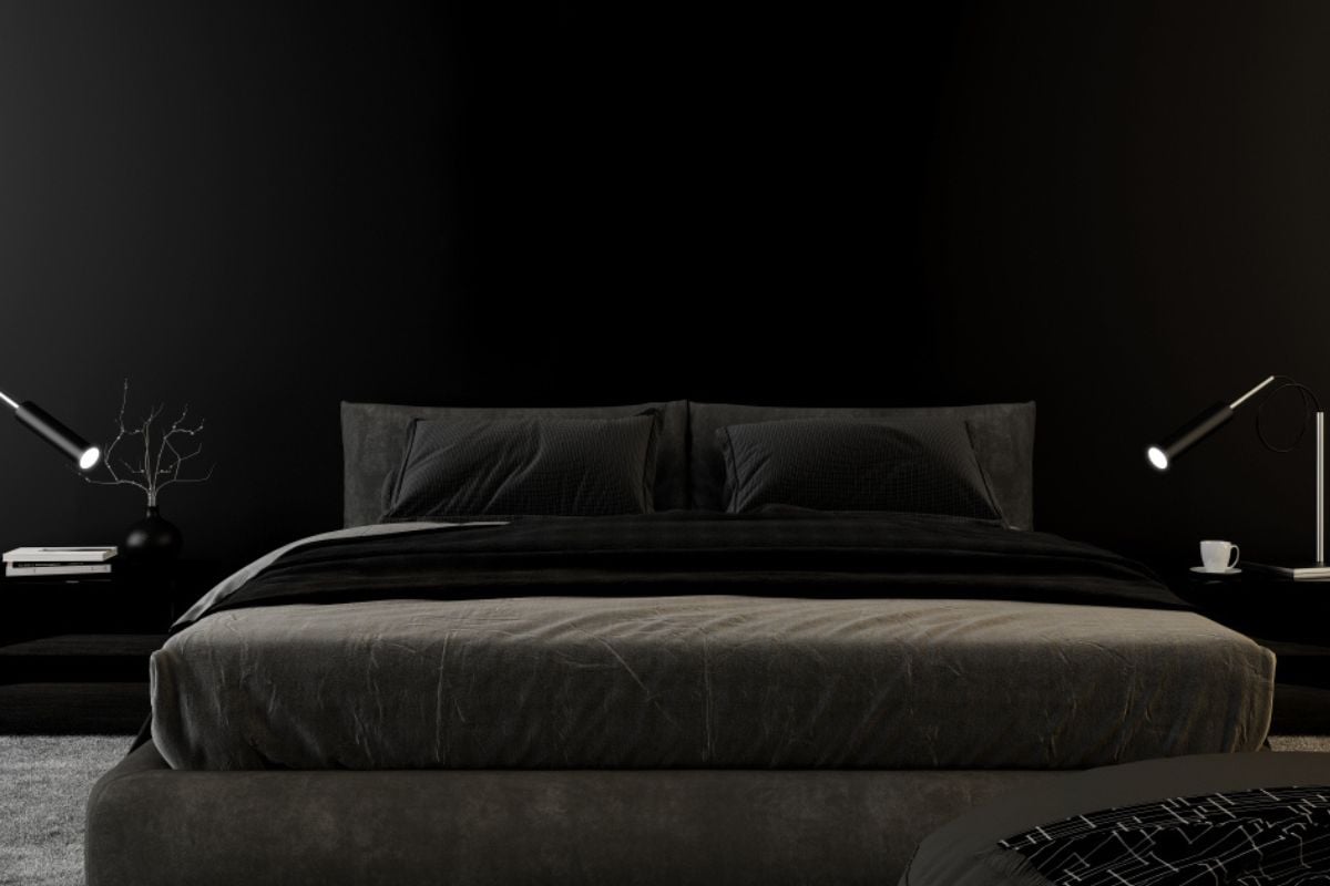
Black walls absorb light and compress perceived square footage, particularly in standard bedrooms. They also require meticulous prep and multiple coats to reverse, adding cost. Buyers shopping for rest don’t want a cave to conquer immediately after closing.
14. Dark Charcoal Everywhere Exhausts
Charcoal can be elegant as an accent, but whole-home applications feel heavy and unforgiving. It magnifies wall imperfections and shows lint, dust, and scuffs in photos. Most buyers want relief and brightness; this delivers homework and touch-up lists.
13. Almost-Black Navy Blue Overpowers
Near-black navies look sophisticated on cabinets but oppressive on broad walls, especially in hallways. They shift dramatically under daylight, complicating decor decisions for buyers. Expect mental math about primer counts and a lower starting offer.
12. Heavy Hunter Green Darkens
Hunter green flattens rooms without strong natural light and clashes with common flooring stains. It also reads season-specific, suggesting holiday decor year-round. Neutral sages and olives sell the vibe without the repaint penalty.
11. Chocolate Cave Brown Weighs Down
Deep brown swallows edges and shortens sightlines, shrinking rooms on camera. It amplifies red tones in oak and cherry, making trim feel outdated. Buyers expect to brighten immediately, and they’ll discount to fund it.
10. Burgundy Wine Red Dominates
Burgundy telegraphs a dated “formal dining” look that today’s open plans rarely support. It casts red onto ceilings and white trim, complicating coverage later. Most shoppers imagine steaming wallpaper; the feeling isn’t far off.
9. Tuscan Gold Yellow Time-Warps
Goldenrod Tuscan shades lock homes into the 2000s faux-finish era. They fight with gray stone, marble veining, and cool metal finishes. Buyers craving contemporary calm will mark down for a primer-and-roll weekend.
8. Burnt Pumpkin Orange Overheats
🔥 Would you like to save this?
Spicy orange reads festive in October and oppressive the other eleven months. It makes tile and granite flash unwanted red undertones, aging kitchens and baths. Broad appeal lives in warm neutrals with subtle depth, not holiday hues.
7. Deep Eggplant Aubergine Suffocates
Eggplant feels luxe in small doses but quickly turns theatrical across full walls. It photographs almost black, wiping out architectural detail that helps sell square footage. Buyers anticipate stubborn coverage and budget to erase it.
6. Pepto-Bismol Pink Turns Twee
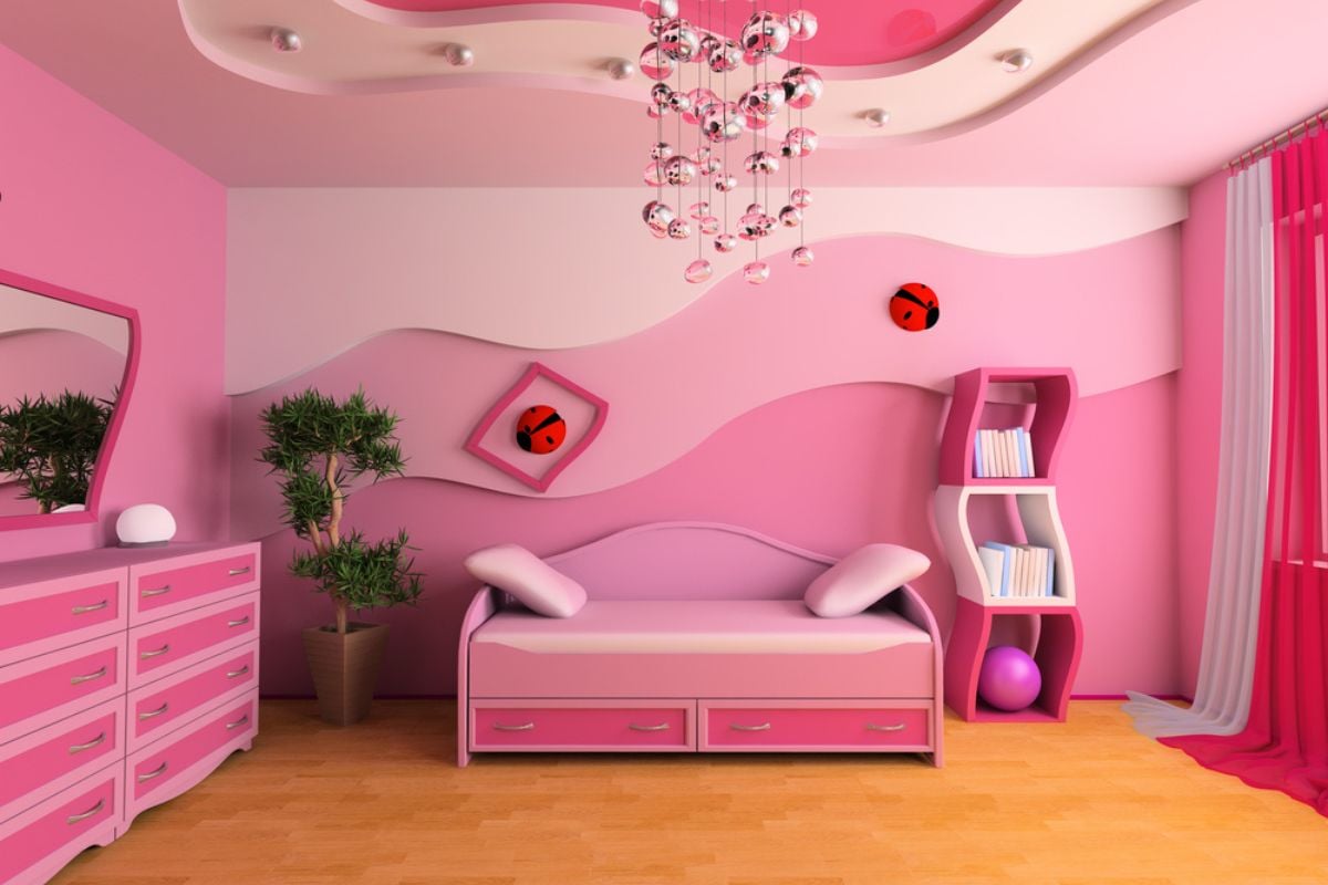
Saccharine pink flattens daylight and makes trim look dingy by comparison. It also traps rooms in a narrow aesthetic lane, limiting buyer imagination. The instant “repaint” reaction chips away at perceived, move-in-ready value.
5. Muddy Mustard Yellow Stains
Mustard carries brown undertones that mimic nicotine residue in photos and person. It clashes with cool countertops and stainless appliances, dating kitchens. Most buyers read it as grime, not warmth—and price accordingly.
4. Avocado Appliance Green Time-Capsules
This retro green turns everything around it older, including perfectly good floors and cabinets. It argues with modern quartz and brushed metals, suggesting piecemeal upgrades. Buyers see a theme park, not a timeless backdrop for their furniture.
3. Grape Soda Purple Cartoonizes
High-chroma purple vibrates under LED light and bleeds onto ceilings, creating a toy-like effect. It clashes with both cool and warm woods, shrinking staging options. The fix requires heavy priming, which buyers mentally subtract from your asking price.
2. High-Gloss Primary Red Agitates
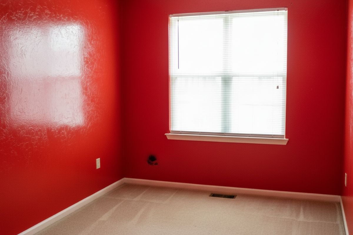
Glossy red reflects like a fire truck, showing every roller line and patch. Psychologically it reads urgent, not restful, which shortens showing time. Most buyers will plan to neutralize immediately and negotiate to fund it.
1. Neon Chartreuse Electric Lime Screams
Neon lime overwhelms vision, dominates photos, and makes adjacent neutrals look dirty. It’s notoriously hard to cover, often demanding stain-blocking primer and multiple coats. Instead of “move-in ready,” buyers hear the buzzing of a paint shaker—and adjust offers down.