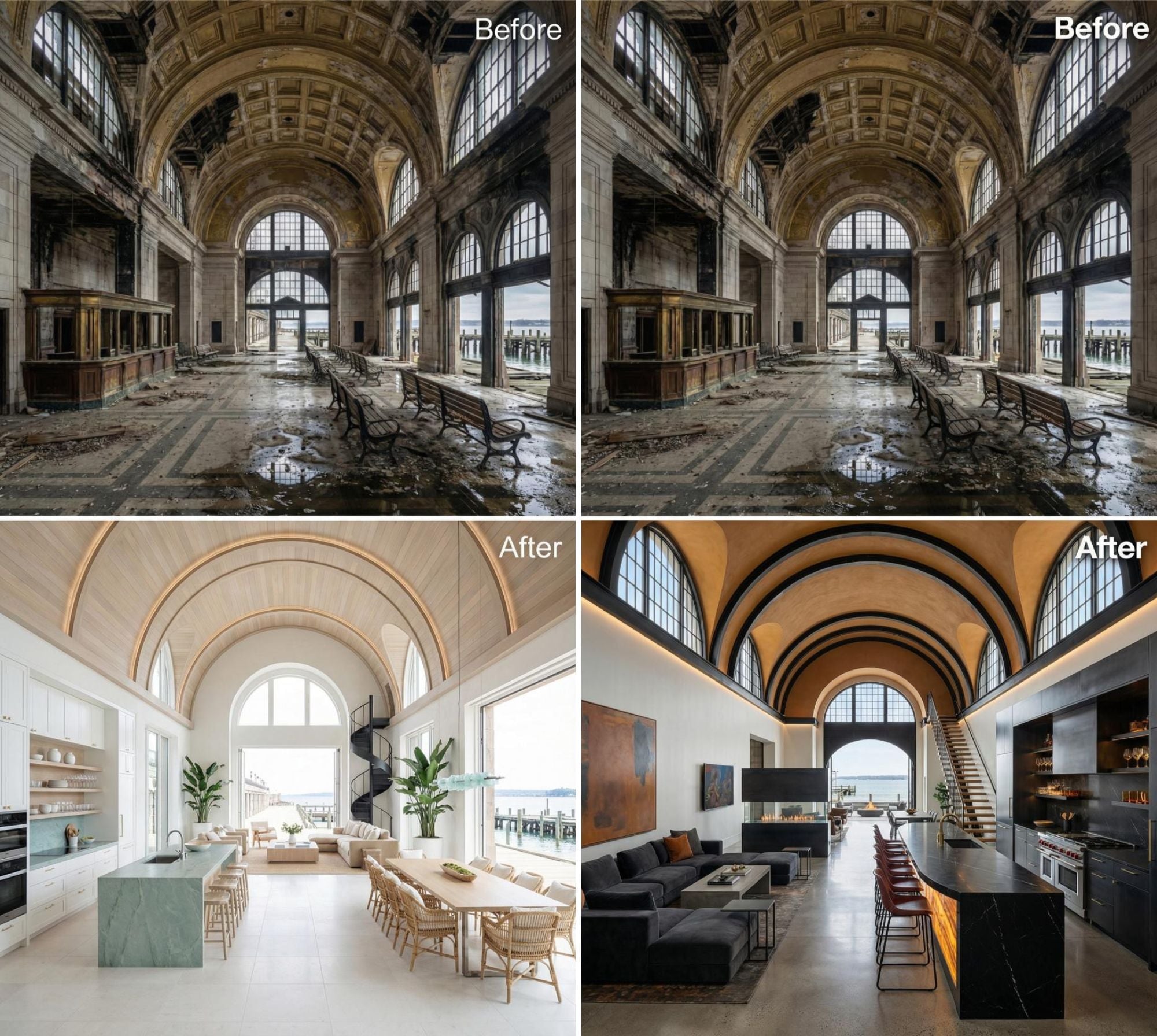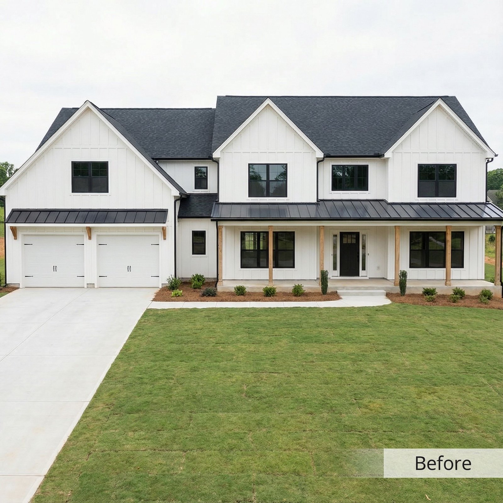
Great design walks a fine line between personal expression and universal appeal, and nowhere is that balance tested more than in our homes. Certain choices—whether made out of habit, convenience, or passing trends—can unintentionally broadcast the wrong message, leaving visitors with the impression that style and substance were afterthoughts.
In order to come up with the very specific design ideas, we create most designs with the assistance of state-of-the-art AI interior design software. Also, assume links that take you off the site are affiliate links such as links to Amazon. this means we may earn a commission if you buy something.
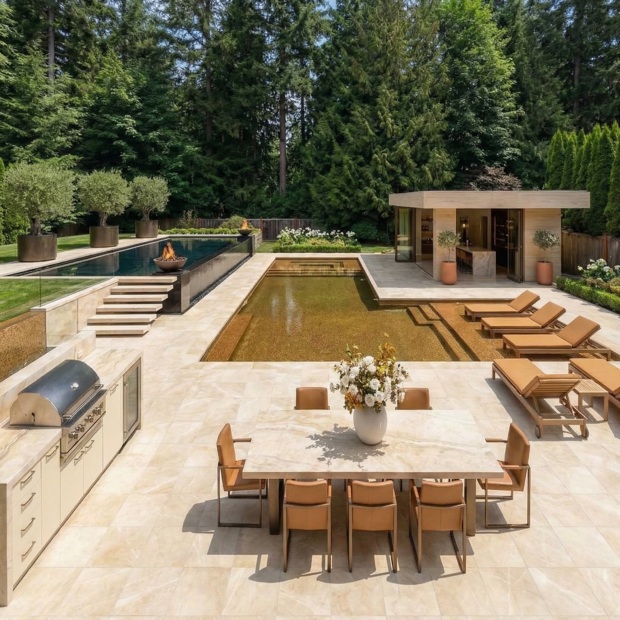
Real estate agents and design experts alike agree that these features don’t just date a property, they can actively hurt resale value by making spaces feel cheaper, smaller, or less functional than they are. From awkward layouts to overdone finishes, here are 29 home features that consistently make guests and potential buyers think, “This house has no taste.”
29. Matchy-matchy 7-piece furniture suites
Buying an entire showroom set ensures everything technically “coordinates,” but it also erases the layered textures, mixed finishes, and scale variation that make a room feel designed rather than delivered. Uniform stain colors, identical legs, and cloned hardware flatten depth and kill the sense of proportion, which is why these rooms photograph like rental staging.
Real estate agents notice buyers move through faster because there’s nothing for the eye to study, while appraisers mentally log “builder-basic” because the furnishings telegraph a lack of investment in the envelope. Curating pieces across eras and materials—say, linen with leather, wood with stone—generates perceived value without increasing square footage.
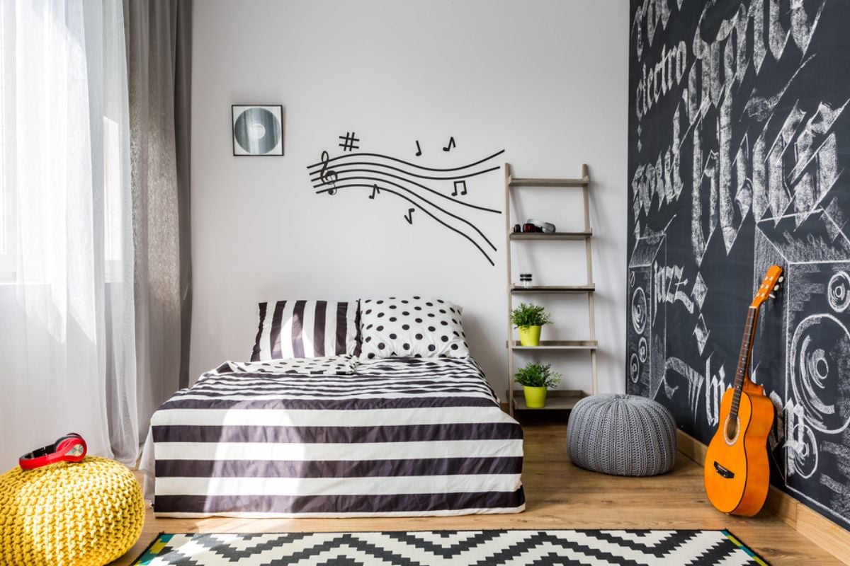
28. Word-art signs and cliché typography decor
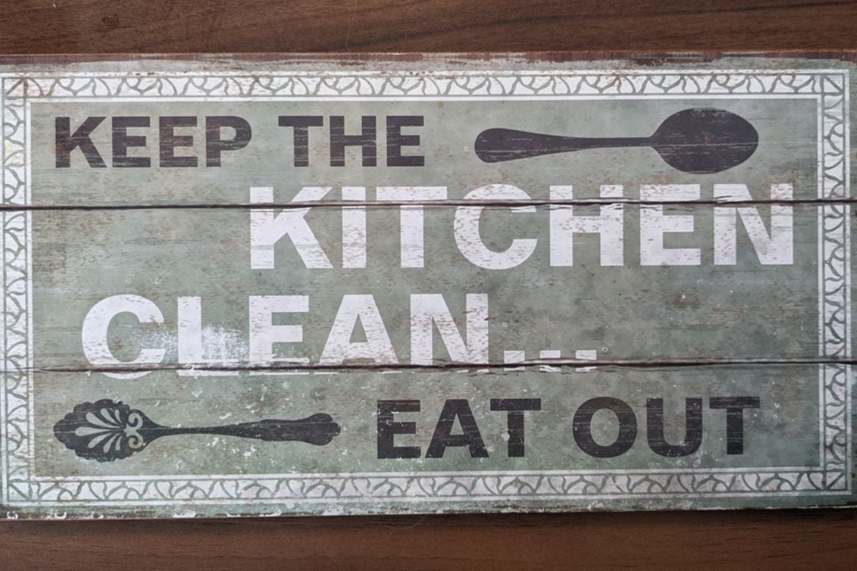
When walls announce instructions—“Gather,” “Blessed,” “Eat”—they replace visual storytelling with literal slogans, which dates a space as quickly as a meme. Typography plaques are produced in bulk sizes and finishes, so scale and patina rarely match the architecture, and they become noise rather than focal points.
In walkthroughs, buyers subconsciously downgrade these rooms because they read as merchandise, not memories or art, and they assume the rest of the home is decorated to the same lowest common denominator. Replace slogans with original art, maps, or textiles sized to the wall so composition, color, and subject carry the message quietly and credibly.
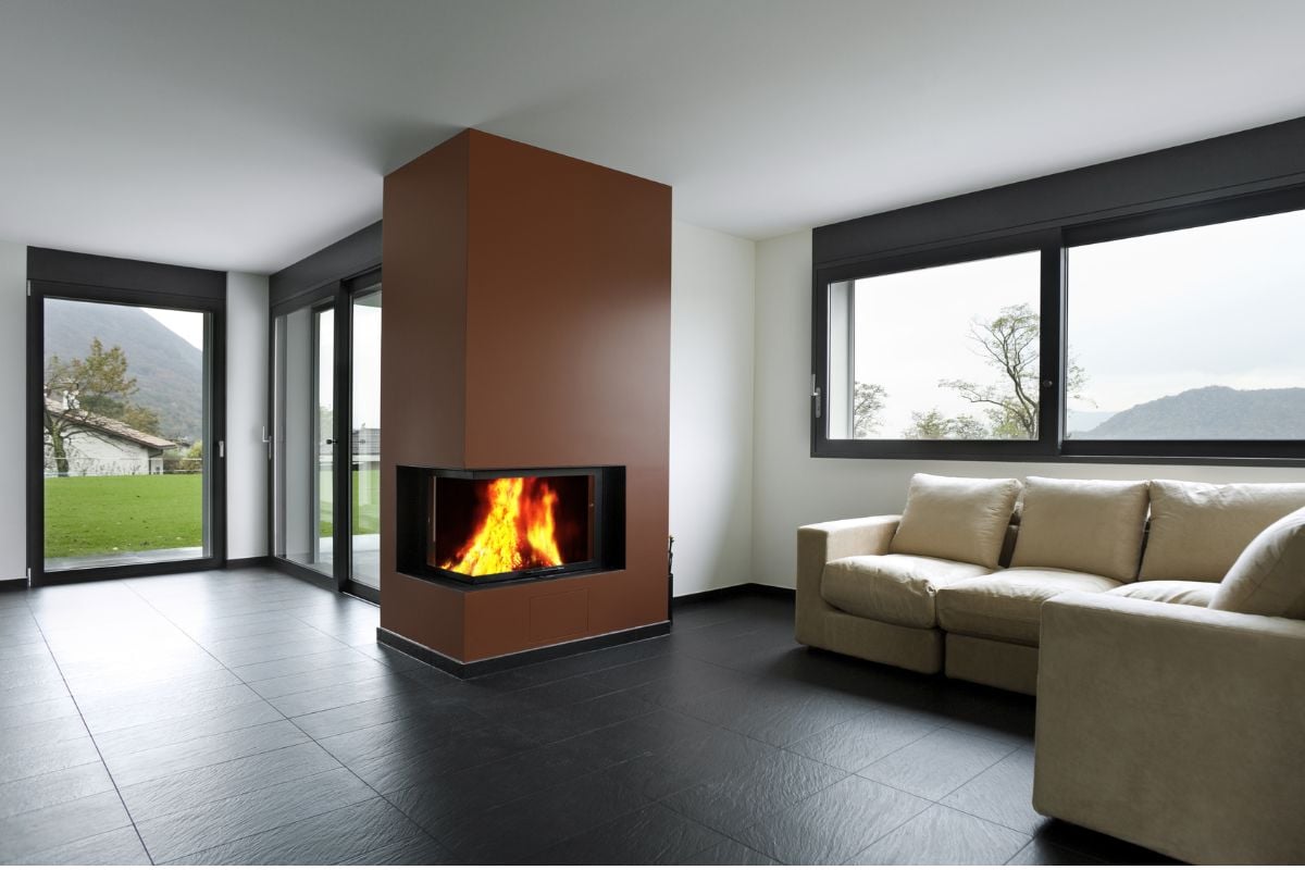
27. TV mounted way above the fireplace mantle
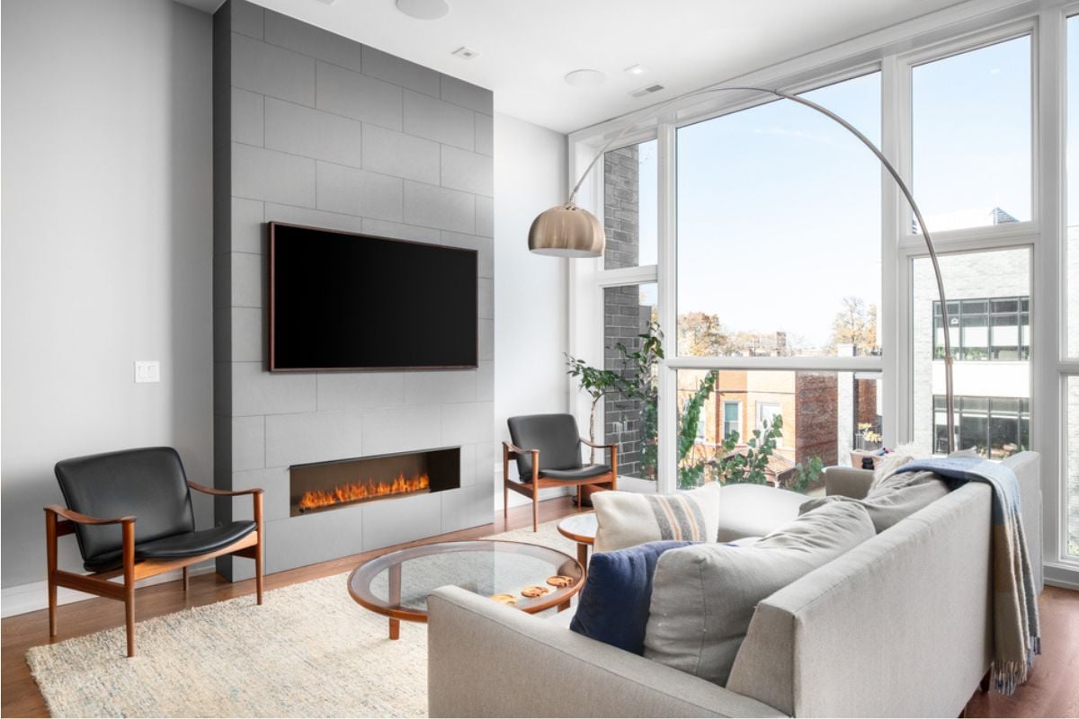
Screens parked over mantels push the centerline well above seated eye level, forcing a sustained upward gaze that results in neck strain and poor image quality due to off-axis viewing. Fireplaces also generate heat and soot, which can shorten panel life and demand more frequent cleaning, and the wiring compromises often reveal themselves during inspection.
From a planning standpoint, seating must drift to accommodate both flame and screen, which fractures conversation zones and wastes square footage. The fix is simple: keep the display around seated eye height on a dedicated wall or integrate a low, cooled recess with proper cable routing so comfort, acoustics, and safety aren’t afterthoughts.
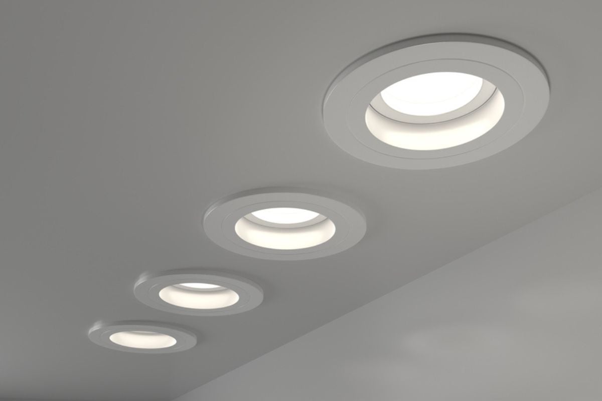
26. Builder-grade dome lights everywhere
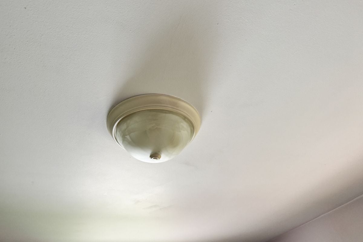
Those flush-mount domes blast a single pool of glare, producing hot centers and dim corners, which emphasizes drywall texture and makes paint read cheaper. Because they rely on one overhead source, faces get shadowed and surfaces flatten, sabotaging photographs and first-showing impressions that drive offers.
Electrical plans that add semi-flush fixtures, sconces at eye level, and lamps at seated height create vertical layers of light, improving color rendering, sightlines, and even perceived ceiling height. A handful of targeted replacements transforms circulation spaces and primary rooms without opening walls or touching finishes.
25. All-gray “greige” everything with no contrast
Monochrome gray walls, flooring, upholstery, and rugs deprive rooms of contrast, so edges blur, objects merge, and the space reads smaller than it is. Without warm woods, saturated textiles, or black accents to ground the palette, lighting temperature swings look harsher and natural light appears colder.
Prospective buyers often call these homes “flat” because the eye has no anchor, which reduces emotional connection and perceived value. Keep neutral envelopes, but introduce dark joinery, warmer metals, and natural materials so the grayscale becomes a backdrop, not the entire story.
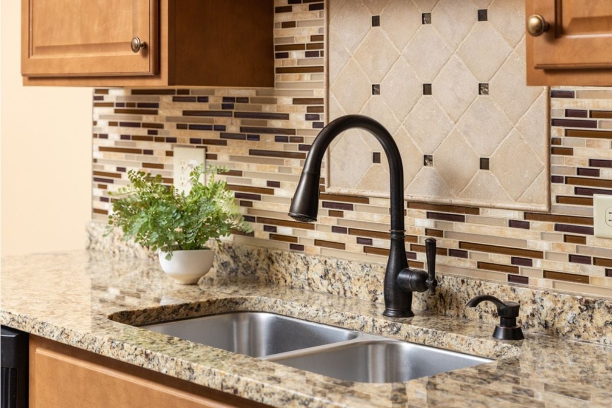
24. 2000s “Tuscan” kitchens (tumbled travertine + brown speckled granite)
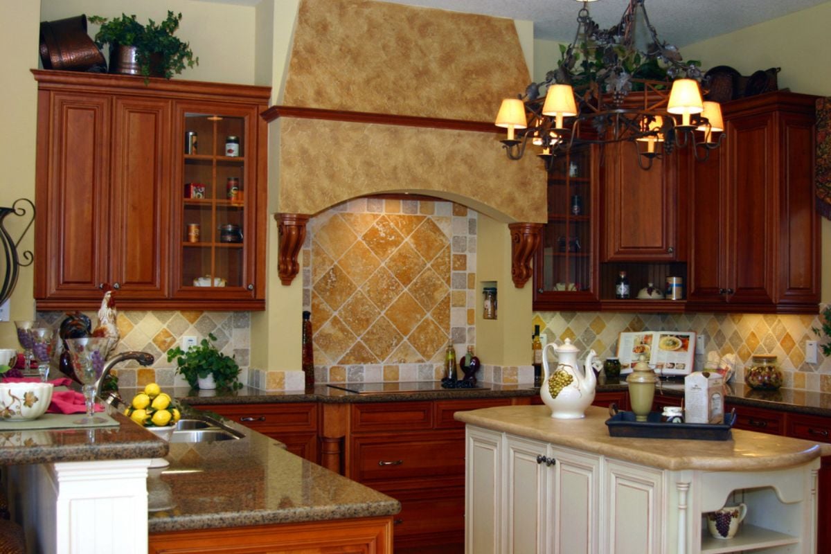
The heavy trio of dark cherry, ornate corbels, and variegated brown granite absorbs light and creates visual clutter at every seam, making even generous kitchens feel compressed. Travertine with deep pits catches grime and forces constant sealing, while ogee edges and busy tile patterns date the space to a narrow renovation window.
Buyers translate the look into future costs because updating requires surface changes across cabinets, counters, backsplash, and lighting. Simplifying to cleaner door profiles, matte or honed slabs, and restrained hardware reclaims square footage visually and modernizes function without moving plumbing.
23. Lick-and-stick stone veneer & non-functional shutters

Thin veneer applied to random sections reads as applique, not structure, because it ignores logical terminations at corners, foundations, or lintels. Likewise, shutters that can’t close over the window opening or are screwed directly to the siding advertise themselves as props rather than shading devices.
Curb appeal and appraisal both benefit when materials appear honest—real masonry at plinths, lap siding where it belongs, and operable or correctly scaled shutters with visible hinges. Aligning materials with proportion and purpose prevents the “costume façade” effect that turns buyers off before they reach the door.
22. Barn doors where you need privacy (especially bathrooms)
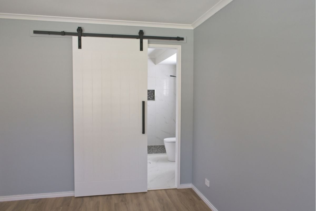
Sliding barn doors leave perimeter gaps and ride on exposed tracks, so they leak sound and light, which undermines the core job of a bathroom or bedroom door. They also require wide clear wall space for travel, blocking outlets and art placement while diminishing furniture options.
Inspectors and buyers alike flag them for poor latching and inadequate smoke separation when used on bedrooms off halls. Keep the hardware where sightlines benefit—pantries, offices—and specify solid, properly hinged doors with thresholds where privacy and fire separation matter.
21. Popcorn ceilings and heavy orange-peel textures

Coarse ceiling texture traps dust, highlights patchwork under oblique light, and drops a timestamp on the home the instant someone looks up. Because texture scatters light, rooms feel dimmer and shorter, and any new fixtures throw exaggerated shadows that make finishes appear cheaper.
Removal or overlay with fresh gypsum and a level-five skim significantly improves reflectance and photographs cleaner, which directly influences perceived condition during listings. Where budgets are tight, strategic smoothing in key rooms—entry, living, primary—delivers an outsized return.
20. Mirrored walls and smoked-mirror closet sliders
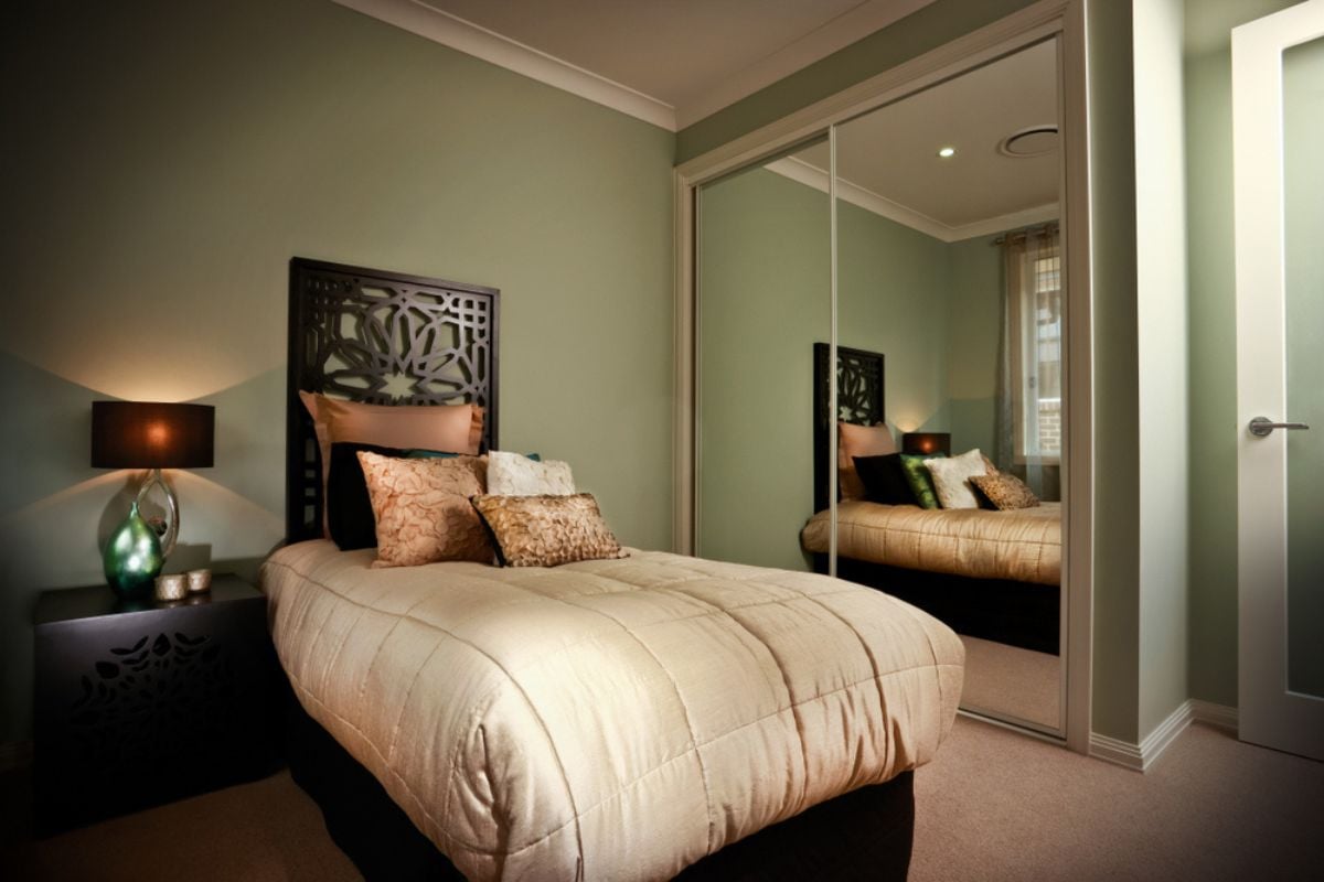
Full-wall mirrors double clutter, create confusing depth cues, and reflect views you’d rather edit, which is why they feel chaotic rather than spacious. Smoked panels tint daylight and skew color perception, making finishes read dingy even when they’re clean.
Beyond aesthetics, older mirror adhesives can fail at edges, telegraphing age and deferred maintenance to buyers. Replace with paneled doors or framed mirrors sized to the task so reflection becomes a designed tool, not an accidental environment.
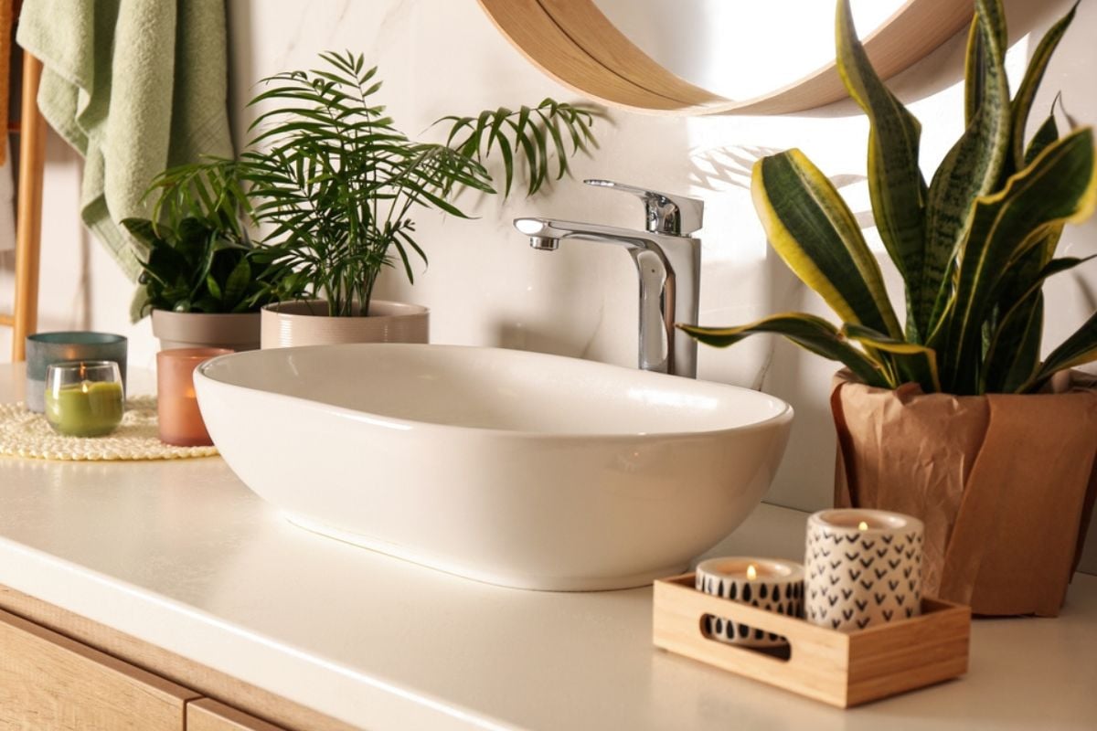
19. Vessel bowl sinks that splash
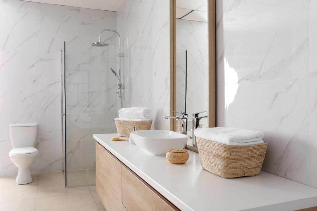
Above-counter bowls raise the rim height, forcing awkward ergonomics and increasing splash across counters and floors, particularly with standard-height faucets. Water and soap collect at the seam where bowl meets deck, encouraging mildew and making daily cleaning more tedious than necessary.
Appraisers don’t credit them because function, not novelty, drives bathroom value, and buyers frequently budget to remove them. An undermount or integrated trough provides generous workspace, better drainage, and quieter operation without style compromise.
18. Faux-distressed “shabby chic” on every surface
Artificial wear patterns repeat the same sand-through at corners and pulls, which the eye reads as counterfeit once it appears on every cabinet and frame. Overuse competes with actual materials—oak grain, stone veining, metal patina—so nothing looks authentic and everything feels theatrical.
In resale, buyers assume they must strip and repaint to reset the baseline, inflating perceived project scope. Limit distressing to a few genuine vintage pieces and let intact, well-finished surfaces signal care and longevity.
17. Only recessed cans—no lamps, sconces, or task lighting
🔥 Would you like to save this?
Recessed cans flood floors but leave faces in shadow and walls underlit, which makes art flat and corners gloomy. Without sconces, pendants, or lamps, light levels can’t adapt to activities—cooking, reading, conversation—so rooms feel either stark or dim.
Showings benefit from vertical illumination that brightens walls and cabinetry, making spaces read wider and higher at the same wattage. A layered plan with controllable zones and varied heights delivers drama, comfort, and better energy use.
16. RGB color-changing LED strips outlining every edge
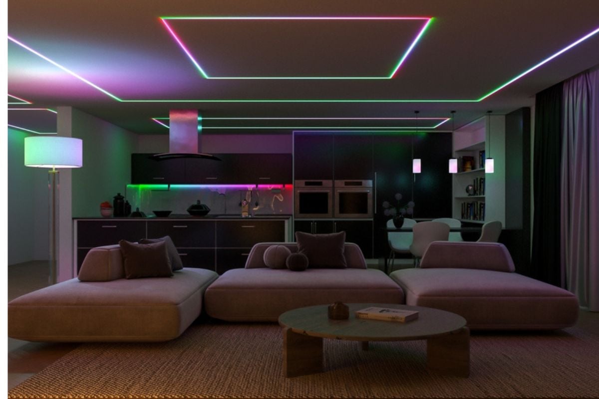
Accent LEDs belong where they serve tasks—under cabinets, in coves for indirect wash—not where they trace every plane like a theme-park queue. Constant color-shifting fatigues the eye and cheapens otherwise solid millwork, and many low-cost strips exhibit poor color rendering that distorts finishes.
During tours, buyers struggle to visualize calm, neutral lighting when the baseline is nightclub mode. Keep strips dimmable and static for function, and let architecture define the geometry rather than glow tape.
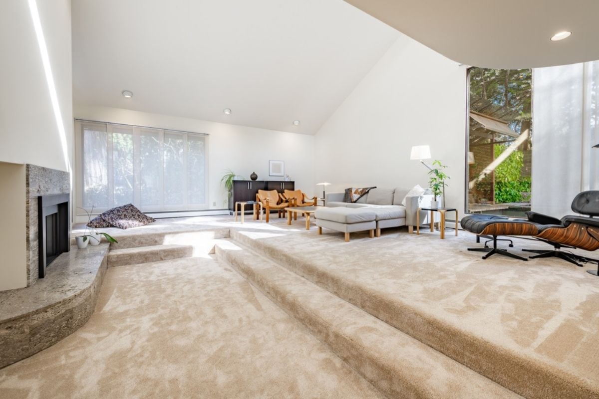
15. Corner fireplaces and random angled walls
Angled elements complicate furniture layout by breaking the orthogonal grid that supports seating groups, media placement, and circulation. Corner hearths often steal two walls at once, shrinking usable footage and forcing sofas into diagonal float positions that waste space.
Appraisers can’t add square footage for “interesting angles,” and buyers mentally subtract for perceived awkwardness. Center a focal point on a straight wall or box out niches to return clear, rectangular planning.
14. Wall-to-wall carpet in bathrooms or dining rooms
Carpet absorbs moisture and food debris, leading to persistent odors, staining, and concerns about unseen subfloor issues. In bathrooms, it hides leaks until they’re expensive; in dining rooms, it telegraphs “crumb trap” and deters entertaining.
Inspectors scrutinize these areas because ventilation and hygiene are compromised, which invites repair requests. Hard, cleanable finishes like porcelain, sealed stone, or site-finished wood keep maintenance predictable and buyer confidence high.
13. Gilded “statement” faucets in basic builder baths
High-gloss gold on laminate vanities and chrome towel bars spotlights the mismatch rather than elevating the room, much like luxury rims on a base-model car. Trend finishes with low-quality valves scratch and pit faster, sending a “quick flip” signal to buyers who look closely at hardware.
Value increases when fundamentals—solid vanity boxes, better counters, real mirrors, proper lighting—come first, because they’re durable improvements. Once bones improve, restrained metal choices read as polish, not costume.
12. Granite tile counters with 4-inch backsplashes and ornate edges
Tile counters introduce dozens of grout joints that harbor stains and bacteria, and the short backsplash chops the wall, making uppers feel heavy and dated. Ogee or bullnose edges compete with cabinet profiles, adding visual clutter where a clean line would calm the composition.
Buyers read the assembly as budget-driven and immediately price a slab replacement into offers. A single material from counter to full-height backsplash modernizes the sightline and simplifies cleaning in one move.
11. Oversized jetted tubs that crowd out the shower
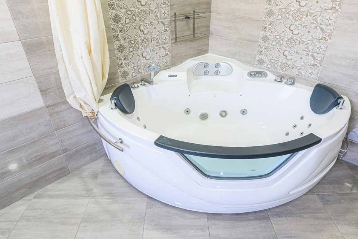
Most households prioritize daily showers, so a large whirlpool that steals square footage from the shower lowers functional value even before maintenance is considered. Jetted systems harbor biofilm unless cleaned meticulously, and aging pumps are noisy and failure-prone, which buyers understand as future expense.
Converting space to a larger, well-lit shower with low threshold, niches, and proper ventilation increases real utility and broadens appeal. If a tub remains, a compact soaking model paired with a generous shower balances ritual and reality.
10. Theme rooms (Tiki, safari, casino) in adult living spaces
Hyper-literal themes lock you into specific colors, textures, and props, reducing flexibility for furniture and making scale mistakes harder to hide. What charms for an hour feels oppressive daily, and buyers struggle to see past murals, thatch, or novelty lighting.
Because editing requires paint, flooring, and often millwork changes, they mentally assign renovation costs during tours. Evoke mood with palette and materials—rattan, linen, sisal—while keeping architecture and large pieces adaptable.
9. Open kitchen shelving used for everyday storage (dust traps)
Open shelves demand constant styling and cleaning because airborne grease and fine dust settle on plates and glasses, especially near ranges without robust ventilation. Daily-use stacks creep into mismatched towers that visually clutter, undermining the calm work triangle serious cooks want.
Buyers equate the look with “high maintenance,” which translates to lower enthusiasm even when the cabinets are otherwise new. Reserve open shelves for a few display items and keep the workhorse gear behind doors and drawers with inserts that earn their keep.
8. Over-scented plug-ins and candles masking odors
Strong fragrance suggests you’re covering moisture, pet, or smoke issues, prompting buyers and inspectors to probe harder for sources. Many synthetic scents also skew how paint and finishes read, and they can trigger sensitivities that cut a showing short.
Clean air, balanced humidity, and proper ventilation sell the house better than perfume ever will. If you scent at all, keep it barely perceptible and localized so the message is “well-maintained,” not “what’s that smell.”
7. Overcomplicated McMansion rooflines, fake dormers, too many gables
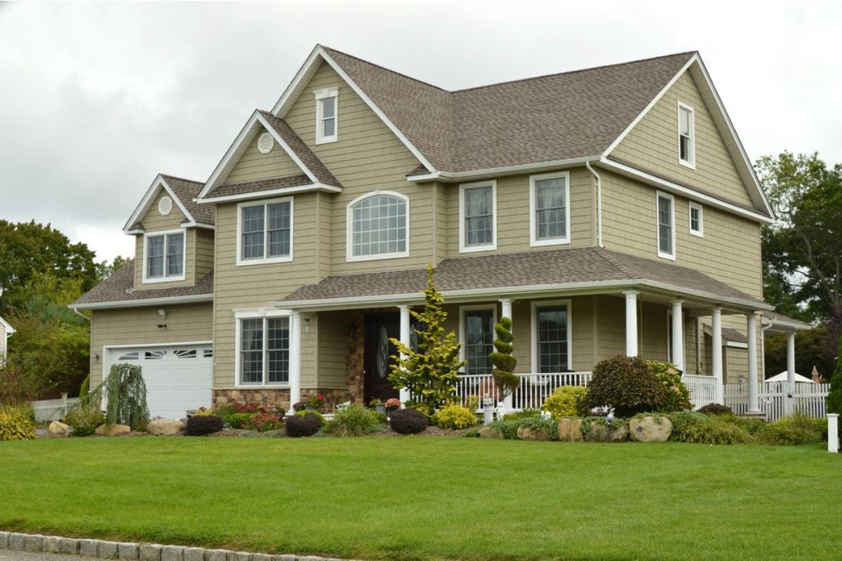
Busy roof geometry adds linear feet of flashing, valleys, and gutters—every one a future leak point—without improving interior usefulness. Underscaled dormers that don’t open into rooms tell on themselves from the street and weaken the home’s architectural credibility.
Insurance and maintenance costs rise with complexity, which savvy buyers factor into total cost of ownership. Simple massing with a few well-proportioned moves looks timeless, performs better, and appraises more favorably.
6. Garage-first “snout house” front elevation
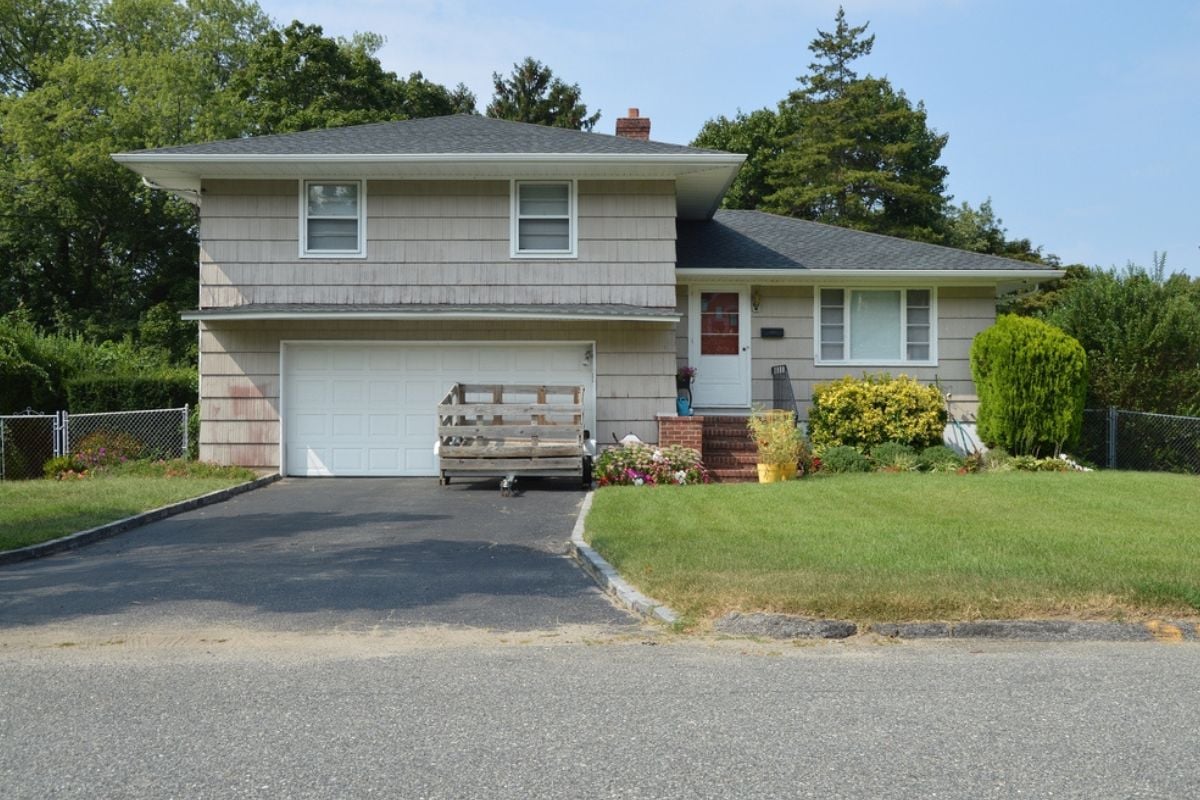
When the garage dominates the façade, human-scaled elements—front door, porch, windows—get visually demoted, producing a streetscape that feels like storage, not living. This configuration reduces natural surveillance of the street and often limits daylight into front rooms, which buyers pick up as gloom.
Recessed or side-loaded garages, modest porches, and layered planting restore hierarchy and welcome. Even modest adjustments to driveway width and door detailing improve curb appeal and first-photo impact.
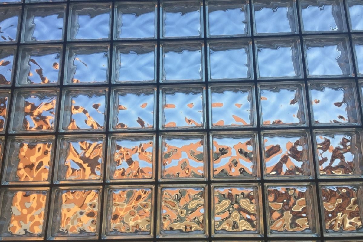
5. Mirrored or glass-block accent windows in showers and facades
🔥 Would you like to save this?
Glass block and mirrored glazing stamp a renovation to a specific decade and complicate future window package upgrades because they don’t match profiles or performance. In showers, they can trap condensation and mildew at joints while providing awkward light quality that skews tile color.
Frosted or textured insulated units offer privacy with better thermal performance and easier replacement down the line. Keeping window language consistent across elevations signals care and reduces long-term maintenance.
4. Unpermitted garage/porch conversions tacked onto the house
Spaces carved from garages and porches often lack proper insulation, egress, and HVAC integration, which inspectors and appraisers flag immediately. Without permits and final inspections, buyers anticipate electrical, structural, and moisture issues they’ll inherit, and lenders may discount square footage that isn’t legal living area.
The result is lower valuations, repair concessions, or deal friction even if the space looks finished. Legalize with drawings and inspections or deconstruct and rebuild correctly so recorded area and comfort match what’s advertised.
3. Front-yard hardscape “parking lot” with little planting or shade

Large uninterrupted paver or concrete fields create glare, raise surface temperatures, and accelerate runoff, stressing foundations and municipal systems. Lack of canopy and layered plantings makes entries feel exposed and unforgiving, which dampens emotional response before a lockbox even opens.
Many jurisdictions now scrutinize impermeable coverage, so over-hardscaping can trigger compliance costs during resale. Introduce permeable materials, beds, and trees to cool the microclimate and soften the approach, increasing comfort and perceived care.
2. Smart-home gimmicks everywhere but cheap baseboards/trim

Voice assistants and app-controlled bulbs can’t hide thin casing, miter gaps, and hollow-core doors, which broadcast cost cutting at every touch point. Buyers trust weight, alignment, and finish quality in millwork more than they trust gadgets that will be obsolete by the next software update.
Investing in solid doors, substantial base, and correctly scaled crown stabilizes the architectural baseline and makes any technology feel like a bonus, not a mask. Spend first on what frames the experience, then layer automation where it actually improves daily routines.
1. Tray ceilings with rope lights and faux-marble everything
Multiple stepped trays dilute ceiling simplicity, collect dust on ledges, and invite gimmicks like rope lights that flatten rather than sculpt the room’s volume. Faux finishes that imitate stone or Venetian plaster without craft read as pattern rather than depth, distracting from proportion and furnishings.
Buyers see inevitable repainting and patching, which they translate into weekend labor or contractor line items. A single, well-scaled recess with quality paint and a disciplined fixture selection conveys calm, height, and intent without theatrics.