🔥 Would you like to save this?
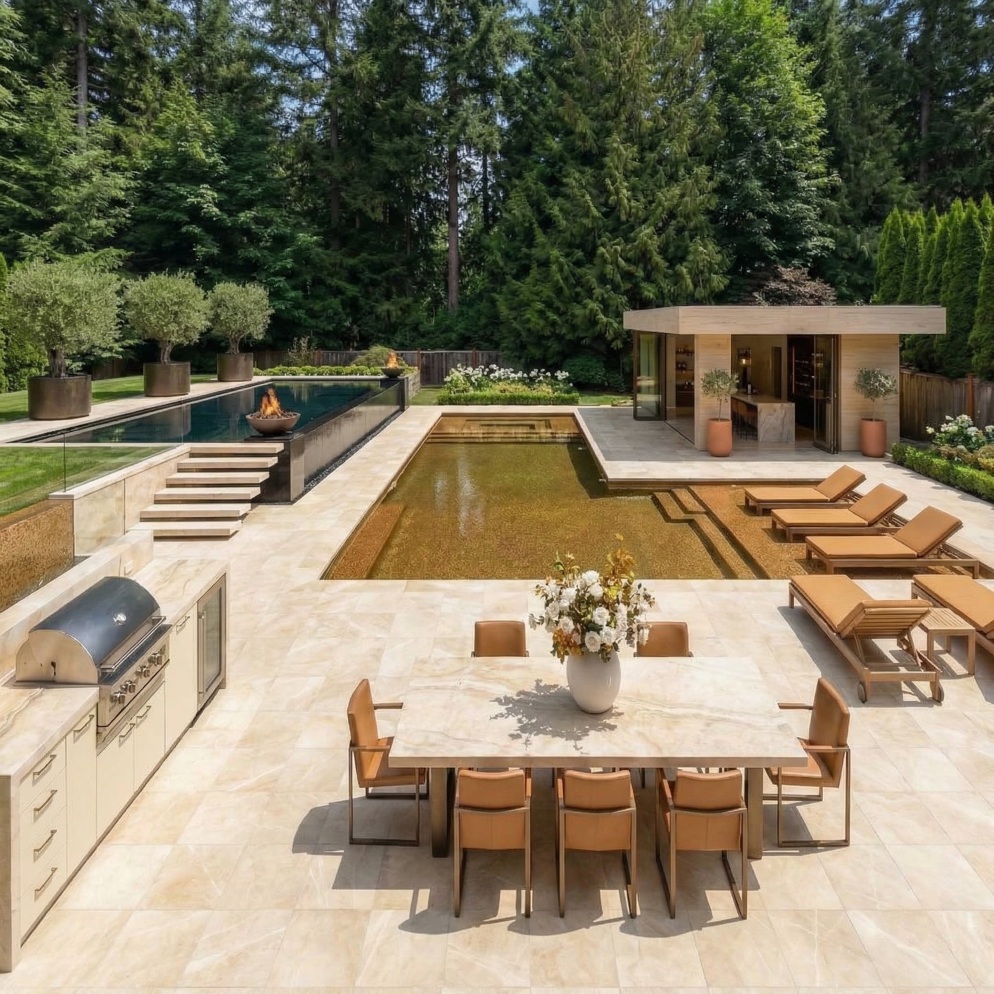
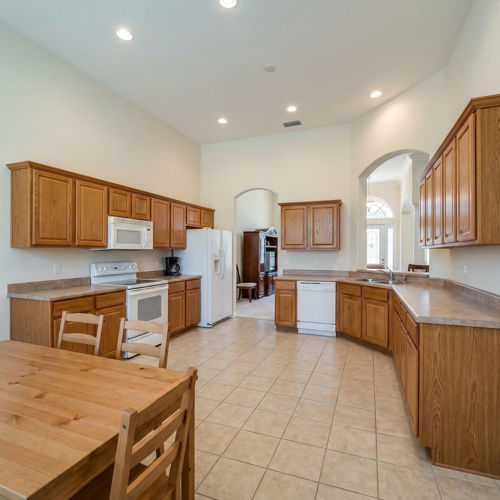
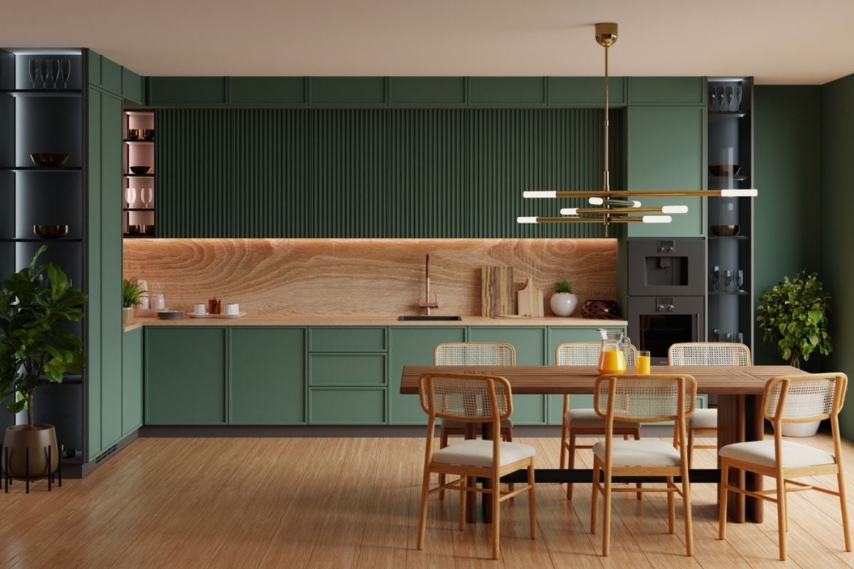
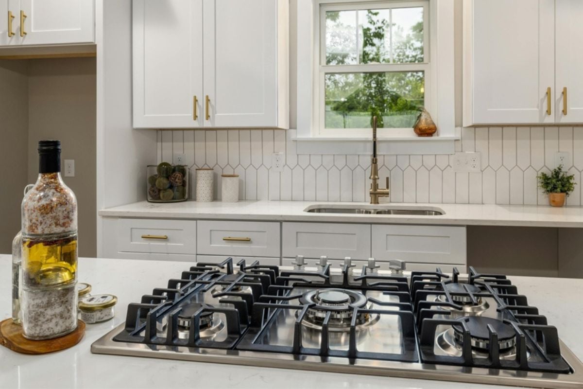
Kitchens are often called the heart of the home, but the wrong layout can make them feel more like a headache than a haven. While finishes and appliances can always be updated, poor flow and awkward design choices are harder—and costlier—to fix.
Buyers notice these flaws instantly during a showing because they imagine cooking, entertaining, or even just grabbing a snack, and the inconveniences stand out. From cramped aisles to misplaced appliances, here are 23 kitchen layouts that send buyers running the other way, no matter how shiny the countertops may be.
In order to come up with the very specific design ideas, we create most designs with the assistance of state-of-the-art AI interior design software. Also, assume links that take you off the site are affiliate links such as links to Amazon. this means we may earn a commission if you buy something.
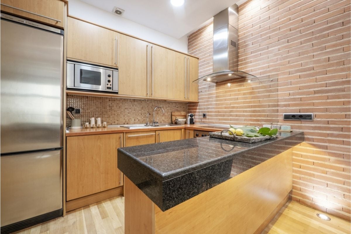
23. Island Cooktop Without Proper Venting
Putting a cooktop on the island without serious ventilation guarantees a house full of lingering odors and grease haze. Buyers know that downdraft systems rarely match the capture efficiency of a properly sized hood, especially with powerful burners or wok-style cooking.
The result is sticky cabinetry, film on pendants, and HVAC filters that clog faster than your patience. If an island cooktop is non-negotiable, buyers expect make-up air, adequate CFM, quiet operation, and a hood design that doesn’t dominate the room.
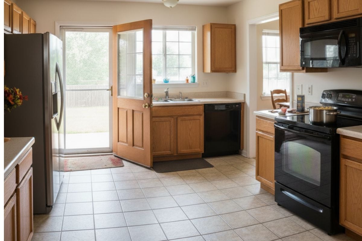
22. Dishwasher Blocking Sink And Trash

When the dishwasher door is down and you can’t reach the sink or the pull-out trash, prep turns into a clumsy two-step. Buyers immediately picture dripping plates across the floor because the flow from scrape → rinse → load is broken.
This layout also becomes a tripping hazard in tight aisles where someone can’t pass behind the open door. Smart plans put trash and sink on the same side of the dishwasher with enough landing space to keep the assembly line smooth.
21. U-Shaped Layout With Pinch Point
A U-shaped kitchen can be great—until the base of the “U” narrows to a hip-bruising choke point. Buyers hate having to shuffle sideways while carrying hot pans or a full sheet tray. That pinched dimension also forces appliance doors to fight for space, making the whole area feel smaller than it is. Maintain at least 48–60 inches at the base so two people can pass, pivot, and work without conflict.
20. L-Shaped Layout With Dead Corner
Dead corners swallow gear, create dark voids, and turn simple tasks into scavenger hunts. Buyers expect corner solutions—lazy Susans, blind-corner pullouts, or an angled cabinet—not a black hole behind doors that barely open.
When the corner also sits near the sink or cooktop, elbows collide and workflow stalls. Good L-shapes either activate the corner intelligently or delete it with a tall pantry or window to keep movement clean.
19. Appliance Doors Colliding At Corners
Nothing screams “afterthought” like a fridge door smacking a wall oven handle or two appliances that can’t open simultaneously. Buyers test these clearances during showings and mentally deduct for every annoying collision.
Beyond frustration, collisions stress hinges and shorten appliance life, which reads as future expense. Keep corners clear with staggered placements, wider fillers, reversed swings, and verified door arcs on the plan—not guesswork.
18. Bar Seating In A Traffic Lane
Plopping stools where people need to walk guarantees bruised shins and constant “excuse me”s during meal prep. Buyers can visualize kids perched with backpacks while someone tries to open the fridge behind them—chaos. Seating belongs out of the main work corridor with a dedicated overhang and safe circulation behind. Provide at least 36–44 inches behind stools to allow a pass-through even when someone is seated.
17. Corner Pantry Blocking Sightlines
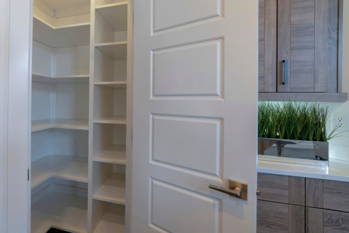
Those big diagonal pantry boxes eat floor area, kill counter runs, and create awkward angles that cabinets have to tiptoe around. Buyers also dislike how they block views to the dining area or family room in open plans. Inside, the footprint is deceptively small, with unreachable upper corners and wasted volume. A slim reach-in with good shelving—or a wall of pantry cabinets—often stores more while keeping the room visually calm.
16. Stove Under Window Lacking Clearance
Ranges under windows look quaint in photos but quickly turn into condensation, splatter on glass, and scorched shades. Buyers worry about code issues too: combustible trim, low sills, and the impossibility of a proper wall hood. Cross-breezes can even blow flames on gas burners, undermining safety. Either raise the sill and engineer a venting solution or move the cooking zone to a protected wall with noncombustible surfaces.
15. Overlong Single-Wall Over 14 Feet
Stretching everything along one wall forces marathon walks between sink, fridge, and range, which kills efficiency. Buyers know that even a modest island or return can cut steps and create landing space where it’s needed.
Long, unbroken runs also make power and plumbing rough-ins more expensive and visually monotonous. Break the line with a perpendicular work zone or a compact island so the kitchen works like a kitchen, not a bowling alley.
14. Wall Ovens Block Main Aisle
When oven doors drop into the only pathway, the kitchen becomes a barricade every time you check a roast. Buyers imagine holidays with multiple cooks and immediately write off the layout as stressful and unsafe. Hot trays need clear landing zones to the side, not across a walkway. Shift wall ovens to the periphery with 15–18 inches of adjacent counter so the aisle stays open and burns stay unlikely.
13. Work Triangle Split By Doorways
Putting doors between the sink, range, and refrigerator interrupts the classic triangle and invites near misses. Buyers picture kids blasting through to the backyard while someone carries boiling pasta across the threshold. Every door swing also steals valuable inches that could be counter or storage. Consolidate the triangle within one zone, then place doors outside that core so movement stays predictable and safe.
12. Open Plan With No Wall Space
Fully open kitchens can leave you nowhere to put tall storage, a serious hood, or even a backsplash. Buyers don’t want to choose between a pantry and a place to hang art or a TV. A tiny stub wall or cleverly framed niche can unlock upper cabinets and better appliance placement. The best open plans balance sociability with enough vertical surface to handle real cooking.
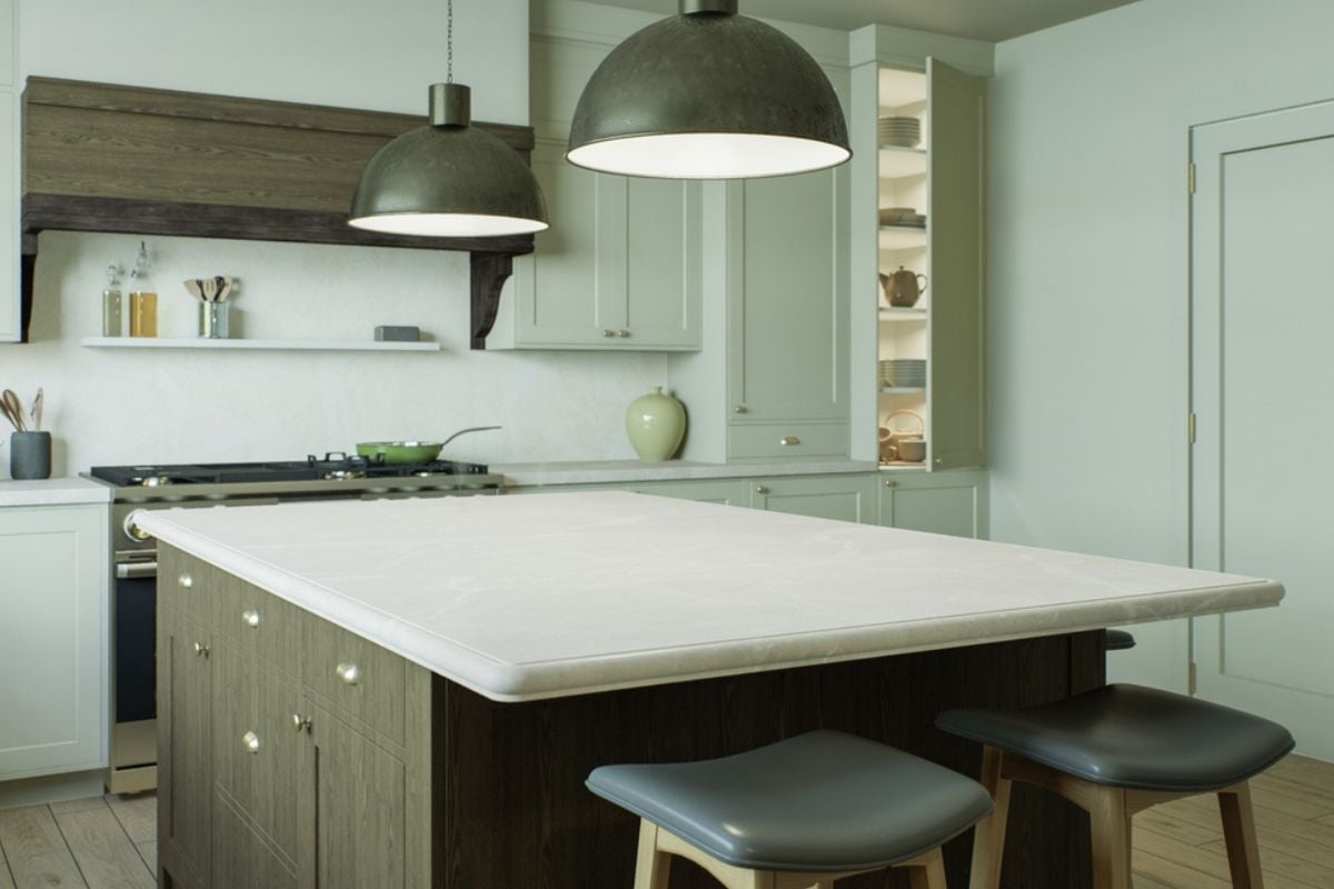
11. Diagonal Island Wastes Floor Area
🔥 Would you like to save this?
Angling the island rarely adds function; it usually burns valuable square footage and creates awkward, unusable wedges. Buyers clock the odd geometry and wonder what problem it was trying to solve. Diagonals also complicate flooring layouts and lighting symmetry, making the room feel off-kilter. Square up the island parallel to cabinetry so aisles are consistent, storage is maximized, and sightlines feel restful.
10. No Landing Beside Appliances
Every major appliance needs a safe spot to set things down the instant you open the door. Buyers expect landing zones next to the fridge, on both sides of the cooktop, and at the sink and ovens. Without them, hot pans, heavy roasts, and drippy containers travel farther than they should. Plan for 12–18 inches minimum beside most appliances and more near the range to make cooking feel effortless.
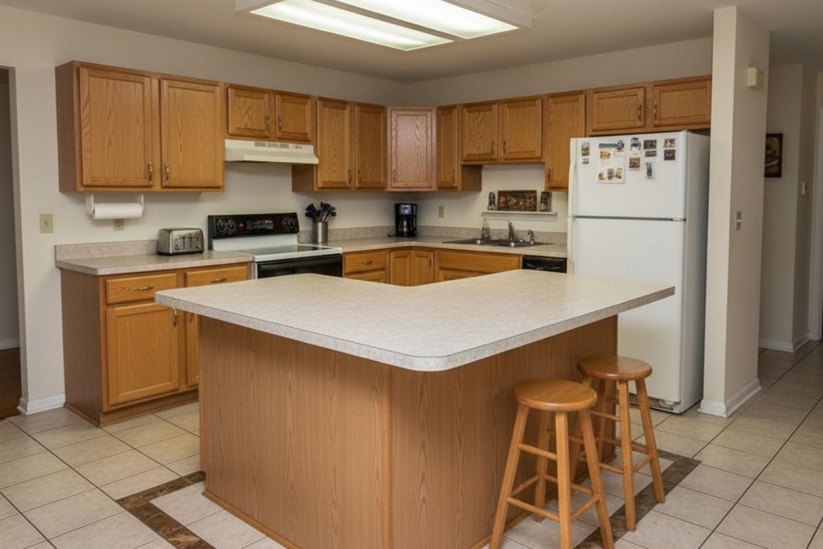
9. Giant Island In Tiny Room
Supersized islands look luxurious online but turn small kitchens into obstacle courses. Buyers quickly notice starved aisles, cramped seating overhangs, and cabinets that can’t fully open. Large slabs also demand more expensive stone and extra seams, which defeats the premium look. Right-size the island to preserve 42–48-inch aisles and consider a mobile cart or prep table if you truly need more surface.
8. Double Islands With Tight Gaps

Two islands can work in big kitchens, but squeezing them into average spaces creates a stressful slalom. Buyers don’t want to squeeze between furniture to reach the sink or fridge. Tight gaps also wreck stool seating and leave no place for a proper vent hood or pendant spacing. If you crave dual zones, make one a narrow butcher-block or commit to a single, well-proportioned island.
7. Peninsula “U-Trap” With One Entry
Peninsulas that close off the room trap the cook inside a cul-de-sac with no graceful exit. Buyers imagine entertaining and realize guests will bottleneck at the pinch point. The lone entrance is also rough for accessibility and makes appliance deliveries a nightmare. Open one side or use a freestanding island so circulation loops instead of dead-ending.
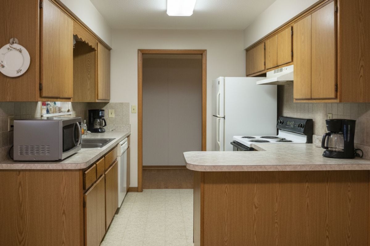
6. Walk-Through Kitchen As Hallway

When the kitchen sits on the main path from garage to backyard, it becomes Grand Central Station at dinner. Buyers dislike constant cross-traffic behind a hot stove or while carrying knives. This layout also multiplies spills and crumbs as people cut through with shoes and bags. Reroute traffic with pocket doors, widen an alternate corridor, or add a secondary mudroom path to protect the work zone.
5. Sink Stuffed In Blind Corner
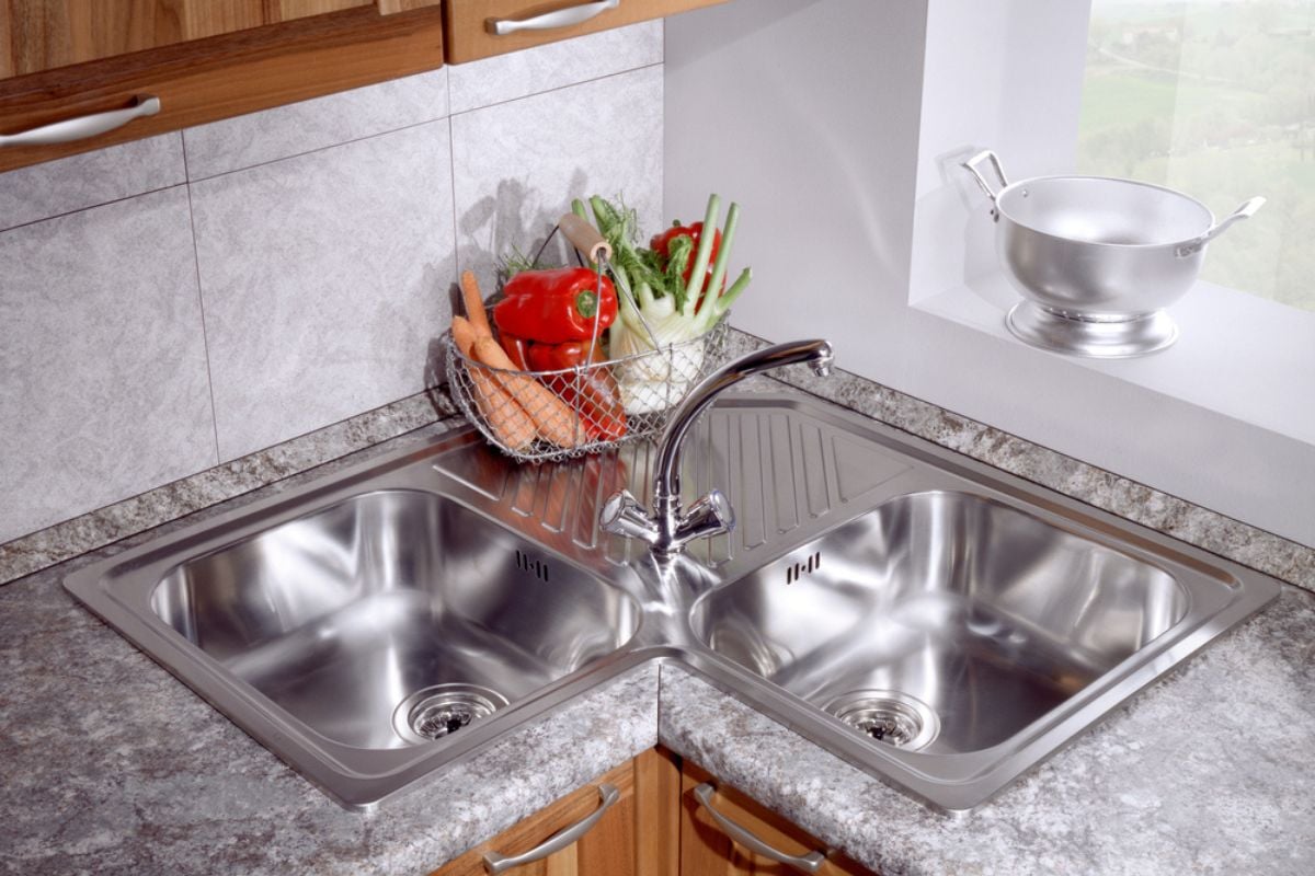
Corner sinks chew up counter space, limit dish-drying areas, and force you to face a wall while working. Buyers know plumbing and disposal service is harder in a blind base, and fixtures often end up off-center. Corners also make it tough to share the sink because only one person fits comfortably. Move the sink to a straight run with windows or sightlines, then turn the corner into storage with clever hardware.
4. Range Beside Refrigerator Placement
Putting a heat source next to a cold appliance is a daily efficiency tax. Buyers worry about compromised fridge performance, melted gasket seals, and zero landing space for hot pans. The side-by-side setup also breaks the thermal zoning that keeps a kitchen comfortable. Separate them with at least a cabinet and counter—ideally, keep the fridge on the edge of the work zone so snackers don’t invade the cook’s lane.
3. Refrigerator Far From The Sink
Most prep starts at the sink, so a far-flung fridge means endless laps with dripping produce. Buyers sense the wasted motion instantly during a showing, especially in long or chopped-up rooms. Distance also invites collisions as family members cross paths to grab drinks. Pull the refrigerator closer to the cleanup and prep area, or add a secondary under-counter unit in the island for high-reach items.
2. Island Crowding Perimeter Cabinets
Islands set too close to base cabinets turn drawers and dishwashers into finger-pinching hazards. Buyers expect at least 42 inches of clearance—48 if multiple cooks share the space. Tight aisles also make stool seating unusable and force sideways shuffles with hot pans. Move the island, shrink it, or replace it with a narrow table to restore breathing room and safety.
1. Galley Aisle Under 36 Inches
Galley kitchens thrive on efficiency, but when the corridor narrows below 36 inches, it stops being functional. Buyers imagine bumping hips, blocking each other at the sink, and struggling to open oven doors. Too-tight aisles also fail accessibility and feel dated compared to modern, airy plans. Expand to 42–48 inches where possible or remove uppers on one side to visually widen and brighten the run.